

When you’re building pretty much anything that exists on the web, you’ll realize that much of what you’re building fits together like legos. Some small blocks combine to form larger sections, which combine to form your site.
This is the foundation of atomic design: small things build into larger ones. And if you can isolate the small parts for reuse across the bigger ones, you can greatly improve efficiency.
In this post, I’ll walk you through what atomic design is and why it’s beneficial for designers, developers, and entire teams. I’ll also include a few examples of how to implement it in design and in code to help you (or your team) get a better understanding of how to apply it in the future.
What is an atomic design system?
Inspired by molecular makeup (have you forgotten your high school chemistry?), Brad Frost realized that building blocks in websites could easily be described in a similar way. In the same way that atoms build into molecules which build into organisms, the smallest components of a web design come together to form more complex components.
This allows us to create a design system that goes from the smallest element (an atom) all the way up to an entire page, understanding how each component links together and assembling them efficiently across designs and code.
The best part? It works for both designers and developers, creating a complete system that improves the effectiveness of any team.
To see this theory in action and understand how each level is distinguishable from the next one, I’ll explain the smallest components of a website first and build up from there. You might have your own way of creating pages or components, but starting with our smallest building blocks creates a great foundation, gives us a better understanding of how things fit together and allows us to easily reuse them in the future.
Then we’ll dive into an example that allows us to take our elements through the design and development process.
Atoms
Atoms are the smallest blocks on your website. These are individual components that do one thing and one thing only.
A button link (not to be confused with a semantic button) is a great example that you’ll find on every project.

Its only function is to take a user to another page. Since it only has one function, it’s easy to reuse it anywhere that specific functionality is needed.
In both the design and code, we can create and control the button in one place, and then reuse it all across our projects. Then, when that button needs an update, the change is simple and centralized, even though it impacts the entire design. This theme of efficiency will continue as the complexity of our elements increases.
Molecules
A molecule is a collection of atoms that combine to create a group of repeatable elements. This is where we start to see things come together for specific uses, but these can often be swapped out for another molecule without any significant impact.
A content block uses a few text areas plus our button from before.
As you can see, it’s built up from different atoms:
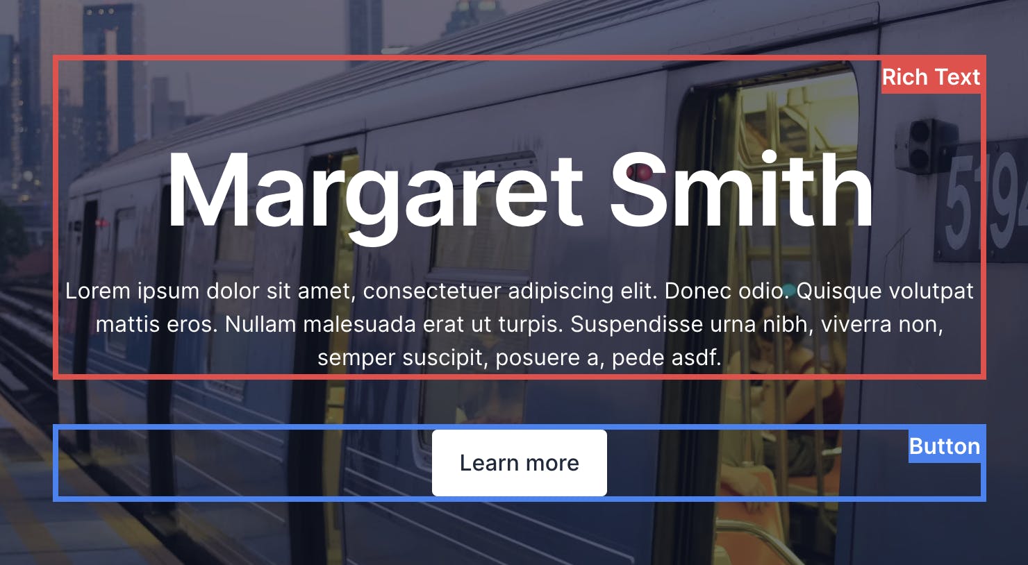
Rich text and a button together have more than one functionality (communicating information and providing the functionality to navigate somewhere else), so they come together as something more complex than an atom. However, they’re still broadly reusable. You could have rich text and a button across many different contexts on a website.
Organisms
Seeing a pattern? We’re slowly building up bigger and bigger reusable elements. Organisms, then, are entire sections that can stand on their own and combine a set of molecules into a component of their own.
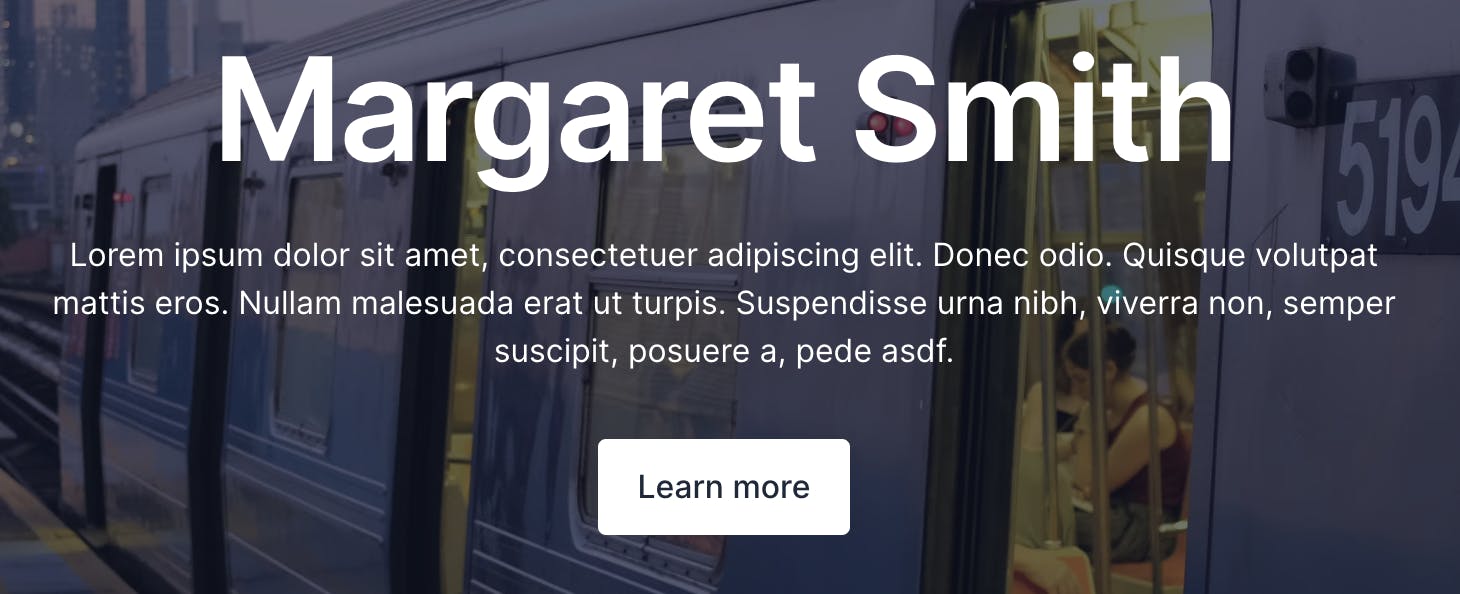
Here’s a hero, a common component of every site that combines our rich text and button molecule with a featured image background.

Separately, the molecules are versatile, but together they’re an even larger building block for a page.
Atomic design systems + Prismic = 🚀
Prismic is a headless page builder that’s perfect for taking atomic designs to a CMS. That’s because developers can create custom organisms, which we call Slices, that content teams can use to build design-consistent pages in a simple interface.
Templates
Our final reusable component is our template. A template is an entire webpage but instead of having fixed content, the content is dynamic, which means that you could use the same template with different content many times. A blog post will often have the same layout and structure across all the blog posts (a template) but the content will be different between each post (a page).
While some elements of a template may be fixed, like the header and footer, others are likely going to be dynamic — no two pages will look exactly the same.
A template lets us create a page while saying these bits are going to be left up to the content editors to lay out. Many websites are built with content management systems that take templates and allow teams to add content dynamically to specific pages.
This flexibility is why it’s so important to break down your other components beforehand. They need to be built in isolation but seamlessly work together when combined.
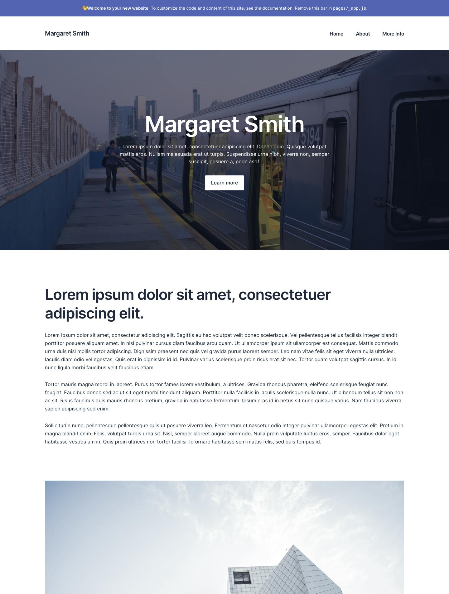
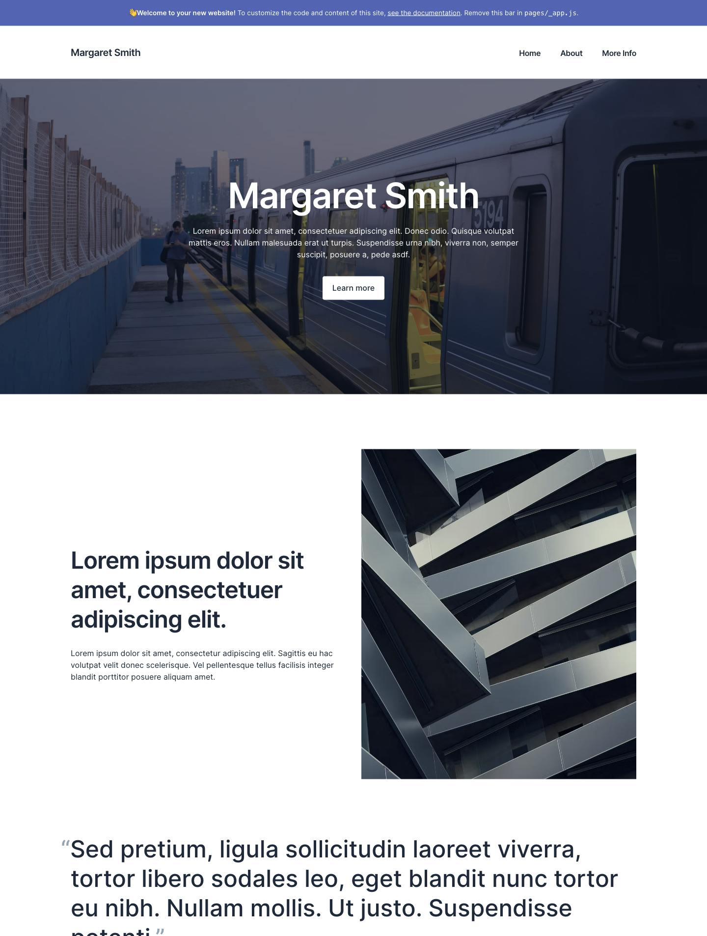
You can see below we’ve taken the same page template as above, but changed the content below the hero, which gives us an entirely different feeling page.
Pages
And finally, let’s not forget about our pages. Pages are very similar to templates in that they show an entire… well… page (who’da thought?). The difference though is that these pages are specific instances of templates with unique content on your site.
That means that while templates are the scaffold of what your pages could contain, the page itself is exactly what that page will look like with customized content.
You might not design or test every individual page, though critical ones are definitely going to need a keener eye to ensure they work exactly as expected.
Why would you use an atomic design system?
Design systems are created for teams. As a business grows, your website project is bound to continue to get more complex. Additional complexity can be devastating if not managed correctly. That’s where design systems come in. Structuring our work simplifies our solution, speeding up future changes, with fewer issues.
Let’s discuss that in more detail.
Structure improves iteration
Every website will change over time. In the voice of Agent Smith: it’s inevitable. So, if you know you’re going to have to come back and make changes in the future, you’d best be sure you’ve set your project up in a way that it’s easy to iterate upon.
Even small requests can add up to big changes if you haven’t structured your work. Implementing a design system, however, will mean that you can change your work in one place, and it’ll update everywhere all at once (like a button, that updates across your entire site with one change).
Consistency improves collaboration
And for larger teams, having everyone work with a consistent approach makes it much easier for everyone to work on each other’s work. By incorporating atomic design, you standardize how things are structured. That makes it much easier to understand how your teammates are thinking and reduces variation in how different people work. No more feelings of frustration when you can’t work out why your teammate created their animated slider in the way they did.
Simplifies communication
By having a design system in place, you start to unify your terminology, which makes talking about the parts of your website easier. That means communicating designs or code to other teams suddenly causes a lot less confusion, making for less back-and-forth and fewer rewrites.
Essentially, with a better understanding across your entire team, you’ll be able to get to the final version faster.
Reuse Everything
Speaking from experience, running a business is all about doing things in the best way you can now to save yourself some time and improve results later.
Design and development are the same. I know I’d rather spend time figuring out a new feature than rebuilding old ones over and over.
So here’s a quick run down of why implementing a design system matters
- Reused assets also make maintenance significantly easier, as you only have to update things in a single place. That’s less boring work for you when you have an update to do.
- That then means you’re able to move much faster, spending more of your workday focused on creating new solutions that are more fun and interesting, not reworking old ones.
- And your team is able to move much faster too as you’re all working the same way, towards the same goals.
Is there a catch?
Not really. The main drawback with using atomic design, or any design system, is that they take time to implement well. But that doesn’t mean you shouldn’t use them. Hopefully, you’re thinking long-term about your (or your client’s) business and that means setting up systems that work for years to come.
Example part 1: Creating an atomic design system example in Figma
Figma is the design tool of choice for our team due to its flexibility, collaboration, and how it functions very similarly to a developer workflow.
Starting to think atomically at the design stage is critical for making sure your designs are usable and maintainable long term. Standardizing your design process will improve efficiency in the future and designing in developer-friendly ways will make website design handovers significantly easier.
Here’s how we create maintainable designs at my agency, Skyward.
Note: If you’re looking to jump ahead and see how this works, or follow along in a real design environment, then you can head to the Figma file and see how I’ve put this together.
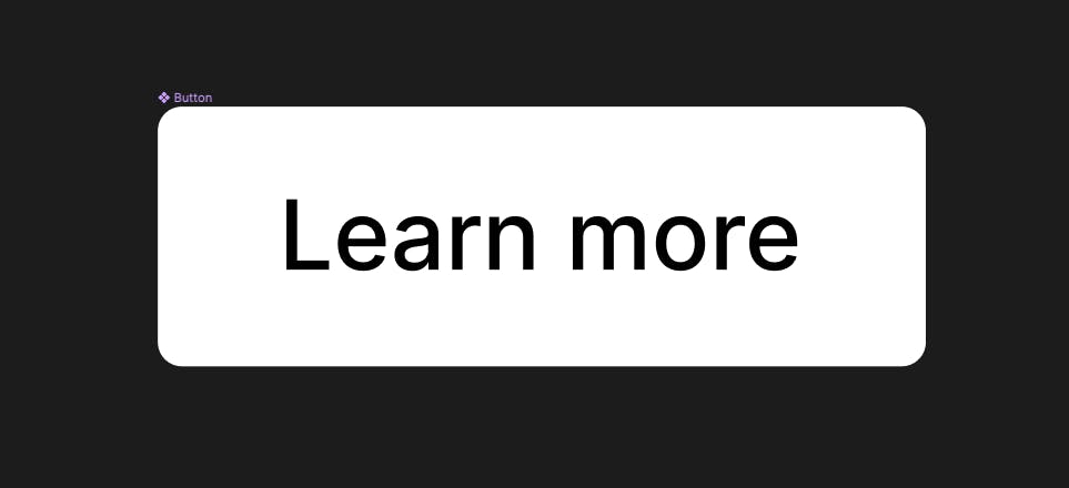
Atoms: Designing our button
Is there any website project out there that doesn’t use a button?
We’re going to create some text inside a rounded frame with some padding, like the one below:
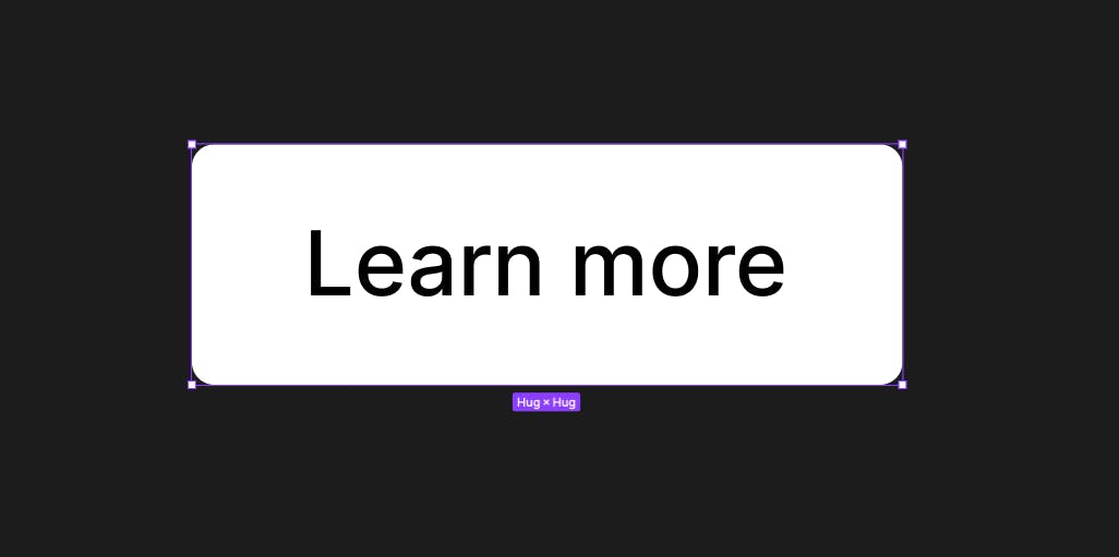
The most important thing we do is make this a component so we can reuse it later. To do this, right-click and select “Create Component” or press CMD + Shift + K (on a Mac).
It should now have a new icon next to the name, which means it’s reusable.
Molecules: Designing our content area
With our button created we can go ahead and create our molecule. We’re following our example from earlier, so let’s create that content area.
We’ve got two text fields and our button from before (you can copy your button and paste it here), spaced out evenly.
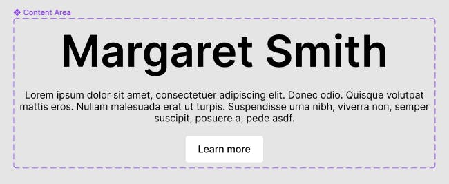
This again needs to be made into a component so we can reuse it later, so select all of the included elements, right-click, and select “Create Component” or press CMD + Shift + K (on a Mac).
Organisms: Designing our page section
And finally, we can create our section. This takes our content area from before and creates a page section from it.

Templates: Designing our page template
And with lots of page sections (organisms) we can build up our page layout very easily. It may take more effort to lay your foundations, but once you’ve got your sections created, building your pages takes a matter of minutes.

Summary
And that is how you go about designing atomically. This is a pretty basic example, and you can do a LOT within Figma that gives you plenty of variety for how your components can be used.
But the great part is that if we need to go back and update any of our components, everything that uses the button, for example, gets updated too!
Example part 2: Building our atomic design system in React
Keeping code simple enough to change but dynamic enough to handle your business needs is one of the most challenging aspects of development.
Using an atomic approach in design and development gets everyone thinking about your website in the same way, and developers still get all the benefits of creating code that’s easy to reuse and maintain long-term.
Here’s how we approach web builds at Skyward, when we bring our atomic designs to life.
Choosing the right stack
After you’ve gone to the trouble of building an atomic design, it’s important that you choose the right tools to take all of those reusability benefits to the website itself. So, you’ll want to select:
- A web framework that is also based on components.
- A CMS that allows you to combine your templates with dynamic content.
Our example uses React, Tailwind, and Prismic. Atomic design doesn’t require that you use any of these tools specifically, but this stack has a couple of important benefits:
- React allows us to code and reuse components the same way that they’re used in our design.
- Prismic not only allows us to bring in our dynamic content, since it’s a content management system, it’s also a headless page builder that allows us to make our organisms (website sections) available to content editors. With Prismic, our website sections will be available to content teams as building blocks in a custom page builder interface.
See the code
If you’d like to jump ahead, or dig deeper into our project you can see the finished code here.
Setting up our project and content
Using Prismic as our CMS gives us a massive speed boost when getting up and running because it’s extremely compatible with atomic design systems. We won’t focus too much on the setup for using Prismic, but after we build our atomic design elements, we’ll take a tour of how they translate into a custom page builder.
Let’s start with some boilerplate by running the following commands:
npx degit prismicio-community/atomic-design-basics-tutorial atomic-design-tutorial
cd atomic-design-tutorial
npx @slicemachine/init
Follow the prompts from your terminal. One prompt will lead you to create a Prismic account, which will allow us to have real dynamic content for our example below. Once those steps are finished, run:
npm run devWhat did all of that do for us? A few things:
- It created a lot of boilerplate code for our project so that we can focus on building each step of our atomic design. If you run the project, you’ll see at http://localhost:3000/ that it’s not showing much at the moment because it’s missing all of the components we’ll create below.
- It also did us a huge favor and created content in Prismic for us, so that when we’re ready to see dynamic content on our website, we’ve got some ready and waiting for us.
- It also configured Prismic’s local development tool, Slice Machine, which helps devs translate an atomic design into a cloud-hosted custom page builder interface. We’ll come back to this later after we’ve built our components, but you’ll find it at http://localhost:9999/.
Atoms: Building our Button
Similar to our design, we’ll start by creating our button atom. We’ll create a link with some button styling. This component exists in its own file so that we can access it and use it anywhere, and it takes the props we need (the link and the text). Add the following code to /components/Button/index.js:
// components/Button/index.js
import { PrismicLink } from '@prismicio/react'

export const Button = ({ buttonLink, buttonText }) => {
  return (
    <PrismicLink field={buttonLink} className='rounded bg-white px-5 py-3 font-medium text-slate-800'>
      {buttonText || 'Learn More'}
    </PrismicLink>
  )
}
Molecules: Building our Content Area
Now that we have our button coded up, we can use that component in our content area.
Just like our design, we’ll have two text fields and a button, spaced out evenly. Add the following code to /components/ContentArea/index.js:
// components/ContentArea/index.js
import * as prismicH from '@prismicio/helpers'
import { PrismicRichText } from '@prismicio/react'


import { Heading } from '../../components/Heading'
import { Button } from '../../components/Button'

/** @type {import("@prismicio/react").PrismicRichTextProps['components']} */
const components = {
  heading1: ({ children }) => (
    <Heading as='h1' size='xl' className='mb-4 mt-12 first:mt-0 last:mb-0'>
      {children}
    </Heading>
  ),
}

export const ContentArea = ({ text, buttonLink, buttonText }) => {
  return (
    <div className='grid justify-items-center gap-8'>
      <div className='max-w-2xl text-center'>
        {/* Prismic already comes with a rich text component, which we can use. */}
        <PrismicRichText field={text} components={components} />
      </div>
        {/* And we reuse our button here. */}
        {prismicH.isFilled.link(buttonLink) && <Button buttonLink={buttonLink} buttonText={buttonText} />}
    </div>
  )
}
Yet again, we’re creating our molecule in its own file so that we can use it anywhere we need it. Just like we’re using our button as an imported component here, we could use the same button across numerous types of molecules.
Organisms: Building our Page Section
Finally, we’ll build our page section. In Prismic, organisms are called Slices, and Prismic will do some special magic for us when we build our organisms in the /slices directory. So, in our /slices/Hero/index.js file, add the following code:
// slices/Hero/index.js
import * as prismicH from '@prismicio/helpers'

import { Bounded } from '../../components/Bounded'
import { ContentArea } from '../../components/ContentArea'
import { Image } from '../../components/Image'

const Hero = ({ slice }) => {
  const backgroundImage = slice.primary.backgroundImage

  return (
    <section className='relative overflow-hidden bg-slate-900 text-white'>
      {prismicH.isFilled.image(backgroundImage) && (
        <Image field={backgroundImage} alt='' layout='fill' className='pointer-events-none object-cover opacity-40' />
      )}
      <Bounded yPadding='lg' className='relative'>
				{/* Here's our ContentArea component. */}
        <ContentArea {...slice.primary} />
      </Bounded>
    </section>
  )
}

export default Hero
Templates: Using Prismic’s outstanding Dynamic Content
Now, all we need to do to start using the magic of Prismic is use our Slices in our page template.
Prismic provides a component called <SliceZone/> that handles dynamic page content for us. Essentially, whenever someone creates a page in Prismic, they’ll be able to choose any combination of our Slice organisms to build their content, using them like building blocks to build as many individual pages as they want. <SliceZone/> helps match their content with the right components from our /slices file.
In pages/index.js replace the contents with the following code:
import Head from "next/head";
import { SliceZone } from "@prismicio/react";
import * as prismicH from "@prismicio/helpers";

import { createClient } from "../prismicio";
import { components } from "../slices/";
import { Layout } from "../components/Layout";

const Index = ({ page, navigation, settings }) => {
  return (
    <Layout navigation={navigation} settings={settings}>
      <Head>
        <title>{prismicH.asText(page.data.title)}</title>
      </Head>
      {/**
      * Prismic provides a SliceZone, which handles our dynamic page content for us
      * We pass it our Slices data, so it knows what to render, and our Slice components, so it knows how to handle them.
      */}
      <SliceZone slices={page.data.slices} components={components} />
    </Layout>
  );
};

export default Index;

export async function getStaticProps({ locale, previewData }) {
  const client = createClient({ previewData });

  const page = await client.getByUID("page", "home", { lang: locale });
  const navigation = await client.getSingle("navigation", { lang: locale });
  const settings = await client.getSingle("settings", { lang: locale });

  return {
    props: {
      page,
      navigation,
      settings,
    },
  };
}
Once you’re done, your Slice should show up on your page at http://localhost:3000/. Note that you may need to refresh the page to see your dynamic content get pulled in.
Let’s see our atomic design benefits in our CMS
Now, let’s take a tour of the content we’ve used in our components to see how our atomic design system can even extend into the content editing experience that a CMS provides. We’ll start with Prismic’s local developer tool, which helps devs connect their designs to the custom page builder they create.
To follow along with this tour, open Slice Machine at http://localhost:9999/.
Organisms in Prismic
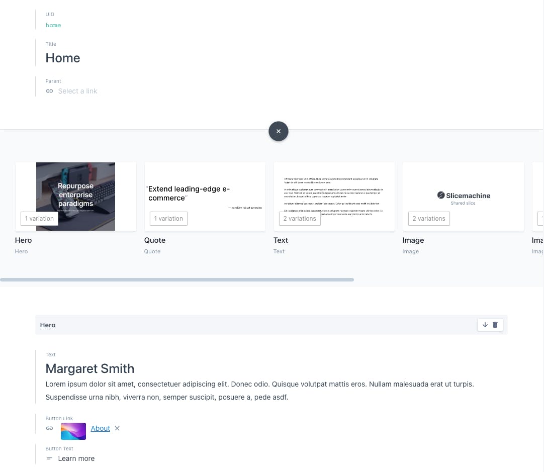
Exposing every level of our atomic design system could make the editing interface for a content team pretty complex when their main interest is creating content (not assembling a design). To make it easier to build website pages that align with our intended design, Prismic exposes our atomic design system at the organism level through reusable website sections called Slices. Let’s see how a Slice gets configured by selecting “Slices” from the lefthand menu:
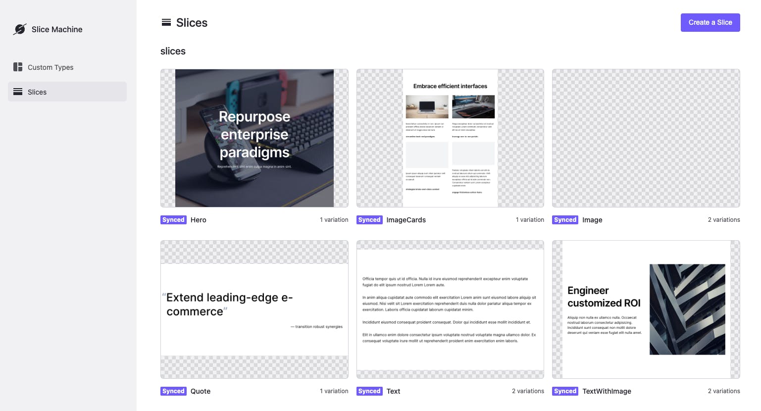
If we select the Hero Slice, we can see how our organism from earlier gets translated into fields for content editors to use in a CMS.
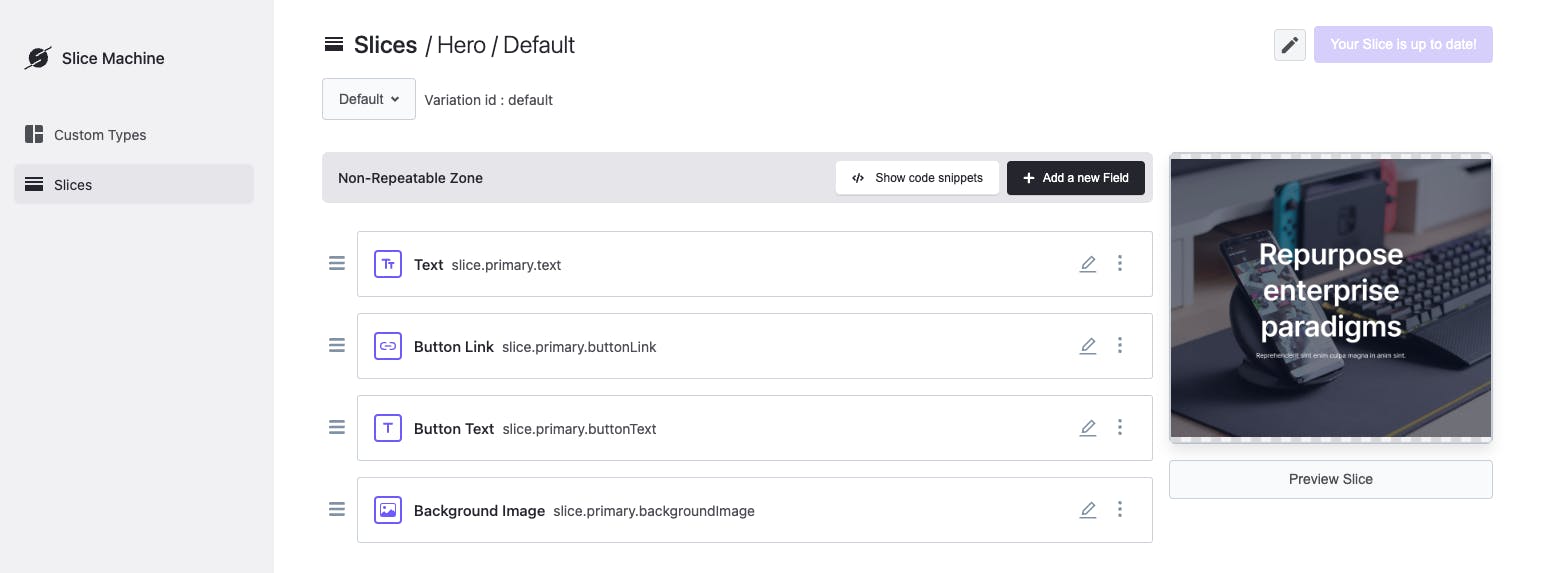
You’ll notice that our project has defined fields for us through our starter project. You can see the Text, Button Link, Button Text, and Background Image fields all in the “Non-repeatable Zone.” These fields are how content editors will be able to add dynamic content from the custom page builder interface. They’re also part of how we model the data that Prismic sends us through their API.
From Slice Machine, we can define them both for our code and for Prismic’s configuration. For example, notice in our Button component’s code from earlier that we’re using buttonLink and buttonText to add content to the button:
export const Button = ({ buttonLink, buttonText }) => {
  return (
    <PrismicLink field={buttonLink} className='rounded bg-white px-5 py-3 font-medium text-slate-800'>
      {buttonText || 'Learn More'}
    </PrismicLink>
  )
}
We’ll see where you add the actual content on our demo site in just a moment when we pop over to our Prismic dashboard.
Templates in Prismic
Before we leave Slice Machine, though, let’s look at one more thing. In Prismic, you can create templates, which are called Custom Types.
Let’s see how our template gets modeled for the CMS in the Custom Types tab. Navigate to the “Custom Types” tab from the lefthand menu. Select the Page Custom Type, and you’ll see that here, we can set up some static elements for the page, but we also have a number of organisms in the “Slice Zone,” which content teams can then use as a custom page builder like building blocks for their content.
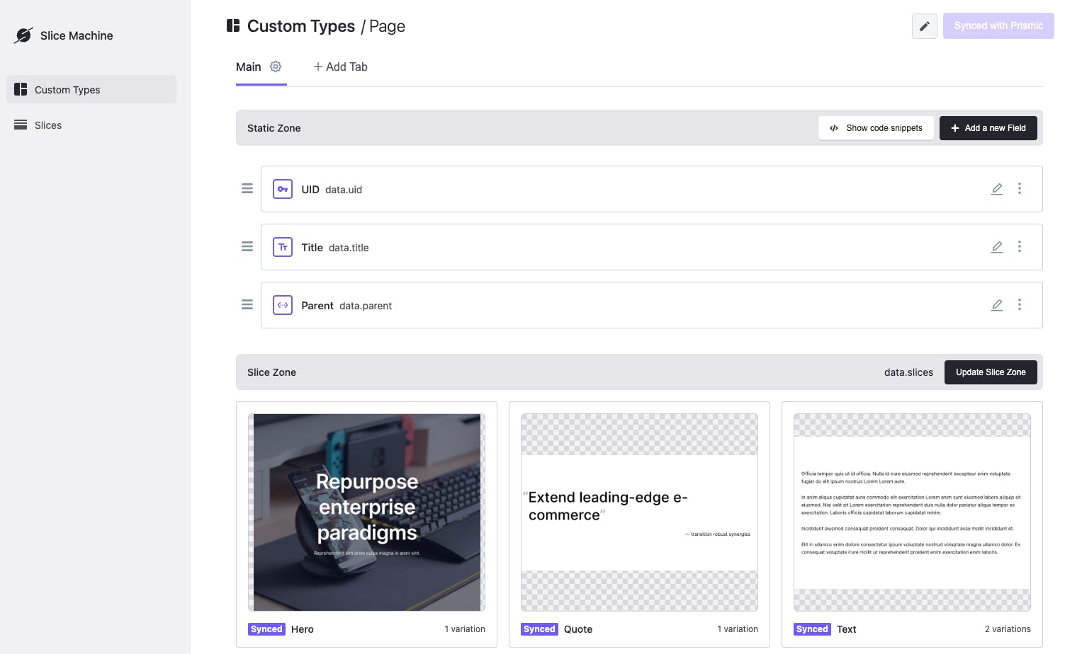
See our Hero Slice?! That means it’s reusable for any page that uses this template. Let’s head over to our Prismic dashboard to see what our templates and organisms can do in a cloud-hosted custom page builder interface.
Bringing atomic designs together in a headless page builder
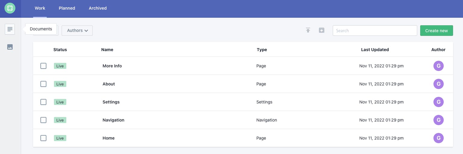
You can open your Prismic dashboard by clicking here. Select the repository you created earlier with the starter command.
You’ll see a list of all of the documents in your starter project. The “Home” document contains all of the dynamic content for the page that we ended our example with. Let’s open that document.
Once inside, we can see that our Hero Slice is already there, with the content we saw earlier.
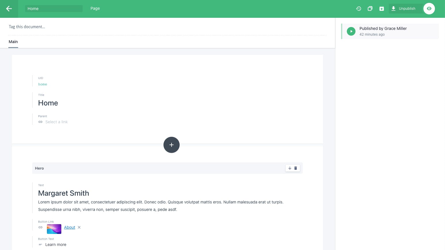
The “+” button that appears in the center, between different sections allows editors to add additional Slices to the layout.
You can add Slices in any configuration you like. As you can see, in Prismic, your organisms and templates become a powerful combination that could result in an almost endless combination of Slices to create unique pages.
Ready to dig deeper with Prismic?
Love seeing a CMS that takes your design system to content teams? Dig deeper in a crash course on building with Prismic and Next.js!
Rounding up
At Skyward, we make sure to build all our projects with a strong design system. Creating a standard approach that’s not tied to our own biases makes teaching other teams a lot easier, and simplifies lots of discussions in our own team.
And once you start seeing websites as a collection of smaller components, you’ll find it a lot easier to create far more complex features, while keeping them maintainable in the long term.
Further learning
And that’s a wrap. Follow this implementation for your designs, development, or both and you’ll end up with a future-proofed approach to creating websites that last years.
Looking to learn more?
- Check out the book by @brad_frost .
- Follow me, @dan_spratling to learn more about how we create scalable systems at Skyward.
- Or read our blog post on how we create effortless design systems at Skyward.


