Yesterday afternoon we launched the new Prismic website!
We’ve been working on it for nine months, and we’ve learned a lot along the way. After working on this website, we wanted to share three principles that helped us get to a result we are proud of and excited to keep building upon.

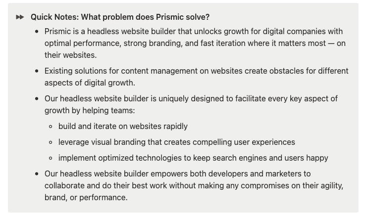
Principle #1: Formalizing our positioning helped set a shared understanding of what we want to communicate on the website.
When we decided to re-do our website, our motivation was that we felt our current one wasn’t representing our value to those we’re a good fit for. We repeatedly heard from our users that they like our Slices, our intuitive content creation interface, and the smooth developer experience. All of that wasn’t so obvious on our previous website. We wanted to fix that.
We made dozens of variations with Hervé, our design agency, to find a good visual brand that would reflect what differentiates us, but we struggled with making decisions on one concept. Something felt off every time we considered a new idea. It’s only when we put our positioning on paper that we were able to make progress:
- What’s the value that our product is the best in the world at providing?
- And who are the best-fit customers that care a lot about that value?

Principle #2: Having precision and a clear vision of what still needs to be done for a first release helped keep everyone excited.
After we formalized our positioning, it was pretty smooth to create a visual identity that would carry that message. Then came the time to structure and organize the website refresh project.
Redoing a website is a long and challenging project; it can feel overwhelming and endless for the team. We started by taking an inventory of all our current pages and the ones we wanted to add. We created a roadmap for all the pages that needed to be redone content-, design-, and development-wise. That represented over 60 pages for us.
That could have looked overwhelming, but formalizing what still needed to be done and updating progress twice per week helped keep everyone focused and energized throughout the nine months we worked together.

Principle #3: We decided to view the release as just the starting point. This is just step one.
During this project, there were a lot of questions we left open and hypotheses that we didn’t verify (yet).
Some questions we still want to answer:
“Is it clear enough from our pricing page that we have progressive pricing?”
“Is the website conveying efficiently the idea that this is a product to make both developers and marketers productive?”
All of these still need to be tested and iterated upon. So we focused on creating foundations for the website that allow us to:
- Test and validate our (many) hypotheses through in-website surveys, Hotjar recordings, and authorized session tracking.
- Iterate on the website quickly, without impacting the visual brand or the website performance, with all our pages’ content and layouts managed through Slices in Prismic.
- Make plans on how to make it better. We consistently added items to a post-launch list of new pages to start working on and new improvements to add to the website experience that we are already thinking of.

Want to learn even more details about our journey? Watch a recording of our January meetup to learn more about our process for building this website, and what helped us work productively on it. Our website team shared their journey, and the team from Hervé, the design agency that helped us along the way, shared theirs, too.

