A design style guide sets the visual and interactive standards for a company’s branding, content, and applications. It ensures a design consistency over all platforms, markets, devices, and contexts.
For example, a style guide will describe how to use a logo (not the design of the logo, but its size and placement on a page). In like manner, it establishes the company’s color palette and guides designers on when and where to use certain colors.
But it’s not just about the visuals or the user interface (UI). It’s also navigation and interactivity. A style guide provides detailed direction on the user experience (UX).
Given its company-wide reach over digital content and software, the style guide is normally part of a larger design system. A design system involves expert collaboration, user testing, tool sharing, and process methodologies, all of which foster adherence to the style guide while facilitating the regular delivery of quality output.
What a style guide is, in more detail
You can use a style guide for websites, products, digital software, public communications on social media, and any other company asset or output. We’ll focus here on web pages and content.
All web pages need an exceptional and consistent UI/UX to engage the public. To achieve that, the company needs to create standards and reusable assets or components that they can apply to their websites. They also need platforms and collaborative tools that enable experts and stakeholders to easily implement a style guide’s rules and recommendations.
Here are some examples of what a style guide will do.
Branding
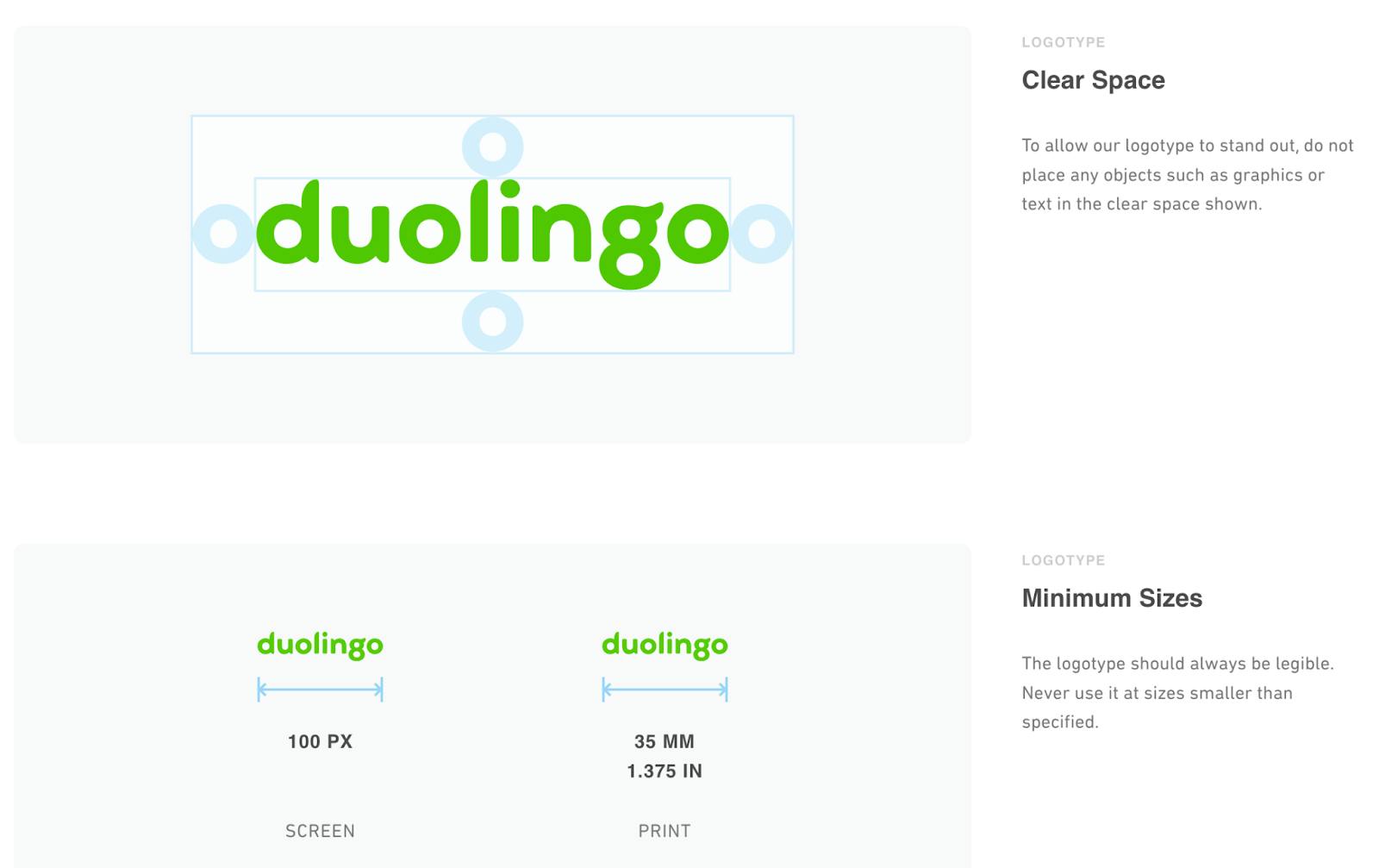
DuoLingo’s style guide sets the minimum size of their logo. It also shows the margins between the logo and the other objects on the page. These standards create consistency and familiarity, to ensure its logo will always be represented at its best.

User Interface (UI)
Every page will apply the same typography choices, with standards for consistency, and variations for variety.

User Experience (UX)
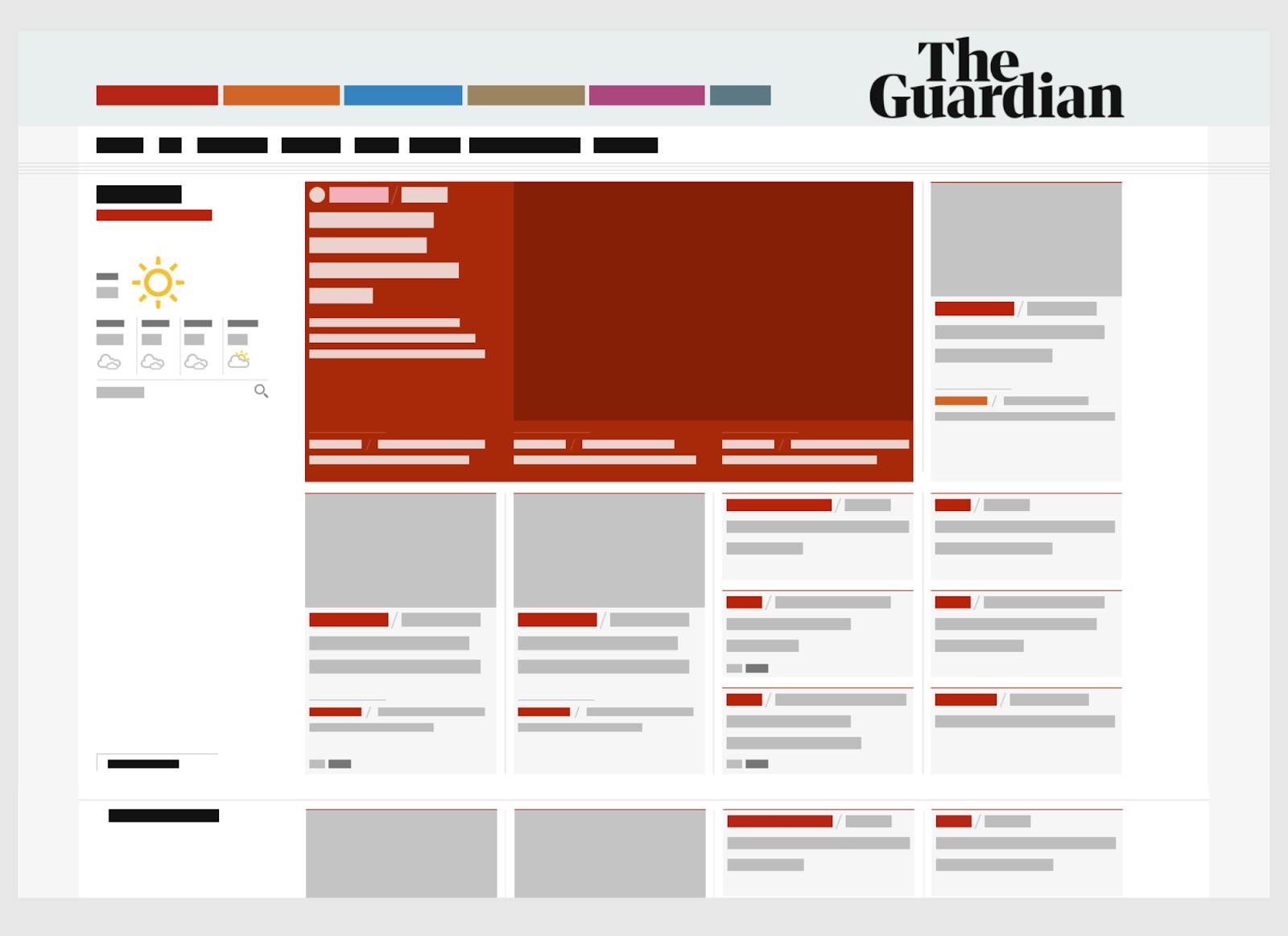
The Guardian’s style guide not only establishes visual standards, it provides templates and wireframes to ensure great layouts and navigational elements.

Writing
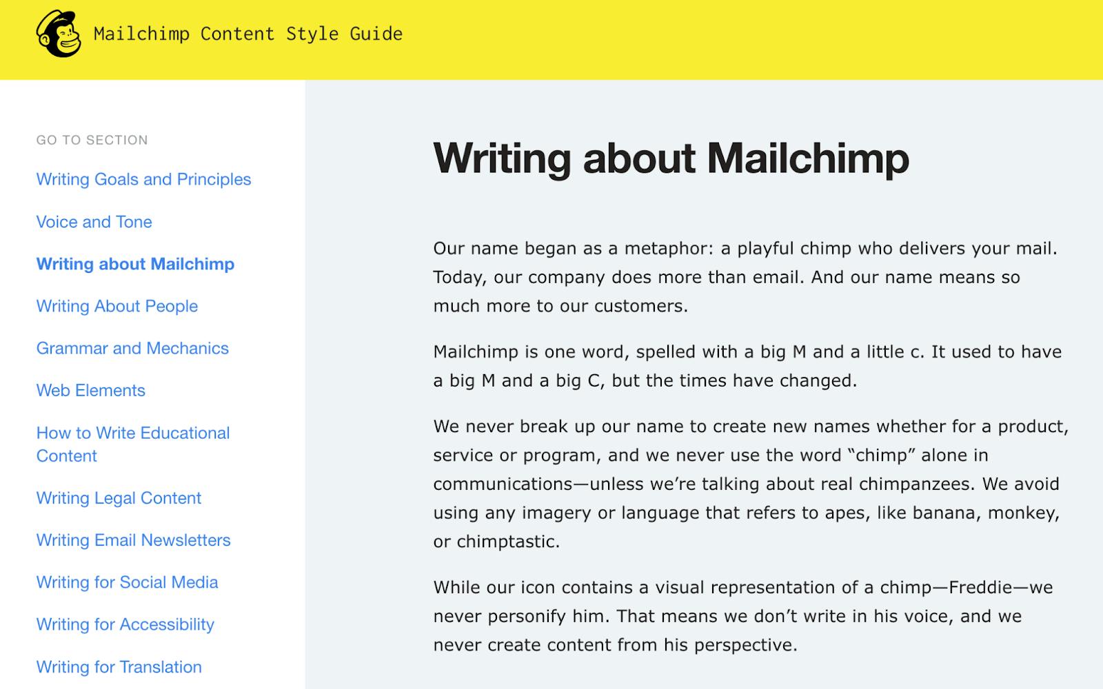
Mailchimp style guide shows how texts should reflect the image of the company.

With these and other examples, developers, designers, marketers, and other content producers can confidently build pages knowing that their designs will be consistent throughout the website.
How many style guides can a company have?
Each context may need a different design approach. For example, an e-commerce company's corporate website will contain some stylistic differences from its online store.
Usually, there’s one over-arching style guide that defines the branding or typography, but will also provide options on what color palette or button shapes to use in a given context. While consistency across domains and across sections of a website remains intact, too much rigidity will undermine the distinct goals of each area of your business.
Here are some contexts that require distinctive style guidelines:
- Different product lines
- Corporate vs. marketing communications vs. social media vs. paper ads
- Regional or international variations (localization)
In all cases, across-the-board consistency is what a style guide is all about.
Who creates the style guide?
Brand drives design. Thus, brand managers need to embed their vision into a style guide’s choices. They must ensure precision and consistency. Additionally, executives should approve the contents of a style guide, assuring the realization of a company’s objectives and strategies.
Marketing and sales teams, and other such consumers of the style guide, need to participate in the style guide creation process, to describe their needs and different contexts. For example, they need to ensure design choices will work in their social media campaigns.
Designers (UI, UX, Graphics) draw the wireframes and mockups, create the UI kits, determine the colors, shapes, menus, etc. And engineers provide the technical potential, feasibility, and challenges. They will also advise on data privacy and regulatory aspects.
Who uses the style guide?
Many of the same people who created the style guide will use it going forward. For example, web and product developers, designers, marketers, and other teams responsible for public facing content and products.
But they aren’t the only users. There are also external consumers of the style guide, such as advertising agencies, public relations, sales teams, and other communication teams.
Because there are external users, the style guide needs to be easily understood, so that not only insiders but outsiders can implement. For example, the above examples come from publicly-available websites that anyone in or out of the company can access and understand.
Conclusion
Websites, and their individual pages, posts, and directories, need consistency. As we’ve seen with the Guardian, you can create templates and wireframes. These in turn can be used directly in your content management system (CMS).
A CMS provides easy integration of a style guide’s templates for layouts and CSS styling for colors, typography, and spacing. They allow you to code or drop reusable components, such as buttons, headers, and forms, into your content. With their scalable structures, they can adapt to your style guide’s navigation menus, headers, footers, and other layout elements.
In this way, you ensure that your style guide is not merely suggestive, but that it drives the development of your digital output.