E-commerce and online media companies aim to create fluid and sensible user experiences (UX). They want their UX to provoke a feeling of ease, satisfaction, and joy, knowing that people return if they have a positive experience.
A few tricks of the trade help create such customer satisfaction and loyalty. User testing is one, and wireframing is another. Combining the two gives a failsafe way to capture what your users want. It also creates a scaled-down UX blueprint to prepare for final designs.
Wireframing involves drawing a skeletal framework of a website or app. It simplifies the layout of a front-end's UX elements, content, and organization. It helps stakeholders like executives, marketers, designers, and engineers work together on the design of their online products, preparing them for prototyping and building. And it makes it easier to adhere to a company’s style guides and design systems.
What is a wireframe?
A wireframe is a sketch or blueprint of the user experience (UX) elements, such as the pieces and navigation of a web page, an entire website, or an app. The wireframe does not focus on the UI's aesthetics, like branding, colors, typography, images, buttons, and text blocks. It has placeholders for these UI parts. It focuses on how to arrange them. For example, it shows every object's size, number, and placement on a screen. It also outlines the navigation from one page to the next.
The wireframing process is brainstorming with a pencil. Anyone can draw. The goal isn't artistry; it concretizes the UX for all stakeholders to participate in the creation process. You can draw wireframes on Post-its or a whiteboard. More advanced wireframes may include designers who will perfect the images and lay the groundwork for later design stages: mockups, prototyping, and, finally, the front-end of the final product.
Finally, wireframes help people focus on the target and communicate their vision. With the simplicity of a bare outline, designers and others can focus on what they want the user to see and do. It is a collaborative tool, facilitating input from all the experts and points of view.
The experts behind a wireframe
Key stakeholders for producing or using a wireframe include UX designers, user testers, product designers, business analysts, marketers, executives, and front-end developers.
Typically, executives, product designers, business analysts, and marketers analyze the company's needs, the needs of their clients, and their industry, and then wireframe. They’ll use wireframe tools from hand-drawn notes to Balsamiq to Lucidchart to Figma, and beyond.
Once the objectives are set, the UX designers, user testers, and engineers envision the product in a wireframe. Marketers, product designers, and others participate in the brainstorming. They can collaborate through comments and iterations to ensure compliance with the company's end goals. The initial stakeholders then approve the final wireframe.
Designers complete and check the wireframe before turning it into a UI mockup or prototype. Using tools like Figma and Sketch, they add branding, colors, typography, etc. In parallel, the engineers will code the placeholders for the content and UX components, leaving the UI elements for last.
Wireframes are schematic sketches of what a product will do. Mockups are realistic but still static drawings of a product's appearance. Developers code prototypes to be minimally interactive, showing how a user will use the software.
Visual examples of wireframes
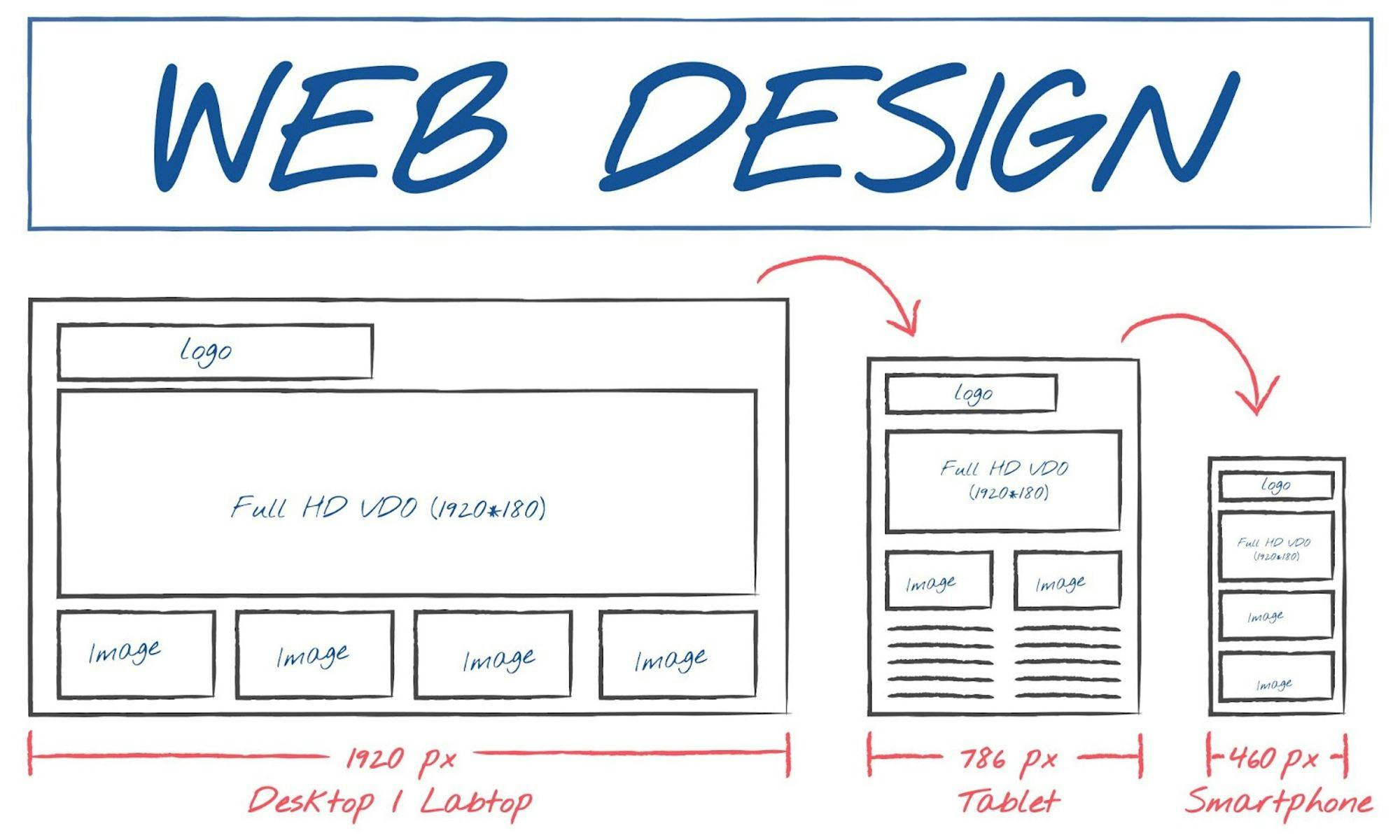
Tools like Sketch, Adobe XD, Figma, Miro, and Axure RP enable designers and engineers to collaborate and agree on the results. In this drawing, they’ve drawn a landing page and also indicated how the design appears on various device types and sizes:

Image by rawpixel.com on Freepik
A lot of work and attention to detail go into such a clear UX blueprint. For example, in this next image, we see notes about user feedback, sketches from different hands—artists or not—and comments from all stakeholders. Note that the sketches don’t have to be perfect. Keeping the wireframes and brainstorming process simple is key to creating a final mockup.

Photo by NEW DATA SERVICES on Unsplash
Wireframes can also display an “abstract” view, which allows people to focus on the objects, and not get lost in the content:

Image by tswedensky from Pixabay
CMS Wireframing
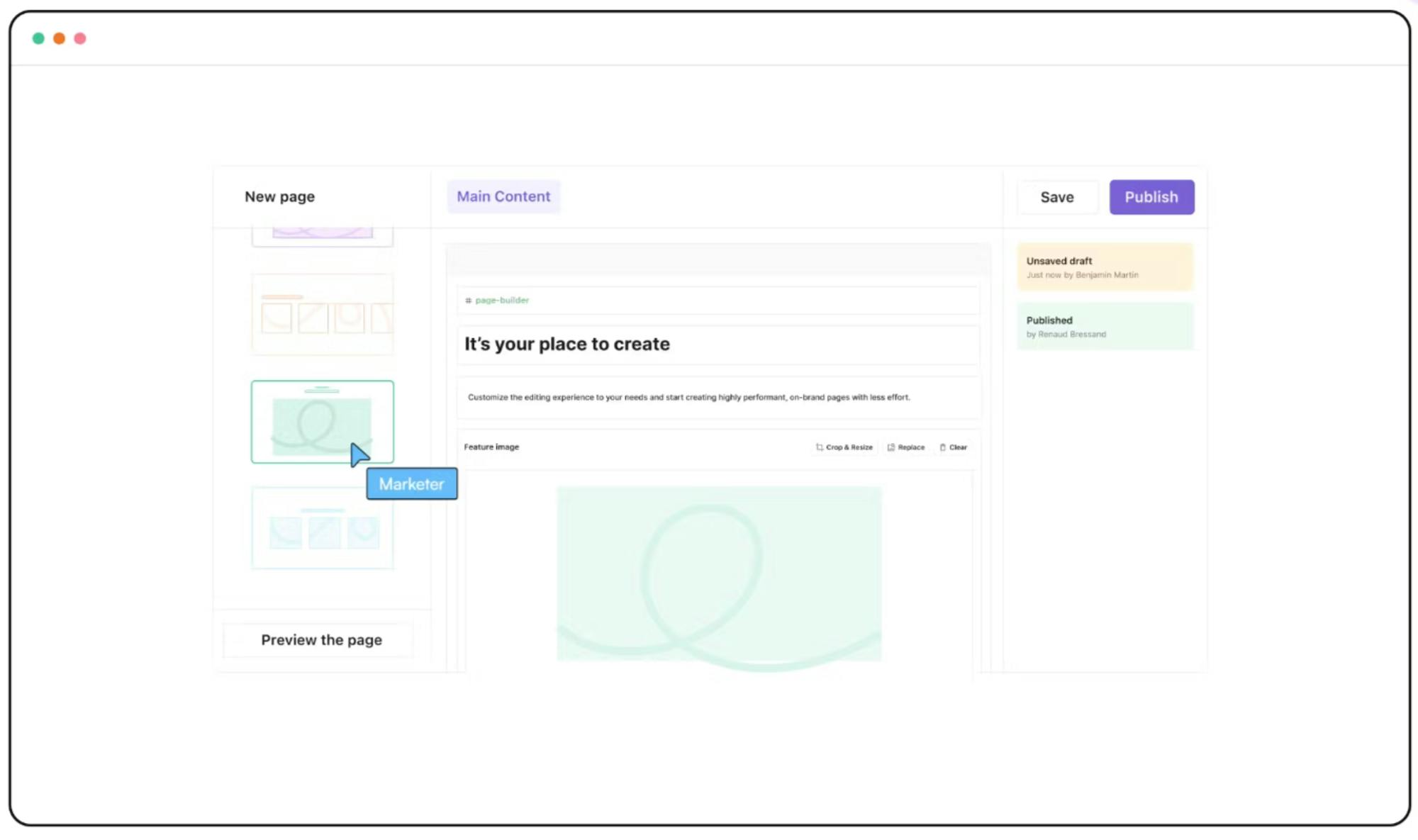
Content Management System (CMS) platforms like Prismic have built-in features that allow creators to use wireframes and mockups directly in their interface. They can draw the wireframes and mockups, called slices, and then use and reuse them for all their webpages. Each slice includes placeholders for content. In this image, you create a “new page” by selecting one or more slices to build a page.

Conclusion
Wireframing encourages you to begin with the basics—something easy to understand. It shows you that you don’t need to be an artist to design, at least not in the initial stages when the focus should be on functionality.
Wireframes prioritize functionality over aesthetics, which allows for a clear and concise representation of a product’s core features.
The main goal is to provide a clear, early visualization of any product's user experience, making wireframing a cost-effective, impactful, and straightforward method for communication and feature design.