

For the longest time, layout systems in CSS were always a bit of a pain, as using tools like floats and tables was far from ideal. But, as these were the tools we had, we persevered. Then along came Flexbox and Grid, and the world of CSS layouts was changed forever by their ease of use and flexibility.
What is CSS Flexbox?
Flexbox is a powerful layout system designed for one-dimensional layouts. It helps us easily build responsive websites and elements.
Flexbox does this by allowing us to arrange items inside a container in either a horizontal (row) direction or a vertical (column) direction. Inside this container, we then have control over things like spacing, alignment, and order. For example, we can create a horizontal container with evenly spaced items using the code below.
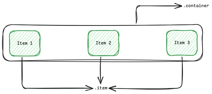
<div class="container">
  <div class="item">Item 1</div>
  <div class="item">Item 2</div>
  <div class="item">Item 3</div>
</div>.container {
display: flex;
justify-content: space-between;
padding: 20px;
}
.item {
background-color: green;
padding: 20px 40px;
text-align: center;
}This code will then produce an output like the one below, with three items evenly spaced across the container.
Try this Flexbox example on CodePen:
Flexbox Base Example
Interactive CodePen loads when it gets near the viewport.
Configuring Flexbox
What we’ve looked at so far is a very basic example of Flexbox, but you can further configure it. Flexbox has a series of properties that you can use to control how it lays out your elements; however, some of the most commonly used are flex-direction, justify-content, align-items, and flex-wrap.
flex-direction
flex-direction, as you might have guessed, allows us to control the orientation in which the container displays its child items. As we mentioned earlier, this either has a default of row or column.
flex-direction: row | column;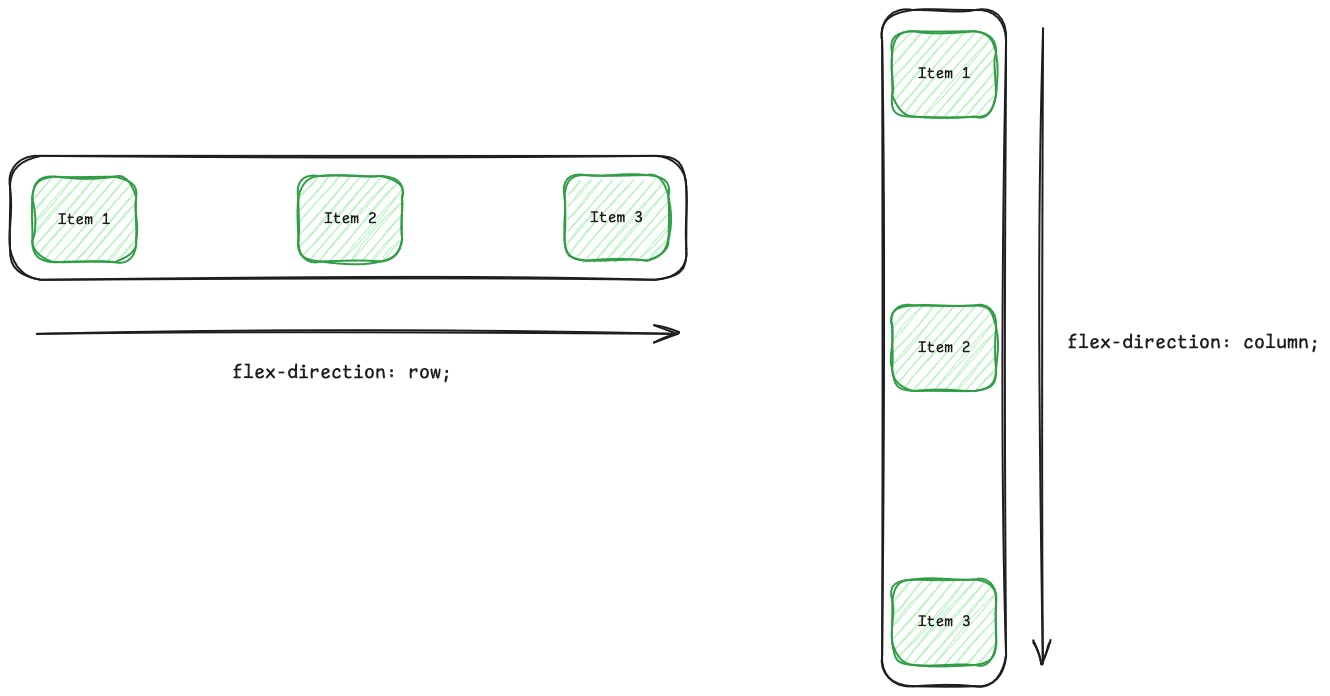
justify-content and align-items
When it comes to understanding justify-content and align-items, we first need to understand axes in Flexbox. There are two axes, the main axis and the cross axis.
The main axis is controlled by the flex-direction property. So, if we’re using flex-direction: row, the main axis is horizontal; if we’re using flex-direction: column, then it’s vertical.
The cross axis, as the name might suggest, is the axis that crosses the main axis. For flex-direction: row, the cross-axis would be vertical, and if we’re using flex-direction: column, then it would be horizontal.
Now that we understand axes in Flexbox, it’ll make understanding align-items and justify-content a lot simpler. Simply put, align-items controls the alignment of the items on the cross-axis. For example, if we use flex-direction: row, the cross-axis would be the vertical one. Therefore, align-items would place the items in the container at the top, middle, or bottom of the container along the vertical axis.
align-items: center | start | end;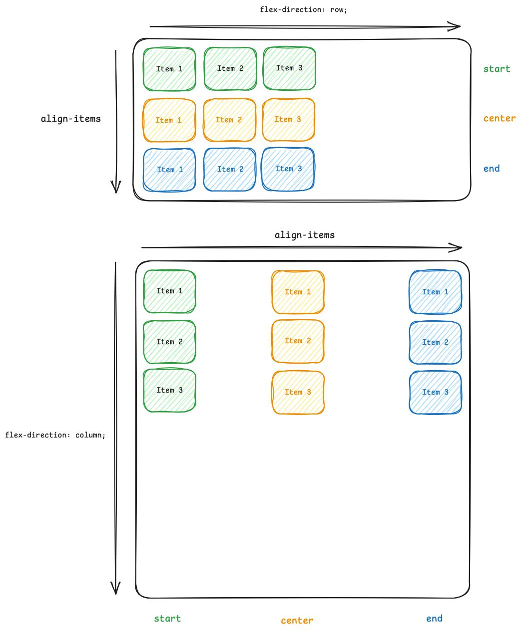
justify-content, on the other hand, handles the alignment of the items inside the container along the main axis. So, if we’re using flex-direction: row, the main axis would be the horizontal one. Therefore, justify-content would place the items in the container at the start, middle, or end of the container along the horizontal axis.
justify-content: center | start | end | space-between | space-evenly | space-around;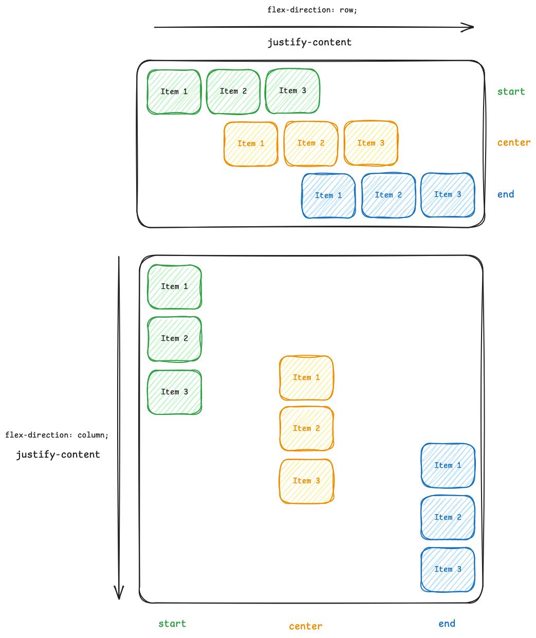
flex-wrap
Finally, to round out the most common Flexbox properties, we have flex-wrap, which, as the name suggests, controls whether the items inside the container will wrap to a new line or not. By default, they won’t wrap and will try to all fit on one line.
flex-wrap: wrap | nowrap | wrap-reverse;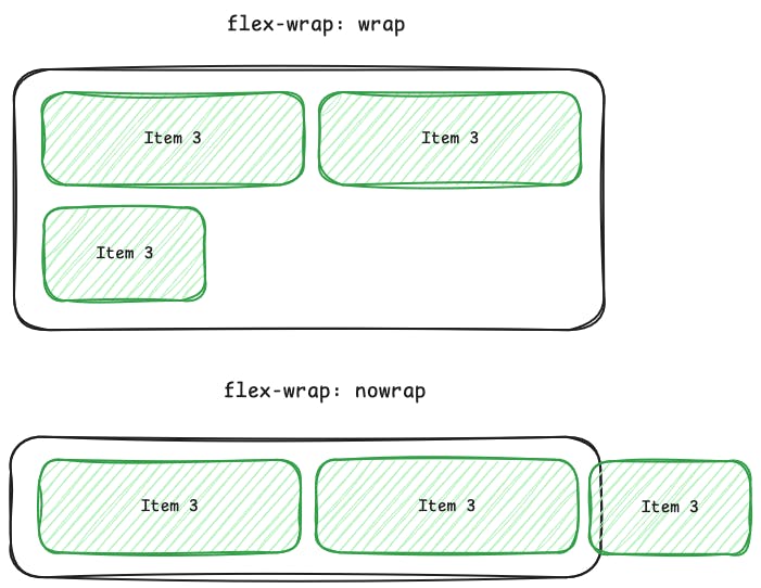
First time here? Discover what Prismic can do!
👋 Meet Prismic, your solution for creating performant websites! Developers, build with your preferred tech stack and deliver a visual page builder to marketers so they can quickly create on-brand pages independently!

What is CSS Grid?
Grid, like Flexbox, is another CSS layout system. However, unlike Flexbox, Grid operates on a 2-dimensional grid system, which enables us to easily place items in and across the various columns and rows we define within the grid. This means that Grid is the most powerful and flexible CSS layout tool available to us today.
To get started with Grid, you have to define a container that will house all the items inside it. To define this container, we apply the display: grid property to the container element.
Once we have defined our grid, we can start defining columns and rows using grid-template-columns and grid-template-rows. After the columns and rows are defined, we can start placing items inside them using grid-row and grid-column, or, for simplicity, we can use grid-template-areas to define areas on the grid and place items within them.
Here’s a look at a basic 3*3 grid of items, each placed in a different section of the grid.
<div class="grid">
  <div class="item item1">1</div>
  <div class="item item2">2</div>
  <div class="item item3">3</div>
  <div class="item item4">4</div>
  <div class="item item5">5</div>
</div>
.grid {
  display: grid;
  grid-template-columns: repeat(3, 1fr);
  grid-template-rows: repeat(3, 150px);
  gap: 10px;
  grid-template-areas:
    "one one two"
    "three four two"
    "three five five";
  max-width: 600px;
  margin: auto;
}

.item {
  background-color: #deb841;
  color: white;
  font-size: 2rem;
  display: flex;
  align-items: center;
  justify-content: center;
  border-radius: 8px;
}

.item1 { grid-area: one; }
.item2 { grid-area: two; }
.item3 { grid-area: three; }
.item4 { grid-area: four; }
.item5 { grid-area: five; }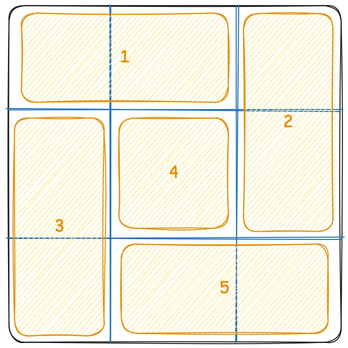
Try this Grid example on CodePen:
Grid Base Example
Interactive CodePen loads when it gets near the viewport.
Configuring Grid
Much like Flexbox, Grid also has some unique properties we can use to configure how items are laid out inside the parent container. However, Grid also shares some properties with Flexbox, such as justify-content and align-items, which function similarly in both tools.
justify-items
justify-items is a Grid-specific configuration property that allows you to define the default justify-self for all the items inside the container. This means we can control how each item in the container aligns inside its own grid area.
justify-items: start | center | end;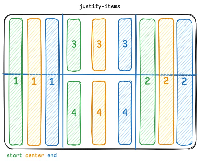
Subgrid
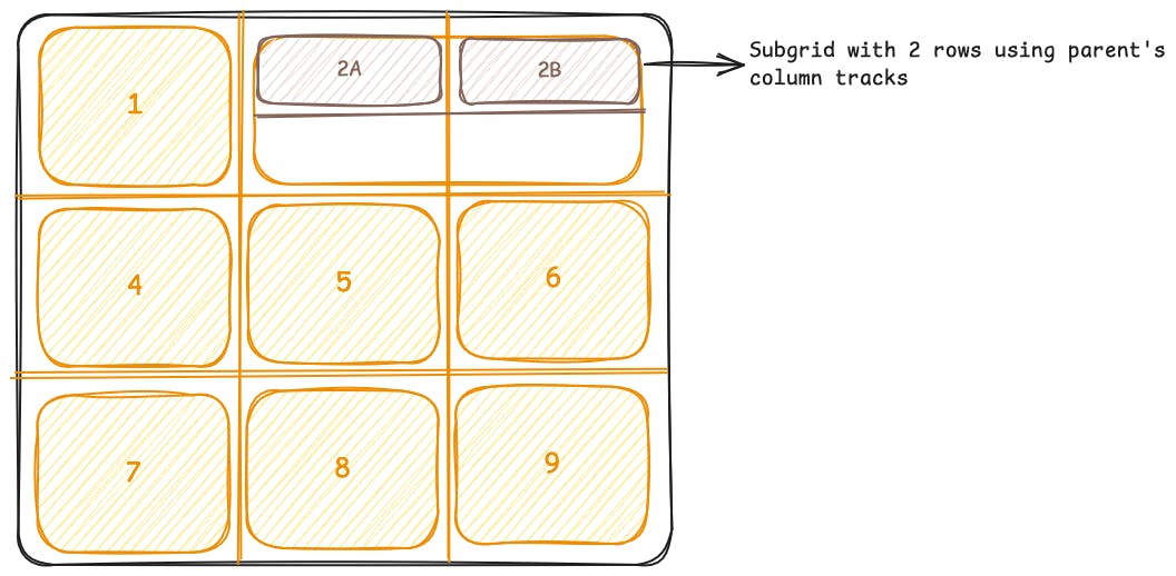
When it comes to configuring Grid, I wouldn’t be doing Grid justice if I didn’t mention the relatively new subgrid value for grid-template-columns and grid-template-rows.
Subgrid can be quite an in-depth topic to cover fully, and probably warrants its own post exploring it. But, by assigning subgrid as the value to one (or both) of the mentioned properties, we’re creating a nested grid inside the parent grid using the parent’s tracks.
In our example below, we have a parent grid that has three columns and three rows. We then define a subgrid with two rows and utilize the parent’s columns via the subgrid value passed to grid-template-columns.
<div class="grid">
  <div class="item">1</div>
  <div class="subgrid">
    <div class="subitem">2A</div>
    <div class="subitem">2B</div>
  </div>
  <div class="item">4</div>
  <div class="item">5</div>
  <div class="item">6</div>
  <div class="item">7</div>
  <div class="item">8</div>
  <div class="item">9</div>
</div>
.grid {
  display: grid;
  grid-template-columns: repeat(3, 1fr);
  grid-template-rows: repeat(3, 150px);
  gap: 10px;
  max-width: 600px;
  margin: auto;
}

.item {
  background-color: #deb841;
  display: flex;
  align-items: center;
  justify-content: center;
  font-size: 1.5rem;
  border-radius: 8px;
  padding: 10px;
  text-align: center;
}

.subgrid {
  display: grid;
  grid-template-rows: 1fr 1fr;
  grid-column: 2 / 4;
  grid-template-columns: subgrid;
  gap: 10px;
  background-color: #deb841;
}

.subitem {
  background-color: #774936;
  color: white;
  font-size: 1rem;
  display: flex;
  align-items: center;
  justify-content: center;
  border-radius: 6px;
}
Try this Subgrid example on CodePen:
Subgrid Example
Interactive CodePen loads when it gets near the viewport.
As you can imagine, the subgrid value opens up numerous possibilities and further enhances the flexibility and power of Grid as a layout tool.
Grid vs Flexbox
CSS Grid and Flexbox are similar in many ways, as we’ve seen, but they also have some differences. Here is a table summarising some of those differences.
Layout Axis
One-dimensional (row or column)
Two-dimensional (rows and columns)
Primary Use Case
Small-scale component layout (e.g. navbars, cards)
Large-scale page layout (e.g. templates, dashboards)
Item Placement
Based on source order (flow-driven)
Precise placement using grid lines or named grid areas
Learning Curve
Easy to learn
Steeper learning curve as it has a higher complexity
Layout Approach
Content-first: layout adapts to content
Container-first: define structure first, place content inside it
Overlapping Elements
Requires some “hacks” with margins and positioning to work
Can easily be done by adjusting the columns and rows the elements are placed in.
When to use them?
CSS Flexbox and Grid, as we’ve explored, share many similarities, which leads some developers to use them interchangeably. But this isn’t ideal, and there are scenarios where one excels over the other. So, when should you use them? Here is how I decide when to use Flexbox or Grid.
- Flexbox => 1-dimensional layouts
- Grid => 2-dimensional layouts
If I’m building a standalone component that only needs to control elements in one direction, like a navigation bar, then I’ll reach for Flexbox.
If I need to control the layout of elements in two directions, like placing that navigation bar on a page with other elements beside and below it, then I’ll reach for Grid.
Best practices
To conclude this post, I wanted to share some best practices for working with Flexbox and Grid.
- Recognize when one tool is better suited for the job than another. If you find yourself creating more complex 2D layouts with Flexbox, it may be time to switch to Grid.
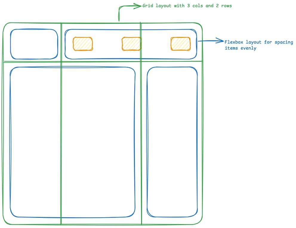
- Use Grid for macro-layouts (how elements fit on the page) and Flexbox for micro-layouts (how elements position their children).
- While it’s not always possible, plan your layouts in advance and determine where Grid or Flexbox will be most effectively used in your designs. A bit of preparation can go a long way.
In this post, we’ve looked at all things CSS Flexbox and Grid. What makes them similar, what makes them different, and ultimately, how to choose one over the other.
I hope you found this post helpful, and I encourage you to experiment with both layout methods and get to grips with them in your own projects so you can see their potential in action!
Thanks for reading.


