

Menus are crucial to any website’s design, but they don’t have to be boring. With CSS, you can create dynamic, visually appealing navigation that boosts the user experience.
This article will explore 43 great examples of modern CSS menus that prove you can have it all—stylish and functional website navigation.
Mega menus
If your website has a lot of content or categories, a mega menu is a great way to organize it. Instead of showing a simple list, it expands into a large panel with grouped links, images, or even icons. This helps users scan and find what they need more easily.
1. Mega menu by Bato web agency
Responsive Hover - Activated Mega Menu
Interactive CodePen loads when it gets near the viewport.
Bato Web Agency’s mega menu has three levels. First, there’s the main navigation. When you hover over certain links, the mega menu opens up. Inside that, you’ll find a third set of links for even more options.
See how we built our multi-level mega menu!
Get the insider scoop on how we built our Prismic website’s multi-level mega menu.
2. Pure CSS3 mega dropdown menu
Pure CSS3 Mega Dropdown Menu With Animation (Vertical)
Interactive CodePen loads when it gets near the viewport.
The pure CSS3 mega dropdown menu also features four levels of navigation. The first is the main menu. Hovering over the “Blog” item reveals the mega menu. Then, hovering over “Our Team” reveals the third level navigation, with one more inside.
3. Bootstrap mega menu
Bootstrap 4 Mega Dropdown Menu Navbar
Interactive CodePen loads when it gets near the viewport.
The Bootstrap mega menu is another great example of a mega menu.
4. Stripe-like CSS-only menu
Stripe Like CSS Only Menu
Interactive CodePen loads when it gets near the viewport.
The stripe-inspired menu is very eye-catching and well-designed. It features great transitions and animations as you move across the different menu items. Overall, it's very delightful to look at.
Unlike regular mega menus that tend to cover the full width of a page, this one keeps things more compact. The content panels appear just beneath the main links.
5. CSS-only responsive mega menu
Responsive Mega Menu and Dropdown Menu using only HTML & CSS
Interactive CodePen loads when it gets near the viewport.
This mega menu is another solid idea. The sub-menus, which appear when hovered, showcase various links and an image.
6. CSS-only multi-level mega menu
CSS only responsive multi-level mega menu
Interactive CodePen loads when it gets near the viewport.
This pen is quite interesting. It features three types of menus. The first is a four-level mega menu. The second is a flat mega menu with three columns. The third is a mega menu with two columns.
Dropdown menus
A dropdown menu keeps your layout clean while still offering multiple navigation options. As with mega menus, a list of sub-items appears when users hover over or click a parent item. It’s a simple and effective choice for menus with a few levels of navigation.
7. Customizable select
Customizable Select
Interactive CodePen loads when it gets near the viewport.
One of the quickest ways to create a dropdown menu is with the select element. It’s simple, accessible, and works without JavaScript out of the box. However, like in this example, you’ll need to customize its appearance.
8. Nested dropdown navigation
CSS-Only Nested Dropdown Navigation (ARIA)
Interactive CodePen loads when it gets near the viewport.
The nested dropdown navigation has three levels. The first level is visible on page load. The second level appears after clicking the dropdown, and the third is tied to the “Shop” item.
9. Glassmorphic dropdown menu
Modern Glassmorphic Dropdown Menu Component
Interactive CodePen loads when it gets near the viewport.
This pen features a dropdown menu with a glassmorphic effect applied to it. It is well-designed and has a nice hover effect.
10. On-page navigation dropdown menu
CSS only drop down menu
Interactive CodePen loads when it gets near the viewport.
When users click on the items in this dropdown menu, the page automatically scrolls to the corresponding chapter section (e.g., Chapter 01, Chapter 02, etc.) within the same page.
11. Dropdown animations
Dropdown Animations with CSS Transforms
Interactive CodePen loads when it gets near the viewport.
This dropdown menu features five types of animations: Scale Down, RotateX, TranslateZ, Scale, and Rotate. It's a great way to make your menu items feel more lively.
Hamburger menus
You’ve likely seen the three-line icon on mobile sites. That’s a hamburger menu. It hides the full navigation until it's clicked, which helps save space on smaller screens while still keeping everything accessible.
12. Barn door menu
Pure CSS Barn Door Menu
Interactive CodePen loads when it gets near the viewport.
This barn door menu features a hamburger icon (top left), which causes the menu to transition into view when clicked.
13. CSS hamburger menu
CSS Hamburger Menu
Interactive CodePen loads when it gets near the viewport.
The CSS hamburger menu is another excellent example of menu items transitioning to view when the burger icon is clicked.
14. Round mask menu
Material design round mask menu (pure css)
Interactive CodePen loads when it gets near the viewport.
With the round mask menu, the menu items appear on hover and transition into view with a mask effect.
15. Mobile navigation animation
Mobile navigation animation
Interactive CodePen loads when it gets near the viewport.
The mobile navigation animation is delightful to look at. It includes sleek text effects and burger icon animations.
16. Action button
action button with checkbox trick (NO JS)
Interactive CodePen loads when it gets near the viewport.
The action button pen features a top section that expands to reveal menu items when a burger element is clicked. The bottom section has three buttons that control the UI.
Yet another great example.
17. CSS blobby nav
Randomly generated CSS blobby nav
Interactive CodePen loads when it gets near the viewport.
The CSS blobby nav is a bit wild. When you click on the burger icon, the menu items transition into view, appearing as bubbles. It's a great one for those who want to spice up their websites with creative, eye-catching CSS animations.
Sticky navigation menus
With a sticky menu, your navigation stays visible at the top of the screen as users scroll. This makes it easier for visitors to get around your site without having to scroll back up.
18. Backdrop filter on sticky navigation
Smooth backdrop filter on sticky navigation
Interactive CodePen loads when it gets near the viewport.
This pen is pretty straightforward. It features a sticky navigation with two backdrop filters applied to the site’s body.
19. CSS-only sticky top
CodePen
Interactive CodePen loads when it gets near the viewport.
The CSS-only sticky top is yet another great, sticky nav. You can navigate to different parts of the page by scrolling or clicking on any links.
20. Smooth scrolling sticky nav
Sticky Navigation Menu With Smooth Scrolling
Interactive CodePen loads when it gets near the viewport.
This navigation menu has a “compression” and smooth scrolling effect. As you scroll, the nav’s height compresses, and the scrolling effect occurs.
First time here? Discover what Prismic can do!
Build locally with your preferred tech stack and spend less time fixing, and more time shipping.

21. Sticky navigation with Glass effect
Future Sticky Navigation with Glas Effect
Interactive CodePen loads when it gets near the viewport.
This pen starts with a regular sticky navigation. However, as you scroll, the nav transitions to a sticky burger icon, which you can click to reveal the menu items.
22. Sticky slide-out navigation Menu
Sticky Slide Out Navigation Menu
Interactive CodePen loads when it gets near the viewport.
This navigation slides out from the left side of the page and sticks in position while you scroll.
Full-screen menus
Fullscreen menus fill the entire screen when activated, often using smooth transitions or animations. They give you space to showcase larger text, grouped links, or simple graphics in a clean layout.
23. Big colorful toggle menu
Big Colorful Toggle Menu - CSS Only | CPC
Interactive CodePen loads when it gets near the viewport.
This pen starts with a hamburger menu made of three colored bars.
When you click the burger, the bars rotate and stretch out to fill the screen. At the same time, an SVG logo is drawn, and the navigation links slide up from the bottom. Each menu item also has its own animation that occurs on hover.
24. Creative menu hover effects
Creative Menu Hover Effects html css
Interactive CodePen loads when it gets near the viewport.
This pen showcases menu items with text effects applied to them. On hover, the page's background changes to a different color, as does the text of the links.
25. Overlay nav
Navi Bar
Interactive CodePen loads when it gets near the viewport.
The overlay nav features a menu icon (top-right) that, when clicked, causes the menu items to appear. It's a classic example used on many websites.
26. Blob menu
Pure CSS Menu - #13
Interactive CodePen loads when it gets near the viewport.
The blob menu showcases a hamburger icon surrounded by a blob element. On click, the blob menu moves to the center of the page and fills the whole screen, revealing the menu items.
27. Sliding curtain
Hamburger Menu 2
Interactive CodePen loads when it gets near the viewport.
This menu slides in from the right side of the page when the top-right burger icon is clicked.
28. Direction-aware full-page navigation
CSS-only Direction-Aware Hover Effect for Full-Page Navigation
Interactive CodePen loads when it gets near the viewport.
This direction-aware navigation starts as a full page. However, an interesting, direction-aware text hover effect occurs when you hover over the items.
Sidebars and vertical menus
A sidebar or vertical menu sits on the side of the screen and works well for dashboards or content-heavy websites. It lets you list many navigation items without crowding the top of the page.
This type of navigation is often paired with icons or collapsible sections to make navigation easier.
29. Sticky responsive sidenav
Sticky responsive sidenav
Interactive CodePen loads when it gets near the viewport.
The sticky responsive sidenav shows a sidebar that remains stationary as you scroll through the page. The nav starts with only icons. However, when you hover, it expands to reveal the corresponding link labels.
30. Navbar with tooltip
Navbar with tooltip on hover
Interactive CodePen loads when it gets near the viewport.
This pen shows a sidebar with icons. When you hover over any icon, a tooltip appears, revealing its label.
31. Vertical menu with gooey effect
Vertical menu with gooey effect on hover
Interactive CodePen loads when it gets near the viewport.
This pen is similar to the last one, as a tooltip appears when you hover over the links. However, it also has a gooey effect surrounding the icons.
32. Sidebar accordion
Accordion Menu
Interactive CodePen loads when it gets near the viewport.
This sidebar menu consists of items that, when clicked, reveal a dropdown menu with submenus attached to them. It is commonly used in admin dashboards, where multiple navigation options need to be shown without cluttering the main screen.
33. One-page navigation
One Page Navigation CSS Menu
Interactive CodePen loads when it gets near the viewport.
The one-page navigation consists of menu buttons on the left side of the page, which, when clicked, trigger a navigation to the corresponding section. It's great for portfolio websites where all the content exists on a single page.
Other CSS menus
We couldn’t fit all the examples in the earlier section. Here are some more great menus worth checking out.
34. Floating button
Botão - Floating Button minimal / Pure CSS / Dark Mode
Interactive CodePen loads when it gets near the viewport.
When clicked, the plus icon in this pen expands to reveal other icons.
35. Dynamic dropdown
Dropdown Menus
Interactive CodePen loads when it gets near the viewport.
This dynamic dropdown menu has a dynamic border effect applied to it. When you hover over the items, the border contrasts, creating a pleasant micro-interaction. At the same time, the menu items expand to reveal the submenus.
36. Menu with speed gauge effect
Menu with speed gauge effect
Interactive CodePen loads when it gets near the viewport.
A speed gauge effect occurs as you hover over the items in this menu. The colors of the icons change at the same time.
37. Split animation
Split animation on hover with single element
Interactive CodePen loads when it gets near the viewport.
A horizontal split text effect occurs when you hover over the items in this menu.
38. Icon bars
CSS Navigation Bar
Interactive CodePen loads when it gets near the viewport.
Three things occur when you hover over the icons in this pen: their container scales up, the texts become visible, and the page’s background color changes.
39. CSS Strange Nav
Challenges: CSS Strange Nav
Interactive CodePen loads when it gets near the viewport.
The CSS strange nav is a strange nav where each menu item is a circular node. The “clients” and “services” items also have a sub-menu, which, on click, expands to reveal yet another node-graph-like connection.
40. CodePen challenge menu
CodePen Challenge: Menu
Interactive CodePen loads when it gets near the viewport.
This pen looks like your regular nav menu at first. However, the action begins once you hover over the items. It's very bold and eye-catching, and had to make this list.
41. Accordion menu
Awesome accordion menu using only HTML & CSS
Interactive CodePen loads when it gets near the viewport.
When you hover over the links in this accordion menu, they expand to reveal the secondary menus attached to them.
42. Hamurger slide accordion
hamburger slide accordion menu
Interactive CodePen loads when it gets near the viewport.
This hamburger slide accordion starts with a hamburger icon, which, when clicked, reveals a main menu. The items in this main menu all have secondary menus attached to them.
43. Sliding tabs
Sliding tabs | CSS transitions only
Interactive CodePen loads when it gets near the viewport.
Last but not least is the sliding tabs menu. Clicking on any menu item causes the background element to slide to that location.
Best practices to follow when creating website menus
Here are some tips to follow when creating a menu for your website.
- Prioritize simplicity: Keep the menu structure simple with clear labels for each item. Avoid overwhelming users with too many options and stick to a limited number of main categories (usually 5-7 items).
- Maintain consistency: Ensure the menu is consistent across all site pages. This helps users build a mental model of how to navigate the site.
- Ensure mobile responsiveness: The menu should work well on all screen sizes. A mobile-first design (e.g., hamburger menus) is a must for modern websites.
- Provide visual feedback: Use hover effects or active states (e.g., color change, underline) to give users feedback on what they are interacting with. This lets them know which menu item they’re currently selecting.
- Optimize for accessibility: Ensure your menu is accessible to all users, including those with disabilities. Use proper ARIA labels and optimize for easy navigation with keyboards.
- Consider the user's journey: Consider how users interact with your site and design the menu accordingly. Place frequently accessed sections or popular products/services in easy-to-reach spots. If the site has many pages or categories, include a search bar in the menu, making it easier for users to find what they need quickly.
- Don’t forget about the footer menu: While top navigation menus are important, the footer menu serves as an essential secondary navigation point. Include important links such as contact information, privacy policy, terms of service, and social media icons.
- Test and iterate: Conduct A/B testing to ensure the menu is effective, then redesign as needed.
CSS menu tools and libraries
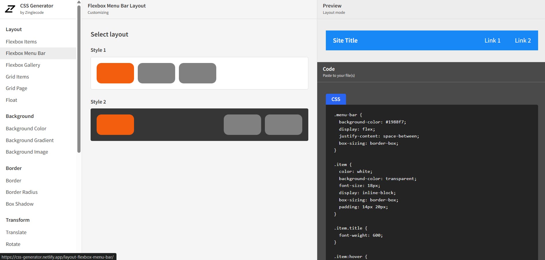
Flexbox menu bar layout
The flexbox menu bar layout is one of many tools in Zinglecode’s CSS generator collection. It offers two menu styles built on the Flexbox model.
While the tool is relatively basic, copying the HTML and CSS into your project is easy. It’s a good starting point if you want to build a simple menu quickly and customize the design to suit your needs.
Responsive navigation generator
The responsive navigation generator offers greater customization. It provides controls for adding or removing menu items, adjusting colors, and the position of the burger menu, and more. You can also copy the code with one click.

Final thoughts
Adding a well-designed menu to your website is a great way to elevate the user experience and visual appeal. We hope the menus we’ve showcased will inspire you to create something fresh for your next project or motivate you to update your current website for a more seamless, stylish navigation.
Have you seen any wild but amazing menus out there? Share in the comments. 👇
Also, check out the following articles to see more CSS resources:
- CSS Text Animations: 40 Creative Examples to Try
- CSS Hover Effects: 40 Engaging Animations To Try
- CSS Button Animations: 40 Ideas to Inspire You + Code Examples
- 39 Awesome CSS Animation Examples with Demos + Live Code
- Tailwind CSS Animations: Tutorial and 40+ Examples
- 40 CSS Background Effects to Enhance Your Website
- 50 Creative CSS Image Effects for Engaging Websites
- CSS Scroll Effects: 50 Interactive Animations to Try


