CSS Hover Effects: 40 Engaging Animations To Try

Don’t come for my head, but I think it’s safe to say that static websites are officially a thing of the past. People nowadays expect some level of interactivity when they visit websites. One of the ways you can keep them engaged is by adding hover animations to your websites.
There’s no limit to the type of hover animation you could make. It could be a simple button that scales up on hover or a card that flips over 3D-style — the possibilities are endless.
In this article, we will explore 40 examples of CSS hover animations—ten of which I created myself 🙃. Hopefully, these examples help you draw inspiration and give you ideas for how to keep users engaged and provide them with a memorable experience. Let’s dive in.
40 examples of CSS hover animations
Let’s start by taking a look at ten custom animations I personally created, complete with demos and code examples!
Custom CSS hover effects
1. Holographic card
Holographic card
Interactive CodePen loads when it gets near the viewport.
As they say, you can’t beat the classics. So, we’re starting with a simple card effect where it scales up, gets a colorful border shadow, and shimmers with a holographic gradient on hover. This animation works with:
::beforepseudo-element: Creates the holographic effect by placing a gradient background with varying opacity and rotation. It initially has0opacity, and on hover, it becomes visible while moving downwards.holographic-card:hover: Applies a scale effect (transform: scale(1.05)) and a glowing box shadow (box-shadow: 0 0 20px rgba(0, 255, 255, 0.5))
2. Liquid morph
Liquid morph
Interactive CodePen loads when it gets near the viewport.
This animation creates a liquid-like morphing effect on a button when hovered over. Initially, the button has a rounded rectangular shape with a dark blue background and a centered text label. When hovered, the button slightly rotates, its border-radius decreases, and a colorful, conic gradient appears. The CSS features powering this animation include:
::beforepseudo-element: Creates a conic gradient background, which transitions from cyan to dark blue, giving the appearance of a liquid filling the button.liquid-morph-element:hover: Reduces the border-radius to10pxand applies a rotation of15deg, giving the button a more angular shape
3. Explosive text effect
Particle deconstruction
Interactive CodePen loads when it gets near the viewport.
This animation creates an "explosive" effect when the element is hovered over. It works with the ::before and ::after pseudo-elements, which produces the radial gradient effect and scale up and rotate on hover.
4. Text underline
Text hover underline
Interactive CodePen loads when it gets near the viewport.
This animation creates a unique hover effect where underlines appear above and below the text when the user hovers over it. Its powered by the ::before and ::after pseudo-elements, which create the underline effect. The pseudo-elements grow from 0 to 100% on hover while a gradient is applied to them.
5. Dropdown menu
Dropdown menu
Interactive CodePen loads when it gets near the viewport.
This animation creates a dropdown menu that appears when hovering over a button. Initially, the dropdown menu is hidden, with its opacity set to 0, but becomes fully visible on hover. The key to this animation is the opacity, which is set to 1 on hover and transform: translateY(0), which moves the menu to its normal position.
6. Double-sided card
Double-sided card
Interactive CodePen loads when it gets near the viewport.
This animation creates a 3D flipping card effect. When the user hovers over the card, it rotates 180 degrees along the Y-axis, revealing the back side. The front and back sides of the card are identical in size but have different backgrounds and the perspective property on the cards’ container enhances the 3D effect.
This animation works with:
transform-style: preserve-3d: Allows the cards to maintain their 3D position during rotationtransform: rotateY(180deg): Rotates the cards along the Y-axis
7. 4-corner image
4-corner image
Interactive CodePen loads when it gets near the viewport.
This animation creates an interactive image effect where the image is divided into four quadrants on hover. The quadrants represent a different section of an image, and they are positioned to create a complete picture when assembled. Upon hovering over the container, the quadrants shift outward, creating the split effect.
It works with:
background-image: url()applies the image to each quadrantbackground-positioncrops specific quadrants of the imagetransform: translate()moves quadrants outwards on hover
8. Cursor animations
Cursor animations 1
Interactive CodePen loads when it gets near the viewport.
This animation has two effects. First, it demonstrates various CSS cursor styles on hover, and each box undergoes different visual effects, like scaling, rotating, clipping, and pulsing. Here’s a breakdown of what powers the effects in this:
cursor: Defines unique cursor types for the different boxes::before: Creates a linear gradient effect that moves diagonally from top-left to bottom-right on hover@keyframes pulse: Creates a pulsating effect where the box grows and shrinks in size repeatedly@keyframes shake: Simulates a shaking or jittery motion, like the kind used to signify "error" or "not allowed"@keyframes moveAround: Causes the boxes to shift slightly in various directions- CSS transforms:
transform: scale(),rotate(),translateY(),translateX(), andskew()are applied to various boxes
9. Rotating cube
Rotating cube
Interactive CodePen loads when it gets near the viewport.
This 3D animation creates an interactive cube with six faces (front, back, right, left, top, and bottom), each styled with distinct colors and a subtle gradient.The cube rotates smoothly in 3D space when hovered over, and a glass-like gradient appears on the faces. It works with:
translateZ,rotateX, androtateY: Position the faces to form a cubeperspectiveandtransform-style: preserve-3d: Ensure proper 3D rendering@keyframes rotate3d: Creates the continuous cube rotation::beforeand::after: Creates the glass-like reflections that occur on hover
10. Chameleon SVG
Chameleon SVG
Interactive CodePen loads when it gets near the viewport.
When hovered over, the card cycles through different SVG-based background patterns and shifts the pattern's position smoothly across the surface. It works with:
background-image: Uses inline SVG data to display custom patterns@keyframes move-and-color: Defines the stages of animation, specifying changes tobackground-imageandbackground-position
That’s it for the custom CSS hover effects. Now, let’s move on to examples from other developers. We’ll start with checking out card hover animations; view this Codepen collection to see other text animations I created.
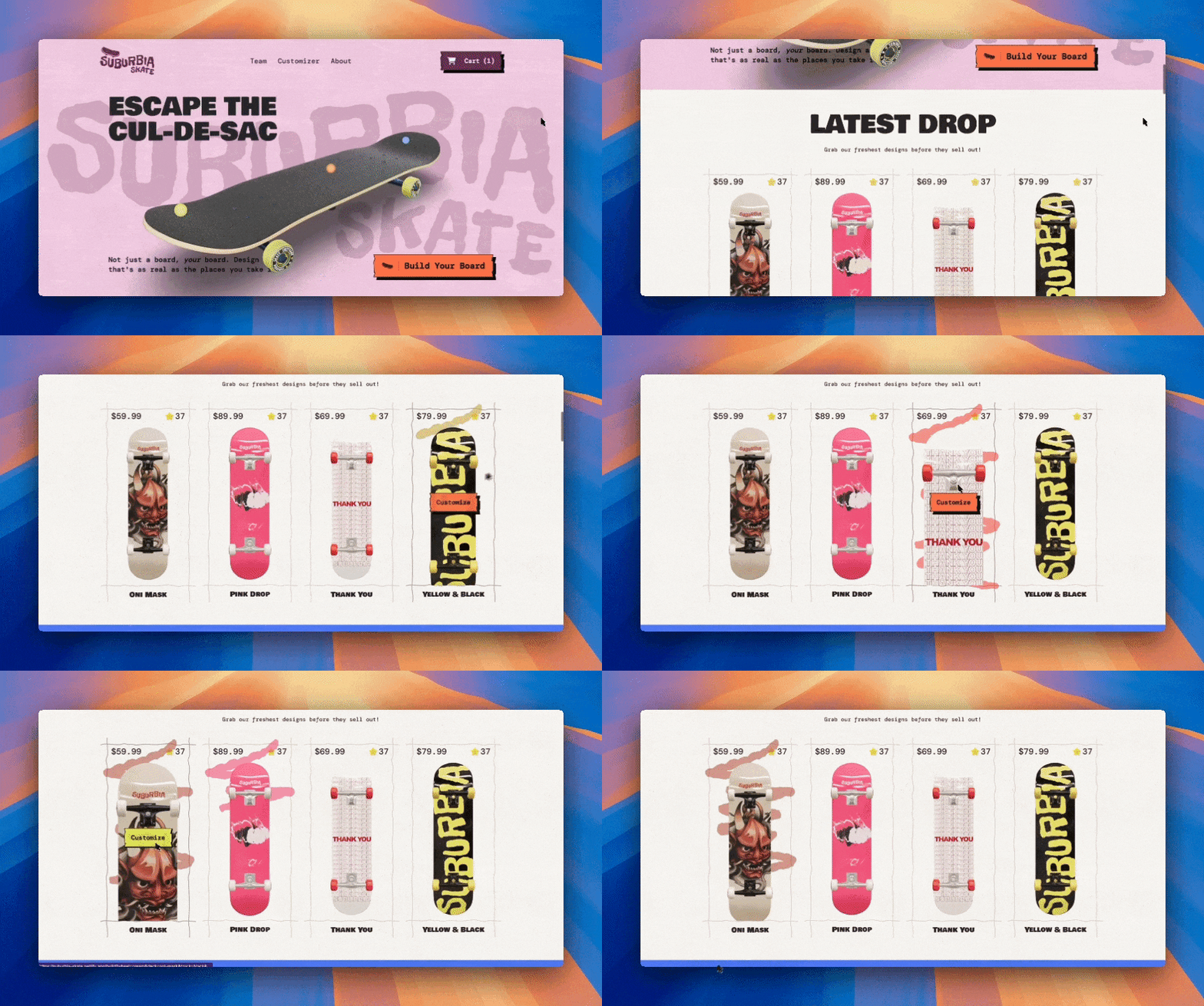
Build a site with interactive 3D hover effects!
Take hover effects to the next level with 3D interactions. In this creative course, we build a customizer app and landing page with real-time animations using Next.js 15, GSAP, Prismic, Three.js, Tailwind, and TypeScript!
Card CSS hover animations
These card hover animations add a unique effect that will grab the attention of your visitors’.
11. Profile card hover
Profile card Hover
Interactive CodePen loads when it gets near the viewport.
The profile card hover animation by Codev Land creates a two-layer sliding effect on a card component. When hovered, the top slide (with an icon) moves up to reveal the bottom slide containing text. This animation relies on:
transform: translateY()(docs): Moves each slide along the vertical axis during hovertransition(docs): Creates a smooth animation effect when both slides’ positions change on hover
12. CSS hard hover effects
CSS Card Hover Effects
Interactive CodePen loads when it gets near the viewport.
The CSS hard hover effects by Bruno Rocha creates a dynamic card hover effect, where top layer shrinks on hover to reveal the inner text-filled layer. The creator uses the transition property to add to the cards to animate changes in their height, border-radius, and font size during hover.
13. Glowing gradient glassmorphism card
Glowing Gradient Glassmorphism Card
Interactive CodePen loads when it gets near the viewport.
The Glowing gradient glassmorphism card by Kodplay creates a visually appealing card layout with a hover animation effect. Each card has a distinct style, with unique gradient backgrounds, blur effects, and hover interactions. Here's a breakdown of how the code works:
::beforeand::afterpseudo-elements: Creates gradient skewed backgrounds. On hover, the skew effect is removed, and the dimensions adjusttransition: Animates the hover effectsspan::beforeandspan::after: Adds blur and glow effects on hoverbackdrop-filter(docs): Adds a glassmorphism effect to the card's content@keyframes animate: Creatives a slight vertical motion to give a dynamic floating effect
14. Tourist cards
hovering cards
Interactive CodePen loads when it gets near the viewport.
The tourist cards hover effect by karim jawhar features three interactive cards, each showcasing the image of a landmark. When hovered over, the cards transform by rotating along the X and Z axes, giving them a 3D effect. This animation works with:
transform:rotateX,rotateZ,translateY, andtranslateZproperties create the 3D rotation and positioning effect that occurs on hovertransition: Smoothens the change between states, especially on thetransformandbox-shadow, making the hover effect more fluid
15. Same height cards
FlexBox Exercise #4 - Same height cards
Interactive CodePen loads when it gets near the viewport.
The same height cards animation by Veronica is another great example. When hovered over, the cards enlarge slightly and reveal more information about the items, such as a "like" icon and time information. At the same time, the image becomes partially opaque as its opacity reduces.
This animation relies on:
transform: scale: Enlarges the card on hover, making it appear to "pop" outcard__img--hoverclass: Handles the changes that occur on the background image when hovered. The image properties that change includeopacity(docs),background-size(docs), andbackground-position(docs)
Icon CSS hover effects
Let’s take a look at some icon hover effects that will be sure to make your website stand out.
16. Social media icons hover effect
Social Media Icons hover effect
Interactive CodePen loads when it gets near the viewport.
The social media icons hover effect by Ephraim Sangma creates a set of Font Awesome social media icons that animate on hover. Here's a breakdown of how it works and the key elements involved:
a:before: Used to create a background color effect when hovering over the social media icons. It is initially positioned below the button. On hover, it slides up and fills the icon’s circletransform: rotateY: Rotates the icon in 360 degrees along the Y-axis, giving a flip effect
17. Interactive close button
A simple but interactive close button
Interactive CodePen loads when it gets near the viewport.
The interactive close button animation by Marius Nicula creates an interactive button with circular elements inside it that move and change colors on hover. It works with the following:
- SCSS
transitionmixin: Creates a consistent transition effect that applies to all properties transform: rotate: Rotates the bars diagonally (+45° and -45°) to give the “X” shape&:hover: The background color of the bars and the position of the circles in the bars change on hover
18. Icon hover effect
css Icon Hover Effect
Interactive CodePen loads when it gets near the viewport.
Engineer’s icon hover effect completes the circular background of the icons on hover. It works with:
border-radius: 50%(docs): Gives the list items their circular shapetransform: rotate: Rotates each list item 45° to tilt the semicircles::before: The half of the semicircle that remains static and visible::after: The other half of the semicircle that slides in on hover
19. CSS social tiles
3D - CSS Social Tiles
Interactive CodePen loads when it gets near the viewport.
The CSS social tiles animation by Stockin uses CSS to create titled 3D buttons that “levitate” in the air on hover. It relies on the following to work:
- CSS transforms (
skew(25deg)androtate(-30deg)): Create the tilted card effect box-shadow: Gives each item depth and a 3D effect::beforeand::after: Complete the 3D effect by acting as the “walls” of each item- Hover effect: The item moves slightly to the right and up and the box shadow becomes larger and more pronounced, enhancing the 3D effect
20. Text and gradient icon hover effect
CSS Icon Hover Effects with Text And Gradient Drop Shadow
Interactive CodePen loads when it gets near the viewport.
The text and gradient icon hover effect by Yixuan creates an animated navigation bar with expanding menu items and colorful hover effects. Here's a breakdown of how it works:
::before: Creates a gradient overlay that fades in on hover::after: Generates a blurred glow around the buttonscale(0): Shrinks the icons when hovered uponscale(1): Scales up the title on hover to become visibleli: Increases in width as the title appears
Link and menu CSS hover animations
Let’s explore some link and menu hover effects that can add flair to navigation bars.
21. Creative menu hover effect
Creative Menu Hover Effects #
Interactive CodePen loads when it gets near the viewport.
The creative menu hover effect by abdel Rhman generates a navigation menu dynamically using Pug templating language. The CSS styles applied give the menu items a simple but eye-catching hover effect. Here's an explanation of how it works:
:before: Creates the border lines that scale into view on hover:after: Creates the background that expands to cover the menu item on hover
22. Menu hover
CSS3 Hover Effect using :after Psuedo Element
Interactive CodePen loads when it gets near the viewport.
Each menu item in Larry Geams’ menu hover effect has a unique left-border color and when a user hovers over the links, the background color slides in to fill the links. This animation is powered by an ::after attached to each link. On hover, the width of ::after extends to 100%, making it fill its source element.
23. Magic line navbar
Pure CSS Magic Line Navbar
Interactive CodePen loads when it gets near the viewport.
The Magic line navbar animation by Rock Starwind creates a sleek navigation bar with a dynamic hover effect. When a user hovers over any of the links, a line indicator slides to align with the hovered link. Here’s a breakdown of the animation:
position: absoluteandbottom: 0: Positions the line at the bottom of the nav baropacity: Sets the default opacity of the line to0and transitions it to1on hovercalc(): Calculates the size and position of the.lineusing the--indexcustom property based on the hovered link's position in the grid-index: Dynamically changes based on the hovered link to indicate which link is active and where the.lineshould movehover ~ .line: A sibling selector that updates the.lineproperties (like--index) based on which link is hovered
24. Wavy menu line
Menu Hover Line Effect
Interactive CodePen loads when it gets near the viewport.
The wavy menu line effect by Mehmet Burak Erman makes links stand out by giving them a wavy line that shows up to the party on hover. It works with:
li:hover: Gives links a base64-encoded SVG line as theirbackground-image@keyframes line: Animates the background's position horizontally on hover
25. Desktop menu animation
[Pure CSS] Desktop Menu Animation
Interactive CodePen loads when it gets near the viewport.
There’s a lot going on with the desktop menu animation by Gabriel Antonio. Let’s explore how it works.
translateY: Moves the position of the top and bottom bars of the hamburger menu on hoveropacity: Hides the top and bottom hamburger menu bars on hoverscaleY: Increases the size of the middle hamburger menu bar on hovertranslateX: Slides the menu out from the left side when users hover over the hamburger menutranslateY,rotate(-90deg), andopacity: Rotates the “MENU” text into view and makes it visible on hovernth-of-type: Creates staggering delays for the menu items, so they animate into view one after the other
Button CSS hover animations
Add character to your CTAs with these creative CSS button hover effects.
26. Don’t push me buttons
Don't Push Me Buttons / CPC Color
Interactive CodePen loads when it gets near the viewport.
The Don’t push me buttons animation by Alex Hart is a 2-for-1 package that comes with a hover animation and a click one. It works with the following:
transform-style: preserve-3d: Gives the buttons a 3D-like appearancetranslate(0, 0.375em): Moves the buttons slightly downwards on hover to simulate a "press" effecttransform: translate(0em, 0.75em): Simulates a complete button press when clicked by moving the button further down
27. Next button hover
CSS BUTTON HOVER
Interactive CodePen loads when it gets near the viewport.
The Next button hover by Imran Pardes displays the word "NEXT" in a bold, skewed background, accompanied by an animated arrow composed of three SVG paths. Here’s how it works
transform: translateX: Places the first and 2nd paths of the arrow off-screen. This ensures they are initially hidden, then slide into view on hover@keyframes color_anim: Makes the arrow paths flash yellow periodicallybox-shadow: The shadow increases on hover, and its color changes to yellow
28. Sleepy birds button
すやすやなボタン
Interactive CodePen loads when it gets near the viewport.
The sleepy birds button by ash_creator is a wildly creative animation that pushes the boundaries of what’s possible with CSS. The birds in this project were all created with HTML and CSS. Initially, the birds are sleeping with there eyes closed, and when hovered over, 2 out of 3 of them wake up.
Let’s see what makes this animation tick:
@keyframes sleep: Gives all characters a subtle breathing/pulsing animation by alternating the birds’ heights. This animation is constantly running on all birds@keyframes wakeup: Transitions the height of all characters on hover. Character expansion on hover@keyframes eyeand@keyframes eye_2: Creates the blinking and eye movement animations that occur on hover@keyframes body_hoo: Character body movements@keyframes face_pen: Face scaling animationsletter-spacing: Increases the letter spacing of the buttons’ texts on hovertranslateX,rotateY, andtranslateX: Animates the background of the buttons on hover
29. Rainbow button hover
Animated button with rainbow hover #pride
Interactive CodePen loads when it gets near the viewport.
The rainbow button hover effect by Thiago Marques is colorful and mesmerizing. When a user hovers over the set of rainbow-colored buttons, a sliding gradient animation that transition through multiple colors occurs, giving the illusion of a moving rainbow background. This effect is powered by:
@keyframes slidebg: Changes thebackground-positionof the background gradients to simulate the moving rainbow effect on hoverbackground-image: Defines thelinear-gradientcolors of each button
30. 3D blend mode buttons
CSS 3D Blend Mode Buttons
Interactive CodePen loads when it gets near the viewport.
The 3D blend mode buttons by Lisi, who drew inspiration from Oleg Frolov, have a 3D-look to it. When the user hovers over a button, it uses three layers of colors to create a wobble-like animation that gives the button a 3D-like appearance. This animation is powered by:
perspective: Gives the buttons a 3D viewtransform: Creates the rotation effect@keyframes rotateAngle: UsesrotateYto rotate the main container on the Y-axis in a continuous loop@keyframes translateWobble: Applies the wobble effect to the button's::beforeand::afterpseudo-elements on hover. It usestransform: translate3dto translate the element in all three axes (X, Y, Z)mix-blend-mode: Is set tocolor-dodgeand causes the colors of the pseudo-elements to blend, creating a striking color contrast effect
First time here? Discover what Prismic can do!
👋 Meet Prismic, your solution for creating performant websites! Developers, build with your preferred tech stack and deliver a visual page builder to marketers so they can quickly create on-brand pages independently!
Image CSS hover animations
These image hover effects that turn visuals into interactive art.
31. Frame hover effect
Frame hover effect with one element
Interactive CodePen loads when it gets near the viewport.
The images in Temani Afif’s frame hover effect initially appear without a border/frame. However, when hovered over, a border appears, and the images become bright, almost as if a dark veil had been removed. The following properties are adjusted on hover to create this animation:
outline: The outline covers the image by default. However, on hover, its thickness changes to a thinner value, creating the effect of a shrinking borderoutline-offset: Defines the gap between the image and the outline
32. Dual image effect
Dual image with hover effect
Interactive CodePen loads when it gets near the viewport.
Temani Afif’s dual image effect gives a diagonally-split box with an image on either side. When the image on the left corner is hovered over, it fills 75% of the screen. The same goes for the image on the r right corner. This dynamic “sliding triangle reveal” animation relies on:
clip-path: Defines triangular regions of the images--_pCSS variable inclip-path: Dynamically adjusts the size and position of the clipping polygon on hover. This causes the triangular regions to grow or shrink, revealing more or less of the images
33. Image hover effect
Image Hover Effect - pure css - #18
Interactive CodePen loads when it gets near the viewport.
When the user hovers over a specific image in the image hover effect created by Ivan Grozdic, all other images become dim (opacity: 0.1) while the hovered one remains fully visible (opacity: 1).
Simultaneously, the image scales up and rotates 3° while a masked text corresponding to the image appears at the center of the screen.
This animation works with:
opacity: Controls the opacity of the images on hoverscaleandrotate: Create a zoom effect when an image is hovered on hoverscale: scales up the text on hovermix-blend-mode: difference: Applies the masking effect to the text so it adapts to its background
34. Gallery hover effect
Gallery Hover Effect
Interactive CodePen loads when it gets near the viewport.
In the gallery hover effect by Bobby Korec, the image zooms in on hover while the header text slides upwards and scales down, creating a clean and visually engaging effect. It works with:
transform: scale(2): Enlarges the image on hover, creating a zoom effectbottom: 300pxandtransform: scale(.4): Scales the text down on hover and moves its position to create an upward sliding effect
35. Masking hover rays
Hover rays with masking and Houdini magic (Chromium only)
Interactive CodePen loads when it gets near the viewport.
The masking hover rays effect by Ana Tudor creates a dynamic effect on an image, where a series of gradients and masks are used to create other “images” that extend out of the original on hover. It resembles a squid’s tentacles extending outward and works with:
mask: Applies multiple radial and linear gradients that control the areas where the image is visible and maskedfilter: grayScale: Gives the image a gray scale effect that changes on hover
Five other creative CSS hover effects I particularly liked
Lastly, let’s explore five more hover animations that don’t fit into any one category but I found to be really engaging.
36. Scotch VHS
Scotch VHS CSS
Interactive CodePen loads when it gets near the viewport.
The Scotch VHS homepage effect by BlurSoulx spices up a product homepage with five types of animations:
- Subtle entrance animation: Creates a fade-in effect when the page loads. It relies on
@keyframes spawnto animate the page’s opacity from0to1and give the page a growing box-shadow - Sphere hover effect: A range of background gradient changes, box shadow effects, and scale up effects are applied to the buttons and links on hover
- Navigation link hover effects: The links and CTAs have various hover effects
- Animated GIF texture effect: Applies an animated GIF texture to the main container’s
::afterpseudo-element on hover. It usesmix-blend-mode: screento make the effect more colorful
37. All but me
All-but-me query with :has()
Interactive CodePen loads when it gets near the viewport.
The all-but-me blog page effect by Mojtaba Seyedi introduces an interactive hover effect on a grid of cards, where hovering over a single card highlights it by making the other cards blur. It works with the following:
:has()pseudo-class: Targets the parent.card-listto detect if anylichild is being hovered (:has(li:hover)). It ensures the blur effect only applies when a hover event occurs:not()pseudo-class: Used to exclude the hovered card (li:not(:hover)) from the blur effectfilter: blur(): Applies a blur filter (blur(4px)) to the non-hovered cards to de-emphasize them. This makes the hovered card stand out from the crowd
38. Cubes hover effect
CSS Only Cubes Hover Effects @ OnlineTutorialsYT
Interactive CodePen loads when it gets near the viewport.
The cubes hover effect by Greg Vissing creates a dynamic 3D-like effect where stacked cubes rotate through various color hues on hover, giving the structure an eye-catching, colorful transition effect. It works with:
@keyframes animate: Applies ahue-rotatefilter over the.container, creating a smooth color transition that loops infinitely over 5 secondstranslate(): Gives the structure its 3D-like positioning:beforeand:after: Create the side and top surfaces for the cubes
39. Inward shadow
Inward Shadow Pt. 2
Interactive CodePen loads when it gets near the viewport.
The inward shadow effect by Smashing Magazine creates an interactive and colorful overlay effect where three circular elements representing news publications transform on hover to reveal their logos. Its powered by:
box-shadow: Gives the circles the initial subtle shadow.item:hover: Makes the text transparent and transitions the box shadow, revealing the logo within
40. X-ray
X-Ray - Pure CSS
Interactive CodePen loads when it gets near the viewport.
Last but not least is the X-ray effect by Josetxu, which is simply mind-blowing. This animation shows an X-ray of the human body on hover. There are also two buttons for toggling between full body view and full X-ray view. The CSS powering this animation is long and quite complex, but some of the key things powering it are:
@keyframes startup-scaner: Controls the initial movement of the scanner overlay during the startup sequence@keyframes startup-skeleton: Gradually reveals the skeleton layer during the startup animationclip-path: Masks and reveals the skeleton in sync with the scanning zones, creating dynamic effects as users interact
Hover animation tools and libraries you should know
Hover.css
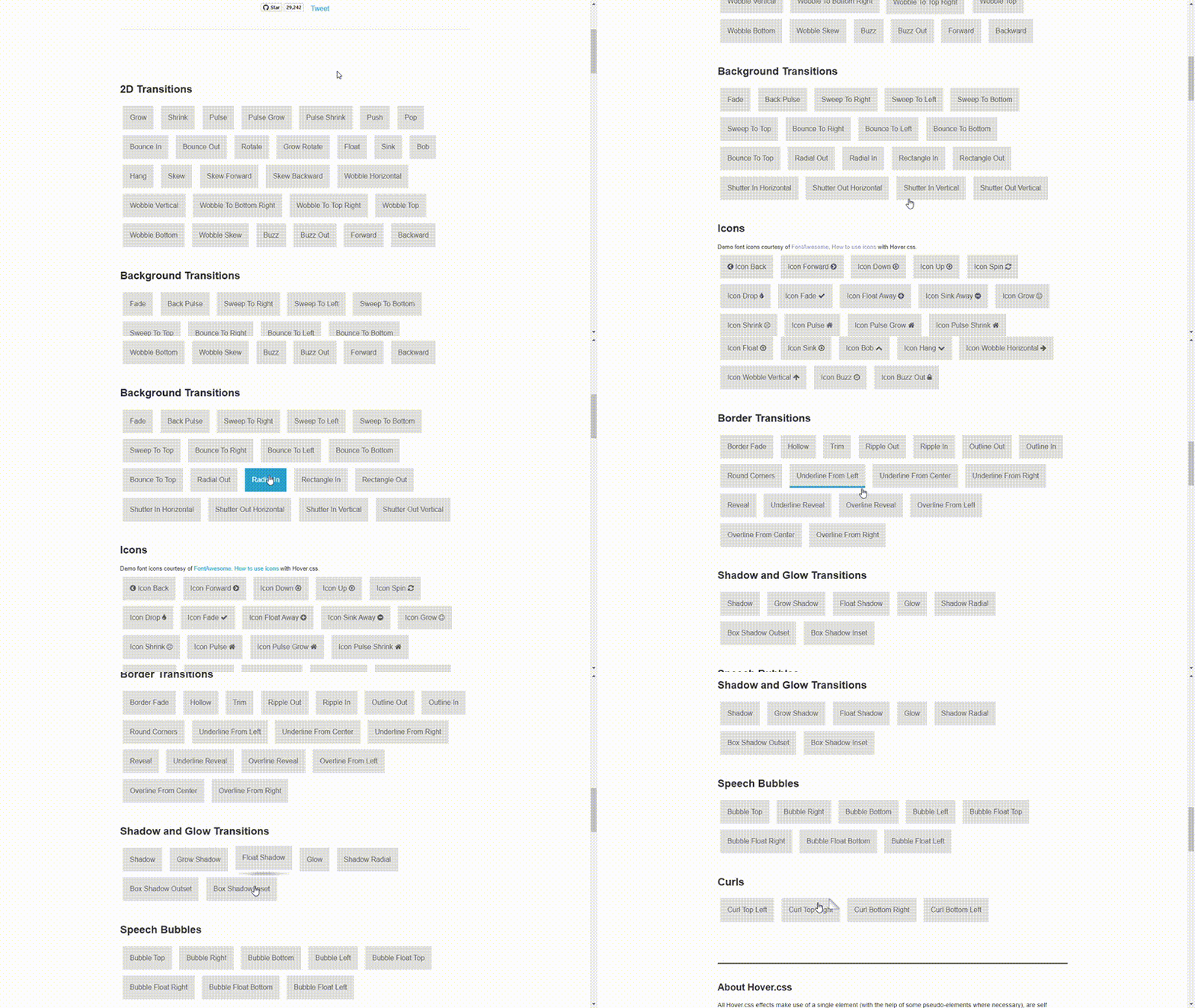
Hover.css is a collection of CSS-powered hover effects that you can apply to images, links, SVGs, buttons, and more. It is a lightweight library that weighs 6.7kb (minified + gzipped).
Hover.css provides over 110 animation effects for animating CSS properties like background colors, borders, shadows, and icons.
Mocassin.css
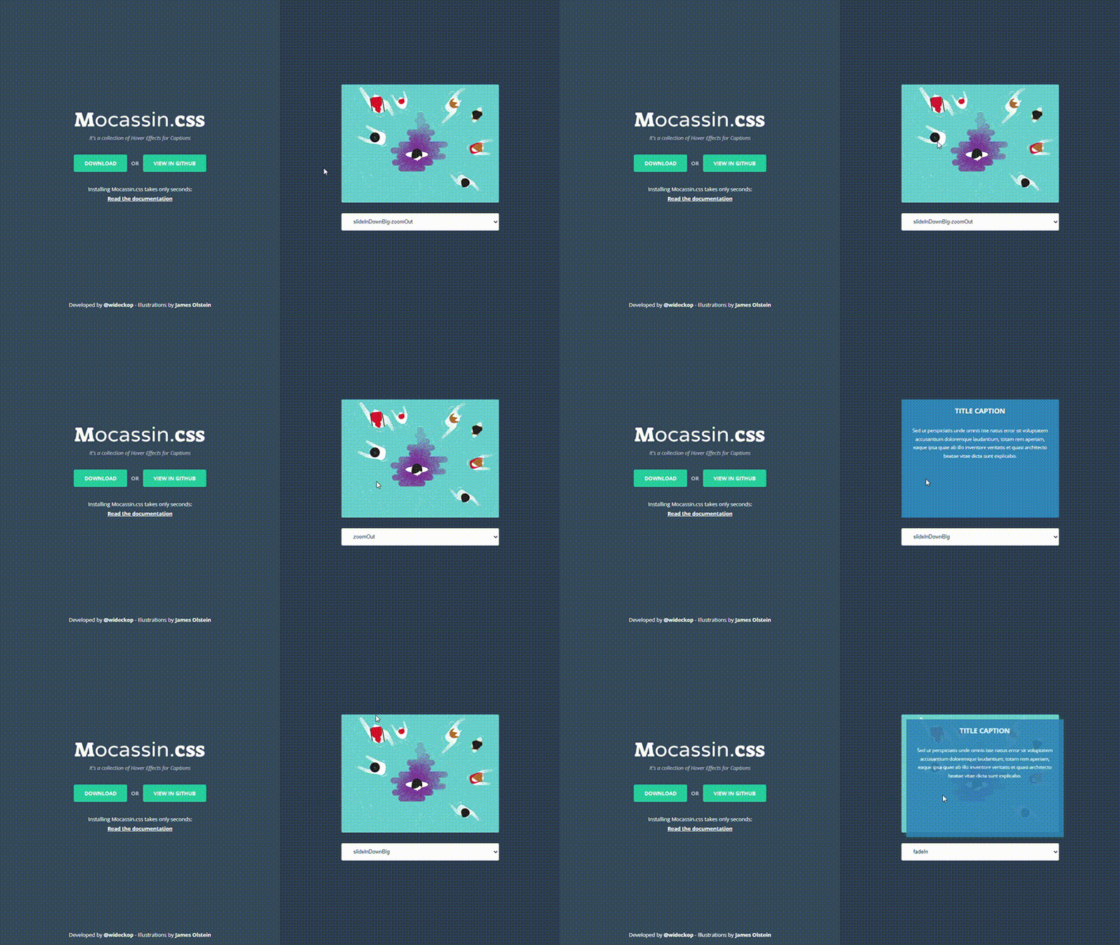
Mocassin.css provides a collection of 20+ hover effects for captions. It is designed to enhance user interactions with visually appealing animations and transitions. The library is easy to use and doesn’t require extensive customization or setup.
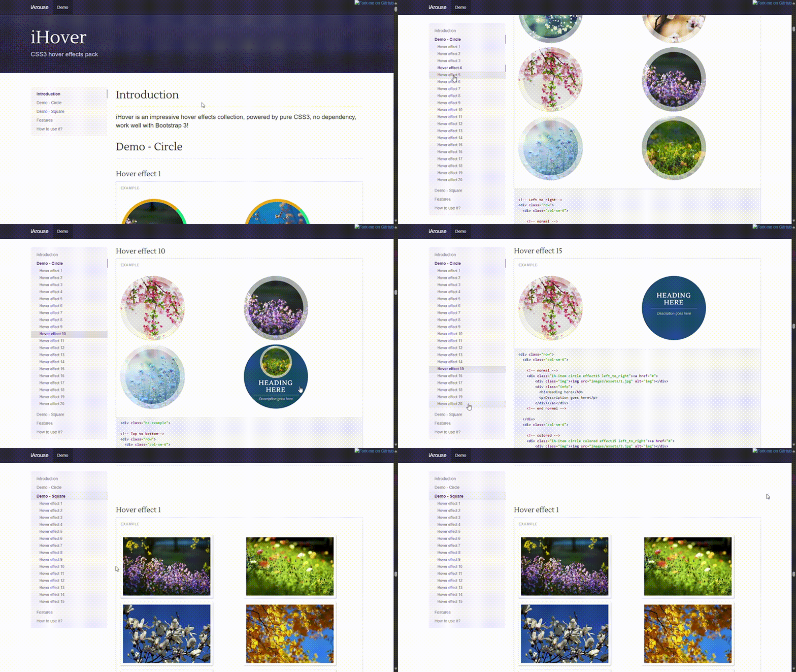
iHover
iHover is a collection of 20 hover effects that you can apply to your website. The library is built on SCSS and is compatible with CSS frameworks like Bootstrap.
Conclusion
Adding hover animations to your website is a great way to give visitors a more engaging and interactive user experience. Whether you're enhancing buttons, images, text, or other elements, these animations can add personality and depth to your designs, leaving a stronger impression.
We trust you’ve gained inspiration from the CSS hover animations we’ve explored in this article. Keep coding and remember to share what you build with the Prismic team!


