39 Awesome CSS Animation Examples with Demos + Live Code

One way website owners are capturing and keeping user attention is through eye-catching animations. Whether it’s subtle hover effects, smooth transitions, or dynamic interactions, animations can create an engaging experience that draws users in from the moment they land on a site.
In this article, we’ll explore 39 CSS animation examples you can add to your website to enhance its interactivity and visual appeal. We’ll view a mix of animations along the way — those that work solely with CSS and those that require JavaScript to work. Let’s dive in!
Text animations
1. Simple text animation
Simple CSS text animation
Interactive CodePen loads when it gets near the viewport.
The simple text animation by Nooray Yemon creates a vertical text-flipping effect inside the #flip container, making different words — work, lifestyle, and everything — appear in a sequential and infinite loop. The animation is controlled by the @keyframes show (docs), which adjusts the margin-top of the child div elements, causing them to slide into view.
2. CSS text animation
Pure CSS Text animation
Interactive CodePen loads when it gets near the viewport.
The CSS text animation by Mamun Khandaker creates a series of animations — rotation, scaling, bouncing, sliding in, and various combinations — for different groups of text. The animations are powered by @keyframes declarations that control transformations like translate (docs), scale (docs), and opacity (docs).
While this animation doesn’t require JavaScript to work, JavaScript is used to repeat the animations when the “Repeat Animation” button is clicked.
3. Hover effect for headers
Hover Effect for Headers
Interactive CodePen loads when it gets near the viewport.
The hover effect for headers by Olivia Ng creates a visually engaging webpage with sections representing different natural elements like deserts, forests, canyons, glaciers, mountains, oceans, and more. Each "element" has a unique background image, interactive hover effects, and text animations to enhance user experience.
4. CSS party5.
CSS Party
Interactive CodePen loads when it gets near the viewport.
The CSS party animation by David East puts control in your hands by providing a slider for controlling the intensity and speed of the text animation.
This text animation relies on @keyframes breath, which adds a text shadow to the text and makes it scale up and down, and some JavaScript code that handles the slider’s input value and uses CSS custom properties to control the animation’s timing.
See more creative text animations!
Want to see more examples of CSS text animations? Then, check out our dedicated article that covers 40 text effects.
Hover animations
5. Animated CSS mail button
Animated CSS Mail Button
Interactive CodePen loads when it gets near the viewport.
The animated CSS main button by Jake Giles-Phillips creates an envelope animation where the envelope opens and reveals its content on hover. It relies on various CSS transforms to work.
6. Sparkly shiny text
Sparkly Shiny Text ✨
Interactive CodePen loads when it gets near the viewport.
The sparkly shiny text animation by Jhey creates an interactive button that features multiple black sparkle SVGs that animate on hover. The text of the button has a layered effect that creates a text-shadow (docs) for a 3D-like appearance.
7. Glowing dot effect
Full CSS growing dot effect
Interactive CodePen loads when it gets near the viewport.
The glowing dot effect by Vincent Durand creates a card component with a grid of tiny dots as its background. The dots expand as users hover over specific sections of the card, and this makes for an interesting effect.
8. Glide to reveal
Glide To Reveal with CSS :has()
Interactive CodePen loads when it gets near the viewport.
The glide to reveal hover effect by Jhey features six digits that are blurred initially but scale up and become clear on hover or focus.
9. OS dock
CSS OS Dock [CSS :has(), lerp custom props]
Interactive CodePen loads when it gets near the viewport.
Check out more CSS hover effects!
Explore our dedicated article to see more CSS hover effects.
Button animations
10. Keyframe tricks
Single Keyframe Tricks
Interactive CodePen loads when it gets near the viewport.
The keyframe tricks effect by David East showcases various types of animations — like shake, pulse, glitch, flip, fill — applied to buttons using CSS keyframes. The JavaScript code in this Codepen is used to stop and start the animation.
11. CSS fizzy button
CSS Fizzy Button
Interactive CodePen loads when it gets near the viewport.
The CSS fizzy button by Jamie Coulter creates an animated button effect where bubble particles emanate from the text button while a right arrow slides into view and the background color changes.
12. Fun 3D button
Fun 3D button
Interactive CodePen loads when it gets near the viewport.
The fun 3D button by LukyVJ creates a button that, when hovered over, scales up while heart-shaped elements of different sizes scale into view. It also provides controls for debugging the animation and changing the body’s background color.
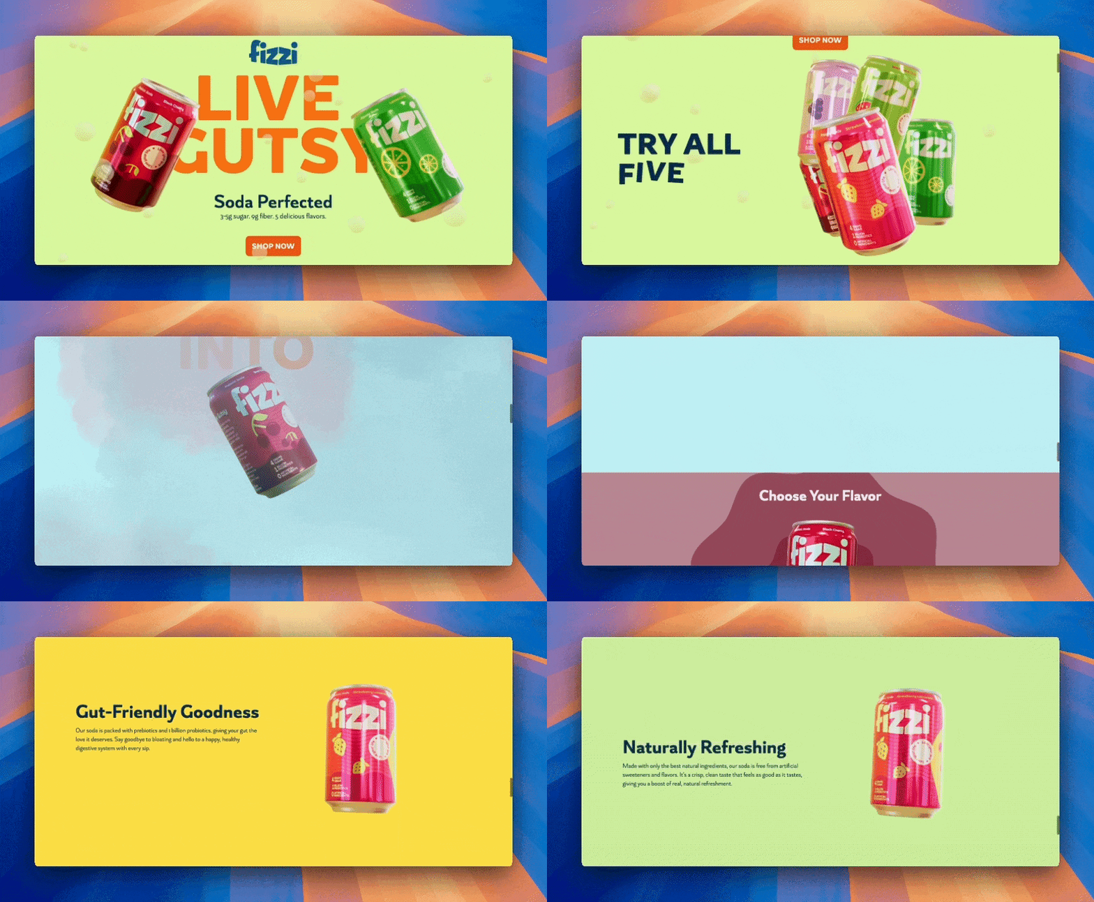
Take your 3D animations to the next level with GSAP and Three.js!
Learn to animate 3D models with GSAP and Three.js in our interactive course! In this creative course, we guide you through building a scroll-animated 3D landing page using Next.js 14, GSAP, Prismic, Three.js, Tailwind, and TypeScript.
13. Rainbow gradient button
Lil rainbow gradient button
Interactive CodePen loads when it gets near the viewport.
The rainbow gradient button by LukyVJ creates a button that scales up, shifts, and shuffles through various colors on hover. It relies on several colors, CSS variables, scale, translateY, and linear-gradient (docs) to work.
14. Storm button
Andreas Storm button
Interactive CodePen loads when it gets near the viewport.
The storm button by jwktje uses HTML, CSS, and SVG to create a voltage button with a glowing effect. The SVG includes a filter named “glow” that gives the graphic a glowing, wavy look. The effect relies on three keyframes to work: spark-1, spark-2, and fly-up.
Click animations
15. Toggle switch with a hole
Toggle Switch with a Hole Handle
Interactive CodePen loads when it gets near the viewport.
Jon Kantner created a toggle switch with a hole that, when clicked, the hole extends and moves to the opposite end along the x-axis. It’s a solid implementation of the basic toggle switch animation we see around.
16. Pure CSS drawer
Pure CSS Drawers
Interactive CodePen loads when it gets near the viewport.
The pure CSS drawer by Jhey creates a 3D drawer with panels that open when clicked. The third drawer has a wavy text animation inside it, further enhancing the awesomeness of this animation.
17. Copy button click effect
Copy Button Click Effect
Interactive CodePen loads when it gets near the viewport.
The copy button click effect by Arjun Ace uses two SVG elements to create its animation. When clicked, a copy-like motion occurs. This effect relies on two keyframe definitions: press to give the card a pressed-in feel when clicked and bounce to animate the SVG copy icon out of view.
18. Beveled buttons
SCSS Beveled Buttons
Interactive CodePen loads when it gets near the viewport.
The beveled buttons animation by Brandon McConnell creates a button that transforms from an envelope-like button to a ghost button when clicked. At the same time, the “Bevel Up” text moves from its initial position above the button to the back.
19. Biometrics button
Black Biometirics Button
Interactive CodePen loads when it gets near the viewport.
The biometrics button by Mikael Ainalem creates an interactive login button with a fingerprint animation. When the button is clicked, it transforms from displaying the text "LOGIN," to showing an SVG fingerprint animation that traces different curved path lines to mimic a fingerprint scan.
Among other CSS features, the animation relies on stroke-dasharray and stroke-dashoffset to manipulate the SVG’s path and give the illusion of drawing fingerprint lines. It also uses a text keyframe to manage the text’s visibility and the Ok keyframe to control the SVG animation.
Loading animations
20. Kinetic CSS loaders
Kinetic CSS loaders
Interactive CodePen loads when it gets near the viewport.
The kinetic CSS loaders by Jenning use a combination of keyframes, pseudo-elements, and CSS properties to create loading elements. You can use these loaders to add visual feedback when processes are running in the background of your app.
21. Newton’s cradle
Newton's cradle using only CSS
Interactive CodePen loads when it gets near the viewport.
Newton’s cradle animation by Arushi Bajpai creates a pendulum swing that continually sways from one end to the other. Each .ball represents a pendulum bob, with a ::before pseudo-element styled to resemble the bob’s strange. The .first and .last balls are animated with firstball and lastball keyframes to mimic the natural swinging motion of a pendulum. The transform-origin (docs) ensures the balls rotate from the top point of their pseudo-element strings, creating a realistic pivot.
22. Glowing loader ring
Glowing Loader Ring Animation
Interactive CodePen loads when it gets near the viewport.
The glowing loader ring animation by Ekta maurya creates a creates a glowing, spinning ring effect. The .ring element forms the circular base while its :before pseudo-element imitates the yellow border. The animateC keyframe handles the yellow rim’s motion, while the animate keyframe handles the yellow dot’s motion.
23. Making-pancake loader
Never-ending box
Interactive CodePen loads when it gets near the viewport.
The making-pancake loader by Pawel creates a playful animation of a flipping pancake in a pan, complete with bubbling effects to simulate cooking. The pancake-flipping effect is achieved through multiple keyframe animations:
jump: Handles the movement of the pancakeflip: Animates the pan’s flipping motionswitchSide: Rotates the pan around its Y-axisfly: Simulates the pancake rising to its peak, rotating mid-air, and returning to its starting positionbubble: Controls the size, position, and fading of the bubbles as they rise from the panpulse: Adds a pulsating effect to the "Cooking in progress..." text by gradually scaling and fading the text in and out
24. Speedy truck
Speedy truck
Interactive CodePen loads when it gets near the viewport.
The speedy truck animation by Tippy fodder creates a looping animation of a scenic background with a truck driving through a landscape of mountains, hills, trees, and rocks. This animation relies on the following keyframes:
tree: Animates the trees to move from the right side of the screen (1350px) to the left side (-50px)tree2: Similar totree, but starts at 650px, creating variation in the scrolling speed and position of the second tree
tree3: Another variation for the third tree, starting at 2750pxrock: Animates rocks from right to lefttruck: Simulates the truck's motion by slightly bouncing it up and down to mimic driving over uneven terrainwind: Animates the "wind" effect on the truck's visual elements by slightly moving them up and downmtn: Moves the mountain backdrop horizontally from its initial position to create the illusion of distant background movementhill: Similar tomtn, moves the hill horizontally to simulate scrolling terrain closer to the foreground
Menu animations
25. Dropdown menus
Dropdown Menus
Interactive CodePen loads when it gets near the viewport.
Kevin’s dropdown menus effect creates a dropdown menu with four categories: animals, names, things, and movies. Each category is styled as a button with hover effects that reveal a list of items.
26. Swanky CSS Drop Down menu
Swanky Pure CSS Drop Down Menu V2.0
Interactive CodePen loads when it gets near the viewport.
The swanky CSS Drop Down menu by Jamie Coulter provides a combination of click and hover animations that will make any menu stand out. When the menu links are clicked, the sub-menus stagger into view one after the other. The social media buttons aren’t left out, as a slide animation is applied to its content on hover.
27. Pure CSS menu
The pure CSS menu by Antonija Šimić creates a fullscreen menu design that features a toggle button that:
- Transforms into an animated "X" when clicked
- Opens two animated sections: a left panel with a call-to-action (CTA) button and a right panel with navigational links.
The left panel slides down vertically, while the right panel slides in horizontally, creating a dynamic opening effect. The menu links include a hover animation where an underline shifts from left to right for enhanced interactivity.
28. 💪 CSS menu feat. emoji
💪 CSS menu feat. emoji
Interactive CodePen loads when it gets near the viewport.
💪 CSS menu feat. emoji by Piotr Galor defines a navigation menu with skewered sub-menus that appear when hovered over. It is a simple but catchy menu animation.
29. Pure CSS menu animation
Pure CSS Menu Animation
Interactive CodePen loads when it gets near the viewport.
The pure CSS menu animation by Charlie Marcotte creates a menu with a white bottom panel containing three hoverable headings — Explore, Connect, and Interact. This effect also includes a pulsating blob-like element that shifts position based on which heading is being hovered.
First time here? Discover what Prismic can do!
👋 Meet Prismic, your solution for creating performant websites! Developers, build with your preferred tech stack and deliver a visual page builder to marketers so they can quickly create on-brand pages independently!
Card animations
30. 3D cards flip
3D Cards Flip
Interactive CodePen loads when it gets near the viewport.
The 3D cards flip effect by Julien Sulpis creates an interactive 3D card-flipping animation. The .board contains three .card elements, each of which can flip between its front and back faces when clicked. As the cards flip, they stack on top of each other and, when clicked again, revert back to their original state and position.
31. Card hover effect
Card hover effect
Interactive CodePen loads when it gets near the viewport.
The card hover effect by Aaron Iker creates cards that, when hovered on, receive a shiny tile effect. Among others, it relies on CSS features like mask-image (docs), backdrop-filter (docs), conic-gradient (docs), radial-gradient (docs), and @keyframes tile, which animates the opacity of the tiles on hover.
32. Animated info card
Pure CSS Responsive animated info card
Interactive CodePen loads when it gets near the viewport.
When a user hovers over the animated info card by Chris Smith, its green overlay slides to the left, revealing a text section with detailed information about trees. This card relies on three animations — slide, slide-left, and slide-up to function.
33. Flipping split card
CSS | Flipping Card Split
Interactive CodePen loads when it gets near the viewport.
The flipping split card effect by Tobias Bogliolo creates a flippable card effect using CSS transforms and perspective, where a wrapper contains a flip container with front and back sides. When a user hovers over the wrapper, the .flip-left and .flip-right elements rotate 180 degrees along the Y-axis, creating a smooth flipping animation.
The backface-visibility: hidden (docs) property ensures that only one side of the card is visible during the rotation, while the perspective and transform-style: preserve-3d (docs) properties give the flip a three-dimensional feel.
34. House of CSS cards
House of CSS cards
Interactive CodePen loads when it gets near the viewport.
The house of CSS cards animation by Amit Sheen creates a 3D card tower that rotates continuously. The tower is built using multiple nested .card elements; each positioned using precise rotateY, translateX, and translateY transformations to create the circular structure.
A towerRotate animation spins the entire structure at a slow, consistent pace. As the tower rotates, visitors can change the viewing angle by moving their mouse over different parts of the screen, which makes the tower look like it's shifting perspective.
Other creative animations
35. Watch tower
Watch Tower Pure CSS Animation
Interactive CodePen loads when it gets near the viewport.
The watch tower animation by Travis Doughty features flying birds and moving clouds and is a great reminder that there are almost no limits to what one can create with CSS and HTML alone. This animation works with clip path, CSS transforms, and several keyframe animations.
36. Funny candle
Funny Candle Pure CSS Animation
Interactive CodePen loads when it gets near the viewport.
The funny candle animation by Kevin David could easily pass for a scene from a cartoon. The candles are brought to life through multiple keyframe animations that control their body expansion, eye blinking, mouth movements, and overall positioning, while additional elements like smoke, light waves, and a flickering fire add character to the scene.
Each element—from the candles' eyes and mouths to the smoke and waves—has its own unique animation sequence.
37. Ants on sugar
Ants on Sugar CSS Animation
Interactive CodePen loads when it gets near the viewport.
The ants on sugar animation by Stephen Fairbanks uses various keyframe animations to create ants moving across a cube of sugar and the background in general.
38. Submarine
Submarine with CSS
Interactive CodePen loads when it gets near the viewport.
The submarine animation by Alberto Jerez creates a submarine immersed in a body of water. It defines various keyframes that handle the animation of the bubbles, lights, and the submarine’s body and blades.
39. Glowing loader
The Glowing Loader - Pure CSS Animation
Interactive CodePen loads when it gets near the viewport.
Websites with cool CSS animation examples
Twinbru
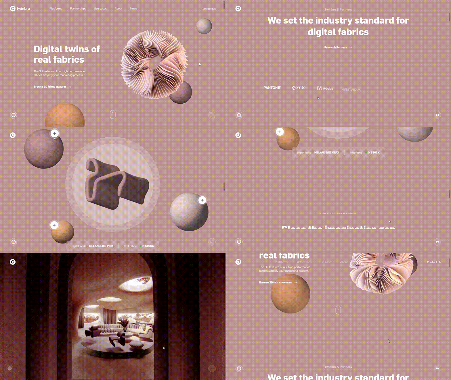
Twinbru’s website is full of many hover animations, 3D elements that move in response to the mouse’s motion, and scroll animations that would be delightful to website visitors. There’s also a color picker for changing the site’s theme, a page-load animation, and a logo animation that occurs on hover.
Fix Studio
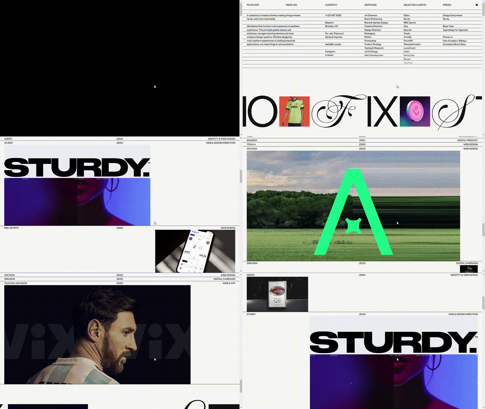
Fix Studio’s website starts off with a mesmerizing loading animation, and then as you scroll, their projects scale into and out of view. There are also various micro-interactions that occur as you explore different pages.
This website is proof that minimalistic websites don’t need to be boring. Rather, they can be creative and engaging.
Apple — iPad Pro
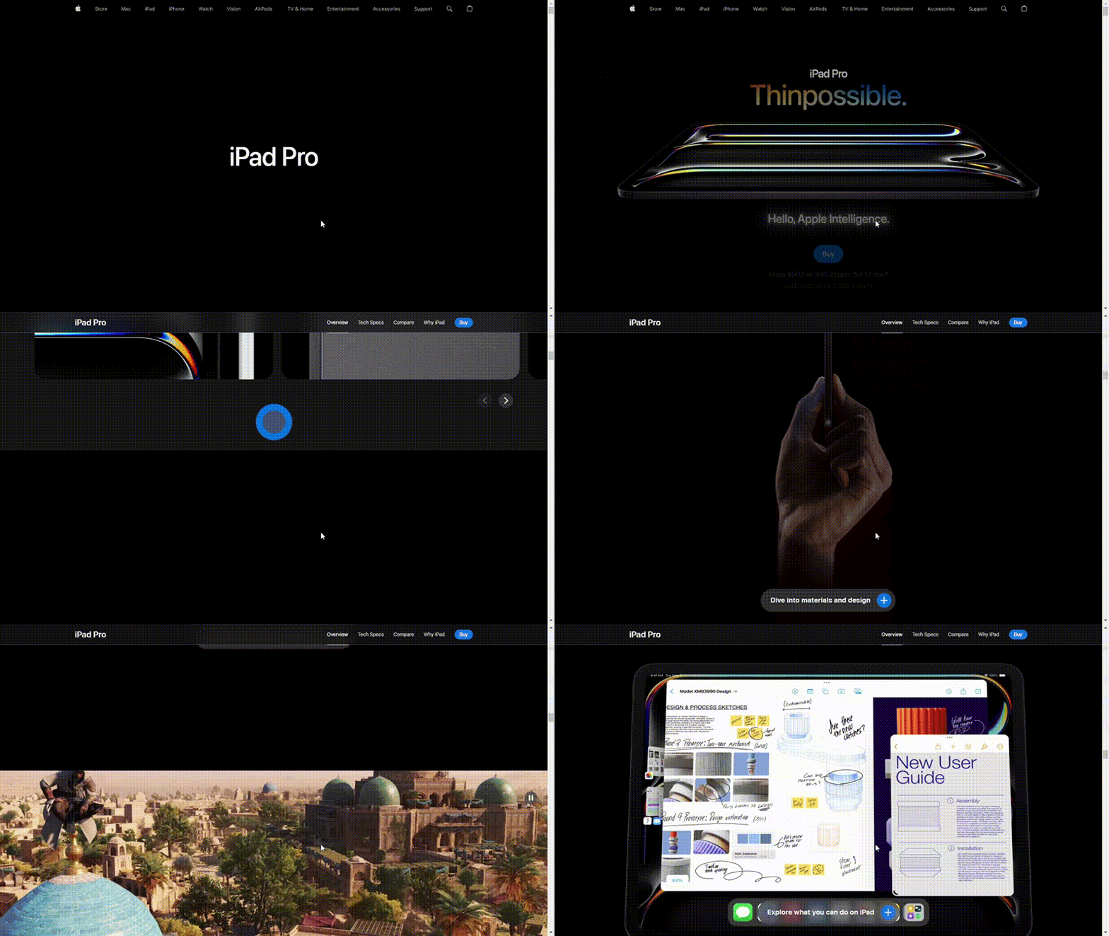
Besides building sleek and performant smart devices, Apple is also known for creating beautifully designed and animation-packed landing pages for its products. An example is the iPad Pro website, which is full of many scroll animations that are nothing short of amazing.
BetterUp

Reports don’t have to be boring, and BetterUp’s landing page for its insights report is is proof. It enhances the reading experience by adding slight transitions, lottie animations, hover animations, parallax effects, and SVG animations to the site.
Somefolk

Somefolk's website kicks things off by using its logo and some text to run a page loader — powered by lottie and SVG animations. Hovering over the text or scrolling through it causes it to shift across a 3D-space — a nice micro-interaction to include.
The site also comes with other scroll animations, SVG animations, and parallax effects, which you’ll see as you scroll further.
CSS animation generators and animation tools you should know
Cubic-bezier.com
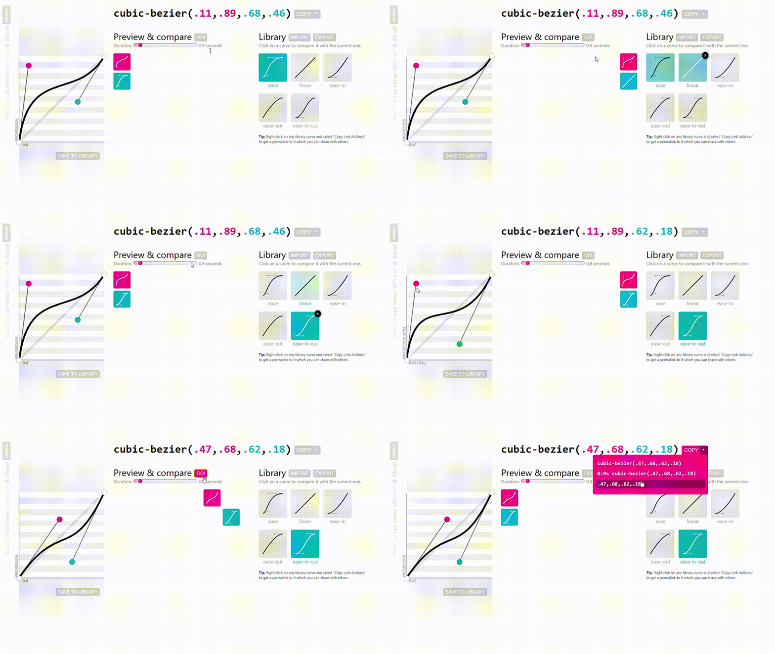
Cubic-bezier.com is an interactive tool for creating and visualizing custom cubic-bezier easing functions, which are used to control the speed and timing of motion effects, CSS animations, and transitions. The tool provides a graphical interface where you can adjust the shape of a Bézier curve by dragging control points, allowing you to see how the easing affects an animation's speed visually and in real time.
Cubic-bezier.com gives you a live preview of the Bézier curve, Includes predefined options like ease, linear, ease-in, ease-out, and ease-in-out, and automatically generates the CSS cubic-bezier() function, which you can copy and paste into your stylesheet.
AngryTools’ CSS animation kit
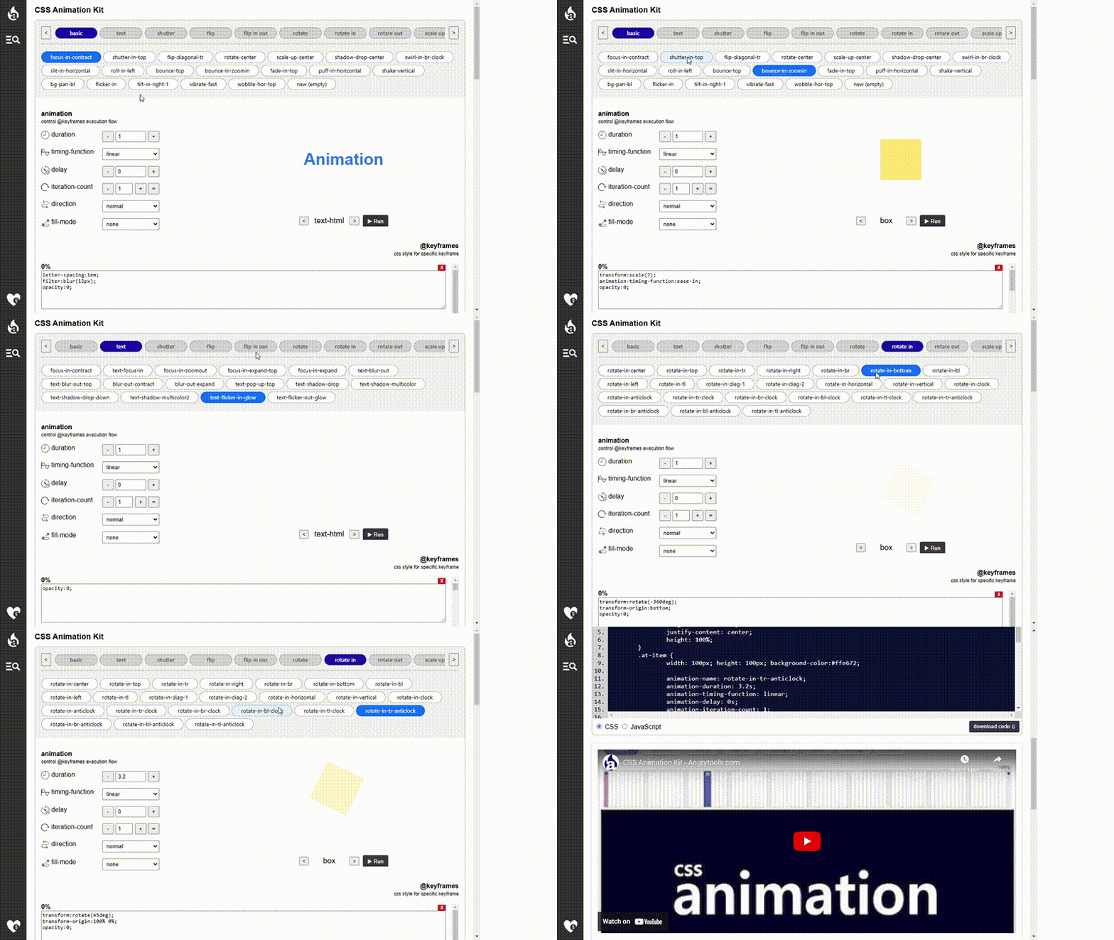
The CSS animation kit offers over 30 categories of animations and comes with 120+ unique types of effects. It allows you to configure animation properties like the duration, timing function, delay, iteration count, direction, and fill mode.
One of its standout features is the ability to customize keyframes — at 10% intervals — between 0% to 100%. You can define custom keyframes and add specific CSS styles for those percentages, giving you greater control and personalization.
Gradiently’s CSS animations generator
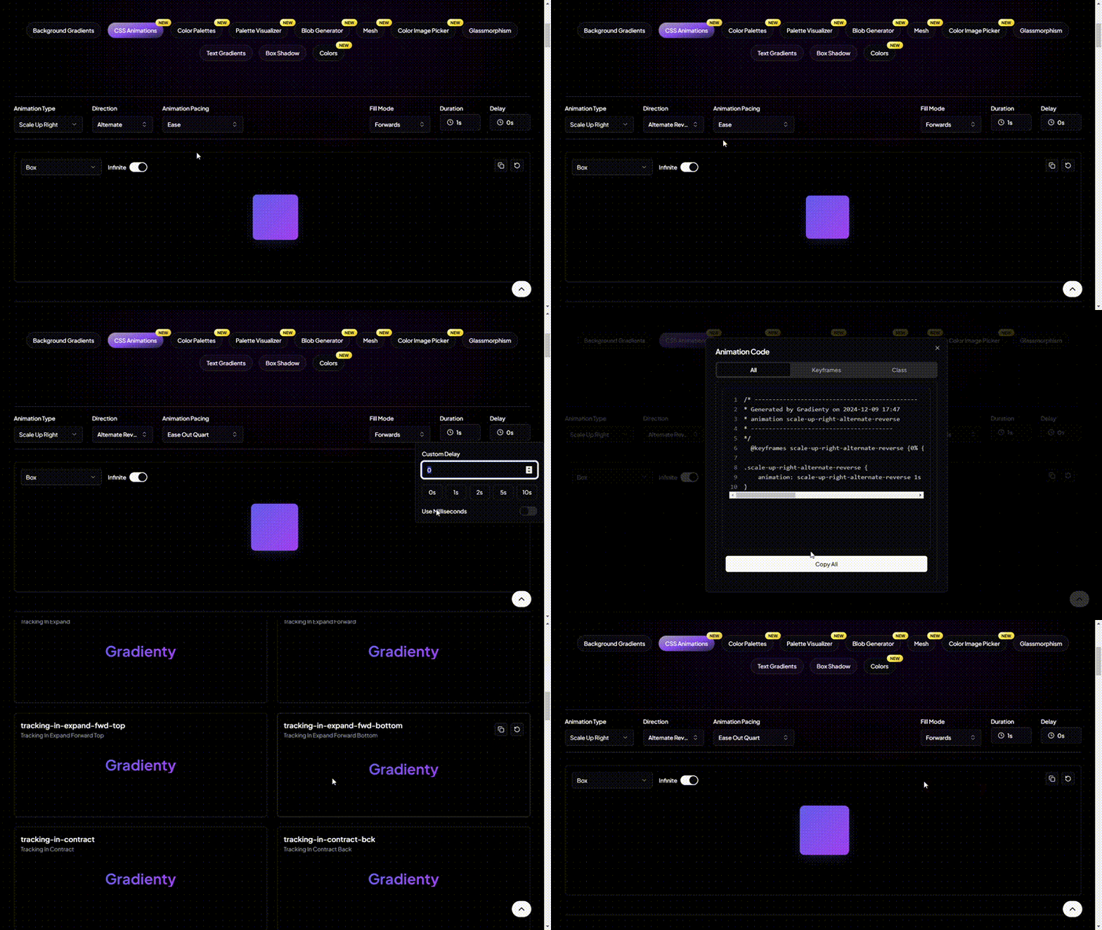
Gradiently’s CSS animations generator provides over 600 animation effects, offering endless possibilities to bring your web elements to life. Like other tools, it allows you to customize the behavior of animations via controls for direction, fill mode, duration, etc.
GSAP
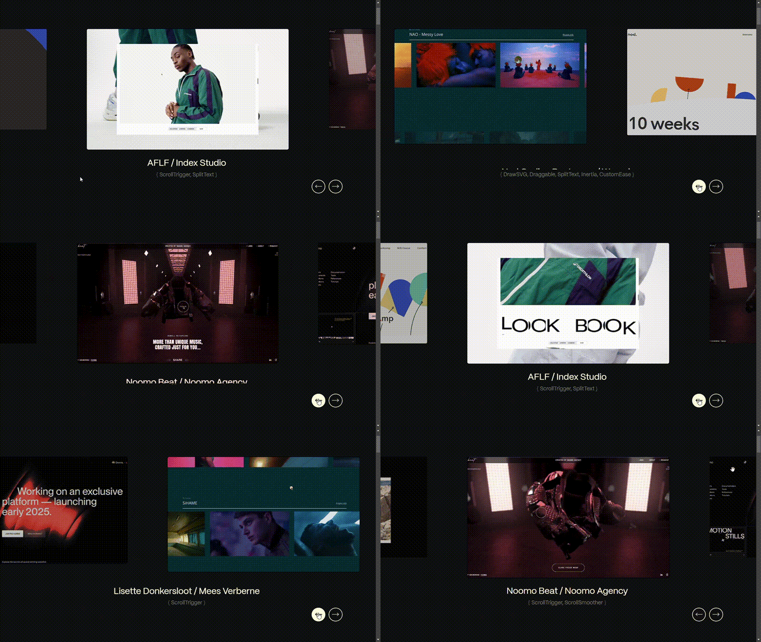
Quick disclaimer: Technically speaking, GSAP isn’t a CSS animation tool, as it relies on JavaScript. However, it’s such a versatile animation library that I had to include it in this list.
GSAP is a powerful JavaScript animation library that allows you to “animate anything JS can touch.” It is a must-have tool if you’re particular about adding all kinds of animations to your website. There’s almost no type of animation you can’t create with this tool; even simple to complex hover animations.
When it comes to GSAP, the limit is your imagination and your ability to learn complex types of animations in depth. The gif below shows a showcase of animations created with GSAP.
There are only so many CSS animation tools we can cover. However, other notable ones worth mentioning include:
- TheAppGuruz’s keyframe animation generator
- DevTools’ CSS animation generator
- Toptal’s animation code generator
- Front-end Tools’ CSS transition generator
- CSS Portal’s CSS keyframe animation generator
- Web Code Tools’ CSS animation generator
Conclusion
Animations can transform a website from static and functional to dynamic and engaging.
In this article, we’ve explored 40 CSS animation examples, ranging from simple, CSS-only effects to more complex ones that need JavaScript.
Whether you’re looking to add subtle enhancements or bold, eye-catching interactivity, these animations can help you bring your website to life. Experiment with and customize them to suit your brand, and watch as your website becomes more memorable and engaging to web visitors.


