CSS Text Animations: 40 Creative Examples to Try

Did you know the average internet user visits over 15 websites a day? So, how do you keep your visitors engaged and focused on your content? One way is by adding text animations. Done right, they can grab attention, add personality, and keep visitors' engaged long enough to make an impact.
In this article, we’ll explore 40 creative CSS text animations featuring ten custom animations I've personally created, plus 30 additional hand-picked examples from talented CodePen creators. Each one comes with a live demo and code, so you can dive in and try them out. Let’s get started!
40 examples of CSS text animations
In this listicle, we won’t just be exploring the 40 examples. We’ll also look at the technologies and the core CSS principles used for each one. Let’s start by checking out 10 custom examples. After that, we’ll see 30 others created by developers across the web.
Custom text animations
1. Explosive letter burst on hover
Explosive letter burst on hover
Interactive CodePen loads when it gets near the viewport.
This animation creates an "explosive" visual effect when the user hovers over the text. The text slightly enlarges, and two circular bursts radiate outward, giving the appearance of an explosion.
The animation relies on the following CSS features and definitions:
::beforeand::afterpseudo-elements: The animations are attached to these elementsradial-gradient(docs): Applied to the pseudo-elements to simulate the colorful burst effect@keyframes burst(docs): Animates the pseudo-elements to create the explosive effect
2. Dancing shadow
Dancing shadow
Interactive CodePen loads when it gets near the viewport.
This CSS animation creates a "dancing shadow" effect where the text's shadow shifts dynamically in opposite diagonal directions. The shadows alternate between two colors and move inwards and outwards. It relies on:
text-shadow: To create the colorful shadow layers around the text@keyframes shadow-dance: Animates the text-shadow property to shift shadows dynamically
3. Melting text
Melting text
Interactive CodePen loads when it gets near the viewport.
This CSS animation creates a "melting text" effect where the text visually appears to droop and dissolve downward, resembling liquid dripping. Key CSS features used include:
::beforepseudo-element: Adds a semi-transparent layer to simulate the initial stage of dripping::afterpseudo-element: Adds a blurred, faded version for a more pronounced liquid effect. Thefilter: blur(10px)property is also applied to::afterto make the melting effect more pronounced@keyframes melt: Animates the main text to gently bob up and down, mimicking a drooping motion@keyframes drip: Animates the pseudo-elements to stretch and fade, creating the dripping effect
4. Matrix
Matrix
Interactive CodePen loads when it gets near the viewport.
This animation creates a "Matrix-style" digital effect to simulate the green text and "rain" commonly associated with the movie The Matrix. It relies on:
text-shadow: Creates the glowing effect around the textclip-path: Used to crop parts of the::beforetext, simulating a "glitch"repeating-linear-gradient(docs): Creates the rain-like background@keyframes rain: Handles the vertical translation of the “rain” background@keyframes glitch: Animates the text distortion effect
5. Text masking
Text masking
Interactive CodePen loads when it gets near the viewport.
This is a masked text animation effect where a background image is clipped to the text, creating a visually engaging "shimmering" effect. Here's a breakdown of the core CSS features used:
color: transparent: Makes the text itself invisible, so only the background image appearsbackground-clip: text: Clips the background image to the shape of the text@keyframes animate-background: Moves the background image horizontally from left
6. 3d spin
3d spin
Interactive CodePen loads when it gets near the viewport.
This animation creates a 3D spinning text effect with vibrant shadows for depth and color. Here's an overview of the features used:
text-shadow: Multiple text shadows are used to give the text a 3D-like appearancetransform: rotateY(0deg): Sets the initial rotation angle on the Y-axistransform-style: preserve-3d: Ensures that child elements (if any) retain their 3D transformations
From text to 3D animations
Ready for next-level text effects? Learn to animate 3D models and create scroll-triggered experiences in our interactive course! We guide you through building a scroll-animated 3D landing page using Next.js 14, GSAP, Prismic, Three.js, Tailwind, and TypeScript.
7. Glitch effect
Glitch effect
Interactive CodePen loads when it gets near the viewport.
This animation does what it says: it creates a glitch text effect and simulates a digital distortion. It relies on:
::beforeand::after: Create duplicate layers of the text.clip-path: polygonis applied to these pseudo-elements to mask specific parts of their texttransform: translate: Shifts the text slightly in various directions to create the distortion effect@keyframes glitch: Animates the movement of the text
8. Neon glow
Neon glow
Interactive CodePen loads when it gets near the viewport.
This animation creates a neon glow text effect with a dynamic glow animation that alternates between two colors. It works with the following CSS features and definitions:
text-shadow: Creates the glow effect with multiple layers of progressively larger blurs@keyframes glow: Animates the text shadows as the colors alternate
9. Wavy text
Wavy text
Interactive CodePen loads when it gets near the viewport.
Everyone loves waves 🏄, and while it isn’t the same as being on the beach, this wavy animation creates a wave-like motion among the individual letters in the word “WAVE.” It relies on:
@keyframes wave: Applies the continuous wave-like animation to each letteranimation-delay: A 0.2s delay is applied to each letter, so their animation kicks in slightly after the previous one
10. Split text
Split text
Interactive CodePen loads when it gets near the viewport.
This animation creates an effect where two parts of a word (CON and JOINED) slide in from opposite directions and join at the center. It works with the following:
transform: translateX: Positions both parts of the text off-screen initially@keyframes slide-in-left: Moves the left text from the left end to its center position@keyframes slide-in-right: Moves the right text from the right end to its center positionanimation-fill-mode: forwards: Ensures the text remains in place after the animation ends
That’s it for the custom CSS text animations. Now, let’s move on to examples from other developers. We’ll start with checking out 3d text animations; View this Codepen collection to see other text animations I created.
3d text animations
11. Glowing 3D text
Glowing 3D Text
Interactive CodePen loads when it gets near the viewport.
The glowing 3D text effect by Bennett Feely gives the “3D CSS GLOW” text a dynamic rotation in 3D space. It works with the following:
@keyframes wobble: Defines the 3D rotation movements@keyframes glow: Defines the glow color transitionstext-shadow: Creates the glowing effect around the text by applying a shadow that changes color during the glow animationtransform-style: preserve-3d: Ensures that the child elements (<h1>tags) of the container (<figure>) are rendered in a 3D spacetranslateZ: Positions each text layer at different depths to create the stacked 3D effectrotate3d: Rotates the entire figure along multiple axes to add dynamic movement
12. “HEY” 3D animation
“HEY” 3D animation
Interactive CodePen loads when it gets near the viewport.
Next on the list is the “HEY” 3D animation by Radu Bratan. This animation uses vibrant colors and dynamic shadows to give the text a pulsating and heartbeat-like effect. The core CSS concepts powering this animation are:
- Text shadows
- CSS transforms
- CSS Flexbox
13. 3D text marquee effect
3D text marquee effect
Interactive CodePen loads when it gets near the viewport.
Like others, Comehope’s 3d text marquee effect isn’t an actual 3D animation but a mirage of one. The animation creates the illusion of text passing through the corner of a 3D box by combining perspective transforms, clipping, and marquee motion. CSS features used include:
- Perspective and 3D transforms
transform-origin: Ensures the rotation occurs from the correct side@keyframes marquee: Defines the smooth motion of the text across the panels
14. Nabla color font
Nabla color font
Interactive CodePen loads when it gets near the viewport.
The Nabla color font by Scott Kellum creates a "pulsing" 3D depth effect for each letter in the text "COLOR FONTS!" The letters animate in a staggered sequence with different delays, creating a visually engaging cascading effect.
The major CSS features and definitions used in this animation are:
font-variation-settings: Adjusts theEDPT(extrusion depth) of the Nabla font to change the 3D depth dynamically@font-palette-values: Applies a specific color palette to the variable font to customize its appearance- CSS Grid
- SCSS features
@forloops and#{$variable}syntax for generating repetitive styles and interpolation
15. 3D rotate
EAT SLEEP RAVE - 3D ROTATE
Interactive CodePen loads when it gets near the viewport.
The 3D rotate animation by Emilio displays the text "EAT SLEEP RAVE," rotates the text along its X-axis, and arranges it in a circular formation that resembles a cylinder. The major CSS features and definitions used in this animation are:
transform-style: preserve-3d: Ensures that child elements retain their 3D positioning@keyframes animate: Rotates the entire container around the X-axis for a continuous spinning effecttransform: perspective: Creates an illusion of depth and makes the object farther away from the viewer. This makes the 3D scene more realistic
Slide-in text animations
16. Text animation with background
Text Animation with background
Interactive CodePen loads when it gets near the viewport.
The text animation with background by Yemon is a classic example of slide-in text. However, they take things a step further by changing the page’s background as the text switches.
The secret to this animation is two keyframes:
roll: creates the drop-in and fade-out text effectbg: cycles through different background colors
17. A Gooey Marquee
A Gooey Marquee
Interactive CodePen loads when it gets near the viewport.
A Gooey Marquee by Amit Sheen gives off a "Gooey Marquee" effect, where text melts out of one side of a glowing wall and melts into the other side of the wall. It's a cool animation that looks like something out of a ghost movie and relies on:
- CSS filters: To create the gooey blur effect
@keyframes marquee: creates for the continuous horizontal motion of the text
18. Ghosts and Ghouls
Codepen Challenge: Ghosts and Ghouls
Interactive CodePen loads when it gets near the viewport.
Ghosts and Ghouls by Sicontis is another ghost-like animation. In this case, though, the text isn’t sliding from one side to the other; a ghost icon is.
@keyframes ghostMove: Moves the icon across the screenmix-blend-mode: exclusion: Creates the dynamic color effect when the ghost passes through the text
19. Schitt’s Creek title animation
Schitt's Creek (CSS) title animation
Interactive CodePen loads when it gets near the viewport.
The Schitt’s Creek title animation by Rob animates two groups of text: the main text (Schitt Creek) and the superscript (s). It's a simple slide-in animation that adds some flair by giving the superscript a shimmer effect at the end.
This animation relies on the following keyframes:
pop-word: Causes the word to rotate and become visibleshow: Makes the word fade in from opacity 0 to 1bar-scale: Makes the superscript "s" bar appearsparkle: Scales and moves the sparkle effect around the superscript "s"shimmer: Adds a text-shadow glow effect to the superscript "s"
20. Text frame border rotation
Text frame border animation rotation that [ONLY CSS]
Interactive CodePen loads when it gets near the viewport.
The text frame border rotation animation — I know; it’s a mouthful — by Fernando Cohen switches things up a bit. Instead of text sliding in and out, it rotates around a picture frame. Not only that but when you hover over the image, some CSS magic happens. Check it out for yourself 👇.
This animation relies on a frameMove keyframe to rotate each character (using the rotate() function) around the edges of the frame.
CSS Typing Effects
21. Typewriter Effect
Typewriter Effect in pure CSS
Interactive CodePen loads when it gets near the viewport.
The Typewriter Effect by Frank Eno is a good example of the typewriter effect with a blinking cursor. Here's a breakdown of how it works:
@keyframes typewriter: Controls the typing effect by gradually expanding the width of the text.@keyframes blinkingCursor: Creates the blinking effect of the cursor.cursorclass: Gives the text a white right border, which is the cursor that shows
22. Typewriter text animation
CSS-only typewriter text animation
Interactive CodePen loads when it gets near the viewport.
The typewriter text animation by Alvaro Montoro creates a dynamic typewriter effect and has different variations of a blinking cursor present. It relies on:
- The
typewriter,thick, andnocaretclasses that define the normal, thick, and no cursors, respectively @keyframes typing: Simulates the typing effect@keyframes blink: Causes the cursor to alternate between fully visible (opacity: 1) and invisible (opacity: 0)
23. Gradient typing effect
Gradient typing effect in CSS
Interactive CodePen loads when it gets near the viewport.
The Gradient typing effect by Jasmine G is another straightforward implementation of this type of text animation. It relies on these keyframes to work:
blink: Create a blinking cursor effect by toggling theborder-colorbetween visible and transparenttype: Makes the text appear letter by letter, simulating a typing effect
24. Editor illustration
Editor Illustration
Interactive CodePen loads when it gets near the viewport.
There’s a lot going on in the Editor illustration by Klare. However, we’ll focus on the typing animation, which relies on the following CSS features and definitions:
typing-1,typing-2,typing-3,typing-4, andtyping-5: Each of these keyframes animates the width of a specific line of code over time to simulate the typing effectcursorandcursor-persisthandle the blinking effect of the cursor by animating itsborder-colorproperty- SCSS features
@forloops for generating repetitive styles and interpolation using#{$variable}syntax
25. Typing text
Typing Text
Interactive CodePen loads when it gets near the viewport.
The Typing text effect by Swarup Kumar Kuila is yet another CSS text animation where the text is revealed like its being typed out on the screen. However, in this example, some wave animations were added to the background. It relies on:
@keyframes type: Creates the typing effect@keyframes bg-animation: Creates the background animation
Hover text animations
26. Animated text hover
ANIIMATED TEXT HOVER IN CSS
Interactive CodePen loads when it gets near the viewport.
We open up this group of CSS text animations with the animated text hover by Clovis Neto. Here, the text “STRONG” splits in half on hover and reappears again. This animation relies heavily on CSS pseudo-classes and pseudo-elements:
::beforepseudo-element on theptag: This usestransform: translateXto create the underline effect we see on hoverspan:first-child(top half) andspan:last-child(bottom half): These are positioned slightly outside the visible area usingtransform: translateYand animate into view on hover
27. Link split hover effect
Link Split Hover Effect
Interactive CodePen loads when it gets near the viewport.
Like the first, this is also a split hover effect, and it was created by James Hancock. The only difference is that this split effect is more pronounced and the text is literally cut into 2 when you hover over it. Talk about CSS magic.
They say a magician never reveals their secret, but here’s how this one works:
- CSS clip-path property: Used to create custom shapes for the text elements (
link--topandlink--bottom). These are the two halves we see on hover - CSS transforms (
translateY,rotateZ, andscaleX): These are used to animate the two halves into view on hover
28. Text hover transition
CodePen Home CSS Text Hover Transition #cpc-pop
Interactive CodePen loads when it gets near the viewport.
Rafaela Lucas’ text hover transition relies on a single h1 element powered by ::before and ::after pseudo-elements:
::before: When the.textcontainer is hovered,::before, with the pink background, expands toheight: 100%. This creates the effect of a pink bar sliding down over the text::after: Has a white background that slides in after the pink one, creating a two-layered background effect
29. CSS text hover effect
Css Text Hover Effects
Interactive CodePen loads when it gets near the viewport.
This text hover effect by parkHJ11 gives off a sort of hamburger vibe with the “in yourself” text placed between two “believe” texts. It relies on:
clip-path: To clip the top and bottom halves of the “believe” texts on hover- CSS transforms (
translateYandscaleY): To make the different text slide into view on hover
30. Text hover
Text Hover
Interactive CodePen loads when it gets near the viewport.
The text (”Line”) in Gayane Gasparyan’s text hover effect starts with a bold, colorful shadow effect and a thick stroke. When hovered over, the text’s weight lightens, becomes non-italic, and loses its shadow. This animation relies on:
ft-varionation-settings: This allows you to control specific variations of a variable font. In this case, it is set to"wght" 900, "ital" 1before hover and becomes"wght" 100, "ital" 0on hover
CSS text color animations
31. The aurora
The aurora
Interactive CodePen loads when it gets near the viewport.
The aurora animation by Ostylowany uses CSS magic to replicate an aurora effect — think “Northern lights. It relies on:
mix-blend-mode: To make the colors blend where they overlapborder-radius: There are several border-radius values that give the colors an organic blob-like shapefilter: blur(): For the soft, glowing effect that's essential for the aurora appearance
32. City nights text effect
City Nights Text Effect
Interactive CodePen loads when it gets near the viewport.
The city nights text effect by Philip Zastrow is a glowing and colorful one with a pulsating text effect. It relies on the @keyframes rule to animate the color and text-shadow of the <h2> element:
@keyframes lights: Changes thecolorandtext-shadowof the text over timecolor: Changes between different shades of blue (usinghsl()values)text-shadow: Creates a glowing effect by layering shadows with varying opacity and spread
33. Text shadow animation
Text shadow animation (CSS) but I'm being extra
Interactive CodePen loads when it gets near the viewport.
Natalia’s text shadow animation gives the effect of 2 sets of colors sliding in consecutively and “painting” some piece of text. It relies on the following CSS properties:
overflow: hidden: Creates the cutting mask for the reveal@forloop: Generates staggered delays for each word’s animationmax-widthandmax-heightkeyframes: Animates the horizontal and vertical flow of the colors over the text
34. Holographic type
Holographic type
Interactive CodePen loads when it gets near the viewport.
The holographic type animation by Jimmy Chion gives off the effect of text hovering over a 3d-like platform. It relies on:
@keyframes cube-rotate: Uses transforms (perspective()androtate3d()) to rotate the platform back and forth and give it depth@keyframes shimmer: Usesfilter()to create a dynamic gradient that cycles between brightness levelsmix-blend-mode: Creates a unique holographic aesthetic
35. Rainbow spotlight
Rainbow spotlight
Interactive CodePen loads when it gets near the viewport.
Shireen Taj’s Rainbow spotlight animation creates a moving spotlight effect on a large, bold piece of text. As the spotlight moves through the text, it creates a rainbow gradient background. Key CSS features used include:
h1:before: Its background is a rainbow gradient that creates the illusion of color moving over the textclip-path: Gives the spotlight an ellipsis shape as it moves through the text@keyframes swing: Transitions theclip-pathposition, giving the text a spotlight-like movement
First time here? Discover what Prismic can do!
👋 Meet Prismic, your solution for creating performant websites! Developers, build with your preferred tech stack and deliver a visual page builder to marketers so they can quickly create on-brand pages independently!
Variable font animations
36. Breathe variable font animation
Breathe animation – Variable Font, HTML
Interactive CodePen loads when it gets near the viewport.
The Breathe variable font animation by Type Forward makes the font appear as if it's "breathing" by dynamically adjusting the font weight. It relies on:
font-variation-settings: Changes the font’s weight from100(thin) to900(bold)@keyframes letter-breathe: Animates the change in font weight to create the breathing effect
37. Font transition on hover
CSS Variable font transition on hover
Interactive CodePen loads when it gets near the viewport.
The font transition on hover animation by Don Lyckman transitions from a thin to a bold style when the user hovers over the text. It also uses the font-variation-settings property to adjust the font’s weight from 100 to 1000.
38. Curved Dusseldot
Curved Dusseldot - Variable Fonts
Interactive CodePen loads when it gets near the viewport.
The Curved Dusseldot by P creates a mesmerizing circular text animation using variable fonts and rotation. The animation relies on the following:
font-variation-settings: Changes the width ("width") of each character, giving it a pulsating effect during animationspin#{$i}keyframe animations: SCSS@forloop generates unique@keyframesanimations (spin1,spin2, etc.) for each character. The animation places each character on a circular path usingtransform: rotateand rotates each one independently
39. Work/Life font animation
Work/Life - Variable Fonts animation
Interactive CodePen loads when it gets near the viewport.
The Work/Life font animation by Gayane Gasparyan creates a dynamic "WORK LIFE BALANCE" text effect using variable fonts where "WORK" and "LIFE" alternate between thick/wide and thin/narrow styles. It works with the following:
@keyframes swapthings: Defines thefont-variation-settingsfor the “WORK LIFE” text container and animates the font's weight and width for those texts@keyframes swapthings2: Defines thefont-variation-settingsfor the “WORK” text and animates the weight and width of its font. It ensures that "WORK" and "LIFE" have opposite styles. That way, when "WORK" is bold, "LIFE" is light, and when "WORK" is light, "LIFE" is bold
40. “Draw in” text effect
"Draw In" Text Effect with Decovar
Interactive CodePen loads when it gets near the viewport.
The “Draw in” text effect by Mandy Michael creates a dynamic "I/O" text effect using variable fonts, gradients, and shadow layers. It works with:
text-shadow: Purple shadows are applied to the::before,::after, andspanelements to give the text depth and create a glowing 3D-like appearance- Pseudo-elements: The
::before,::after, and<span>::beforeelements add layers to the text and are positioned behind it withz-index @keyframes draw: Usesfont-variation-settingsto animate the 'DRAW' axis of the font between two extremes:1000(its fully drawn-out appearance) and 0 (its compressed or minimal appearance)
Text animation tools and libraries you should know
So far, we’ve explored various types of text animations. Let’s be honest: while these animations are great and engaging, they can be tricky to make, especially when you have limited experience working with CSS. Thankfully, you don’t need to make them all from scratch. There are open-source solutions you can use.
These tools aren’t strictly dedicated to making text animations. However, you can use them for that purpose. Let’s explore them.
Animate.css
Animate.css is a lightweight — 5.2kb (minified + gzipped) — CSS animation library. It is widely used and has over 80k GitHub stars.
Animate.css provides 16 categories of animations and 90+ animations in total. This ensures you have a wide range of CSS animation types, styles, and effects to explore. The gif below shows some of these animations in action.
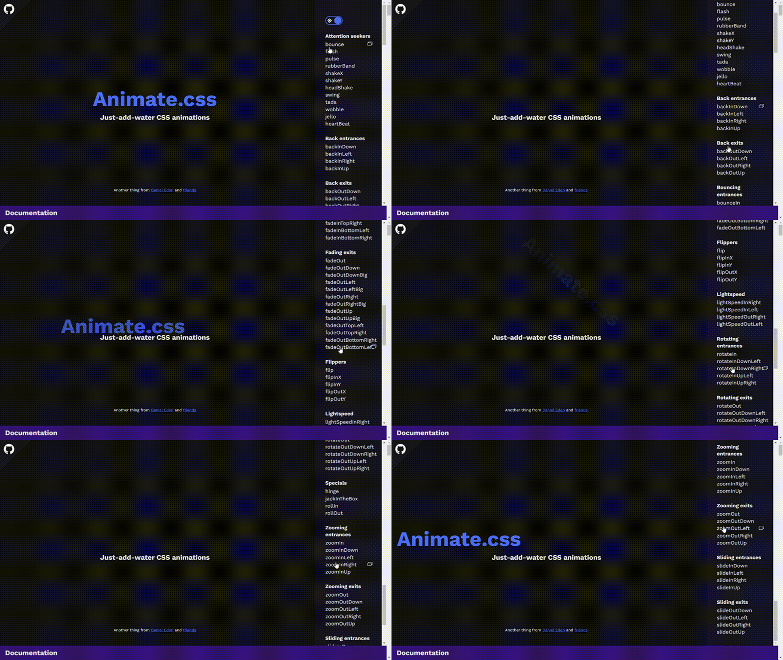
Another secret to its success and wide adoption is that it is easy to learn and use. All you need to do is install the library, import its CSS file into your app, and apply its special classes like animate__animated.
Animsta
Animsta is a versatile CSS animation library for animating text, background colors, SVGs, images, and more. It provides different types of animations, including entrance and exit animations. As for text animations, Animsta provides over 50 of them, including ones for blur, focus, shadow, and pop-up effects.
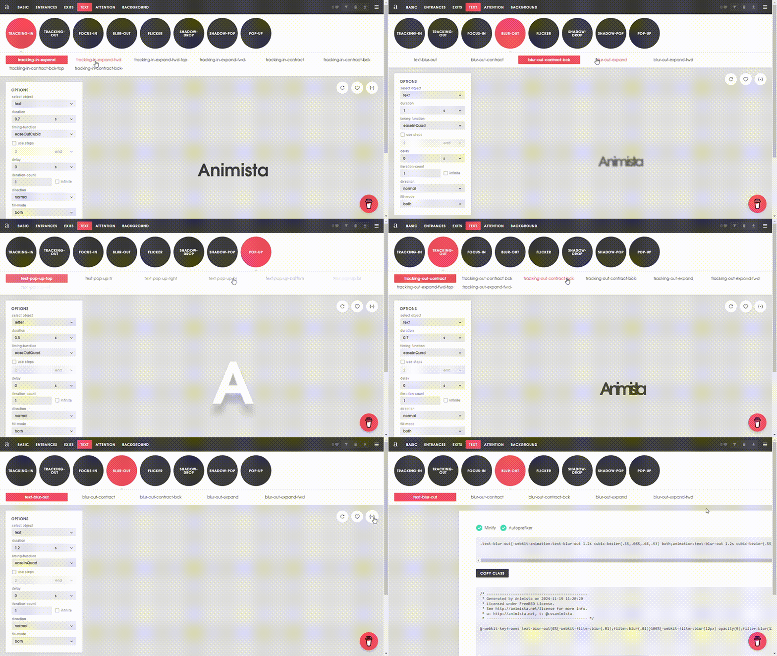
An interesting thing about Animsta is that unlike other libraries where you have to install their npm packages, Animsta gives you access to the code for your desired animation. It does this via itsplayground environment where you can test its animations and copy their code (classes and keyframes) to paste into your project.
Loading.io
Loading.io is a comprehensive online platform for all your online needs. It provides tools for animating images, texts, icons, spinners, and backgrounds. It also has CSS and JavaScript libraries for loading animations, button animations, and transitions.
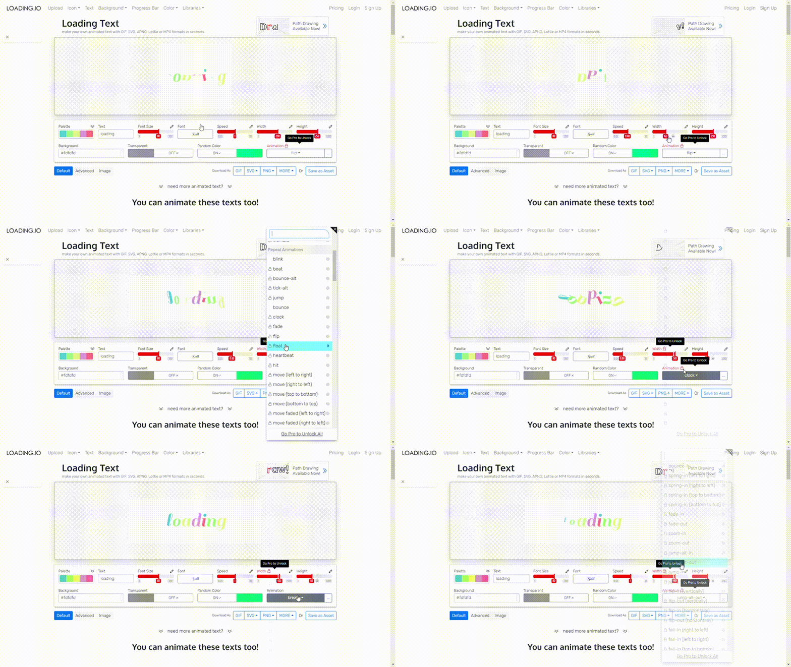
When it comes to text, Loading.io provides over 130 animations for you to work with. The animations are extremely unique and eye-catching, which is something I love. You can export texts as GIFs, SVGs, PNGs, JPGs, MP4s, and Lottie files.
Overall, Loading.io is a great platform to explore. The only downside is most of its animations are paid for; less than 20 of them are free.
Conclusion
You can never go wrong with adding animations to your website and web app. Or can you?
While animations are a great way to add eye-catching visual flair to your websites, it's important to be moderate and consider factors like accessibility, performance, and animation overload for your visitors. Ensure that you don't add too many animations and that they aren't overwhelming for your visitors.
Lastly, explore the different CSS text animation examples we've covered in this article and include them in your site(s).


