Tailwind CSS and Bootstrap continually come up in CSS conversations across developer communities. Developers want to know their differences and similarities and which one is better.
CSS frameworks and their unique design systems have been a staple of web development over time, with new ones regularly being released. It’s only natural to question if a new one is better than the existing one. So, in this post, we will compare one of the longest-running CSS frameworks, Bootstrap, with one of the newer ones, Tailwind CSS, to see the differences and similarities and how to choose between them.
What is Bootstrap?
Bootstrap is one of the longest-running CSS frameworks still in use; it was created and open-sourced in 2011 by Twitter. One of its biggest strengths is that it provides CSS-based templates and classes for common components that put responsiveness and mobile-first design at the forefront. For example, if you want to make a dropdown in Bootstrap, you can use dropdown-menu and dropdown-item classes, respectively, on the container and child elements, and Bootstrap will automatically apply all of the required CSS in the background to style these components as dropdown menus or items.
Let’s take a look at an example application of Bootstrap:
Copy
<div class="dropdown">
  <a class="btn btn-secondary dropdown-toggle" href="#" role="button" data-bs-toggle="dropdown" aria-expanded="false">
    Dropdown link
  </a>

  <ul class="dropdown-menu">
    <li><a class="dropdown-item" href="#">Action</a></li>
    <li><a class="dropdown-item" href="#">Another action</a></li>
    <li><a class="dropdown-item" href="#">Something else here</a></li>
  </ul>
</div>
The above code block demonstrates some of Bootstrap's out-of-the-box component styling and utility classes, for example:
- Applying
.dropdownto the parent container - Using
.btnand.dropdown-toggleon the toggle button - Adding
.dropdown-menuon the menu container - Applying
.dropdown-itemon each menu item link
Bootstrap handles applying the required CSS for dropdown styling and functionality based on these classes.
What is Tailwind CSS?
Tailwind CSS, on the other hand, was created in 2017 by Adam Wathan and Steve Schoger. It describes itself as a “utility-first CSS framework packed with classes to build any design.”
Unlike Bootstrap, Tailwind CSS doesn’t come with prebuilt classes like dropdown-menu and dropdown-item for components. Instead, it operates at a much lower level using utility classes like px-4, text-center, and rounded-full. These are all abstractions of traditional CSS properties: padding-x, text-align, and border-radius. But instead of writing CSS yourself and worrying about things like class naming conventions, Tailwind CSS handles it all for you, and you just need to use the classes directly on the elements you wish to style.
Besides utility classes, Tailwind CSS provides you with the tools to do it quickly and easily. For example, Tailwind CSS comes with a great IDE integration in VS Code that helps you autocomplete suggestions, lint your classes, and provide class definitions — all without you needing to leave your editor.
Another thing to note about Tailwind is that it has been a source of inspiration for many other CSS frameworks and UI component libraries like Daisy UI and Flowbite.
Now let’s take a look at a basic example of Tailwind CSS in action:
Now let’s take a look at a basic example of Tailwind CSS in action:
<div class="bg-gray-200 p-4 flex gap-x-4">
  <img src="photo.jpg" alt="..." class="w-32 h-32 rounded-full">
  <div>
    <h2 class="font-bold text-lg">Lizard</h2>
    <p class="text-gray-600">Lizards are a widespread group of squamate reptiles, with over 6,000 species, ranging across all continents except Antarctica</p>
  </div>
</div>
This shows an example application of different Tailwind CSS utility classes, such as:
bg-gray-200for the background colorp-4for paddingflexfor layoutgap-x-4for horizontal spacingw-32andh-32for image width and heightrounded-fullfor round image stylingfont-boldandtext-lgfor text styling
The utilities are composed to create styled components without needing custom CSS.
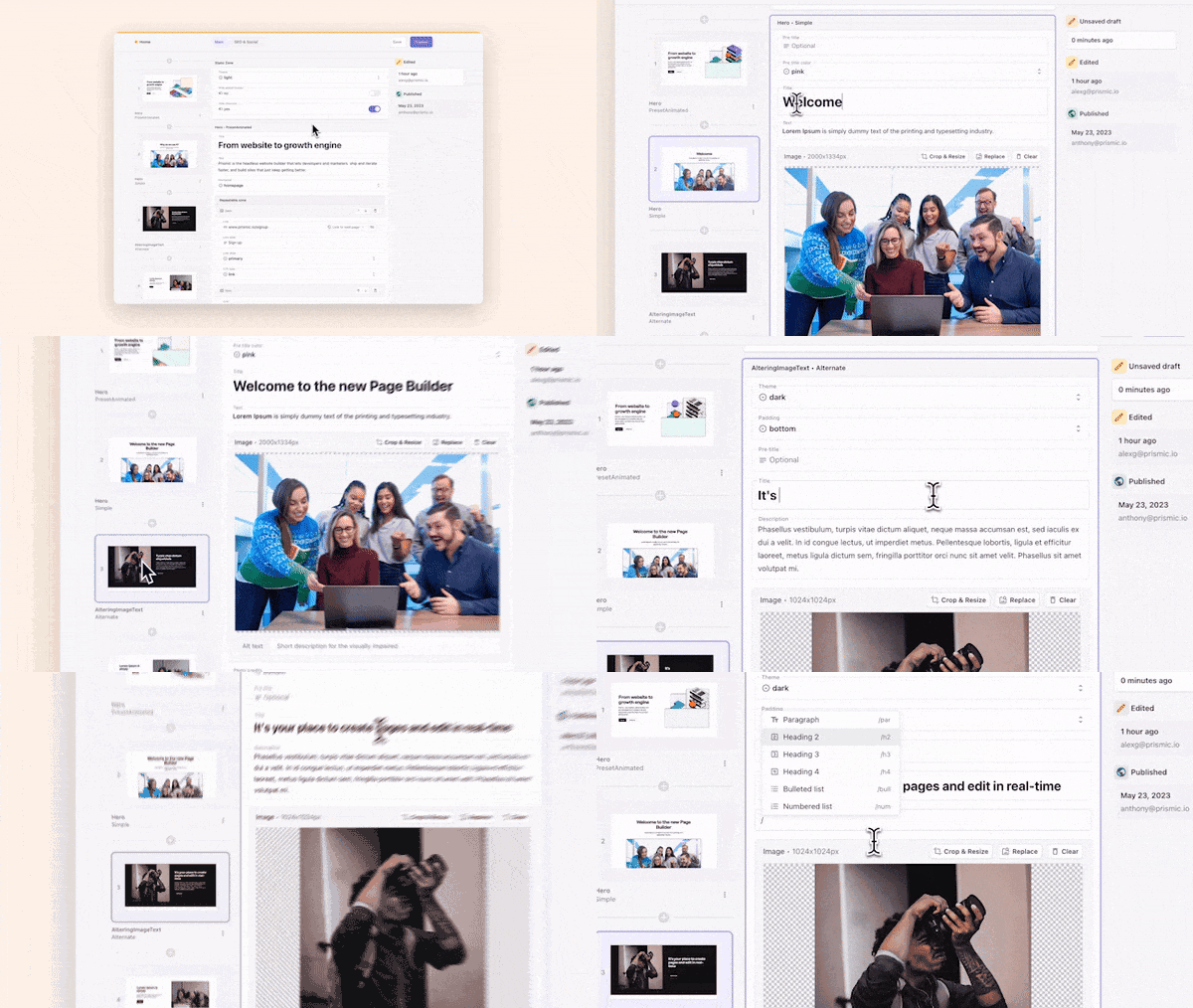
Deliver a fast website with a visual Page Builder
Prismic is a headless solution, with a visual Page Builder for your marketing team to release pages independently.
Why compare Tailwind vs Bootstrap?
Bootstrap was released in 2011, and in that time, web development has evolved and new technologies have emerged. Just because something — in this case, Bootstrap — has been around for a long period of time doesn’t instantly make it the best tool for the job. We need to compare it to newer tools to establish what the best tool for our scenario is.
But why Tailwind CSS? Tailwind CSS has gained a large following in a relatively short period of time, and it has a lot of momentum behind it. It’s quickly becoming one of the most popular frameworks used in modern web development. This makes it the perfect candidate to compare against Bootstrap. So, is the new kid on the block the best or is the old tried-and-tested method still better?
The differences between Bootstrap and Tailwind
Component-based approach vs utility-first approach
Bootstrap provides a set of pre-designed components for elements like buttons, forms, navbars, etc., that you can easily integrate into a project. Bootstrap's components are ready to use out of the box, making it a great choice for developers who want to quickly build a website without spending too much time on styling. However, this can sometimes lead to websites looking similar to one another, as many developers use the same default Bootstrap styles.
On the other hand, Tailwind CSS follows the utility-first approach, which means that it provides a set of utility classes that can be used to style elements directly in the HTML markup. This gives YOU more flexibility and control over the styling of your website, as they can quickly apply styles without having to write custom CSS. However, this utility-first approach can lead to HTML markup that is cluttered with too many classes.
Loading and setup strategies
Both are different architecturally as well. Bootstrap can be loaded from a CDN or downloaded and hosted on your server as a CSS file. Tailwind CSS, on the other hand, generates a CSS file in your project by reading your source files and their class names, producing a bespoke set of classes.
Performance
In terms of performance, Tailwind CSS tends to create smaller CSS files compared to Bootstrap, as it only generates the styles that are actually used on the website. This can help reduce the overall file size of the website, leading to faster load times and improved performance. Bootstrap, on the other hand, may result in larger CSS files due to its extensive list of components and styles.
Utility-first CSS framework
Component-based framework plus utility classes
All styles defined in utility classes
Pre-defined classes for each component
Highly customizable with composable utilities
Less flexible, relies on pre-made components
Requires Node.js and npm for setup
Can be used via npm, but also works with a simple CDN link
Customizable themes using a configuration file
Offers pre-designed themes and templates
Includes responsive styles
Includes responsive styles
An opinionated component library is available, such as Tailwind UI, a commercial product.
Comes with extensive component library
Steeper learning curve due to new utility-first paradigm.
Easier for beginners familiar with CSS
Smaller community but very helpful resources due to a rise in popularity
Massive community resources
Provides functionality for dark mode
Supports dark mode
Compatible with various JavaScript frameworks like React, Vue, etc
Compatible with various JavaScript frameworks like React, Vue, etc
How are Tailwind and Bootstrap similar?
Both frameworks abstract the actual CSS away from your workflow, so you no longer need to worry about writing tons of CSS directly and can focus more on building your user interface (UI). This is possible because you only need to use the various class names in your HTML markup, and the frameworks will handle all the actual CSS for you behind the scenes. While some say this approach of using lots of classes in your HTML markup leads to a busy-looking markup, it's hard to argue against the fact that these frameworks both simplify and speed up building UIs.
Although they've been around for different periods, they're both in production for high-profile and successful companies, proving they can be used in large deployments and at scale. According to StackShare, Bootstrap is used by over 42k companies, with names like Spotify, Udemy, and Twitter standing out. On the other hand, According to BuiltWith, Tailwind CSS is used on over 270k live websites.
Key considerations for choosing between Bootstrap and Tailwind CSS
Answering questions about you or your project might help you choose between Tailwind CSS and Bootstrap.
How much design work is acceptable for you?
As alluded to earlier on, Tailwind requires more design work than Bootstrap. While Bootstrap offers prebuilt CSS components out of the box for you to use, Tailwind does not. This means you need to design and build all your components from scratch. If designing isn't your strongest skill set or your project is on a tight deadline, and there's little time allowed for design, you may go with Bootstrap and its prebuilt components to save time.
Is development speed more important than a unique-looking website?
While Bootstrap's prebuilt CSS components will speed up your development and take the need for designing away from you, it does come with a trade-off. Your website is likely to look more generic. As mentioned in the previous section, Bootstrap is reportedly used by over 40k companies. There are only so many times you can reshuffle and re-skin prebuilt components before patterns emerge.
Now, if the website's design isn't the focal point of the project and it doesn't need to be a completely custom design, prebuilt CSS components may be the way to go. But, if having a unique design is vital to the project or your brand identity, then having the freedom to build completely custom UIs might be the best choice, and that's what Tailwind CSS offers.
Is a UI kit for you?
This consideration closely relates to the first one. Bootstrap has prebuilt components that speed up your development and give you repeatable and responsive design elements quickly and easily. Tailwind CSS does not have this, but it is worth noting again that the creators of Tailwind CSS do offer a UI kit called TailwindUI — as we mentioned, this is a paid optional extra and, unlike Bootstrap, is not included in the core offering.
UI kits can be great; they offer you speed and reusability. But they can also limit what you can achieve with your design. This is because UI kits only have so many components within them, and because your design needs to utilize these components, you're limited by the number of ways they can be rearranged. It would help to consider this trade-off when choosing between Tailwind CSS and Bootstrap.
It is also worth mentioning, though, that just because Tailwind CSS doesn't include a UI kit from the get-go, you could always create one for your project using it; then you would get the benefit of a UI kit and the flexibility of Tailwind CSS at the same time.
Is one better than the other?
Okay, so let's tackle the real question you came to this post for. Is one of these CSS frameworks better than the other for developers? Both are good choices for projects, so if one is better than the other is a personal preference more than an objective. It depends on many things in web development, especially in design.
If you like the freedom to make completely custom components and designs from the ground up without worrying about actually writing CSS and managing the files and selectors that go with it, Tailwind CSS is a no-brainer. But, if designing isn't your strong suit and you'd rather not think about it all, something like Bootstrap that offers prebuilt UI components and more of a "bring your content" approach might be for you. Bootstrap appeals to a lot of backend developers for this reason.
What about vanilla CSS in 2024?
Another option is not using a CSS framework at all. Because CSS frameworks are growing in popularity, it doesn't mean they should be the only thing we use. CSS is still a good choice in 2024. It can still produce excellent-looking websites and UIs.
In reality, all Tailwind, Bootstrap, and other CSS frameworks do is abstract writing CSS away from the developer, providing a more efficient method for making the same excellent websites and UIs. Sure, they also have added benefits like prebuilt CSS components like Bootstrap or a design framework/system like Tailwind CSS. But at their core, they're just ways to write CSS more efficiently and let you focus on building your website and styling it in the markup rather than worrying about naming classes and selectors.
Of course, this raises the question of why bother with a CSS framework. I think vanilla CSS is a powerful tool that can produce fantastic results. But, if you're serious about building and scaling a project, the efficiency gains and workflows offered by CSS frameworks like Tailwind CSS are worth their weight in gold.
Will you use Tailwind CSS or Bootstrap for your next project?
You might have guessed the conclusion for this post already, but which CSS framework you use (or if you use one at all) depends on you, your experience with CSS, and the situation you find yourself in. Bootstrap might be the way to go if you're not a designer and want to create a quick and easy UI for people. But, if you want complete freedom with your design and the ability to create custom designs and components easily, Tailwind CSS is the better choice.
I'm firmly in the Tailwind CSS camp; I'm not an award-winning designer, and I doubt I will ever be. But, because of the system Tailwind CSS has in place and forces on you, it's hard to make a bad-looking design. Yes, your HTML markup looks busier than average, but I prefer having that to maintaining separate files of CSS with their classes, IDs, and attributes.
So, what about you? What camp do you fall into? Do you use CSS frameworks? And, if so, what is your favorite?
Let us know over on Twitter!
Try editing a page with Prismic
A visual page builder, configured to marketing team's needs. They can easily create on-brand website pages, release more, attract more visitors and convert quality leads.


