


Component libraries are a significant part of any good design strategy and system. They are a pre-built selection of components, assets, or resources that developers can use in combination or on their own to create UIs and designs. Components in a component library could range from basic (like buttons) to more complex options (like scrolling lists). Really the only limit is your imagination.
Component libraries can be built with any form of CSS whether that be vanilla CSS or a CSS-in-JS tool like Styled Components, but, of course, in this post, we’ll explore component libraries for Tailwind CSS — a utility-first CSS framework.
First, you might be wondering: how does a Tailwind CSS component library differ from just using Tailwind CSS itself? Well, out of the box, Tailwind CSS doesn’t give you any pre-built components; it only offers utility classes. This means if you want a component, you need to build it using the classes provided to you. Or, you can use a component library built with Tailwind CSS and let others do the hard work of building them for you!
9 Best Tailwind Component Libraries
daisyUI (free)
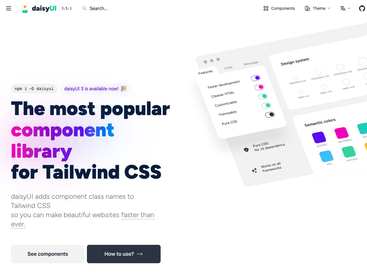
With 50+ components, over 15,000 GitHub Stars, and over 2 million NPM installs, daisyUI is one of the more popular inclusions in this list.
Designed to be used as a plugin with Tailwind CSS, daisyUI adds multiple utility classes for you to use in place of the original Tailwind CSS ones. For example, now you can use the btn class to get a button with the classes inline-block cursor-pointer rounded-md bg-gray-800 px-4 py-3 text-center text-sm font-semibold uppercase text-white transition duration-200 ease-in-out hover:bg-gray-900. Now, that’s a time-saver!
daisyUI is also “fully themeable and colorable,” with nice documentation on how to use those features to make your project more efficient.
Features
- Offers semantic class names
- Supports 10+ frameworks
- Offers 30+ prebuilt themes and allows you to create custom themes
- Provides 50+ components and 500+ utility classes
- Has a store where you can buy premium templates for dashboards, documentation, blogs, and landing pages
Preline UI (free)
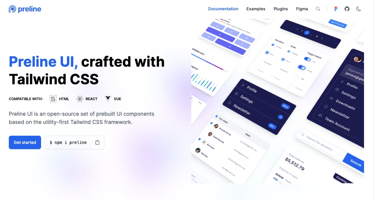
Preline UI is an open-source Tailwind CSS component library that provides developers with reusable UI elements to build websites faster. The library contains over 40 customizable components like buttons, cards, navigation, and more that are designed to be configurable and adaptable. Developers can tweak styles like colors, padding, font sizes, and light/dark mode by modifying Tailwind utility classes without needing CSS expertise.
Preline UI Figma also offers the world's largest free Figma design system, crafted with Tailwind CSS styles and Preline UI components with top-notch additions.
As an open-source project, Preline UI is free to use in websites and web apps without restrictions. Overall, it's a useful toolkit for Tailwind developers looking to accelerate UI development.
Features
- Provides 70+ components
- Dark mode
- Compatible with 10+ tools including React, Next.js, Svelte, and Remix
- Offers 10 prebuilt templates and 400+ examples
- Comes with s Figma design system
- Supports third-party plugins for tools like ApexCharts, clipboard.js, DataMaps, DataTables, Dropzone.js and Tiptap WYSIWYG editor.
Mamba UI (free)
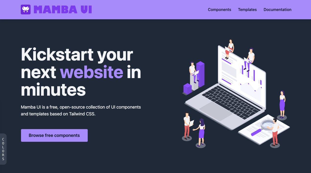
Mamba UI is an open-source Tailwind CSS framework. It comes with over 150 components that you can use to streamline your UI development workflow.
Mamba UI’s goal is to make it easy for you to create high-quality designs regardless of your target application. All of its components and designs are modular and can be customized to fit your brand.
Features
- Supports 8 technologies
- Offers 157 components across 41 categories
- Provides starter templates for business and portfolio landing pages.
Tailwind Elements (free)
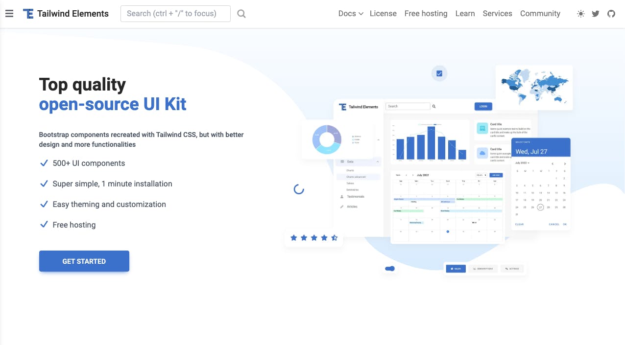
Tailwind Elements takes one of the most successful component libraries of all time and gives it a breath of fresh air using Tailwind CSS. It offers a design system called Material Minimal that incorporates the Material Designs principle while remaining unique.
Tailwind Elements offers 500+ components, is free to use, and supports 12+ JavaScript frameworks, including React, Next.js, Nuxt.js, and Svelte.
Tailwind Elements currently offers 500+ components for all your design needs, and best of all, it’s completely free to use. They also offer more than your typical components; they also offer “design blocks” which are custom-designed, ready-to-use sections of pages like hero, pricing, and contact sections.
Features
- Supports 12+ frameworks
- Offers over 500 components
- Comes with dark mode functionality
- Built on its custom design system called Material Minimal
- Provides an online playground for quick experimentation and learning
HyperUI (free)
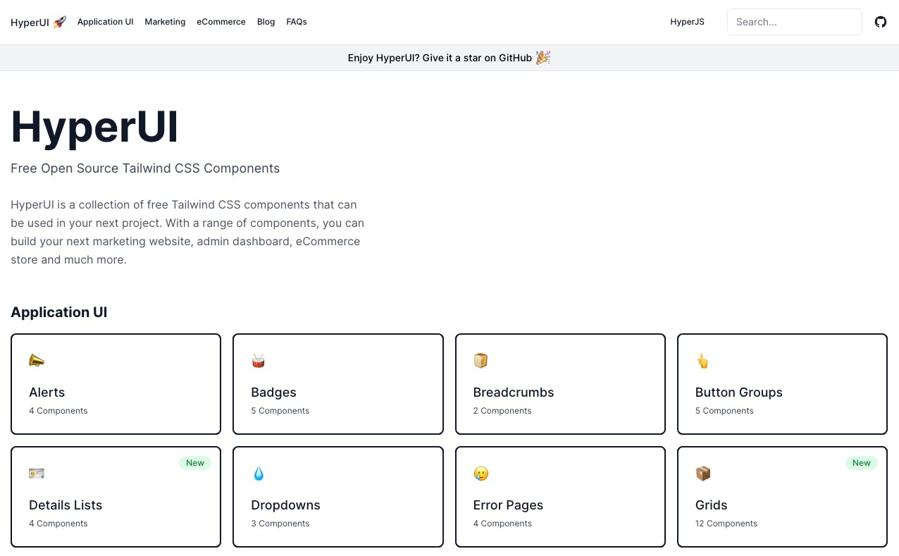
A bit smaller in popularity compared to some of the other libraries in this list but no less powerful, HyperUI, has over 42 components across three categories of websites: marketing pages, eCommerce, and application UIs. If your product fits into one of those categories, then it’s definitely worth checking out HyperUI and seeing if any of the designs take your fancy!
Features
- Offers 42 components
- Comes with 248 examples showing the components in action
Tailwind Templates (free)
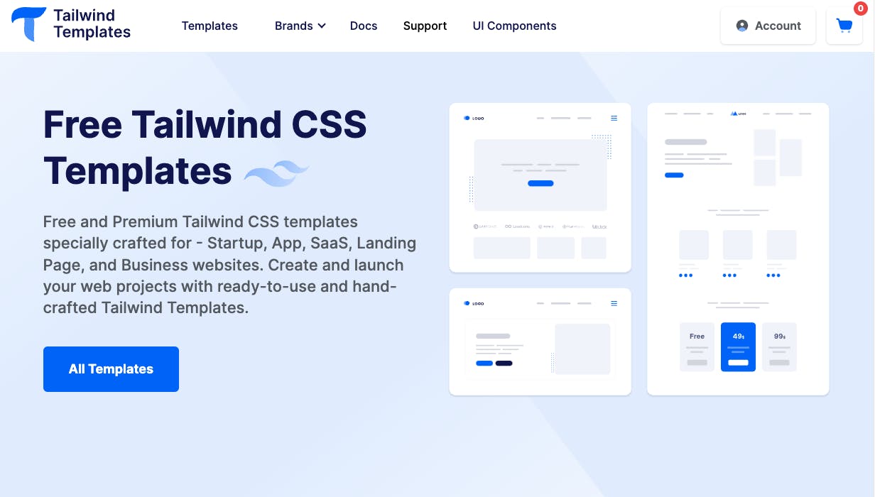
Tailwind Templates offers a generous collection of customizable components and full website templates built with Tailwind CSS. They provide 600 ready-made UI components for headers, footers, cards, alerts, and more. Tailwind Templates also includes 30+ complete website templates for popular use cases like marketing sites, admin dashboards, applications, and e-commerce.
All of Tailwind Templates’ components and templates are open source and free for commercial use.
Features
- Offers 30+ templates
- Supports React, Vue, and HTML
- Offers 84 unique components across different categories and use cases. This adds up to over 600 components
- Comes packaged with a Figma design system
TailGrids (free)
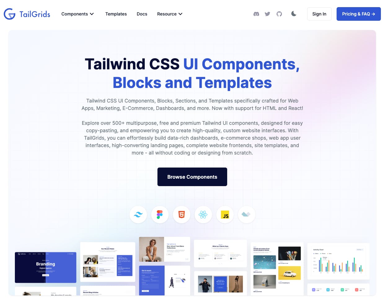
Also built by the creators of Tailwind Templates, TailGrids stands out as an extensive open-source library containing over 100 Tailwind CSS components for building fully responsive web apps and sites.
TailGrids provides developers with a vast selection of customizable UI elements covering navigation, forms, buttons, cards, modals, and more. It makes customizing styles easy with its utility-first workflow powered by Tailwind CSS. Developers can tweak things like colors, spacing, and font sizes without touching CSS.
All TailGrids components are optimized for mobile, tablet, and desktop by default. Extensive documentation with live component previews and code examples helps developers implement components.
TailGrids gives developers a feature-packed toolkit to jumpstart development and rapidly build beautiful, responsive interfaces.
Features
- Comes with 13+ templates
- Provides dark mode functionality
- Supports React, Vue, and HTML
- For HTML, TailGrids uses Alpine.js to create interactive HTML components like carousels, popups, and dropdown menus
Tailwind UI (paid)
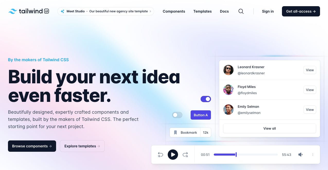
No Tailwind CSS component library list would be complete without talking about TailwindUI. It’s the official offering from the makers of Tailwind CSS and has over 500 components ready for you to use on your next project with seamless integration to Tailwind CSS and bountiful amounts of customization. The only drawback to this otherwise great library is the price, which, for a lot of people, can be quite steep at over $200 for an individual license.
Features
- Supports HTML, React, Next.js, and Vue
- Provides 11 paid templates
- Provides over 500 components in total
Flowbite (paid)
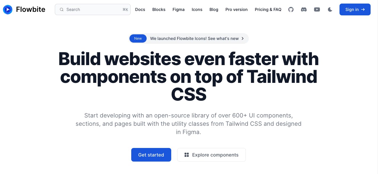
The last component library in our list and our second paid one is Flowbite. It has over 440 components across various types of designs and applications, much like some of our previous libraries.
An interesting thing about this library is you can also get the Figma files for the components so your designer and developers can be perfectly in sync with each other, further increasing your efficiency.
Features
- Supports 20 frameworks and libraries
- Comes with 66 general components
- Provides Flowbite Blocks, a collection of over 440 components that cut across marketing UI, application UI, publisher UI, and e-commerce UI
- Supports dark mode functionality
- RTL support
- Offers Flowbite GPT, a custom-trained ChatGPT model for generating UI components
- Provides Flowbite Icons, a collection of 400+ SVG icons
- Comes with a Figma design system
Why are component libraries useful?
Efficiency
Having all of your components pre-designed and built for you can be a tremendous time saver. When all your components are pre-built, all you need to do when building a new feature is drop them onto the page and let the library handle the rest. No more messing around with CSS for hours to get it just right or typing out HTML tags from scratch. Instead, let your component library handle all of this for you while you focus on the functionality and getting your code shipped.
When you centralize all your components into a single library, it also has the benefit of allowing you to make global changes from one place. Say your product or company goes through a rebrand and you need to change all your colors, now it’s just one place to update them and the changes ripple out to your entire application.
Consistency
If you have multiple developers and/or designers working on a project, it can be a headache to ensure there is stylistic consistency across the entire project. What if two people make a button and use different amounts of padding or margin? You’d have multiple buttons that look different. But, these errors can easily be avoided by using a component library; instead of having your developers make the same button over and over again increasing the chances for inconsistencies, use the same button from the component library, and don’t worry about it again.
Collaboration
This point is more valid if you’re designing your own component library in-house, but it still holds true to an extent with external ones as well. When everyone on your team uses a component library it promotes collaboration across disciplines. If a developer wants to change a button they need to speak with a designer to make sure it works everywhere in the app and is consistent. This promotes people working together to solve problems and build a better, more cohesive finished product.
First time here? Discover what Prismic can do!
👋 Meet Prismic, your solution for creating performant websites! Developers, build with your preferred tech stack and deliver a visual page builder to marketers so they can quickly create on-brand pages independently!

How can you decide between libraries?
Choosing between component libraries can be tough, so to help make your decision that bit easier here are four things to consider when evaluating component libraries for use in your team(s) and/or product(s).
Stylistic Preferences
As this is all about design, UI, and the visuals of your product, there are of course a lot of opinions involved. If you don’t like the look of a component library or the general art direction of it, then it makes sense to skip it and find one you do like the look of. At the end of the day, this is going to be a core part of your project, so you want to make sure you’re happy with it as your foundation.
Component Selection
Some libraries have more components than others — that’s just the truth of the matter so depending on your requirements, you may be limited in choice by the type of components you need in the library. If you only need the basic components like buttons and links, and you don’t mind custom-building some components yourself, you’ll have a lot more options to choose from. But, if you need a very specific type of component like a scrolling horizontal list menu then you’re going to be more limited.
Popularity
An important criterion for choosing a component library, especially a free one, is how popular it is and how active its community is. If the library you’re thinking of adopting has been stale for over 12 months and shows no sign of activity then you may want to think twice about using it in your product, since it’s unlikely you’re going to get new features or bug fixes in a hurry.
Documentation and Resources
Last but not least are the documentation and resources. Libraries that have great documentation and helpful resources for users are going to be a better choice overall. If the onboarding process is slick and it’s easy for new designers and developers to get up to speed, it’ll save your project time and money. Whereas if the library is difficult for people to get their heads around, it’s going to take people longer to learn and implement, meaning it’s going to take more time before they can start building.
Why do people pay for some component libraries?
With so many high-quality free libraries out there, you may be wondering why should you pay for one. Well, here are three reasons you may want to consider purchasing one.
Better Support Options
The vast majority of free component libraries only offer community support like forums or GitHub issues, which is okay if you’re just a hobbyist user with no real dependencies on the library. But, what if you’re a business and suddenly your front end stops working due to a UI bug? Now you need support and quickly! This is where the better support options of premium libraries come in; you may be able to speak to someone from the library directly or get priority email support to help resolve your issues and get you building again.
Support Developers and Their Work
Component libraries take a lot of time, resources, and energy to produce and actively maintain. So, it’s a perfectly valid reason to purchase one just to show your support to the developers who made it to help them continue working on the project for longer. After all, we all need to pay our bills somehow and projects that don’t help pay the bills are often the first to go when money is needed. So, help keep your favorite free library alive longer and support the devs who make it.
Access Higher Quantities and More Complex Components
Finally, as seen with the component library overviews above, the paid ones tend to have higher quantities of and more complex components in them so if they have a component you need, it might just make sense to purchase the library. The alternative would be making it from scratch with the free components offered to you, but unless it’s a one-off, constantly making new components from scratch might mean you’re using the wrong library to start with.
Final thoughts on Tailwind Component Libraries
Component libraries can be a great help to both developers and designers alike, they can make us more efficient and help us collaborate more in a team while also ensuring stylistic consistency across an entire project. There really aren’t many reasons to not like them so often the hardest part is choosing the right one which is why we covered four ways to help you pick the right one for your project.
- Does the library fit your stylistic preference?
- Does it have the components you’re looking for?
- Is the community active?
- Are there good documentation and resources to help new users?
Depending on your answer to these questions and the type of project you’re working on, one library may be better than another so hopefully, one of the six libraries we recommended will fit your needs for your next project.


