

In recent times, the appeal for dark mode has significantly increased, and offering or adding a dark mode option to your applications has become an essential feature. User experience reigns supreme because users are the focus of whatever application or website we are building. Hence, adding a dark mode option becomes a necessity as it is part of what improves the user’s experience. For one, I am one of the many users who appreciate this feature as I always toggle whatever web or mobile app I am using to dark mode first before anything. I am pretty sure there are many others who also enjoy the dark themes.
Dark mode provides a sleek and eye-friendly alternative to the traditional light mode. It not only makes your website look modern and aesthetically pleasing, but it also helps to reduce or minimize eye strain in low light, making it comfortable for users to view in low-light environments. Tailwind CSS is a utility-first CSS framework that makes it easy to add dark mode functionality to our projects.
In this article, we will be looking at how to use Tailwind CSS to enable or integrate dark mode in our project. By the end of the article, you will be able to set up, customize, and control dark mode toggle with Tailwind CSS.
Prerequisite
Before we proceed, it is important that you have at least a basic understanding of:
- React (Next.js)
- CSS.
- Tailwind CSS
We will be using Next.js for this tutorial as it is one of the most popular meta-frameworks of React.
Brief overview of Tailwind CSS
Tailwind CSS is a utility CSS framework that offers a range of low-level utility classes for crafting designs directly within your HTML. In contrast to CSS frameworks, Tailwind CSS does not include prebuilt components (there are third-party Tailwind components, though). Instead, it empowers users with utility classes that can be mixed and matched to bring their design visions to life. This approach encourages the development of easily manageable codebases, making it a popular and favored option in web development circles.
Setting up Tailwind CSS
Next.js sets up pretty much all that we will need when we use create-next-app. This is great because you no longer have to install and configure Tailwind manually anymore. One great advantage of using Next.js is that it optimizes CSS styles by automatically tree-shaking unused CSS during the build process. This means that only the styles you actually use in your projects will be used or included during the bundling. Tailwind’s other utility classes will be removed and excluded after bundling. This reduces unused CSS and optimizes our application by reducing bundle size.
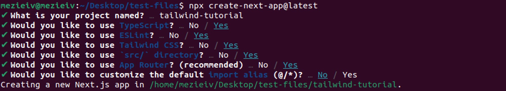
To install Tailwind CSS, run the code below:
npx create-next-app@latestDuring installation, you will see the following prompts. Select Yes for Tailwind CSS. See image below:
After installation, your project will be created with all the necessary features.
If you’re using a previous Next.js version, Tailwind CSS docs show how to install and configure Tailwind in your Next.js app.
Before enabling our dark mode, we will remove the default CSS stylings so they don't conflict with our tailwind styles. First, head over to the global.css file and delete all the styles except the tailwind directives. The directives are custom Tailwind at-rules that you will use in your CSS. Simply put, they offer special functionality for our Tailwind CSS.
Your global.css should look like this:
// global.css

@tailwind base;
@tailwind components;
@tailwind utilities;
Next, inside tailwind.config.ts file, remove the backgroundImage style. You can copy and replace your code with the one below:
// tailwind.config.ts

import type { Config } from "tailwindcss";

const config: Config = {
  content: [
    "./src/pages/**/*.{js,ts,jsx,tsx,mdx}",
    "./src/components/**/*.{js,ts,jsx,tsx,mdx}",
    "./src/app/**/*.{js,ts,jsx,tsx,mdx}",
  ],
  theme: {
    extend: {},
  },
  plugins: [],
};
export default config;
How to enable dark mode with Tailwind CSS
Tailwind has a dark variant that lets you style your website differently when dark mode is enabled. It applies whatever style you have prefixed with dark:
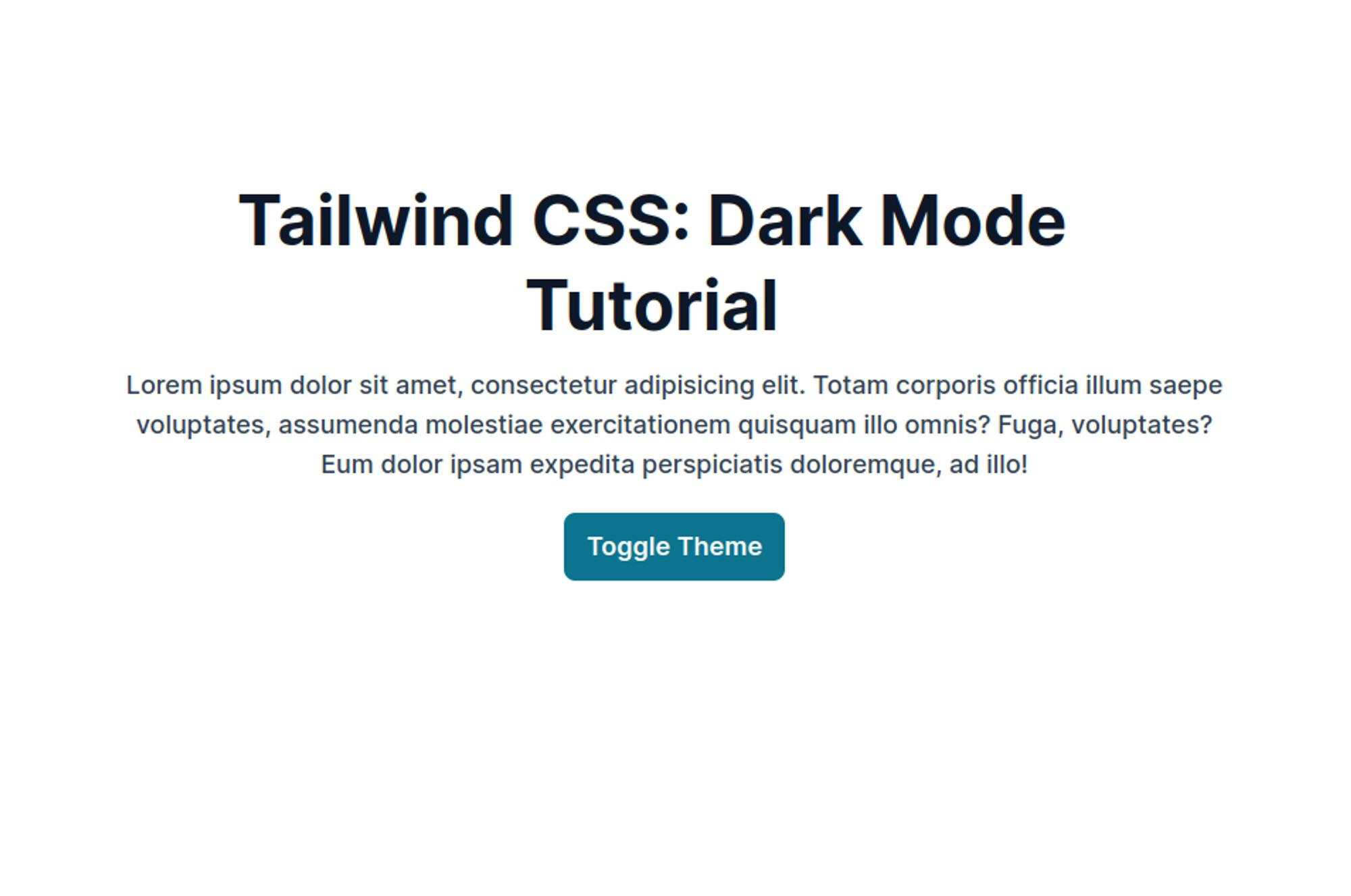
Head over to your page.tsx file, and update the code with the one below:
/* page.tsx */


export default function Home() {
  return (
    <main className="flex items-center justify-center p-20 pt-32">
      <div>
        <h1 className="max-w-3xl text-center font-bold text-slate-900 text-5xl leading-tight mb-3">Tailwind CSS: Dark Mode Tutorial</h1>
        <p className="max-w-3xl text-lg font-medium text-slate-700 text-center mb-5">Lorem ipsum dolor sit amet, consectetur adipisicing elit. Totam corporis officia illum saepe voluptates, assumenda molestiae exercitationem quisquam illo omnis? Fuga, voluptates? Eum dolor ipsam expedita perspiciatis doloremque, ad illo!</p>
        <button className="flex justify-center items-center m-auto text-lg w-fit bg-cyan-700 hover:bg-cyan-800 transition-color duration-200 ease-in-out py-3 px-10 rounded-lg text-gray-50 font-semibold py-[10px] px-4">Toggle Theme</button>
      </div>
    </main>
  );
}
This is what you will see when you run npm run dev:
First time here? Discover what Prismic can do!
👋 Meet Prismic, your solution for creating performant websites! Developers, build with your preferred tech stack and deliver a visual page builder to marketers so they can quickly create on-brand pages independently!

If you notice, our button isn’t doing much yet, and neither are the variant styles, even though we have dark variants in our HTML. This is because we haven’t configured or enabled our dark mode yet.
Configuring the selector
The darkMode provides two (2) strategies for enabling dark mode in our project: media and selector (replaced class) strategies. Let’s look at the difference and when to use either.
Media
The media strategy relies on the user’s operating system to determine whether to apply dark mode styles. It uses the prefers-color-scheme media feature, which allows you to apply different styles based on the user’s preference for light or dark mode.
In summary, if you want to rely on your operating system, i.e., use your device theme as your preferred theme, use media strategy. However, you should know that when you use this strategy, you can’t toggle dark mode manually within your application.
Selector
The selector strategy replaced the old class strategy in Tailwind CSS v3.4.1. This strategy provides more control over when and how dark mode is applied. Instead of applying styles based on prefers-color-scheme, dark mode styles will be applied whenever the dark class is present or added to the HTML tree.
<div class="bg-white dark:bg-black">
	......
</div>
In summary, if you want to toggle your dark mode manually, use the selector strategy.
Using media strategy
Let us see how we can use the media strategy in our application.
Inside your tailwind.config.ts file, add the dark mode feature:
import type { Config } from "tailwindcss";

const config: Config = {
  content: [
    "./src/pages/**/*.{js,ts,jsx,tsx,mdx}",
    "./src/components/**/*.{js,ts,jsx,tsx,mdx}",
    "./src/app/**/*.{js,ts,jsx,tsx,mdx}",
  ],
  darkMode: "media", // add this line
  theme: {
    extend: {
    },
  },
  plugins: [],
};
export default config;
Now, whatever our operating system or device preference is, that will assume our styling choice. Also, we will be adding our background color to our main layout. This is because we want the theme to cover the entire page:
 <html lang="en" className={inter.className}>
      <body className="bg-white dark:bg-slate-950">{children}</body>
 </html>
Your layout.tsx file should look like this:
import type { Metadata } from "next";
import { Inter } from "next/font/google";
import "./globals.css";

const inter = Inter({ subsets: ["latin"] });

export const metadata: Metadata = {
  title: "Tailwind CSS: Dark Mode",
  description: "Adding dark mode to our Next.js app using Tailwind CSS",
};

export default function RootLayout({
  children,
}: Readonly<{
  children: React.ReactNode;
}>) {
  return (
    <html lang="en" className={inter.className}>
      <body className="bg-white dark:bg-slate-950">{children}</body>
    </html>
  );
}
When we run our project, we will see that on light mode, our website has a lighter theme, and when we toggle our device theme to dark mode, it automatically changes its theme:
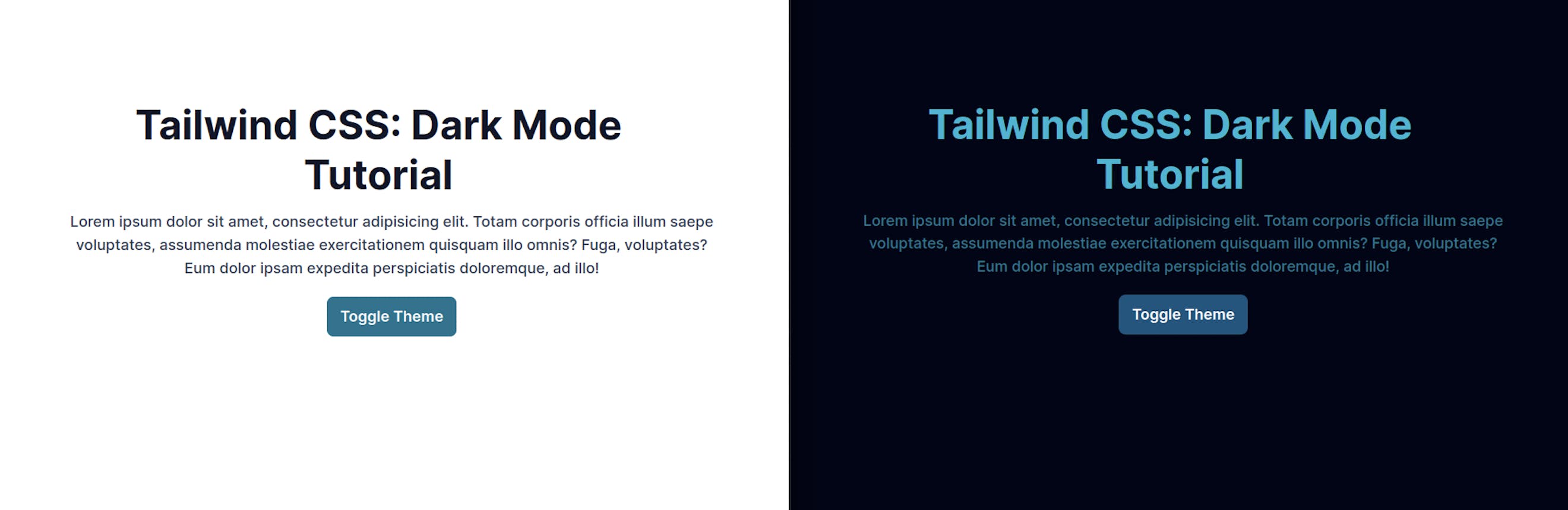
See gif below:

Toggling between light and dark modes using device preference.
This looks great. However, it is not what we typically want. We want to allow users to choose whatever theme or mode they desire. Remember, users are the focus; our sole aim is to give users a great and smooth user experience.
To allow users to make this choice, we will be using the selector strategy.
Using selector strategy
Inside your tailwind.config.ts file, change the dark mode feature to selector:
import type { Config } from "tailwindcss";

const config: Config = {
  content: [
    "./src/pages/**/*.{js,ts,jsx,tsx,mdx}",
    "./src/components/**/*.{js,ts,jsx,tsx,mdx}",
    "./src/app/**/*.{js,ts,jsx,tsx,mdx}",
  ],
  darkMode: "selector", // add this line
  theme: {
    extend: {
    },
  },
  plugins: [],
};
export default config;
If you noticed, immediately after we changed the darkMode strategy, our website returned to its default theme: Light mode.
Next, inside page.tsx file, let's add the changes below:
/* page.tsx */

"use client"

export default function Home() {

  const toggleTheme = () => {
    document.documentElement.classList.toggle('dark')
  }

  return (
    <main className="flex items-center justify-center p-20 pt-32">
      <div>
        <h1 className="max-w-3xl text-center font-bold text-slate-900 dark:text-cyan-500 text-5xl leading-tight mb-3">Tailwind CSS: Dark Mode Tutorial</h1>
        <p className="text-lg font-medium text-slate-700 dark:text-cyan-700 text-center mb-5">Lorem ipsum dolor sit amet, consectetur adipisicing elit. Totam corporis officia illum saepe voluptates, assumenda molestiae exercitationem quisquam illo omnis? Fuga, voluptates? Eum dolor ipsam expedita perspiciatis doloremque, ad illo!</p>
        <button onClick={toggleTheme} className="flex justify-center items-center m-auto text-lg w-fit dark:bg-sky-500/50 bg-cyan-700 hover:bg-cyan-800 transition-color duration-200 ease-in-out py-3 px-10 rounded-lg text-gray-50 font-semibold py-[10px] px-4">Toggle Theme</button>
      </div>
    </main>
  );
}
We have a toggle function to change between dark and light modes. document.body.classList.toggle('dark') toggles the dark class, i.e., it removes and adds the class dark to the HTML body, applying the dark mode styles.
See gif below:

We now have a working button. However, this is not where we will stop. When you toggle or turn on the dark mode and refresh your page, the theme returns to its default light mode. This is because our preference does not yet persist.
When users log off and log in to our application or web app, we want their theme preferences maintained. This optimizes their experience as they won’t have to turn on dark mode every time.
Persisting user preference
To persist user preference, we will use local storage to set our current theme whenever the user toggles the theme button.
Inside page.tsx file, we will introduce the useEffect hook to retrieve and check the current theme preference. If the theme is dark, then we will add the dark class to the HTML element and vice versa.
"use client"
import { useEffect } from 'react'

export default function Home() {
  useEffect(() => {
    const theme = localStorage.getItem('theme');
    if (theme === 'dark') {
      document.documentElement.classList.add('dark');
    }
  }, []);

  const toggleTheme = () => {
    if (document.documentElement.classList.contains('dark')) {
      document.documentElement.classList.remove('dark');
      localStorage.setItem('theme', 'light');
    } else {
      document.documentElement.classList.add('dark');
      localStorage.setItem('theme', 'dark');
    }
  }

  return (
    <main className="flex items-center justify-center p-96 pt-32">
      <div>
        <h1 className="text-center font-bold text-slate-900 dark:text-cyan-500 text-5xl leading-tight mb-3">Tailwind CSS: Dark Mode Tutorial</h1>
        <p className="text-lg font-medium text-slate-700 dark:text-cyan-700 text-center mb-5">Lorem ipsum dolor sit amet, consectetur adipisicing elit. Totam corporis officia illum saepe voluptates, assumenda molestiae exercitationem quisquam illo omnis? Fuga, voluptates? Eum dolor ipsam expedita perspiciatis doloremque, ad illo!</p>
        <button onClick={toggleTheme} className="flex justify-center items-center m-auto text-lg w-fit dark:bg-sky-500/50 bg-cyan-700 hover:bg-cyan-800 transition-color duration-200 ease-in-out py-3 px-10 rounded-lg text-gray-50 font-semibold py-[10px] px-4">Toggle Theme</button>
      </div>
    </main>
  );
}
Inside our toggleTheme function above, we are checking if the dark class is present in our HTML element. If it is present, we want to change the theme to light mode by removing the dark class and updating the stored theme preference to light. Additionally, if the dark class is not present, then we add the class to the HTML element and update the local storage theme value to dark preference.
Now, even if we refresh our page, our theme persists unless we toggle the theme.
Supporting system preference and manual selection
Finally, let’s look at a more practical example. In this scenario, we want to give users three options. The three options will allow users to choose light, dark, or use their system’s theme. This is more realistic and also flexible.
To achieve this, we will leave our selector strategy as it allows users to manually toggle the theme. We will then programmatically add the support for the system scheme.
Inside your page.tsx, copy and paste the code below:
"use client"

import { useState, useEffect } from 'react'

export default function Home() {
  const [activeTheme, setActiveTheme] = useState<string>('system');

  useEffect(() => {
    const savedTheme = localStorage.getItem("theme");
    if (savedTheme === "system" || !savedTheme) {
      applySystemTheme();
      setActiveTheme("system");
    } else {
      applyTheme(savedTheme);
      setActiveTheme(savedTheme);
    }

    const mediaQuery = window.matchMedia("(prefers-color-scheme: dark)");
    const handleSystemThemeChange = () => {
      if (!savedTheme || savedTheme === "system") {
        applySystemTheme();
      }
    };

    mediaQuery.addEventListener("change", handleSystemThemeChange);

    return () => {
      mediaQuery.removeEventListener("change", handleSystemThemeChange);
    };
  }, []);

  const applyTheme = (theme: string) => {
    if (theme === 'dark') {
      document.documentElement.classList.add('dark');
    } else if (theme === 'light') {
      document.documentElement.classList.remove('dark');
    }
  };

  const handleThemeChange = (newTheme: string) => {
    setActiveTheme(newTheme)
    localStorage.setItem('theme', newTheme);
    if (newTheme === 'system') {
      applySystemTheme();
    } else {
      applyTheme(newTheme);
    }
  };

  const applySystemTheme = () => {
    const systemPrefersDark = window.matchMedia('(prefers-color-scheme: dark)').matches;
    if (systemPrefersDark) {
      document.documentElement.classList.add('dark');
    } else {
      document.documentElement.classList.remove('dark');
    }
  }

  return (
    <main className="flex items-center justify-center p-96 pt-32">
      <div>
        <h1 className="text-center font-bold text-slate-900 dark:text-cyan-500 text-5xl leading-tight mb-3">Tailwind CSS: Dark Mode Tutorial</h1>
        <p className="text-lg font-medium text-slate-700 dark:text-cyan-700 text-center mb-5">Lorem ipsum dolor sit amet, consectetur adipisicing elit. Totam corporis officia illum saepe voluptates, assumenda molestiae exercitationem quisquam illo omnis? Fuga, voluptates? Eum dolor ipsam expedita perspiciatis doloremque, ad illo!</p>

        <div className="flex items-center">
          <button onClick={() => handleThemeChange('light')} className={`flex justify-center items-center m-auto text-lg w-fit transition-color duration-200 ease-in-out py-3 px-10 rounded-lg font-semibold py-[10px] px-4 ${activeTheme === "light"
            ? "bg-cyan-800 text-gray-50 active:bg-cyan-700 focus:outline-none focus:ring focus:ring-cyan-300 hover:bg-slate-600 text-gray-50"
            : "bg-slate-500 dark:bg-slate-600 hover:bg-cyan-800 text-gray-100 dark:text-gray-400"
            }`}>Light Theme</button>
          <button onClick={() => handleThemeChange('dark')} className={`flex justify-center items-center m-auto text-lg w-fit transition-color duration-200 ease-in-out py-3 px-10 rounded-lg font-semibold py-[10px] px-4 ${activeTheme === "dark"
            ? "bg-cyan-800 text-gray-50 active:bg-cyan-700 focus:outline-none focus:ring focus:ring-cyan-300 hover:bg-slate-600 text-gray-50"
            : "bg-slate-500 dark:bg-slate-600 hover:bg-cyan-800 text-gray-50 dark:text-gray-400"
            }`}>Dark Theme</button>
          <button onClick={() => handleThemeChange('system')} className={`flex justify-center items-center m-auto text-lg w-fit transition-color duration-200 ease-in-out py-3 px-10 rounded-lg font-semibold py-[10px] px-4 ${activeTheme === "system"
            ? "bg-cyan-800 text-gray-50 active:bg-cyan-700 focus:outline-none focus:ring focus:ring-cyan-300 hover:bg-slate-600 text-gray-50"
            : "bg-slate-500 dark:bg-slate-600 hover:bg-cyan-800 text-gray-50 dark:text-gray-400"
            }`}>Use System Theme</button>
        </div>
      </div>
    </main>
  );
}
Firstly, we are retreiving the value of our theme from local storage when the page loads. If the value is system, we are calling our applySystemTheme function and setting our activeTheme state to system. However, if it is neither null nor system, then, we are calling applyTheme function.
applySystemTheme function uses Window: matchMedia() API to check if the document(webpage) matches the query string. In our case, the media query becomes prefers-color-scheme: dark since we’re checking for system dark mode preference. Additionally, the matchMedia() API can be used to monitor the document to see if it matches or stops matching our media query. This is why we are listening to any changes in our useEffect hook and calling applySystemTheme function.
applyTheme function accepts the string theme as an argument and either removes or adds the dark class to our HTML element based on the argument. If the argument or value is dark, it adds the dark class, but if the argument is light, then it removes the dark class, thus, rendering a light theme.
Finally, the activeTheme state is to set the active button and style it differently from the others (inactive buttons). This is so that the user knows which button is clicked or selected. at any moment
The final output:

Conclusion
As you can see from this article, enabling dark mode is pretty much straightforward and also customizable, especially when you’re working with Next.js. A good practice for a bigger project would be to use Context API and wrap your full application so that the theme is easily accessible in any part of the application.
Further your Tailwind CSS and Next.js learning!
Build a dark modern website with Next.js, Tailwind CSS, Prismic, TypeScript, and GSAP
If you're looking to take your skills to the next level, try this Next.js full website tutorial course! See the power of Prismic as a Headless website builder alongside Next.js, the popular React framework. In this tutorial, you'll create a trendy, dark, and modern website and use GSAP to add wonderful animations, both on page load and on scroll. You'll also use Tailwind CSS to style the super-polished website.
More Tailwind CSS and Next.js resources
Check out these other, great articles on Next.js:
- https://prismic.io/blog/sveltekit-vs-nextjs
- https://prismic.io/blog/nextjs-cms
- https://prismic.io/blog/nextjs-image-component-optimization
- https://prismic.io/blog/how-to-use-prismic-with-nextjs-app-router
Other great articles on Tailwind:


