

Images are a vital part of any website. They allow us to engage users and visually convey complex information. As the saying goes, “A picture is worth a thousand words.”
While images have numerous benefits and can improve user experience and SEO performance, they can also slow down page load times and lead to poor website performance if not properly optimized.
There are different tools we can use to optimize the images we add to websites. One such tool is the custom <Image/> component Next.js provides. The image component is an extension of the HTML <img> element.
This article will explore the Next.js image component and how it helps with image optimization. We will learn how it works, its features, and how to integrate it into Next.js applications.
Importance of image optimization
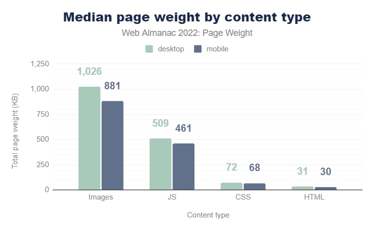
Data from Web Almanac 2019 shows that images account for almost 75% of a webpage’s weight, and 75% is a lot! Web Almanac 2022 data shows that images are the number one contributor to a page’s weight, whether on desktop or mobile.
Images are a major culprit when it comes to a webpage’s size. This doesn’t mean we should stop adding images to our websites, as doing so will lead to a poor browsing experience and affect industries that rely heavily on them, such as the e-commerce industry.
Instead, we must ensure our images are properly optimized for peak web performance. The image optimization process involves the following:
- Compressing and reducing the size of image files
- Resizing images to the appropriate dimensions
- Choosing next-gen image formats that provide optimal performance, such as WebP and AVIF.
We can eliminate the negative impact that images have on websites by properly optimizing them. That way, we can have as few or as many images on our website without affecting performance.
Image optimization ensures that our websites have the best Core Web Vitals (CWV), enhances website loading speed, reduces bounce rates, improves SEO, and boosts user engagement.
What is next/image?
The Next.js image component, or next/image, is a custom component from Next.js. It extends the standard HTML img element with additional features and optimizations. It’s basically a version of the regular img element on steroids. It allows us to optimize images easily and automatically in our Next.js applications.
While there are online tools that we can use to optimize images, they are not effective at scale. Neither are these manual methods efficient for websites with hundreds and thousands of images. This is where next/image comes in as a programmatic solution for optimizing images.
Benefits and features of next/image
Let’s explore some benefits and features that the Next.js image component provides.
Automatically compresses images
The component automatically compresses images for peak performance, improving a website's overall performance. This helps save bandwidth by reducing image file sizes and the amount of data the browser needs to download during rendering.
Take this 640x896 Pexels JPG image, for example. When working with the default HTML img component, the image's size is 105kb.
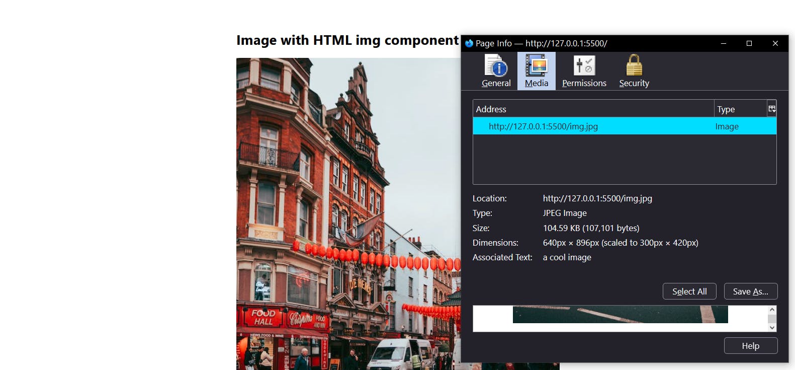
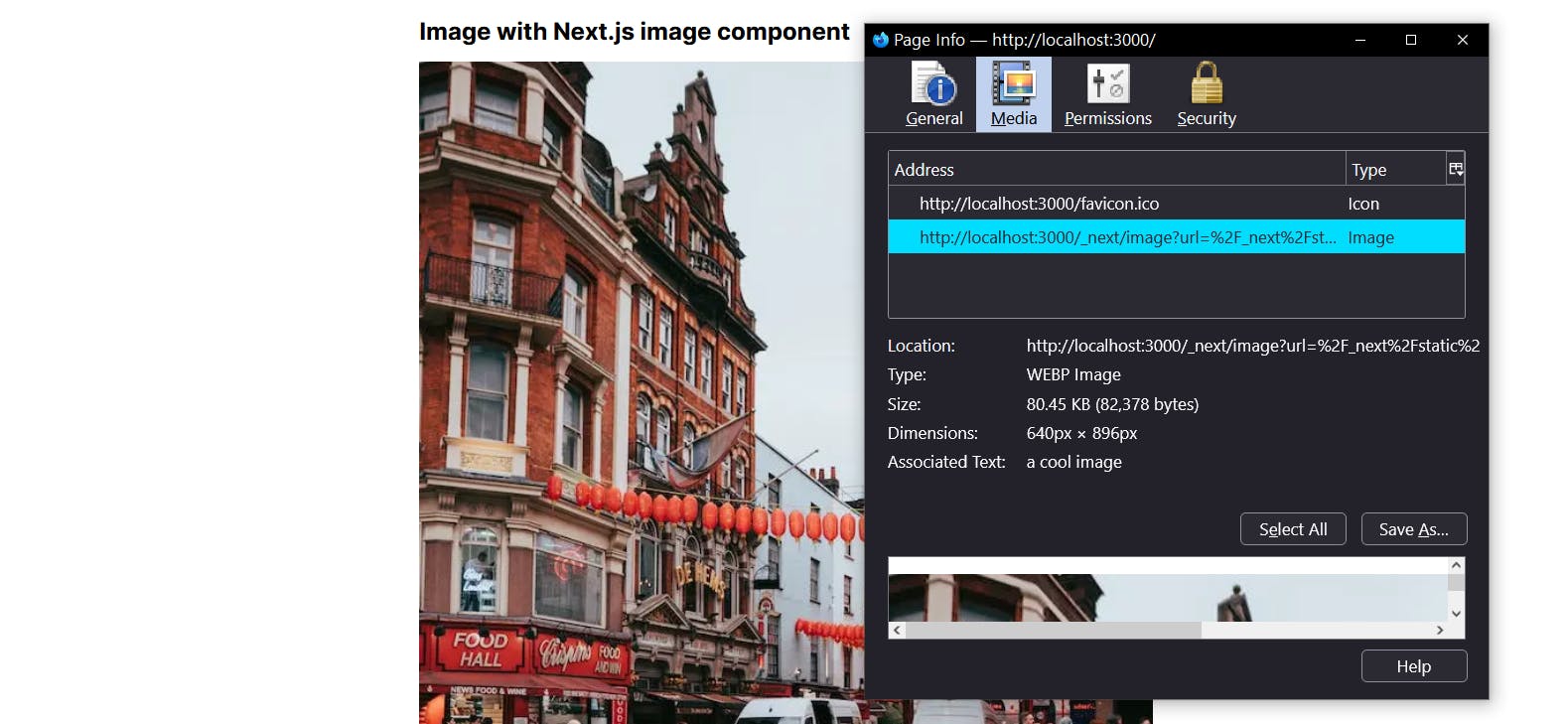
However, switching to <Image/> reduces the size to 80kb—a 23.81% reduction!
I performed this test with the 1920x2688 version of the same image. That version's size was 603kb, and <Image/> also reduced it to 80kb—an 86.7% decrease.
Serves images in modern formats
The Next.js <Image/> component automatically serves images in modern image formats like WebP and AVIF. This ensures that only the most optimized and lightweight version of images reaches the client.
Next.js serves images in modern formats because that preserves fidelity and quality while remaining performant. In the earlier experiment, we saw that next/image didn’t only reduce the size of the original image, but also converted it from JPG to WebP.
Supports image lazy loading
The component supports the lazy loading. This means the browser will only load the images when they enter the viewport instead of loading them all at the initial page load.
Lazy loading helps to improve the initial page load time. Here’s a code snippet of next/image's lazy loading in action.
<Image src={img} alt="a cool image" loading="lazy" />Improves user experience
Optimized images lead to fast-loading websites, meaning users get the best experience possible. Using next/image not only enhances website load times but also minimizes Cumulative Layout Shift (CLS) by ensuring images are loaded with appropriate width and height dimensions. This further improves the overall user experience.
Provides a richer developer experience and boosts productivity
The next/image component abstracts the complexities of image optimization and makes it easier for us to work with images. This means we can focus on core activities, such as handling bugs and building propriety functionalities. We can rest easy knowing that we don’t have to worry about optimizing images because next/image handles that for us.
Deliver a fast website with a visual Page Builder
Prismic is a headless solution, with a visual Page Builder for your marketing team to release pages independently.

How to use the Next.js <Image/> component
The first step is importing the <Image/> component from next/image.
import Image from 'next/image' //import the image componentAfter that, use it as shown below:
import Image from 'next/image'
import img from "./img.jpg";

export default function Page() {
  return (
    <Image src={img} alt="a cool image" />
  )
}
Next.js automatically generates the width, height, and blurDataURL values for statically imported images. This helps prevent Cumulative Layout Shift (CLS) while the image loads and is one of the ways next/image boosts SEO performance.
However, when working with remote images, we must manually define their width and height. This is because Next.js can’t access remote files during the build process, which prevents it from determining their dimensions for proper rendering.
Explicitly defining the width and height, as shown in the example below, helps Next.js know how much space to reserve for the image. This prevents layout shifts from occurring when the image loads.
import Image from 'next/image'

export default function Page() {
  return (
    <Image
      src="https://dummyimageurl.com/photos/cool-image.jpg"
      width={500}
      height={500}
      alt="a cool image"
    />
  )
}
How to use remote images - next/image configuration options
remotePatterns
When working with remote images in Next.js, we have to register the images’ root URL for them to render in the browser. We can handle this configuration in the remotePatterns property. Failure to do that will result in the following error.
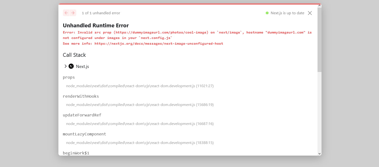
To fix the error, add the protocol and hostname of the URL to the images.remotePatterns config in next.config.js file.
const nextConfig = {
  images: {
    remotePatterns: [
      {
        protocol: "https",
        hostname: "dummyimageurl.com",
      },
    ],
  },
};
We can also define the URLs of remote images with the domains property. However, this has been deprecated since Next.js 14 in favor of remotePatterns. Here’s how the domains configuration works.
module.exports = {
  images: {
    domains: ['dummyimageurl.com'],
  },
}
loaderFile
Next.js provides a built-in Image Optimization API that optimizes and serves images. However, if needed, we can create a loader function to serve images from our preferred CDN.
Configure next.config.js with the following to add a custom loader:
module.exports = {
  images: {
    loader: "cloudinary",
    path: "https://res.cloudinary.com/your-unique-account-id/",
  },
};
Here are some example loader configurations for cloud providers such as Cloudinary, Imgix, and Cloudflare.
Properties of next/image
As of this writing, the image component has sixteen properties. Here’s a brief overview of each property.
Required Props
src: Used to specify the source of an image. The source can be an external URL or a statically imported file. Its prop type isstring.widthandheight: Defines the dimensions of an image. Their prop type isnumber. As we covered earlier, these image dimension props are only required for remote images, not static ones.alt: Used to provide alternative text for an image. This text is displayed when the image fails to load. The alt text is also important for accessibility and SEO. Its prop type isstring.
Optional props
loader: A custom function that generates the complete URL of an image source. For example, if the source is a partial URL such asprofile.png, we can write a loader to resolve the full URL, sayhttps://imigx.location-of-image/profile.png.fill: Instead of setting the width and height of an image, we can use thefillprop instead. It will cause the image to fill any available space in its parent element. Its prop type isbooleanand defaults toposition: "absolute".sizes: Used to set up responsive sizes for images at different breakpoints. The image component will use the sizes defined to generate the appropriatesrcSetversions of the images. This property is only needed for images that use thefilllayout. Its prop type isstring, and its default value is100vw(full-screen width).quality: A range of numbers between 1 and 100 that determines the quality of the optimized image. Its prop type isnumber, and it defaults to 75.priority: Next.js lazy loads all images by default. However, when an image’spriorityis set totrue,next/imagepreloads that image. Its prop type isboolean, and it defaults tofalse.placeholder: Allows us to display a low-resolution version of an image as a placeholder while the actual image loads. Its prop type isstring, and it defaults toempty. When set toemptyno placeholder will be shown. However, when set toblur, an image blur placeholder will appear till the image finishes loading.
Advanced props
style: Allows us to pass an object of CSS styles directly to an image component. This gives us more control over the styling of images.onLoadingComplete: A callback function that runs once the image has finished loading and the placeholder has been removed.onLoad: A callback function that runs once the image has finished loading.onError: A callback function that runs if the image does not load.loading: Defines the loading strategy for an image. It is set tolazyby default. It can also be set toeager, which means the component will load the image immediately.blurDataURL: Works together with theplaceholderprop. It specifies a data URL for a blurred version of the image, which is displayed as the placeholder.
The code snippet below shows a practical application of the <Image/> components props.
import Image from 'next/image'

const imageLoader = ({ src, width, quality }) => {
  return `https://res.cloudinary.com/${src}?w=${width}&q=${quality || 75}`
}

const imageStyle = {
  borderRadius: '50%',
  border: '1px solid #fff',
}

export default function Page() {
  return (
    <Image
      loader={imageLoader}
      src="/profile.png"
      width={500}
      height={500}
      alt="Picture of the author"
      quality="85"
      loading="lazy"
      proprity={true}
      style={imageStyle}
      sizes="(max-width: 768px) 100vw, (max-width: 1200px) 50vw, 33vw"
      onLoadingComplete={(img) => console.log("image loaded successfully")}
    />
  )
}
Next.js image component: tips and best practices for image optimization
Here are some tips and best practices to follow when working with Next.js's Image component:
Define the width and height attributes for remote images
Setting the width and height attributes for remote images ensures optimal performance and prevents layout shifts as the images load. This allows Next.js to determine the appropriate sizes for the image and generate optimized versions accordingly.
Lazyload images
Lazy loading defers the loading of images until they are about to enter the viewport. This reduces the page's initial load time and improves its overall performance. Next.js image component has built-in support for lazy loading, making it easy to implement.
<Image src={img} alt="a cool image" loading="lazy" />Specify a list of device width breakpoints using the deviceSizes prop
If you are the width of your user's devices, you can use the deviceSizes prop to specify a set of breakpoints. The Next.js image component considers the defined sizes when serving images, ensuring the user's devices receive images in the proper dimensions.
Next.js provides the following default breakpoints:
module.exports = {
  images: {
    deviceSizes: [640, 750, 828, 1080, 1200, 1920, 2048, 3840],
  },
}
Enable blurry image placeholders with the placeholder prop
This shows a blurry base64 version of the image as a placeholder while the image loads. While the blur effect won’t make the image load faster, it will affect the web visitor’s perception and make the loading process appear faster.
<Image src={img} alt="a cool image" placeholder="blur" />The gif below shows the next/image blur effect in action.

Improvements with Next.js 14
Data from a community survey performed by the Next.js team showed that 70% of respondents use the image component in production, and they saw improved Core Web Vitals. The image component received the following improvements with the launch of Next.js 13.
- It provides enhanced image optimization, meaning images will load faster, even with poor internet connections.
- The
altattribute is now required. This will enforce accessibility best practices for images. - It ships less client-side JavaScript, which helps reduce layout shifts and provides faster loading.
- It supports native browser lazy loading. This means the component is much faster because native lazy loading doesn’t require hydration, leading to better performance.
Integrate next/image in your Next.js project
Seeing code in action can often solidify concepts and help with practical application. If you’re ready to take your understanding of next/image a step further, this video gives a step-by-step guide on how to implement the Next.js image component in a Next.js project.
Install the starter and see how to optimize images on your website with Next.js and how you can further simplify this using Prismic's image component!
Summing up next/image
Images are an integral part of the web experience. After all, a picture — or image — is worth a thousand words.
Luckily, we don’t need to trade between performance and providing users with engaging content. We can use tools like next/image to ensure that all website images are properly optimized.
Try editing a page with Prismic
A visual page builder, configured to marketing team's needs. They can easily create on-brand website pages, release more, attract more visitors and convert quality leads.