Top 9 CSS Frameworks for Developers and Designers in 2026


When it comes to styling websites and web applications, there are different CSS technologies we can use. We can stick with classic vanilla CSS, CSS preprocessors like SaaS and Less, or CSS-in-JS tools like Emotion and Styled Components.
Besides these methods, we can also style websites with CSS frameworks. The problem is that, as of this writing, over 40 CSS frameworks are available, making it difficult to choose the right one for our next project.
If you've been struggling with analysis paralysis, this article is just what you need. In this piece, we will explore what CSS frameworks are, the advantages of styling applications with them, and 9 CSS frameworks you should know about in 2026 and beyond.
Let's dive in!
What are CSS frameworks?
CSS frameworks are a set of pre-written and ready-to-use CSS stylesheets. Instead of creating CSS styles from scratch, CSS frameworks allow developers to swiftly create user interfaces and build websites by providing a foundation of styles and layout structures they can work with.
CSS frameworks contain styles for pre-designed UI components, responsive grid systems, and elements like buttons and forms. They sometimes also contain JavaScript code for interactive web components like responsive navigation with hamburger menus, tabs, and accordions.
If you are creating a new site, CSS frameworks are a great tool because they can boost your productivity and be a solid foundation for creating design systems and style guides. They also help you create consistent user interfaces and websites and are a great choice for large and small teams and projects.
Advantages of using CSS frameworks
Here are some advantages that CSS frameworks provide:
Faster development
A major benefit of CSS frameworks is that they save time. Working with CSS frameworks means you won't have to start defining CSS classes and styles from scratch. The frameworks provide several predefined styles that speed up development and keep us from reinventing the wheel.
Brand consistency
The default styles and components CSS frameworks provide ensure that websites have a consistent look and feel across different pages and devices, which makes them look professional and user-friendly while boosting accessibility.
Cross-browser compatibility
Different browsers interpret CSS code differently, leading to inconsistencies in the appearance of web pages. CSS frameworks have been tested across various browsers and built with cross-browser compatibility in mind, ensuring that styles render consistently across different platforms. This saves developers the time and effort of manually troubleshooting browser-specific issues.
Facilitate responsive design
Responsive design has become essential in today's mobile-first world, where websites need to adapt to different screen sizes and devices. CSS frameworks often come with built-in responsive features, such as media queries and grid systems, making it easier to create pixel-perfect responsive websites without extensive coding.
Code readability and maintainability
CSS frameworks follow best practices and coding standards, making it easier to understand and modify your codebase. This is especially beneficial when working on large-scale projects or collaborating with other developers.
9 CSS frameworks you should know in 2026
1 - Bootstrap
Bootstrap is a free, open-source web development framework that provides a collection of HTML, CSS, and JavaScript components and styles. It is a popular choice for developers who need to create responsive websites and web applications.
Bootstrap provides a set of pre-built templates and reusable components, such as navigation bars, buttons, forms, and grids, that you can customize to fit your requirements.
Bootstrap began as an internal project at Twitter called “Twitter Blueprint.” It was later called Bootstrap and released as an open-source project. A community of developers now maintains it.
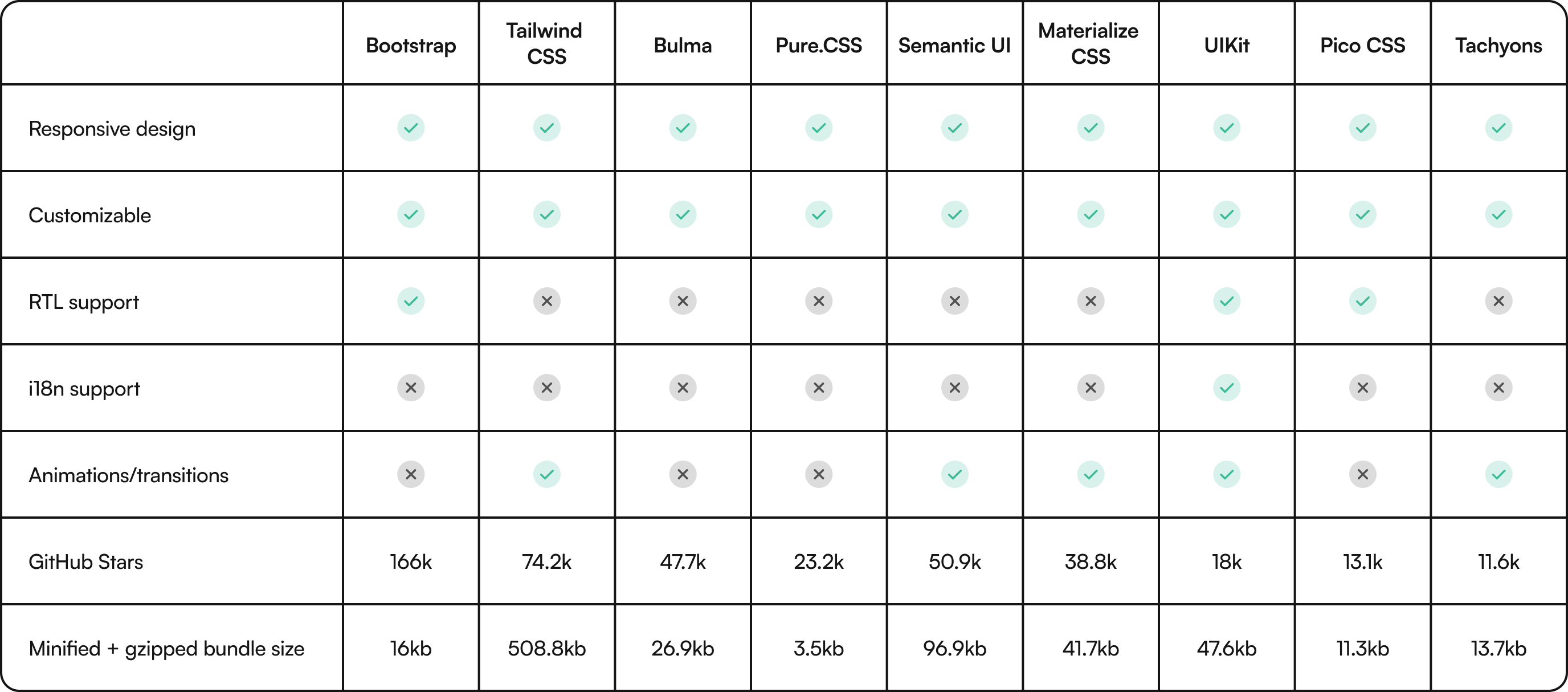
It is one of the most widely used CSS frameworks available, and companies like Twitter (not surprising), Spotify, LinkedIn, and Udemy have used it for their projects. Data from W3Techs shows that Bootstrap is present in 18.6% of websites.
Features
- Right-to-Left (RTL) text support: Bootstrap provides RTL text support, which is necessary for projects that must accommodate texts with different directions.
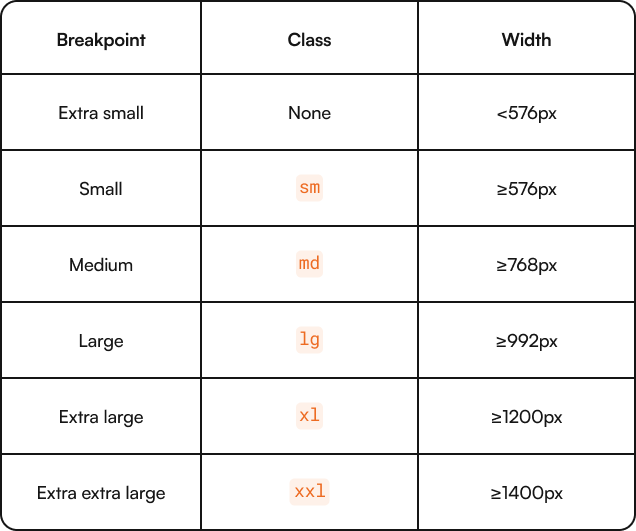
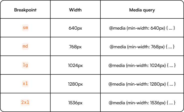
- Responsive design: Bootstrap provides a flexible and fluid grid layout that allows you to create responsive websites that adjust to different screen sizes and devices. Bootstrap provides the following default breakpoints:
- Comprehensive set of plugins: Bootstrap provides a dozen JavaScript plugins that you can use to set up interactive components like modals, alerts, and toasts.
- Bootstrap icons: While Bootstrap doesn’t provide icons by default, it has Bootstrap Icons, a comprehensive library of SVG icons you can leverage. There are over 2,000 icons available. To get started with Bootstrap icons, you only need to install the library and apply the relevant classes for the icon(s) you want.
<i class="bi bi-chevron-left"></i>
<i class="bi bi-folder2"></i>- Utility API: Version 5 of Bootstrap comes with a Utility API, a Sass-based tool for generating utility classes. It allows you to modify Bootstrap’s default utility classes. You can modify several properties, including background color, borders, positions, shadows, and spacings. Note that Bootstrap’s Utility API is an advanced feature that requires deep knowledge of the framework.
Pros
- Fully customizable: You can easily modify Bootstrap’s default styles and components to match your project’s needs.
- Popular and has a large ecosystem: Bootstrap has a large community of developers who actively contribute to its development. They provide regular updates, bug fixes, new features, and many learning materials. Data from 2023’s State of CSS shows that Bootstrap is currently the most used CSS framework, with 80.3% of developers using it.
- Extensive documentation: Bootstrap provides detailed documentation full of code snippets and examples, making it easier to learn how it works.
- Starter templates and themes: The Bootstrap team provides several paid themes that you can leverage for projects. Since it's a popular CSS framework, the community has also created different starter templates that speed up development.
Cons
- Similar-looking websites: A major issue that has plagued Bootstrap is that websites built with it often look the same. However, with v5 and features like the Utility API that allows for greater customization, you can create unique websites with Bootstrap.
- Multiple versions: Bootstrap has been around for a while. It has 5 major versions (v1 to v5) and 30 minor versions that cover different patch releases. This can be difficult to manage, particularly when dealing with legacy projects. Also, you will likely bump into old code and outdated information on platforms like Stack Overflow.
2 - Tailwind CSS
Tailwind CSS is one of the most popular CSS frameworks today. It is the brainchild of Adam Wathan, one of the authors of Refactoring UI.
It is known for its utility-first approach, which provides a set of utility classes for styling layout, typography, colors, spacing, and more. This approach eliminates the need to write additional CSS except for unique scenarios like when you need custom animations.
While it is one of the newest frameworks available, Tailwind CSS has successfully established itself as a top contender among other well-known CSS frameworks. Data from the State of CSS 2023 shows that Tailwind CSS has the highest retention rate (75.5%) among CSS frameworks.
Features
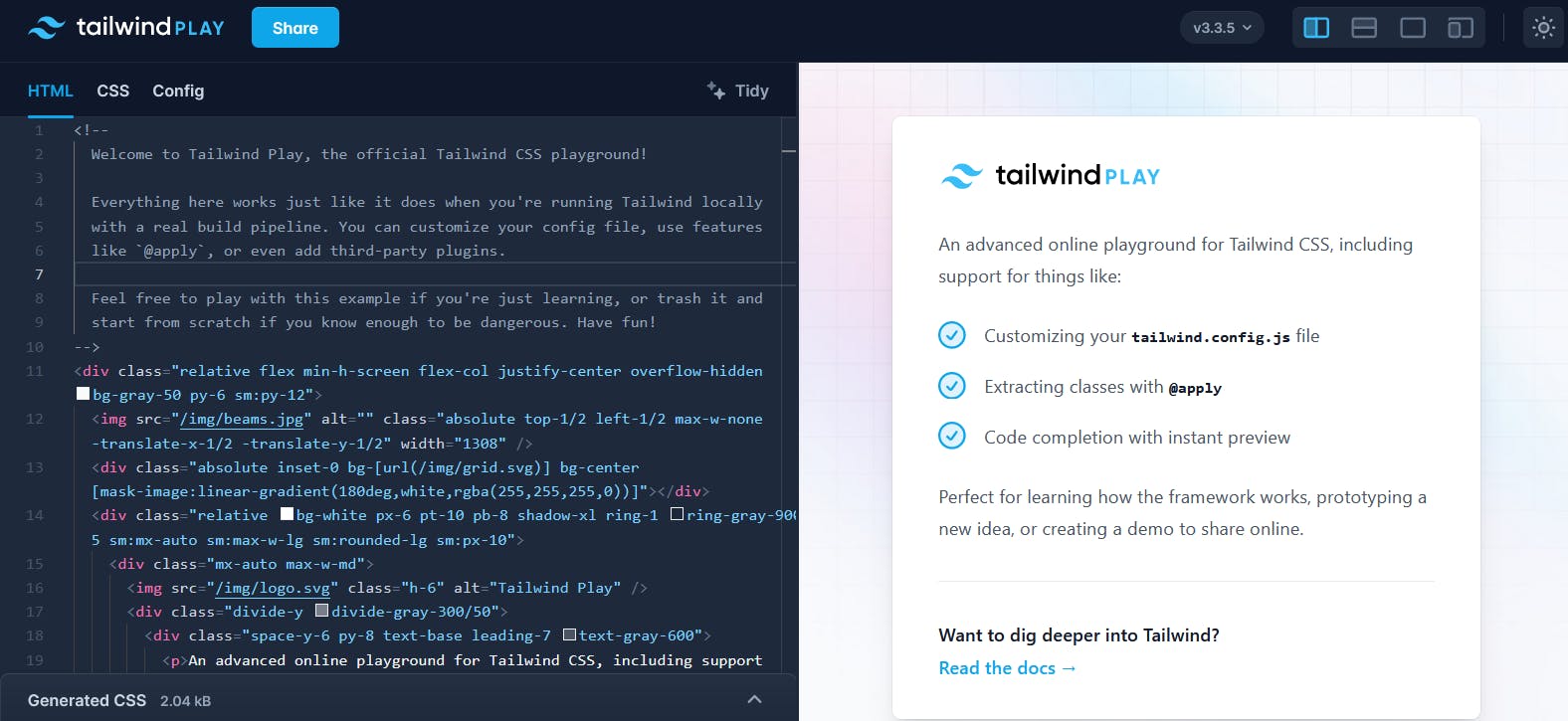
- Tailwind Play: An online code editor where you can try out Tailwind CSS directly in your browser. It's a great resource for developers who want to perform quick experiments, check for responsiveness across different screen orientations, or try Tailwind CSS for the first time.
- Utility-first approach: Unlike other frameworks that provide pre-defined components, Tailwind CSS focuses on providing a wide range of utility classes that can be directly applied to HTML elements. This approach lets you build and customize UI components without writing custom CSS.
To properly understand the utility-first approach, let’s consider a scenario. Say we wanted to style a card component. We would traditionally write some custom CSS and create custom classes that are tailor-made for the component.
<div class="card">
  <!-- insert card content -->
</div>

<style>
  .chat-notification {
    display: flex;
    max-width: 24rem;
    margin: 0 auto;
    padding: 1.5rem;
    border-radius: 0.5rem;
    background-color: #fff;
    box-shadow: 0 20px 25px -5px rgba(0, 0, 0, 0.1);
  }
</style>
Tailwind’s utility-first approach switches things up and creates utility classes that target specific CSS properties. This approach allows you to style components without writing custom CSS. Here’s a code sample of the utility-first approach in action. Explore the utility-first fundamentals of the documentation to learn more.
<div class="p-6 max-w-sm mx-auto bg-white rounded-xl shadow-lg flex items-center space-x-4">
  <!-- insert card content -->
</div>
Dark mode support: Tailwind uses the prefers-color-scheme CSS media query under the hood to provide dark mode functionality. You can set up dark mode by using Tailwind's dark variant. However, note that while Tailwind provides the classes, you still have to create the dark mode theme switcher.
<div class="bg-white dark:bg-slate-800">
  <h3 class="text-slate-900 dark:text-white">I love dark mode</h3>
</div>
Tailwind UI: An official marketplace where you can buy UI components and complete website templates created by the Tailwind CSS team.
Pros
- Highly customizable: Tailwind provides a
tailwind.config.jsfile that allows you to customize every aspect of the framework, including colors, spacing, typography, and breakpoints, to meet your project’s requirements. - Responsive design: With built-in responsive utilities, Tailwind CSS makes it easy to create responsive layouts. You can apply responsive classes to elements to control their appearance on different screen sizes, resulting in a seamless user experience across devices. Tailwind provides the following default breakpoints:
- Complete control of design tokens: Tailwind CSS gives you full control of design tokens and variables. It allows you to control elements like colors, spacing, and typography, which helps in making unique websites.
- Starter templates: With Tailwind CSS, you get access to free and paid templates from the core team and the community that fit different use cases.
- Developer-friendly syntax: Tailwind CSS uses intuitive class names that describe the purpose of each utility. For example,
bg-blue-500sets the background color to a specific shade of blue, whilep-4adds padding around an element. This makes it easy for developers to understand and use the framework effectively. - Customizability: With its comprehensive configuration file, Tailwind CSS offers unparalleled customization options. Developers can easily change colors, spacing, typography, and other design elements to match their project's unique branding and style requirements.
Cons
- Learning curve: Tailwind CSS has a relatively steep learning curve compared to other frameworks, primarily due to its utility-first approach. You will need to familiarize yourself with the extensive list of utility classes to understand how to combine them effectively.
- File size: As Tailwind CSS provides many utility classes, the resulting CSS file can be quite large, particularly for large-scale projects. This may affect page load times, especially on slower networks or mobile devices.
However, you can reduce the file size and optimize for production by minifying and compressing the CSS with tools like cssnano and Brotli.
First time here? Discover what Prismic can do!
👋 Meet Prismic, your solution for creating performant websites! Developers, build with your preferred tech stack and deliver a visual page builder to marketers so they can quickly create on-brand pages independently!

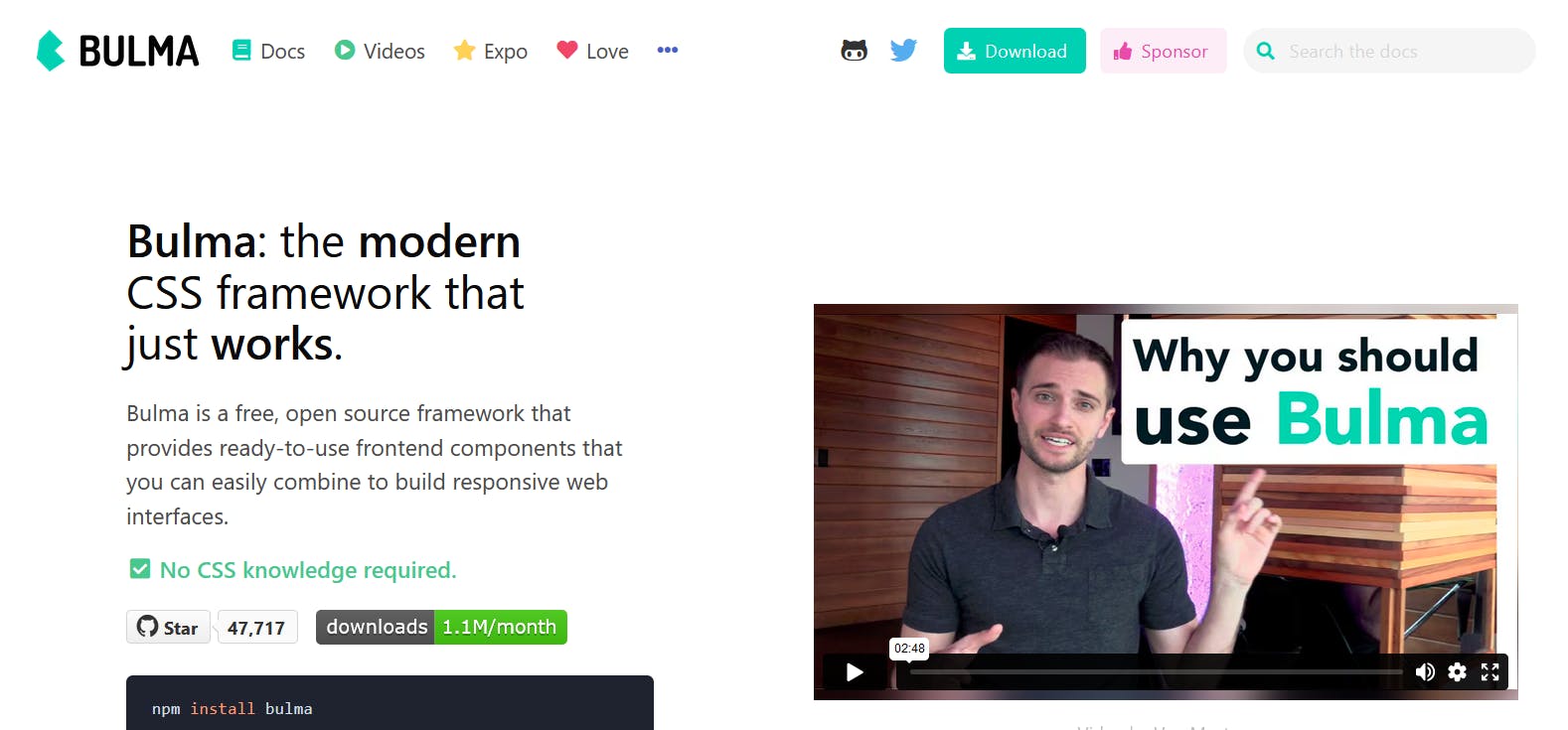
3 - Bulma
Bulma is an open-source CSS framework that aims to provide a modern, lightweight, and flexible solution for building websites. It has gained recognition for its simplicity and ease of use.
Unlike CSS frameworks like Bootstrap, Bulma does not rely on JavaScript and focuses solely on providing a robust set of CSS classes. It offers a straightforward syntax and a modular approach, making it easy for developers to work with.
Explore Bulma’s Expo page, which features over 40 websites built with the framework.
Features
- Modularity: Bulma's modular structure allows you to import only the specific components or styles you need. This approach reduces unnecessary bloat in the final CSS output. Bulma has 39 .sass files that you can import individually. For example, if you only need button styles, you can simply import them from their files and apply them.
<!-- import required styles into CSS file -->
@import "bulma/sass/utilities/_all.sass"
@import "bulma/sass/elements/button.sass"

<!-- apply styles -->
<button class="button"> Button </button>
<button class="button is-primary"> Primary button </button>
<button class="button is-large"> Large button </button>
<button class="button is-loading"> Loading button </button>
Modifiers syntax: Bulma provides modifier classes that you can use to create variant styles for elements. The classes all start with is- or has-, and allow you to create alternative styles. You can combine modifiers together.
<button class="button is-primary is-small" disabled> Button </button>
<button class="button is-info is-loading"> Button </button>
<button class="button is-danger is-outlined is-large"> Button </button>
Pros
- Simplicity: Bulma's simple and intuitive syntax makes it easy for developers of all skill levels to learn and use.
- Flexibility: The framework provides a high degree of flexibility in terms of customization, allowing developers to create unique designs without being constrained by predefined styles.
Cons
- Limited ecosystem: Compared to larger frameworks like Bootstrap, Bulma's ecosystem may have fewer third-party integrations and community-generated resources. As of this writing, Bulma has 47.7k GitHub stars vs. 166k for Bootstrap.
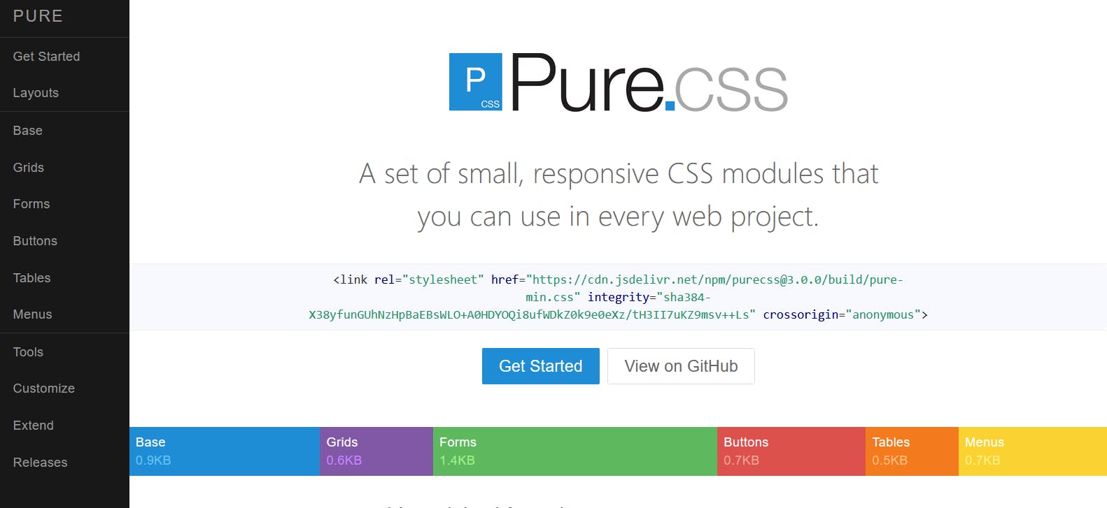
4 - Pure.CSS
Pure.CSS is a lightweight CSS framework that focuses on simplicity and minimalism. It prioritizes a small file size and a modular approach, making it ideal for developers who want to keep their codebase lean and efficient.
It provides a set of responsive CSS modules that can be easily customized to fit various design requirements.
Features
- CSS-only components: Unlike some other frameworks that rely on JavaScript for interactivity, Pure.CSS focuses on providing CSS-only components.
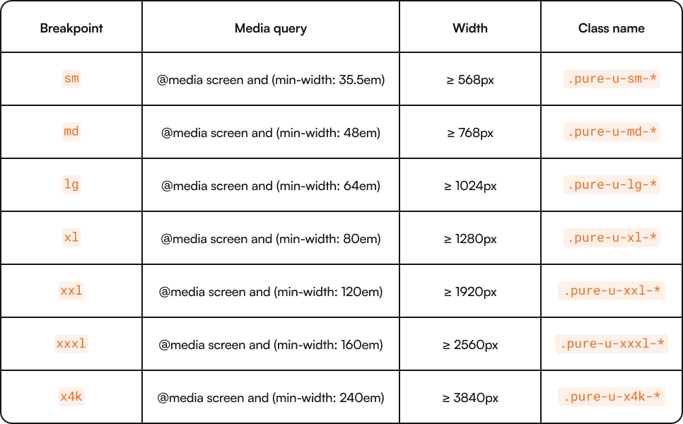
- Responsive grid system: Pure.CSS provides a responsive grid system called Pure Grids that allows for easy layout customization across different screen sizes. This makes it easier to create responsive designs without reinventing the wheel. Pure provides the following media query breakpoints.
Pros
- Lightweight file size: One of the standout features of Pure.CSS is its incredibly small file size. The entire framework is only 3.5kb minified and gzipped, which means faster load times for your web pages.
- Modular structure: Pure.CSS follows a modular architecture, allowing you to select only the necessary components. This flexibility helps reduce unused code and optimize performance.
Cons
- Limited pre-designed components: While Pure.CSS offers a solid foundation for building websites, it has fewer pre-designed components than other frameworks like Bootstrap or UIKit. It doesn’t provide styles for components like nav, cards, tags, and dropdown.
- Learning curve: Pure.CSS’ grid system and the naming convention it uses for its grid classes make it challenging to learn.
5 - Semantic UI
Semantic UI is an open-source CSS framework for styling websites and applications. An interesting thing about Semantic UI is that it still uses JQuery today. It also supports integration with React, Angular, Ember, and other JavaScript frameworks.
While Semantic UI is not as widely used as Bootstrap, it has a higher retention rate. 36.2% of developers who use Semantic UI keep using it, while 31% of Bootstrap’s users stick with it.
As of this writing, semantic UI has over 50k GitHub stars.
Features
- JQuery code: Semantic UI relies on JQuery for interactive components.
- Transitions: Semantic UI provides over 30 transitions that you can apply to elements.
Pros
- Unique components: A great thing about Semantic UI is that it provides unique components like statistics, 3d shapes, sidebars, feed, and sticky content.
- Lightweight: Semantic UI’s size is 96.9kb when minified, which is great for performance.
- Documentation: An interesting thing in Semantic UI’s documentation is a Glossary page, which includes definitions of the terminologies present in the docs. This makes it easier to understand and navigate the documentation.
Cons
- Still uses JQuery: JQuery is still used by 21.9% of websites today, so it's not disappearing anytime soon. However, modern web development practices have moved to other languages and frameworks.
6 - Materialize CSS
Materialize CSS is a popular frontend framework that allows developers to create responsive and visually appealing websites and web applications. It is based on Google's Material Design guidelines, which provide a set of rules and principles for creating user-friendly interfaces.
Materialize CSS provides many pre-built components and utilities, including navigation bars, buttons, cards, forms, modals, and much more.
Features
- Provides interactive components: Materialize CSS doesn’t stop at providing styles for different elements. It also includes JavaScript code that you can use for interactive components like carousels, dropdowns, modals, tooltips, and tabs.
- Responsive and mobile-first: Materialize CSS is built with a mobile-first approach, ensuring that websites created with this framework are fully responsive and optimized for different screen sizes.
Pros
- Material design principles: Materialize CSS follows the principles of Material Design, which provides a clean, modern, and visually appealing aesthetic. It offers a consistent and intuitive user interface that is familiar to users, making navigation easier and enhancing the overall user experience.
- Starter templates: Materialize CSS provides themes and templates that speed up the development process and make it easier for you to get started.
Cons
- Limited customization: • Materialize CSS’s strict adherence to Material Design guidelines limits the extent to which you can customize the appearance of elements. This can be a disadvantage for projects with highly customized designs and specific branding requirements.
- Requires JavaScript knowledge: You need JavaScript knowledge to use the interactive components Materialize CSS provides. This can be difficult for beginner developers who are still learning the ropes of web development.
7 - UIKit
UIKit is a modular CSS framework for creating attractive and responsive web interfaces quickly.
It offers a wide range of customizable components that are visually appealing, user-friendly, and compatible with all modern web browsers. The components include buttons, forms, navigation bars, and sliders. This makes it easy to build beautiful websites without starting from scratch.
Features
- Internationalization: UIKit supports the internationalization of its components via an i18n options object it provides.
- RTL support: UIKit supports right-to-left languages and enables you to change the orientation of all design elements. The RTL version of UIKit reverses the orientation of its design elements, including properties like floats, text-align, position coordinates, and direction of background shadows.
- Animations: UIKit provides a collection of built-in animations to enhance user interactions. You can use these animations to add flair and interactivity to your website.
- Responsive design: UIKit helps create interfaces that look good on various devices and screen sizes. It automatically adjusts website layouts to provide a seamless and accessible experience on desktops, tablets, and smartphones.
Pros
- Easy to use: UIKit is known for its simplicity and ease of use, allowing you to quickly build web interfaces without writing CSS code from scratch.
- Customizable: UIKit allows you to customize and extend its styles and components to fit your needs. This flexibility enables you to create unique and personalized designs.
- Provides multiple components: UIKit provides a wide range of ready-to-use presentational and interactive components, including spinners, accordions, and icon navigation.
Cons
- Paid features: UIKit has a product offering called "UIKit Pro," which comes with over 100 styles, a layout library, and a page builder. However, you have to pay to access this system.
8 - Pico CSS
Pico CSS positions itself as a “minimalist CSS framework for semantic HTML.” It was designed to offer a clean and semantic approach to web design.
A major differentiator between Pico and other frameworks is its unique approach to styling — Pico directly applies essential styles to HTML elements, reducing the need for extra classes. For example, in many CSS frameworks, if you want to style a button, you might need to add multiple classes like btn, btn-primary, and btn-large to achieve the desired look. With Pico, you simply write <button> in your HTML, and it’s automatically styled without needing any additional classes.
This semantic styling approach is possible because the framework automatically applies default styles to your HTML elements when you include its CSS file in your project. This approach keeps your HTML clean and enforces semantic HTML practices.
With Pico, there’s no need for bloated classes or unnecessary dependencies—just pure, lightweight CSS that enhances the natural structure of your HTML. This framework is perfect if you want to avoid the overhead often associated with larger, more complex CSS frameworks.
Features
- CSS variables: Provides over 130 CSS variables that you can use to customize its design system. All CSS variables in Pico are prefixed with
pico-to avoid conflicts with other frameworks or your custom variables, ensuring a smooth integration into your existing codebase. - Conditional styling: This feature allows you to selectively apply Pico's styles to specific parts of a webpage. This gives you control over where Pico's styles are used.
- Dark mode: Pico provides built-in support for dark mode. This feature automatically adapts to the user's preferred color scheme based on their system settings.
- RTL support: It includes built-in support for RTL languages, making it a good choice for international projects. This feature allows you to accommodate languages like Arabic, Hebrew, and Persian.
Pros
- Responsive: Pico ensures that your website looks good on all devices right out of the box without needing any additional configuration or classes for responsiveness.
- Lightweight: At 11.3kb (minified+gzipped), Pico CSS is a lightweight framework, which is a plus for performance and page load times.
Cons
- Limited component styles: Pico doesn't provide styles for a wide range of components like sliders, progress bars, and carousels. While it handles basic and essential UI elements, you may need to create custom styles and functionality or use third-party libraries to fill in the gaps for more complex components.
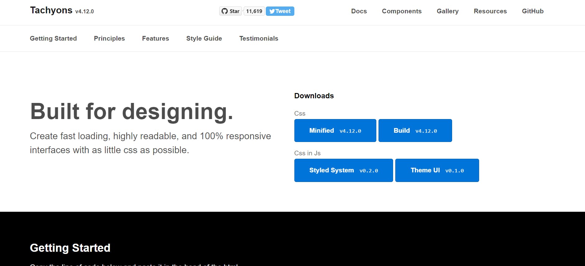
9 - Tachyons
Tachyons is a functional CSS framework designed to help developers create fast-loading, highly readable, and responsive interfaces with minimal code.
Tachyons emphasizes modularity by breaking down CSS into small, reusable classes. This allows you to build complex layouts and components using only the styles they need. This approach not only speeds up development but also ensures that the final product is lightweight and performant.
Features
- No JavaScript functionality: Tachyons focuses only providing utility classes for styling and layout. Unlike other frameworks that include components like modals, dropdowns, and carousels that require JavaScript, Tachyons does not. This makes it lightweight and highly performant, but it also means that you need to rely on external JavaScript libraries or write custom scripts to add interactivity to your web projects.
- Modularity: Tachyons is not a monolithic framework. Instead, it is composed of small, single-purpose classes that can be mixed and matched to create complex designs.
Pros
- Lightweight: Compared to other frameworks like Tailwind CSS and Semantic UI, which have a minified+gzipped bundle size of 516.5kb and 96.9kb, respectively, Tachyons delivers a small 13.7kb CSS file.
- Fully customizable: Tachyons provides a config file where you can customize various parts of its system like class names, media queries, or breakpoints.
Cons
- Documentation navigation: Tachyons’ documentation is all on one page, without a sidebar or search functionality. This can make navigating the documentation and finding specific information inconvenient, leading to a poor learning experience.
- Limited components: While Tachyons provides a solid foundation, it lacks the extensive pre-built components found in other frameworks like Bootstrap or Materialize CSS. It has 21 components as of this writing, meaning that you may need to create custom components or rely on additional libraries to achieve more complex UI elements.
Which CSS framework should you use?
If you’ve made it this far into the article, you may be wondering, “What CSS framework should I use?”
The simplest response to this is, “it depends.” It depends on factors like the nature of your project, the project requirements, and the brand and design specifications.
Personally, I love working with Tailwind because of its active developer community and how flexible it is in creating unique and custom websites. Besides that, many frontend developer job descriptions require Tailwind knowledge, so learning it could give you an advantage.
Ultimately, make sure you consider the features, pros, and cons before choosing.
The following table gives a summary of the CSS frameworks we covered.
Final thoughts on CSS frameworks
As we look ahead to 2026 and beyond, we can expect new CSS frameworks to emerge and to see updates to existing ones. The CSS frameworks we have covered in this article are some of the best ones you can use for your next project.
CSS frameworks shorten development time, ensure brand consistency across different browsers and screen sizes, they help with accessibility, enforce responsive design, and improve code maintenance.
Always consider the features, props, and cons when choosing a CSS framework.


