CSS Button Animations: 40 Ideas to Inspire You + Code Examples

Buttons are everywhere—on forms, CTAs, landing pages, and countless other parts of the web. But too often, they’re overlooked as simple functional elements. Why settle for ordinary when buttons can be eye-catching and memorable?
To inspire you, here’s a collection of 40 creative CSS button animations, many of which I’ve created myself, to help your buttons stand out and add extra flair to your projects. Let’s dive in!
Custom CSS button animations
1. Glitch effect
Glitch effect
Interactive CodePen loads when it gets near the viewport.
This animation creates a button with a "glitch" effect that activates when hovered over. It relies on @keyframes glitch, which shifts the button in quick, jagged movements, mimicking a screen glitch.
2. Liquid fill effect
Liquid fill
Interactive CodePen loads when it gets near the viewport.
The code for this animation creates a button with a "liquid fill" effect that changes its background when hovered over. The hover state of the liquid class triggers a smooth transition where a blue gradient "liquid" fills the button from the bottom upwards. The effect uses CSS variables (--p and --t) to control the fill percentage and timing, ensuring a visually pleasing and fluid animation.
3. Matrix rain
Matrix rain
Interactive CodePen loads when it gets near the viewport.
This animation creates a button that’s styled to mimic the iconic "Matrix rain" effect when hovered over. The code-rain div is responsible for the animated green cascading lines effect. On hover, the code-rain background becomes visible, and the @keyframes rain animation moves the gradient vertically, simulating falling code.
4. Hologram
Hologram
Interactive CodePen loads when it gets near the viewport.
This animation creates a cool futuristic button with a glowing "hologram" vibe. The button has a cyan glow around the border and background, with text that flickers in pink and cyan to mimic a glitchy effect. The glitchy look comes from the ::before and ::after pseudo-elements, which animate slightly out of sync to create that distorted feel. A thin "scan line" moves up and down over the button, adding to the sci-fi look.
5. Neon pulse
Neon pulse
Interactive CodePen loads when it gets near the viewport.
This animation gives a button a glowing "neon pulse" effect that gives off a futuristic vibe. The button has a cyan border and a subtle box shadow, adding to its glowing appearance. Two animated layers (::before and ::after) expand outward from the button's edges in a pulsing motion, starting bright and fading as they grow larger.
The pulse animation runs continuously, with a slight delay between the two layers, creating a mesmerizing ripple effect. This design is perfect for grabbing attention on a dark-themed website or any project with a sci-fi or high-tech aesthetic.
Animate your text, too!
Want to add more life to the text on your website? Our CSS text animation article covers 40 types of text effects you can explore. Check it out!
6. Magnetic field
Magnetic field
Interactive CodePen loads when it gets near the viewport.
This code powering the magnetic field animation creates a particle field around a button, where tiny particles float dynamically when the button is hovered over, simulating a magnetic attraction. The particles are created dynamically with JavaScript, each given random positions and movement directions for a natural, scattered effect.
When hovered, the particles-field becomes visible, and the particles animate in a pulsating motion using the particleFloat keyframes.
7. Button animation collection
Button animation collection
Interactive CodePen loads when it gets near the viewport.
This set of buttons shows 4 types of animations:
- A pulse animation button that grows and shrinks repeatedly
- A wobble Animation button that shakes when hovered
- A border reveal button that fills its background from left to right when hovered over
- A rotate 3D button that flips along the X-axis when hovered
That’s it for the custom CSS button animations. Now, let’s move on to examples from other developers. View this Codepen collection to see other button animations I created.
3D CSS button animations
Let's start by checking out some creative 3D button animations by various CodePen creators!👇
8. CSS 3D button
CSS 3D Button
Interactive CodePen loads when it gets near the viewport.
The CSS 3D button animation by Mirza creates a 3D cube effect that rotates 360 degrees along the X-axis, giving it a spinning effect.
The <a> tag is styled to look like a cube, with each of its four <span> elements representing a face of the cube, positioned using rotateX and translateZ transformations.
9. CSS button flip
Auto Width Css Button Flip
Interactive CodePen loads when it gets near the viewport.
The CSS button flip animation by Alex Moore creates a "flip" effect where the button switches between a front and back text on hover.
The button uses the data-front and data-back attributes to dynamically display different content for each side while the vertical 3D flipping effect is achieved using rotateX transformations combined with translateY.
10. 3D CSS button
3D CSS BUTTON
Interactive CodePen loads when it gets near the viewport.
The 3D CSS button by Sulemans Codes contains five span elements stacked on top of each other. Upon hover, each span moves outward with decreasing opacity — thanks to the translate and opacity transitions — creating the illusion of an expanding ripple effect.
Ready for advanced 3D animations?
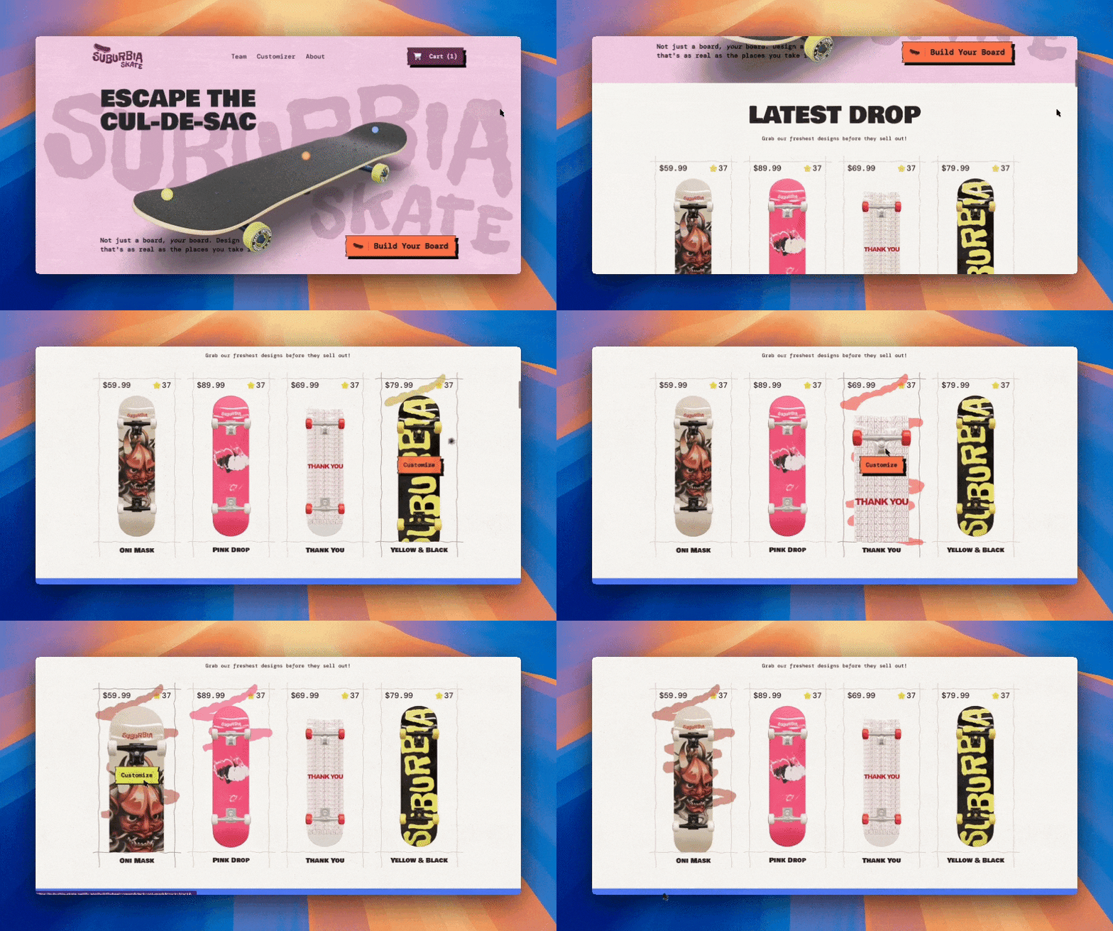
Create dynamic 3D interfaces with smooth animations using GSAP in our interactive course! You’ll learn how to build a customizer app and landing page with real-time animations using Next.js 15, GSAP, Prismic, Three.js, Tailwind, and TypeScript!
CSS button hover effects
Next, let’s dive into some hover effects and see how they can make buttons feel alive.
11. Button hover animations
Pure CSS button hover animation
Interactive CodePen loads when it gets near the viewport.
The collection of button hover animations by afa defines 28 types of button animations organized into four categories: shadow, background, border, and other.
Each button has unique hover effects and uses CSS properties like transform, box-shadow, background, opacity, and the ::before and ::after pseudo-elements to create dynamic interactions.
12. Blob bottom
Blobs button
Interactive CodePen loads when it gets near the viewport.
The blob button by Hilary features a "gooey blob" effect that creates an organic-like hover interaction. The button includes multiple span elements styled as blobs, which are animated using an SVG filter (filter: url('#goo')) to achieve the gooey, morphing effect.
Upon hovering, these blobs transition from their resting state to expand and merge smoothly, filling the button area while maintaining their fluid appearance.
13. Creative button hover collection
Creative Button Hover Collection
Interactive CodePen loads when it gets near the viewport.
The creative button hover collection by Yasin Softaoğlu demonstrates various button designs with distinct styles and hover effects, categorized into the following types:
- Type 1: Buttons with hover effects featuring white overlays that move diagonally, vertically, or horizontally
- Type 2: Buttons where the background fills from different directions
- Type 3: Buttons with dynamic shadow effects and a pressed look when clicked
- Type 4: Buttons with subtle hover interactions, like expanding underlines or moving lines
CSS click animations
Moving on, let's explore click animations that can make buttons more interactive.
14. Pressable CSS button
Pressable, iOS Compatible CSS Button
Interactive CodePen loads when it gets near the viewport.
The pressable CSS button by jemware uses interactive animations to enhance its functionality and design. When clicked, the button’s :active state shifts the button downwards (top: 10px) while changing its background color to a darker shade, simulating a pressed effect.
15. Hover glow effect
Чистый CSS Button Hover Glow Effect
Interactive CodePen loads when it gets near the viewport.
The hover glow effect by Kocsten enhances its button’s visual appeal on hover by applying a gradient of bright colors that appear around the button — via its :before pseudo-element. Then, on hover, the button’s :active state changes its text color to black and fills the whole background.
Discover more CSS hover effects
Want to see more examples of CSS hover animations? Then, check out our dedicated article that covers 40 hover effects.
16. Switch button
Pure CSS button switch
Interactive CodePen loads when it gets near the viewport.
The switch button animation by Mojtaba Seyedi features a toggle switch with a 3D-like feel. The button’s appearance consists of multiple rounded i elements, styled to look like small dots, and a gradient background that gives it a polished look.
When the checkbox is checked, the background color changes, and the text switches to "OFF" with a soft shadow effect, creating a visually engaging toggle effect.
CSS button loading animations
Next, we’ll look at loading animations that keep users engaged during processing.
17. CSS loading button
CSS Loading Button
Interactive CodePen loads when it gets near the viewport.
The CSS loading button by Joe is designed to simulate a loading state. The ::before pseudo-element creates a diagonal striped background using a repeating linear gradient, and the animation defined in the @keyframes loading continuously transitions the background from right to left, giving the impression of movement.
18. CSS loading button — 2
Pure CSS Loading Button
Interactive CodePen loads when it gets near the viewport.
The loading button by CodingDecoding combines a spinning icon and text to visually indicate a loading state. The spinner effect is created using the fa-pulse class from Font Awesome, which continuously rotates the fa-spinner icon. The button’s cursor is set to progress to reinforce its "loading" status.
19. CSS loading button — 3
Pure Css Loading Button
Interactive CodePen loads when it gets near the viewport.
The CSS loading button by Jude Francis creates a button with a loading spinner effect. The ::before pseudo-element covers the button, giving it the "disabled" state appearance, and the ::after pseudo-element — infinitely rotated by the @keyframes spin — adds a circular spinner.
Pair your buttons with powerful CTAs
Creating animations for your buttons is a great start, but they need to work hand-in-hand with effective call-to-action (CTA) text to truly make an impact. Strong CTAs can guide your audience and boost conversions. Check out our dedicated article for actionable tips and examples to improve your buttons' effectiveness.
CSS button text animations
Now, let’s shift our focus to text animations that add flair to button labels.
20. CSS menu transition
CSS menu transitions
Interactive CodePen loads when it gets near the viewport.
The CSS menu transition by Khaos includes multiple navigation sections that showcase different types of animations applied to navigation links. It is a creative playground for exploring different types of transition effects.
21. CSS sliced button
CSS Sliced Button
Interactive CodePen loads when it gets near the viewport.
The CSS sliced button by Sarah features a button with two distinct layers—top and bottom—that shift position on hover, creating a split effect. The dividing line is created with the ::before pseudo-element.
22. Button hover with slide animation
Button Animated | Button hover with slide animation Pure css
Interactive CodePen loads when it gets near the viewport.
The button hover with slide animation by Ajeet Kumar features circular icons that slides across their respective button on hover, with the text transitioning between two states (title and title-hover). These hover effects are achieved with CSS transitions, linear gradients, and positioning.
CSS button background animations
Let’s move forward with animated backgrounds that turn buttons into eye-catching elements.
23. CSS mask button hover
CSS-Mask Button Hover Animation ( Experimental )
Interactive CodePen loads when it gets near the viewport.
The CSS mask button hover animation by Yugam creates interactive button hover animations using CSS masks. It defines three buttons with a unique mask animation applied to them. The buttons display a sprite image, and on hover, the mask shifts, revealing a part of the image using a smooth transition defined by keyframes.
24. New CSS button
NEW CSS BUTTOn
Interactive CodePen loads when it gets near the viewport.
The new CSS button animation by Kyon Jordan is an interactive button with an animated border effect, where the button's borders — four gradient lines — continuously move around the edges.
Then, on hover, the button’s text color and background change, while a reflection effect, achieved using webkit-box-reflect, adds a mirrored reflection of the button.
25. Flush button
Flush button
Interactive CodePen loads when it gets near the viewport.
The flush button effect by AbhishekBaiju gives the button a “submerged in water” background where bubbles — created with radial-gradient — are constantly floating through it. Then on hover, the top half of the button’s background switches to black, while the water effect continues on the button half.
CSS button feedback animations
Next up, we’ll explore feedback animations that provide visual responses to user actions.
26. CSS open dialogue animation
CSS Button
Interactive CodePen loads when it gets near the viewport.
The CSS Button by Matthew Morete creates a polished modal with smooth entrance and exit animations. When the button is clicked, the modal slides in— both are designed with a subtle shadow effect. The trigger and close buttons include icon integration and interactive hover states, and the animations are handled through keyframes for enter/exit transitions, providing a seamless and professional feel to the modal interaction.
27. CSS submit button
Pure CSS Submit Button Animation.
Interactive CodePen loads when it gets near the viewport.
The CSS button by Matthew Morete creates a button that opens a dialog box when clicked. The dialog is designed with smooth animations for opening and closing. It also uses various keyframes to animate transitions like fade-in, fade-out, and slide movements.
28. Submit button animation
Submit Button pure css animation
Interactive CodePen loads when it gets near the viewport.
The submit button animation by Dead Pixel defines an animated button that, when clicked or focused, expands, changes color, shrinks back to its original size. During this time, the text switches to a “✅” symbol.
First time here? Discover what Prismic can do!
👋 Meet Prismic, your solution for creating performant websites! Developers, build with your preferred tech stack and deliver a visual page builder to marketers so they can quickly create on-brand pages independently!
CSS button svg animations
Our list isn’t complete without SVG animations for buttons.
29. Hover icons
Hover icons
Interactive CodePen loads when it gets near the viewport.
The hover icons effect by Miguel defines two SVG icons inside buttons with interactive hover effects. The .svg-path class and the @keyframes draw animation work together to create the effect of the SVG path being drawn on hover.
30. SVG button animation
CSS / SVG button animation - inspired by gn.org canvas button animation
Interactive CodePen loads when it gets near the viewport.
The SVG button animation by Stanko uses SVG paths styled with the stroke-dasharray and stroke-dashoffset properties to create a continuous, looping outline effect around a button. The keyframes outer-dashoffset and inner-dashoffset animate these properties, changing the stroke patterns and offsets over time, giving the impression of the outer and inner rectangles dynamically drawing and erasing themselves.
On hover, the button scales slightly, changes color, and pauses the animation for an interactive effect.
31. SVG play buttons
SVG play buttons
Interactive CodePen loads when it gets near the viewport.
The SVG play buttons by Adir consists of buttons with a rectangular base and a triangular play icon. A glowing effect — using filters — is applied to the play icon on hover.
CSS button icon animations
Next, we’ll explore how animating icons can take buttons to the next level of creativity.
32. Social media icons
Social media icon #5
Interactive CodePen loads when it gets near the viewport.
The social media icons animation by Nick creates a set of social media icons with interactive hover effects. Each icon has a line, created using the ::before pseudo-element, that matches the brand color of the icon. When you hover over an icon, the line animates from top to bottom, and as it moves, the icon's color changes to its brand's color. This effect enhances the visual appeal and highlights the brand identity of each icon.
33. grid-template links
grid-template links
Interactive CodePen loads when it gets near the viewport.
Grid-template links by Jhey creates a responsive navigation bar with social media links. The links are positioned in a row using the position: absolute property, with each link spaced according to the CSS custom properties --count and --index. When a user hovers over the links, they spread out horizontally, and their opacity increases.
34. CSS fizzy button
CSS Fizzy Button
Interactive CodePen loads when it gets near the viewport.
The CSS fizzy button by Jürgen Leister creates a visually dynamic "fizzy" button with particle animations. On hover, the arrow button slides up, and some animated particles. The particles' behavior is randomized in position, size, and animation timing to create a "bursting" effect.
Hamburger menu CSS button effects
These menu CSS effects add a creative twist to your navigation.
35. Gooey Menu
Gooey Menu
Interactive CodePen loads when it gets near the viewport.
The Gooey menu by Lucas Bebber uses SVG filters, such as feGaussianBlur and feColorMatrix, to produce a soft, blob-like effect on the menu elements, enhancing its appearance. When the hamburger icon is clicked, the menu items scatter out in an arc when clicked.
36. CSS menu concept
CSS Menu Concept - #codepenchallenge
Interactive CodePen loads when it gets near the viewport.
The CSS menu concept by GEOX creates a toggleable navigation menu. A hidden checkbox (#toggle) manages the menu's open and closed states, with a label element acting as the toggle button, transitioning between a hamburger icon and an "X" when clicked. When the menu is open, navigation items transform from lines into visible links.
37. Pure CSS menu
Pure CSS Menu - #13
Interactive CodePen loads when it gets near the viewport.
The pure CSS menu animation by Ivan Grozdic uses a custom checkbox input to toggle the hamburger menu — which has a continuously moving blob as its background.
When clicked, the blob moves from the hamburger icon to the center of the screen, before expending to show all the menu links. On hover, the links’ colors change and a line extends across it. Overall, this animation is sure to make your navbars stand out!
CSS button animations with JavaScript
Finally, let’s explore some CSS button animations that also use some JavaScript code to work.
38. Button concept
Button Concept
Interactive CodePen loads when it gets near the viewport.
The button concept by Shyamvcreates an interactive button that has a visual state change from "remove" to "success."
The button changes its appearance when hovered or clicked, switching icons (fa-remove to fa-check) and background color (from red to green), with animations enhancing the user experience.
The JavaScript code, written in CoffeeScript, adds a "success" class when the button is clicked, triggering the CSS transitions, and removes the class after 3 seconds to reset the button.
39. Flipover CSS mixin
FlipCover CSS Mixin
Interactive CodePen loads when it gets near the viewport.
The flipover CSS mixin animation by Velina V Veleva uses CSS, and JavaScript to generate interactive, styled buttons for social media and email links using a combination of HTML.
The flipCover function accepts configuration options like CSS class, URL, display text, and dimensions to create visually clickable sections for different platforms.
The buttons are animated and layered, with flipping effects applied via CSS classes (-button, -cover, -outer, and -inner) for an engaging user experience.
40. bubbly button
Bubbly Button
Interactive CodePen loads when it gets near the viewport.
The bubbly button by Nour Saud creates a button that has a "bubbly" animation effect when clicked. The animation of the bubbles is handled by JavaScript code and 2 keyframes (topBubbles and bottomBubbles). The JavaScript also ensures the animation resets and replays on each click.
CSS button generators and animation tools you should know
CSS3buttongenerator.com
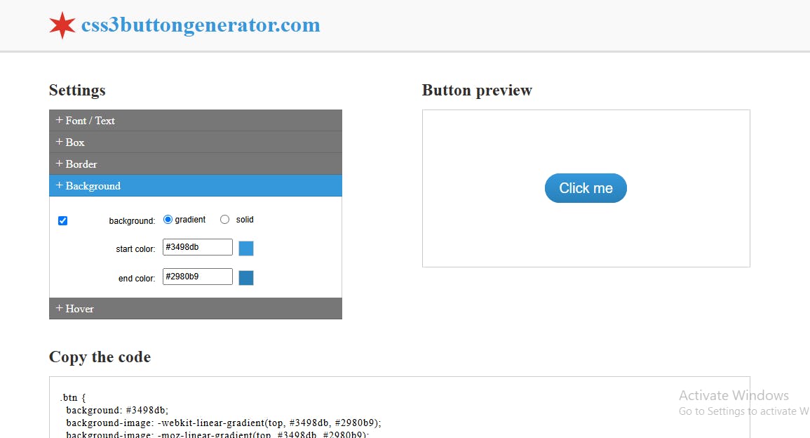
CSS3buttongenerator.com is designed to help you create custom CSS buttons without the need for manual coding. It offers a variety of configuration options to design buttons tailored to your needs, including control over text, borders, background, and hover effects. Once you've customized your button, the platform generates the CSS code, which you can copy and use directly in your projects.
CSS button generator
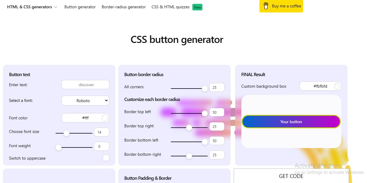
CSS button generator is a versatile tool for creating customized CSS buttons with advanced options. It allows you to design buttons with personalized text, font styles, borders, shadows, and hover effects, offering a live preview as you make changes.
This platform also provides extra pre-made button styles, pre-made shadows, and the ability to add icons to buttons, making it a comprehensive solution for button generation. Once your design is complete, you can easily copy the generated HTML and CSS code for use in your projects.
Buttons generator by Marko Denic
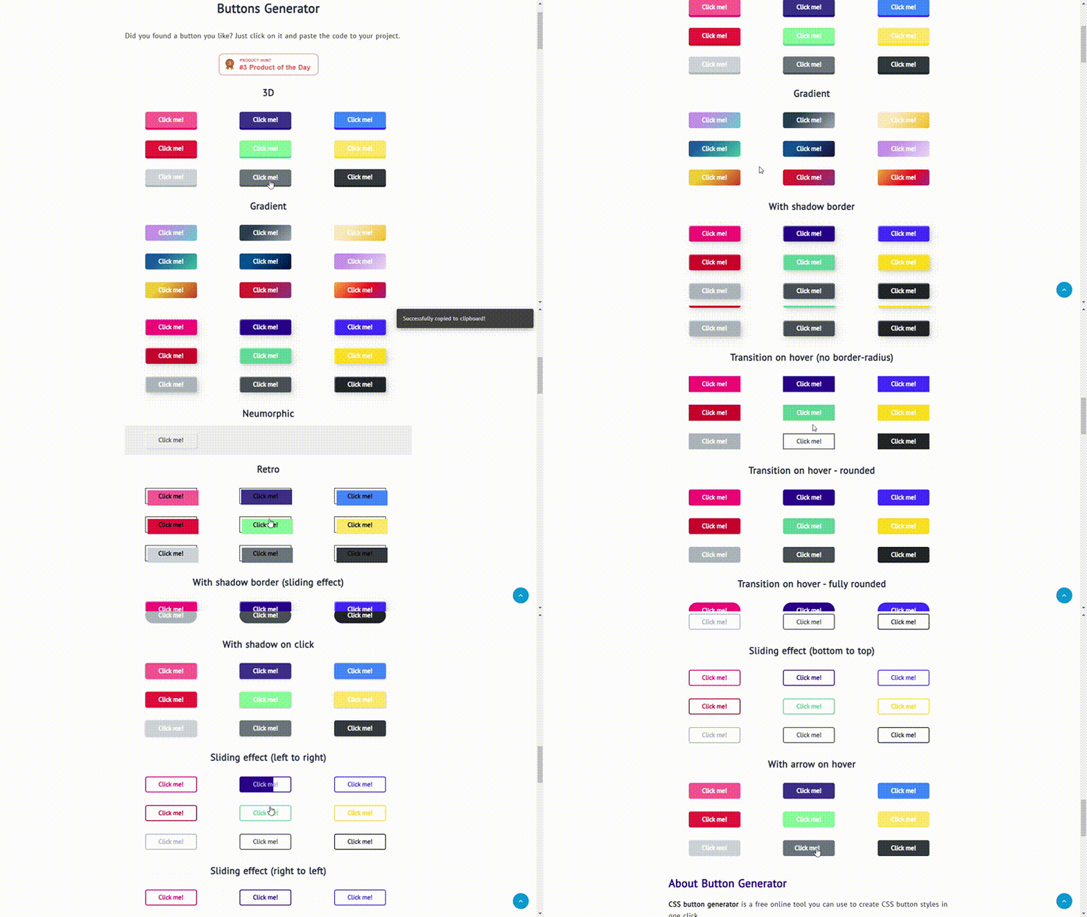
Technically speaking, buttons generator by Marco Denic is a collection of different pre-designed CSS buttons. You can explore various animated button styles and copy the ready-to-use CSS code directly into your projects. The animations are built with nothing but CSS.
Front-end tools’ CSS button generator
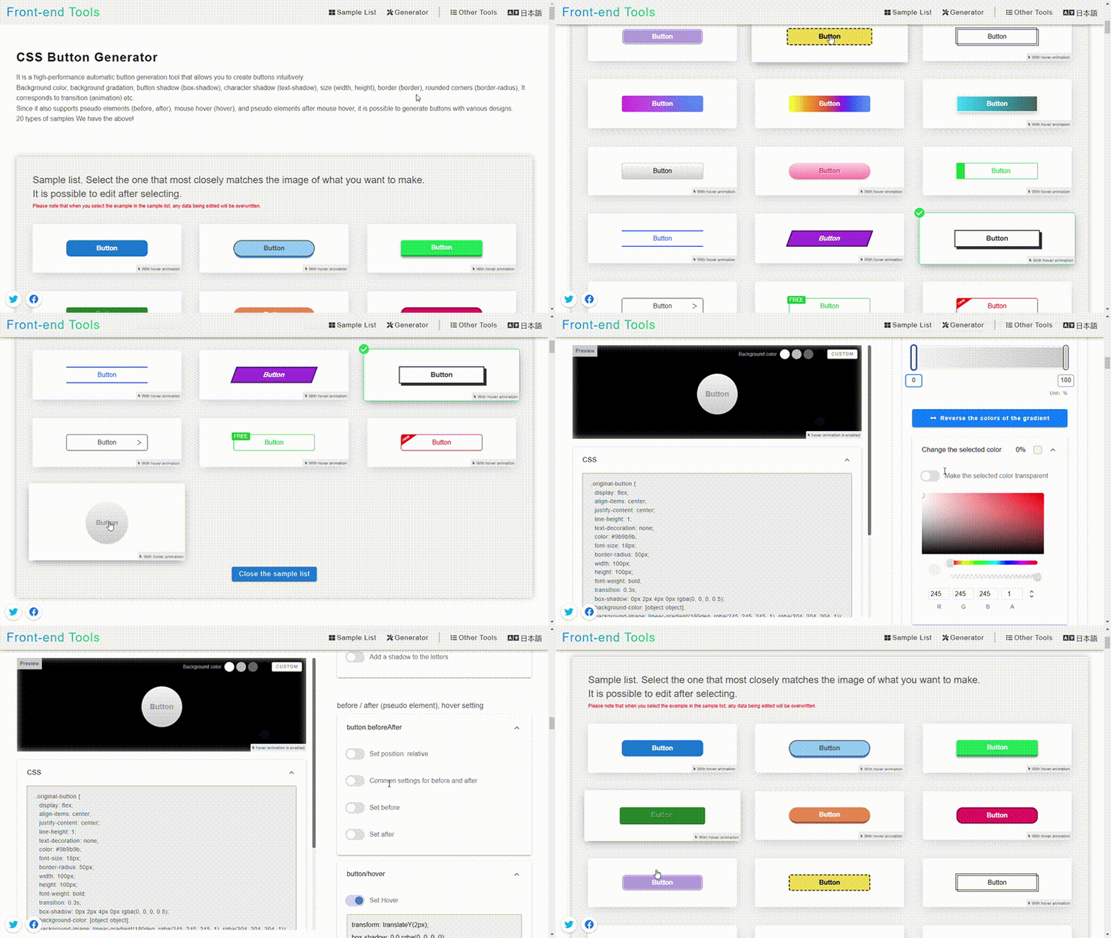
Users can explore a sample list of button styles, copy their code, or dive into an editor interface to create fully customized buttons on Front-end tools’ CSS button generator. It also supports advanced features like pseudo-elements and allows you to define transitions and hover effects for those elements, giving you greater control over the type of animations you can create.
Conclusion
CSS button animations open up a world of creativity, transforming simple buttons into interactive, visually engaging elements that enhance the user experience. Whether you’re adding subtle hover effects or diving into advanced techniques like SVG or 3D animations, these animations can make your website stand out.


