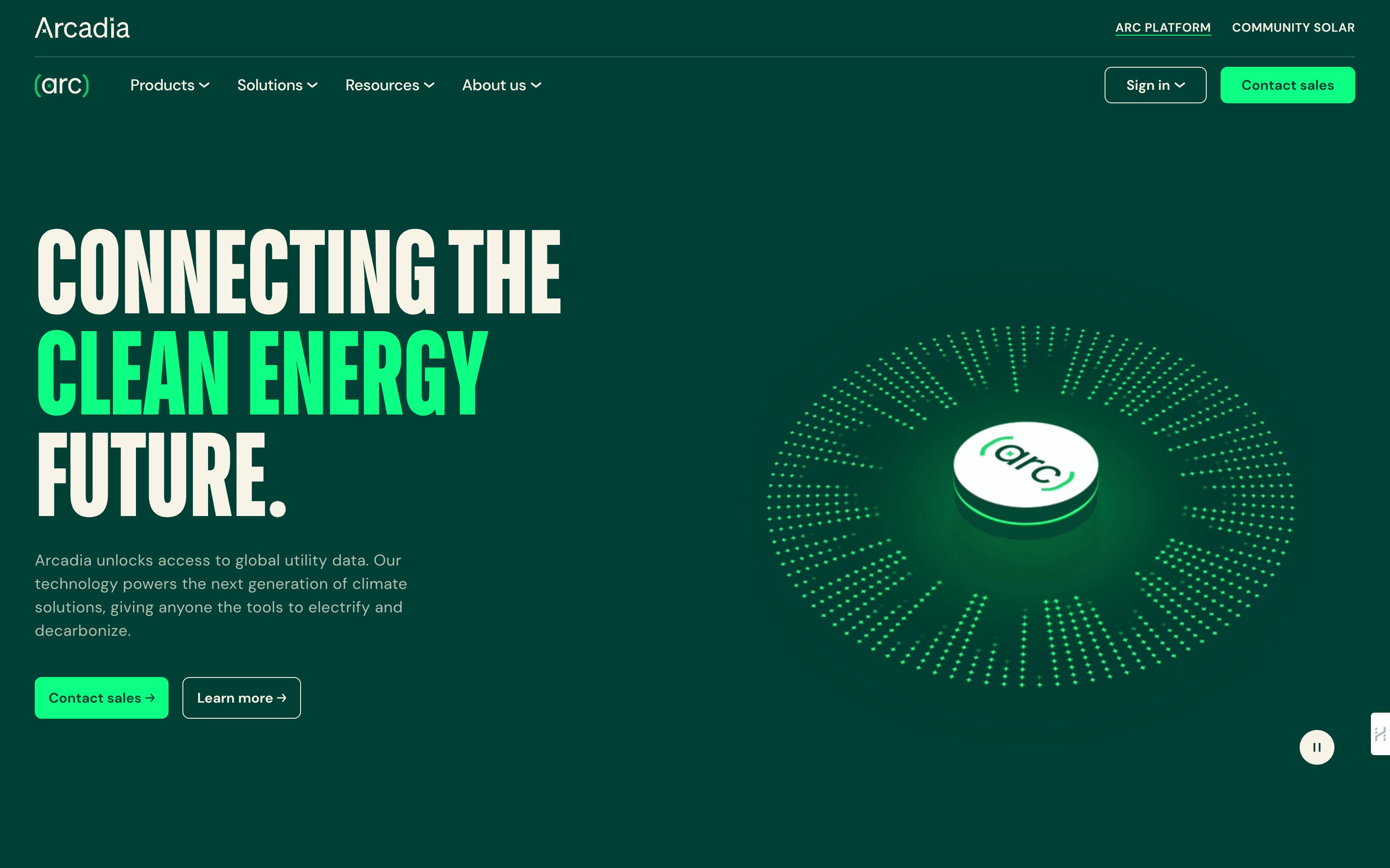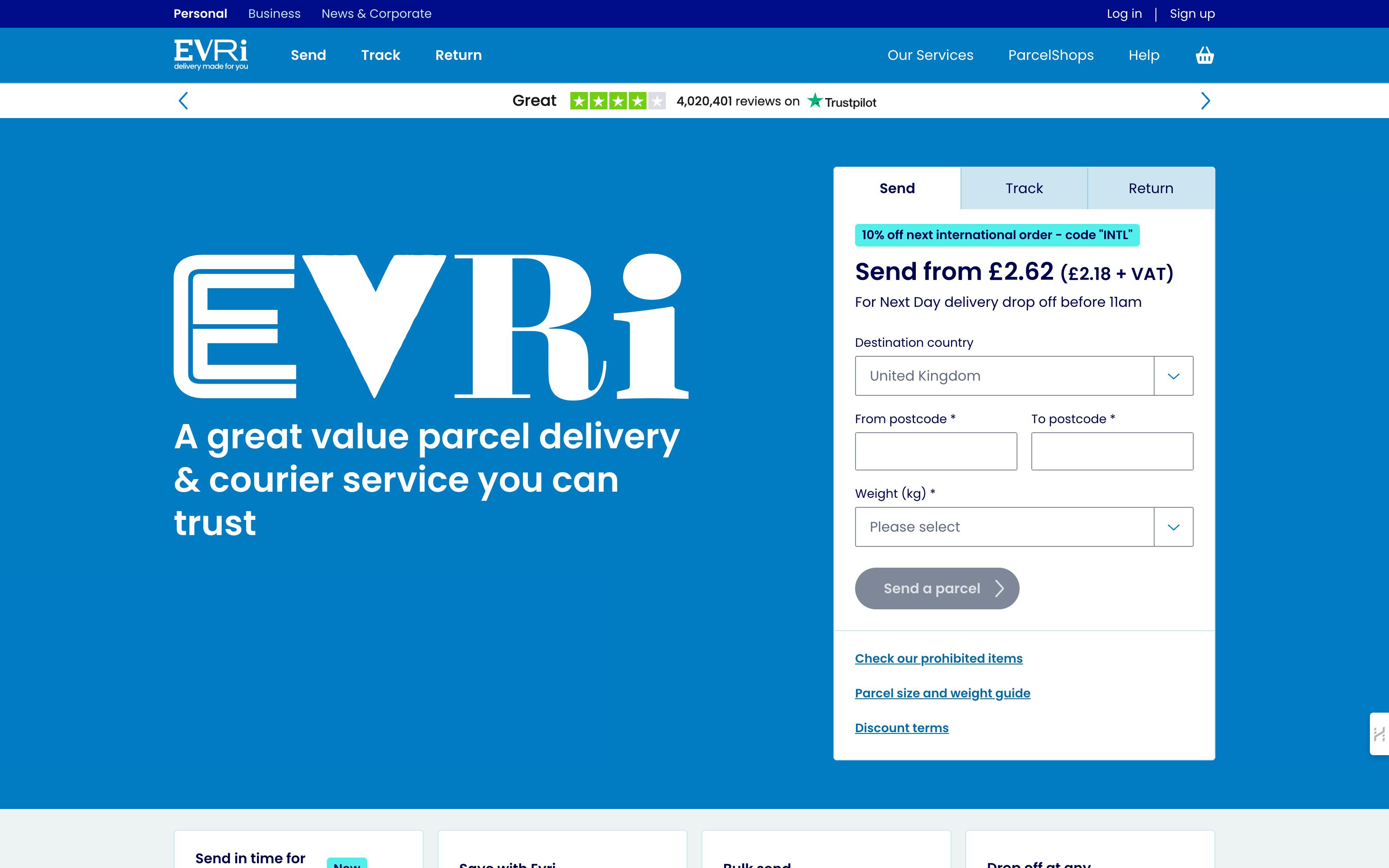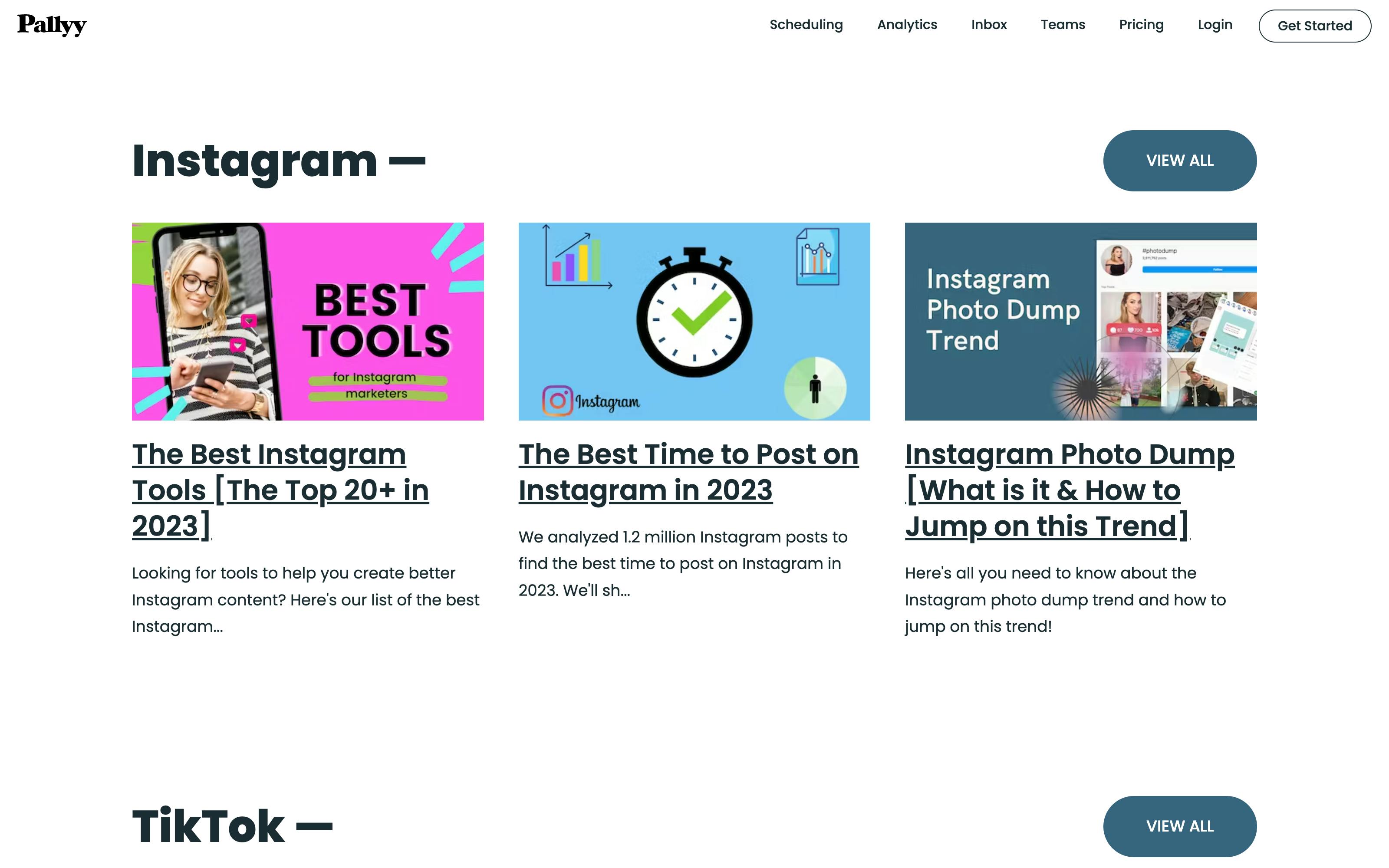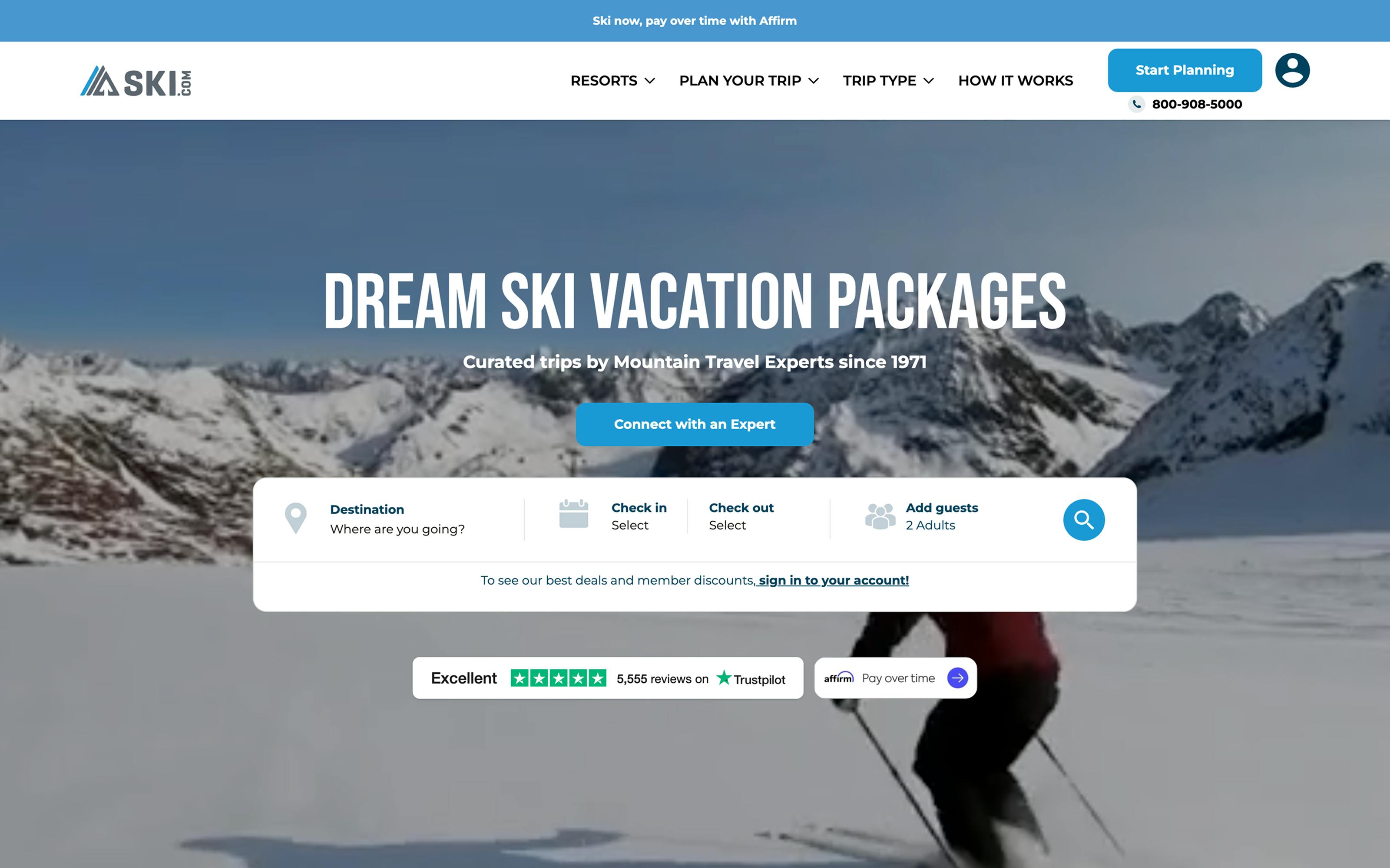
You open that website, click on that ad, or spot that pop-up message, and suddenly, a simple button or line of text pulls you in and grabs your attention: "Start Your Free Trial," "Discover Your Style," or "Get Started Now." Before you know it, you're clicking, signing up, or making a purchase.
That's the power of a persuasive call to action (CTA) in action, pun intended. These short, strategic prompts are crafted to turn casual viewers into customers, guiding them from “just looking” to “taking action.”
In this article, we’ll break down the most effective CTA examples and explore how they boost conversions so you can apply them to engage and convert your audience.
What is a call to action (CTA)?
A call to action, or CTA, is a marketing term for any design element or prompt that encourages users to take a specific action. This action could range from signing up for a newsletter, downloading a free resource, making a purchase, or even sharing content on social media.
Whether it's a button on a website, a line of text in an email, or a compelling phrase at the end of a video, CTAs bridge the gap between interest and action, guiding your audience toward a desired outcome.
Without a clear CTA, users might browse a website or read through a post but leave without taking the next step you want them to. Well-crafted CTAs direct users toward actions that benefit you/your business and them. The end goal is to convert passive visitors into engaged users, leads, or paying customers.
CTAs are commonly placed in a website’s hero section
Read our dedicated guide on “Website Hero Section Best Practices + Examples: A Complete Guide” to learn more about hero section CTAs!
Types and examples of CTAs
Different types of CTAs serve various purposes based on where you place them and the goals you aim to achieve. Let’s explore the main types and examples of CTAs commonly used across marketing channels.
1. Marketing website CTAs
Marketing website CTAs are designed to guide visitors through your site and encourage engagement with your brand. These CTAs are strategically placed throughout a website to move users closer to a conversion, like learning about a product, signing up for a newsletter, or scheduling a demo.
Example of marketing website CTAs in action
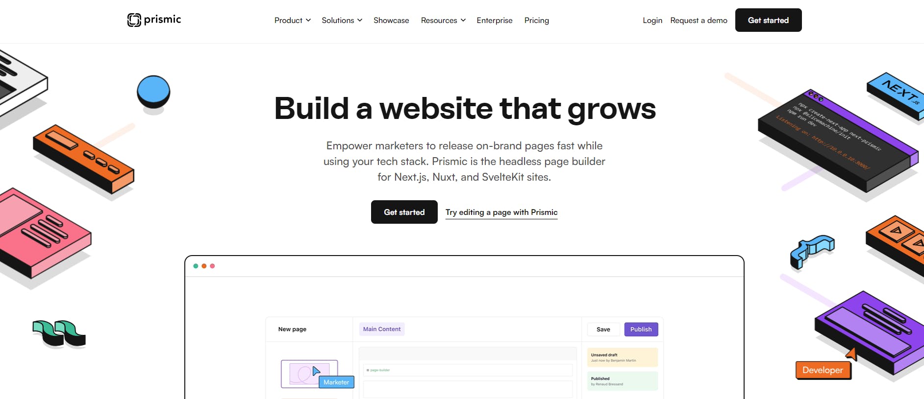
Prismic’s website features a "Get started" CTA that is designed to encourage users to dive into Prismic's platform right away.
Prismic pairs this main CTA with an extra action-oriented link, "Try editing a page with Prismic.” This alternative CTA appeals to users who want to experience Prismic’s platform and capabilities before committing.
2. Landing page CTAs
Landing page CTAs are tailored to the specific goal of a landing page, like downloading a resource, learning more about a product, signing up for a webinar, or making a purchase. Since landing pages are often single-purpose, the CTA here is typically very prominent and directly related to the action the page intends users to take.
Example of landing page CTAs in action
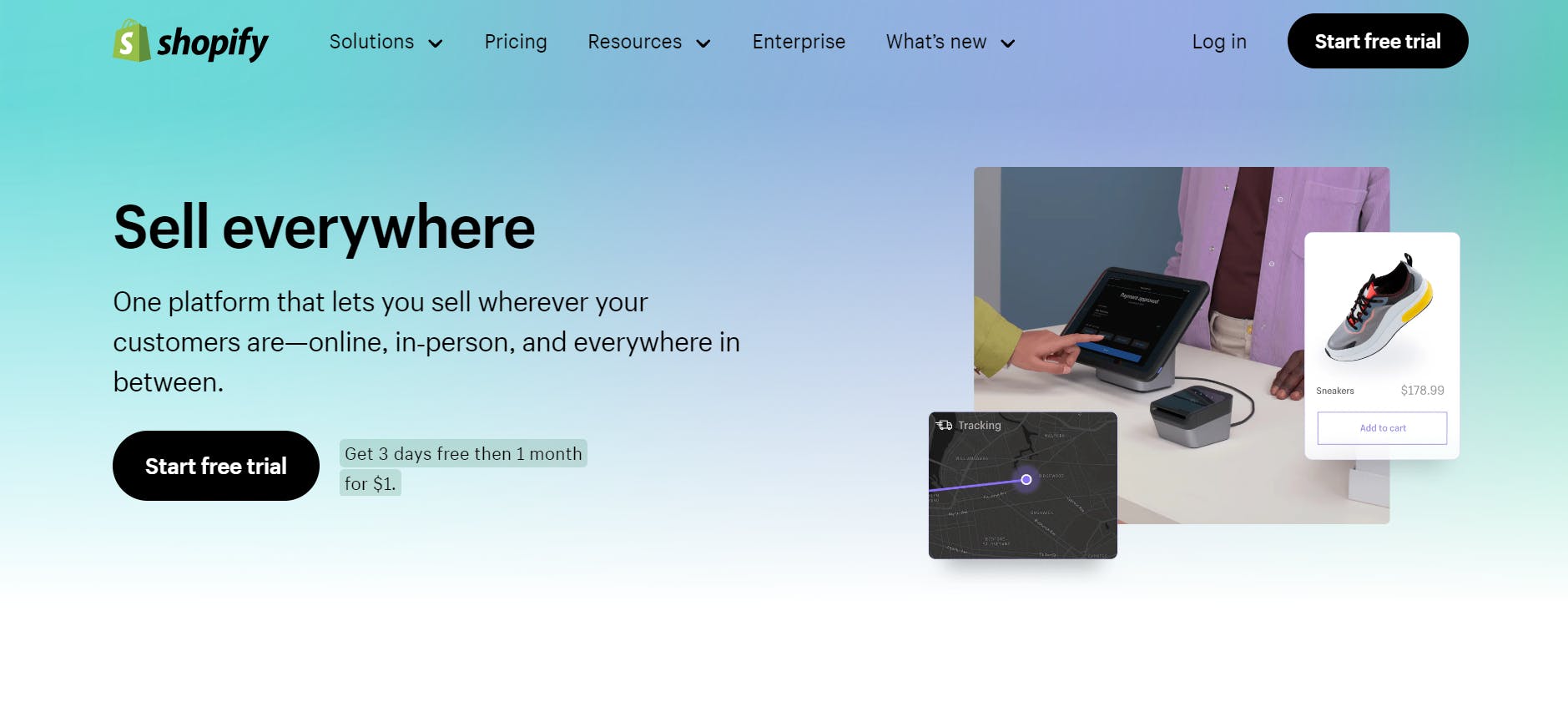
Shopify’s landing page for their "Sell" features a straightforward CTA: "Start free trial". They designed this CTA to stand out with a black background, making it instantly noticeable against the lighter background.
The "Get 3 days free then 1 month for $1" phrase next to the CTA creates a sense of affordability, encouraging visitors to try it out.
3. E-commerce CTAs
E-commerce CTAs encourage customers to explore products, add items to their cart, and complete purchases. These CTAs are essential on product and checkout pages, where they help drive conversion by prompting users to take direct purchasing actions.
Example of e-commerce CTAs in action
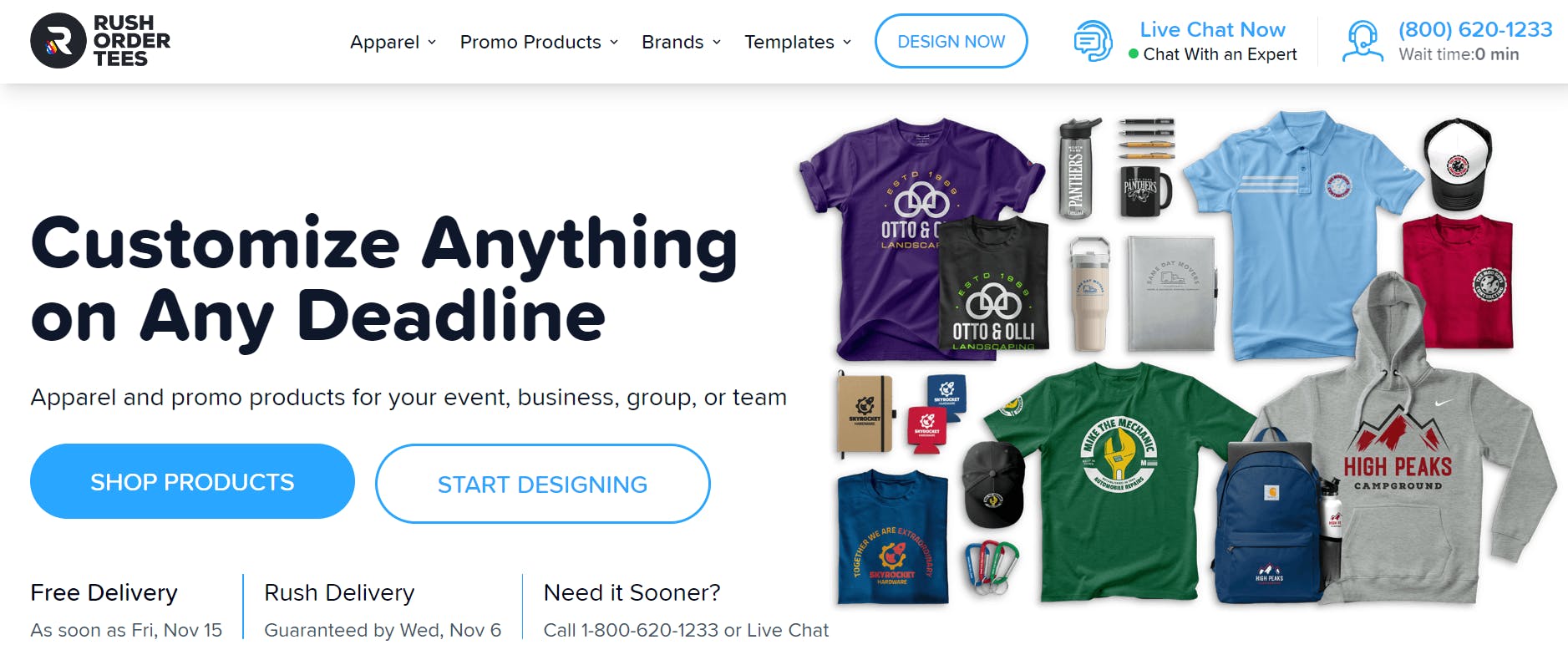
RushOrderTees’ website features two CTAs: "Shop Products" and "Start Designing." These CTAs target different user intentions. The first is tailored to users looking to explore available products, and the second is for customers looking to create customized products.
4. Portfolio website CTAs
Portfolio websites, often used by freelancers, designers, and agencies, use CTAs to encourage clients to reach out. These CTAs help convert visitors into clients or collaborators by inviting them to learn more about the creator’s work or get in touch.
Example of portfolio website CTAs in action
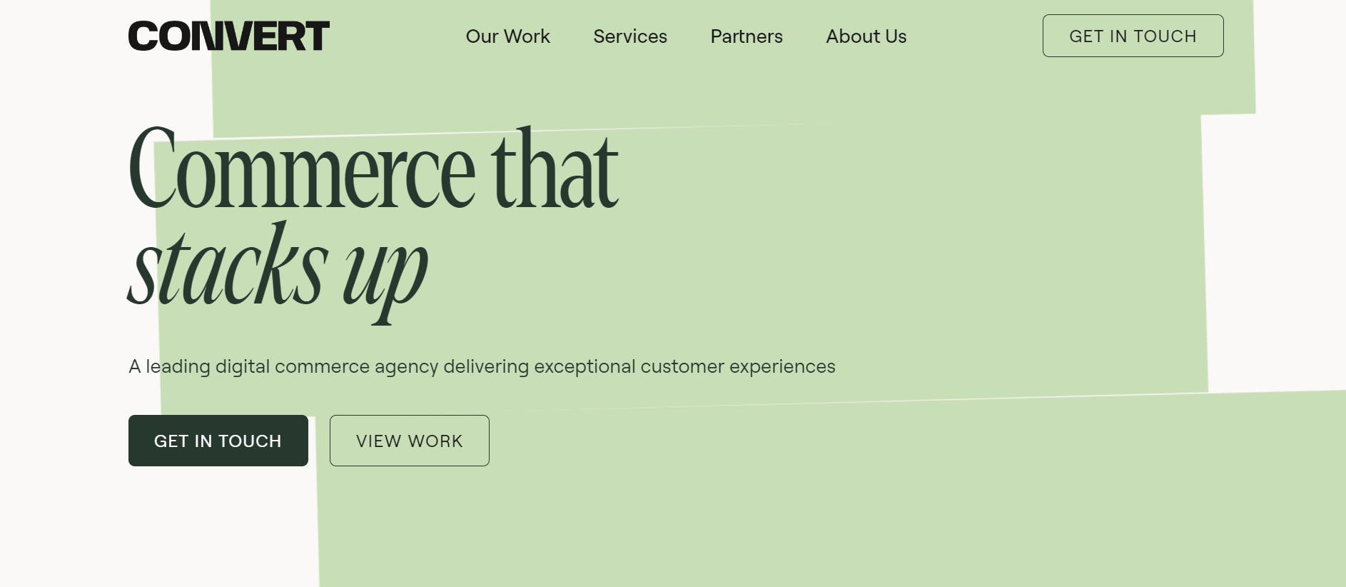
Convert Digital’s website uses a minimalist yet impactful approach with two CTAs: "Get in Touch" and "View Work." These CTAs serve different purposes — one is focused on generating leads, while the other drives traffic to the agency’s past projects, allowing potential clients to see the quality of their work.
Are you looking to build a portfolio website for yourself or a client?
Then, check out our tutorial video that covers how to do just that! In this step-by-step tutorial, you'll create a stunning 3D animated portfolio website with Next.js 14, Three.js, GSAP, and Prismic.
5. Email CTAs
Email CTAs are actionable prompts included in newsletters, promotional emails, and transactional emails. These CTAs are designed to guide recipients toward a specific action, like reading a new article, using a discount code, or finishing a registration.
Example of email CTAs in action
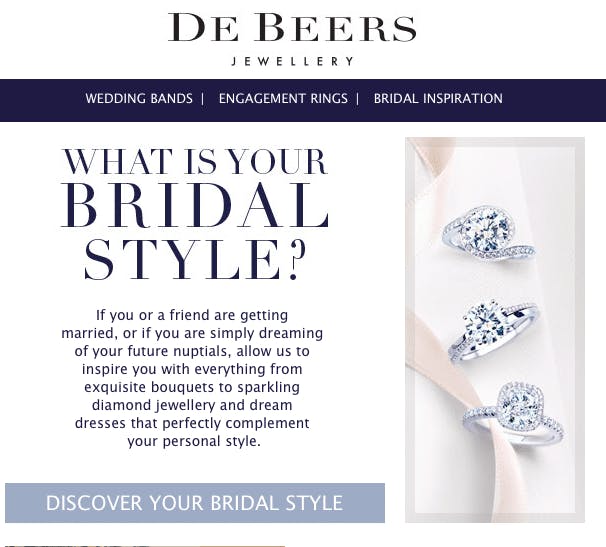
De Beers’ email marketing campaign uses an inviting and personalized CTA, "Discover Your Bridal Style", to engage recipients. This CTA is designed to encourage potential customers to explore De Beers' bridal jewelry collection and discover products that align with their unique style. This CTA appeals to individuals who value a personalized and customized shopping experience in their wedding planning.
6. Personalized Pop-up CTAs
Personalized pop-up CTAs appear on websites based on specific user behavior, like exit intent, time spent on a page, or items in a cart. These CTAs are designed to capture attention and boost engagement by tailoring the message to each user’s activity on the site.
Example of pop-up CTAs in action
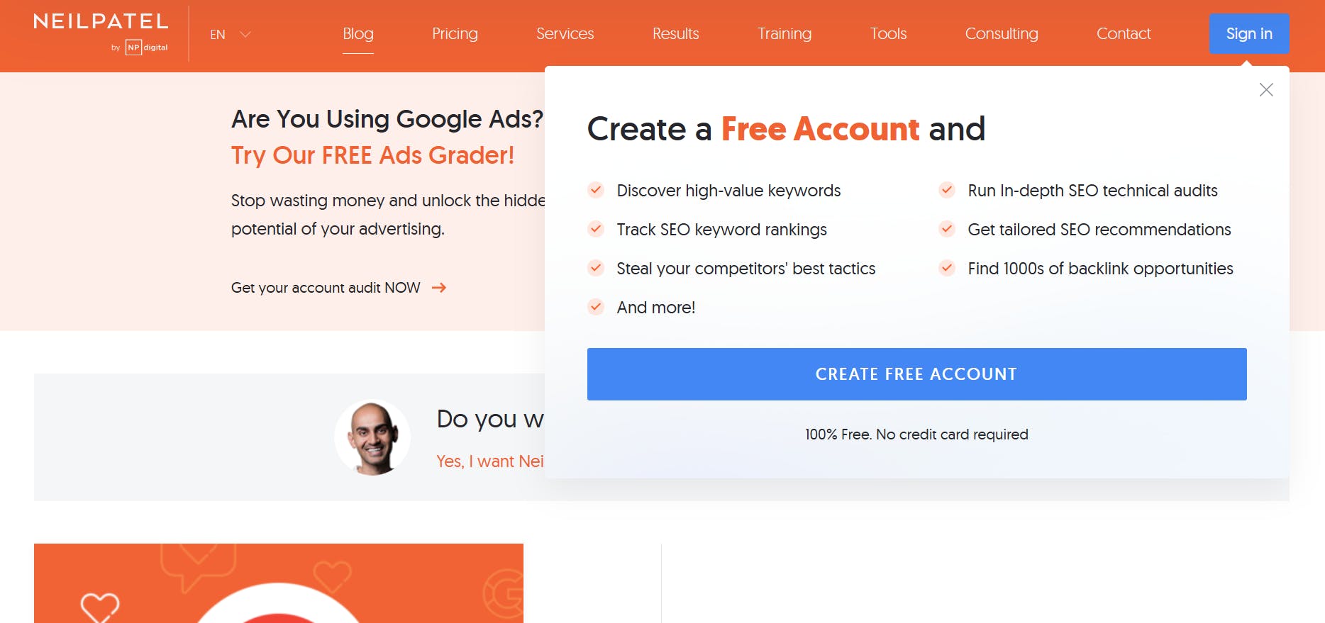
Neil Patel’s website uses an attention-grabbing pop-up with the CTA “Create Free Account” to encourage users to sign up for his platform. This pop-up is designed to appear to users who may benefit from additional SEO tools and insights.
7. Limited-time offer CTAs
Limited-time offer CTAs create urgency, encouraging users to take action before a promotion ends. These CTAs can be effective in sparking immediate action, as they suggest that an opportunity may soon be unavailable.
Example of limited-time offer CTAs in action
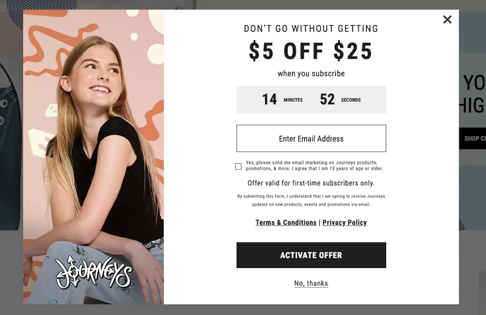
Journeys’ website pop-up uses a countdown timer and a strong CTA, “Activate Offer,” to create urgency and encourage immediate action. The pop-up offers “$5 off $25” and targets first-time subscribers to drive conversions.
8. Social media Ads CTAs
Social media ads use CTAs to capture attention and drive conversions directly from platforms like Facebook, Instagram, and LinkedIn. These CTAs are designed to fit seamlessly into the user’s social media experience while encouraging interaction.
Example of social media ads CTAs in action
Toptal’s social media ad targets companies in need of skilled developers and emphasizes their rigorous vetting process. The ad uses two CTAs: "Hire Now" and "Learn More," providing its target audience with options to either take immediate action or gather more information.
First time here? Discover what Prismic can do!
👋 Meet Prismic, your solution for creating performant websites! Developers, build with your preferred tech stack and deliver a visual page builder to marketers so they can quickly create on-brand pages independently!
7 CTA statistics and tips for writing compelling CTAs that convert
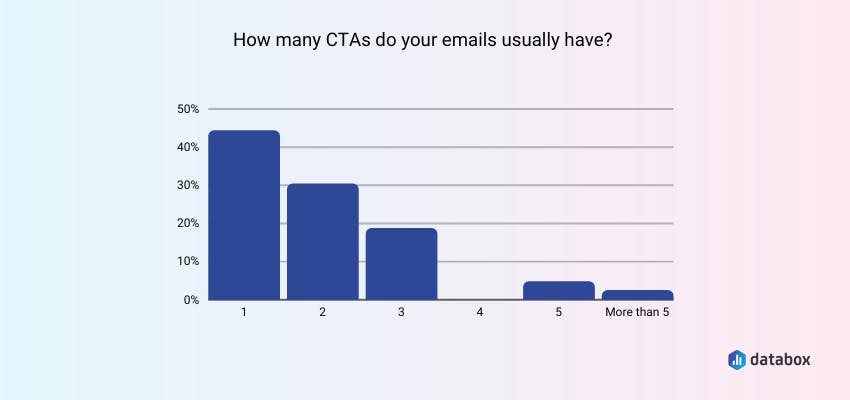
1. 43% of marketers use one CTA per email (Databox), and single-CTA emails increase clicks by over 371% (Wordstream)
Using too many CTAs in emails can overwhelm or confuse readers, leading to fewer clicks. Databox data shows that 43% of marketers opt for a single CTA per email. This preference aligns with the Omnisend data from their Black Friday to Cyber Monday analysis, which found that emails with fewer CTAs (specifically 2-3) had better click-through rates. This supports the notion that "less is more" when it comes to email CTAs.
Tip: While you may be tempted to flood your emails with CTAs, avoid overwhelming your readers with multiple actions, as more is not always better. A single, focused CTA can guide them more effectively.
2. Personalized CTAs perform 202% better than generic ones (HubSpot)
Personalization can boost CTA performance by 202%, as it creates a more relevant and engaging experience for users.
Tip: Use data to personalize your CTAs based on user behavior, location, or previous interactions. For instance, a returning visitor might see “Welcome back! Explore New Features,” whereas a new user might see “Start Your Free Trial Today.”
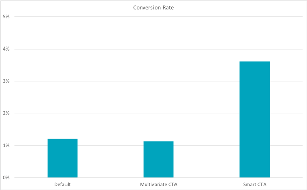
3. Placing CTAs at the bottom of long landing pages can increase conversions by 304% (CXL)
Conversion expert Michael Aagaard found that placing a CTA at the bottom of a long landing page resulted in a 304% increase in conversions.
Tip: Don’t just rely on CTAs at the top of your page. For longer pages, consider placing CTAs at natural stopping points throughout the content, guiding users to take action after they’ve had time to absorb the information.
4. Changing the CTA text from "Book a Demo" to "Get Started" increased conversions by 111.55% (HubSpot)
Tweaking CTA language from “Book a Demo” to “Get Started” helped PartnerStack increase their conversion rate by 111.55%, demonstrating that wording can significantly impact user perception.
Tip: Frame your CTA text in a way that feels helpful rather than sales-driven. Language like “Get Started” suggests immediate value, whereas “Book a Demo” feels more like a commitment. Choose words that reduce friction and make the action seem easy and rewarding.
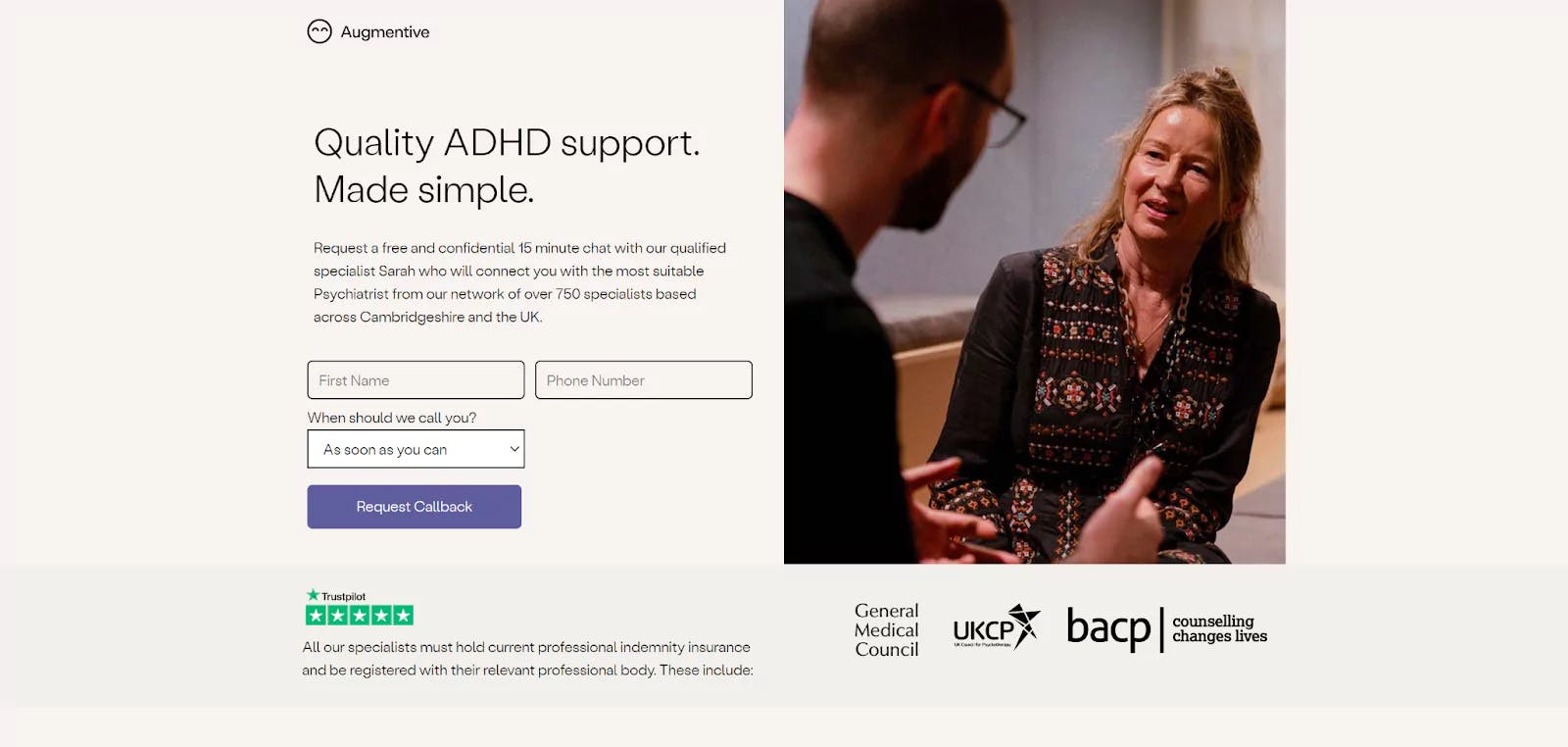
5. Social proof under CTAs can increase conversions by 68% (HubSpot)
Including social proof, like customer reviews, under a CTA helped Augmentive achieve a 68% increase in conversions, emphasizing the importance of trust.
Tip: Place testimonials, ratings, or user-generated content near your CTA to reassure users that they’re making a wise choice. This added credibility can be the nudge needed to convert hesitant visitors.
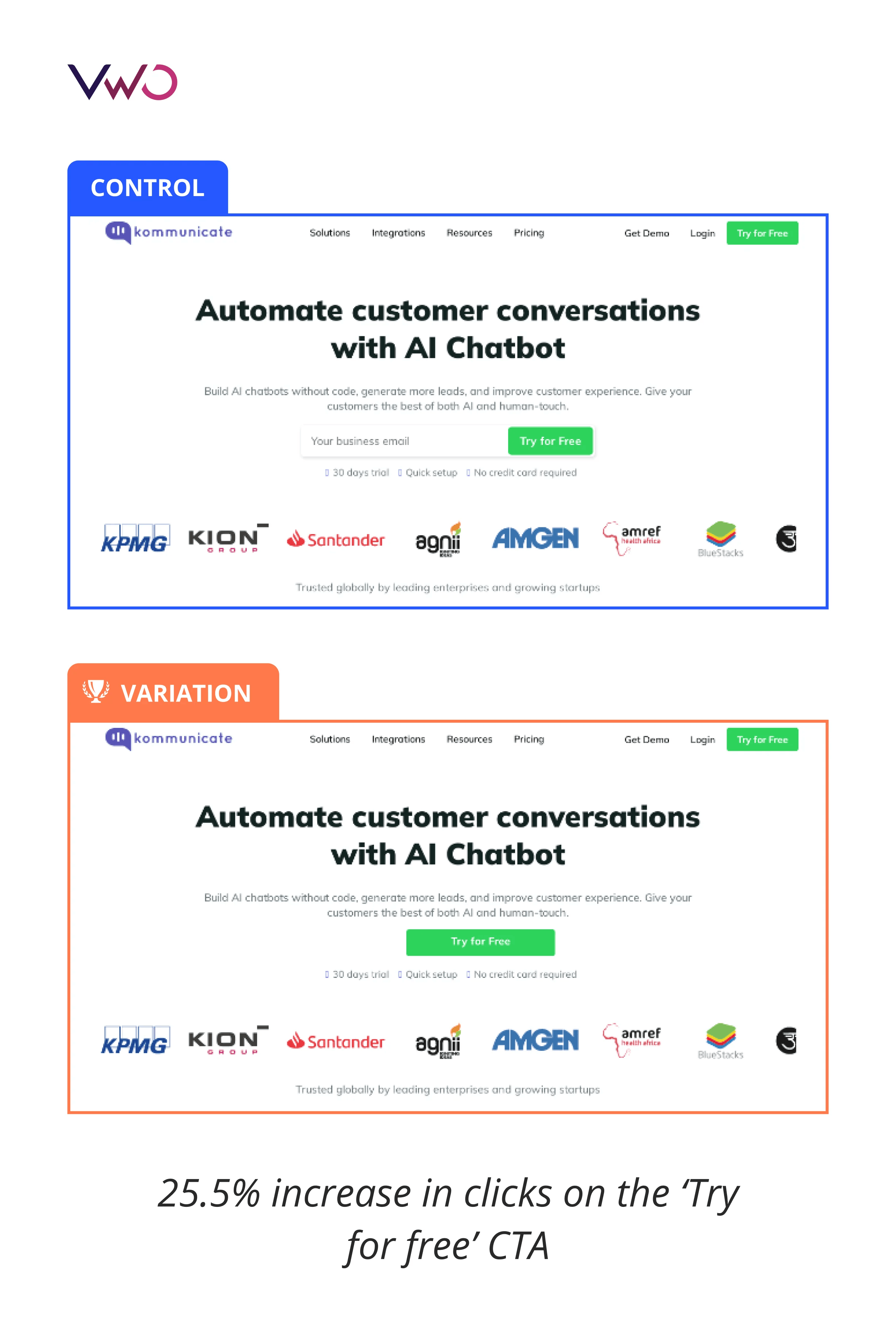
6. Removing email fields from CTAs increases clicks by 25.5% (VWO)
When Kommunicate removed the email field from their CTA, they saw a 25.5% increase in clicks, highlighting that reducing friction can lead to higher engagement.
Tip: Simplify your CTAs by minimizing the steps required for users to complete the action. If collecting information isn’t essential, remove it from the initial CTA to encourage more clicks and reduce perceived effort.
7. Making the CTA button larger and darker improved the conversion rate by 57.79% (Demio)
A well-sized, high-contrast CTA button can greatly improve conversions. When designing your CTA, consider using bolder colors and slightly increasing its size. Ensure that the button is large enough to stand out without overwhelming the rest of the content. This visual enhancement can subtly guide users toward the CTA as their eyes naturally gravitate toward prominent elements.
UX design tips to help improve CTAs and other elements
CTA buttons and other elements of your website need the right color contrast and visual stability to give users the best experience possible. Read our dedicated article to learn about other UX design tips to follow.
More CTA best practices and tips
We’ve covered some statistics and corresponding CTA tips earlier in the article. However, you can never have too many of them! Here are some more solid CTA best practices worth implementing:
- Be clear and direct: Avoid vague language. Users should know exactly what will happen when they click on a CTA.
- Use action-oriented words: Words like “Get,” “Try,” “Discover,” and “Claim” encourage users to take action.
- Create urgency when appropriate: Adding words like “Now” or “Today” can make users feel like they need to act quickly, especially for time-sensitive offers.
- Align with the user’s stage: Not every user is ready to buy right away. Use different CTAs for users at different stages of the buyer’s journey (e.g., “Learn More” for those in the awareness stage and “Get Started Now” for high-intent users).
- A/B test your CTAs: Test different CTA phrases and placements to see which performs best with your audience. Small changes can lead to significant improvements in engagement and conversion rates.
A/B test your CTAs
Learn more about A/B testing your CTA and redesigning other aspects of your website via the resources below:
➡️ How to A/B Test Your Website Redesign
➡️ Website Redesign Guide: What, Why, and How of a Website Redesign
5 AI CTA generators worth checking out
Let's face it: creating compelling CTAs that convert and drive engagement can be hard, especially when you're managing multiple campaigns or hitting a creative block. Thankfully, in such cases, you can use AI CT generators that can suggest CTA ideas tailored to your audience and goals.
Note that the platforms we’re about to explore aren’t stand-alone CTA generators. They’re versatile tools that can support you across various tasks, including ad copywriting, social media content creation, and email marketing.
AI tools to boost your productivity
From code generators to documentation generators, etc — learn more about AI tools that can boost your productivity.
ChatGPT
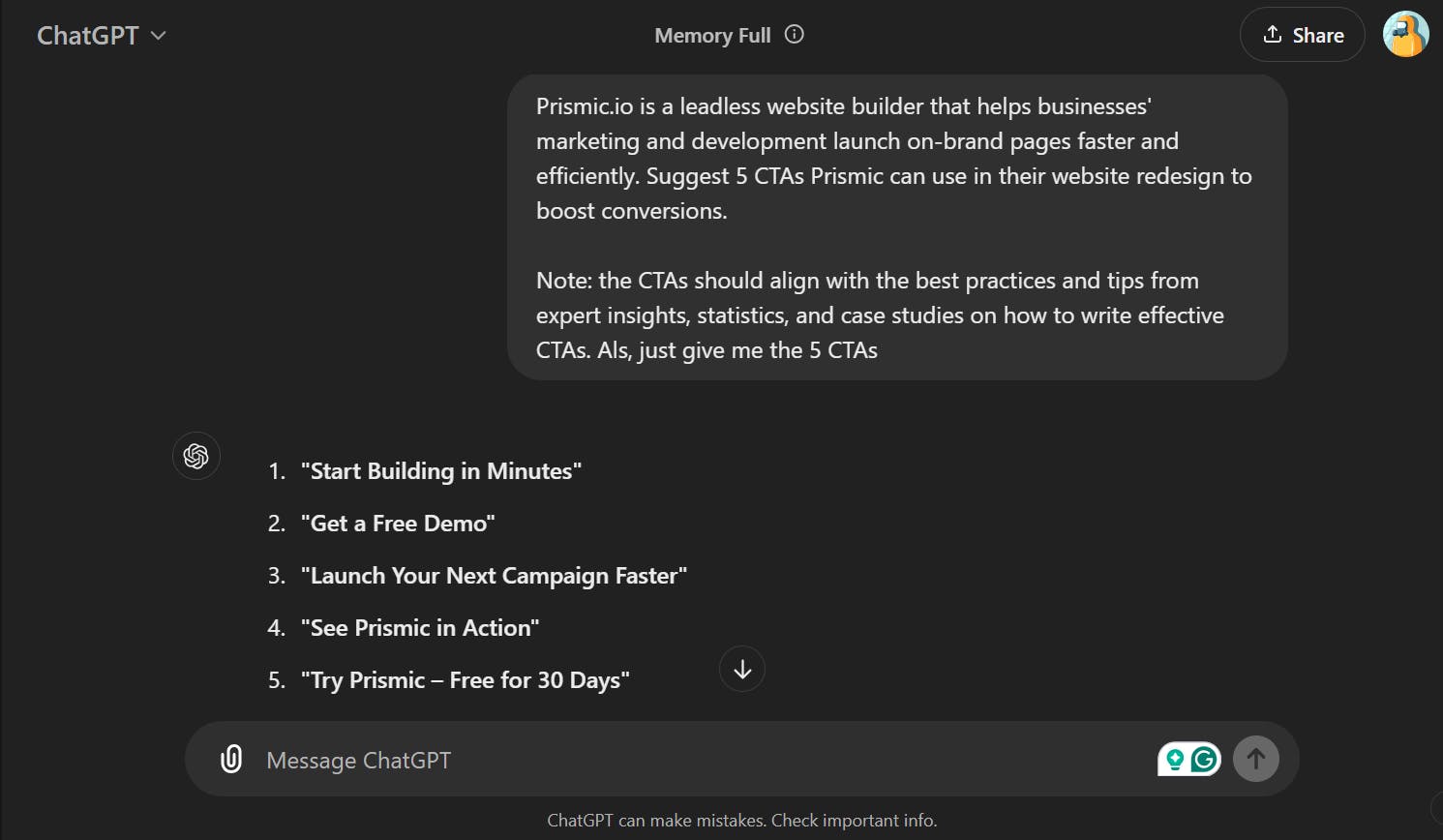
Unsurprisingly, ChatGPT is on our list, which wouldn’t be complete without it. This tool has proven itself to be versatile software for creating various types of content, including CTAs.
ChatGPT is a powerful language model that understands context and can generate CTAs tailored to various goals, like increasing sign-ups, boosting sales, or encouraging social shares. With ChatGPT, you can input specific information about your audience and product, and it will suggest customized CTA ideas that feel fresh and engaging.
Originality.ai
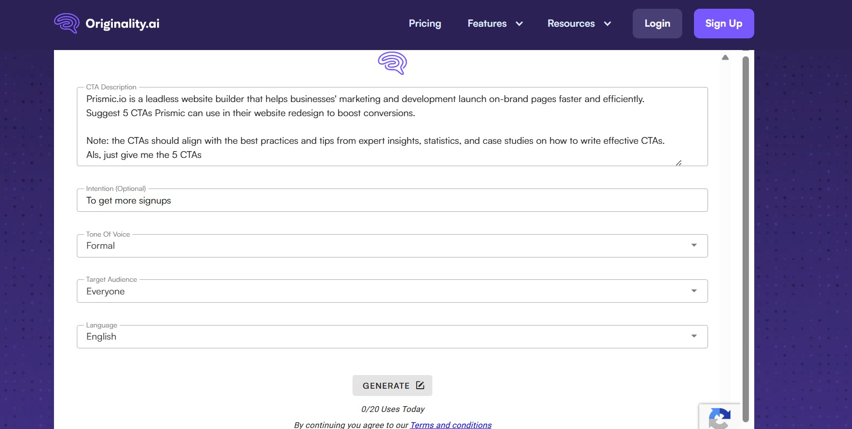
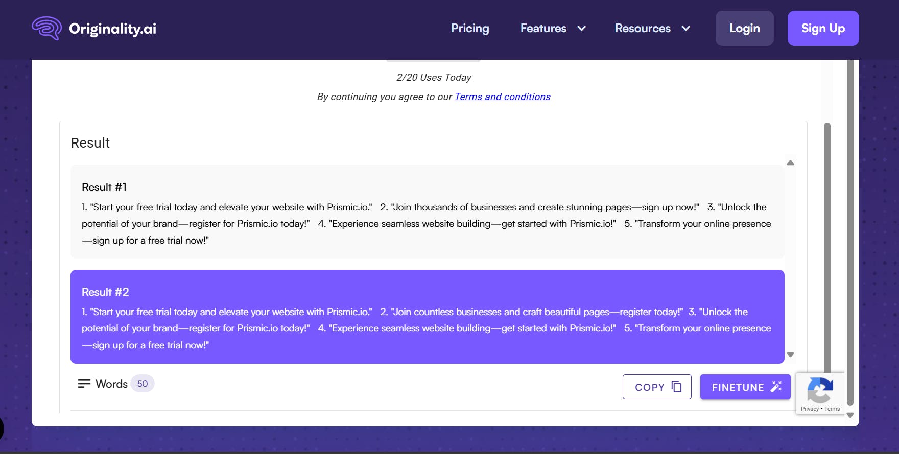
Originality.ai is designed to assist with various types of content, including CTAs. It offers a CTA Generator where you can specify your goals, audience, and tone of voice. It then provides custom-fit tailored CTA suggestions based on those parameters.
The tool allows you to refine generated CTAs to match your specific objectives, and its fine-tune feature gives you an extra set of suggestions, enabling you to pick the best fit for your brand’s voice and purpose.
Originality.ai’s prompting form:
Originality.ai’s result:
Copy.ai
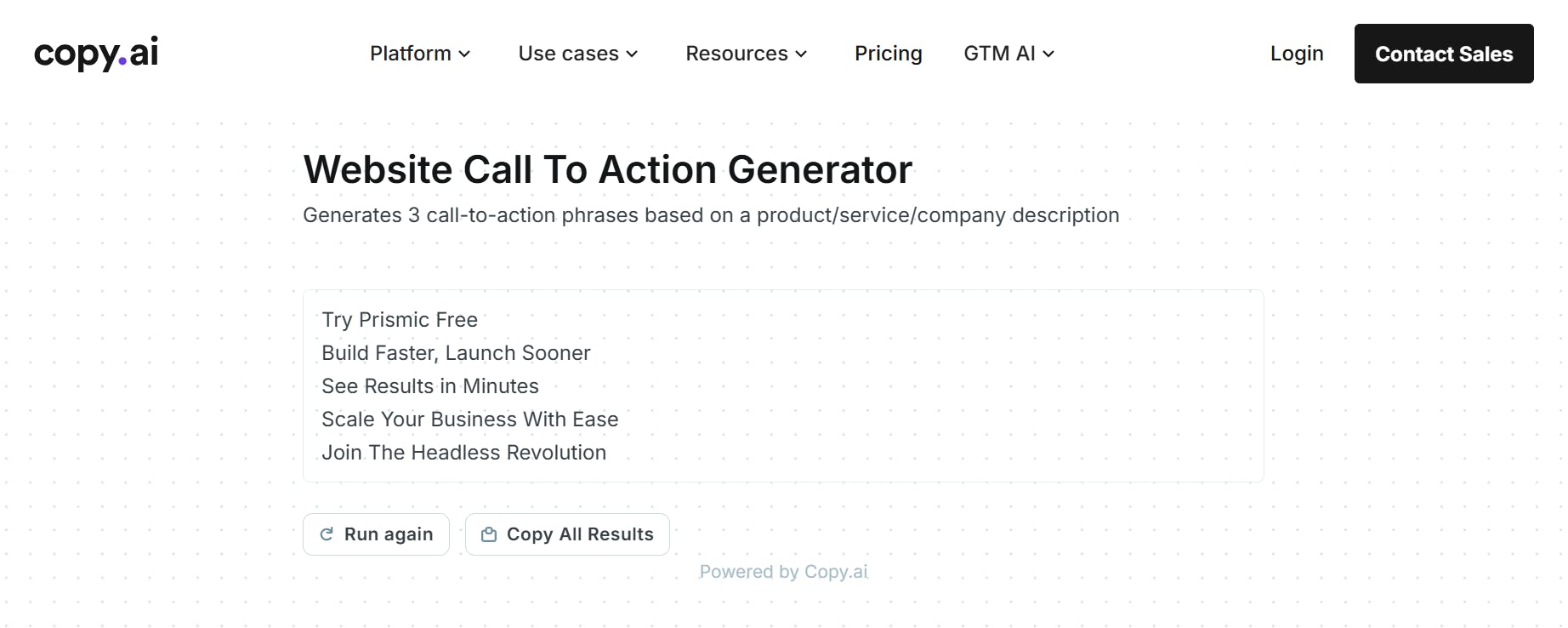
Copy.ai is designed for marketers and content creators looking to streamline their writing tasks. It offers a CTA generator that produces actionable, engaging CTAs for various marketing purposes, including sales promotions, product launches, and lead generation.
Junia
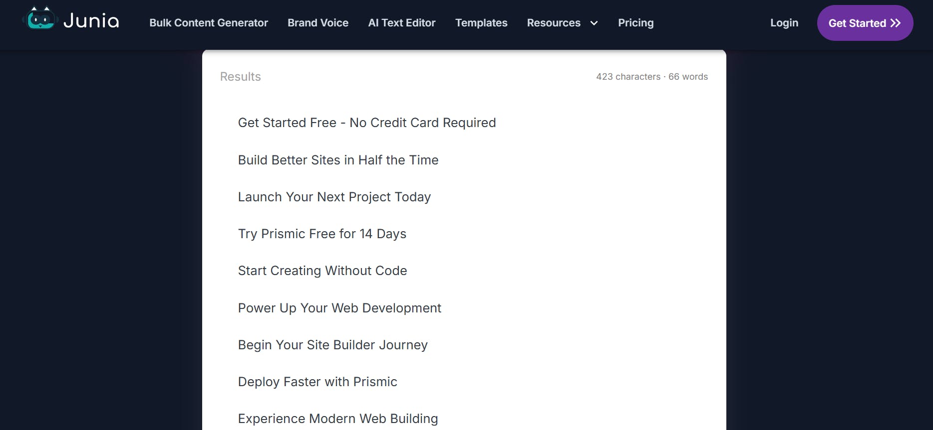
Junia is a powerful AI platform that assists with bulk content generation and includes a CTA generator as one of its tools. It can quickly generate tens of CTAs that are fit to match your target customers and campaign objectives.
AirOps
AirOps offers a CTA generator that you can use to create compelling, high-converting CTAs. It provides fields for specifying the desired action, target audience, tone, and context. These fields help it generate CTAs that align with your campaign’s objectives.
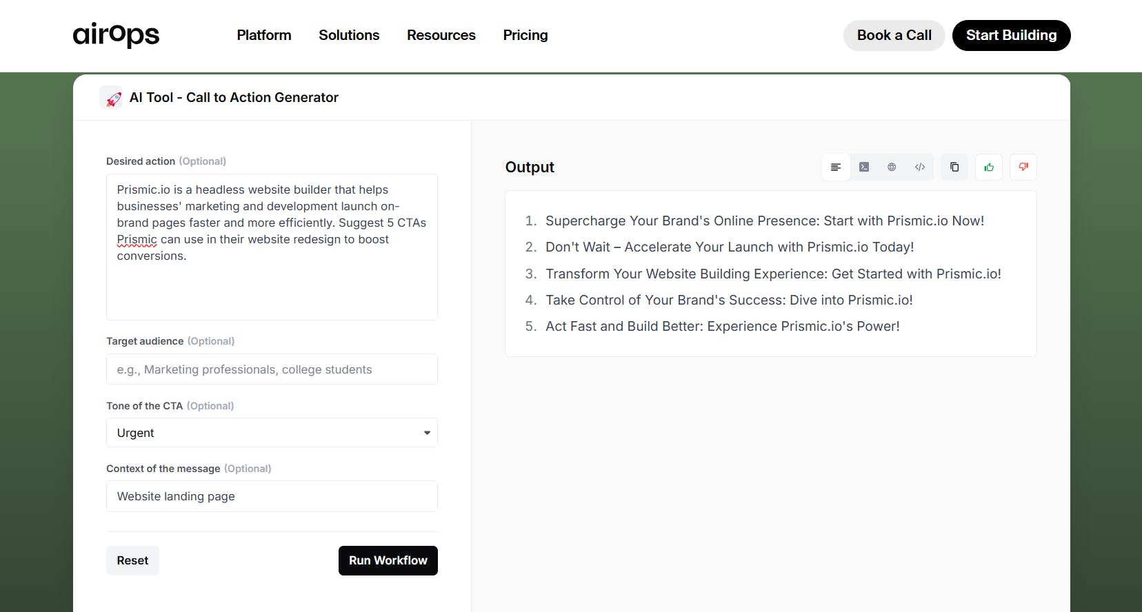
While the AI CTA generators we’ve explored can increase your productivity and help overcome creative blocks, they are not a replacement for human ingenuity and creativity. The CTAs they generate may still need a human touch to resonate fully with your goals, brand voice, and vision.
Use these tools as creative assistants that aid in crafting effective CTAs, but don’t skip the final edits that can transform a good CTA into a great one.
Conclusion
A well-crafted call-to-action (CTA) can be the difference between a casual visitor and a loyal customer. Whether you’re running an e-commerce site, a blog, or a service-oriented business, CTAs play a pivotal role in guiding your audience toward taking meaningful actions that drive conversions.
Hopefully, the CTA examples and tips we’ve explored in this article will help you craft the right CTA that will boost your marketing results.


