Website Hero Section Best Practices + Examples: A Complete Guide

When someone visits your website, you have just seconds to communicate who you are, what you offer, and why it matters. Your hero section plays a crucial role in making that initial impression and serves as a key tool for conversions.
This guide provides clear, actionable advice on creating hero sections that look appealing and drive performance. We will explore the essential components and best practices to help you craft a hero section that helps convert visitors into customers.
So, let’s dive in! 👇
What is a website hero section?
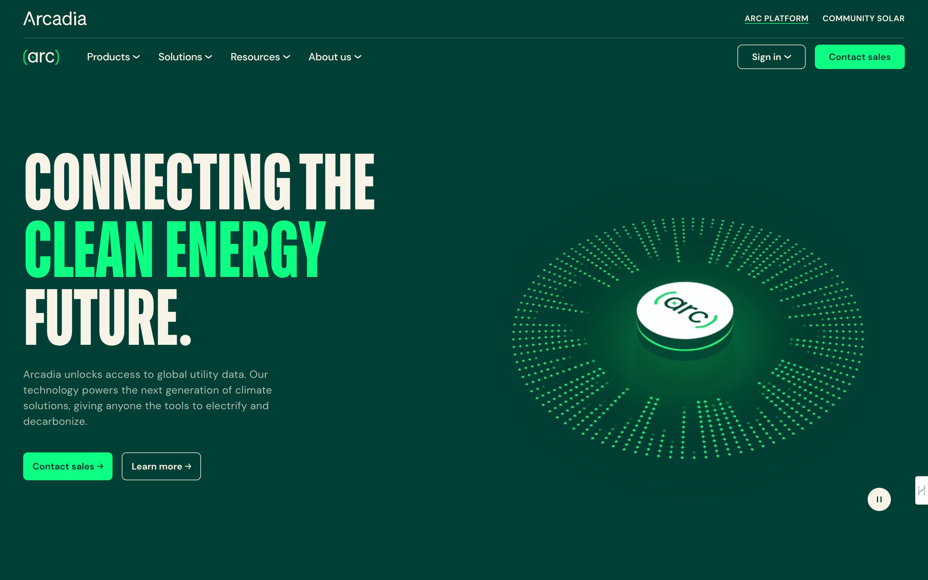
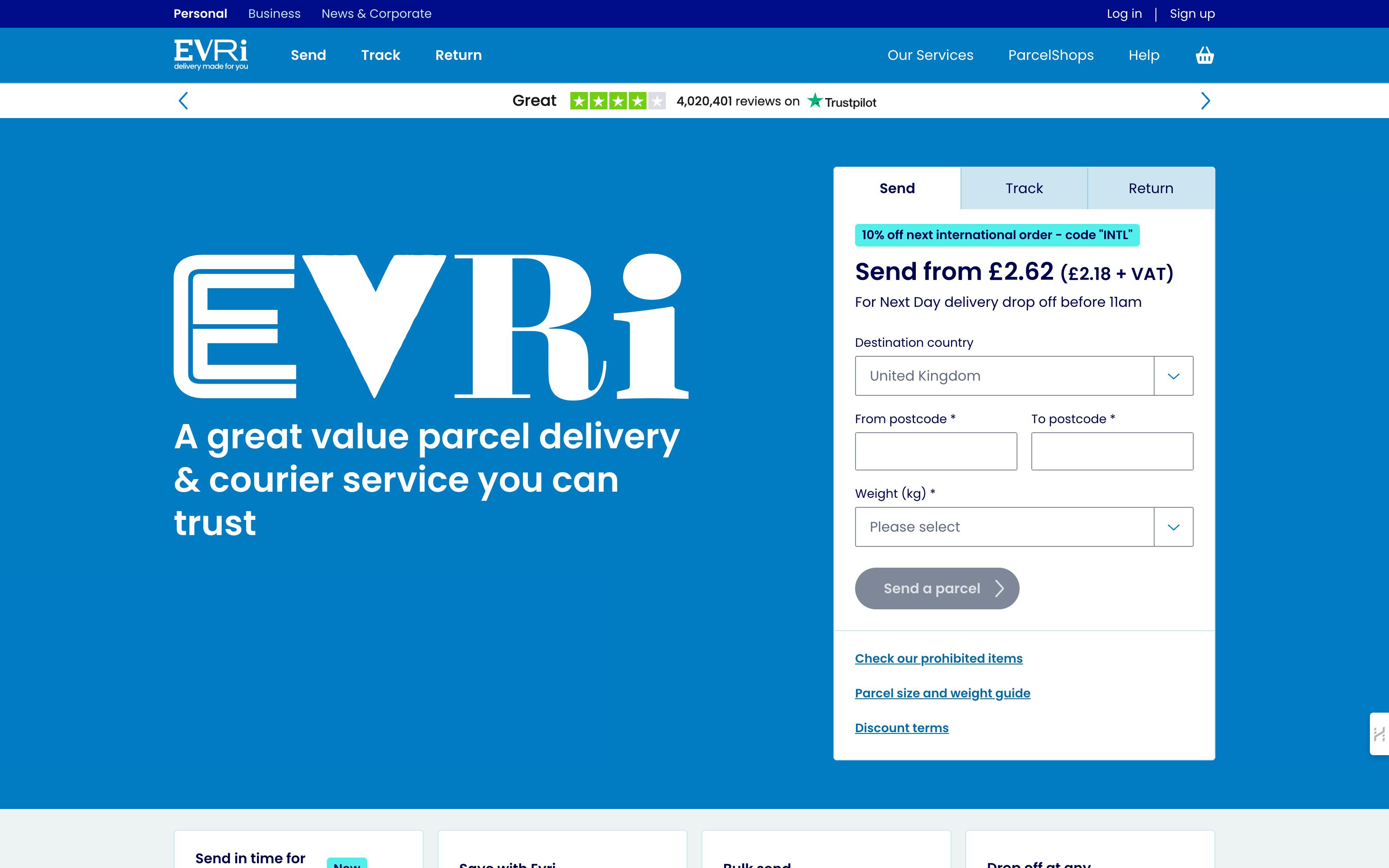
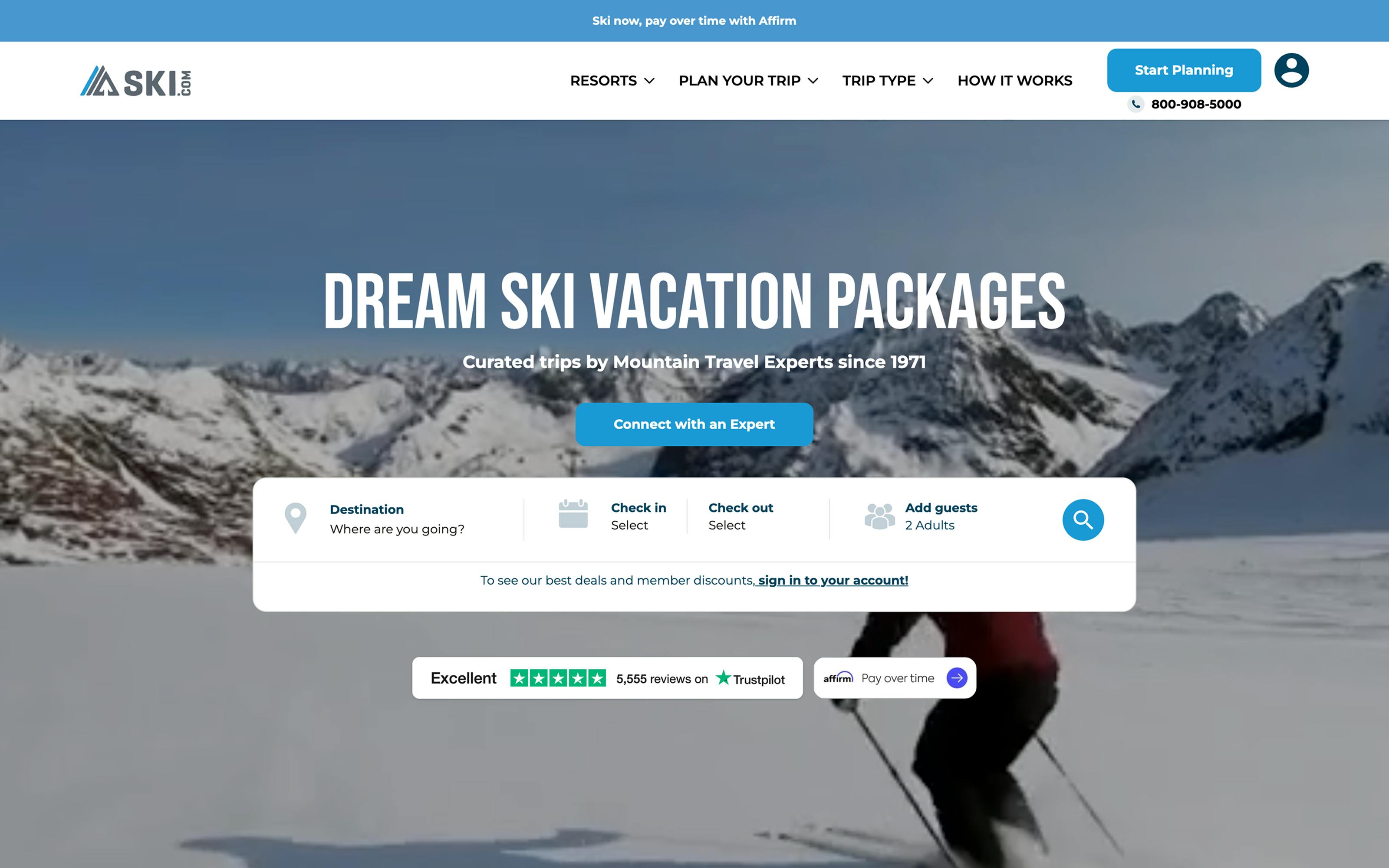
A hero section is the prominent visual element that appears “above the fold”—meaning it’s visible without scrolling—at the top of a webpage, typically spanning the entire screen. It’s the first content visitors see when landing on your website, making it crucial for establishing your brand’s identity and conveying your core message.
Essential components of a website hero section
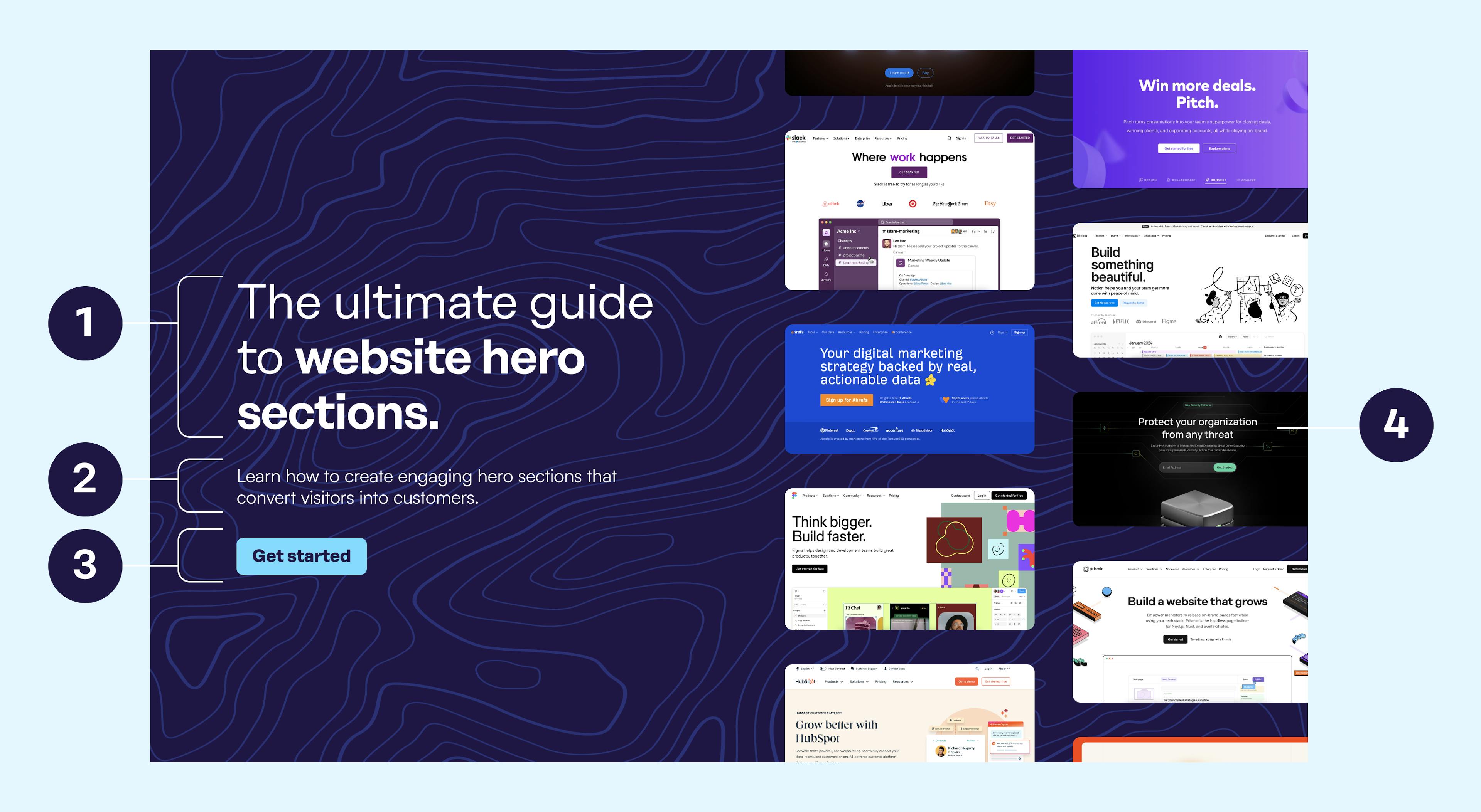
A well-crafted hero section balances concise, compelling messaging with an inviting design that sets the tone for your brand. Here’s a breakdown of the essential elements:
1. Headline
The headline is the focal point of the hero section. It should be a powerful, engaging statement that immediately conveys your brand’s core value or primary offering. Think of this as the hook that draws in visitors and gives them a reason to say.
✔️ Aim for a few impactful words that resonate with your target audience and align with the purpose of your site, whether it’s to inform, sell, or entertain.
2. Subheading
The subheading (or supporting text) complements the headline by adding context, elaborating on the value proposition, or introducing more details about your offering. This text should be brief yet descriptive, providing enough information to clarify what your brand does and how it benefits the user.
✔️ This element can also communicate your brand’s tone and personality, setting expectations for your site’s visitor experience.
3. Call-to-action (CTA)
A prominent, visually appealing call-to-action (CTA) encourages visitors to take the next step, such as signing up, exploring a product, or contacting your team. The CTA should be action-oriented, easy to find, and aligned with your goal for the visitor’s journey.
✔️ Use clear, direct wording—like “Get Started” or “Learn More”—to make it obvious what action to take, and consider using a contrasting color to help it stand out.
4. Hero visual
The hero visual, often an image, video, or animation, should reinforce your brand’s message and add visual interest. This visual element is an opportunity to showcase your brand’s aesthetic, evoke an emotional response, and create a memorable impression.
✔️ Ensure the visual aligns with your content and doesn’t distract from the text elements.
What about the website navigation?
While technically distinct from the hero section, the main website navigation appears above the fold and is essential for guiding visitors across your site. This area typically includes the logo and menu items, giving users easy access to key sections such as “About,” “Features,” “Pricing,” or “Contact.” The navigation bar should be intuitive and strategically placed to complement the hero section without detracting from its message.
Best practices for crafting a great website hero section
1. Lead with benefits, not features.
Rather than telling visitors what you do—show them what’s in it for them. Your hero section should prioritize a clear value proposition and immediately answer, “What’s in it for me?”
Example: Notion
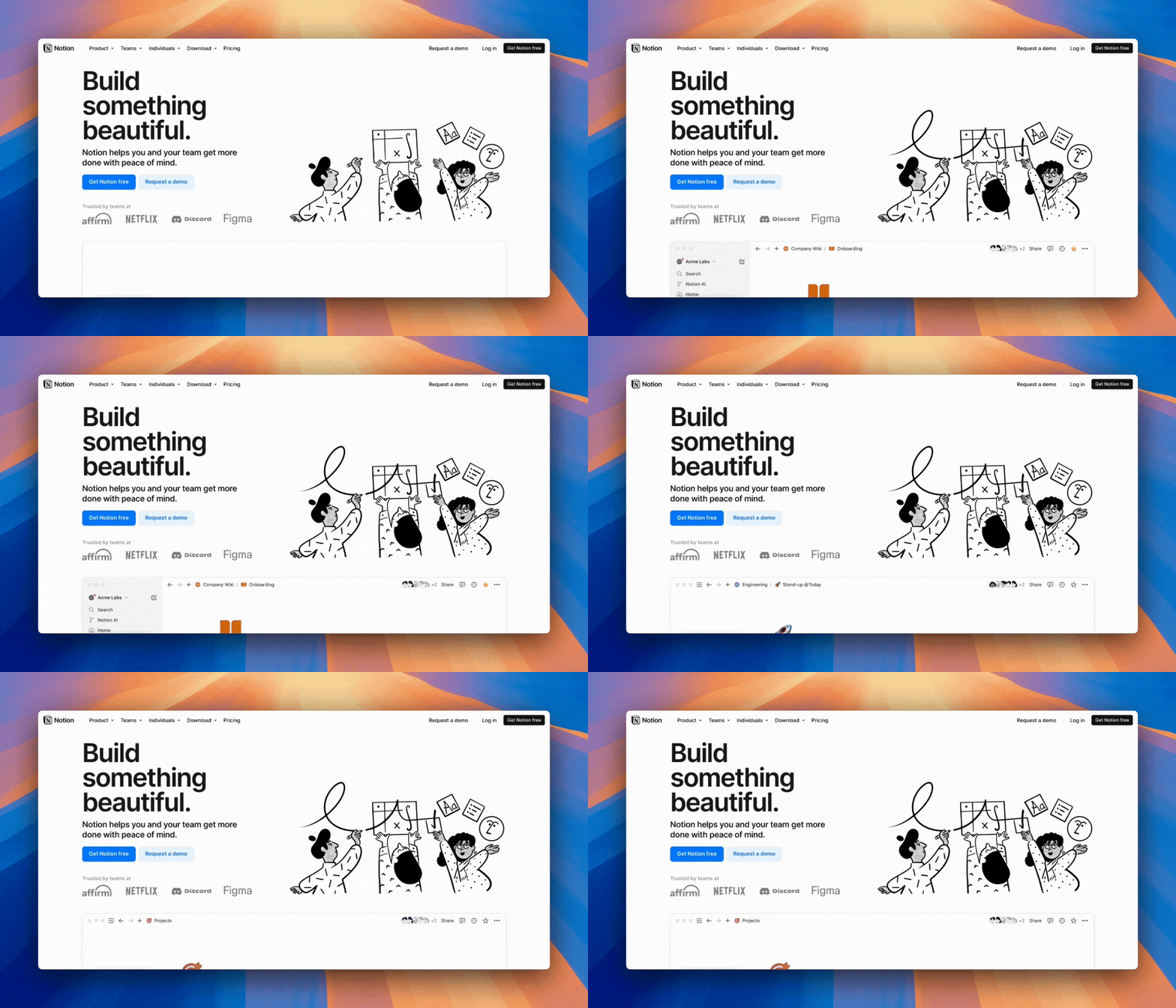
Notion uses a benefit-oriented headline: “Build something beautiful,” emphasizing what users will achieve rather than what the product does.
Notion’s hero section focuses on the user’s experience and outcome. The headline, “Build something beautiful,” suggests the positive impact of using Notion, prompting visitors to imagine themselves creating seamless workflows or captivating layouts. The subheading, “Notion helps you and your team get more done with peace of mind,” addresses productivity and ease, which are core benefits that appeal to busy professionals. This benefit-first approach, paired with a GIF showcasing the product’s visual appeal and functionality, clearly shows that Notion is built to help users succeed.
2. Limit CTAs to keep focus on your primary goal.
Analysis shows that too many CTAs can significantly impact conversion rates—with some studies showing decreases of up to 266% when multiple competing actions are presented (GMP). For maximum impact, keep your hero section focused with a single, clear CTA, or at most, a primary and secondary option that doesn’t compete.
Example: Figma
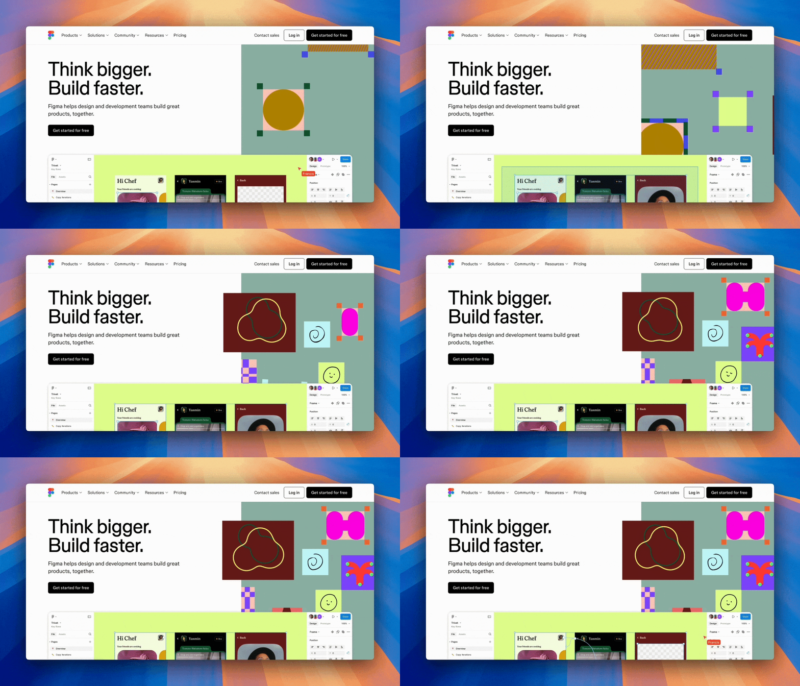
Figma’s hero section features one compelling CTA: “Get started for free,” which aligns with the company's primary conversion goal.
Figma’s hero section shows how a single, well-crafted CTA can drive powerful results. Their “Get started for free” button stands out through strategic positioning and contrast, while the messaging reduces friction by emphasizing the risk-free nature of taking action. By focusing on just one conversion path, Figma creates a clear and confident user journey.
The absence of additional CTAs doesn’t limit options—instead, it streamlines decision-making and maintains momentum toward their primary goal. This focused approach demonstrates how simplifying choice can enhance the user experience and improve conversion rates.
A note on secondary CTAs
When your hero section has room for more than one call-to-action, use a primary CTA for your main goal and a secondary CTA to offer an alternative path—like learning more or accessing a resource. This gives visitors the flexibility to engage at their own pace while keeping your key objective in focus. Make sure your primary CTA is visually prominent, while the secondary CTA should be accessible but more subtle so it doesn't distract from your primary goal.
3. Optimize hero section load time.
The first three seconds of page load time are crucial—compress images and lazy load background videos to ensure essential items in your hero section appear instantly!
Example: Prismic
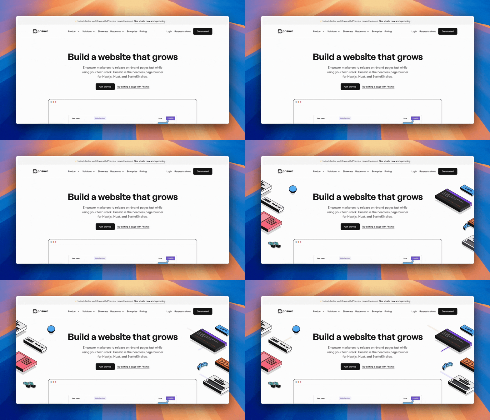
Prismic prioritizes quick loading of essential hero elements like heading, subheading, and CTA.
Prismic's hero section demonstrates excellent performance optimization by prioritizing what matters most. Critical content (headline, subheading, and CTA) loads and becomes interactive immediately. While the engaging sliding animation enhances the experience by adding visual interest, it doesn’t block core functionality or essential content.
Prismic + Imgix for automatic image optimization!
Thanks to Prismic's partnership with Imgix, you can ensure all your hero images (and all other images) are fully optimized! Prismic dynamically compresses and optimizes your images, improving your website load times and SEO.
Learn more about image optimization with Prismic.
4. Incorporate animated or interactive elements (without sacrificing performance).
Add visual engagement through thoughtful animation or interaction—but ensure it supports your message rather than competing with it.
Example: Slack
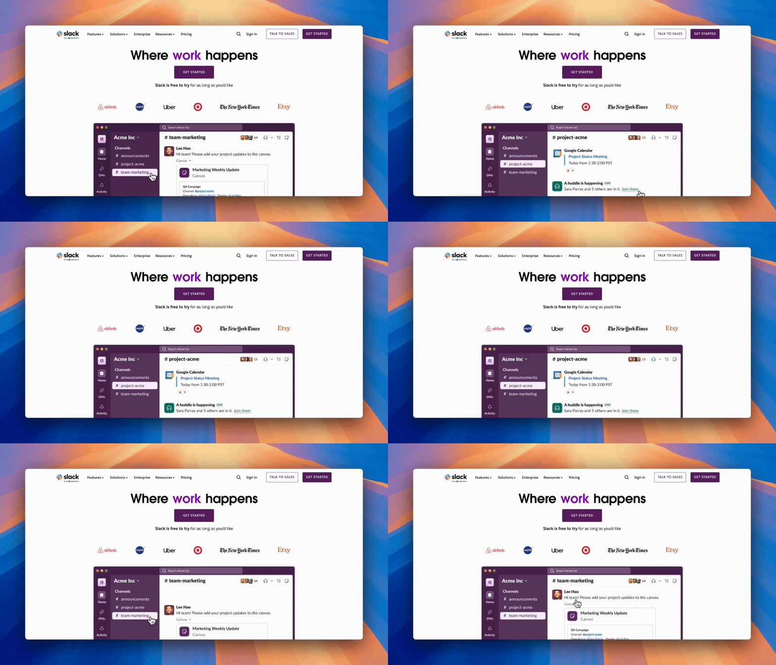
Slack’s hero section features an animation showing the product in action, immediately demonstrating its value.
Slack’s hero section demonstrates how animation can enhance your message without detracting from it. The animated GIF of their platform in action serves a dual purpose: it adds visual interest while simultaneously showing—not telling—how the product enables team collaboration.
Slack maintains fast load times by keeping the animation contained and optimized while delivering an engaging experience showcasing its value. This balance shows how animated elements can enhance your hero section when purposeful and performance-minded.
First time here? Discover what Prismic can do!
👋 Meet Prismic, your solution for creating performant websites! Developers, build with your preferred tech stack and deliver a visual page builder to marketers so they can quickly create on-brand pages independently!
5. Design with intention and hierarchy
Strategic use of whitespace and visual hierarchy guides visitors’ attention and increases comprehension—creating a clear path from first glance to action.
Example: Pitch
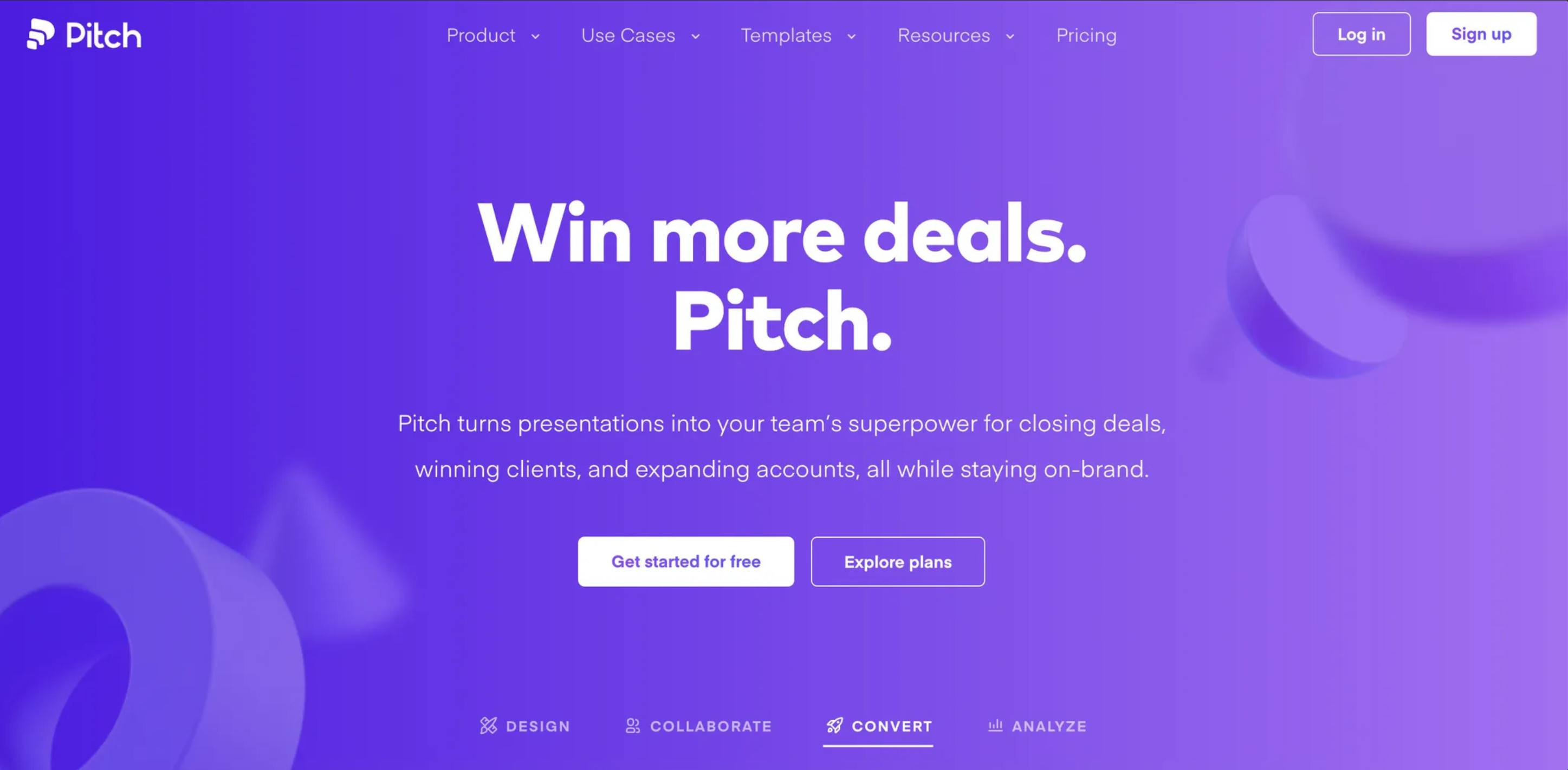
Pitch’s hero section demonstrates how thoughtful spacing and structured information can make presentation software feel modern and sophisticated.
Pitch’s hero section exemplifies the power of intentional design hierarchy. The generous whitespace around their headline creates an immediate visual impact, while the spacing between elements helps visitors process each piece of information separately. This architectural approach to layout mirrors their product’s promise of beautiful, modern presentations—showing their value proposition.
Turn hero section designs into code faster with Figma to Prismic slice plugin
Designing the perfect hero section takes collaboration between designers and developers. Once your team has designed the ideal layout in Figma, you need to translate that design into working code.
Prismic's Figma to Prismic plugin streamlines this handoff. Select your hero section frame in Figma, export it with the plugin, and Prismic generates a structured slice model with a starter React or Vue component—complete with mapped fields for your headline, subheading, CTA, and hero visual.
This removes the manual setup work and ensures your hero section is built as a reusable slice, making it easy to test variations and quickly update hero sections across your site as your messaging evolves.
Try the Figma to Prismic plugin
6. Leverage social proof.
Combine trusted brand logos with compelling statistics or testimonials to build credibility and trust at first glance.
Example: Ahrefs
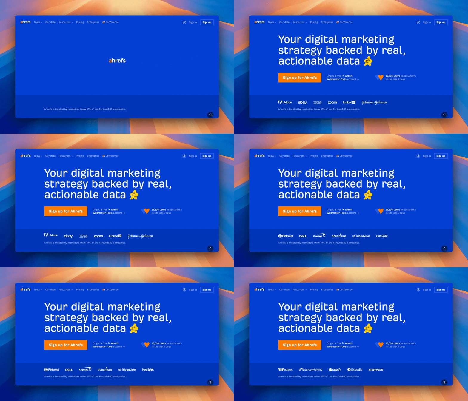
Ahrefs showcases recognizable logos from impressive brands like Adobe, eBay, Uber, and more!
Ahrefs features an impressive array of diverse, recognizable logos spanning multiple industries. The subtly animated rotation of logos makes them clearly visible within the hero section to establish immediate credibility. Still, the logo presentation doesn’t overwhelm the main message or distract from the main ‘Sign up for Ahrefs’ CTA. It creates an aspirational element—”if these successful organizations use it, we should too.”
Ahrefs also includes live metrics showing new user signups in the last 7 days and highlights that “44% of Fortune 500 companies trust Ahrefs.” These subtle but significant additions reinforce the platform’s credibility through dynamic, quantifiable proof points.
7. Test and refine your hero sections for continuous improvement.
Don’t settle for a single version of your hero section—optimization is an ongoing process. Regularly testing different elements like headlines, CTAs, visuals, and layouts can help you discover what resonates best with your audience. Test and compare variations to gain insights into which combinations drive the highest engagement and conversions. Over time, these incremental changes can significantly impact user experience and your website's overall success.
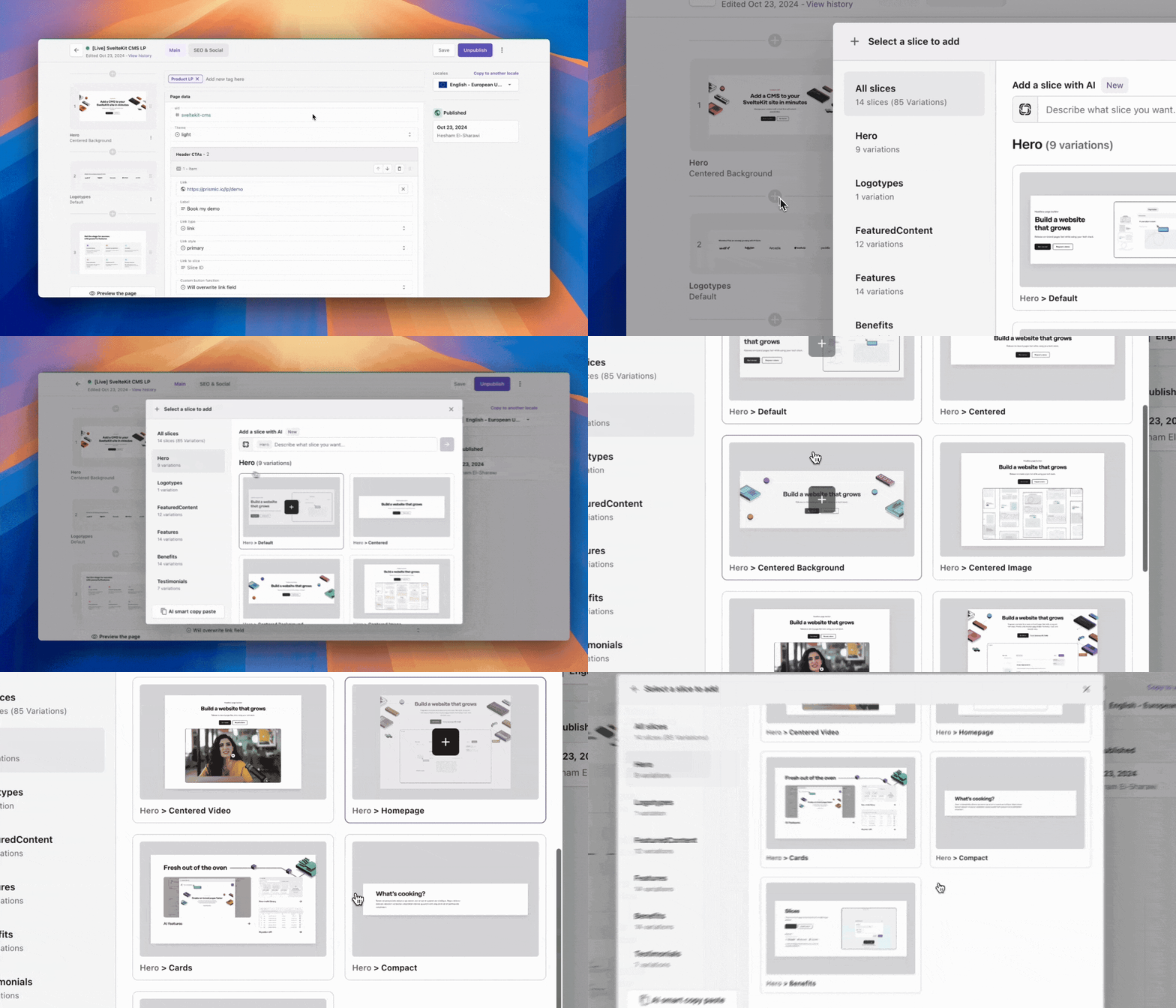
Quickly test and update sections with Prismic slices and slice variations.
With Prismic, you can quickly test different versions of your hero section using slices and slice variations without rebuilding the entire page. Slices allow you to create reusable page sections, and slice variations make it simple to build multiple versions of your slice, such as light and dark options. This flexibility lets your team experiment and publish updates seamlessly, ensuring your website is always optimized for performance and conversion.
👉 Learn more about slices and slice variations.
Final thoughts on website hero sections
In the few seconds it takes to make a first impression, your hero section holds immense potential to engage visitors and drive conversions. By focusing on value-driven messaging, intentional design, concise CTAs, and performance optimization, you can create a hero section that not only attracts attention but also guides visitors toward meaningful action.
Let’s recap some key takeaways:
- Emphasize benefits over features for a more compelling message.
- Limit CTAs to keep focus on your primary goal.
- Ensure fast load times by optimizing images and animations.
- Test and refine regularly to stay aligned with user needs.
With Prismic’s slices and slice variations, you can easily experiment with new ideas and update your hero section on the fly—empowering content teams to continuously improve and ensure each visitor’s impression is a great one. Let us know if you have any hero section tips of your own in the comments below! 👇


