
In part 1 of this series, we learned about what accessibility is, why it’s important, and how developers can become advocates for it. But, you may be wondering, “How do I actually set my project up for accessibility success?” Now, we’re going to go through specific tips for how to optimize a project for accessibility from the start.
Accessibility is, of course, too varied (and exciting) a field to comprehensively cover here. I won’t go into the more advanced areas of focus management or keyboard navigation with complex interactive interfaces. But, I find that certain techniques can improve the accessibility of pretty much every website I build. So, I’ll walk you step-by-step through my personal starting point for projects. In the end, we’ll have a reasonable set of defaults, and we’ll better understand what kinds of considerations to make moving forward.
We’re going to work in the context of Next.js, which is a powerful front-end framework and often the right choice for my freelance work. Next.js has, however, historically had some accessibility problems. Until version 10.2, which was released in April 2021, the Next.js router failed to announce route changes to screen readers. Essentially, screen reader users had no way of knowing that the page had changed when they clicked on links. (You can check out the related Github issue for more context.)
Since version 10.2, the Next.js' accessibility has improved significantly, and the main issues have been resolved. Consequently, I believe that, with a bit of know-how, it is entirely possible to build accessible experiences within Next.js. So, let’s dive in and do it 🤿
🚀 Don't forget to check out part 3 of this series, where you'll learn about creating accessible components for a CMS.
Setting up an accessible Next.js app
Let’s say we’re starting from a fresh Next.js project, or from an existing project whose accessibility we want to improve. There are a variety of default accessibility practices that I recommend implementing in basically any project. Here we’ll see how to do so in Next.js, but it’s important to emphasize that these are best practices in the web standard more broadly and do apply in other frameworks. (You can check out the code in the associated Github repo here.)
Typescript
Typescript is a strongly-typed language that compiles down to Javascript. In essence, it helps us prevent errors like calling a string method on a number. Though Typescript isn’t the right fit for every project, I’d recommend that you consider it when starting a new Next.js project. It may not seem intuitively related to accessibility, but it can be super helpful.
Plenty of default React elements, as well as packages, will raise type errors if required accessibility properties aren’t provided. For example, the Typescript compiler is quite good at catching <img> tags without alt text. Like automated testing, we can’t trust that Typescript will catch everything, but I’ve found it great for notifying me of accidental mistakes I might have otherwise missed. I’m a big fan of using language features to force myself to write more accessible code (you’ll see more of that in the CSS section!).
The text language
The language of our website may or may not correspond to the language that the user’s computer uses. If the user is using a screen reader, then the software needs to know which internationalization mode it should use to pronounce the text in the proper language. Consequently, the <html> tag on all websites should have a lang= attribute.
We want this attribute to go on the <html> tag because it wraps all the content on our page, but Next.js handles this element automatically, so how can we override it? One approach I’ve taken in the past is overriding Next.js’s default pages/_document.js file. I recently learned (courtesy of Melvin Goerge), however, that Next.js automatically adds the lang= attribute if we simply tell it our default internationalization region in the next.config.js file like so:
// next.config.js
module.exports = {
  i18n: {
    locales: ['en'],
    defaultLocale: 'en',
  },
}
Of course, if your website is in a language other than English, you will need to substitute "en" with the proper code for that language. Additionally, if your site includes smaller chunks of content in different languages, you will want to add the lang= attribute like so: <p lang="jp"> 今は日本語が大丈夫になった!</p>.
The <head> tag
Some accessibility defaults require that we change or add elements to the <head> tag. Fortunately, it’s easy to edit this tag in Next.js using the built-in Head component. You probably know that the <title> tag in the <head> is good for SEO and shows up on window/tab titles in browsers. You may not know, however, that screen readers generally announce the <title> on page change, so it serves as an important landmark for sight-impaired users. We’ll want to set a good default in our pages/_app.js file like so:
// pages/_app.js
import Head from 'next/head'
import '../styles/globals.css'

function MyApp({ Component, pageProps }) {
  return (
    <>
      <Head>
        <title>Our Awesome Blog</title>
      </Head>

      <Component {...pageProps} />
    </>
  )
}

export default MyApp
Then we’ll want to use the same technique to add a different title for individual pages in each page’s file. I’ve also often used the next-seo package (you can check it out here), which lets you set the page title and a bunch of other SEO-related properties with an easy developer experience.
While we’re talking about the <head> tag, I’d strongly recommend against adding any kind of tag that aims to prevent users from zooming into the page (like the dreaded <meta name="viewport" content="user-scalable=no">). Most browsers won’t even respect this tag anymore. Users should always be able to zoom in if they want to view text at a larger size.
Semantic landmarks
When people think of accessibility, they often think of an endless series of role and aria-* properties. These properties are certainly needed for complex interactive elements, but, when possible, we’re better off simply picking the right HTML element for the job, and then all the semantic information comes “for free.”
We can think of <div> and <span> elements as the “milquetoast of the web.” A screen reader will be able to read any content within them, but it won’t know how that content relates to the page structure or whether it is interactive. So, in general, rather than piling aria-* properties on our elements, we want to pick the right element when possible.
When we choose more specific HTML elements, they come with semantic information that helps screen readers readily interpret their functions. HTML comes with semantic sectioning elements (comprehensively listed in MDN) for the page structure. In general, every site should have a <main> element, and most sites will have a <header> and <footer>, so we will probably want to define a structure like this:
// pages/_app.js
import Head from 'next/head'
import '../styles/globals.css'

function MyApp({ Component, pageProps }) {
  return (
    <>
      <Head>
        <title>Our Awesome Blog</title>
      </Head>

      <header>
        <p>Navbar coming soon!</p>
      </header>

      <main id="main">
        <Component {...pageProps} />
      </main>

      <footer>
        <p>Copyright Alexander Dubovoy, 2021.</p>
      </footer>
    </>
  )
}

export default MyApp
Note: Here, I’m assuming that you’ll be using the same header and footer on every page on your site, so the page component can be wrapped in the <main> element. If the header or footer changes, you may need to use Next.js layouts (described in the official docs).
Skip link
On sites with headers, screen reader users will often want to skip ahead to the main content, instead of hearing the header read aloud each time they navigate to a new page. The same principle applies for keyboard navigators because they won’t want to repeatedly tab over all the links in the header. So, any website with a header should also contain a “skip link” above the header that allows the user to scroll down quickly to the main content. We can probably visually hide this element when it’s not actively focused (unless we want to make it a key part of our design, which I love as an idea!). Consequently, I usually add a SkipLink component like this:
// components/SkipLink.js
const SkipLink = () => {
  return (
    <a href="#main" className="skip-link">
      <style jsx>
        {`
          .skip-link {
            position: absolute;
            top: 0;
            right: 100%; /* moves off screen */
            z-index: 500; /* some number that will make sure it covers other elements */
          }

          .skip-link:focus {
            right: auto;
            background-color: #000;
            color: #fff;
            border: #fff 3px solid;
            padding: 1em;
          }
        `}
      </style>
      Skip to content
    </a>
  )
}

export default SkipLink
Then, I’ll import and render this component in the main app layout:
// pages/_app.js
import Head from 'next/head'
import SkipLink from '../components/SkipLink'
import '../styles/globals.css'

function MyApp({ Component, pageProps }) {
  return (
    <>
      <Head>
        <title>Our Awesome Blog</title>
        <link rel="icon" href="/favicon.ico" />
      </Head>

      <SkipLink />

      <header>
        <p>Navbar coming soon!</p>
      </header>

      <main id="main">
        <Component {...pageProps} />
      </main>

      <footer>
        <p>Copyright Alexander Dubovoy, 2021.</p>
      </footer>
    </>
  )
}

export default MyApp
The Navbar
Next, let’s add some site navigation. Our Navbar will go at the top of the page, inside of the <header> landmark. It should also go inside of another HTML sectioning element, the <nav> element. Navbars are lists of links, so regardless of how we intend to style it, the correct semantic element is a <ul> with a <li> for each link. Consequently, we’ll want a structure like:
<header>
  <nav>
    <ul>
      <li>
        <a href="/">Home</a>
      </li>
      <!-- More links... -->
    </ul>
  </nav>
</header>
Over time, I’ve developed a couple of React components that will achieve this structure and provide a few other helpful, accessibility-oriented properties:
// components/Navbar.js
import { useRouter } from 'next/router'
import Link from 'next/link'

const NavbarLink = (props) => {
  const router = useRouter()
  const isActive = router.pathname === props.href
  // Use the built-in useRouter hook in Next.js to determine whether the link is going back to the current page or somewhere else.
  const href = router.pathname === props.href ? '#main' : props.href
  // If the link is going to the current page, change its `href` property to go to the `#main` element. That way, instead of being redundant, this link can act similarly to our `SkipLink` component!

  return (
    <li>
      {isActive && <span className="visually-hidden">Current page: </span>}
      <Link href={href}>
        <a aria-current={isActive}>{props.children}</a>
      </Link>
    </li>
  )
}

const Navbar = () => {
  return (
    <nav id="navigation">
      <ul role="list">
        <NavbarLink href="/">Home</NavbarLink>
        <NavbarLink href="/about">About</NavbarLink>
        <NavbarLink href="/contact">Contact</NavbarLink>
      </ul>
    </nav>
  )
}

export default Navbar
This component adds a few additional features over the HTML structure we saw above:
- If the link goes to the current page, instead of to another page, it adds the text “Current page: “ before it. Note that we may want to hide this text for non-screen-reader users, which is why I’ve added the
.visually-hiddenclass (that we will add to our CSS in the next section). - We make this link go to the
#mainelement and act similarly to our skip link so that it has a useful functionality instead of simply triggering a refresh. (This trick comes from Heydon Pickering’s book “Inclusive Components”.) - We give this link the
aria-currentproperty so that screen reader users will know this is the link for the current page. - We add
role="list"to the<ul>element. This may seem counterintuitive, and that’s because it is! By default, a<ul>already has an automatic role of"list", so why would we add it redundantly? It turns out that, if we apply the CSSlist-style: none;to a list, some browsers then reset the default role. It’s a very rare case where styling can impact the accessibility of the underlying HTML structure. So, I generally putrole="list"on any list element I think I’m likely to want to style withlist-style: none;.
Note that this component is currently completely unstyled, but, once we have the HTML structure right, we can use CSS (fairly) freely. We’ll want to add this component to our main layout:
// pages/_app.js
import Head from 'next/head'
import SkipLink from '../components/SkipLink'
import Navbar from '../components/Navbar'
import '../styles/globals.css'

function MyApp({ Component, pageProps }) {
  return (
    <>
      <Head>
        <title>Our Awesome Blog</title>
        <link rel="icon" href="/favicon.ico" />
      </Head>

      <SkipLink />

      <header>
        <Navbar />
      </header>

      <main id="main">
        <Component {...pageProps} />
      </main>

      <footer>
        <p>Copyright Alexander Dubovoy, 2021.</p>
      </footer>
    </>
  )
}

export default MyApp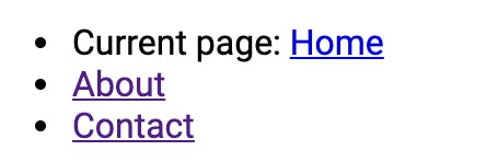
CSS tips for accessibility
Focus indicator
We can also set some good accessibility defaults in our CSS. Let’s start building our styles/global.css file together. One of the most important defaults we can provide is for our focus indicator. It happens wayyyyyy too often that I can’t use a website with my keyboard and then find the following snippet in their CSS 😡
/* Absolutely NEVER do this under any circumstance */
*:focus {
	outline: 0;
}
This CSS will instantly render your website entirely unusable for anyone trying to navigate it via a keyboard. People with a whole range of disabilities can’t use a mouse/trackpad and have to navigate websites primarily through using the “tab” key (or sometimes arrow keys) to switch between interactive elements and the “return,” “enter,” or “space” keys to push them. The outline is the only way these users will know which element is in focus. Unfortunately, some people who don’t understand its utility don’t like the way it looks (I’ve been asked by almost every client to remove it at various points):

So, the best remedy is to make a big, bold focus indicator an integral part of our design. Another trick is to use :focus-visible instead of :focus, because it applies only when an element is selected via the keyboard and not when it is clicked via the mouse. Unfortunately, browser support isn’t perfect for :focus-visible, and we don’t want to lock out users with older browsers. So, we can use a bit of trickery (derived from “:focus-visible and backwards compatibility”). If you’re interested in learning more about this topic, I’d strongly recommend Sara Soueidan’s guide.
*:focus {
  /* some exciting focus styles */
  outline: 0.1em #AA2B2B solid;
  outline-offset: 0.1rem;
}

*:focus:not(:focus-visible) {
  /* undo all the above focus styles */
  outline: 0;
  outline-offset: 0.25rem;
}

*:focus-visible {
  /* some even *more* exciting button focus styles, just for keyboard navigators */
  outline: 0.25em #AA2B2B dashed;
  outline-offset: 0.25rem;
}
Lists
As mentioned when we were building our Navbar, browsers sometimes will remove the semantic "list" role from list elements styled with list-style: none;. Consequently, I usually add the following trick to my stylesheet:
ul[role="list"], ol[role="list"] {
  list-style: none;
  padding-inline-start: 0;
}
This way, any <ul role="list"> element will automatically be styled without the bullet points. Similar to using Typescript, we can build our CSS so that it automatically prevents us from making accidental accessibility mistakes. If I forget to add the role="list", I’ll still see the bullets, so I’ll know I need to add it in order to remove them.
Utilities
I also usually add some accessibility-oriented utility classes to my stylesheet. The main one we’ll need, which we already applied in our navbar, is a .visually-hidden class. The purpose of this class is for when we want to include text in our page that is designed to only be read by screen readers (but not seen by users using our site’s visual interface). Such text can be useful to describe icons/visual content, provide additional context, or even include fun Easter eggs for sight-impaired users. I usually use a snippet that originally comes from Bootstrap:
.visually-hidden, .sr-only {
  /* hides content except when viewed by screen readers */
  position: absolute;
  width: 1px;
  height: 1px;
  overflow: hidden;
  clip: rect(1px, 1px, 1px, 1px);
  white-space: nowrap;
}
Reduced motion
Due to a variety of cognitive and visual conditions, motion-based animations can be uncomfortable or dangerous for some users. As a result, CSS has a prefers-reduced-motion media query that lets us design alternatives. I will commonly add a snippet like the following to my CSS:
@media (prefers-reduced-motion: reduce) {
  html:focus-within {
    /* turns off smooth-scrolling behavior (if turned on) when prefers-reduced-motion is active*/
    scroll-behavior: auto;
  }

  *:not(.animates-without-motion),
  *:not(.animates-without-motion)::before,
  *:not(.animates-without-motion)::after {
    animation-duration: 0.01ms !important;
    animation-iteration-count: 1 !important;
    transition-duration: 0.01ms !important;
    scroll-behavior: auto !important;
  }
}
This snippet will essentially turn all animations off completely when the user prefers reduced motion. My personal innovation is the addition of the :not(.animates-without-motion), which means that animations will get turned back on if we add the animates-without-motion class to an element.
As Chris Coyier points out in “No Motion Isn’t Always prefers-reduced-motion,” animations serve a real usability purpose, so we don’t want to cut off animations completely for users who prefer reduced motion. Instead, we want to check our animations individually to make sure that they have some kind of an alternative to motion. For example, color or opacity transitions are totally fine! So, I will write two variants of an animation (see below) and then slap on the animates-without-motion class:
/* Imagine we're editing a specific element with the .element class. */
.element {
  transition: left 500ms ease, opacity 500ms ease;
}

@media (prefers-reduced-motion: reduce) {
  .element.animates-without-motion {
    /* maintain the opacity transition but remove the position-based transition */
    transition: opacity 500ms ease;
  }
}
Of course, this solution is particularly geared toward a framework like React, where we can put the animates-without-motion class automatically on different components. If we were working in raw HTML, it might get annoying to have to constantly add it. I should also mention that, in the context of React particularly, there may be animations that are driven by JavaScript and not CSS, and we will need to separately address prefers-reduced-motion in those cases. The popular Framer Motion framework, for example, includes a useReducedMotion hook for ease.
Text sizing units and more
Finally, we’ll want to be careful about some other CSS properties when we’re building for maximum accessibility. We generally don’t want to use the px unit in CSS, particularly when dealing with the size of text or elements. If we do, then users won’t be able to change the default text size in their browser preferences, which users may need to do for visual comfort. Instead, we’ll always want to use the rem, em, ch, or related units when dealing with sizes that are relative to our font size (you can read more on this topic in Every Layout’s article). These units size based on the default text size (usually 16px), so if that size changes, they adjust accordingly.
We’ll also want to make sure to maintain adequate color contrast across our site. Fortunately, automated testing handles this topic quite well, so we can usually spot errors using Lighthouse or Axe.
Note: If you want to see the full CSS file we just built, it’s available in the Github repo for this post. If you’d like a more comprehensive, accessibility-oriented CSS reset, I’d recommend checking out Andy Bell’s CSS modern CSS reset.
You might also want to check these out:


The “Nuclear Option”
I should note that, if you’re concerned that Next.js’s client-based routing will mess accessibility up or that React will push your bundle size up, it is possible to use the “nuclear option.” Next.js has an experimental feature that disables all client-side JavaScript and delivers only HTML and CSS to the browser. Given that browsers handle routing perfectly fine on their own, this is a great approach if you’re primarily using Next.js to organize a static site and don’t need any React-based interactivity. It’s a rather large decision, and the feature is still fairly experimental. But, theoretically, it should work if you add:
// next.config.js
{
  unstable_runtimeJS: false,
}
Testing your work
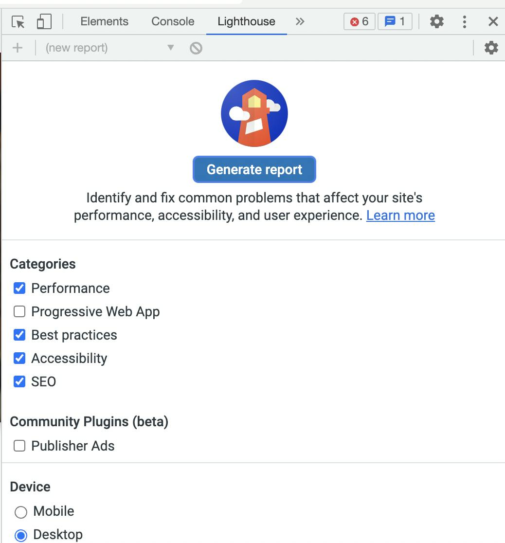
Now that we have our project set up, we need some way of actually seeing if our code is working 🤔 One of the tools you may have already heard of is automated testing. The easiest way to get started is by trying Lighthouse, which comes built-in as a tab in the Developer Tools panel in Google Chrome.
Lighthouse will list the accessibility issues it detects with your site and suggest potential fixes. Lighthouse is also a great tool because it provides other metrics that can similarly help you optimize your site’s SEO ranking. There are a number of alternatives, and I often use axe to get a second opinion.
Automated testing, however, has limitations.
Color contrast, for example, is a perfect case for automated testing. There are clear mathematical guidelines about what constitutes appropriate contrast. If you fail the formula, you have to change your colors.
An automated test, on the other hand, can’t tell you if the alt text you wrote for an image is actually interesting or helpful; it can only ping you if you forget to write anything at all. As an analogy, we write automated tests for every new feature we release on several of the websites I work on. These tests are great for helping us figure out if we broke something. But, I wouldn’t ever write a feature without also launching a development server and testing things manually.
We should think about automated accessibility testing similarly. Manuel Matuzovic has even gone through the sarcastic exercise of building a completely inaccessible site that still gets perfect Lighthouse scores.
So, we will want to combine automated tests with manual testing and an understanding of best practices. One of the best things we can do is to run user testing with users who experience a variety of different disabilities.
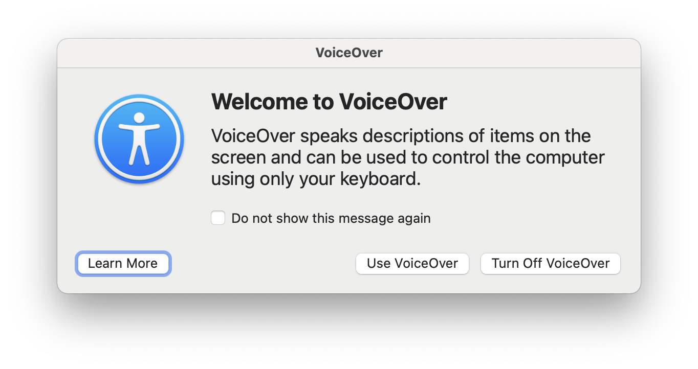
Smaller projects, however, may not have the bandwidth to do user testing at all, and we may need to leverage technological solutions. Even developers without sight impairments can and should learn to use a screen reader.
- On Mac, it’s free and easy to turn VoiceOver on, and it includes a tutorial.
- On Windows, the landscape is a bit more complicated, but you may try JAWS.
- Personally, I also use the browser Polypane, which includes accessibility tools to simulate conditions like color blindness.
We can use technology to help put ourselves more in the shoes of users with differing needs. So, when we’re manually testing, we shouldn’t just try out different screen sizes (as we probably already do). We should also test from the perspective of as many different disabilities as we can.
When in doubt about best practices for a particular component, we can always cross-reference with the Web Content Accessibility Guidelines (WCAG) recommendations. I also recommend checking out Inclusive Components, which has great templates for a variety of basic components.
Going further
Now, we’ve set up our site with a fairly comprehensive range of accessibility defaults. We also know how to test it to make sure we’re headed in the right direction. That’s awesome! But does it mean our site will automatically be accessible? Well, no ...
First off, there are certain types of interactive components that might require more specific thinking about screen reader support, focus management, and keyboard navigation. Some classic examples would be modals, dropdown lists, etc. It’s not possible in this article to go through every type of element you may want to build, but generally, someone else will have already defined the best practices! Some great resources to investigate are the WCAG guidelines and Inclusive Components. Furthermore, it’s often possible to find pre-built React components that already optimize for accessibility, particularly through Reach UI.
Second, even if we’ve written great CSS and set our project up beautifully, it’s not going to be accessible if the actual content on the site isn’t. This is why we’ll have to talk with our non-technical collaborators to make sure that everyone understands how to maintain accessibility on our site. So, check out the next article in this series, where we’ll write accessible content in a CMS and teach others to do the same ✍️


