Part 3: Striving for Accessibility When Building Components for a CMS

In part one of this series, we learned that accessibility is about preventing disability-based discrimination against people who visit our websites. In part two, we learned how to set up our actual codebase for accessibility in a Next.js project.
This is the Prismic blog, though, so you might be interested in building a site that draws content from a CMS (”content management system”) like Prismic. In that case, some of the people using the CMS might not be coders (which is awesome 💝). Consequently, it’s important that both coders and non-coders maintain healthy communication to make the site as accessible as possible.
But how can the developer(s) set components up and communicate to help ensure that everyone follows best practices? This article is meant to guide developers in building accessibility into CMS projects. I’ll go through the types of site components you may be adding through a CMS (whether you code or not) and how to make them accessible to the greatest number of people. 🙂
If you missed part one of the series and are wondering what accessibility is, you can check the definition out here.
Slices and CMS components
CMSs will often provide a way for content creators to drag/drop and customize site components. Prismic has a particularly fully-featured implementation called Slices. So, what kinds of components do we want to include for our content creators? How can we set them up for accessibility? Of course, the answer will depend quite a lot on your site’s design. But there are some components and patterns that, in my opinion, will be helpful for nearly any site. The key principle is to make our components consistently flexible to context so that they will be reusable.
I should also note that, whatever component you are building, you’ll want to make sure that it is clearly documented using language that is “friendly” for non-coders. The best way to make sure your components are used in the way you intend is to provide an explanatory guide!
Headings
Headings provide some of the key landmarks for screen readers and other accessibility software to interpret our sites. A good heading structure is also important for SEO. So, we’ll want to ensure that our site has only one <h1> element (that states the title of the page) and that the other headings progress logically, without skipping a level.
Often, however, we run into issues when using a CMS in terms of keeping our heading structure consistent. Imagine, for example, we have a card component like this:
const Card = (props) => {
  const { title, picture } = props

  return (
    <div>
      {/* A hard-coded heading level will make our component less reusable in the CMS */}
      <h2>{title}</h2>
      <img src={picture} />
    </div>
  )
}
This would be great if we always knew that this card would be placed after an <h1> in our page’s structure. But, imagine that our content creator wants to put an <h2>All Products</h2> on the page. Then, our cards would probably actually fall under this <h2> in the page structure, and their title should be an <h3>. By hardcoding the heading level, we’ve created the possibility that our content creator won’t be able to keep the page’s table of contents orderly! That’s why I usually include a Heading component like this in my sites:
import React from 'react'

/**
 * Heading.
 * Renders an `h1`-`h4` element, depending on the `level` prop.
 */
const Heading = (props) => {
  const { level, ...otherProps } = props

  const H = (() => {
    switch (level) {
      case 1:
        return ({ children, ...headingProps }) => (
          <h1 {...headingProps}>{children}</h1>
        )
      case 2:
        return ({ children, ...headingProps }) => (
          <h2 {...headingProps}>{children}</h2>
        )
      case 3:
        return ({ children, ...headingProps }) => (
          <h3 {...headingProps}>{children}</h3>
        )
      case 4:
        return ({ children, ...headingProps }) => (
          <h4 {...headingProps}>{children}</h4>
        )
      default:
        return ({ children, ...headingProps }) => (
          <h1 {...headingProps}>{children}</h1>
        )
    }
  })()

  return <H {...otherProps}>{children}</H>
}

export default Heading
Then, we could refactor our card component like this:
import Heading from './Heading' // the component we just wrote

const Card = (props) => {
  //Editors could set the heading level in the CMS or it will default to 2
  const { title, picture, headingLevel = 2} = props

  return (
    <div>
      {/* Now we have a dynamic heading level for our card */}
      <Heading level={headingLevel}>{title}</Heading>
      <img src={picture} />
    </div>
  )
}
Check out a related post


This way, now our component will, by default, have an <h2>, but the content creator can tweak the level according to context. We may wish to style the heading with a font-size: 1.3rem; or something similar so that a change in heading level won’t change its appearance. If our component had more than one heading component, we may also do some math for the subheadings like headingLevel + 1. But, now our component can be consistently reused in different contexts.
How you might talk about this with content creators:
On the web, there are different types of headings from levels 1 - 6. Not only do these headings keep our writing organized, they help people with disabilities navigate our web pages.
We always want to have one (and only one) heading level 1 that states the main title/topic of our page. Afterward, we want to build a descriptive “table of contents” that highlights the structure of our content. This means that we won’t want to skip levels (for example, going from level 2 directly to level 4).
We’ll also want to make sure that any big sections of our page are broken up logically into distinct headings — this will help everyone understand what we’re talking about. So, when choosing a heading level, we should consider where the heading is in the page’s structure to ensure no levels are skipped and everything flows naturally. It doesn’t matter if we want the heading to be bold or a different size or color; all the style-related concerns can be adjusted separately.
Paragraphs
In order to ensure a reasonable width on paragraphs, I will often add some styling like this to limit paragraph widths to a readable level:
p {
  /* Limit our paragraphs to never get wider than the width of 60 characters */
  max-width: 60ch;
}
You may choose to apply this technique on other elements too if you want to ensure readability!
Links
Links should be underlined and styled with some distinctive color (basically always blue). I know underlining links may seem old-fashioned, but it’s still how most people on the internet know to spot a link. Generally, we want to avoid distinguishing elements by color alone, since color may be harder for some people to perceive.
It’s generally best if external links are marked as such. Site visitors may feel surprised when they are sent to a different website. If we use text (like “(external)”) or an icon with screen-reader-readable text accompaniment, then the visitor won’t be so surprised.
It’s also possible to make links open in a new window or tab (target=”_blank”), but 99% of the time we shouldn’t do this, even if the link is external. Site visitors generally get confused when they’re suddenly taken out of the flow of what they were doing! You can check out “When to use target=”_blank"” by Chris Coyier for a full explanation.
How you might talk about this with content creators:
Links on the web have been blue and underlined for a long time now. Though it’s tempting to make links look more “sleek” and to try something different, we run the risk that site visitors won’t understand that there’s a link there. Generally, we want to go with the conventions to make our visitors’ experience simpler. The main goal is to make sure visitors will understand what happens when they click the link so they aren’t surprised. So, links to external sites should explicitly say that they are “external,” and links should have descriptive text.
Buttons
The dividing line between a link (<a>) and a button (<button>) keeps on getting blurred as websites include large call-to-action links that are styled like buttons. But actually, they are different elements. While links are designed to take you to a new page, buttons are meant to trigger some kind of interactive action related to the content on the current page.
The most common use for buttons is to submit forms. Links and buttons do have some behind-the-scenes differences as well. For example, buttons will activate when you push the spacebar while focused on them. Links, on the other hand, will only activate when you push the return/enter key.
For some reason, links get way overused these days in my opinion. If you’re making an <a href="#"> to call some kind of interactive function, you should probably consider replacing it with a button. If you don’t want the default button border, etc., you can change it! Here’s a sample of a “button reset”:
button.button-reset {
  appearance: none;
  color: inherit;
  cursor: pointer;
  background-color: transparent;
  box-shadow: none;
  border: none;
  padding: 0;
  text-decoration: none;
  text-align: center;
}
If you’re building a component where you’re not sure if a link or a button will be appropriate to the context, you may consider setting a default and giving the content creator the choice (like we did with our Heading component). But, if you do, you’ll have to explain to them when to choose which one.
Fortunately, content creators generally won’t need to pick between the two links and buttons themselves. For example, in our component system, we might use an <a> tag if a URL/href is provided, whereas we might choose a <button> if some type of internal action is triggered on click. Let’s make the choice easy for them (by making it in advance)!
Images
Sight-impaired people won’t be able to see your images (or other visual elements like icons, emoji, and charts), so you need to provide some way of giving them a comparable experience. As a result, we should always have a text-based alternative, or “alt text.” On images, it’s quite simple to add them (<img alt=”YOUR TEXT” />), but you might want to give your content creators an idea of what constitutes good alt text.
How you might talk about this with content creators:
If we’re writing an article about our friend Sarah, then “image of Sarah” would not be a good alt text. The site visitor won’t know why you included this image, what it looks like, or what it says about Sarah.
You may want to consider why you included this image and what logical or emotional impact it’s supposed to have. For example, you may say, “A portrait of Sarah at her workplace. She is sitting in front of a computer with design software open. She looks at ease as she edits a complex illustration.” Then, the visitor will understand a little bit about Sarah and how competent she is as a designer.
If you include a graphic like a chart, you will want to spell out explicitly what data points are presented. Rather than just saying “Chart of market demand for Finnish blueberries”, you might want to say “Chart of market demand for Finnish blueberries. In 2012, 2 million tons were sold. In 2013, 1 million tons were sold.”
Similar to images, videos also need a text-based alternative. In the case of a video, a single sentence generally won’t be enough, so we need closed captioning (”CC”). Fortunately, CC doesn’t change our job so much as a developer, but it will need be added by content creators. They may be unaware of this necessity, so it may be good to highlight it for them and recommend a solution.
There’s a variety of ways to add CC to your videos. If you’re using some kind of video editing software, it will probably have an option for this task. If you’re using YouTube, then you can add custom captioning in YouTube Studio, and it has a fairly nice interface.
Audio
Similarly, if you’re including audio in your site, you need to provide hearing-impaired site visitors a comparable experience. It depends on the audio, but you may write some text similar to an image’s alt text (described above). If the audio includes speech, like an interview, for example, then a full transcript will be the best way to represent the content. You can include this text directly underneath the audio in normal HTML <p> tags or the like.
Icons and emoji
Icons, as with any visual content, should have a text alternative. Icons are generally formatted as <svg> elements rather than <img> (image) elements. Unfortunately, inline SVGs don’t have an alt text attribute! One HTML trick I like to use instead is the following:
<div class="icon">
  <!-- Screen readers will read this text instead of the svg, but it won't be visible-->
  <span class="visually-hidden">Icon of a trashcan.</span>
  <!-- Setting "aria-hidden" to true will hide the element from the accessibility API -->
  <svg aria-hidden="true"><!-- Our icon... --></svg>
</div>
This way, the presence of an SVG element won’t be read by screen readers, but the alternative text we add in our <span> will. Depending on whether you’re using your own SVG elements or a React icon library like FontAwesome, the implementation may vary, but this approach should work.
I should also mention that this same approach applies to emoji!
<div class="emoji">
  <span class="visually-hidden">Emoji of an arepa, a South American corn cake.</span>
  <span aria-hidden="true">🫓</span>
</div>
So, if you’re using an icon library, you might build a Slice in your CMS that lets the content creator choose an icon and asks them to write a textual alternative.
Although the code may look different from an <img> tag with alt text, I think we should give our content creators a similar way to enter textual alternatives for all our visual components. That way they don’t have to understand the underlying code; they just have to understand what constitutes a good text-based alternative.
How you might talk about this with content creators:
Icons and emojis are a great way to add flair to our websites. They often communicate meaning in an immediate, visual way. But, not everyone who uses our website will be able to see our icons. So, they should always come accompanied with some descriptive text that a computer can read if the person is using a screen reader. The good news is that, if this text doesn’t fit into our design, we can hide it visually, while assistive technology can still read it.
Lists
You may think there are two types of lists built-in to the internet:
- Bullet-pointed (
<ul>) - Numbered (
<ol>)
The difference between the two is, of course, essentially stylistic. What you may not know is that these lists are also more easily “skimmable” than long blocks of unstructured text are when using a screen reader. That’s why they’re often a nice choice for components that may not “look” like lists immediately. A classic example is a navbar! It’s really a list of links; we just don’t want to see the list’s bullet points.
So, as you’re building components for your CMS, you may want to consider whether a list is actually the best way to organize content, regardless of how it looks. And, in part two, we saw a trick to style lists with role="list" to ensure that the accessibility stays, even if we style the bullet points away.
Furthermore, there are actually three types of lists on the internet! Just, for some inexplicable reason, most developers only know two of them. The third type is also super useful; it’s called a definition list. It’s used when each list item should have two pieces of information (a key and a value).
Imagine we’re making a site to search for restaurants. You might have a section where you list out all a restaurant’s info, like its name, address, rating, etc. In that case, you probably don’t want to pollute your structure with tons of extra headings just for a sentence or word that comes after them. That’s what definition lists are for! Here’s a sample:
<dl>
  <dt>Name</dt>
  <dd>Charlotte I</dd>

  <dt>Address</dt>
  <dd>Berlin</dd>

  <dt>Rating</dt>
  <dd>Five stars</dd>

  <dt>Offers takeout?</dt>
  <dd>Yes</dd>

    <!-- and more... -->
</dl>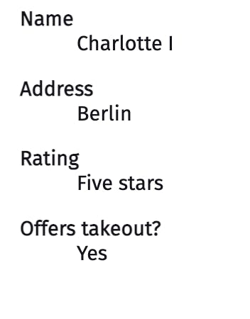
Definition lists are also commonly used for glossaries of terms and other types of content involving key-value pairs, so I encourage you to consider whether your content creators might benefit from having components built with them. Of course, the default styling uses indentation between the <dt> and <dd> elements, but you can choose to style them differently to fit your component’s design.
Content creators will generally pick the right type of list for their purpose — if we give them a choice between semantic elements.
Accordion components
On FAQ pages, websites will often have an interface where, when you click on a question, it shows its answer, and then it hides it when you click again. Browsers didn’t always have a built-in way of doing this, and people often make inaccessible solutions when they build such elements from scratch. It turns out, though, there’s actually a built-in browser element for this! It works super well out of the box, so I’d encourage you to add it to your CMS’s available components:
<details>
  <summary>How awesome is this site?</summary>
  Very awesome!
</details>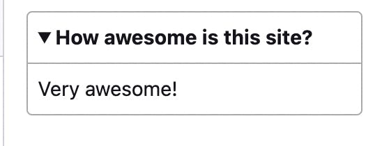
Content creators may be used to seeing similar elements on the internet, so they are likely to understand its use case. Let’s set up our component system to use the built-in details/summary elements, rather than a potentially inaccessible plugin.
Quotations
You may also want to provide your content creators a way of adding block quotes, which should have a structure like the following:
<blockquote>
  <p>To be or not to be?</p>
  <!-- Notice the use of the cite tag -->
  <p>— <cite>Hamlet</cite></p>
</blockquote>
The reason why I mention this component is to stress the importance of wrapping the author in a <cite> tag, which will help assistive technology understand the structure.
Content creators may be used to seeing similar elements on the internet. But, we might want to encourage them to use citations according to the (semantic) format provided in our component, rather than placing them in non-semantic paragraph tags afterwards.
Checking the structure
Finally, how can we check if we’ve chosen the right structure for our site? In part two, I shared a variety of testing techniques. I did want to share one more trick here specifically regarding page structure: remove all the style. I know it sounds ridiculous, but hear me out! You’ll quickly see whether your site structure is effective.
What I often do is go into the web inspector in my browser, open the <head> tag, and delete any <link> tags to a stylesheet or any <style> tags. Here’s what the DuckDuckGo Homepage looks like for an example:
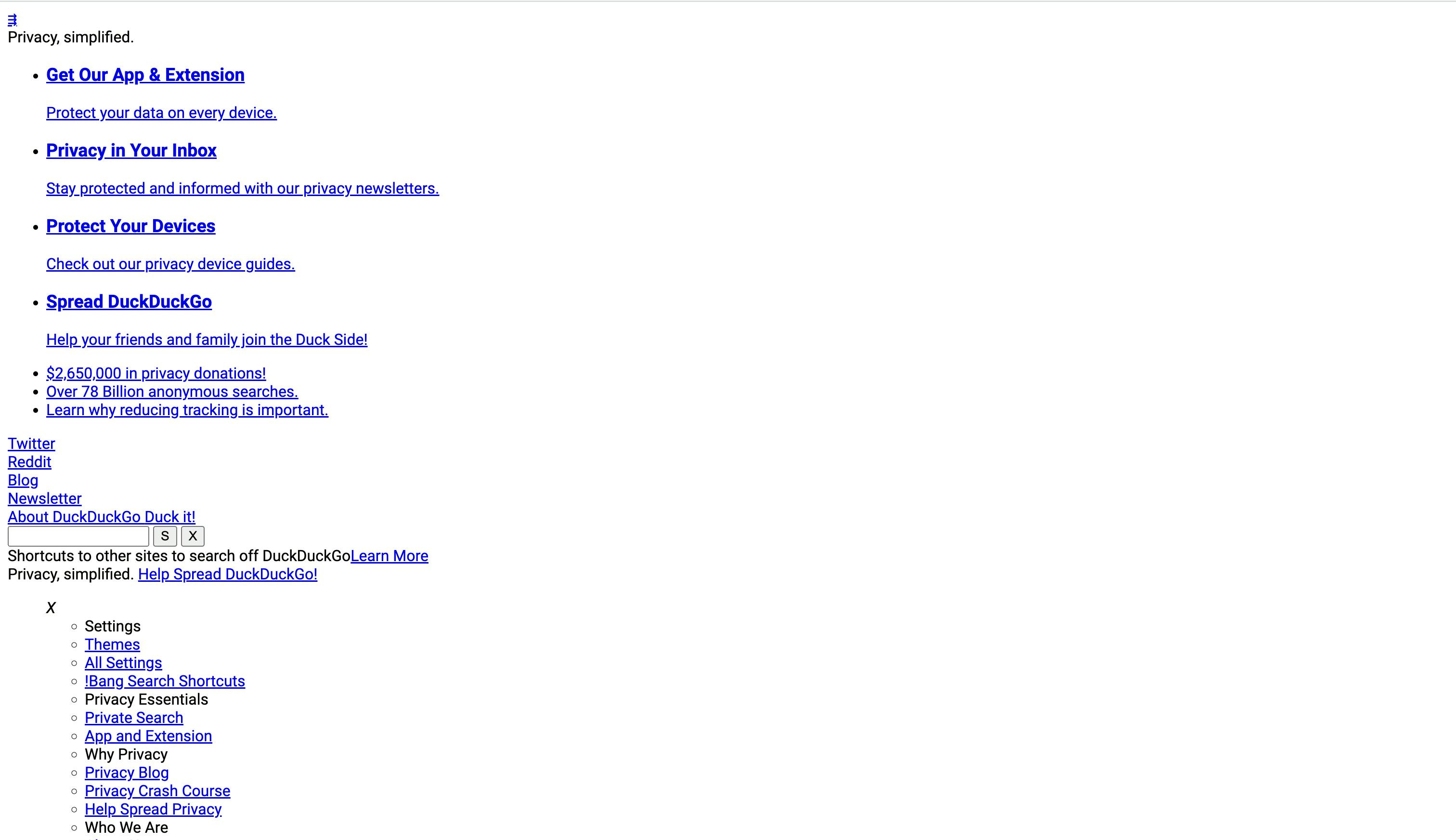
With this site, there are two lists of links, which get formatted as bullet-pointed lists. There are four <h1> elements, which is perhaps a controversial choice (although screen readers will generally know how to interpret it). The buttons next to the search box say only “S” and “X”, which might make them difficult to understand without additional styling and context clues. But overall, the site has a logical structure.
If your site’s structure makes sense in plain HTML, you can make it beautiful with CSS. But if the plain-HTML view lacks structure, additional styling will only hide underlying accessibility issues.
Going further
Of course, we haven’t addressed every component you may want to have on your page. You may particularly have to research further for complex, interactive elements like forms or tabs. But, for standard pages like blogs, this may already be enough and should help get you going in the right direction.
The good news too is that browsers are getting progressively better. I truly believe that, over the next few years, several common interface components (particularly modals and tabs) that we generally build from scratch will be replaced by native browser elements. This is a great trend because there is a strict vetting process for native browser elements in terms of accessibility and performance. The less we reinvent the wheel each time, the more everyone will benefit.
If you need more, however, as I mentioned in part two, I’d recommend checking out the Web Content Accessibility Guidelines (WCAG) and Inclusive Components.
Advocates for accessible web development
In this three-part series, we’ve now learned about what accessibility is, how to set up a Next.js site for accessibility, and how to promote accessible content in a CMS. I hope that you will use these tips in your own Next.js projects and become advocates for accessible web development.
But, there’s also still far more to learn!
- If you’ve found the discussions in part two of the more technical details of accessibility interesting, I’d specifically recommend researching keyboard navigation, focus management, and the Web-ARIA standard.
- You may want to check Adam Silver’s book “Form Design Patterns” for specific help with one of the thornier areas of accessibility.
- Though large parts of accessible development are really about “not messing up the browser defaults” or “adhering to best practices,” as you continue, I hope you’ll also find that there are all kinds of unique questions and new frontiers that arise depending on what you need to build.
On the flip side, you may have noticed that, in this article, I have talked about how your site should be structured, but I haven’t really mentioned what content should be on it. That’s because of a distinction I mentioned in part one between the terms accessibility and inclusion.
While accessibility deals specifically with disability-based discrimination caused by usability problems, inclusivity is a broader term. It describes a design process that aims to actively incorporate myriad experiences. It also includes more categories than disability, such as race, native language, and socioeconomic status. (You can check out Inclusive Design Principles for a breakdown of what inclusivity means).
As a result, we could theoretically imagine building a fully accessible website that spouts ableist viewpoints. Of course, there isn’t ... much of a point in doing so. But it goes to show that people still experience discrimination when using the web, even if the cause is not technical usability.
So, just structuring your site perfectly isn’t the whole battle. We have to make sure that, every time we go to write or code, we are including and celebrating diversity. I hope that, for you, accessibility can become a key part of this mission to build even more broadly inclusive websites.


