Accessibility is one of the most vibrant and important areas of front-end development. It’s not always the first thing people learn, however, so it can be difficult to know where to start. Sometimes the drudgery of automated tests can scare people off, and they think implementing accessibility is a rote chore. Instead, I think that, if we get a good grounding in the basics, accessibility can give us a powerful lens to answer one of the most fundamental questions in front-end: How do we make our site usable for the greatest number of people, in the greatest variety of situations?
As developers, we can and should use our unique power as architects of the web to prevent discrimination by prioritizing accessibility. Plus, accessibility is fascinating and can be a lot of fun 🙂
But, what actually is accessibility? Rather than dealing with it purely in the abstract, I’m going to try to help you understand how to implement best practices within a Next.js app. As you may know (possibly from my previous article on the Prismic blog), I think Next.js can be a great choice of framework for building static-generated websites. It’s also a common choice for freelancers like me. So, I will also provide advice about how to communicate with freelance clients about accessibility because it is our job as developers to be advocates for it. This article will be the first of a three-part series on the following topics:
- What is accessibility? Why is it important? How can we convince others to prioritize it?
- How can we set a Next.js project up for accessibility?
- How can we work with non-technical collaborators to produce accessible content?
What is Accessibility?
What exactly do I mean when I talk about “accessibility”? In order to help define “accessibility,” the WAI (”Web Accessibility Initiative”) differentiates between three closely-related terms:
- Usability
- Accessibility
- Inclusion
(You can see the official definitions on the WAI site).
If our site uses bright colors and doesn’t support a dark mode, we may call that a “usability” issue. The user may find the light color scheme annoying when they have made a choice to use a dark mode on their device.
On the other hand, if our site does not provide alt text for an important image-based diagram, we would call that an “accessibility” issue. In that case, a sight-impaired user would need to access the website through a screen reader. Consequently, accessibility issues occur when a site fails to accommodate users’ disability-related needs. As the WAI says, “Accessibility addresses discriminatory aspects related to equivalent user experience for people with disabilities.”
By contrast, the term “inclusivity” is even broader than accessibility and includes a wider range of design decisions. A bloated website with tons of JavaScript may receive perfect accessibility scores, but it would not be inclusive, since users on a slow internet connection couldn’t load it. Inclusivity, furthermore, is generally understood to address more types of discrimination (based on race, native language, economic means, etc.) and their intersectional consequences. Inclusivity is broad enough that I admittedly can’t do it full justice here, but I’d strongly recommend Heydon Pickering’s book “Inclusive Components.”
It’s important to know what types of disabilities accessibility addresses. To my knowledge, there isn’t an officially sanctioned list (because it could risk leaving somebody out!). But, I’ll try to present a non-exhaustive categorization of some accessibility needs to include:
Visual
- Video or image-based content may be inaccessible (audio alternative required).
- Various forms of color blindness may make users unable to distinguish between different colors consistently (i.e., red and green).
- Various optical conditions make small text difficult to read, or types of visual content difficult to access.
- Motion-based animations may be inaccessible.
Audial
- Audio-based content may be inaccessible (visual alternative required).
- Certain types of audio may be difficult to parse (for example, quiet voices with loud background music).
Manual
- The user may not be able to operate certain input devices (often they might navigate only using the keyboard).
- Certain types of dexterity may be difficult or impossible (for example, certain types of touch interactions or fast-paced click sequences).
Cognitive
- Motion-based animations may be inaccessible, jarring, or cause seizures.
- Fast-paced text or content may be inaccessible.
- Overly complex or non-standard interfaces may be unintuitive and inaccessible.
It is important to note that accessibility needs may arise/compound for people as they grow older. I haven’t included “Age” as a category above because it so readily overlaps with other categories, depending on individual circumstances.
Why is Accessibility Important?
The primary reason why we and our collaborators should care about accessibility is that an inaccessible internet is definitionally discriminatory.
We’re probably working with the web because we think internet technologies are cool, useful, or in some capacity, important. If we then cut access off for people with disabilities, we are actively discriminating.
In fact, I think the reason for prioritizing accessibility is quite simple. Web developers play an integral role in delivering basic services and shaping global conversation. If we exclude a category of people, regardless of whether it’s based on ignorance or negligence, we are harming a marginalized community.
One question that often comes up is: “How many people does this actually affect?” It’s actually incredibly difficult to know, as Hidde de Vries argues in “How many people with disabilities use our site?” The privacy implications would be disastrous if websites could easily discern whether a user is using a screen reader, for example, so the metrics simply are not available.
But, the numbers don’t really matter.
In fact, if 90% of the population were sight-impaired, the term “accessibility” would likely mean accommodating sighted people instead! Accessibility, by definition, impacts a minority population, but even if the number of users on your site with accessibility needs is small, that doesn’t mean their needs don’t matter. The CDC, furthermore, estimates that 26% of all American adults face some form of disability. I guarantee you that if you put in the work to make your website accessible, more people with disabilities will use your site. And, if you open a dialogue about accessibility on your site with users, you may find that a more diverse group has already been using it than you may have realized.
Stay on the leading edge of development with a monthly coding challenge.
Explore new tech with a fun, scaffolded, coding challenge that lands in your inbox once a month. You'll get all of the learning with minimal spin-up.
How Do We Convince Others That Accessibility Is Important?
If I’ve done my job so far, you’re already in agreement that, as a developer, you should prioritize accessibility. But, even if we care on principle, it can be hard to have much impact as “the only accessibility person” on a project. We have to take an active role in convincing our collaborators.
In this section, I’m going to focus particularly on how to talk about accessibility as a freelancer. I’m a freelancer myself, so I can better speak from this perspective. I have also found resources about accessibility as a freelancer to be rarer. But, I do hope that the arguments presented will still be relevant to other types of work.
Starting on the Right Note
Usually, my projects start with some type of “client intake call” where we discuss their needs and the project scope, as well as my schedule and abilities. I have found that mentioning accessibility on this call generally helps set the right tone for the working relationship.
If you work with accessibility regularly, you may, for example, cite it as one of the “strengths” on your coding resume. Or, you can say that working on accessibility is one of your aspirations in this project. Sometimes a client will have specific accessibility needs in mind, and then they may feel comfortable discussing them with you. At other times, a client (particularly if they don’t code or use assistive technology) may not really know about accessibility. So, you might give them a concise explanation of what it is and why it’s important (👆 see above!).
I often like to stress that, not only is accessibility deeply important in its own right, but it is part of a unified coding practice that ensures the best results. The unfortunate reality is that sometimes more business-minded people don’t think the moral imperative for accessibility is strong enough to justify actually putting in the work, time, and budget to make it a reality. This attitude may simply be a red flag 🚩 about the working relationship, but it may be possible to overcome with some of these arguments:
- SEO: It’s already true that accessible websites generally have better SEO. Web crawlers function similarly to screen readers; it’s easier for them to read textual content than to interpret images. So, a website with well-written
alttext and a good HTML structure will give search engines a better understanding of the content. In the future, with Google’s firmer stance on accessibility, it may have an even more direct impact on SEO (see “Will Accessibility Become Increasingly Important for SEO?” by David Oltean). As Google incorporates “page experience” into its search rankings, accessibility issues increasingly result in an intentional SEO performance decrease, rather than an incidental one. Inaccessible content will, simply put, be left behind. - Legal obligation: Inaccessible websites may expose companies to legal claims. I’m not a lawyer and laws vary widely by jurisdiction, but in the USA the Justice Department has asserted the Americans with Disabilities Act (ADA) applies to websites.
- Machine readability: A screen reader accessible site with a semantic HTML structure will likely be better understood by other software, like a read-later service or web crawler.
- Benefits for able-bodied users too: Many users without motion impairments sometimes prefer to navigate with a keyboard. (I know I’ve done it during coronavirus lockdown while eating an inevitable snack with my other hand!) Appropriate color contrast and readable fonts, similarly, help website legibility for everyone. Of course, these “trickle-down” effects aren’t the primary reason to build accessible sites, and we run the risk of justifying accessibility for how it benefits ... able-bodied people if we overemphasize them.
- Code smell: Usually inaccessible code is rife with other types of issues. We call this phenomenon a “code smell” because, once you “smell” it, it’s a sign that even more things might be going wrong under the surface. Fixing accessibility issues usually solves a range of other bugs.
I’ve provided lots of reasoning here, but, depending on the client, the conversation can be really short. Sometimes, I just have to say, “I focus on accessibility in my front-end work,” and that’s enough to set the right tone moving forward. A client may use assistive technology or have accessibility needs, in which case they may be able to help test the site and set accessibility priorities.
Doing the “Invisible Work”
Certain types of accessibility work are what I call “invisible.” I put the word in air-quotes 😶🌫️ because, of course, accessibility features are, in fact, perceivable to people who need them! Sometimes, however, the work we need to do to make a site accessible won’t actually make anything look or feel different to users who don’t use assistive technology. In other words, an able-bodied client won’t even know you changed anything.
Here are some examples:
- Reduced motion: Any motion-based animations should have alternatives that don’t use motion. It’s possible to detect this user preference through an
@mediaquery in CSS, and the reduced-motion alternative doesn’t change the original animation. So, clients who don’t know about reduced motion preferences may never even see the alternative you develop. - Proper HTML structure: I don’t recommend descending to the depths of HTML Hell, but it’s often theoretically possible to hack together a really horrible HTML structure that still looks right. If your client doesn’t code and doesn’t use a screen reader, they may not notice the difference ... even though your users will.
alttext: In the third article in this series, I’ll talk about writing goodalttext for images. Some clients may never read thealttext you write, and I’ve never had a client complain that I wrote goodalttext for an image!- Skip link: In the second article in this series, we’ll build a “skip link,” which lets users skip ahead to the main page content, instead of having to tab through the whole navbar. Typically, these links are hidden unless focused. I put them on all my sites, and I’ve never had a client say anything about it.
As you can see, this work is our responsibility as developers to simply do, and there’s no reason to ask a client’s permission. I used to do the “invisible work” automatically and not mention it, but I actually think it’s a great idea to let the client know. It helps broaden the client’s awareness and their opinion of you as a freelancer.
So, after I’ve done “invisible” work, I think it’s great to make it “visible” for the client too. I may, for example, tell them that their site is also optimized for users who prefer reduced motion and show them how some of the animations look in that case. They’ll probably be thrilled to know that their site is optimized for this use case, even if they didn’t previously know it existed.
Sorting Out the “Visible Work”
There’s another category of work that is ... much thornier. 👹 In the spirit of full humility, I have to admit that I still really haven’t figured out the best approach here. By contrast, I call it “visible work.”
Sometimes, the work to make a site accessible will conflict with the design mockup. In fact, such a conflict will almost certainly come up, unless the designer is thinking about accessibility. (In fact, you might share this guide with designers you work with regularly to help them understand your work better.) Here are some examples:
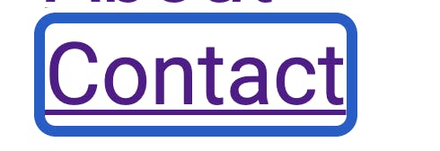
- Focus styling: Focusable elements should always have a clear visual indicator when focused (in part two, we’ll learn how to design accessible focus indicators). I get asked by non-technical clients ... pretty much all the time to remove the focus style because they don’t know what it’s for and think it’s ugly.
- Color contrast: It’s honestly quite rare that I receive a design that has fully WCAG-compliant color contrast ratios. Color is such a key part of design that it can really ruffle some feathers if you ask for a change. 🦅
- Color-based distinctions: Key information (like in an on/off toggle) should never be differentiated by color alone since not everyone can perceive these differences. Sometimes designs may not include a text or icon alternative in addition.
- “Honey, I shrunk the div”: Elements or font size may be too small to be reasonably legible to users. There’s no “minimum font size” allowed on the web (and color contrast factors in significantly) but usually fonts under about 12px end up being too small. In the next article, we’ll also look at how to make sure our users can always resize the font to suit their needs. 🔎
- “UI gone rogue”: Sometimes the interface elements suggested in a design will be non-standard to the point of being essentially non-usable for all but the most tech-savvy users. The elements may particularly rely on mouse-based interactions without a clear way of providing a keyboard-based alternative.
These kinds of issues arise when the design doesn’t account for accessibility needs, and the changes required are either structural or aesthetically noticeable. As freelancers, it’s true that we have limited capability to impact a client’s priorities, and the end product is ultimately theirs and not ours. So, what can we do?
The first thing I would try is to advocate for the most accessible choice. The client may not be aware that the design is inaccessible, and they may be entirely receptive to change. In general, I try to make my recommendations as impersonal as possible and to avoid moralizing language. I often like to rely on (and link to) compliance requirements from the WCAG. Here’s a (somewhat edited/redacted and, of course, anonymized) sample of a conversation I had with a client who reported a bug when they saw that focus indicators were showing up on their site on Safari:
"Hi! That’s actually not a bug but a result of browser differences in an accessibility feature. When elements are focused, they always have to have some kind of border or way of indicating focus. Some people only use the internet using a keyboard, either due to accessibility needs or personal preference, so it's required. Chrome and most other browsers let you hide the border if the user isn't using the keyboard (which is implemented on the site), so you won't see this behavior on Chrome/Firefox/etc. Safari is unfortunately the only major browser that just doesn't support this quite yet, so the official recommendation is to show focus indicators in Safari, even when the user is using a mouse. In other words, it's a result of the best practices. I definitely see why it might not look the best from a design perspective, but if we removed it, we’d lose usability."
The client in this case (completely understandably) just didn’t know what the borders were for. They were super receptive to this argument and appreciated learning about the differences between browsers. They also joined me in urging the Safari team to support focus-visible even sooner. 😉 It was a great learning opportunity for everyone and made me feel more comfortable speaking about these kinds of issues generally with clients!
Sometimes, however, the client may not be receptive to impartial argumentation. For me, the most common situation where I’ve found this to be the case is with color contrast. For some reason, many people are open to changing just about anything but ... don’t touch the colors on their website! It’s part of a common misconception that accessibility is somehow a limitation on “artistic” design (see “Myths about Web Accessibility” by Alvaro Monoto). At the end of the day, you may not be able to convince the client to make a change, and, as a freelancer, it’s not really your decision.
So, what can we do when the client rejects a design change? This is where I’ll give the same advice as in the previous section but in reverse: Where possible, make the “visible” work “invisible.”
In the case of color contrast, it turns out there’s actually a CSS @media query for prefers-contrast. When users enable a browser/system setting, you can style your site to have even more contrast than normal. According to Can I Use, it only has about 80% browser support, and the user does have to enable the setting. But, I would design the boldest, most contrast-y variant of the CSS imaginable for this @media query. Sure, it won’t reach all users, but it will provide a good alternative for many, and I can’t imagine the client would have an issue with it. In this sense, we’ve made an “invisible” change to the site that at least mitigates the damage for a percentage of users.
Finally, I’d encourage you to be kind to yourself. You may be building a site from scratch, but you may also be launching into a codebase with decades of inaccessible code. We can’t always convince a client to go from 0% to 100% overnight. Even if we only marginally improve their accessibility practices, that’s still a win for everyone.
You Might Also Enjoy:
Next Up: Starting Our Project
We’ve now discussed what accessibility is and why it’s important. You’ve been thoroughly convinced that, as developers, we have to embrace web accessibility in order to prevent discrimination against people with disabilities. We’ve also learned some techniques that can help you to become an advocate to others you work with. We’ve discussed how being aware of the difference between “visible” and “invisible” work can help us to maximize the influence we have as freelancers on our clients’ accessibility practices.
But regardless of whether it's is “visible” or “invisible,” it’s now time to get to work and actually build our project! Stay tuned for the next part in this series, which will be more technically focused on specific coding practices that support accessibility in a Next.js project.


