An Insider Perspective: How We Built the Prismic Blog

At Prismic, we launched a redesigned blog on August 31st, 2023. We think a good blog offers a superior, memorable user experience, loads fast, generates interactions with readers, and helps attract the right traffic to your website. From what we can tell so far, our initiatives prove to be working!
It’s still too soon to share defined results on the impact, but what we can see as of now is that:
- Our session durations for visitors who saw blog posts increased by 75%
- The average page view per session increased by 20%
- The bounce rate decreased by 30%.
We attribute a lot of this success to an improved user experience. Here’s a quick look at the before and after of our blog home page:
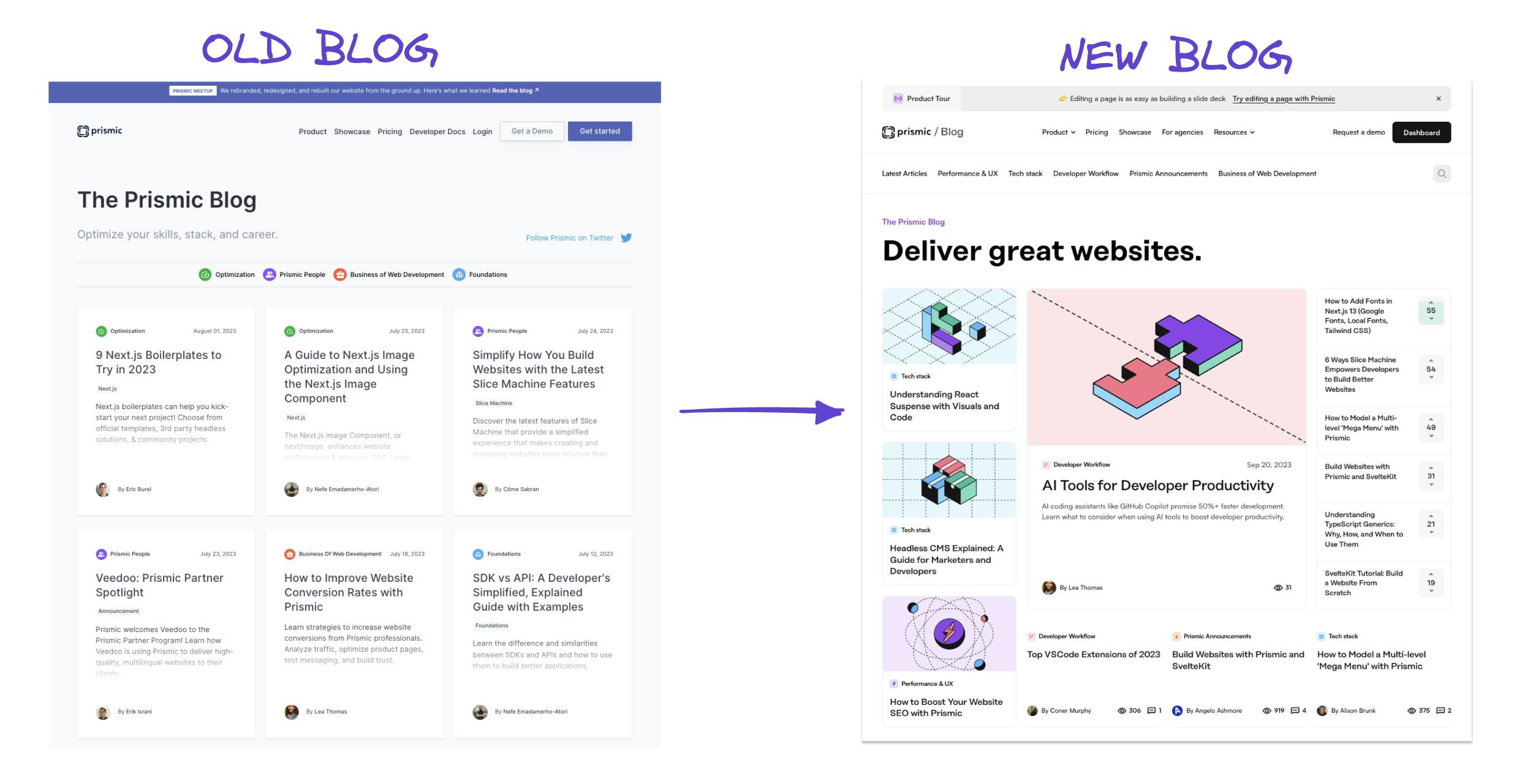
The intent of this article is to give you an inside look at the strategy behind our redesign and the process we followed to achieve these results. We hope some of our learnings will inspire your next blog project!
Credits
The blog was implemented by Samuel Horn and designed by Hervé, our branding agency. The strategy for the redesign was thought through by Grace Miller, Lea Thomas, Alison Brunk, Lidija Kacar, and Nouha Chhih. Don’t hesitate to leave us a comment at the end of the post. We are happy to help!
Step 1: The strategy
Why give the blog a makeover?
We started working on our blog and hired our first content strategist back in September 2021. From user research, we identified that the developers who use our tools build websites for a living, using frameworks like Next.js, Nuxt.js, and Sveltekit. After audience research, we pinpointed that these developers read content to optimize their skills, better understand their tech stack, and grow their careers. So we decided to create content around these three categories, plus an extra one for Prismic updates:
- Optimization covers topics for experienced developers who want to explore new technologies, compare frameworks, fix web performance issues to improve their site’s SEO, make it more scalable, or who are curious about our take on the future of the web (e.g., our series tied to the growing accessibility movement).
- Business with content to help developers with career decisions, tips on working with non-technical teams, project management advice for freelancers and agencies, entrepreneurship guides for finding your first clients or building your business.
- Foundations content focused on capturing younger developers who are just learning the basics of JavaScript for website development.
- Prismic Updates with updates on our developer tools, APIs, web optimization tips when using Prismic, and website stories from community members.
We had a foundational workflow that allowed us to produce high-quality content for developers.
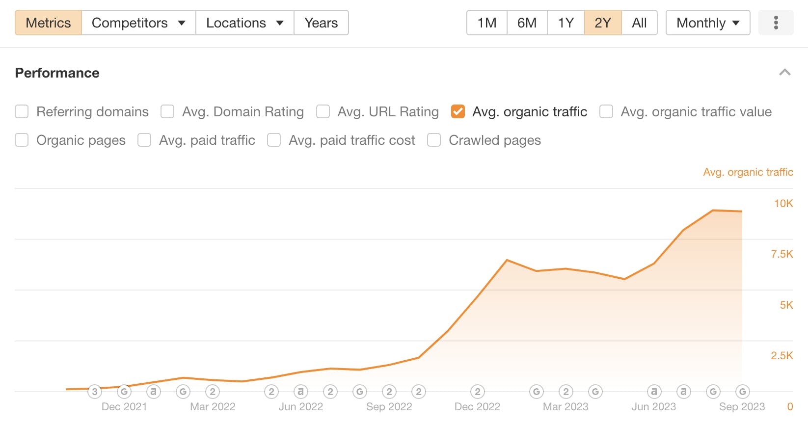
The result of that is better metrics all around (see traffic growth ☝️ from ahrefs). However, there was one area that we were not addressing yet: creating a relationship with readers.
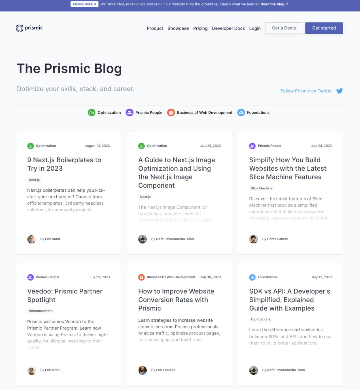
Our existing blog home looked like this:
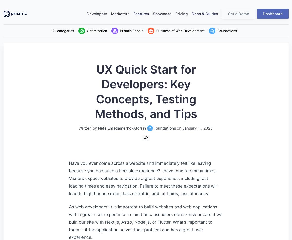
Our blog posts would use a simple page type for things like tech comparisons, business management guides, list-style posts, etc.
Between five of our highest-quality blog posts in the last quarter, 24.9% of our through traffic went back to the blog homepage (which is not to mention traffic to other blogs). Our interpretation from this was that when our audience reads something really good, they’re wondering if there’s more. But, we were not making it easy for them to:
- Easily see what other kinds of content we publish and understand if the rest of our content is of interest and valuable to them.
- Remember something distinctive about the resource we’re creating or our brand (on the blog page) at a glance. This could be a great place to create visibility for our other initiatives, such as our community space or our YouTube content.
Accomplishing these goals was critical because gaining reader loyalty is an important component of an effective SEO strategy. Our goal was (and still is) to cultivate a relationship with our readers, to keep our brand top-of-mind for the moment when they’re ready for a headless page builder, all while we’re building other funnels to capture this traffic.
The list of changes we targeted
Redesign the home page
Redesign prismic.io/blog to highlight topical authority and invite exploration. Our challenges were that:
- The blog home layout was pretty standard and repetitive. It wasn’t providing the rich content experience we wanted to provide to make an impression on visitors.
- We didn’t have the option to logically group the content on the blog homepage in any other manner than a scrollable grid. While our top-level categories suggested that we cover relevant topics to our readers, the rest of the page wasn’t making it easier to understand the specific topics we cover.
- The preview text on every blog postcard made the page feel overwhelming and distracting from the ability to focus on the titles of each post.
Improve the blog post page
Improve the blog post page type to promote visitor engagement and invite to further content discovery:
- The reading experience felt bland and un-branded, even though we had 10 slices to pick from when creating a blog post.
- One issue we had when a post had a lot of code blocks (pretty common on a developer blog!) was that it could become visually busy.
- We lacked interactions and animations on blog posts that would entice visitors to keep reading, explore more articles, explore our product, or share their impressions on the content they are reading.
Update category and author pages
Bring category pages and author pages into alignment with the new branding to make them visually consistent.
Improve tracking
Use our blog rebuild as an opportunity to improve our tracking.
- To improve our understanding of how higher-level aspects of our content strategy were performing, we wanted to send the blog category and blog tags information about a blog page when tracking a page view or click event on it.
- For context, we were using GA4 with Tag Manager at the time for tracking and had a simultaneous project of migrating to Amplitude with Segment to improve our attribution of activated users and projects. (We’ll do another blog post about this soon!)
Step 2: The design phase
Sharing our needs with the design agency
We structured these thoughts for our design agency. Our expectations were grouped by goal with examples of other blogs we felt were succeeding at these objectives.
Our Notion database looked like this with four over-arching requests.👇
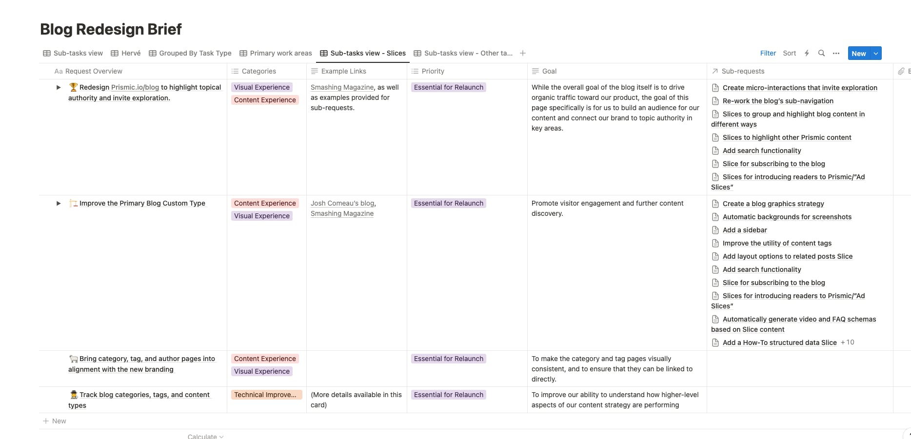
Under each request, there was a set of specifications for new page layouts, new slices, new interactions, and new features.
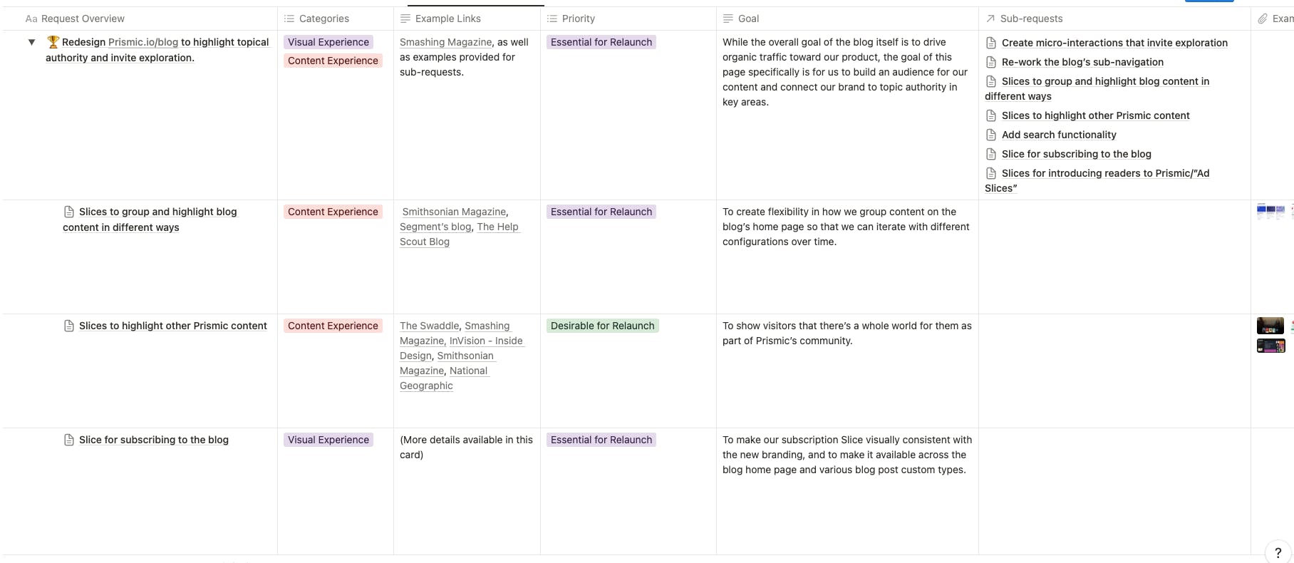
Each request was documented with specifications that answered the question, “What currently exists to this end?” We also included screenshots and URLs for examples that we liked in other publications.
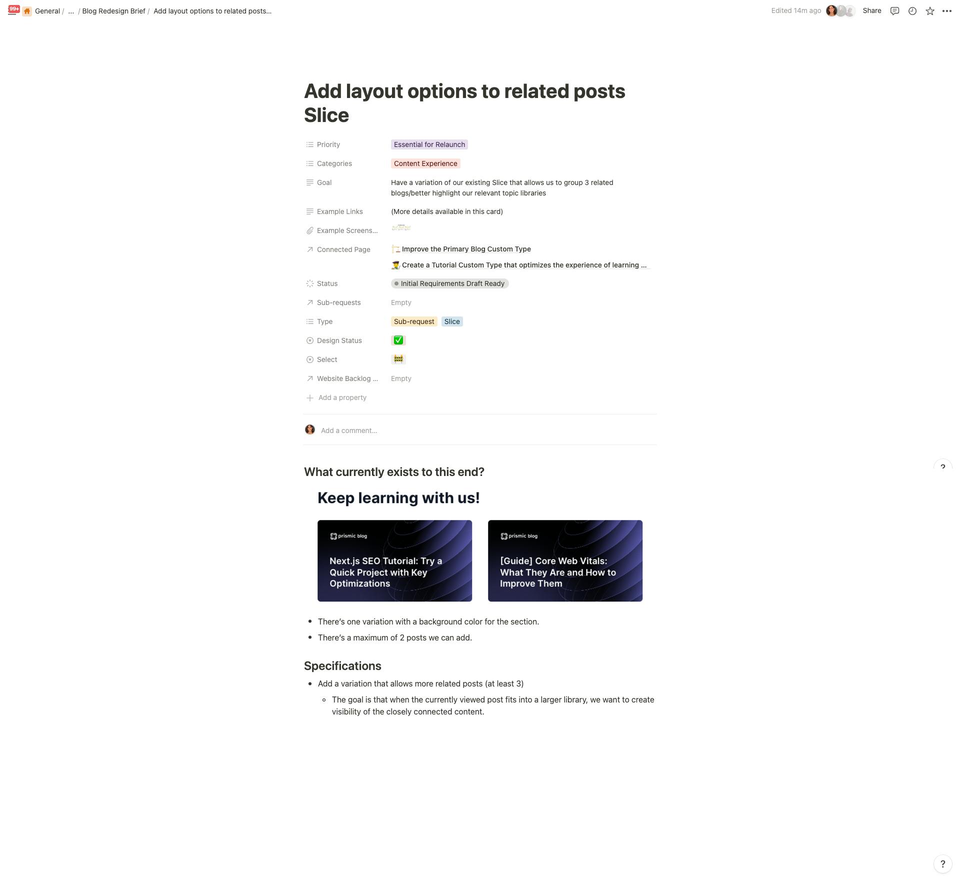
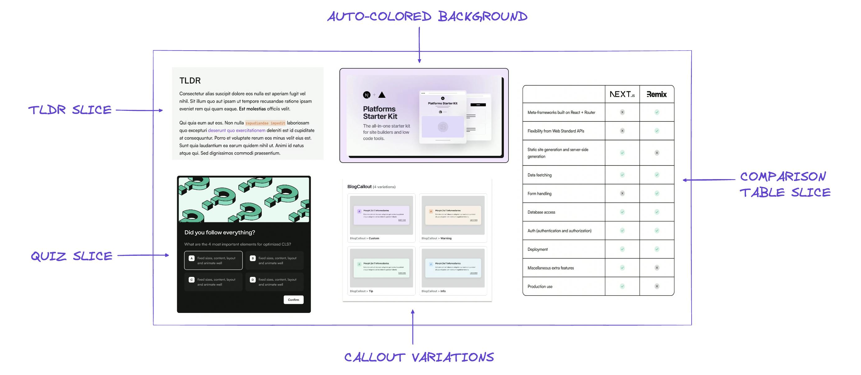
In case it helps, here is the list of initiatives we selected to improve the readability and engagement of our blog posts. 👇
Initiatives for improved readability
- Add a TL;DR slice. To make our TL;DR summaries more valuable to users and enable them to explore details only in the areas they care most about.
- Add a comparison table slice. To have an accessible option for creating tables on the blog, prior to this, we were uploading screenshots of tables.
- Add a quiz slice. Create user engagement by allowing them to test their knowledge.
- Add automatic backgrounds for screenshots: To keep the blog upload process efficient while improving the overall appearance of posts.
- Improve the callouts slice: We covered some use cases that the slice doesn’t currently solve for, like allowing code blocks within the callouts, and also added to the existing blue and red variations a green one that indicates success.
Initiatives for improving the indexation of our blog posts
- Add
dateModifiedstructured data to blog posts to indicate to crawlers that the article was refreshed with up-to-date content. - Automatically generate video and FAQ schemas based on slice content to make it more efficient to add schemas to the blog.
- Add CollectionPage schema to help define the hierarchy of elements on the blog home and to help make it more eligible for Google's rich results features.
Create micro-interactions to invite exploration
- Add features that invite developers to increase engagement with our content: like quizzes, a smart progress bar, and a celebration animation when a reader finishes reading a blog post.
- Add features that show that our content is read by other devs and appreciated for its quality: upvotes, viewers counter.
- Add a feature to allow us to interact with users and get their feedback: a commenting system with the ability to reply.
- Add a search bar for readers to quickly find out if we have content on a topic that is top of mind for them.
- One sub-goal for us was to build these interactions in a unique way as proof our blog is built by developers, for developers.
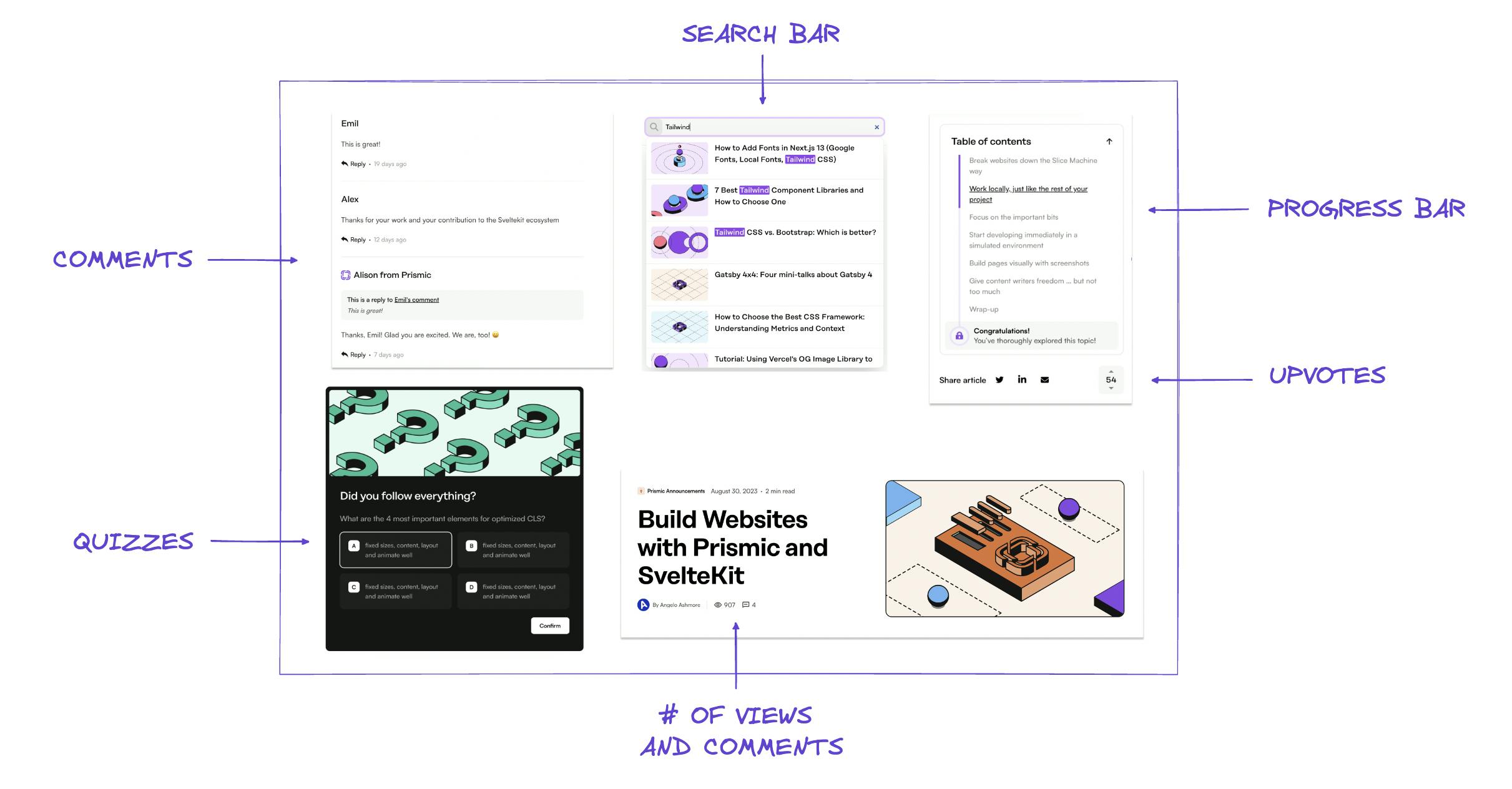
(We’ll share more about how these are built on “Step 4: The Implementation” below 👇)
Improve OG Images
Our thumbnails for articles were not consistent with our brand and lacked variety, so we needed a new blog graphics strategy to align them with the new visual branding.
Additionally, we needed to enable the team to create custom thumbnails easily while staying on-brand. This is probably a challenging topic for many blog teams, so you’ll find here more details on how we scoped this task.
What existed to this end?
We auto-generated OG images with a background image and blog post title, like this:

Specifications for future OG images:
- Align automatic OG images with the new visual brand
- Have more variety in these images while maintaining visual consistency.
- We often make tech comparisons and explore topics like speeding up website performance for SEO, so having some standard shapes that we could configure for custom OG images would be amazing. (As well as any design guidelines for assembling and using those shapes.)
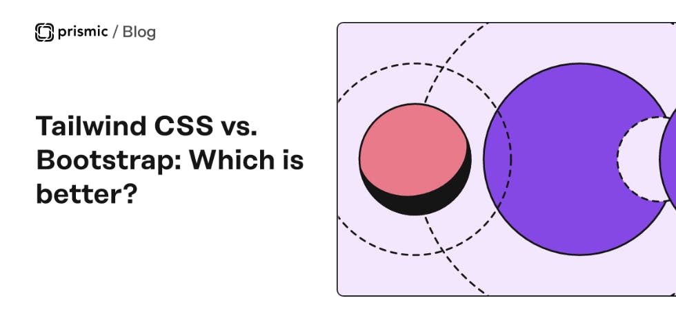
Here's an example of how a new one might look:
The design iterations and end result
We prioritized our 54 specs and shared the database with Hervé. We decided to limit the number of open requests to five, so every week, Hervé presented their progress on our five open topics during a weekly call. This allowed us to ensure a consistent rhythm in the design progress.
On a weekly basis, we would receive updates on a scoped set of topics, provide feedback, validate tickets, and open new ones, until we went through the list of our 54 requests.
Pro Tip
Even though we shared some feedback and impressions live during our weekly calls with Hervé, a structured written feedback was always shared after the meeting. This allowed us to give clear next steps to the agency.
One team member was responsible for gathering the team’s feedback during the weekly call, formalizing it into a Notion page, sending for review to the rest of the team, and made sure we shared next steps with Hervé the day after the call, to keep short iteration loops.
The final designs
After three months of iterations, we reach these results:
Blog home
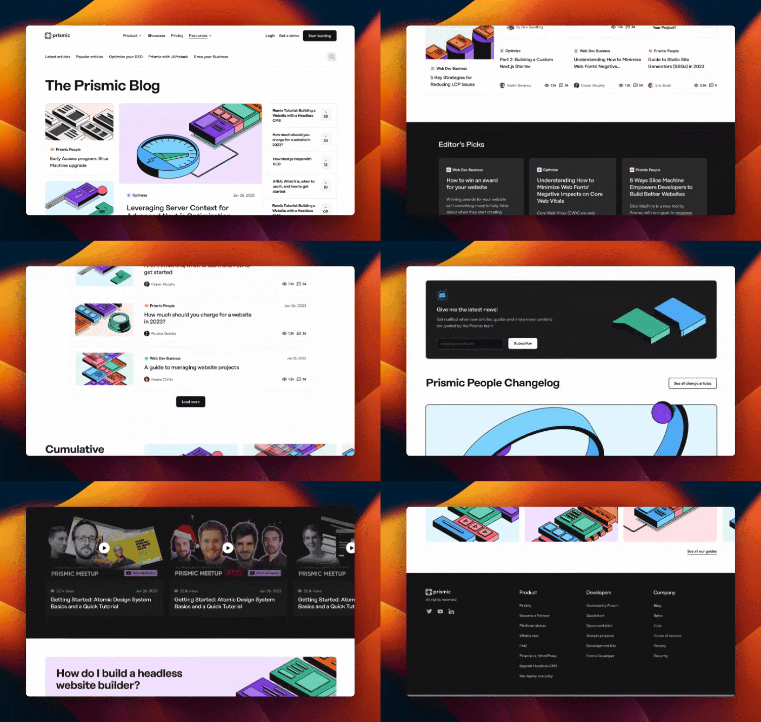
We received a blog home design in Figma that is an assembly of the slices and layout features we asked for. We still needed to create the page content and outline for the launch (more on that below). These are the complete set of slices we have at our disposal for all future versions of our blog homepage.
Blog post page
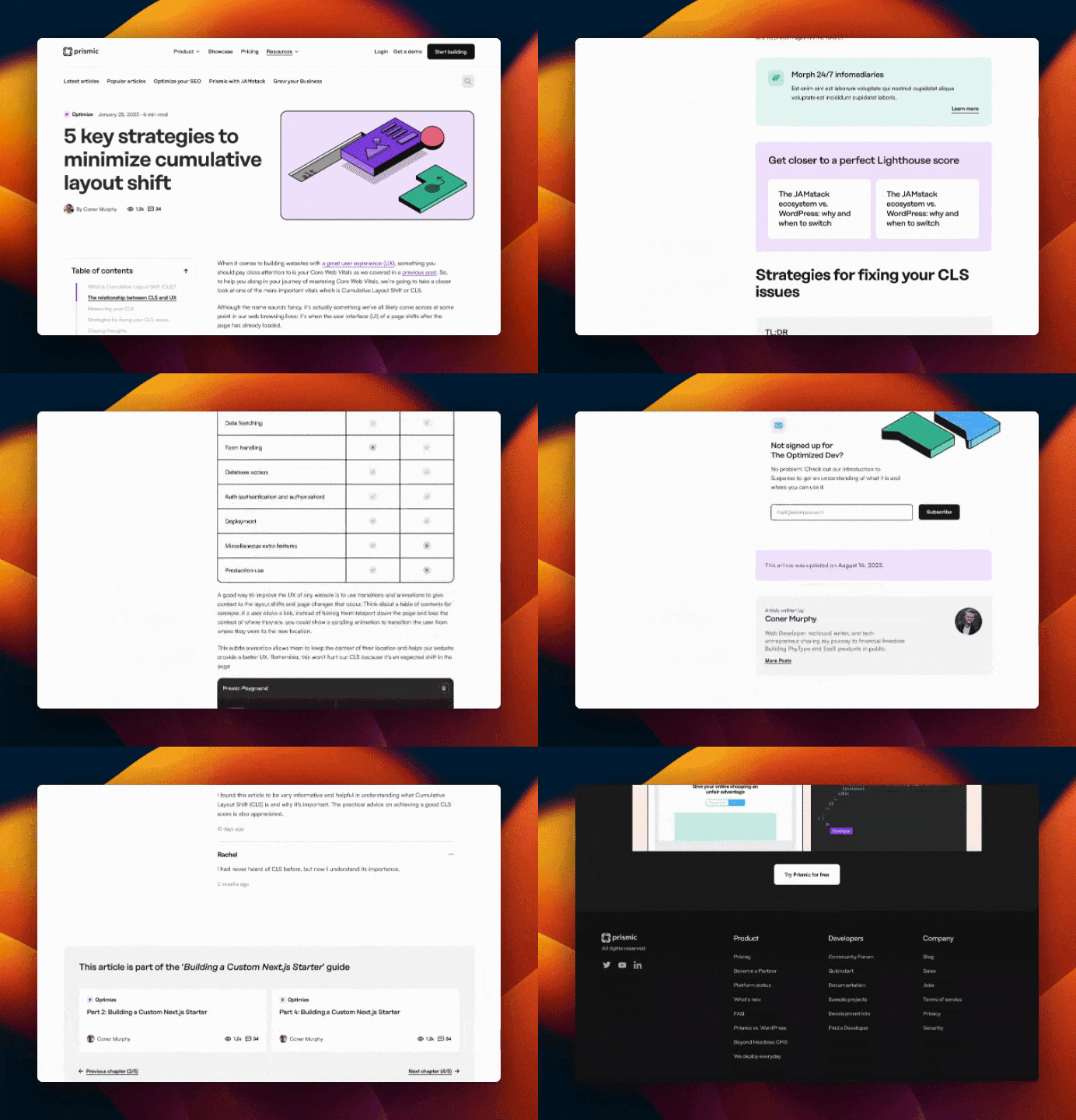
We received a blog post page designed in Figma, using one of our existing blog posts as a model, with an instance of all the new slices and micro-interactions we requested.
Asset guidelines
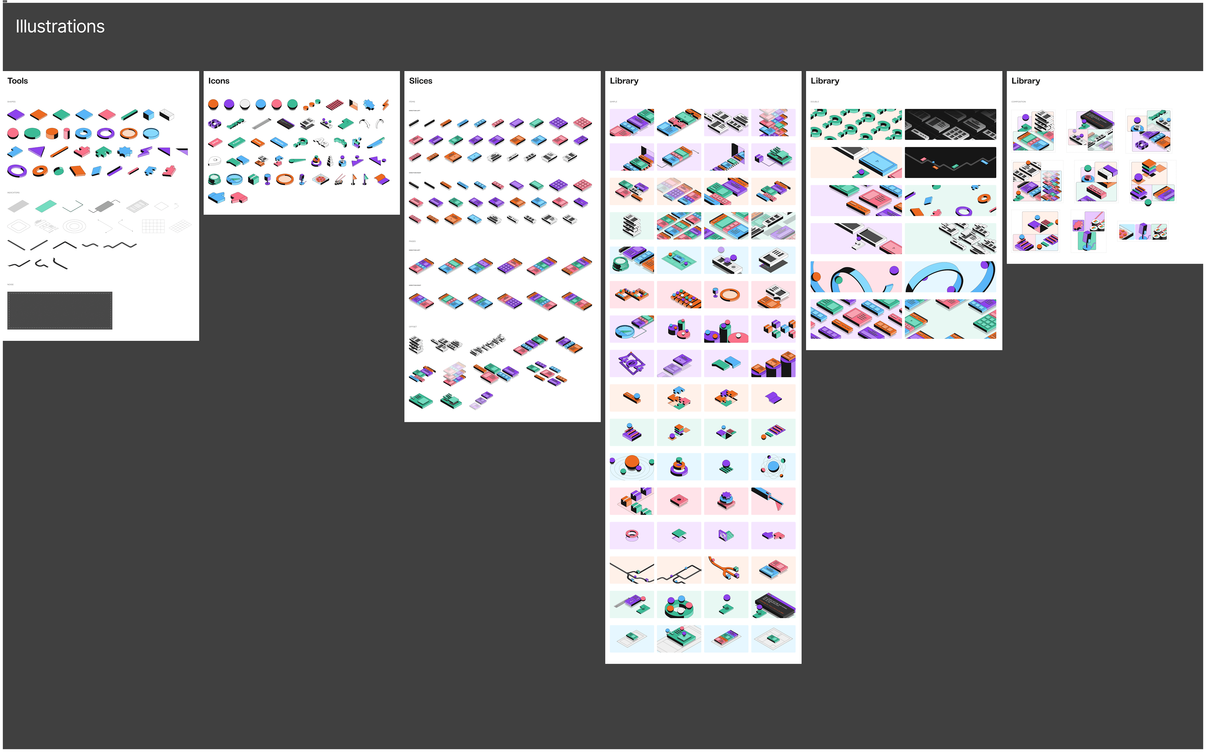
We also received guidelines for creating blog posts and OG images.
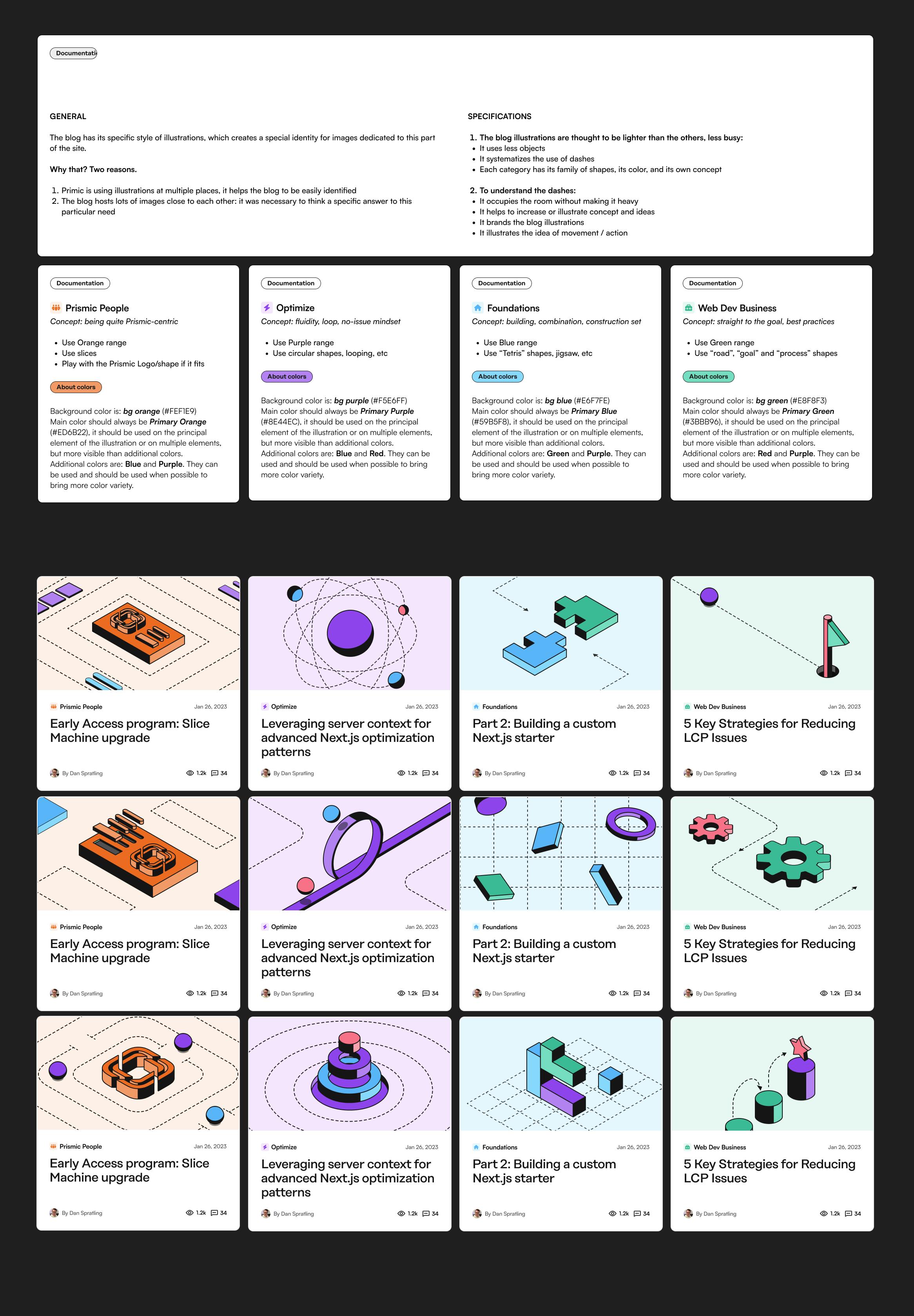
This also included an illustration library of design assets to pick from to compose our image assets.
Step 3: The content architecture
Defining the blog headline
The blog home headline serves an important dual purpose for both content design and SEO. From a content perspective, the headline acts as the front door to the blog, setting reader expectations about the blog's focus and tone. We wanted a more descriptive, succinct headline that clearly communicates our blog's value proposition.
For SEO, the headline is a prime opportunity to establish keyword relevance by incorporating target phrases. As the title tag for the homepage, it signals important topical keywords to search engines. An optimized headline welcomes readers while also boosting discoverability and rankings through strategic keywords.
We went from a prevalent “The Prismic Blog” like this:

To a more user and value-centric “Choose your stack. Nail your workflow. Deliver great websites.”

Defining blog categories
We essentially kept our existing categories and split two of them into three categories (with one new Developer Workflow category) to be more specific about the value for our readers:
- Business of Web Development stayed the same ✅. With content to help developers with career decisions and tips about managing client projects for agencies and freelancers specifically.
- We renamed Prismic Updates to Prismic Announcements to make it clearer that we’ll cover what’s new with Prismic.
- We found that the differentiation between our existing Optimizations and Foundations categories wasn’t clear enough and reorganized them into Performance & UX, Tech stack, and Developer Workflow categories to connect best with the areas of growth developers seek.
Blog home layout
This is probably the section that we will experiment the most with as we observe how readers navigate it and get more data about which of our blog posts perform the best (in terms of the number of page views, reading completion, interactions, and conversion).
As of today, we decided to organize our homepage in the following way, with the logic explained below:
- Focus the Hero on featuring the most popular and recent articles for readers who come here from a blog post to find popular content at first sight.
- Include a section to feature our YouTube content, and introduce the fact that we don’t make only written content (we make excellent content for website developers in video format for those who prefer watching over reading!)
- Deliver on the three values we highlight in our blog title, with one slice content feature for each. Content that helps you:
- Choose your tech stack
- Nail your workflow
- Deliver great websites - Then we feature our newsletter to invite readers who reached this stage to keep up-to-date with future content we’ll release and become returning readers.
- If a reader wants to explore more and see the depth and variety of topics, we feature the Blog tabs slice, giving a condensed way for readers to explore our categories of content.
- Finally, readers who reach the bottom of the page can see:
- The Prismic changelog that shows a timeline of our last three major product updates, which is a tool for us to showcase that our product evolves constantly and fast.
- An end-of-page CTA sharing the Prismic value proposition for developers - “Deliver a fast website with a visual Page Builder for your marketing teams.”
Step 4: The implementation
How we chose our stack
- CMS: We prefer using our own product, Prismic, as our CMS. It aligns with our philosophy and allows us to understand our product from the user's perspective. Using Prismic also fits our ideal customer profile (ICP) perfectly.
- Framework: Our previous blog was on a separate Nuxt.js installation, which was disconnected from the rest of our website. We recently rebuilt the website using the latest version of Next.js. To integrate the blog with the website and share Slices and other content, we decided to build the new blog using Next.js within our website.
- Hosting: Both our old Nuxt.js blog and the new Next.js website were already hosted on Vercel. Integrating the blog into the website allowed us to benefit from Vercel's Speed Insights, which we already had activated for the main repository, which monitors the blog alongside the main website.
- Styling: When building our new website a few months ago, we switched from using styled components to usingTailwind CSS. Setting up a Tailwind config for our redesigned brand and having everything readily available saved us a lot of time. Tailwind's built-in purging of unused styles through the
contentproperty also helps us deliver small stylesheets. In fact, the combined stylesheet for the entire site and blog is only 14.8kb. - Dynamic data: For dynamic data such as comments, votes, and views that don't come from Prismic, we opted for Supabase. Supabase is an open-source alternative to Firebase that offers backend services for web application development and scalability. It provides database management, real-time subscriptions, authentication and storage services, and auto-generated APIs. With Supabase, we were able to create a simple backend for all our dynamic data.
- Search: We chose Algolia for our blog's search function because of its fast, reliable, and typo-tolerant search capabilities. These features enable users to quickly and accurately find what they're looking for. Additionally, integrating Algolia's search index with Next.js serverless functions is straightforward.
How we built the interactions
Search
We built the search with Algolia and Next.js, which was pretty straightforward. Here is the process detailed in simple steps if you want to give it a try for yourself:
- Initial setup: In your Next.js project, install algoliasearch and react-instantsearch-dom
- Setting up Algolia: Create an Algolia account if you don’t have one yet, then create a search index within Algolia
- Configuring Algolia in Next.js: In your Next.js app, add your environment variables:
NEXT_PUBLIC_ALGOLIA_APPLICATION_ID=<your-app-id>
NEXT_PUBLIC_ALGOLIA_SEARCH_ONLY_API_KEY=<your-algolia-search-key>
ALGOLIA_ADMIN_KEY=<your-algolia-admin-key>
4. Building the functionality: Setup your search component. Here is a simplified example, stripped from styles and Prismic specifics:
//components/search/index.tsx

import algoliasearch from "algoliasearch/lite";
import { InstantSearch } from "react-instantsearch-dom";

const searchClient = algoliasearch(
  process.env.NEXT_PUBLIC_ALGOLIA_APPLICATION_ID!,
  process.env.NEXT_PUBLIC_ALGOLIA_SEARCH_ONLY_API_KEY!
);

const Search = () => {
  <InstantSearch searchClient={searchClient} indexName="your-algolia-index-name">
    <SearchBox />
	  <SearchHits />
  </InstantSearch>
}

export default function Search;//components/search/SearchBox.tsx
import { connectSearchBox } from "react-instantsearch-dom";
function SearchBox({ refine }: { refine: any }) {
return (
<input
type="search"
onChange={(e: React.FormEvent<HTMLInputElement>) =>
refine(e.currentTarget.value)
}
/>
);
}
export default connectSearchBox(SearchBox);//components/search/SearchHits.tsx
import { connectStateResults, Highlight } from "react-instantsearch-dom";
function SearchHits({
searchState,
searchResults,
}: {
searchState: any;
searchResults: any;
}) {
const validQuery = searchState.query?.length >= 3;
return searchState.query && validQuery ? (
<div>
{searchResults?.hits.length === 0 && (
<div>No results found!</div>
)}
{searchResults?.hits.length > 0 &&
searchResults.hits.map((hit: any) => {
return (
<Link
key={hit.objectID}
>
<Highlight attribute="title" hit={hit} tagName="mark" />
</Link>
);
})}
</div>
) : (
<></>
);
}
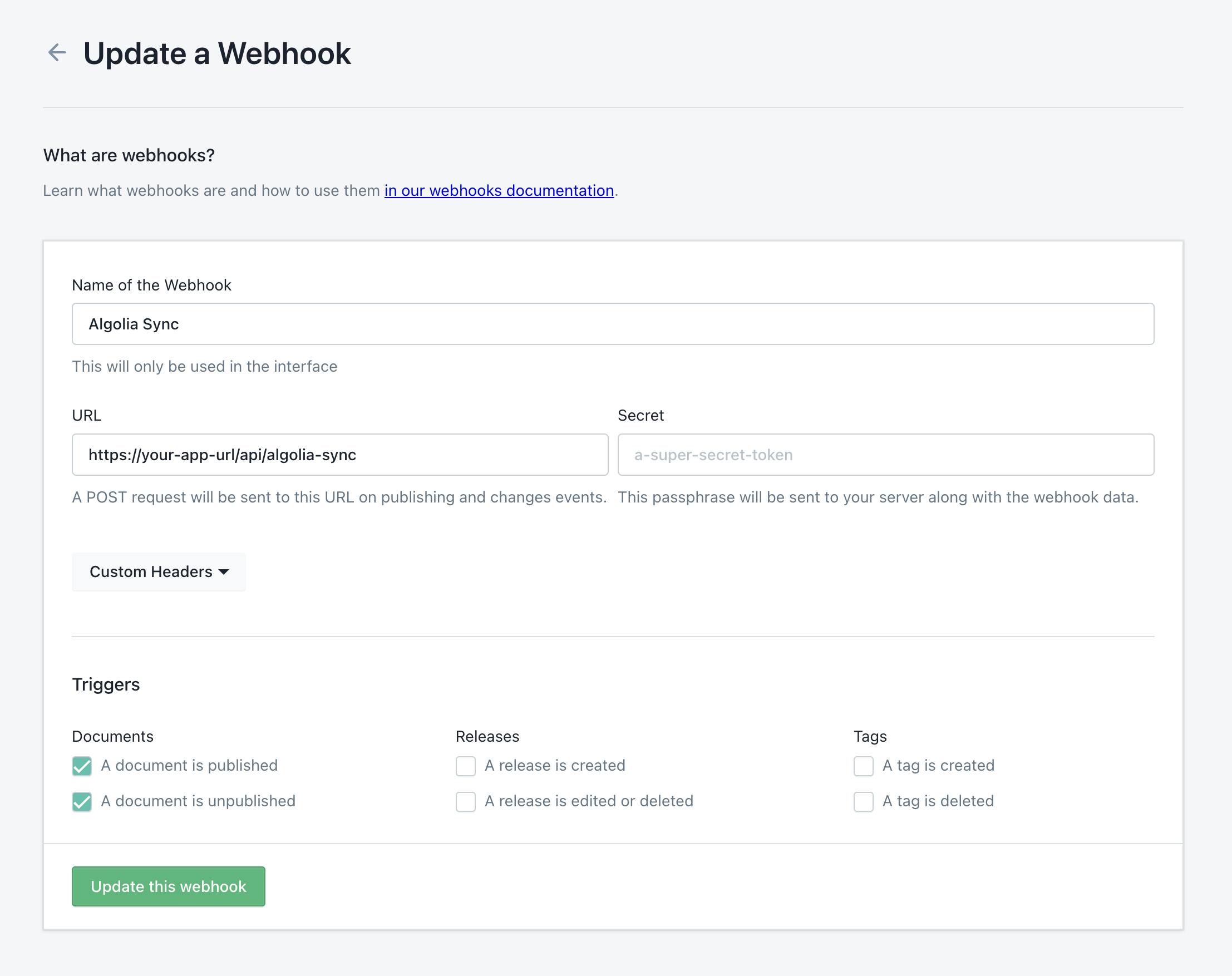
export default connectStateResults(SearchHits);5. Updating the index: Set up a serverless function for updating the index on saving documents in Prismic. This function is simplified to only include blog posts by title, but you could query more documents from Prismic and feed Algolias index more properties than just the title:
//pages/api/algolia-sync.ts

import algoliasearch from "algoliasearch";
import { createClient } from "@/prismicio";
import type { NextApiRequest, NextApiResponse } from "next";

export default async function handler(
  req: NextApiRequest,
  res: NextApiResponse
) {
  if (req.method === "POST") {
    const prismic = createClient();
    const algoliaClient = algoliasearch(
      process.env.NEXT_PUBLIC_ALGOLIA_APPLICATION_ID!,
      process.env.ALGOLIA_ADMIN_KEY!
    );

    const index = algoliaClient.initIndex("your-algolia-index-name");

    const blogPosts = await prismic.getAllByType<BlogDocumentWithExtras>("blog");

    const blogRecords = blogPosts.map((post) => ({
      objectID: post.id,
      title: asText(post.data.title),
    }));

    await index.saveObjects([
      ...blogRecords,
    ]);

    res.json(`Content successfully synchronized with Algolia search`);
    res.end();
  }
}
6. Webhook: Finally, set up a webhook inside Prismic to rebuild the search index when content is updated:
Comments / Views / Votes
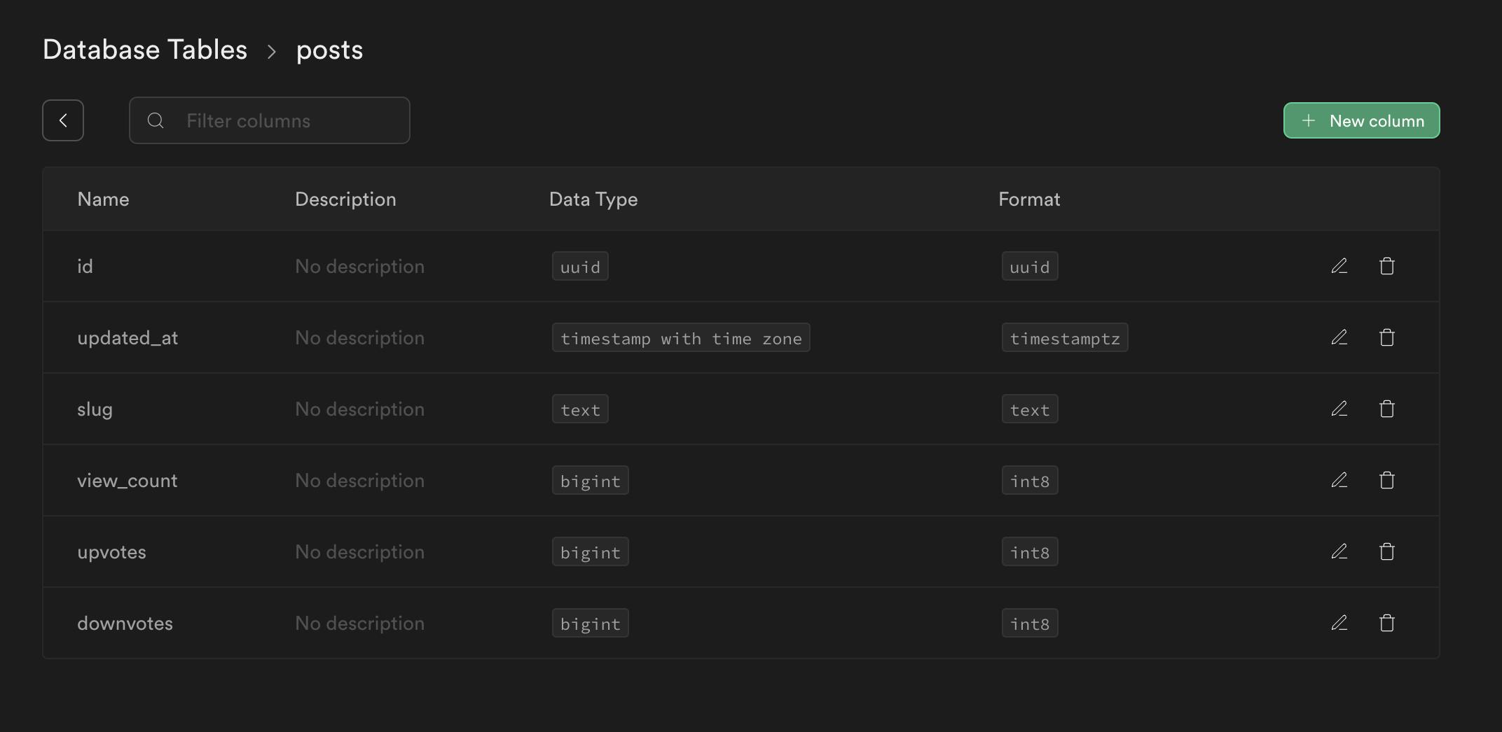
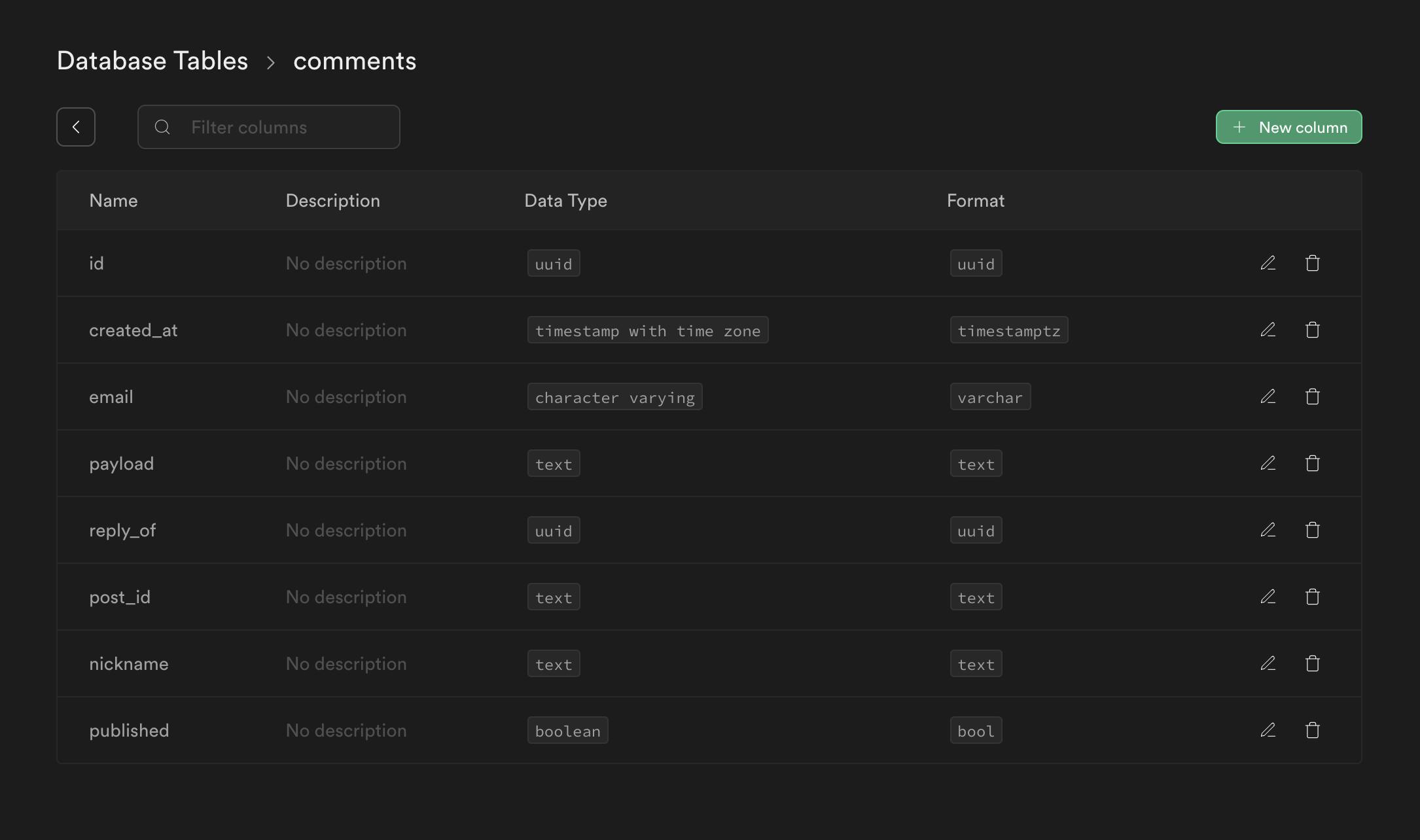
For these dynamic functionalities, we created a Supabase app with two tables, one for posts and one for comments. The implementation is a bit too long to outline in code. See below for a brief explanation of how it was built:
Posts table (views and votes):
The posts table is populated with a new post each time a user visits or votes for a post. This happens with the help of serverless functions within Next.js. It stores the total amount of views, upvotes, and downvotes. Those are then fetched dynamically for each post on demand to always show the right amount of views and votes on a post.
Comments table (comments):
The comments table is populated with a new comment via a serverless function each time someone fills the comment form on a blog post but with the published column set to false initially. Then, the Supabase app is set to send a webhook to our Slack on each new comment. In Slack, we can choose to approve or delete the comment. When approved, a request is sent to Supabase to change that specific comment to be approved.
Each time the blog is built, we query this table to fetch approved comments for posts based on post_id, and if a post has comments associated with it, we generate HTML for that comment.
Step 5: Migrating content
We obviously wanted our 150+ posts from the old blog to migrate to our new blog. For that, we could have still used our old blog repository, but there were a couple of concerns:
- Our old data was formatted in a way that was not ideal. For really old posts (before we had Slice Machine), all of the post content was just a big static RichText field. We wanted the new blog to use slices. For some of the newer posts, we had slices implemented, but since we built it a long time ago, we had new ideas for slices we wanted to make.
- Since we decided to integrate the new blog into our main website code-wise, it made sense to also have the content in the same Prismic repository. For context, the blog content still lived in an old repository from a website we had years ago.
Preparing the migration
For the migration, we wrote a script internally, which basically takes JSON files for the old posts as inputs, maps over them, and then outputs new JSON files with updated structure.
As a base for the script for this migration of our blog, we used this script that our Solution Engineering team created. This is a work-in-progress package and was modified to support our specific needs.
For example, on our old blog posts, we had 2 static fields where you could pick related posts as a content relationship. We didn’t want those static fields anymore for the new blog. Instead, we wanted to have a slice called 'Related Posts', where we would have the same content relationship fields in the repeatable part, but since it's a slice, we'd be free to place it anywhere in the post.
To do this, we modified the script to detect those static fields in our old posts and instead output a slice with the same posts and placed it at the end of the post.
As you can imagine from this one example, there are a lot of steps like this needed to modify the script to match all of the data from your old posts. But that’s the gist of it.
Disclaimer
Our team is in the process of updating the script to adapt to certain changes in the latest Slice Machine packages. Feel free to drop a comment below if you have any questions!
Migration steps
When all of the modifications to the script were done, we used it to do the following:
1. Import and export documents
- We exported all documents from the old repository via the Import/Export feature in Prismic.
- We put all those files in the ./original folder and ran node migrate.mjs.
- Imported the generated files in the new repository via the Import/Export feature in Prismic.
- This created a new release in Prismic, which we needed to publish for the next steps.
2. Fix content relationships
Since the documents imported had new IDs, we needed to fix all links and content relationships. This was done by:
- Exporting all the documents again, but from the new repo this time.
- Putting them in ./bef_cr and running
node migrate_rel.mjs. - Importing the newly generated files again in the new repository. This time, no new documents would be created. In the release, we instead had updates for all documents previously imported.
Final thoughts on our blog rebuild & migration
If you’re currently in the process of structuring a blog revamp, we hope reading how we approached the topic helped you spark ideas on how you could do the same! We hope we provided inspiration on how to list the changes you want to see on your blog, how to structure the collaboration with your designers, and how to make technology decisions that support blog objectives.
If we can help in any way with your blog project, don’t hesitate to leave us a comment below. Depending on whether it’s a development or content strategy question, the right person on the team will make sure to respond back.
Cheers!

