Prismic Insider Perspective: Best Practices for Building Your Slice Library


Two years ago, we began a full rebuild of our website, which we launched in 2023. This insightful process led us to a new project: a comprehensive rebuild of our slice library, informed by our experiences as developers and marketers.
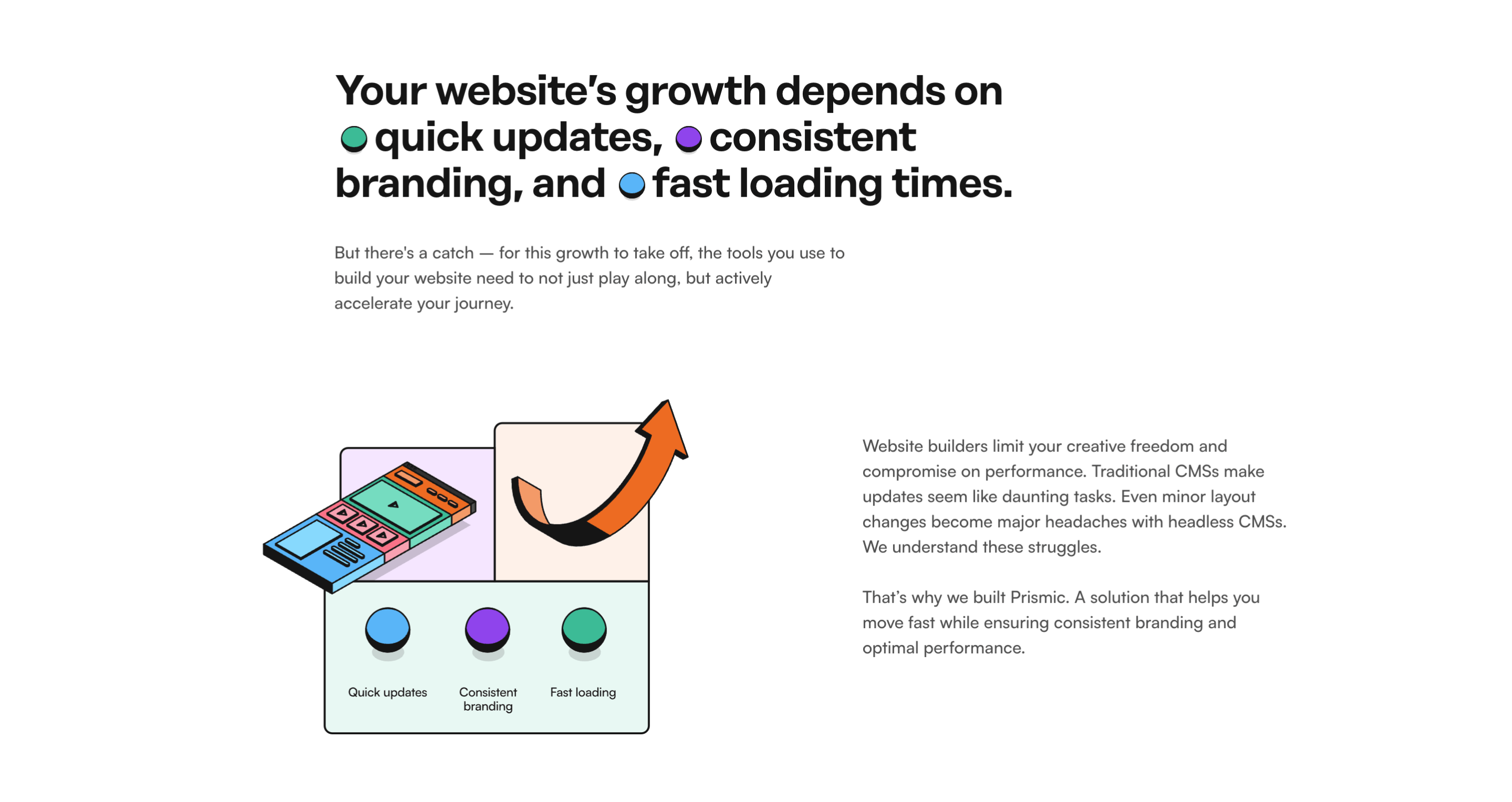
Since the website's launch, we experienced growth, made updates, and faced challenges. The decision to rebuild our slice library supported our ambitious content creation goals and future-proofed our processes for marketing and development teams.
Last quarter, we released 12 core website pages and aim to release more. Our marketing team needs to find the right slice quickly, and our developers need a clear understanding of when to create new variations and name fields.
As we grow, we enhance our efficiency and organization. Hence, we've decided to rebuild our slice library three months ago to optimize our productivity as a team.
This article outlines:
- The structure of our slice library
- Our recommendations for modeling a slice, using slice variations, and naming fields
- How we've established a smooth process to maintain the release pace of new pages while rebuilding our slice library
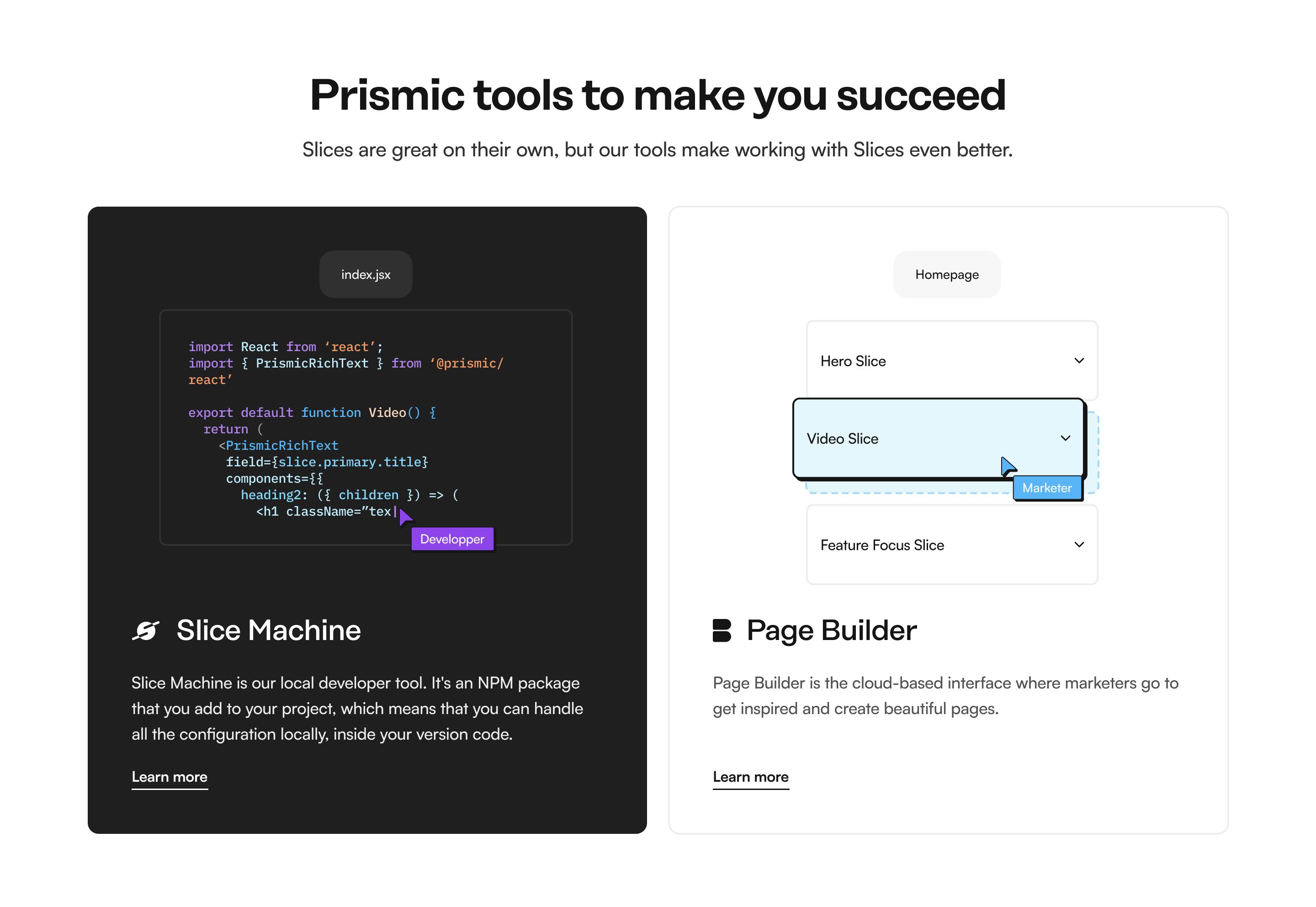
The foundations: how slices and Slice Machine simplify website building
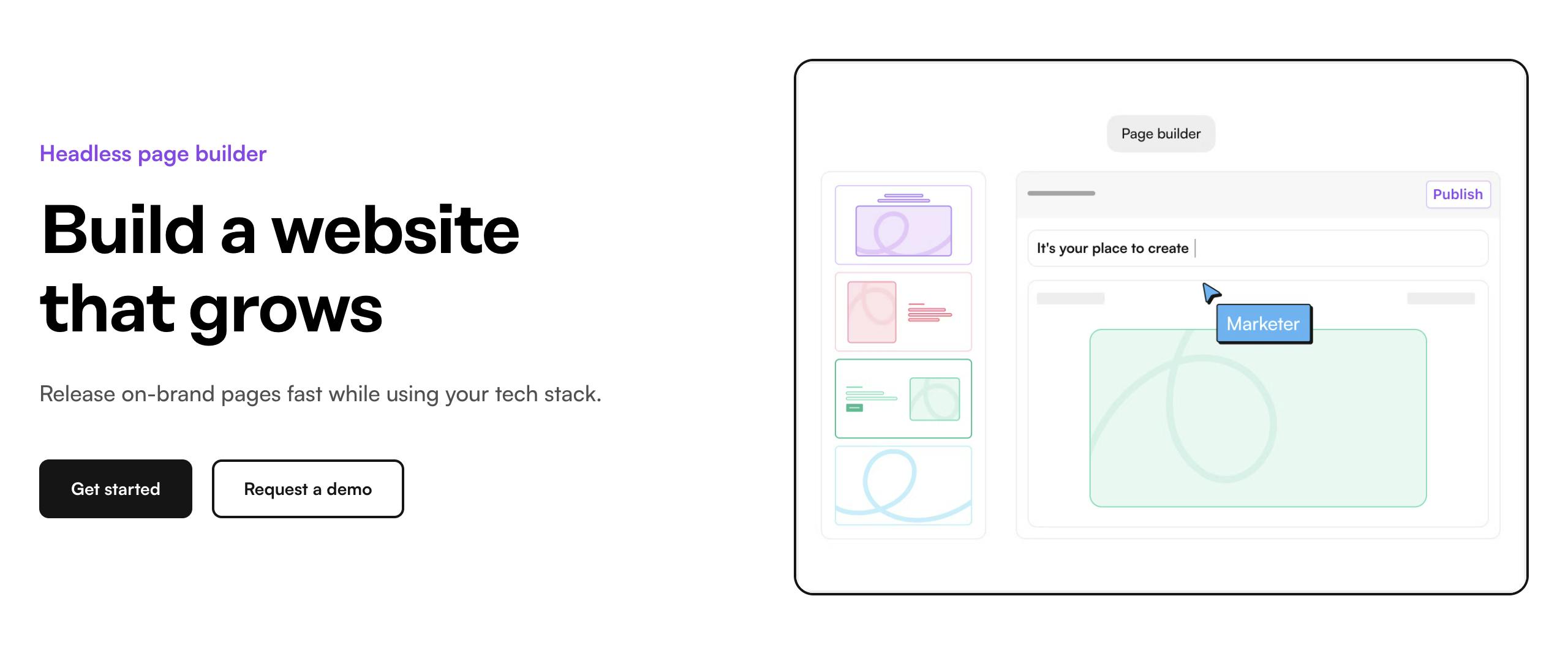
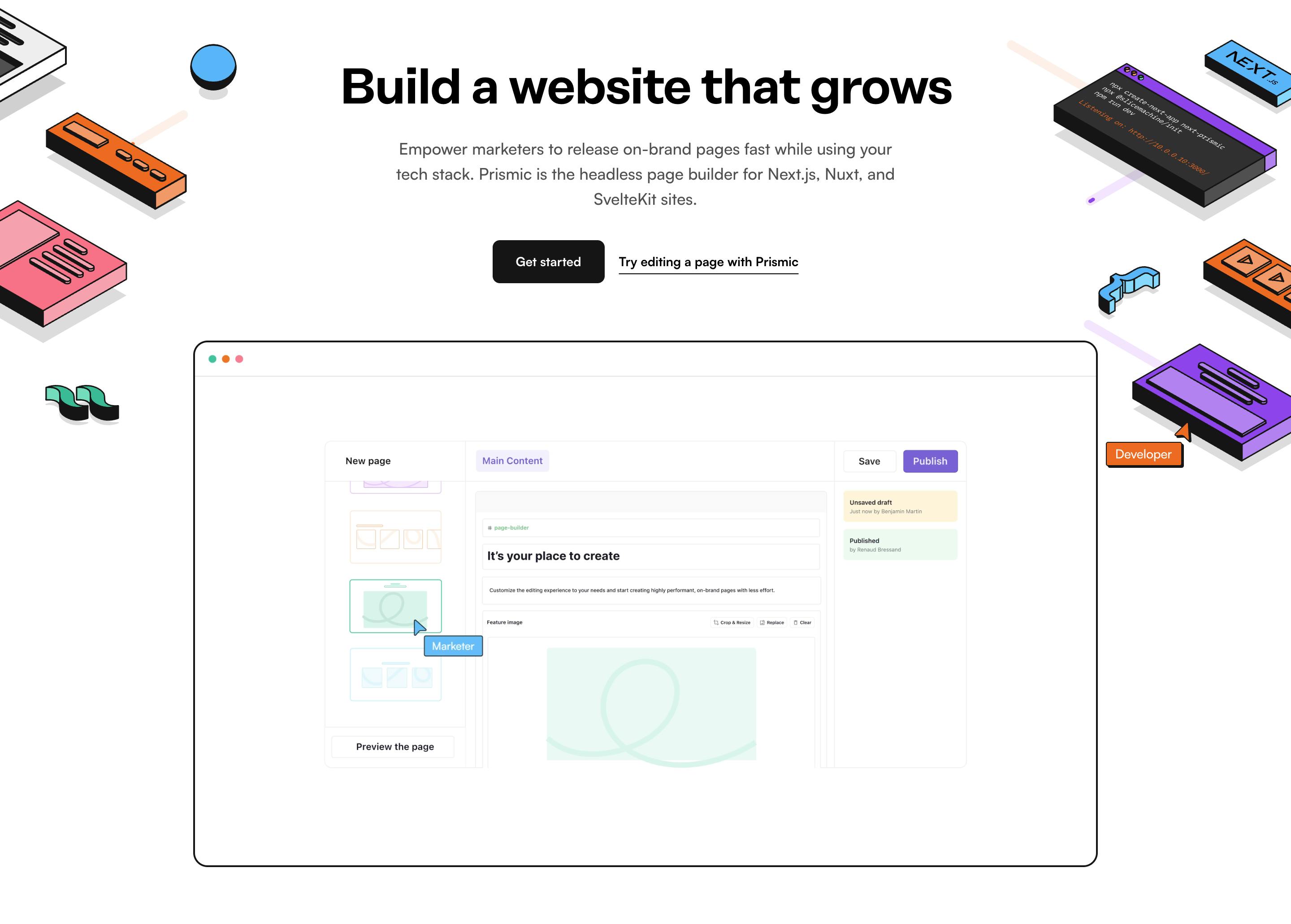
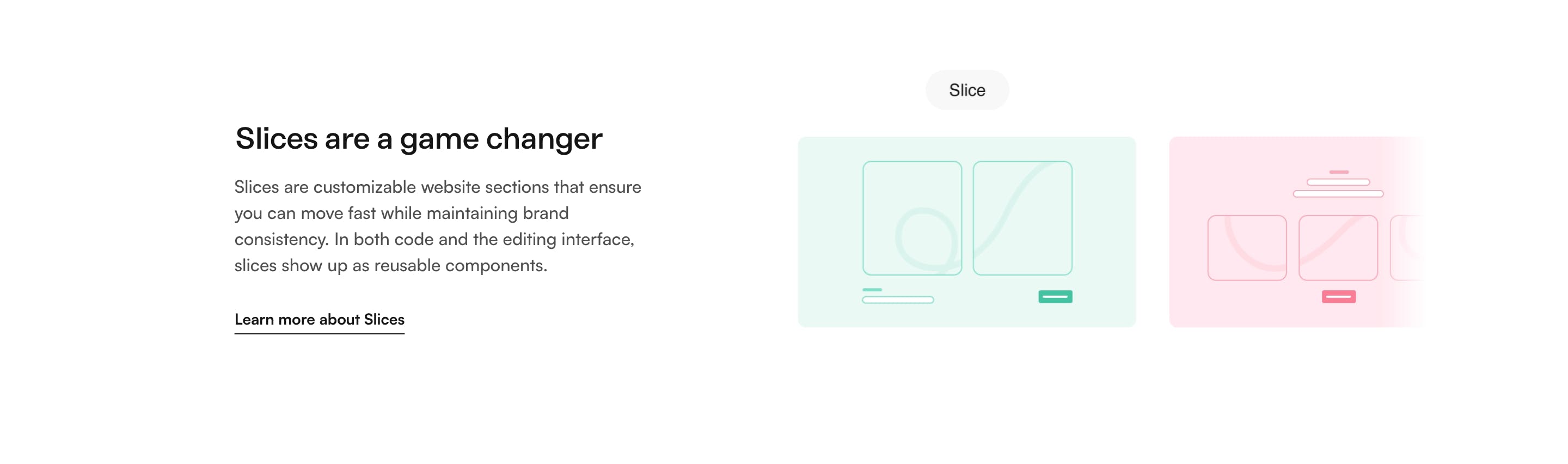
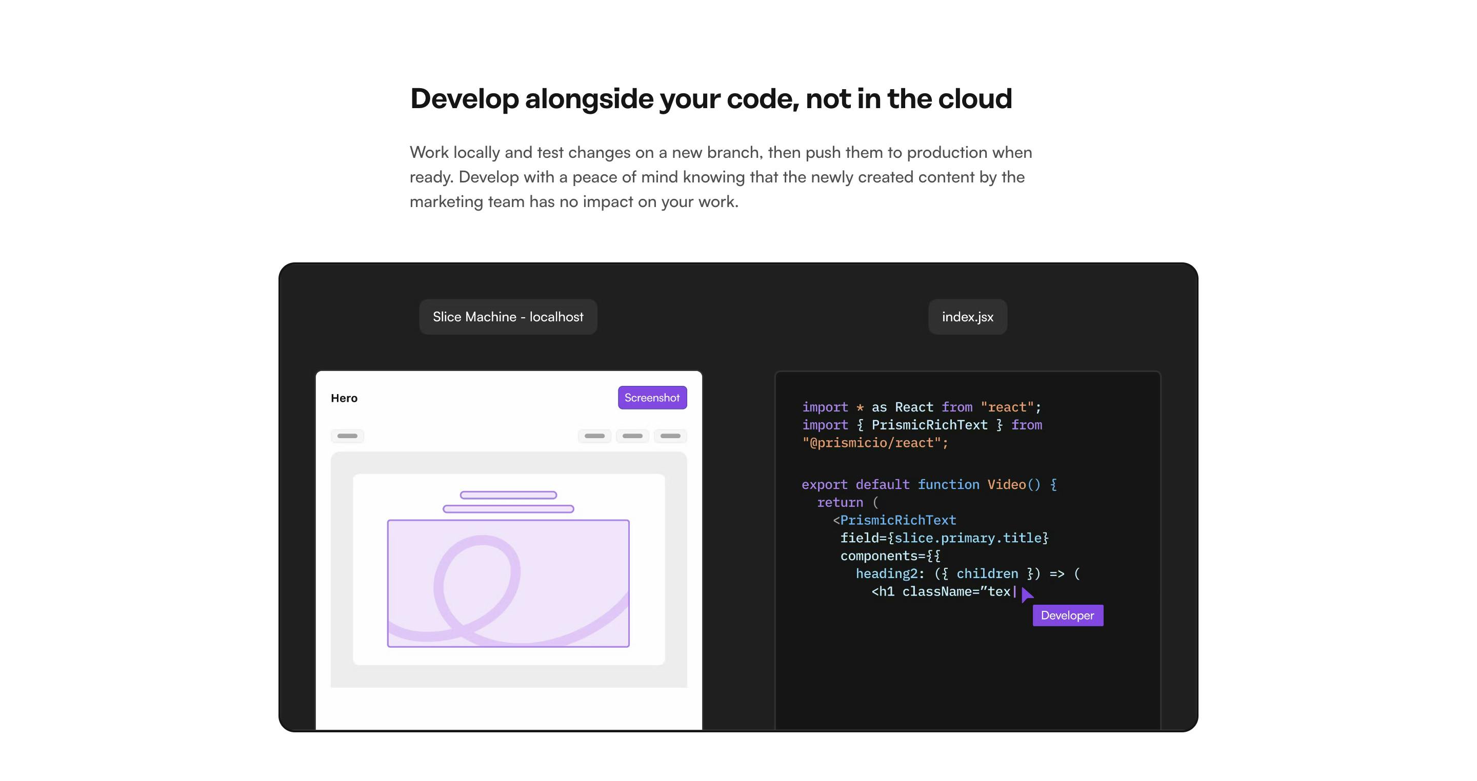
At Prismic, the cornerstone of our approach to website creation is encapsulated in one term: 'slices.' Slices are the individual sections of a website, forming the foundation of our philosophy on how to build websites. This modular approach streamlines the design and development process, enhancing efficiency.
To handle these slices, we've created a developer tool - Slice Machine. Designed with developers in mind, it enables the creation of new slices through a simple UI.
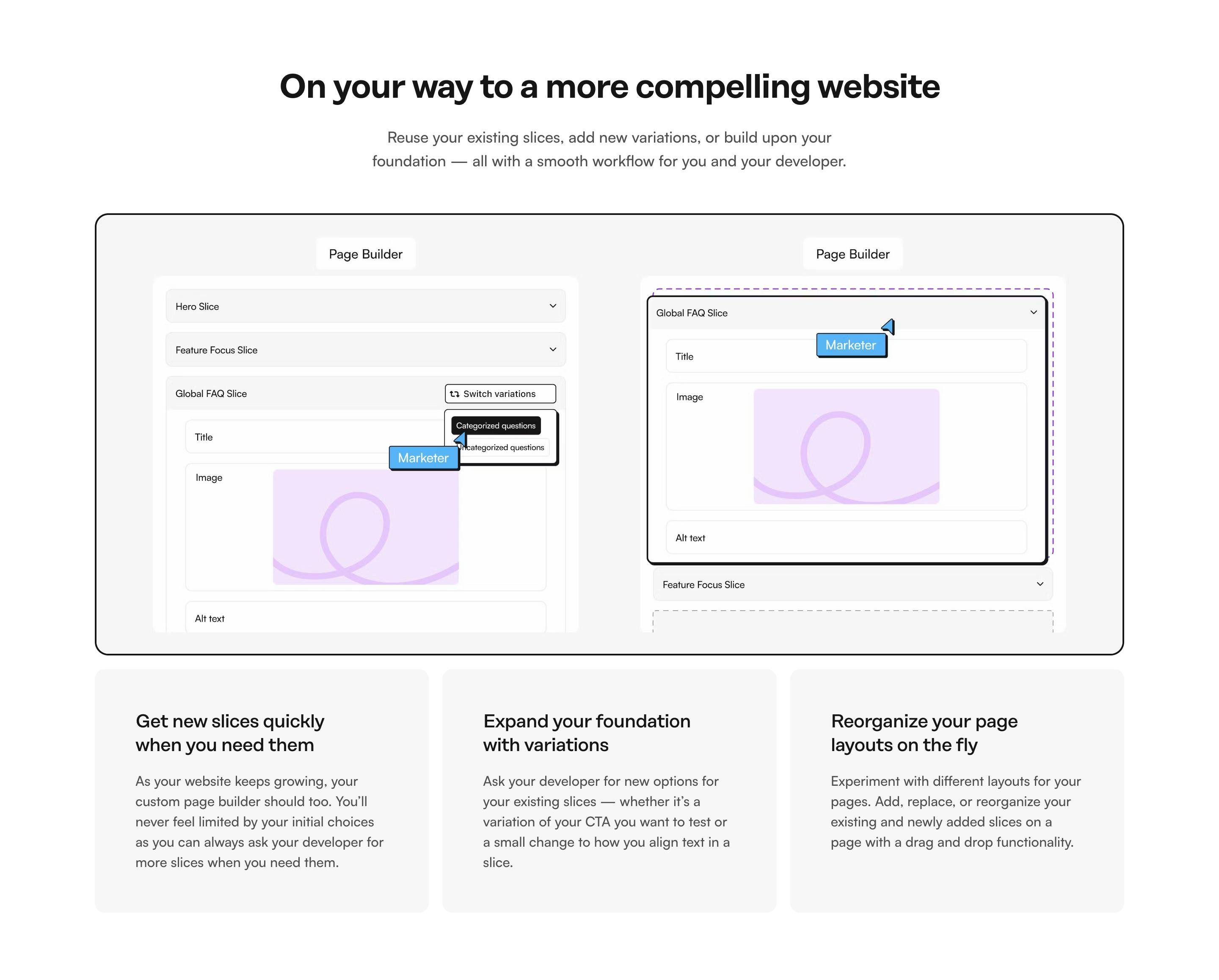
Once created, they can be pushed to the other part of our product, the visual Page Builder, where the marketing team can use the slices to create pages.
This not only accelerates page creation but ensures the marketing team has a direct line to the latest code changes.
Now that you have a good understanding of the concept of slices (configured in Slice Machine and then used by content teams in the visual Page Builder) let's take a closer look at our slice library and discuss some recommendations for organizing your own slice library.
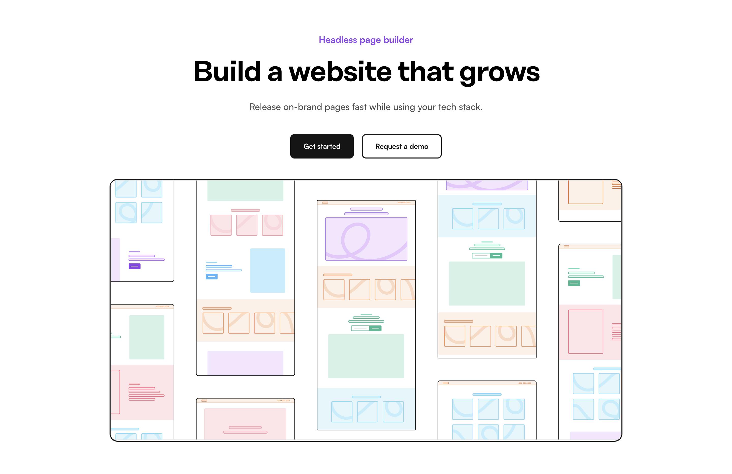
What the Prismic slice library looks like
For the structure of the library, we decided on a user-centered approach, where you should be able to tell the actual use case of the slice by seeing the slice name instead of a name describing the fields of the slice. This leads our marketing team to pick the right slice from the get-go.
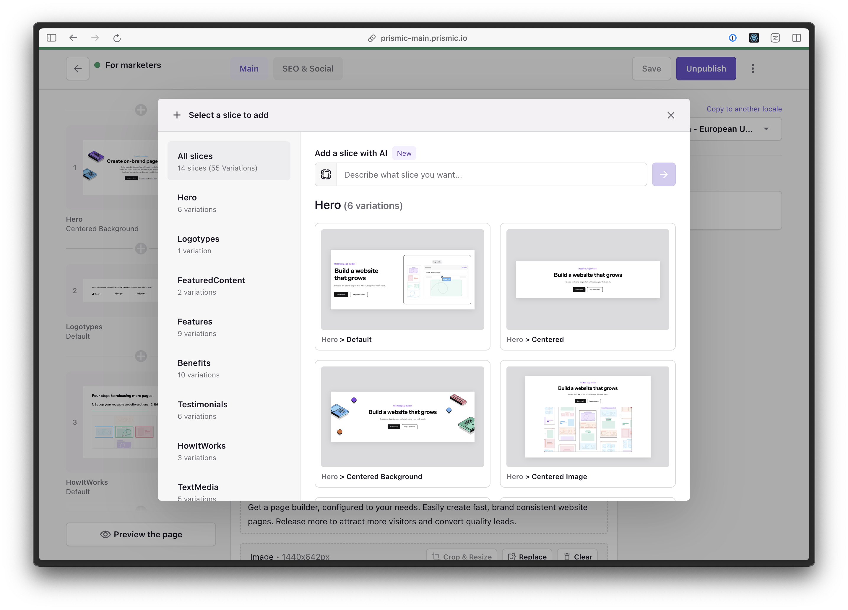
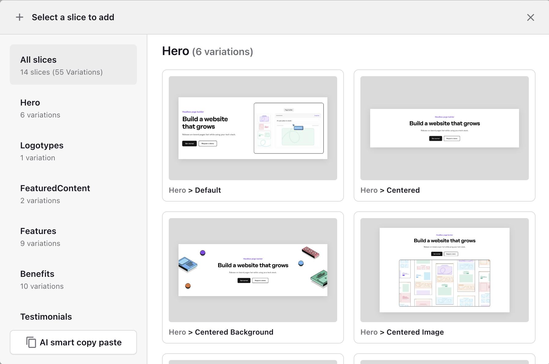
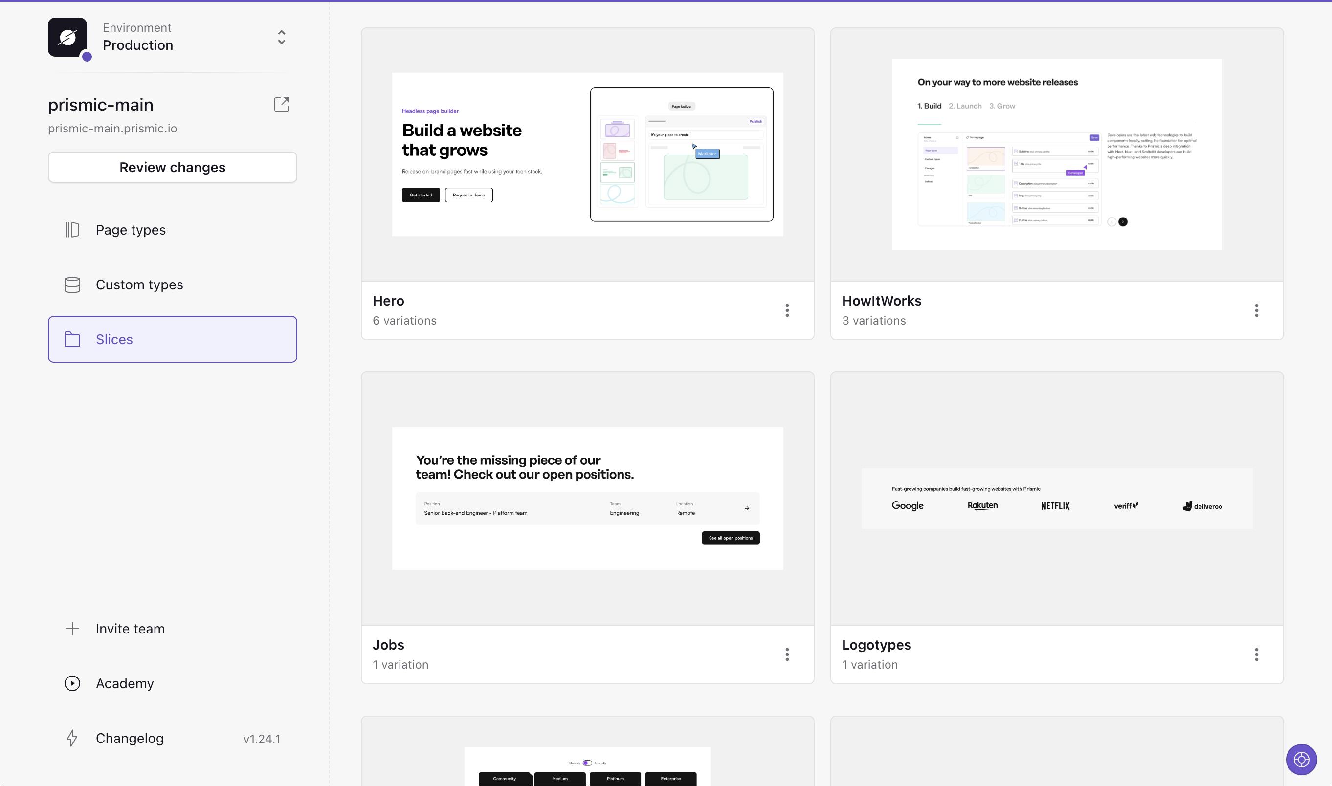
Today we have 14 slices (with 55 variations) that follow the logical structure of a B2B website (with some exceptions like the spacer). Below you can view all of our current slices, and how we chose to structure them:
Hero
Hero Default
Hero Centered

Hero Centered Background
Hero Centered Image
Hero Centered Video
Hero Centered Homepage
Logotypes
Logotypes Default

Featured content
Featured Content Partner
Featured Content Showcase Slider
Features
Features Default
Features Four Columns
Features Frameworks

Features Numbers
Features Three Columns Large Image
Features Two Columns
Features Two Columns Illustration
Features Two Columns Large Image
Features Two Columns Small Image
Benefits
Benefits Default
Benefits Animation Cards
Benefits Animation Text Left
Benefits Animation Text Right
Benefits Illustration Cards
Image Accordion
Benefits Image Text Left
Benefits Image Text Right
Benefits Text Illustration
Benefits Text Image Grid

Testimonials
Testimonials Default
Testimonials Case Study
Testimonials Photo Cards
Testimonials Photo Slider

Testimonials Video Slider
Testimonials Website Slider
How It Works
How It Works Default
How It Works Cards
How It Works Sticky
Text Media
Text Media Default
Text Media Callout

Text Media Image

Text Media Intro

Text Media Video

FAQ
FAQ Default
Call To Action
Call To Action Default

Call To Action Cards Illustration
Call To Action Cards Photo

Call To Action Compact
Call To Action Illustrated
Call To Action Background
Call To Action Illustrated Bottom
Form
Form Demo
Pricing
Pricing Default
Pricing Table
Jobs
Jobs Default

Spacer
Spacer Remove Space - this simply removes the added space between a specific section.
Now when our marketing team need to choose a slice for their content — they know they need to start with hero and end with the CTA. Depending on the page they will also probably have to add some features slices or testimonials. For each section they can choose the variation that looks the best for the amount of content they need. They can easily spot the right variation from the screenshot.
Stay on Top of New Tools, Frameworks, and More
Research shows that we learn better by doing. Dive into a monthly tutorial with the Optimized Dev Newsletter that helps you decide which new web dev tools are worth adding to your stack.

Follow a familiar structure
Your slice library needs to feel familiar for the marketing teams — every website has a hero, a call to action, a testimonial, features, benefits or value proposition slices, so we wanted to follow that familiar structure.
Reflecting on the restructuring of the slice library, we've distilled a set of best practices that were instrumental in guiding our rebuild. These principles not only helped us navigate the rebuild more effectively but also hold valuable insights for anyone looking to create or refine their own slice library.
Tips for modeling your slices in a logical and simple way
For developers, marketers & project managers: principles for modeling your slice library
1. Understand the anatomy of a slice
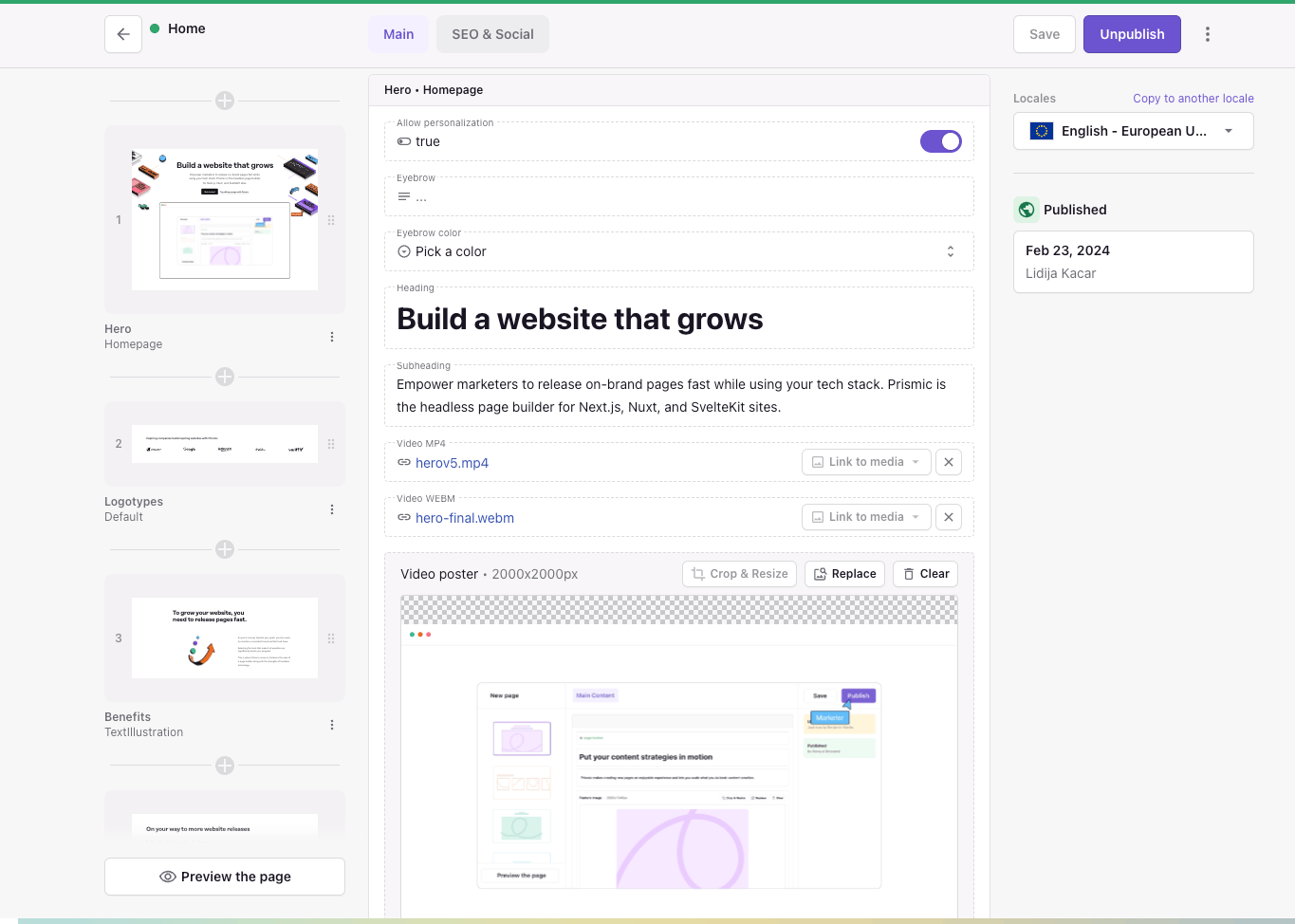
Understanding the structure and modeling of slices is critical to creating an efficient and effective slice library. The fundamental components of a slice include variations, zones, and fields.
- Variations Variations refer to the different versions of a slice that can be created. If we imagine the hero example from above as a Slice, common variations could be Default, Centered, LeftAligned, and so on.
- Zones Zones relate to the specific areas within a slice, the first zone is called “Non-Repeatable Zone” and it would contain your static fields, and then you also have a “Repeatable Zone”, for things you want to repeat in your slice, a common thing to have here is call to actions, but it could also be cards for a pricing slice for example.
- Fields Fields are the individual elements that make up a slice, such as text or image fields.
2. Simple, consistent naming conventions and field definitions
When creating a lot of slices, it’s easy to loose consistency along the way. For each field you add to a slice, you will always have two decisions to make:
- The “Field Name” - This is what your content theme will see, and need to be as descriptive as possible, without being to complicated. This can be changed later without affecting your live content.
- The “Field ID” - This would be what you will use to identify this field in the code, and it will also be what Prismic uses to reference your content. This means that if you chose to change this value when your slice is used in production, you also have to migrate content.
As you can imagine, when creating multiple slices, this could easily get out of hand if you’re not consistent in how you name your fields. Here are some of our considerations you could take when naming your fields:
- Naming consistency: This is crucial when developing multiple slices. Human errors can occur, like inconsistent naming conventions for elements such as call-to-action buttons. For instance in our library, some had ID’s like
link,link_label, andlink_style, while others hadcta,cta_label, andcta_style. This inconsistency can lead to confusion, especially when using a component like CallToActions, that relies on an array with consistent named fields for rendering buttons. Ensuring uniformity in naming across items simplifies the developer's workflow. - Content Persistence: When the content editor switches between two variations of a slice or two different slices, fields with the same ID will maintain their content. For instance, if you have two variations of a slice named "WithImage" and "WithVideo," and the "WithVideo" variation includes an image field for the video poster, it might be useful to assign the same ID for the image field in the "WithImage" variation and the poster field in the "WithVideo" variation. However, you can use a different descriptive name. For example, in the "WithImage" variation, it might be Name: ”Image”, ID:
image, while in the "WithVideo" variation, it could be Name: "Video Poster” ID:image. This way, the content editor could swap away, and still have fast previews of their content.
3. Only add fields when really needed
Another strategy we used to reduce decision fatigue for marketers was to eliminate unnecessary options. This might sound like common sense, but actually it’s easy to overdo the amount of fields.
Previously, you could choose the style of call-to-action buttons regardless of where they were used in the slice. For the rebuild, we aimed to include such decisions only where they truly mattered. In areas where the same style was consistently used, we defaulted to that style and removed the option from the slice.
Using a slice library and creating pages with it might reveal aspects that are difficult to anticipate. For us many extra fields could likely have been avoided from the start if we assessed what we would use before building the slices.
For developers: Tips for creating modular, indexable, easy to maintain slices
1. Think about HTML semantics
Semantic HTML and accessibility are also crucial considerations when structuring your slices. Semantic HTML ensures that the content within your slices is organized and can be understood by both users and search engines. It involves using HTML code to reinforce the meaning of the content in webpages rather than just to define its look. Accessibility considerations ensure that your website can be used by as many people as possible, including those with disabilities.
2. Be as modular as possible
Another key aspect is the application of modular design principles to slices. Modular design is a method that subdivides a system into smaller parts (modules) that can be independently created and then used in different systems to drive functionality.
When applied to slices, this means creating reusable components that can be mixed, matched, and reused across your website. This not only promotes consistency and efficiency but also helps maintain brand guidelines across your site. By implementing these practices in the structure and modeling of slices, you can make the most out of your slice library.
An example of such a components reused across slices could be common ui elements such as a <Heading />, or a <Button />, and you’re probably familiar with having some sort of UI-library for components like this already. But it could also be about more slice specific components, such as a <SliceLayout />, which can wrap each slice and be responsible for things like padding between slices, theming, and so on. Or you might find a common pattern, where most of your slices have a h2-heading with en eyebrow and subheading, then a <SliceHeader /> component encapsulating these other three UI-components might be a good idea.
Another part of being modular, is how you chose to structure your slice variations in code. When creating a new slice Slice Machine will create a new folder for you, including the code, model and mock data for your slice, this will look something like:
/slices
  /SliceName
    index.tsx
    mocks.json
    model.json
In our old slice library, I most of the time kept all of the code for the slice in that /slices/SliceName/index.tsx file, of course importing common UI-components, but the variations for the slice was all in the same file, at least the simple ones. This lead to a pretty huge file for almost every slice, with a lot of conditionals for different variations.
One decision I made early on when creating the new library was to, however small and similar the variations where, the rules is to always keep them in their own files, for separation of concerns and modularity.
This means that now, all slices looks like:
/slices
  /SliceName
    /VariationName
      index.tsx
    /VariationName
      index.tsx
    index.tsx
    mocks.json
    model.json
And the structure for that main entry file look something like:
import dynamic from "next/dynamic";

import { SliceZoneContext } from "@/lib/types";
import { getTheme } from "@/lib/utils/getTheme";
import { Content } from "@prismicio/client";
import { SliceComponentProps } from "@prismicio/react";

const FeaturedContentShowcaseSlider = dynamic(() => import("./ShowcaseSlider"));
const FeaturedContentPartner = dynamic(() => import("./Partner"));

export type MainFeaturedContentProps = SliceComponentProps<
  Content.MainFeaturedSlice,
  SliceZoneContext
>;

const MainFeaturedContent = ({
  slice,
  context
}: MainFeaturedContentProps): JSX.Element => {
  const theme = getTheme(slice.primary.theme, context.theme);

  return (
    <section
      data-slice-type={slice.slice_type}
      data-slice-variation={slice.variation}
      data-slice-theme={theme}
    >
      {slice.variation === "showcaseSlider" && (
        <FeaturedContentShowcaseSlider slice={slice} theme={theme} />
      )}
      {slice.variation === "partner" && (
        <FeaturedContentPartner slice={slice} theme={theme} />
      )}
    </section>
  );
};

export default MainFeaturedContent;
This approach makes the variations very modular. If you later find that a variation should be moved to another slice, the transition will be as simple as moving a folder and adjusting some imports.
Bonus points!
A bonus with this approach if you’re using Next.js app router is that you can be sure that all possible client side logic is kept in the variation components, thus the main entry /slices/SliceName/index.tsx could always be kept as a server component if you would need to do data fetching at the slice level.
The theoretical foundation of our rebuilding process is best illustrated through practical examples. Let's take a closer look at one of our first challenges - the transformation of the 'Simple Hero' slice, 'Accordion' slice and options of adding padding on each slice. The following deep dives into these two slices not only showcase some of the issues we encountered but also highlights the solutions we implemented.
Examples of restructuring based on the above principles
Deep dive #1: Making the 'Simple Hero' slice simple
Let's examine one of the first slices we redesigned, the “Hero”. We initially had a (poorly) named “Simple” variation, which over time, became not so simple. Here’s how it looked before the remake of our slice library:
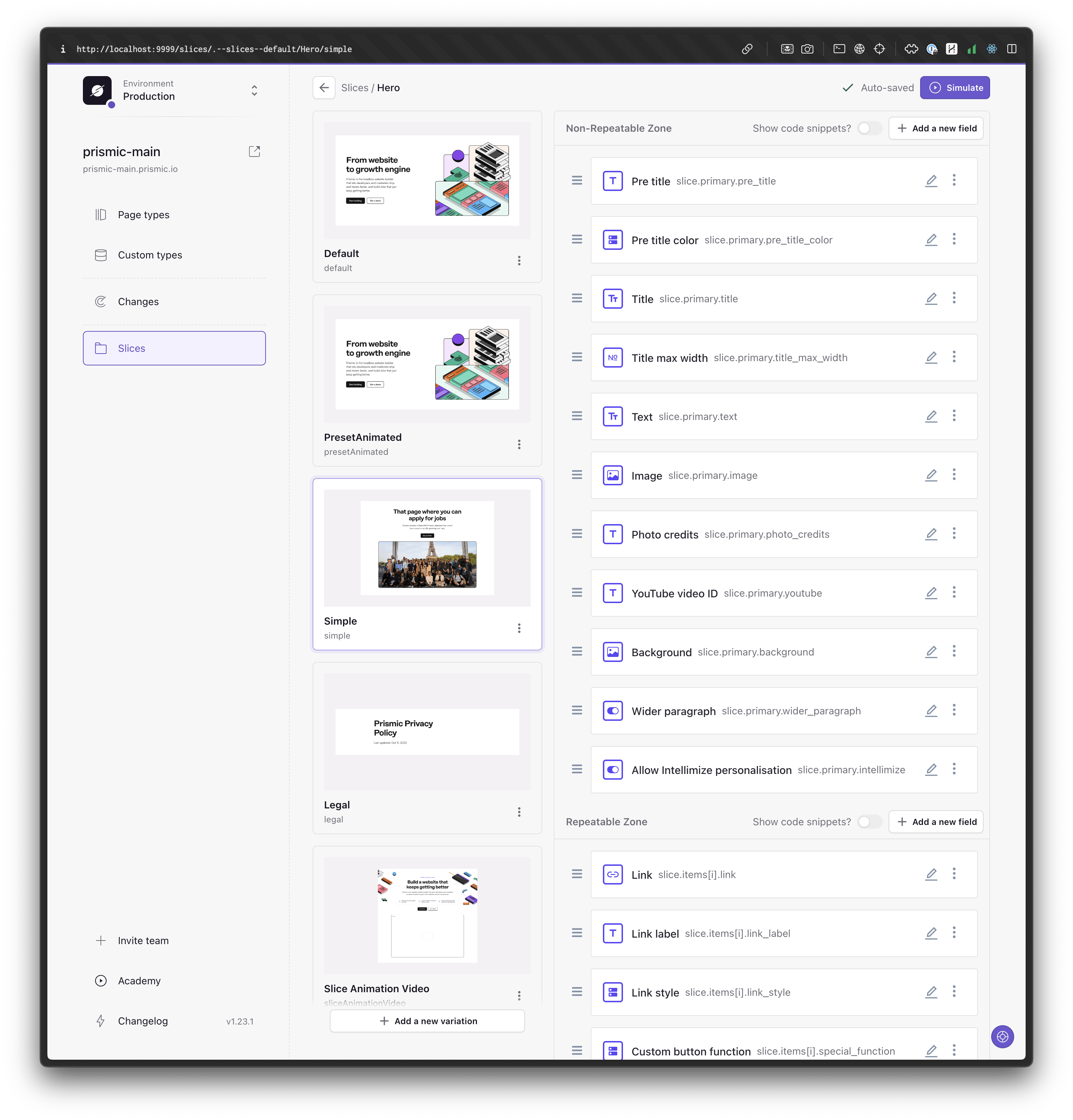
When we initially created this "Simple" variation, it consisted of:
- a centered heading
- subheading
- and call to action
Hence the name "Simple", though it should probably have been called “Centered”. But still, it was a fitting label compared to the other variations at the time.
However, as the marketing team asked for more customization possibilities, over the course of multiple iterations, we added features such as the ability to include an image below the text, the option to add a video, and the possibility of using the image as a background, among others.
This evolution led to several issues:
- The variation could look significantly different from the screenshot, which is not a good sign if we want to be consistent and not break the brand.
- The huge amount of fields cluttered the editor.
- The code was filled with conditionals because all the options became messy and hard to manage.
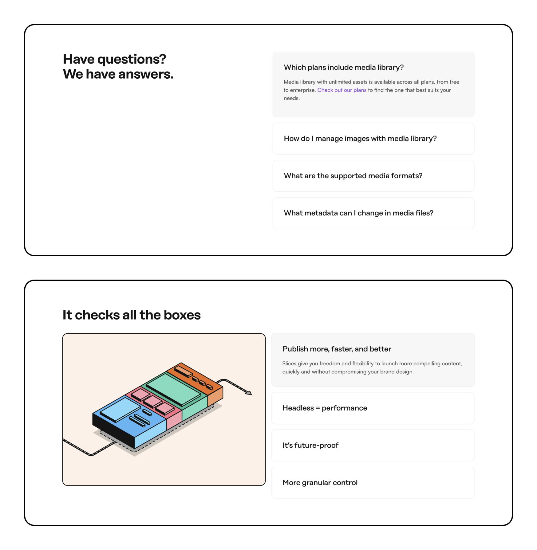
Below, you'll see a screenshot of our new hero slice. The "Simple" variation has been divided into four distinct variations: centered, centered background, centered image, and centered video.
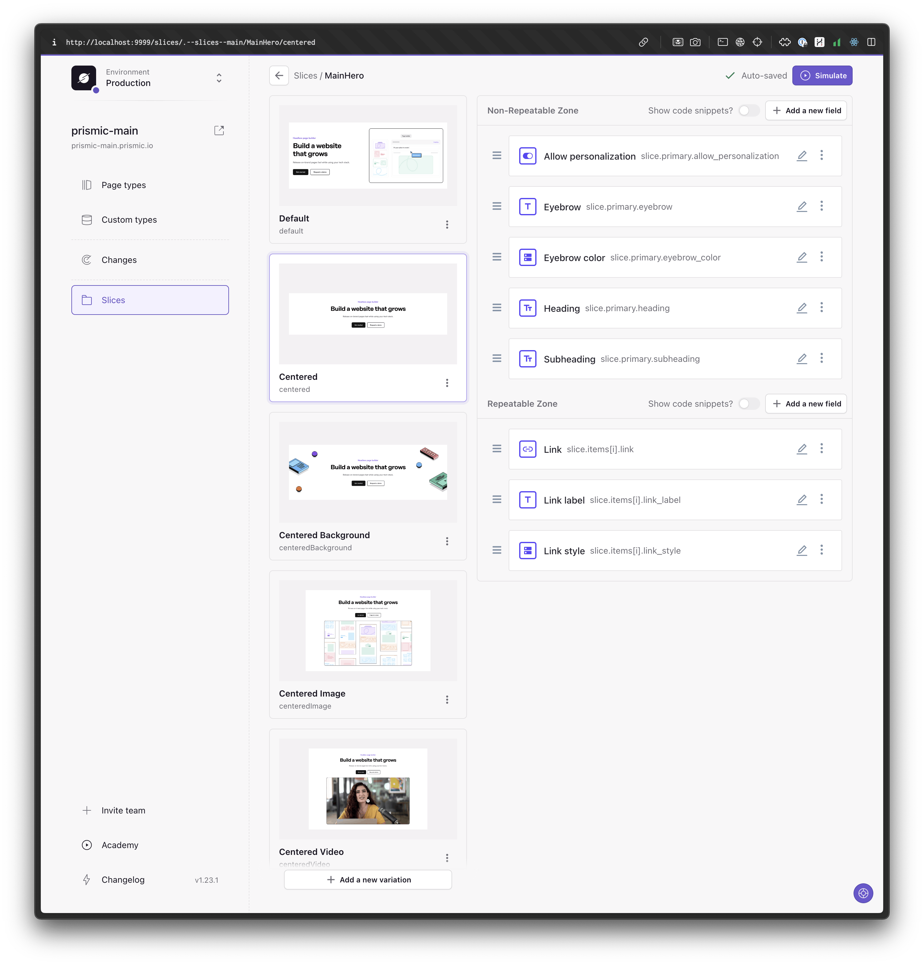
This change significantly improves the user experience for content editors. Now, they can easily identify the slice from the screenshot and only needs to fill out the necessary fields for this variation. Moreover, it's safer to avoid breaking the brand guidelines, a promise we uphold.
Take advantage of slice variations
The key takeaway here is not to fear breaking your slice into numerous variations. If it looks too different, it likely should be a new variation.
Our library transitioned from having many slices with few variations, to approximately 50% fewer slices, but with significantly more variations. This structure is extremely beneficial, both from the perspective of editing in the Page Builder and looking at how the code is structured.
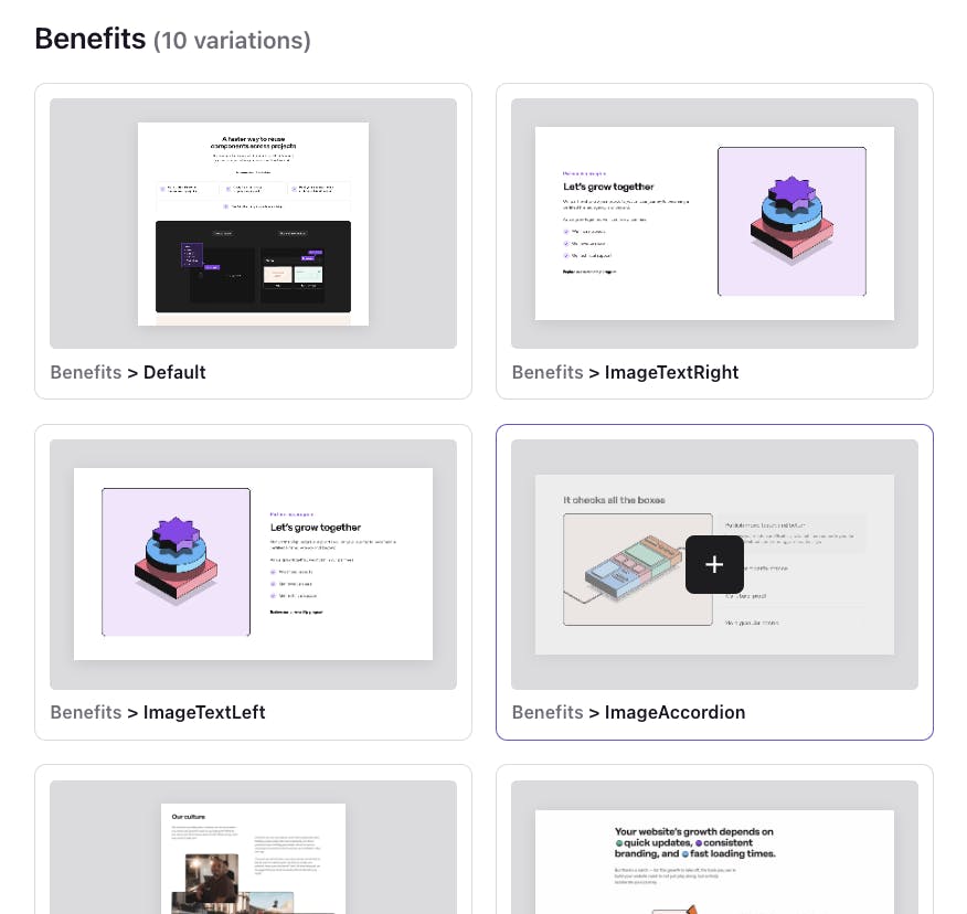
Deep dive #2: Breaking the Accordion slice in two use-case specific slices
A challenge for our marketing team was the structure of slices I created as a developer. It didn't always align with the marketers' mindset. For instance, consider this Accordion slice:
In our previous library, this slice was named "Accordion", which had two variations: "Default" and "WithImage". For a developer, this made sense, as they essentially represented the same component in code, except that one included an image that changed based on which accordion was expanded.
However, our marketing team used them differently. The first "Default" variation was always utilized as a FAQ section, while the second was used to highlight different benefits.
Today, the first variation is a slice called "FAQ" with only that variation, and for the second one, we have another slice called "Benefits", along with several other variations designed to showcase benefits.
From a developer perspective, previously, both variations resided in the slices/Accordion/index.tsx file, which was cluttered with numerous conditions. Now, each variation has its own file: slices/Faq/Default/index.tsx and slices/Benefits/Accordion/index.tsx. This arrangement helps us locate the slice file easily if our organizational needs change in the future. Despite their separation, these variations still share common code, including the custom <Accordion> component and the <SliceHeader> component.
Deep dive #3: Managing padding and Spacer slice
As we mentioned earlier, one of the challenges our marketing team found with our new website was the overwhelming amount of choices you had when adding a new slice.
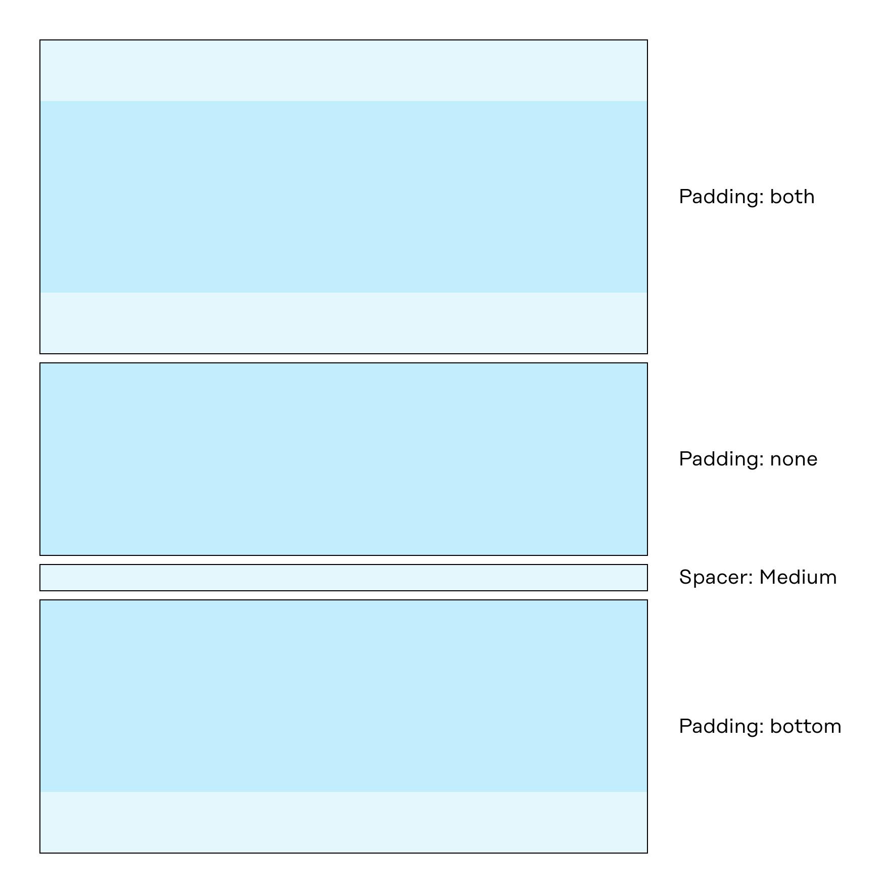
One of those choices that had to be made on every new slice added, was a field called “Padding”. It was a select field we had on each slice, where the marketer could select either both, top, bottom, or none , both being selected by default.
This informed the slice on how to apply padding, hence also what became spacing between the slices.
Along with this we also had a slice called “Spacer”, which you could set to a couple of different sizes. Together, this enabled the marketer to set pretty much any spacing between slices.
Development note: We use padding instead of margin in this case because we have different themes (light and dark) across all slices, each adding a background to the slice. Since slices of the same or different themes can be adjacent, the spacing needs to be contained within the slice.
Initially I thought this was a good approach, and while it was in terms of customisability, I depend on the marketer to make the right design decision, and as we learned, it can quickly become overwhelming.
For the slice library rebuild, we removed this option to set padding and defined a default padding on all slices. Content editors, only select a theme for a slice: either dark or light. Slices that have the same theme, say two dark themed slice, should have no space between them.
If you’re interested in the code details it works like this 👇
We rely on providing information about the slice theme in the HTML like this:
<section
	data-slice-type={slice.slice_type}
  data-slice-variation={slice.variation}
  data-slice-theme={theme}
	data-slice-theme-variation={muted ? "muted" : "default"}
>
    Slice Content
</section>
Using this information, we then added rules like this in css to make all slices work together:
/* Remove space between same theme slices */
[data-theme="dark"]:not([data-theme-variation="muted"]) + [data-theme="dark"]:not([data-theme-variation="muted"]),
[data-theme="light"]:not([data-theme-variation="muted"]) + [data-theme="light"]:not([data-theme-variation="muted"]) {
  @apply -mt-12 md:-mt-20 2xl:-mt-24;
}
And for cases where we have specific slices that should always work in a special way when placed together:
/* Remove space between same theme slices with main_text_media */
[data-slice-type="main_text_media"][data-theme="light"] + [data-slice-type="main_text_media"][data-theme="light"],
[data-slice-type="main_text_media"][data-theme="dark"] + [data-slice-type="main_text_media"][data-theme="dark"] {
  @apply -mt-12 md:-mt-12 2xl:-mt-12;
}
Also, we still have a "Spacer" slice, but now it only has one variation for when you want to completely join two slices together, regardless of their theme.
Backstory: why we restructured our slice library while our website was live👇
Our website was live for a year when we decided to rebuild our slice library to make slices more findable for marketers, simplify content modeling, and simplify maintenance for developers.
Through the marketers' eyes: navigating design decision overload
With the slice library on our new website, we started to notice our marketing team was grappling with an overwhelming number of design decisions. The slices had to many choices to alter the look of them. This, in turn, led to an undesirable state of decision fatigue, which significantly hampered their efficiency and productivity. It was a situation where the sheer volume of choices to be made became more of a hurdle than a help. This issue only worsened as we continually updated and iterated on our library of slices.
Furthermore, we observed another issue that was proving problematic for our marketing team. The structure of our library, which was originally conceived and designed from a pure coding perspective, turned out not to align well with the mental model of our marketing team. This mismatch between the library's structure and the team's understanding of it led to a considerable amount of confusion. They should not need to think about what slice to use for showing a couple of features for example. Instead of having to decide between an “Accordion slice” or a “Slider slice”, they should be able to pick a “Features” slice, which may contain accordions or sliders, depending on if that’s how we choose to display features.
Developers' dilemma: striving for code clarity and structure
During the first year of the website's existence, we made numerous iterations. As a result, the structure of the code for the slice library became somewhat disorganized. We didn't thoroughly consider all the additions. Upon examining almost every slice, it's easy to identify areas where we could enhance the code and slice structure.
Along with this, we also aim to have our website serve as a prime example. We wish to select pieces of code as examples and share them with the community. Therefore, having a lean and well-structured base is increasingly important.
The building of our new website taught us a lot, showing us what we're doing well and what we need to improve. We've had great successes and faced tough challenges, but all of it has been very useful. It's why we decided to do a careful, detailed rebuild of our slice library. Our goal is to make our code better, the editing experience to be smooth, and to make our website a perfect example of how a slice library should be built.
We began by outlining a plan that allowed us to rebuild while introducing new features and pages on the website. We chose to handle one slice at a time to avoid maintaining a large, divergent branch alongside production. Essentially, we aimed for incremental merges of new slices. During the replacement process, we chose to keep the old slices in the codebase until the end of the project, as a backup plan in case of any issues.
Our method for rearranging current slices (which doesn’t block us from delivering new features and launch pages)
If you’re reading this article and you already have a slice library, this section will be useful for sharing how to simplify and restructure it without freezing production.
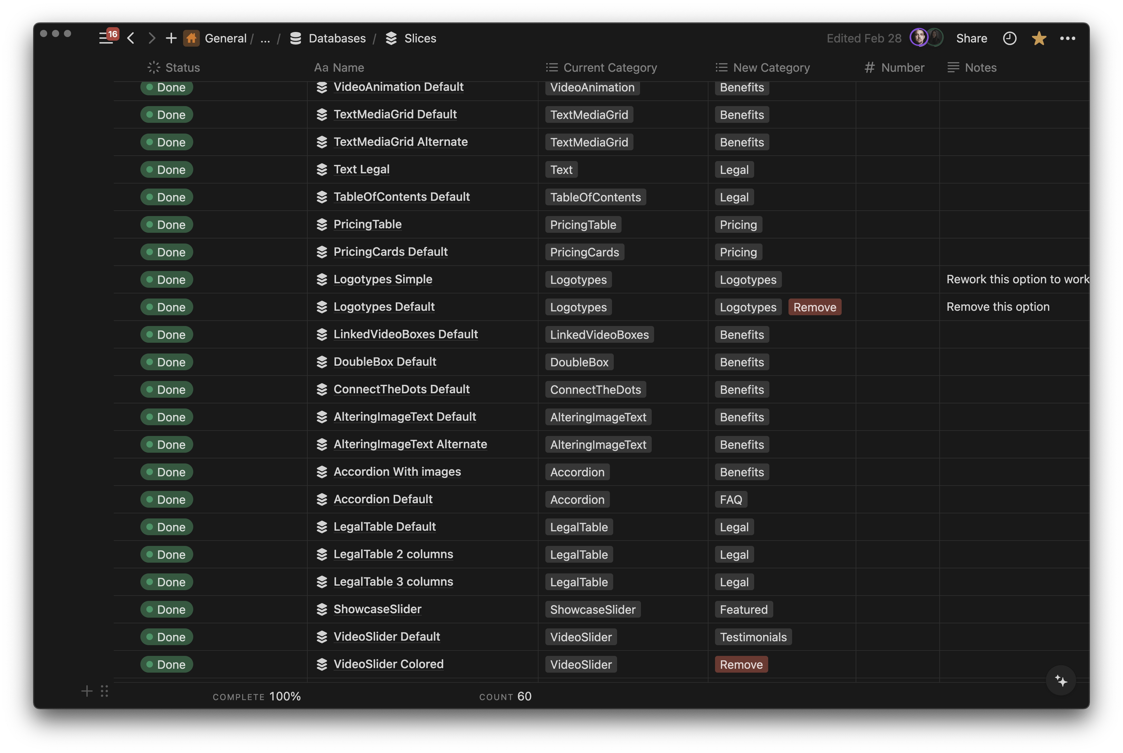
Prep work: inventory and structure
The first thing we did in terms of planning was compile an inventory of all slice variations in our current library. We then categorized these based on their existing slices and the desired slice classifications for future use.
From the get go we developed a process for rebuilding a slice, best described as a cycle of R's. This is a cyclical process comprising six steps. Below is a detailed explanation of each step:
Step 1. Reconnoiter
A thorough review of all the previous slices and their variations that are intended to form a new slice. Careful consideration is given to determining which fields should be retained, which need to be removed, and which require renaming (keeping consistency in mind). This step ensures that we have all the necessary information to create the new slice. All of this is documented in Notion. We created a simple Notion template if you want to reuse something similar for your rebuild, you can duplicate it here.
Step 2. Refine
After gathering all necessary information, we proceed to create the new slice. This stage involves restructuring components in code and establishing a consistent naming convention for fields in Slice Machine, ensuring similarity across all slices.
The goal is to make the slice lean, efficient, and effective, thereby enhancing its performance and streamlining its structure. For us, this involved a restructure/rebuild of our component library. Since we went from having a lot of code in a single slice file to dividing the code into one file per variation, this also introduced the need to develop new component to keep the code DRY (Don’t Repeat Yourself). Looking back at the accordion example from above, this slice was the only page where we used an accordion, so that component lived in that slice. But now, since we needed to split this into two different slices, we needed an accordion component to not repeat that same code across slices. Another example of streamlining this, also mentioned above, is that we always keep the entry file for each slice as a server component. This way we know that if this slice need to fetch external data, it will happen in this main slice file.
Step 3. Replace
With the new slice created in code and in Slice Machine, we publish it to our Page Builder and then begin the process of replacing the existing slices in the production environment by this one. Quality assurance is conducted simultaneously to ensure that the new slice functions as expected and meets all the required standards. We did this manually, duplicating the old slice, changing to the new slice, and copy content that didn't persist due to new field names.
Step 4. Review
Once the slices have been replaced, we then proceed to review the new slice. This involves a thorough examination of the slice and making necessary changes based on any bugs that may have been found. This step ensures that any issues are identified and rectified promptly.
Step 5. Remove
Following the review, the old slice is then eliminated from all Page Types it was previously on. This step is critical in maintaining the efficiency of the system as it ensures that outdated and redundant slices are removed and no longer used by others.
Step 6. Repeat
After the removal of the old slice, we then return to the planning stage to start the process for the next slice. This repetition ensures that the process is continuously improved and refined with each iteration.
As we draw this narrative to a close, it's clear that the journey to rebuild our slice library was both challenging and enlightening. Below, we recap the major milestones of this journey, and best practices that steered us towards a successful rebuild.
Now it’s your turn
Concluding this article, we discussed our strategic decision to rebuild our slice library to streamline the content creation process and enhance efficiency. Our rebuilding process involved a six-step cycle: Reconnoiter, Refine, Replace, Review, Remove, and Repeat.
We faced challenges such as maintaining consistency across slices, managing choices when adding a new slice, and aligning the library with the marketing team's mental model. To overcome these, we implemented consistent naming conventions, reduced unnecessary options, and aligned the library structure with the marketing team's understanding.
Key takeaways
- Modular Approach and Consistency: Adopt a modular approach to building your slice library, ensuring consistency across fields and variations. This helps in maintaining a scalable and manageable codebase.
- Semantic HTML and Accessibility: Focus on semantic HTML and accessibility considerations. This not only aids in structuring content meaningfully but also ensures your site is accessible to a wider audience.
- Reduce Decision Fatigue: Limit the number of choices when designing slices to avoid overwhelming users, particularly marketers, with too many design decisions. This helps maintain brand consistency and streamlines the page creation process.
- Strategic Planning for Rebuilds: Undertake strategic planning before building or rebuilding your slice library. Inventory existing slices if you have any, plan for gradual transitions without disrupting current functionalities.
- Continuous Improvement Cycle: If you’re rebuilding an existing library, implement a cycle of reconnoiter, refine, replace, review, remove, and repeat for each slice. This structured approach ensures continuous improvement and alignment with your website's evolving needs.
- Naming Conventions and Field Definitions: Apply consistent naming conventions and carefully consider field definitions to ensure clarity and maintainability. This reduces confusion and streamlines development work.
- Address Marketer and Developer Needs Equally: Ensure the structure of the slice library aligns with both the mental models of marketers and the technical requirements of developers. This facilitates efficient and effective collaboration across teams.
- Emphasize Clarity and Simplification: Focus on clarity and simplification when designing slice variations. If a variation becomes too complex or diverges significantly from its original design intent, consider creating a new variation.
- Consider Future-Proofing and Scalability: Design your slice library with future expansion in mind. Ensure it can easily accommodate new slices, variations, and features without requiring extensive rework.
Create your own Slice Library
If you're interested in creating your own unique slice library, we have a comprehensive guide available in our documentation that is designed to assist you in getting started. This guide will provide you with step-by-step instructions, making the process straightforward and easy to understand.
Additionally, we are always striving to improve and would greatly appreciate any feedback you may have. We invite you to join our community and share your thoughts and experiences. Engaging with our community is not only a great way to give feedback, but also a fantastic opportunity to connect with other like-minded individuals who are using our services.


