
In this tutorial, you'll learn how to build and launch a website from scratch with Svelte and SvelteKit.
Why learn SvelteKit?
According to the State of JS survey, Svelte is the fastest-growing front-end development framework. Svelte is growing with good reason. It is designed for developer ergonomics and web best practices. With Svelte, you’ll make fast, accessible websites.
As the official back-end framework for Svelte, SvelteKit saw immediate uptake by developers when it was first released in beta. SvelteKit 1.0 was released in December of last year and has grown quickly.
Svelte and SvelteKit have many of the same features as other popular web development frameworks, like components, scoped CSS, and file-system based routing. Svelte also includes shortcuts for styling, reactivity, animations, and templating.
What is Svelte?
At its core, Svelte is a code compiler. Whereas other frameworks like React and Vue.js generally add code to your web app to make it work in the user's browser, Svelte compiles the code that you write when you build your app. In doing so, it creates very small files and fast websites.
As a compiler, when you write Svelte, it looks a little strange. Here's an example of a .svelte file:
<script>
  let name = 'world';
</script>

<h1>
  Hello {name}!
</h1>
That will generate a component that looks like this:
Svelte looks like HTML, with <script> and <style> tags included, but it also adds syntax to make your HTML dynamic — inside curly braces. All of this code gets transformed into vanilla HTML, CSS, and JavaScript with Svelte's compiler.
What is SvelteKit?
SvelteKit is a back-end framework for Svelte. While Svelte handles code that runs in the browser — like interactivity and reactivity — SvelteKit gives you infrastructure for the server hosting your app. SvelteKit will provide routing, layouts, static-site generation, API endpoints, and other app features that can only run on a server.
SvelteKit is also great because it has extremely fast hot reloading in development mode. When you click save, changes can appear instantaneously.
An overview of our SvelteKit project
In this project, we’ll build a simple info website with SvelteKit, inspired by the website for Svelte Summit (of which Prismic is a sponsor). The website in our project will have a dynamic, component-based layout and dynamic routing. The website content will be managed in a CMS so that the website manager can add, edit, and remove pages freely. And, we’ll optimize everything for great performance.
In the process of making this website, we’ll go over how to:
- Create a layout
- Set global styles
- Code components
- Use the
{#each}and{#if}blocks - Use Svelte’s
on:,use:, andclass:directives - Create forms and progressively enhance them
- Compute reactive properties with
$: - Integrate a CMS
- Deploy your app
In the end, we’ll deploy the site so you’ll have your own SvelteKit website live online.
Deliver a fast website with a visual Page Builder
Prismic is a headless solution, with a visual Page Builder for your marketing team to release pages independently

Initialize your project
For this project, we’re going to use a starter from Prismic. This will provide us with some basic configurations for creating and templating content. We’ll still have complete control of the project structure, styling, and layout.
To get started, log in to Prismic or create a new account, and create a new repository with SvelteKit. On the next page, choose “minimal starter” from the list of options for getting started.
A note on Prismic tiers
Prismic has an unlimited free tier for individuals, which makes it ideal for getting started with a new project. However, if you want to use a different CMS (or no CMS), that’s fine too. This tutorial will cover basic principles that you can use with any project.
Follow the instructions to launch your project. You’ll see a command to run in your terminal.
After the command has finished running, open the project in your code editor.
Get familiar with the project structure
Let’s take a tour of the project.
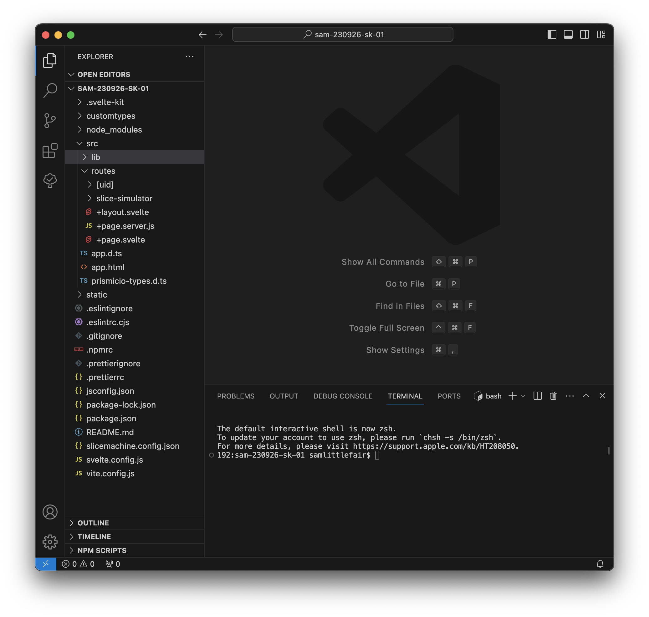
You should know about the following important Svelte-specific files and directories:
svelte.config.js: This is where you add any configuration specific to Svelte or SvelteKit. You won’t need to touch it for this project.static: This is where you can add static assets, like fonts or images.src/: This is where you build your website.src/app.html: This is the root of your project. You don’t need to edit it, but it is required for your project.-
src/routes/: This is where you place each page of your website. A page is defined as a+page.sveltefile inside theroutes/directory. So,src/routes/+page.svelteis your homepage, andsrc/routes/contact/+page.svelteis your/contactpage. src/routes/+layout.svelte: The global layout for your app.src/routes/+page.server.js: Back-end logic for your homepage.src/routes/+page.svelte: Front-end UI for your homepage.
You should also know about these Prismic-specific files and directories:
slicemachine.config.json: This is where you put configuration for Prismic’s development tool, Slice Machine.src/prismicio-types.d.ts: This file contains auto-generated types for your Prismic content (for type checking if you’re using JSDoc or TypeScript).src/routes/slice-simulator/: This route is only used by Slice Machine.src/routes/[uid]/: This is the route that will later render dynamic pages, like /contact or /pokemon.src/lib/prismicio.js: This contains some configuration for your Prismic API client.src/lib/slices/: Slices are the components that will render your content from Prismic.
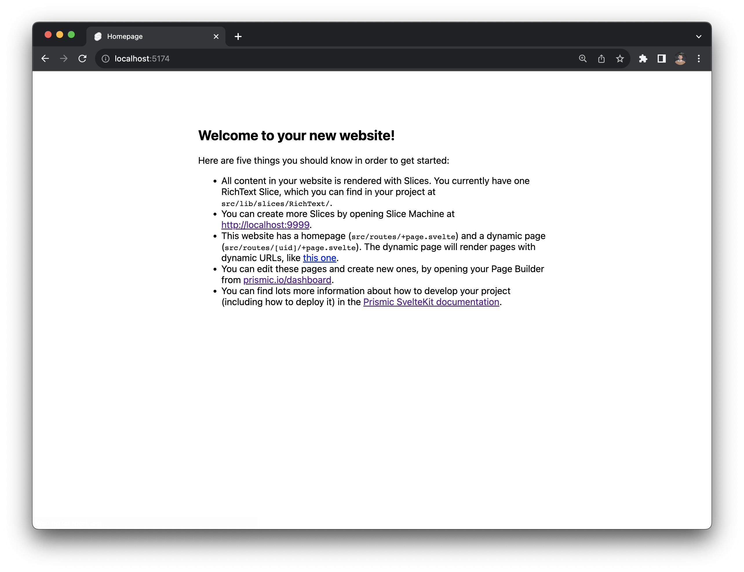
Run your project
Type npm run dev into your terminal to get things going. This will run two servers.
One is the Vite development server. This will serve your website in development mode. (By default on localhost:5173).
The other is Slice Machine. This serves Prismic’s local development tool. (More on that later.)
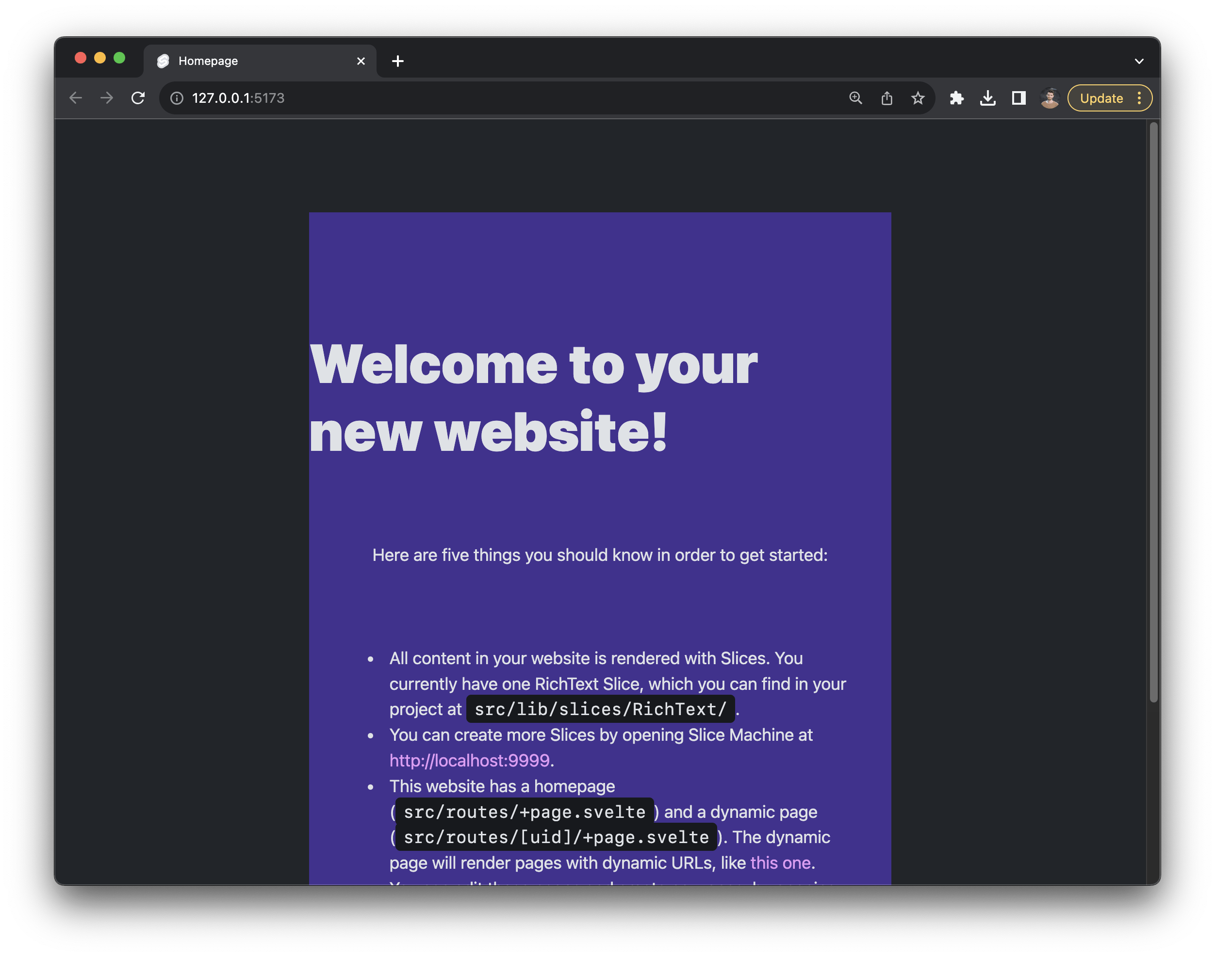
Go to localhost:5173 to see the skeleton of your project. It should look like this:
Create a layout
src/routes/+layout.svelte is your global layout. Anything you put in here will appear everywhere in your app. It’s already pre-populated with some SEO boilerplate code from Prismic.
When you create src/routes/+page.svelte, the page and its content will get injected in line 18 of this file — where the <slot /> element is. You can even create child layouts (like src/routes/blog/+layout.svelte), which will get injected into this one like Russian nesting dolls.
Set global styles
We’re using Open Props for styling in this project. Open Props is a popular new CSS framework that provides hundreds of CSS variables. It’s nice if you like writing CSS, but you can also safely delete it if you’d prefer to use your own approach. For now, open a new terminal (leave your dev server running) and install Open Props:
npm i open-propsLets add some global CSS in this file. Copy-paste all of this into the bottom of your layout file:
<style>
  /* Import Open Props styles */
  @import "open-props/style";
  @import "open-props/normalize";
  @import "open-props/gray-hsl";

  /* Declare a font */
  @font-face {
    font-family: "Anton";
    font-style: normal;
    font-weight: 100 900;
    font-display: swap;
    src: local(""), url("/Anton.woff2") format("woff2");
    unicode-range: U+20-7E, U+E4, U+E5, U+F6;
  }

  /* Define colors scheme for light and dark mode */
  :root {
    --brand: var(--red-6);
    --text-1: var(--gray-9);
    --text-2: var(--gray-11);
    --surface-1: var(--gray-3);
    --surface-2: var(--indigo-2);
    --surface-3: var(--gray-2);
    --surface-4: var(--orange-4);
    --surface-shadow: var(--gray-8-hsl);
    --shadow-strength: 2%;
  }

  @media (prefers-color-scheme: dark) {
    :root {
      color-scheme: dark;

      --brand: var(--orange-10);
      --text-1: var(--gray-3);
      --text-2: var(--gray-2);
      --surface-1: var(--gray-9);
      --surface-2: var(--gray-10);
      --surface-3: var(--purple-12);
      --surface-4: var(--violet-11);
      --surface-shadow: var(--gray-11-hsl);
      --shadow-strength: 50%;
    }
  }

  /* Set fonts */
  :global(html) {
    --font-serif: "Anton";
    font-family: var(--font-sans);
  }

  /* Add some global styling for website sections */
  :global(section) {
    display: flex;
    flex-direction: column;
    align-items: center;
    gap: var(--size-10);
    padding: var(--size-11) 0;
  }

  :global(section:nth-child(even)) {
    background: var(--surface-1);
  }

  :global(section:nth-child(odd)) {
    background: var(--surface-4);
  }
</style>
Finally, download this font file and add it to the static directory:
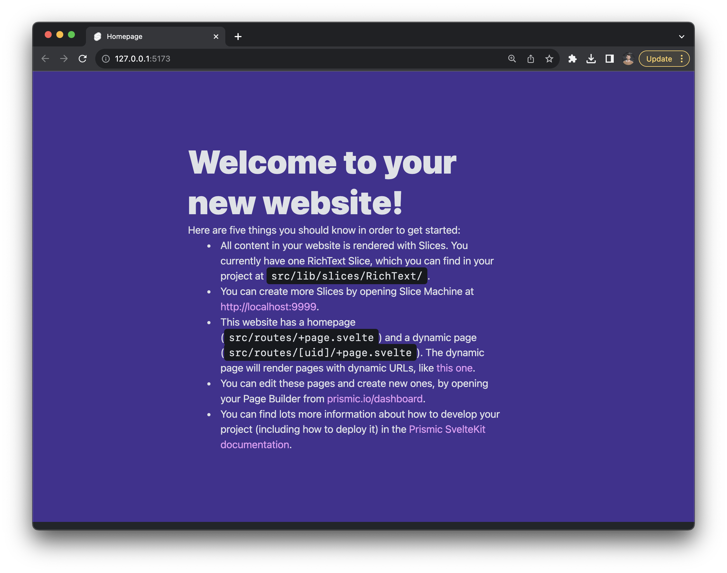
Your website is probably starting to look a little different:
Light and dark mode
This project has light and dark mode, so your components will look different depending on your system settings.
We can customize the styling to make this look a little better.
Open src/lib/slices/RichText/index.svelte and update the code like this:
<script>
  import { PrismicRichText } from "@prismicio/svelte";
  import Label from "./Label.svelte";

  /** @type {import("@prismicio/client").Content.RichTextSlice} */
  export let slice;
</script>

<section class="container">
  <div class="text">
    <PrismicRichText field={slice.primary.content} components={{ label: Label }}
    />
  </div>
</section>

<style>
  .text {
    width: 100%;
    max-width: var(--size-content-3);
  }
</style>
Here, we’ve added <div class="text"> and some CSS to give this component a little structure.
Create content models
In your browser, go to localhost:9999. Here, you’ll find Slice Machine, Prismic’s development tool.
Slice Machine helps you create Svelte components to build webpages. For starters, we’re going to create a HeroText Slice.
In Slice Machine, go to Page types > Page and then click Add slice and select Create new. Call your slice “HeroText” and add it to the default library (src/lib/slices).
Open your HeroText slice. Click Add field and select Rich Text from the list of field types. Name your new field "Title" and click Add. Then click on the ✏️ pencil icon to edit your Title field. Unselect all field types except h1 and click Done.
Add a second Rich Text field, called “Subtitle.” Edit this one so that it only accepts a p element and click Done.
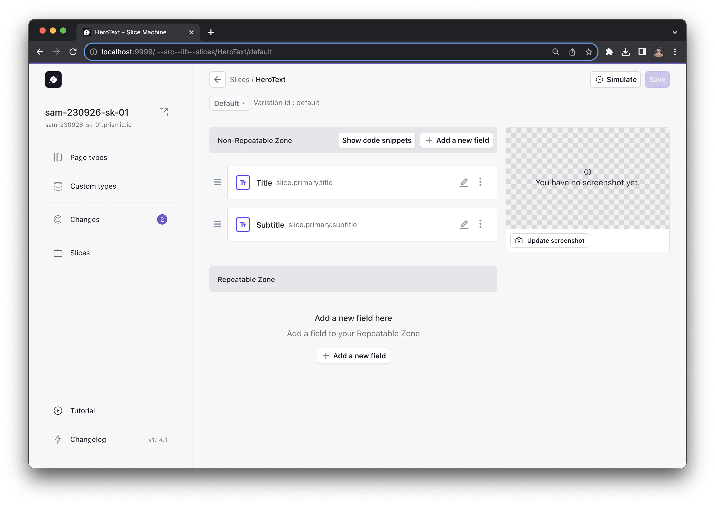
In the upper right, click Save, then click Simulate. This will open a new window displaying a live preview of your slice, with no content.
Build a component
Go back to your code editor and open src/lib/slices/HeroText/index.svelte.
Your slice component already has a slice prop declared. This is how the component will receive all of its data.
First, let’s render the Title property, which will come from slice.primary.title.
The Title property is rich text, which means it’s a complex data structure. We can use Prismic’s PrismicRichText component to render the rich text in Svelte.
Import the PrismicRichText component from @prismicio/svelte and use it in your component like this:
<script>
  import { PrismicRichText } from "@prismicio/svelte";

  /** @type {import("@prismicio/client").Content.HeroTextSlice} */
  export let slice;
</script>

<section data-slice-type="{slice.slice_type}" data-slice-variation="{slice.variation}">
  <PrismicRichText field="{slice.primary.title}" />
</section>
Go back to the simulator that we opened a moment ago. You should be able to find it at this URL:
http://localhost:9999/.--src--lib--slices/HeroText/default/simulator
Now, you should see a simulated preview of your component. Try editing the text in the title field.
Next, go back to your component and add another PrismicRichText component underneath the Title. This time, pass slice.primary.subtitle:
<PrismicRichText field={slice.primary.subtitle} />In the simulator, you should see the subtitle appearing.
Style component children
Finally, lets give this slice some panache. Add the following styles:
<style>
  section {
    /* Add a gradient background */
    background-image: var(--gradient-30), var(--noise-5);
    /* Add some noise to the background */
    filter: var(--noise-filter-1);
    background-size: cover;
    text-transform: uppercase;
    display: flex;
    flex-direction: row;
    align-items: flex-start;
    justify-content: center;
    gap: var(--size-4);
    padding: var(--size-14) 0 var(--size-13);
    font-family: var(--font-serif);
  }
</style>
This adds a cool background and some layout to our component.
Svelte automatically scopes CSS, so these styles will only apply to section elements in this component. The styles won’t even apply to section elements in child components. But what if you want to style a child component?
Svelte offers a :global() selector to escape style scoping. If you write the following:
<h1>Lorem ipsum</h1>

<style>
  :global(h1) {
    color: pink;
  }
</style>
Then every h1 in your app will have this rule applied.
To style child components, you can scope your :global() selector, like so:
<div>
  <h1>Lorem ipsum</h1>
  <SomeComponent />
</div>

<style>
  div :global(h1) {
    color: pink;
  }
</style>
Since the styles are scoped to the div in the component, the :global() selector will only affect elements in the div, including in child component.
Back to our example, we have text elements, like h1 and p, as children of this component. To style those, we can use a scoped :global() selector. Add these style rules to your component:
section :global(h1) {
  color: var(--red-5);
  text-align: right;
  font-size: var(--size-11);
  line-height: var(--size-11);
  width: min-content;
}

section :global(p) {
  color: black;
  text-align: left;
  font-size: var(--size-7);
  font-family: var(--font-serif);
  color: var(--purple-11);
  font-size: var(--size-8);
  line-height: 120%;
  width: min-content;
}
In the simulator, you should see a pretty flashy hero component.
Use the {#each} block
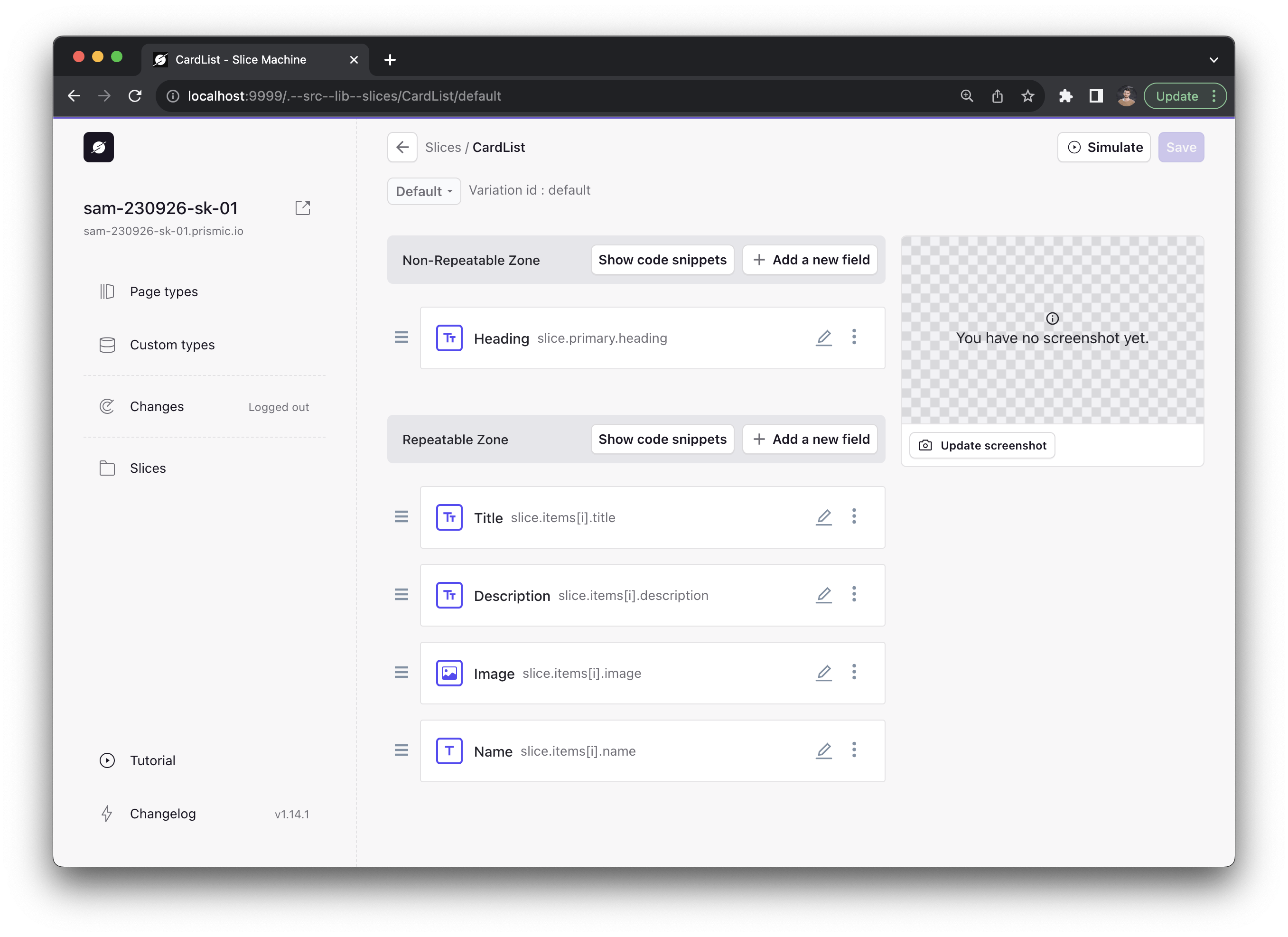
Next, we’re going to create a component that uses Svelte’s famous {#each} and {#if} logic blocks. To get started, go back to Slice Machine and create a new slice called “CardList.”
In the “Non-repeatable zone” of your CardList slice, add a rich text field called “heading” with only h2 elements enabled.
Then, in the repeatable zone, add the following properties:
- “Title”: a rich text field with only h3 enabled
- “Description”: a rich text field with only p enabled
- “Image”: an image field
- “Name”: A key text field
In the end, you should have a model that looks like this:
Click Save and then click on Simulate so we can preview the slice while we edit it. You should see the placeholder component.
Now open src/lib/slices/CardList/index.svelte.
First, let’s add our heading. Import the PrismicRichText component from @prismicio/svelte and use it to template the heading:
<script>
  import { PrismicRichText } from '@prismicio/svelte';
  /** @type {import("@prismicio/client").Content.CardListSlice} */
  export let slice;
</script>

<section data-slice-type="{slice.slice_type}" data-slice-variation="{slice.variation}">
  <PrismicRichText field="{slice.primary.heading}" />
</section>
Now, you should see some content in the simulator.
We’re going to use the {#each} block to create a list of cards to display information.
Svelte’s {#each} block accepts an array and renders a template for each item in the array. For example, this code:
<ul>
  {#each ["dog", "cat", "mouse"] as animal}
    <li>{animal}</li>
  {/each}
</ul>
Will output this HTML:
<ul>
<li>dog</li>
<li>cat</li>
<li>mouse</li>
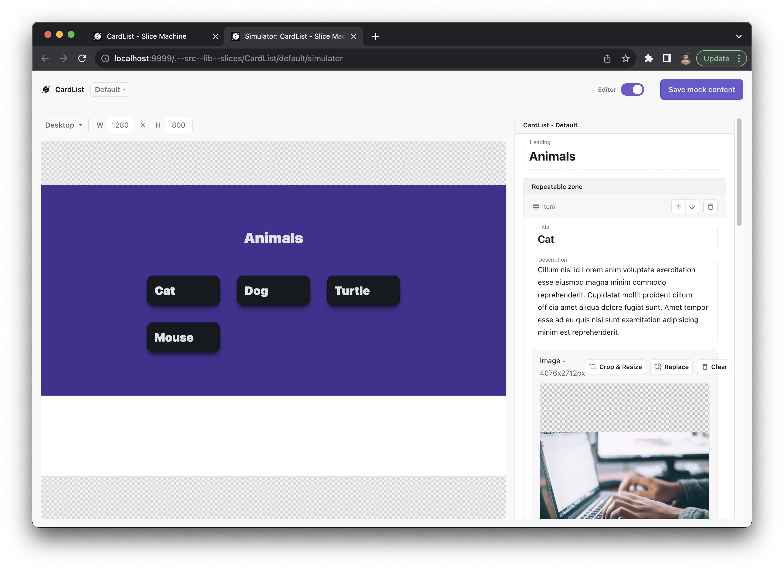
</ul>Update your component with an {#each} block to iterate over the repeatable items in your slice:
<section data-slice-type="{slice.slice_type}" data-slice-variation="{slice.variation}">
  <PrismicRichText field="{slice.primary.heading}" />
  <div class="cards">
    {#each slice.items as card, index}
    <article class="card">
      <header>
        <PrismicRichText field="{card.title}" />
      </header>
    </article>
    {/each}
  </div>
</section>
Here, we’ve created a div container with the class cards to create a CSS grid. In that container, we’re creating an article for each card. The article currently just has the card’s title. Let’s add some CSS:
<style>
  .cards {
    /* Create a responsive grid layout */
    display: grid;
    grid-template-columns: repeat(auto-fit, minmax(200px, 1fr));
    gap: var(--size-8);
    max-width: 900px;
  }

  article {
    /* Some card styling */
    border: 1px solid rgba(0, 0, 0, 0.6);
    border-radius: var(--radius-3);
    padding: var(--size-4);
    box-shadow: var(--shadow-3);
    background: var(--surface-2);

    /* Layout for the card's content */
    display: flex;
    flex-direction: column;
    align-items: left;
    gap: var(--size-3);
  }
</style>
Now we have actual cards!
In the simulator, try adding more cards to see how the layout changes.
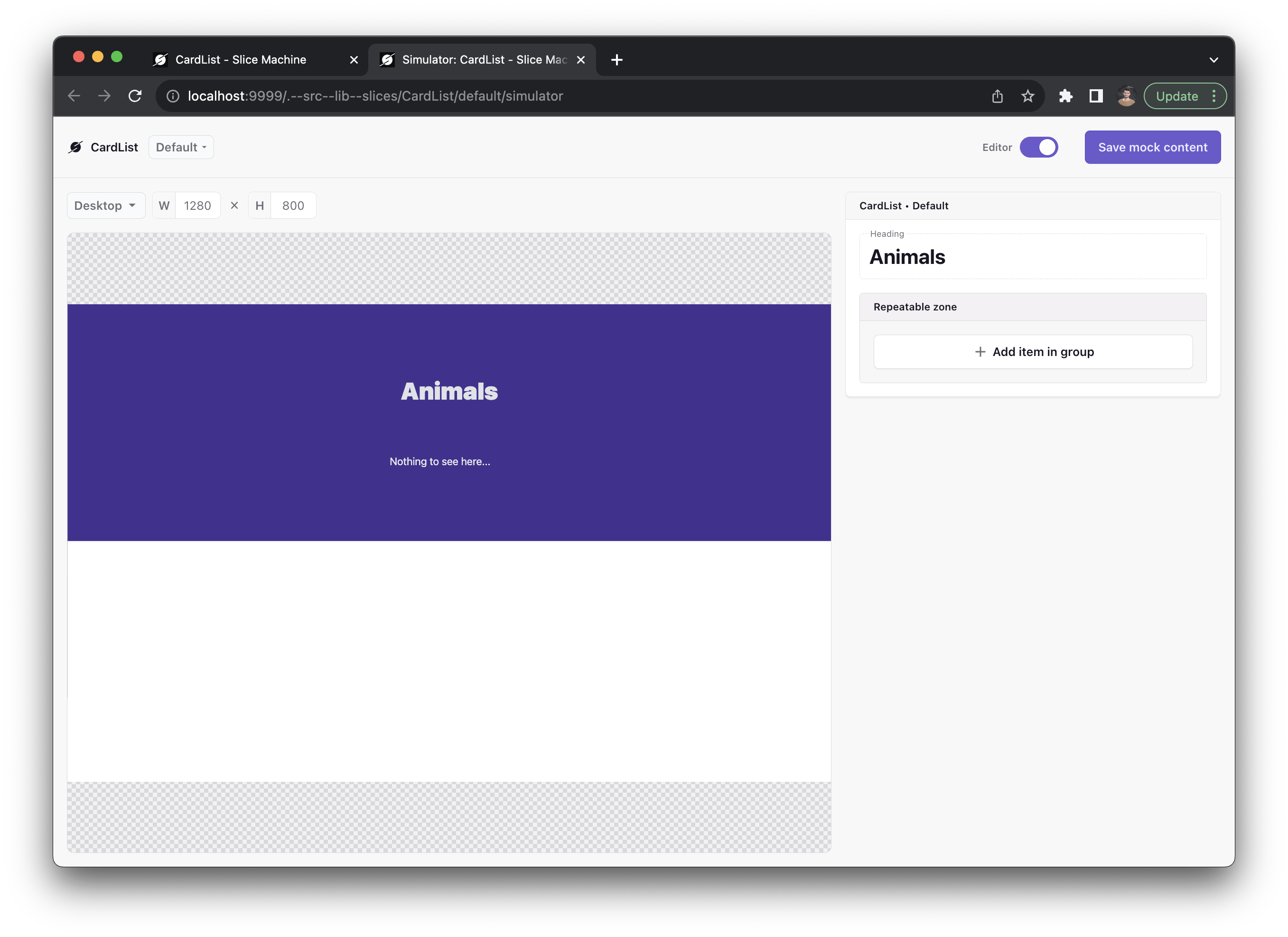
We can also add a fallback in case there are no speakers. Update your {#each} block with this {:else} statement before the end. This will display when the array is empty:
{:else}
  <p>Nothing to see here...</p>
{/each}
If you delete all of the items in the simulator, the fallback will appear:
Let’s fill the cards with some more content.
Import the PrismicImage component from @prismicio/svelte:
import { PrismicImage } from '@prismicio/svelte';Add this markup to your component:
  <article class="card">
    <header>
      <PrismicRichText field={card.title} />
    </header>
+ 	  <PrismicRichText field={card.description} />
+ 	  <footer>
+ 		  <PrismicImage field={card.image} />
+ 		  <h4>{card.name}</h4>
+ 	  </footer>
  </article>
And then add these styles:
footer {
  margin-top: auto;
  display: flex;
  flex-direction: row;
  align-items: center;
  gap: var(--size-3);
}

footer :global(img) {
  width: 50px;
  height: 50px;
  object-fit: cover;
  border-radius: var(--radius-round);
}
Now we have some nice-looking content:
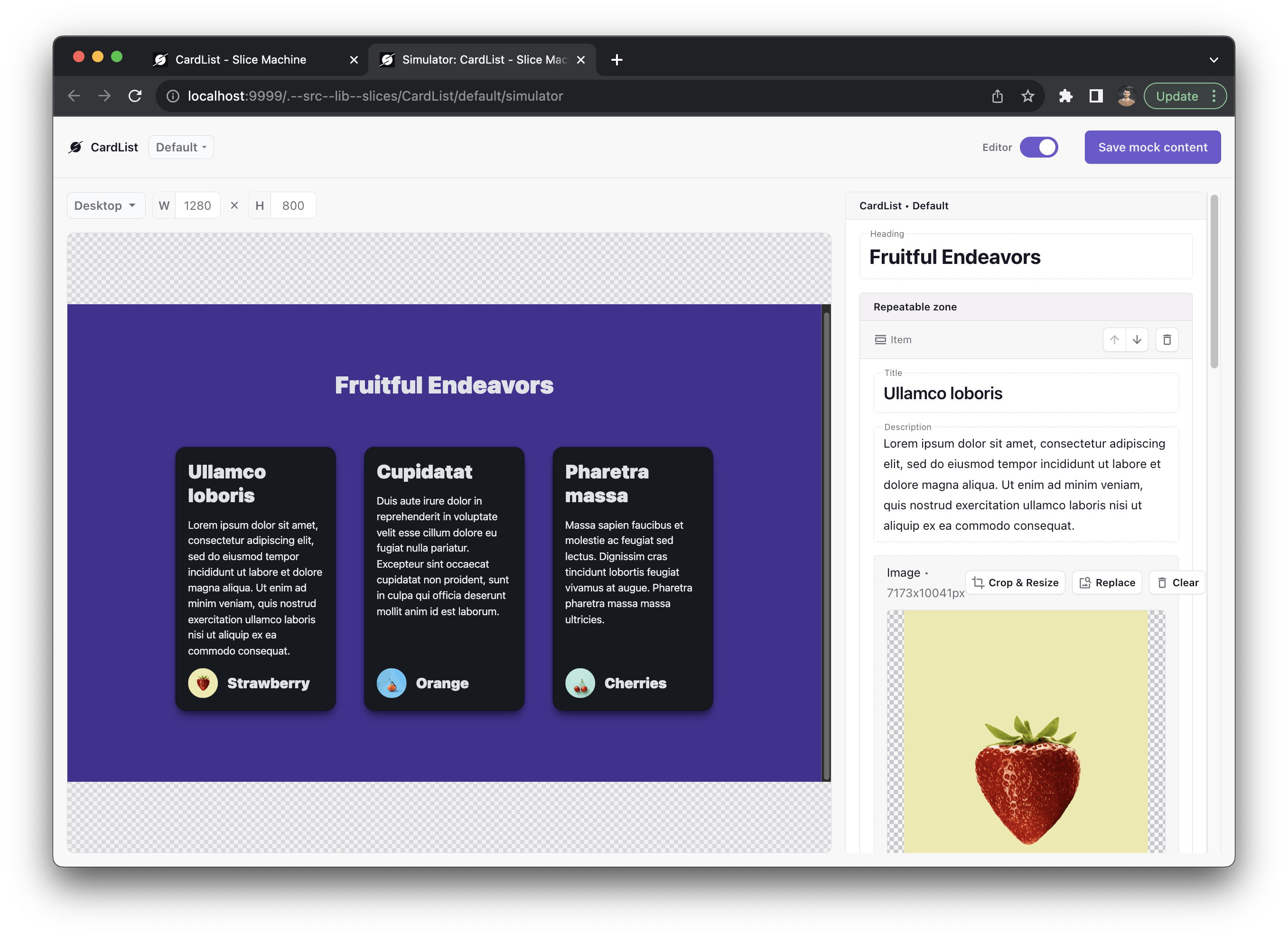
Note that the images use the PrismicImage component, and they’re served from Prismic’s image service, which means that they are fully optimized.
Use the {#if} block
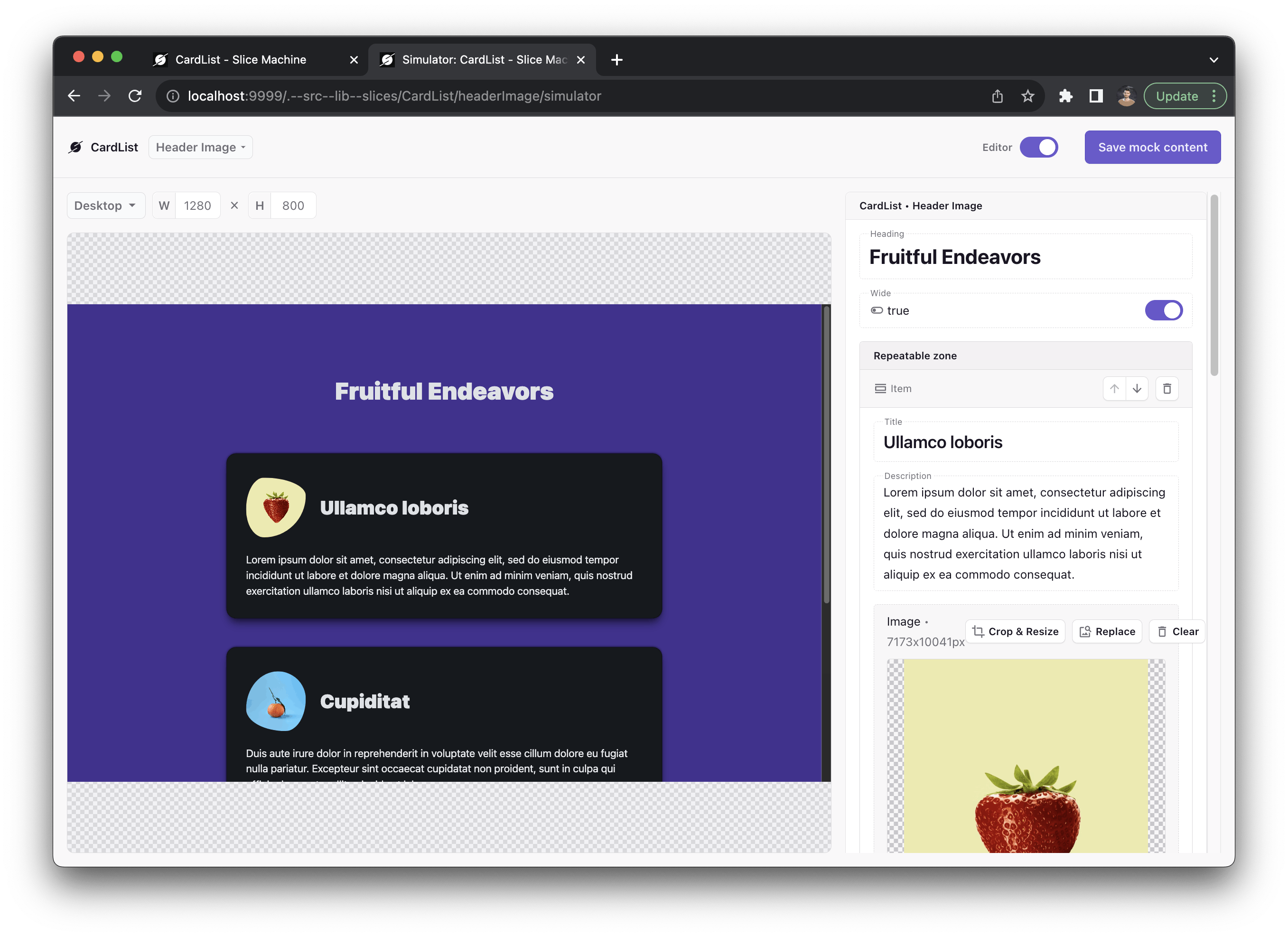
We could stop there and call it a day. But a card is really useful type of component. Wouldn’t it be nice to have the ability to use it for different things? We can do that by defining a variation. Go back to the CardList slice in Slice Machine. Click on the drop-down menu at the top, which says “default.” Click Add a new variation. Call this variation “Header Image”, and duplicate it from the default variation. On the Header Image variation, delete the “Name” field and click Save.
If you go back to the simulator and refresh, you’ll see that you can now switch between the default variation and the Header Image variation.
In the Header Image variation, we’re going to hide the footer and display the image in the header. We’re going to use Svelte’s {#if} block to do that.
Wrap the whole footer in an {#if} block, like this:
{#if slice.variation === 'default'}
  <footer>
    <PrismicImage field="{card.image}" />
    <h4>{card.name}</h4>
  </footer>
{/if}
Now you’ll see the footer appear and disappear depending on the variation.
Next, we’ll add the image to the header:
	<header>
+ 	{#if slice.variation === 'headerImage'}
+ 		<PrismicImage field={card.image} />
+ 	{/if}
		<PrismicRichText field={card.title} />
	</header>
Add style the image:
header :global(img) {
  width: 100px;
  height: 100px;
  object-fit: cover;
  margin: var(--size-5) auto var(--size-7);
}
Finally, we’re going to add some flare to the image using inline styles. Svelte allows you to add inline styles just like in HTML:
<h1 style="color: red">Lorem ipsum</h1>Earlier when we created the {#each} block, we declared an index variable, which gives us the index of the current item of the array. We’re going to use the index variable to dynamically declare a variable from Open Props to create a cool blobby border for our images. Update the image component like this:
<PrismicImage
  style="border-radius: var(--radius-blob-{(index % 5) + 1})"
  field="{card.image}"
/>
Now we should have a nice blobby header image for our cards:
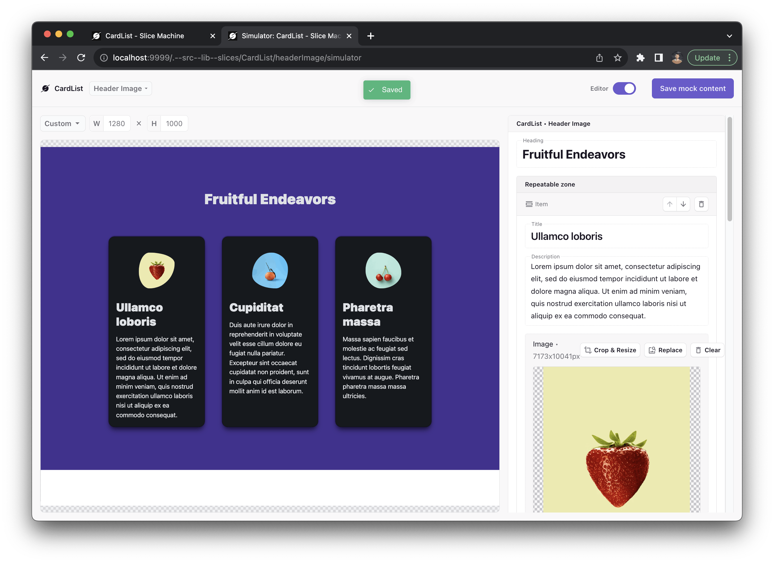
Open Props has five blob shapes, so the cards will look through them continuously.
Let’s make one final addition to make these cards even more dynamic. In the non-repeatable zone of the Header Image variation of your CardList slice, add a new boolean field called “Wide.” In your <script> tag, destructure that property from the slice:
$: wide = slice.primary.wide;(Because this property is nested in an object, we use the dollar-sign syntax rather than the let syntax to reactively update the variable if the value of the nested property changes. Svelte normally doesn’t monitor nested properties for changes.)
Then, on the <div class="cards"> element, add this attribute: class:wide. This is Svelte’s class shorthand.
<div class="cards" class:wide>If wide is true, Svelte will add a class with the name "wide" to the element. Now, we can add this style rule:
.cards.wide {
  grid-template-columns: repeat(auto-fit, minmax(600px, 1fr));
}

.wide article {
  padding: var(--size-7);
}

.wide header {
  display: flex;
  flex-direction: row;
  align-items: center;
  justify-content: start;
  gap: var(--size-5);
  margin-block: var(--size-2);
}

.wide header :global(img) {
  margin: 0;
}
Save your changes and refresh the simulator. Now we have the option of showing large-format cards:
Create a form
Next we’ll take advantage of SvelteKit’s built-in form handling to create a contact form.
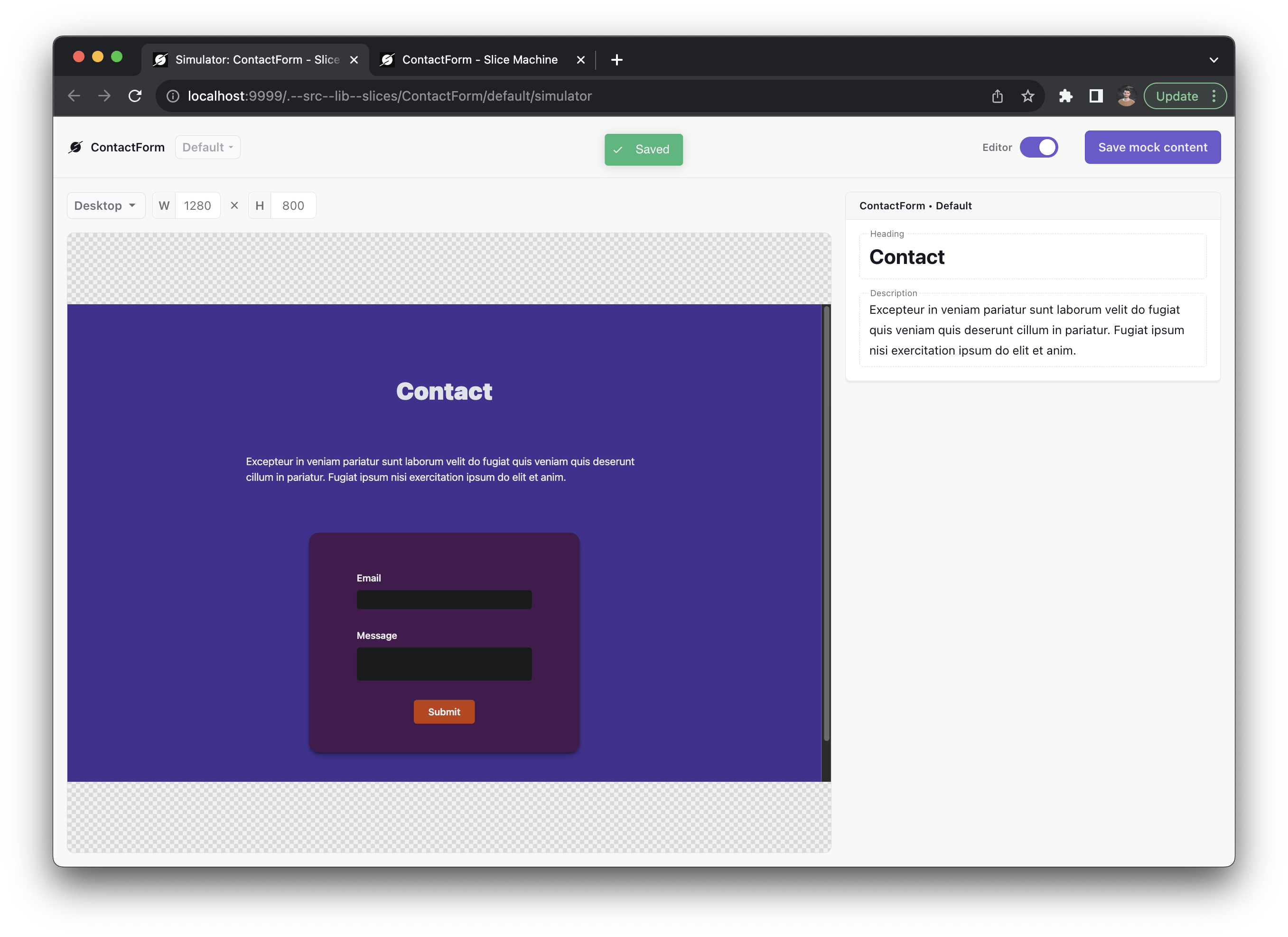
Return to Slice Machine and create a new slice called “ContactForm”. This Slice only needs two Rich Text fields:
- A “Heading” with only h2 enabled
- A “Description” with p enabled
Click Save and Simulate to open a preview of your component, and open src/lib/slices/ContactForm/index.svelte to start working on it.
Start by copy-pasting in this basic form component:
<script>
  import { PrismicRichText } from "@prismicio/svelte";

  /** @type {import("@prismicio/client").Content.ContactFormSlice} */
  export let slice;
</script>

<section
  data-slice-type="{slice.slice_type}"
  data-slice-variation="{slice.variation}"
>
  <PrismicRichText field="{slice.primary.heading}" />
  <PrismicRichText field="{slice.primary.description}" />
  <form method="POST" action="/">
    <div class="group">
      <label for="email">Email</label>
      <input required type="email" id="email" name="email" />
    </div>
    <div class="group">
      <label for="message">Message</label>
      <textarea name="message" id="message" minlength="1" maxlength="1000" />
    </div>
    <div class="group">
      <button>Submit</button>
    </div>
  </form>
</section>

<style>
  form {
    display: flex;
    flex-direction: column;
    gap: var(--size-7);
    width: var(--size-content-2);
    background: var(--surface-3);
    padding: var(--size-9) var(--size-10) var(--size-8);
    border-radius: var(--radius-3);
    box-shadow: var(--shadow-2);
  }

  label {
    display: block;
    margin-bottom: var(--size-2);
  }

  label,
  button {
    font-weight: var(--font-weight-6);
  }

  input,
  textarea {
    display: block;
    width: 100%;
    resize: none;
  }

  button {
    border-radius: var(--radius-2);
    padding: var(--size-2) var(--size-5);
    margin-left: auto;
    margin-right: auto;
    display: block;
    background: var(--brand);
    box-shadow: var(--shadow-1);
    transition: box-shadow color 1s var(--ease-spring-2), color 1s;
  }

  button:hover {
    box-shadow: var(--shadow-2);
  }
</style>
This might look like a lot of code, but it’s all just basic markup and styling. There’s nothing special happening here, yet.
The only thing that’s special about this form is on the <form> element itself: method="POST" and action="/". This tells SvelteKit to send a POST request to the / route in your app. That means we need to add a function to handle that request. Open src/routes/+page.server.js.
When you created your app, Slice Machine generated this file to load the data for your page from the Prismic API. Now, we’re going to use the same file to handle this POST request.
Add the top of your file, delete this line:
export const prerender = true;Then, add these two imports:
import { fail } from '@sveltejs/kit';
import { dev } from '$app/environment';
Then, add this code to the file:
export const actions = {
  default: async ({ request, fetch }) => {
    // Access the form data
    const data = await request.formData();
    // Retrieve the user's email
    const email = data.get("email");
    // Retrieve the user's message
    const message = data.get("message");

    // Send the email and message to an external API
    // Update this endpoint to send the data wherever you want
    const response = await fetch("https://monkey-elephant.free.beeceptor.com", {
      method: "post",
      body: JSON.stringify({
        email,
        message,
      }),
      headers: {
        "Content-Type": "application/json",
      },
    });

    // Simulate a 1s loading time in development
    if (dev) {
      await new Promise((resolve) => setTimeout(resolve, 1000));
    }

    // Return an error if the API request is not successful
    if (response.status !== 200) {
      return fail(500);
    }

    // Return a success message
    return {
      success: true,
    };
  },
};
The export actions is responsible for handling POST requests. On the <form> element, we didn’t give our POST request a name, so the actions object will handle it with the default action.
We extract the user input from request.formData() and then send that data to an external API (wherever you want to save this information). Then, we added a simulated loading time in development and finally returned an error or a success message.
This is all you need to do to make your <form> work in Svelte. You can use this form component on any page of your app, and SvelteKit will route the request to this handler.
Build your website
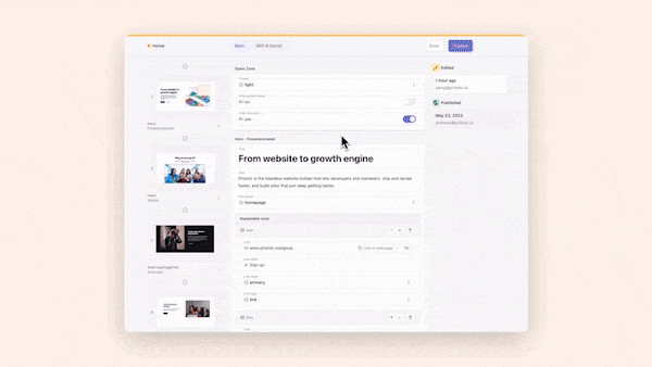
Prismic is a Headless Page Builder. “Headless” means that Prismic doesn’t provide the front-end code. You do. That’s everything you’ve just written. Now, we’re going to use the page builder part.
Return to Slice Machine, then go to Page types > Page. Click Add slices > Select existing. Select all existing slices and click Add. (If you don’t see that option, you can skip this step.)
Now go to the Changes page, log in if necessary, and click Push changes in the upper right. This will push all of your content models to Prismic’s Page Builder. Once you’re done, click on the link to open your Page Builder in the top-left corner.
Now, you should be in Prismic’s Page Builder. You’ll see two documents that were automatically created with your project. Open the Homepage document. Now, you can edit the content by adding, editing, rearranging, and deleting slices. Try adding all of the slices you just created to the page.
Take a guided tour of the new Page Builder!
The new Prismic Page Builder allows you to drag and drop page sections to build website pages as easily as a slide deck. If you would like a guided tour that walks you through all of the features step-by-step, give the demo a try for yourself!
Make sure to add a ContactForm slice! We’ll use this to test our form later on.
Click Save and Publish. Then, view your new page in development at localhost:5173 (the default localhost port that SvelteKit uses).
Enhance your page with JavaScript
Now that we have a working webpage, we can add some cool features.
Earlier, when you created the form, it was pure HTML. That means it will work almost anywhere — on slow connections, with ad blockers, in old browsers. This is great to ensure that your website always runs properly. But SvelteKit also lets you add JavaScript to improve the user experience. This is called “progressive enhancement.” Unfortunately, many websites don’t work at all without JavaScript. Progressive enhancement is the philosophy that JavaScript should improve a webpage, but the page should still work even when JavaScript doesn’t.
To accomplish this, SvelteKit provides a Svelte action called enhance.
In src/lib/slices/ContactForm/index.svelte, add this import:
import { enhance } from "$app/forms"Then, add the action to the form:
<form method="POST" action="/" use:enhance>The use: directive is what Svelte calls an “action.” It adds functionality to an element.
In this case, use:enhance tells the form to prevent page reloads only if JavaScript is working. Instead, SvelteKit will just update the data on the page. You might be wondering: What data?
Earlier, when we created the form action, we returned an object like this:
{
  success: true
}
Now, we can access that information when it gets returned by importing the page store:
import { page } from "$app/stores"The page store contains information about the current page, including anything returned from an API action.
Try updating the form button:
<button>
  {$page.form?.success ? "Thank you ✨" : "Submit"}
</button>
Now, test your form submission.
You should see a one-second loading delay (which we’re simulating) and then the button should update to “Thank you ✨”.
We can also disabled the form after a submission. Declare a submitted variable inside your <script> tag:
let submitted = falseThen, change that variable to true when the form is submitted:
<form method="POST" action="/" on:submit={() => (submitted = true)} use:enhance>Here, we’re using Svelte’s on: directive, which allows you to define an action in response to user input.
Finally, conditionally add a disabled attribute to your button:
<button disabled={submitted}>
  {$page.form?.success ? 'Thank you ✨' : 'Submit'}
</button>
Now the user can’t submit the form multiple times.
Compute a reactive property
What if we want to display a loading state?
For that, we’ll need to create a computed property. We already did that earlier in our CardList slice, with this line:
$: wide = slice.primary.wide;Since Svelte doesn’t monitor all the changes to every variable (that would put too much strain on the computer’s memory), the $: declaration creates a variable (wide) that is computed based on one or more other variables. SvelteKit will monitor those other variables. If they change, it will update the wide variable.
Next, add this line to your <script>:
$: loading = submitted && !$page.form?.success;If the form has been submitted, but there’s not yet a successful response, loading will be true. After the form returns success: true, loading will be false.
Update your button like this:
<button class:submitted class:loading disabled={submitted}>
  {$page.form?.success ? 'Thank you ✨' : loading ? 'Loading' : 'Submit'}
</button>
Now, we’re using the class: directive to conditionally add a "submitted" or "loading" class if either of those variables are true. Finally, we also update the text of the button conditionally.
Now, let’s add some styling for our loading and submitted states:
@keyframes loading {
  from {
    background: var(--gray-6);
  }
  to {
    background: var(--gray-7);
  }
}

button.loading {
  animation: loading 2s alternate infinite;
}

button.submitted {
  background: var(--surface-4);
  box-shadow: none;
  cursor: default;
}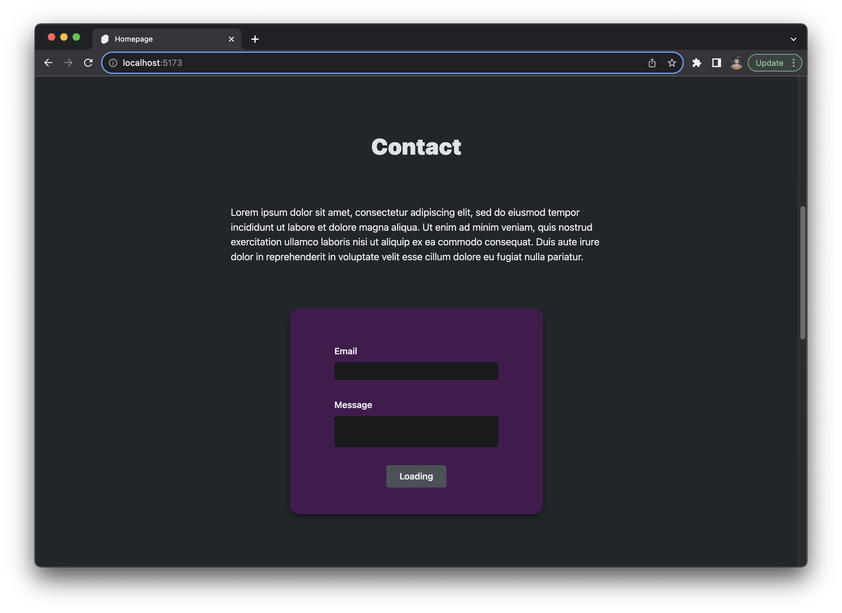
Test out the button to see how it updates. This is a nice enhancement. But even if the JavaScript doesn't load, the form will still work.
Create a nav
Now we have our content done, we need a way to navigate between pages. We’re going to create a Nav component.
Create a new directory for components: src/lib/components/ and inside create Nav.svelte. Paste in this code:
<script>
  import { PrismicLink } from "@prismicio/svelte";

  /** @type {import('../../prismicio-types').NavDocumentData['links']} */
  export let links;
</script>

<nav>
  <ul>
    {#each links as link}
    <li>
      <PrismicLink field="{link.link}"> {link.label} </PrismicLink>
    </li>
    {/each}
  </ul>
</nav>

<style>
  nav {
    position: fixed;
    background: var(--surface-3);
    z-index: 1;
    width: 100%;
    padding: var(--size-4);
    box-shadow: var(--shadow-1);
  }

  ul {
    list-style: none;
    padding: 0;
    margin: 0;
    display: flex;
    justify-content: space-around;
    font-size: var(--font-size-1);
    text-transform: uppercase;
    font-weight: var(--font-weight-5);
    color: var(--text-1);
  }

  li :global(a) {
    color: var(--text-2);
    padding: 0 0 5px;
  }

  li :global(a:hover) {
    text-decoration: none;
    color: var(--text-1);
    box-shadow: inset 0 -2px var(--brand), 0 2px var(--brand);
  }
</style>
This is some basic markup and styling for a Nav component. However, you might notice a typing error on the links prop. That’s because we need to create a model for it.
Return to Slice Machine one last time. Go to the Custom types page and click on Create. Choose Single and name your custom type “Nav”.
Click Add a new field and add a group field. Call it “Links”.
Inside your new Links field, click on the Add field button. Add a link field and call it “Link”. Then add another field to Links: a key text field called “Label”. Click Save.
Go to the Changes page and click Push changes.
Now open the Page Builder and create a new document. When prompted for the type of document, select Nav.
Add a few links to your Nav document. For now, they can be links to anything — Facebook, Wikipedia. Include a link for the homepage.
Create a new file: src/routes/+layout.server.js. This file will load the data for our layout. Inside, paste in this code:
import { createClient } from "$lib/prismicio";

/** @type {import('./$types').PageServerLoad} */
export async function load() {
  const client = createClient();

  const nav = await client.getSingle("nav");

  return {
    nav,
  };
}
This just runs an API query to fetch your Nav document and then returns it so you can use it in your template.
Now open src/routes/+layout.svelte. Import your Nav component and add a prop to your <script> tag:
import Nav from '$lib/components/Nav.svelte';

export let data;
Then, use your Nav component somewhere above the <main> element:
<Nav links={data.nav.data.links} />

<main>
  <slot />
</main>
Now your page should have a nav!
Let’s also add a basic footer. Add this code below your <main> element:
<section>
  <footer>
    <p>© {new Date().getFullYear()}</p>
  </footer>
</section>
Now you have a full webpage with a layout!
Add more pages
In Svelte, each page is declared with a +page.svelte file, and the page’s route is defined by the enclosing folder. So, src/routes/contact/+page.svelte will render your /contact page, and src/routes/about/team/+page.svelte will render your /about/team page.
You can also create dynamic routes using square brackets. In your project, you already have src/routes/[uid]/+page.svelte. This will render a page for /* — any page at the root of your website. It will also provide the [uid] variable to the page as data. So, if someone visits /features, SvelteKit will provide { uid: "features" } as data in your load() function. That data is accessible in the params prop.
You can see this in action in src/routes/[uid]/+page.server.js. That file is already complete.
This means that you add more pages in your Page Builder, and SvelteKit will automatically render them for you. Try adding some more pages and linking to them in your nav.
Deploy your SvelteKit site
Make sure your project is pushed to GitHub. You'll need to initialize your project as a git repository:
git initAdd all of your files to staging:
git add .And commit them:
git commit -m "Init"In GitHub, create a new repository and follow the instructions to push your project to GitHub.
Visit Netlify or Vercel and create an account or log in. Click New project or New site. Follow the instructions to deploy your new GitHub repo. You can leave the deploy settings as is.
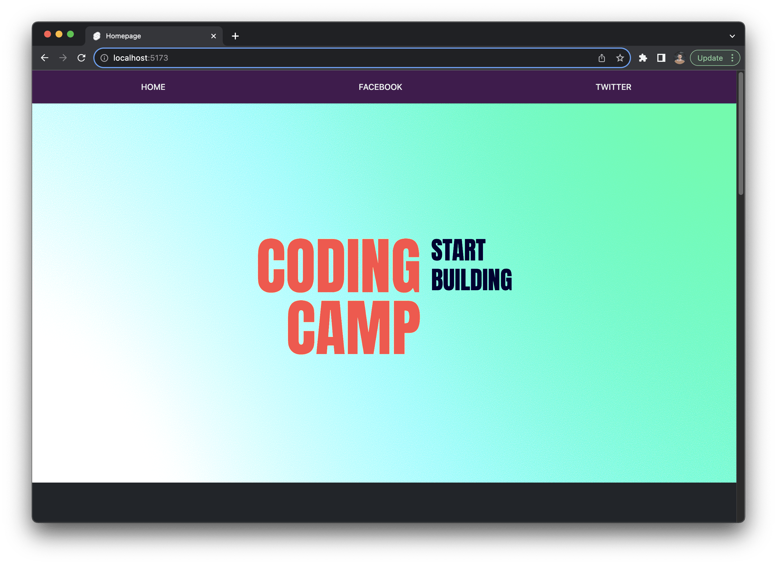
Here's what my final site looks like. You can see the code for it on GitHub.
Congratulations!
Once you deploy your site, it should be live! Congratulations on building a website with SvelteKit 🎉
To recap, here’s what we went over:
- You initialized a project with a Starter from Prismic
- You created a layout with global styles, a nav, and a footer
- You integrated a CMS to safely and conveniently separate code from content
- You build an entire website with a component-based architecture
- You used Svelte syntax to add logic like loops, conditionals, and progressive enhancement
- You learned some of SvelteKit’s special features like the $page store
- You deployed your website
Want to keep going? Here are some next steps you can take:
- Add more pages to your website
- Create more slices
- Use Prismic's webhooks with your project
- Add a blog to your website
Further learning
Expand your SvelteKit knowledge by building this creative portfolio with SvelteKit, Three.js, GSAP, and Prismic!
In this fun course, we'll make an interactive and stylish personal portfolio website to help you stand out. We'll use SvelteKit, Three.js for awesome 3D effects, GSAP to animate our site on enter, scroll, and hover, and use Tailwind CSS for all the styling. We'll use Prismic for our content, which turns our custom components into a page builder with a ton of great features like live previews. Try it out!
Try editing a page with Prismic
A visual page builder, configured to marketing team's needs. They can easily create on-brand website pages, release more, attract more visitors and convert quality leads.