How to Improve Website Conversion Rates with Prismic
 By Lea Thomas
Struggling to convert website traffic? Increasing website conversion rates is necessary for any growing business looking to drive more targeted traffic, leads, and sales. Yet, why do so many companies find converting traffic so difficult? We discovered this challenge among a customer of ours and set out to help them figure out their bottlenecks and provide several possible solutions for conversion rate optimization.
Prismic helps thousands of customers manage on-brand content for their marketing websites, whether B2B (Business to Business) or B2C (Business to Customer). And, of course, we use our own product to build Prismic's marketing website.
We are well-versed in conversion rate challenges and compiled 6 of our best tips below for any marketing team or website manager who wants to dig deeper into this topic using Prismic's headless website builder.
What is a website conversion?
Simply put, website conversion is any instance a user completes to a website goal: micro, small conversions like taking a quiz, or macro, like purchasing a product. Some examples of conversions are:
- Signing up for a demo
- Signing up for a free trial, freemium version, or email newsletter
- Making a purchase or booking a service
- Downloading content like a white paper
- Filling out a contact or request form
- Clicking on a call-to-action (CTA) button
- Engaging with content, like watching a video or taking a quiz
Any goal you want visitors to complete can be considered a conversion. Each business will have different conversion objectives based on their goals.
What is a good conversion rate?
Conversion rates vary among industries. Good conversion rates tend to range from 2-5% depending on the industry and type of conversion. Micro-conversions like newsletter sign-ups and quiz completions generally have a higher conversion rate than macro-conversions like signing up for a demo or purchasing a course.
Tracking website conversions
Tracking website conversions is important to understanding the visitor journey and optimizing the experience to drive more conversions. Common conversion metrics are conversion rate (CVR) and cost per conversion (CPC). Common analytics tools like Google Analytics 4, Fathom, and Hotjar can provide this information.
Improving website conversion rates includes analyzing the following:
- visitor behavior
- testing page elements such as images
- building and testing trust signals
- aligning to visitor motivations
The goal is to remove friction in the journey and guide visitors to convert at key points.
Conversion rate formula
We established that conversion rates are one of the most important metrics for your website. The formula for calculating your conversion rates is straightforward. The key is to be clear on how you want to measure and classify conversions.
The typical formula for calculating conversions is:
- Total number of conversions / Total number of sessions * 100
Optimize product pages
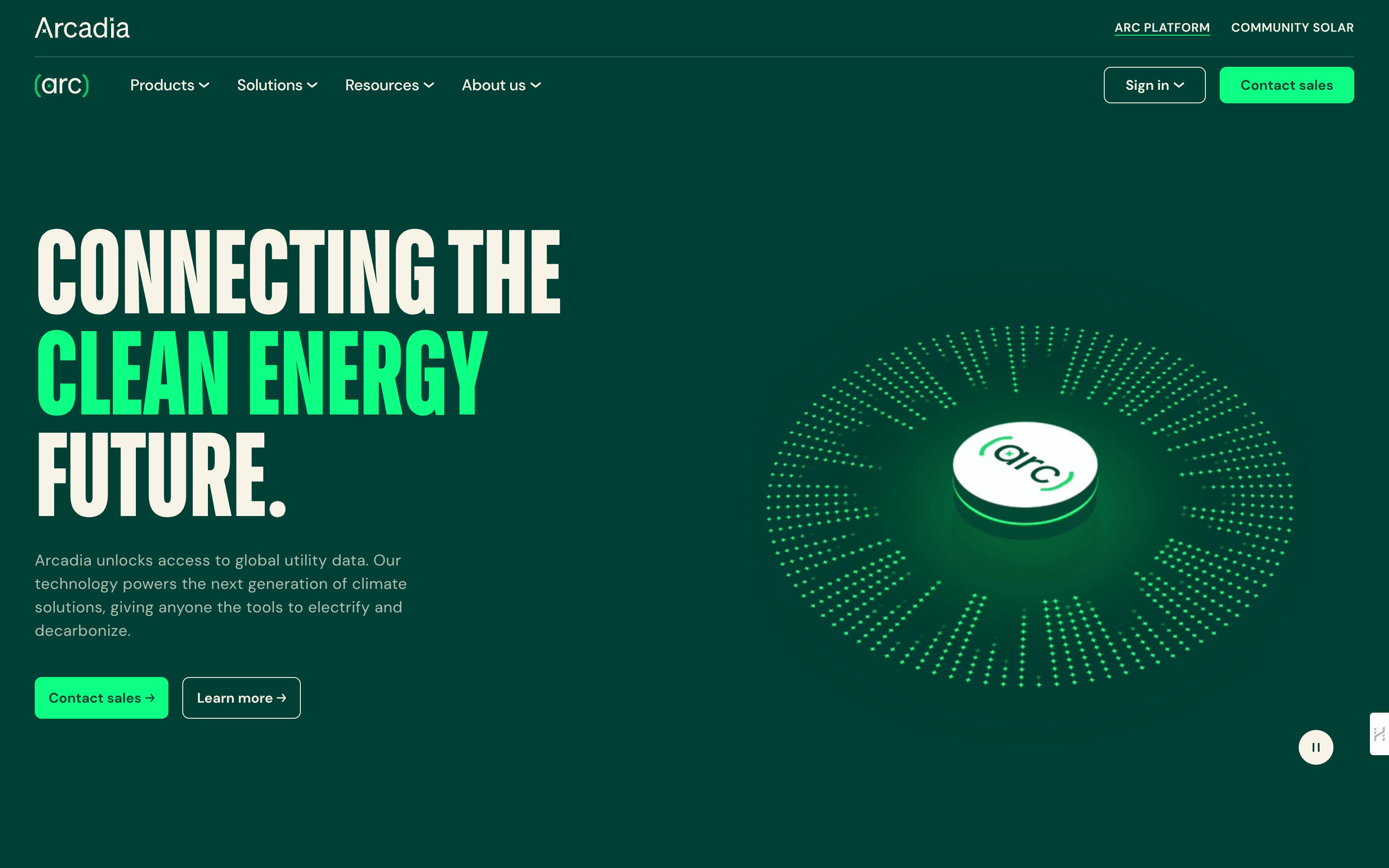
Optimizing product-focused pages helps visitors better decide if what you are offering will meet their needs. For this reason and more, these pages are typically referred to as your “money” pages. Clearly explaining the product in the context of how your product can remedy visitor challenges is of prime importance.
Consider overhauling product pages to improve content quality and structure. For example:
- showcase more visuals demonstrating product usage and benefits
- break up dense paragraphs into scannable sections with subheads
- expand on unique capabilities with dedicated feature explainers
- tell better stories about solving customer pain points
On Prismic's site, we created super-rich pages highlighting some of our core features, such as Slice Machine and the new Page Builder. These in-depth, story-driven pages convert better than generic product pages. Conversion rates are generally higher for pages announcing new features and capabilities like our new Page Builder.
The key here is to use content to highlight your product’s value, not just its features. Take users on a journey to see how you can best address their needs. Structure pages to make scanning easy. Include visual product examples and demos if possible.
🎓 Tips to achieve this in a Prismic-powered website
Enrich your slice library by adding page sections that allow you to create content pieces that provide more information and a better narrative around your product features.
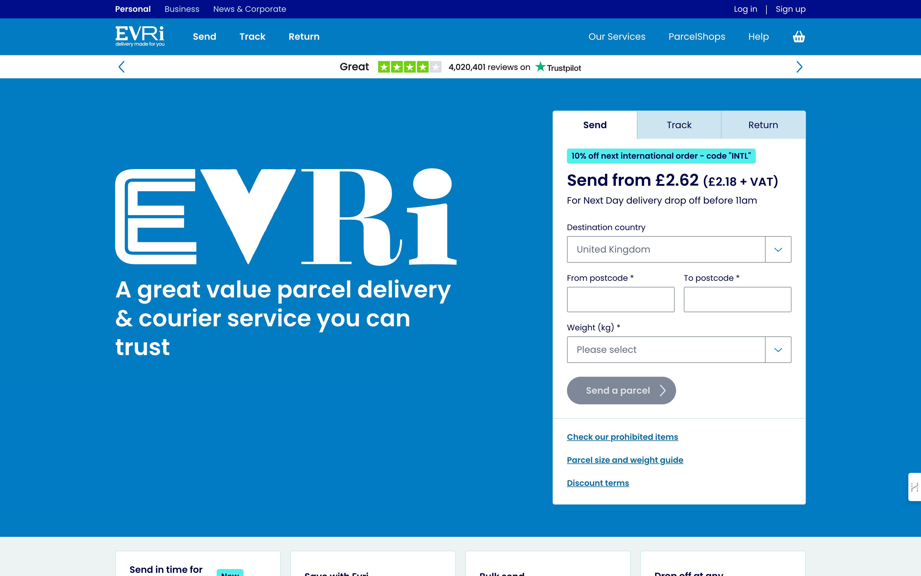
Offer low-risk conversion opportunities
If the existing conversion steps feel like a big commitment to your audience, consider introducing lower-risk conversion opportunities. These could include offering:
- a demo video
- access to case studies
- trials of your product
These graduated conversion opportunities allow visitors to experience your product/service before fully committing. They enable collecting lead information and building engagement.
At Prismic, our audience has high intent so we don't use gated content, which is content that can only be accessed in exchange for filling out a form, or providing personal information. But for businesses with colder traffic, multi-step conversions may be worthwhile. Test offering low-barrier value exchanges tailored to your audience.
Overall, visitors gain trust through low-risk interactions. And each conversion still moves them closer to becoming customers.
🎓 Tips to achieve this in a Prismic-powered website
Create a new page type to promote gated content (white-paper, case study, video), you may create new slice designs that help communicate the value users will get from the content.
As in any other page, use the opportunity to build a narrative using slices from your library.
Use slice variations to experiment with style and layout variations and determine which variations convert the most.
Build credibility and brand trust
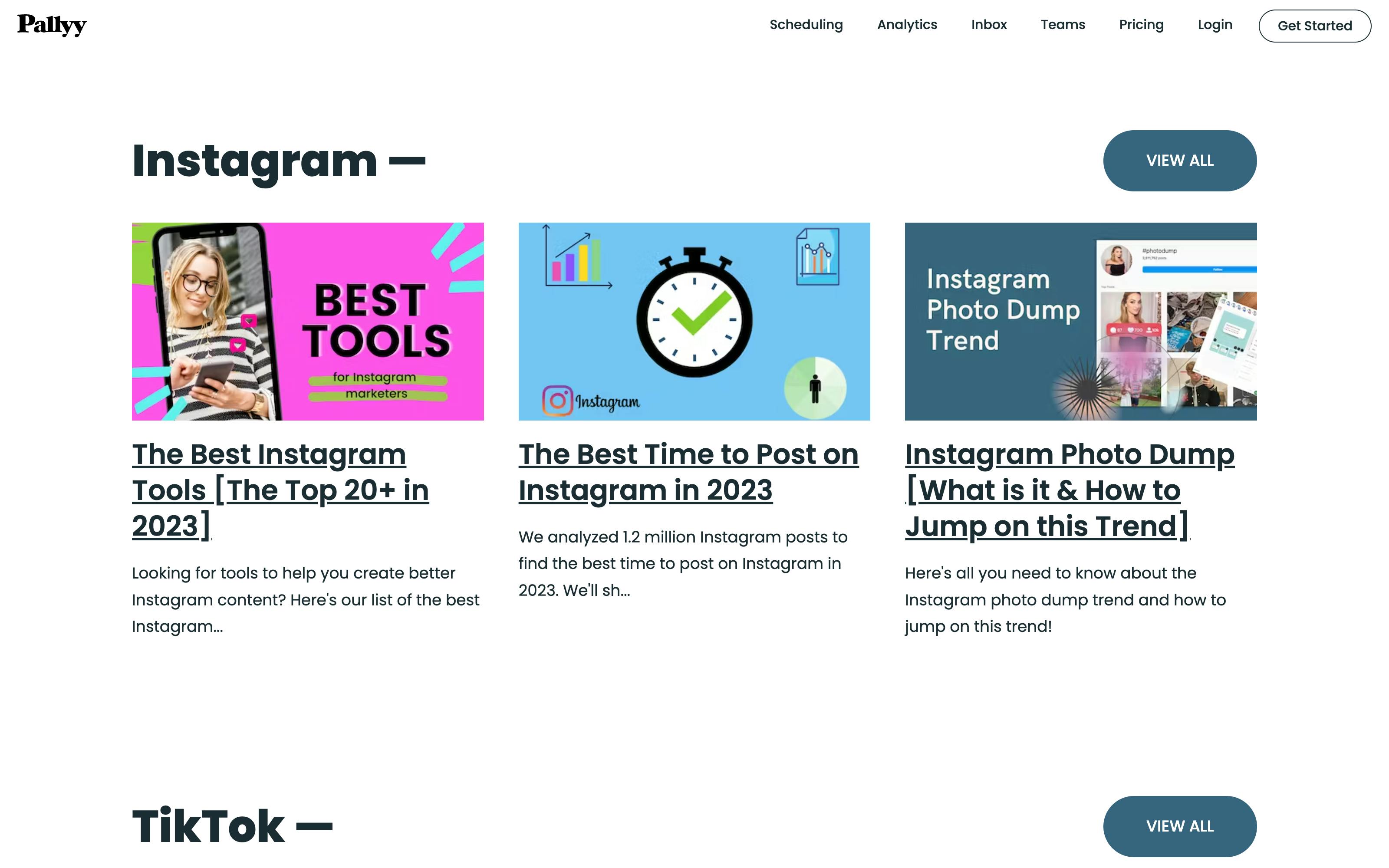
Lack of trust is a major barrier to conversion. Reinforce credibility by highlighting customer validation. Feature testimonials, case studies, and reviews directly on your site. Curate press mentions awards, and certifications. Publish relevant surveys or research results. Social proof from real users is very persuasive. Back up claims with specific examples and metrics.
We showcase customer websites built with Prismic. Prospects relate to these brands and can see the real-world results.
Showcasing diverse credibility signals helps visitors see you are an authority they can trust. This can drive higher conversion rates by easing doubt. It’s helpful to focus on authentic third-party proof points versus self-promotion. Tell the story, don’t just list it; update it frequently to keep the content fresh.
🎓 Tips to achieve this in a Prismic-powered website
Create a “page type” for “case studies”.
Create specific slices for these pages (a carousel of customer verbatim, a component highlighting customer success KPIs).
Re-use the CTA slices that you’ve already implemented on your project, and make those CTA templates available to content editors on these new “trust-building” page types.
Again, use slice variations to experiment with the style of CTAs and figure out the variation that converts the most. Check out our playbook on creating case studies for more tips.
Understand visitor needs and motivations
Understanding your audience is important to creating high-converting experiences. This allows you to map their needs, goals, and hesitations. Looking at visitor demographics and conducting user research helps create more accurate buyer persona profiles to better serve their needs. This way, you can tailor messaging and designs to resonate with these insights.
Here’s an example:
- Say your main conversion point is for users to sign up for your mental health app. You could evoke feelings of reassurance, empowerment, optimism, and inclusivity to align with these needs and increase the conversion rate.
On each page, use empathetic language and visuals. Guide visitors to imagine how you can help them reach their aspirations and relieve their pains because crafting experiences aligned to motivations makes conversion feel more natural. This also allows you to reduce hesitations by showing how you understand and can help them succeed.
Tips to achieve this in a Prismic powered website
Empathy can be built with tone of voice, but also with visual storytelling. You can implement human-centered editorial slices allowing you to build rich copies.
Analyze Site Traffic and Funnels
At Prismic, our pricing page is the second most viewed page on our website. Pricing and product pages tend to have higher traffic. Knowing this, we use analytics to understand how visitors navigate these pages and our site at large, to reveal optimization opportunities to increase conversions.
Here are a few pointers based on our experience.
- Start by identifying your most popular landing pages. Review the content, design, and layout. What stands out as working well or needing improvement?
- Next, look at pages with high exit rates. Determine what causes visitors to leave and how you can improve engagement.
- Finally, analyze visitor behavior paths from the entry page to conversion. Where are they dropping off? These are pain points to address.
Continual analysis, research, and testing will uncover improvement opportunities. Optimize top pages and critical funnels to smooth the path for visitors to convert.
A/B test messaging and visuals
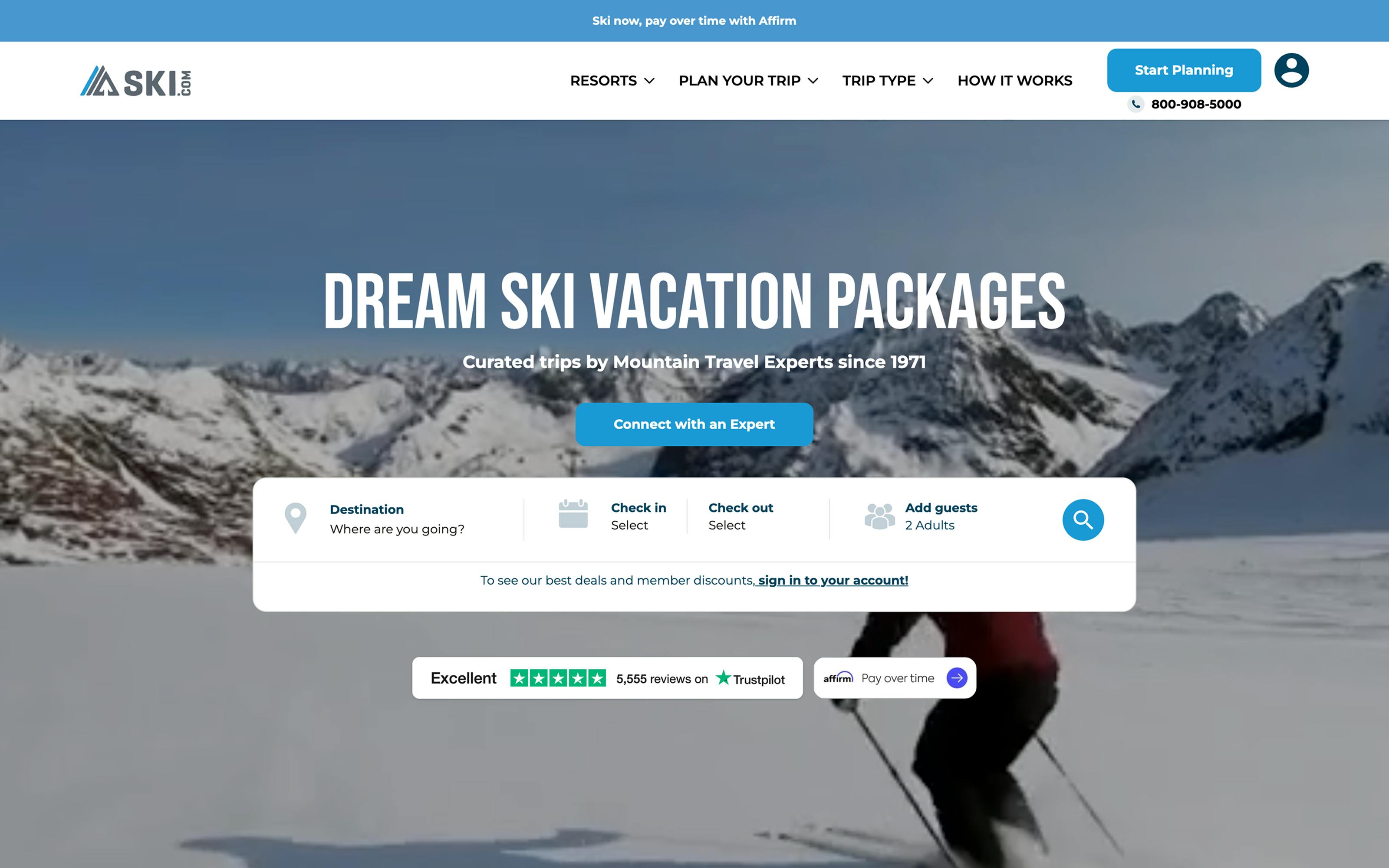
Experiment with different messages or visuals, especially in the hero section, to see which resonates better with your audience. Based on your hypothesis, you should emphasize different emotional aspects to improve conversions.
For example, you may test:
- Highlighting convenience vs. cost savings
- Lead with emotional appeal vs. product features
- Using expert photos vs. user photos
- Long-form sales letter vs. short value statements
Remember, it's important to align your strategies with your specific goals, resources, and understanding of your audience's needs. A data-driven and empathetic approach to testing messaging can lead to significant improvements in both CTR and conversion rates. Prismic's content platform enables continuous testing and optimizing your site.
Get help improving conversions
Implementing an effective conversion optimization strategy takes the right tools and support. If you need help, we can connect you with certified designers and developers to help implement our tips or iterate on your Prismic site. They can help you:
- Audit your current platform and content workflows
- Map out an optimization roadmap
- Implement Prismic and integrate your tech stack
- Help implement tracking
- Train your team and transfer knowledge
3 ways to get started
📣 Tell us about your project, and we'll provide assistance.
🤝 Join our community forum to connect with our members, find solutions, and get feedback.
💯🚀🎯 See for yourself how Prismic can help drive results. Contact our team to request a demo and discuss your goals. We're excited to explore how we can partner to build an optimized, converting website.
This article was written as a collaboration between Lea Thomas, Nathanael Lamelliere (Revenue), and Adriana Suarez (Customer Success Manager).


