
A Next.js starter is a fantastic solution if you want to boost your productivity and move forward confidently with your future projects.
In our previous article, we explored what starters are, what types are available, and how to know if you need to build a custom one.
To quickly recap, a starter project is a pre-made, foundational code base for building applications. Using one allows you to save time on your future projects by reducing the number of repeatable actions it takes to spin one up.
In our previous article, we identified two types of starters that you can use:
- Technology-oriented - A project that is shipped without any UI elements and focuses on configuring tools and libraries so you can build on top of it quickly and easily.
- Use-case-oriented - These starters have a feature-rich setup with the customizable components and elements you need to deliver outstanding projects for a specific use case, like a marketing or e-commerce website.
While you can use third-party starters that others have created, they aren’t always the right fit for your work. In this article, we will go through the steps of building a custom Next.js starter project. We’ll start with a technology-oriented starter, and then build a use-case-oriented one on top of it. This way, we will cover some ideas that were mentioned in our previous article:
- Why is it handy to have a starter?
- Which type of starter do you need?
- How do you identify what to include in your starter to make it as reusable as possible?
Choosing our tech stack
First, let's figure out what technologies we want to use for our starter.
For that, we need to identify the tools we feel confident with, understand well, and use on most of our projects.
Let's step back and think about the values we should keep in mind when thinking about creating a quality starter:
- Reusability - the primary purpose of the starter project is to have a foundation for multiple projects that your favorite stack can support. It's essential to pick the bare minimum to include here so that you don’t block the reusability.
- Flexibility - A starter project should not limit you but rather boost your productivity. A starter that’s not flexible enough will leave you adjusting the code base every time you start a project, rather than diving into your work. The right level of flexibility is different for everyone. Try to focus on including only the things that you use on every single project.
For this project, here’s the stack we’re going to use, along with why I’ve chosen each element of it:
Next.js
Next.js provides a complete toolset to build fast and SEO-friendly projects. A great developer experience is not the only benefit you get with Next.js — you also get a strong community that can help you along with your work. For me, it’s very often the foundation for the websites I build, so it makes sense to include it.
Tailwind
Tailwind will give us a solid solution for styling because it offers a fast styling process and simplicity for implementing responsive design. Tailwind is a project that has been around for quite some time and is improved frequently, which is vital for excellent developer experience since it's constantly enhanced and polished.
Prismic
I’m obviously biased toward including Prismic in my project 😉 But, I think it makes sense for my starter because it is a well-documented headless website builder with excellent support for different stacks, including Next.js. We are adding Prismic as a part of the technology-oriented starter for two reasons. As a type of CMS, it allows us to get a complete setup for managing content, and it also enables us to create websites for teams with different skill sets. Both technical and non-technical teams will be able to work on improving our website once it’s implemented.
These are the technologies for our most basic, technology-oriented starter. Later on, we will extend this starter so that it’s ready to go for a marketing website use case.
Build the most performant websites
Join other developers on the leading edge of development and subscribe to get monthly insights on creating websites that are performant and deliver maximum business value.

Building a technology-oriented starter with Next.js, Tailwind, and Prismic
With Next.js, we get a solid framework with all the tooling to create top-performing and SEO-friendly applications.
Setting up Next.js
To start creating our starter project, we need to create a Next.js project.
This can be achieved by running the following command in your terminal:
npx create-next-app@latestAfter hitting enter, we will be guided through the multi-step wizard to get a bootstrapped project with all of our preferences.
✔ What is your project named? … my-starter
✔ Would you like to use TypeScript with this project? … No
✔ Would you like to use ESLint with this project? … Yes
✔ Would you like to use `src/` directory with this project? … No
Creating a new Next.js app in /Users/yourawesomeusername/Documents/my-starter.
Let's review what we got after completing the CLI flow. First, we gave our project a name. In the next step, we needed to decide whether to go with Typescript or use the default JavaScript option. We went with JavaScript. Then we decided that we wanted to use ESLint as our linting solution. And finally, we decided to stick with the src directory approach.
Now we are ready to proceed to the next step!
Adding Tailwind
In general, Tailwind is a powerful and flexible tool that you can trust in production. It also allows us to write more consistent and maintainable code. With the help of their fantastic documentation, we will also speed up the development process. So let’s dive into adding it to our starter!
To do that, we need to open our terminal for our new Next app’s directory and type:
npm install -D tailwindcss postcss autoprefixer
npx tailwindcss init -p
These two commands do the following:
- Install the
tailwindpackage and its peer dependencies via npm - Create
tailwind.config.jsandpostcss.config.jsfiles in the root of your project
Once you are done with that, we can work with tailwind.config.js so it will know where we plan to use Tailwind in our app. In simple words, we need to tell Tailwind, "Hey, I plan to use Tailwind-specific classes in these folders for these types of files.”
To be more specific on what we want to do, we need to add paths to our template files.
// tailwind.config.js

module.exports = {
//by adding paths to this part of the config file, we're letting Tailwind know that we'll use its classes in each of these places
  content: [
    "./pages/**/*.{js,ts,jsx,tsx}",
    "./components/**/*.{js,ts,jsx,tsx}",
		"./slices/**/*.{js,ts,jsx,tsx}",
  ],
  theme: {
    extend: {},
  },
  plugins: [],
}
Finally, all we need to do is add Tailwind directives to our CSS. We can do this in the file where we store our global styles.
Using the default globals.css file you already have in your starter is a good idea for a cleaner solution since it doesn't break the recommended project's base architecture from the Next.js CLI. Additionally, we don't need to verify that we’ve attached our global styles.
/* /src/styles/globals.css */

@tailwind base;
@tailwind components;
@tailwind utilities;
Once we are done with that, we can add Prismic as our final puzzle piece!
Adding Prismic
Prismic is a headless, API-first website builder that will allow us to design a custom workflow for creating new pages and connect the page content to a fully custom front-end made with Next.js. We’ll be able to create custom sets of content fields to use as building blocks in Prismic’s page builder interface. Prismic calls these building blocks Slices, and they will become reusable components in our Page Builder interface.
Let's get an overview of the Prismic setup steps we’ll save ourselves for future projects:
- We’ll initialize Slice Machine. This is a developer tool that’s going to help us configure our components to get data from Prismic’s API, configure our content fields for the Page Builder, and more.
- We’ll add all of the code required to make Prismic’s handy helpers available in our project — as with every tool we have in our setup, we need to add code that enables Prismic in all the right places.
To add Prismic, we need to navigate back to our terminal and type:
npx @slicemachine/init@latestThis command does a bunch of cool tricks for us. Here are some that show the general trend of what’s happening under the hood:
- Creates a new Prismic project.
- Adds a Slice Machine script to
package.json. - Creates a
sm.jsonconfiguration file. - Detects that we are using Next.js and installs the necessary dependencies.
Later on, we’ll initialize Slice Machine to see what this developer tool is all about. For now, let's create a prismicio.js file at the root of our project and add the following code there:
// prismicio.js

import * as prismic from '@prismicio/client'
import * as prismicNext from '@prismicio/next'
import sm from './sm.json'

/**
 * The project's Prismic repository name.
 */
export const repositoryName = prismic.getRepositoryName(sm.apiEndpoint)

// Update the routes array to match your project's route structure
/** @type {prismic.ClientConfig['routes']} **/
const routes = [
  {
    type: 'homepage',
    path: '/',
  },
  {
    type: 'page',
    path: '/:uid',
  },
]

/**
 * Creates a Prismic client for the project's repository. The client is used to
 * query content from the Prismic API.
 *
 * @param config {prismicNext.CreateClientConfig} - Configuration for the Prismic client.
 */
export const createClient = (config = {}) => {
  const client = prismic.createClient(sm.apiEndpoint, {
    routes,
    ...config,
  })

  prismicNext.enableAutoPreviews({
    client,
    previewData: config.previewData,
    req: config.req,
  })

  return client
}
Right after that, we can use the PrismicProvider and PrismicPreview components in src/pages/_app.js to wrap our entire app. Here’s what each component does:
PrismicProviderallows us to use key utilities to make Prismic work in your project.PrismicPreviewenables previews for our application (once you’ve completed some additional setup steps).
// src/pages/_app.js

import Link from 'next/link'
import { PrismicProvider } from '@prismicio/react'
import { PrismicPreview } from '@prismicio/next'
import { repositoryName } from '../../prismicio'

import '../styles/globals.css'

export default function App({ Component, pageProps }) {
  return (
    <PrismicProvider internalLinkComponent={(props) => <Link {...props} />}>
      <PrismicPreview repositoryName={repositoryName}>
        <Component {...pageProps} />
      </PrismicPreview>
    </PrismicProvider>
  )
}
We are almost there!
There are only two things left to do, and both of them help us set up Slice Simulator. Slice Simulator is a mini-app that allows you to locally preview the components you create without switching back and forth to Prismic’s Page Builder to create data for your preview. Instead it provides mock data to populate your components locally. First, we’ll create a Slice Simulator page. Then we’ll specify a Slice simulator URL.
To create a Slice Simulator page, let's create a file called slice-simulator.jsx inside the pages directory. Inside, paste this code:
// /pages/slice-simulator.jsx

import { SliceSimulator } from "@prismicio/slice-simulator-react";
import { SliceZone } from "@prismicio/react";

import { components } from "../slices";

const SliceSimulatorPage = () => (
  <SliceSimulator
    sliceZone={({ slices }) => (
      <SliceZone slices={slices} components={components} />
    )}
    state={{}}
  />
);

export default SliceSimulatorPage;
And finally, in sm.json at the root of our project, let's add a property for the Slice Simulator URL:
"localSliceSimulatorURL": "<http://localhost:3000/slice-simulator>",Our custom, technology-oriented starter
Phew! We did a lot! And now it's time to celebrate because we have our own technology-oriented starter! Let's do a quick recap of what we did and what we have at this point.
We identified the tools we wanted to use for our starter. We went with Next.js, TailwindCSS, and Prismic (great choice, my friend). After identifying the tools, we did some cooking, and as a final result, we have our own custom Next.js starter! This project can be used as a solid foundation for any of our future projects.
If that’s all you needed, you can jump down to publishing your starter to GitHub so that it’s ready to use on your next project.
Ready for more? Let's use this starter to build a more specific use-case starter on top of it! How cool is that?
Building a starter for marketing websites with Next.js
Let's imagine that we are working at an agency to set the right mood for our use case starter.
We build a lot of marketing websites and often do re-branding projects for companies to take their digital growth to the next level. We already have a good technological base to build from, so now it’s just about adding on the layers of UI elements that are common across these projects. Since we’re building these sites for marketing teams that want some independence, we can think about which building blocks we need to give them in their Page Builder interface.
Let’s identify what we might need in Prismic’s universe.
First, we need templates, which Prismic calls Custom Types**,** to create top-level elements that provide a structure to hold our building blocks. One example would be a “page” Custom Type.
Then, we’ll add our components, a.k.a. Slices, as the building blocks for the body of our pages**.** Each of our Slices will have custom fields that we can define so that our marketers can put all of the right information into every Slice.
Planning our reusable components
First, let's start with Custom Types. There are two categories for custom types:
- Single types for when you need only one instance for your content, such as a really unique and complex homepage.
- Repeatable types for when you’ll reuse the same template many times, like many marketing pages or articles.
For this project, we will need two Custom Types:
- Settings - a Custom Type where we can group things like menu structure, social links, contacts, etc.
- Page - a repeatable Custom Type that we can use to create pages dynamically
Then we’ll need some Slices. For this starter, we’ll think about the Page Builder components that are common across all of the marketing websites that we work on. Let's see those:
- Hero - we need to have this Slice as an intro to pages
- CTA - calls to action are pretty common, right?
- Features - a list of services is something that you can definitely reuse
- Cover - a handy element with an image in the background and text over it
- Image grid - adding this Slice will allow us to show off products and more with first-rate visuals
- Pricing table - feels reusable, right?
Now that we identified the list of elements that might be included in the starter, it's time to start building again!
Configure Prismic
You might think, "Okay, now I have to install and configure Prismic." You don't have to! Because we did that as a part of our technology-oriented starter, you can use Slice Machine straight away to start configuring Prismic and your reusable components!
Configure Tailwind
Let’s add a theme and configure Tailwind for our starter.
The theme is a file where you define the important properties for your project’s design, like:
- Color palette
- breakpoints for responsive design
- fonts
- border-radius values
In order to create a complete use-case-oriented starter, we will implement the following theme to have a complete design look and feel but keep it flexible and editable at the same time. In tailwind.config.js add the code for the theme section to your file.
// tailwind.config.js

module.exports = {
  content: [       // Part which we defined during the configuration process
    "./pages/**/*.{js,ts,jsx,tsx}",
    "./components/**/*.{js,ts,jsx,tsx}",
    "./slices/**/*.{js,ts,jsx,tsx}",
  ],
  theme: { // object for the theme
    container: {
      center: true,
      padding: {
        DEFAULT: "1.5rem",
        sm: "2.5rem",
      },
    },
    fontFamily: {
      headings: "MuseoModerno, sans-serif",
      copy: "Roboto, sans-serif",
    },
    fontSize: {
      xs: ["0.75rem", "1.3333333333"],
      sm: ["0.875rem", "1.7142857143"],
      base: ["1rem", "1.5"],
      lg: ["1.125rem", "1.3333333333"],
      xl: ["1.25rem", "1.6"],
      "2xl": ["1.5rem", "1.3333333333"],
      "3xl": ["1.875rem", "1.3333333333"],
      "4xl": ["2.25rem", "1.3333333333"],
      "5xl": ["3rem", "1.1666666667"],
      "6xl": ["3.75rem", "1.0666666667"],
      "7xl": ["4.5rem", "1.1111111111"],
      "8xl": ["6rem", "1.0833333333"],
      "9xl": ["8rem", "1.0625"],
    },
    extend: {
      colors: {
        primary: {
          background: "var(--bg-primary)",
          text: "var(--text-primary)",
          brand: {
            DEFAULT: "var(--brand-primary)",
            light: "var(--brand-primary-light)",
          },
        },
        secondary: {
          background: "var(--bg-secondary)",
        },
      },
    },
  },
  plugins: [],
};
Creating Custom Types
Settings Custom Type
Now that we have everything in place, let's create the Custom Types we mentioned earlier to see that process in action. Let's go with the Settings Custom Type first.
To get started, we need to run Prismic’s developer tool, Slice Machine (if you didn’t already), so in your terminal run:
npm run slicemachineOpen Slice Machine on http://localhost:9999/ and click the "Create one" button near the center of the page to start.
You will see a modal window where you can specify if the Custom Type should be repeatable or for only a single use. For our settings, we should pick the single option because we will need to make it only once to group the following elements:
- Menu
- Contact
- Social links
Name your Custom Type, “Settings,” and its ID will be automatically generated for you; then click “Create.” Now it’s time to configure the data we want people to be able to add to our Custom Type in the Page Builder interface.
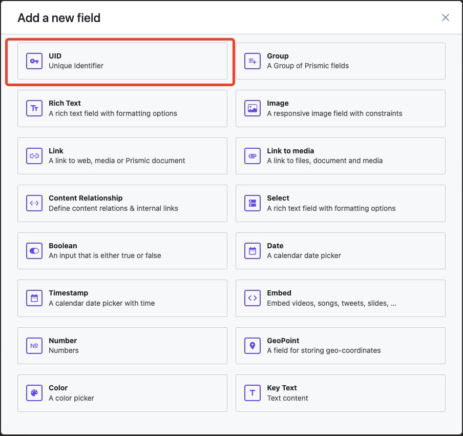
To do that, click the “Add a new field” button under the “Static Zone” heading.
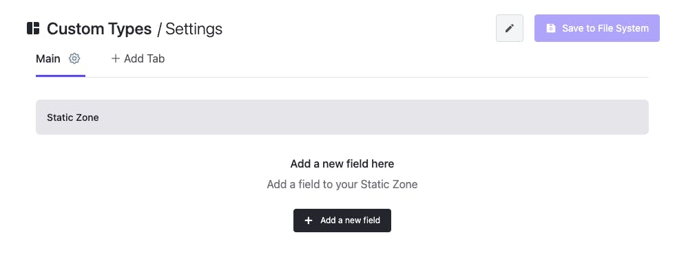
The first fields we’ll add are for the Menu. From the dialog box, select the “Group” field type, name it “Menu,” and then select “Add” to update your data model. This type of field means that any fields you add to the group in Slice Machine will be repeatable for content editors in the Page Builder. So, next, you’ll add fields for links and menu labels to this group, and in the Page Builder, content editors will be able to add as many items to the menu as needed.
To add more fields to the Menu, you’ll use the “Add Field” Option that’s now available on your new Menu element. For your Menu, you’ll add a Link field that’s named, “Link,” and a Key Text field that’s named “Label.”
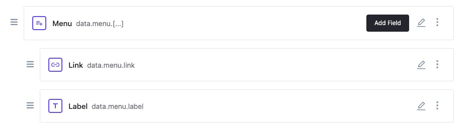
You’ll repeat a similar process for the contact and social links elements. For the contact element, you can use a rich text field. And for the social links element, you can repeat the same process that you did for Menu, but this time naming the Group “Social Links.”
Finally, your Custom Type should look this way.
Now, click the “Save to File System” button in the top right corner to make sure your changes are ready for you to move on.
Page Custom Type
The Page Custom Type will require less work! Head over to the Custom Types tab on the left-hand menu to add another Custom Type, using the “+ Create a Custom Type” button on that page.
This time, you’ll create a repeatable type named, you guessed it, “Page.”
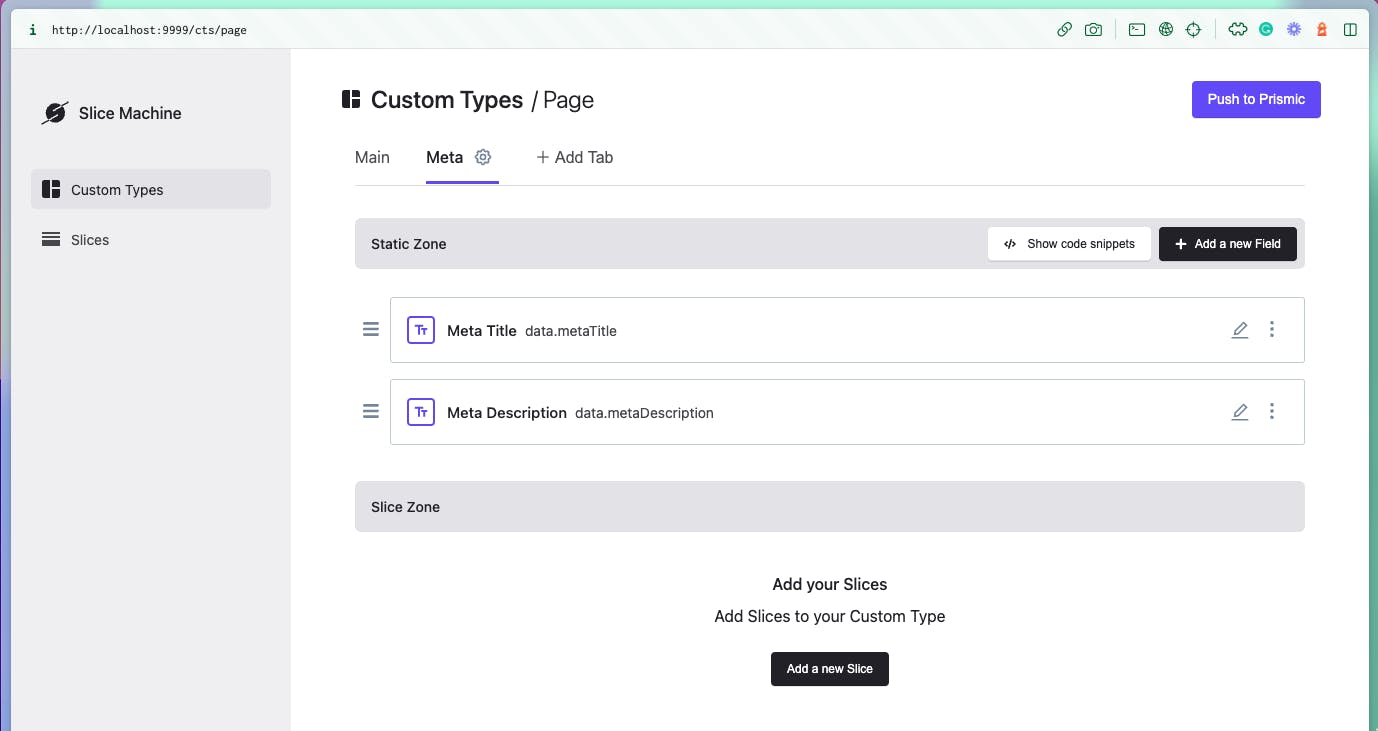
We don't need anything complex for the Page Custom Type in the Static Zone, and we only need to specify the uid for routing purposes. This way each page will be associated with a route based on the uid value. The uid is a special field you can find when creating a new Custom Type, and you can also simply give it the name “uid.”
Next, we need to add a metadata tab for our Pages. To do that, press the "+ Add tab" button and name your tab "Meta." Here we need just two items in the static zone:
- Meta title - a rich text field that will allow content teams to control the title that’s visible to search engines, etc.
- Meta description - another rich text field that will allow content teams to control the descriptive text that’s visible to search engines.
For specific projects, you could customize this tab even further with fields for OG images, and more. For now, the fields above are all we’ll need, so go ahead and save this Custom Type to the file system, as well.
As you can see, there’s also another zone in addition to the Static Zone — the Slice Zone. Once we’ve created some Slices, we can come back to our Custom Type and add Slices to this zone that content editors will be able to use (and reuse) to create your gorgeous-looking pages in the Page Builder!
And we are done with Custom Types for now!
How cool is that? Our fabulous-looking starter is coming together!
Creating Slices
We are ready to proceed with creating our Slices.
As we mentioned earlier, we need a few of Slices for our starter:
- Contact form - important to keep in touch with your audience
- Cover - a handy element with an image in the background and text over it
- CTA - calls to action are pretty common, right?
- Features - list of services is something that you can definitely reuse
- Hero - we need to have that slice as an intro to pages
- Image grid - adding this slice will allow us to have a stunning image grid
- Pricing table - feels reusable, right?
Let’s go through the build process of the Hero Slice to see how it works. From there, you’ll be set to create all of the Slices you need for this starter and beyond!
At the end, we will have a Slice that we can use as an intro for our pages.

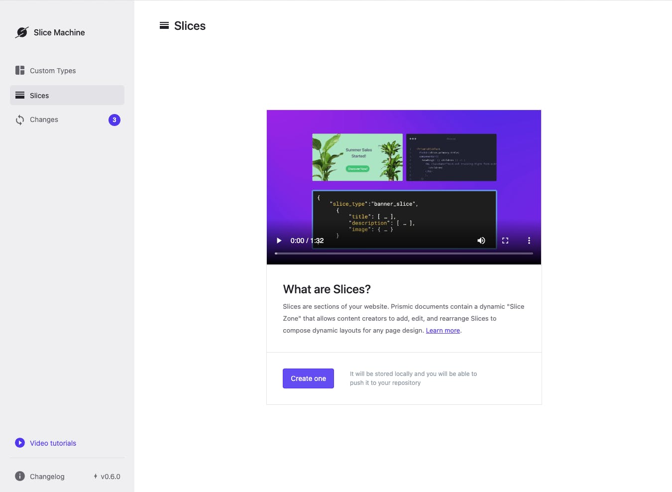
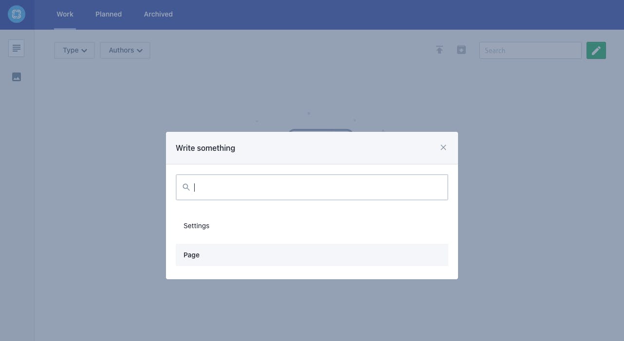
First, navigate to the Slices tab. There you will see a modal window with an intro video similar to the one you saw when creating Custom Types.
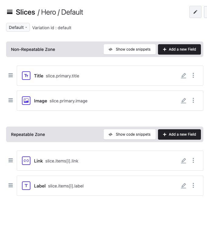
After pressing the “Create one” button, let’s model the fields our Slice. In order to create the “Hero” Slice, we need the following structure:
In the Non-Repeatable Zone:
- “Title” - A rich text field
- “Image” - An image field
In the Repeatable Zone:
- “Link” - A link field
- “Label” - A key text field
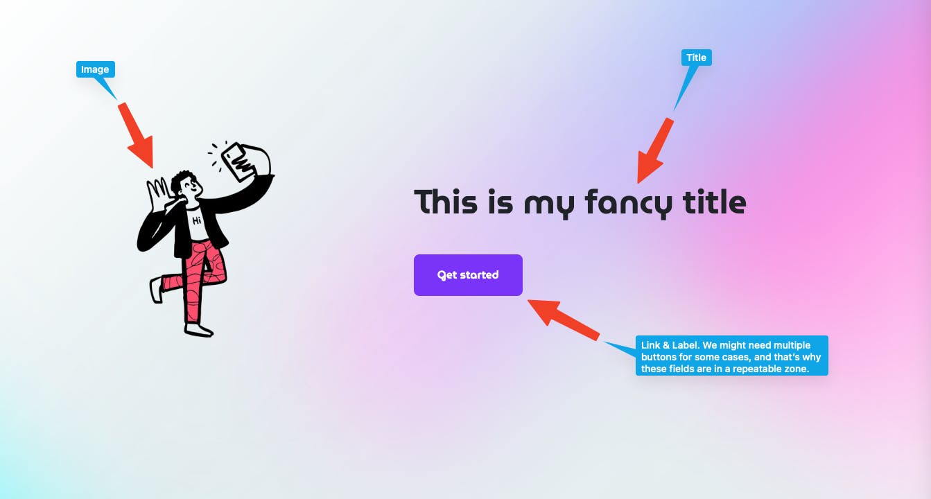
After adding all of the necessary fields, our Slice’s structure should look like this:
After saving our Slice to the filesystem, let’s head back to our “Page” Custom Type. Now, in the Slice Zone, we can select, “Add a new Slice.” There’s our Hero Slice! Select it and add it to the Custom Type. Save the changes to the file system. Now, anyone building a page can use our Hero Slice as a building block on as many pages as they want.
To finish configuring the data and our Page Builder, all we need to do is go to the “Changes” tab and click the “Push All Changes” button. Now, when anyone logs into our Prismic repository, they’ll be able to create pages with our Custom Type and Slice.
Now, to see some of the other magic that Slice Machine helped us with, we can navigate to the code editor and see that folder for our brand-new Slice was created in the slices/Hero folder with templated code. In the slices/Hero/index.js file, we see:
// slices/Hero/index.js

import React from 'react'
import { PrismicRichText } from '@prismicio/react'

/**
 * @typedef {import("@prismicio/client").Content.HeroSlice} HeroSlice
 * @typedef {import("@prismicio/react").SliceComponentProps<HeroSlice>} HeroProps
 * @param { HeroProps }
 */
const Hero = ({ slice }) => (
  <section>
    <span className="title">
      {
        slice.primary.title ?
        <PrismicRichText field={slice.primary.title}/>
        : <h2>Template slice, update me!</h2>
      }
    </span>
    {
      slice.primary.description ?
      <PrismicRichText field={slice.primary.description}/>
      : <p>start by editing this slice from inside Slice Machine!</p>
    }
    <style jsx>{`
        section {
          max-width: 600px;
          margin: 4em auto;
          text-align: center;
        }
        .title {
          color: #8592e0;
        }
    `}</style>
  </section>
)

export default Hero
Since we use Tailwind for our starter, we’ll add some classes in slices/Hero/index.js that we’d commonly use for the hero element of the page so that this component is ready for future projects:
// slices/Hero/index.js

import * as prismicH from "@prismicio/helpers";
import { PrismicText, PrismicLink } from "@prismicio/react";
import Image from "next/image";
import clsx from "clsx";

const Hero = ({ slice }) => (
  <section className="hero-slice container flex items-center justify-center flex-col py-36 md:py-56 lg:py-72 xl:py-80 md:flex-row md:justify-around">
    {prismicH.isFilled.image(slice.primary.image) && (
      <div
        className={clsx(
          "w-2/4 md:w-3/12 flex-grow-0",
          slice.variation === "left" && "md:order-2"
        )}
      >
        <Image
          src={slice.primary.image.url}
          width={slice.primary.image.dimensions.width}
          height={slice.primary.image.dimensions.height}
          alt={slice.primary.image.alt}
        />
      </div>
    )}
    <div
      className={clsx(
        "text-center",
        slice.primary.image.url && "mt-8 md:w-6/12 md:mt-0 md:text-left"
      )}
    >
      <h1 className="text-3xl font-headings max-w-xl lg:text-5xl">
        <PrismicText field={slice.primary.title} />
      </h1>

      {prismicH.isFilled.group(slice.items) && (
        <nav className="mt-10 -m-2">
          {slice.items.map((item) => (
            <PrismicLink
              field={item.link}
              key={item.label}
              className="button m-2"
            >
              {item.label}
            </PrismicLink>
          ))}
        </nav>
      )}
    </div>
  </section>
);

export default Hero;
Rinse and repeat
In a similar fashion, we can create all of the Slices that we need in order to have all of the building blocks to complete our starter. Now it’s your turn to try your hand at modeling the fields and adding Tailwind classes the rest of our basic Slices!
What we finally have
And there we have it! Two excellent starters built using Next.js, Tailwind, and Prismic!
Now, you can see the full power behind starters and how you can improve productivity by saving set-up steps for future projects. In the end, it’s a matter of knowing how much set-up you can include in your starter while keeping the code base flexible enough for many applications.
⭐ Bonus: If you want to make your starter even more efficient for the future, head over to our documentation to fully configure Previews as part of your starter.
Publishing templates on GitHub
Now, once we’ve created a starter, whether we were happy with just the technology-oriented one, or we want to use the full use-case-oriented Next.js starter, we can move it to GitHub.
To do that, we can follow the commands that GitHub supplies us with:
git remote add origin git@github.com:yourUserName/my-awesome-starter.git
git branch -M main
git push -u origin main
But we need to make one minor modification to make our repository fancy and polished! If we navigate to our repository’s settings, we can see a checkbox with the title "Template repository," which will ensure that newly generated repositories have the same directory structure and files!
After doing that, you will notice the pill element with the text "Public template" or "Private template," which will confirm that your changes were applied.
Template repositories allow you to generate repositories with the same directory structure, branches, and files. No additional actions are required when using a template repository; it simplifies the process and improves your productivity when using your starter on your next project.
Make your development work even more productive!


Final Recap
Phew, that was a lot! Let's do a quick recap of what we did:
- We took a look back at what starters are and what kind of starters we can build.
- We picked the stack for our custom Next.js starters and identified the tools we wanted to work with.
- We started by creating a technology-oriented starter.
- Then, we used that starter to create a use-case-oriented one on top of it for a marketing website made with Next.js.
- And finally, we moved our starters to GitHub and modified our repositories to be template repos.
Now with that knowledge, you are fully ready to create more amazing starters for your needs! You can also check out the Next.js starters that the Prismic team made to help you succeed faster!


