

The landscape of website design keeps changing and evolving, and with that comes a need to have a cohesive and consistent website and an overall good user-friendly experience. The need for websites with a good user experience cannot be over-emphasized in this day and age.
Imagine a website where different pages have different font sizes and font styles. The color combinations don’t complement each other (or worse, conflict with each other) and aren’t consistent with the company’s brand. These and many others are reasons enough to prevent users from spending time on your website. One good reason for such a scenario is when multiple developers work on the website and don’t share a particular brand style guide. This affects both the front and backend devs.
For this reason, one concept has emerged as a guiding light for designers and developers: design systems. Web Design Systems are a powerful toolset that empowers designers and developers to create beautiful, consistent, and efficient websites. It is a set of standards to manage design at scale by reducing redundancy while creating consistency across different pages and channels.
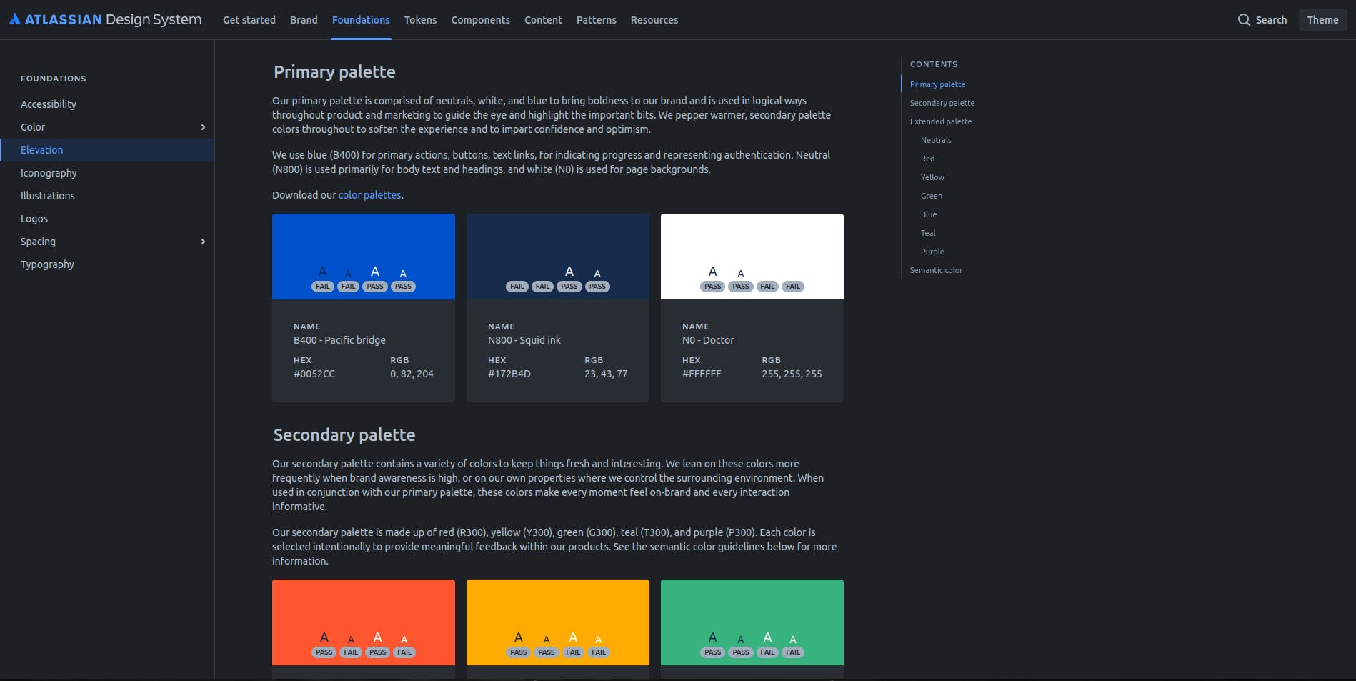
Color palettes from Atlassian Design System
In this article, we will be looking at what design systems are, their purpose, and then how to leverage them in our projects. We will also be looking at some design system inspirations from popular companies.
What is a Design System?
Design Systems are a collection of reusable components, patterns, and guidelines that serve as the foundation for designing and building websites. It encompasses not only visual elements but also the underlying principles and rules governing their use.
Its toolbox is filled with pre-built components, a style guide outlining visual elements, and a set of design principles explaining the reasons behind creating user-centered interfaces. That's essentially a design system. It's a single source of truth for everything that makes up your website's look and feel.
Design System elements:
Component Library
A component library is a collection of reusable UI elements that form the building blocks of a website or application. People often associate design systems with component libraries. A component library is a collection of reusable UI components that meet a specific UI need. It is a part of what makes up the whole Design System and includes:
- Buttons (primary, secondary, outline)
- Forms (input fields, dropdowns, radio buttons)
- Navigation bars
- Cards (product cards, blog post summaries)
- Modals (pop-up windows)
- etc.
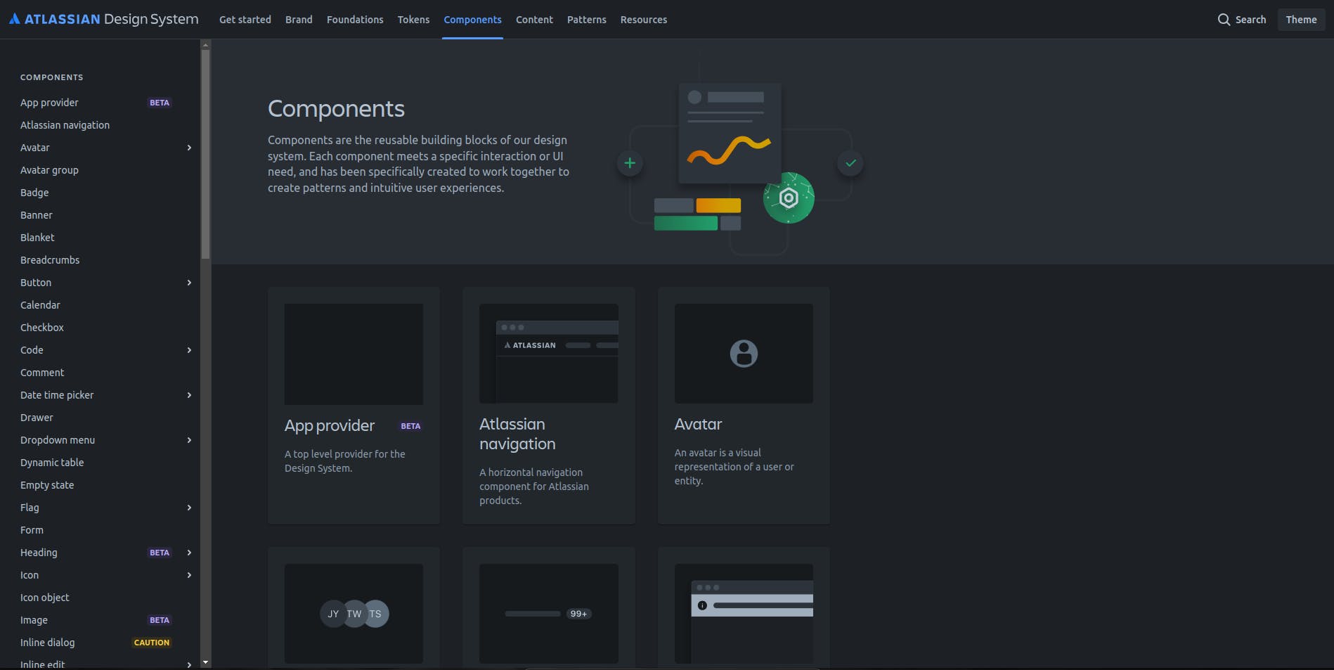
Below is an image showing Atlassian’s component library.
Pattern Library
A pattern library is a set of UI patterns or design patterns that focus on how the components are arranged to create consistent website layouts and functionalities. These patterns help maintain layout and usability consistency throughout the interface.
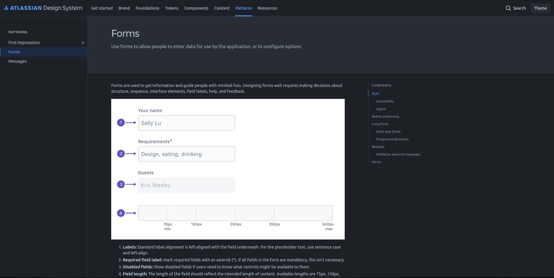
Taking the example of a website form, A form usually comprises labels, text fields, and buttons, all of which are components of the component library.
- Labels: Labels define what a particular form or text field represents.
- Text field: A text input field to input information defined by the label.
- Button: The button triggers the action of the form.
The Pattern Library would define form-specific layout guidelines, for example:
- Should form fields be aligned left or arranged in a grid?
- Should required fields be post-fixed with a red asterisk or be marked “(required)”?
- Should the primary button be centered or left-aligned? If additional action options are offered, where to put the primary button vs. standard buttons or link buttons.?
A good pattern library not only shows what the different patterns do but also provides guidelines on how to implement the pattern and the reasons or principles behind the guidelines.
Other examples of pattern libraries include:
- Hero section layouts (large banner with call to action)
- Product listing page structure
- Blog post templates
- Form layouts
Style Guide
Style Guides define the general look and feel of a brand, including color palettes, typography, spacing, and other visual elements to ensure consistent and cohesive branding or visual identity across all pages of your website. The Style Guide is like a rule book for your website’s visual identity, it defines the design elements that create a unique, consistent identity with its core principles.
Style Guides often consist of:
- Color Palette: A set of pre-defined colors used throughout the website (e.g., primary, secondary, accent colors).
- Typography: Defines the fonts used for headings, body text, buttons, and other elements.
- Spacing: Establishes consistent spacing between elements for a clean and organized layout (e.g., margin, padding).
- Imagery: Guidelines for image styles, formats, and photography usage.
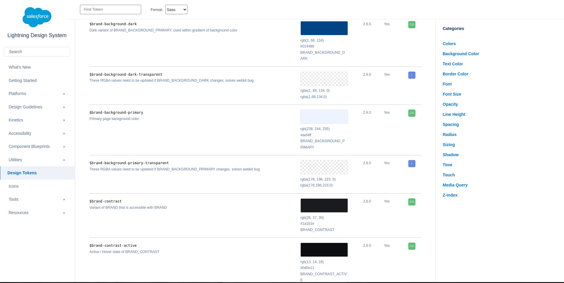
Design Tokens
Design Tokens are the single source of truth for naming design choices. Design Tokens are names used to replace hard-coded values of colors, pixel values, and so on to maintain a consistent, reusable, and scalable visual system. For instance;
- primary-text-color: is the token for the primary, dark blue color for texts in default light mode
- primary-dark-text: is the token for the primary, light blue color for texts in dark mode
The reason for this is to avoid repetitive hard coding of the same color for different pages.
Developers and designers can reference these colors with the token names anywhere they want without the overhead of checking the color code. Also, when scaling and making design changes to the overall website, developers will only have to make changes to the tokens, and it will affect every page since the tokens are referenced everywhere.
Icon Library
An icon library is a collection of reusable icons that represent concepts and actions. Icons play a crucial role in enhancing an interface's usability and visual appeal. Hence, having a consistent set of scalable vector icons is of utmost importance.
For instance, if you open up an icon library like react-icons, you will notice each collection has a unique and distinct feel.
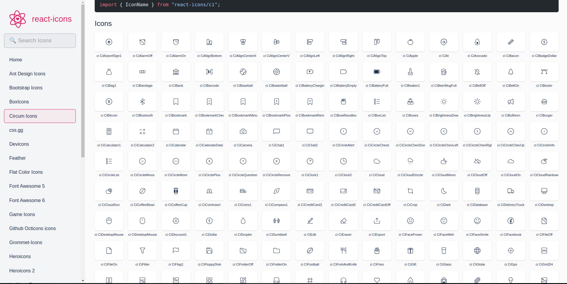
Icons can be:
- Custom-designed by your visual designers for your brand. Or,
- Sourced from icon libraries like React-icons, Font Awesome, or Material Design Icons
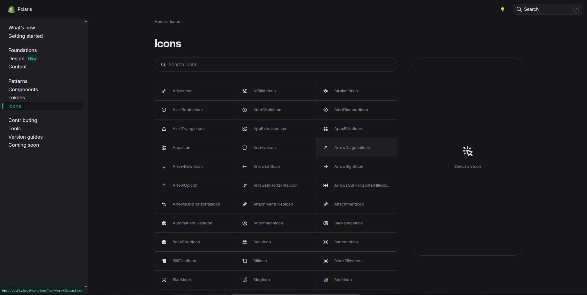
Icons from Shopify’s Design System
Other elements of a Design System might include:
- Design Principles: Guidelines for achieving user-centered and visually appealing designs.
- Code Documentation: Makes it easier for developers to implement design components.
- Content Guidelines: Guidelines for the tone of voice and vocabulary used in writing website copy, texts, error messages, and documentation.
Stay on Top of New Tools, Frameworks, and More
Research shows that we learn better by doing. Dive into a monthly tutorial with the Optimized Dev Newsletter that helps you decide which new web dev tools are worth adding to your stack.

4 Benefits of Design Systems in web design
Design Systems play a vital role in streamlining the website design and development process, as well as enhancing consistency, efficiency, and scalability. Providing a centralized repository of design assets and guidelines empowers teams to build cohesive and quality sites and apps.
Design Systems are important for the following reasons:
- Consistency: Design systems ensure a unified user experience across all website pages, regardless of who created them or how many people are working on them.
- Efficiency: Design systems save time and resources by eliminating the need to recreate design elements from scratch.
- Scalability: Design systems make it easier to maintain and update the website's design as it grows with new features and content.
- Brand Identity: Design systems ensure all elements in the website complement or adhere to the brand's visual identity.
Creating a Design System for your website
There are 2 ways to build a design system for your website design.
Approach #1: Create your Design System from scratch
This is creating a custom design system from scratch, i.e., you are implementing a design system to meet the unique needs of your website and brand. Most teams start from a few existing websites or product screens and, from these, formalize their component library UI elements, pattern libraries, styles guides, and so on while also listing the core principles behind the elements and layouts.
This approach is not only time-consuming but also expensive as it requires an (experienced) Design System team to build the component library UI elements, pattern libraries, style guides, and so on while also listing out the core principles behind the elements and layouts.
On the flip side, this approach ensures a unique and highly customized design system. This is because all decision-making and every pattern chosen is cut out specifically to match your brand identity.
Approach #2: Adopt and customize an existing Design System
Creating design systems is complex, taxing, and time-consuming. Hence, it is expensive to create one from scratch. Usually, the safest approach is to analyze existing systems to see which ones are the closest to your brand and needs.
It might be that your website has a unique layout, like:
- An e-commerce store with rich product pages.
- An extensive developer documentation website.
- A SaaS marketing website with a lot of photography.
Starting from an existing Design System with a similar Component & Pattern Library might set you up with a great start. You can adopt that design system that was built and scaled by an experienced team. Learn by mimicking their identity pattern, guidelines, decision-making, and creative solutions.
Then, you can successfully incorporate your visual identity into it. Adapt and customize it to suit the unique needs and brand of your website. Carefully select and modify elements of the component libraries, pattern libraries, style guides, and so on that suit to create your design system. In this case, you don’t want to use the whole existing system but want to keep the foundational logic and tailor the system to fit your project.
5 Best Website Design System Examples - Salesforce, Shopify, & More
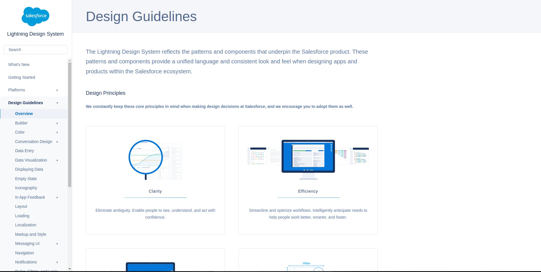
Salesforce Design System
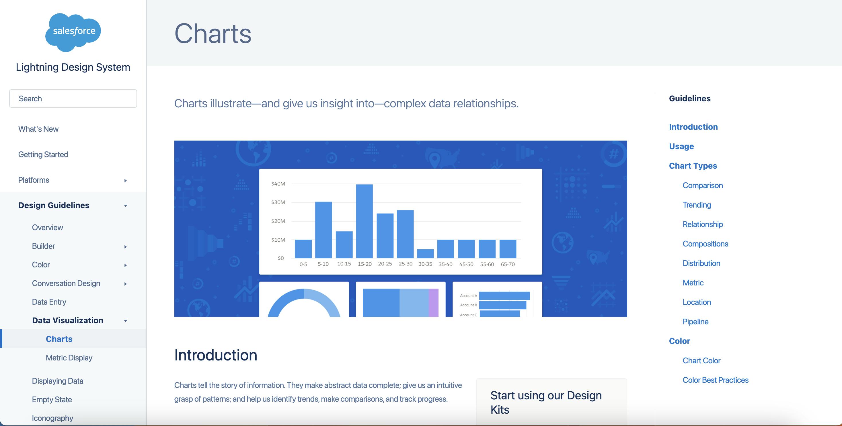
Salesforce Lightning Design System, popularly known as SLDS, is made to create CRM-like user interfaces. It’s one of the most complete and extensive out there. It can feel intimidating but it is a great source of inspiration if you need to document one feature of your website extensively because you need it to stay consistent and differentiating. For instance, you’ll find
- Guidelines for designing charts, (we especially appreciate their way of showing Dos and Don’ts!)
- Guidelines for designing a Support Bot, with language and bot personality instructions (how does the bot introduce himself, how does it apologize, etc.
- Extensive accessibility guidelines with specific rules and advice for web vs. mobile UIs, color contrasts, keyboard interactions, and focus management for keyboard users.
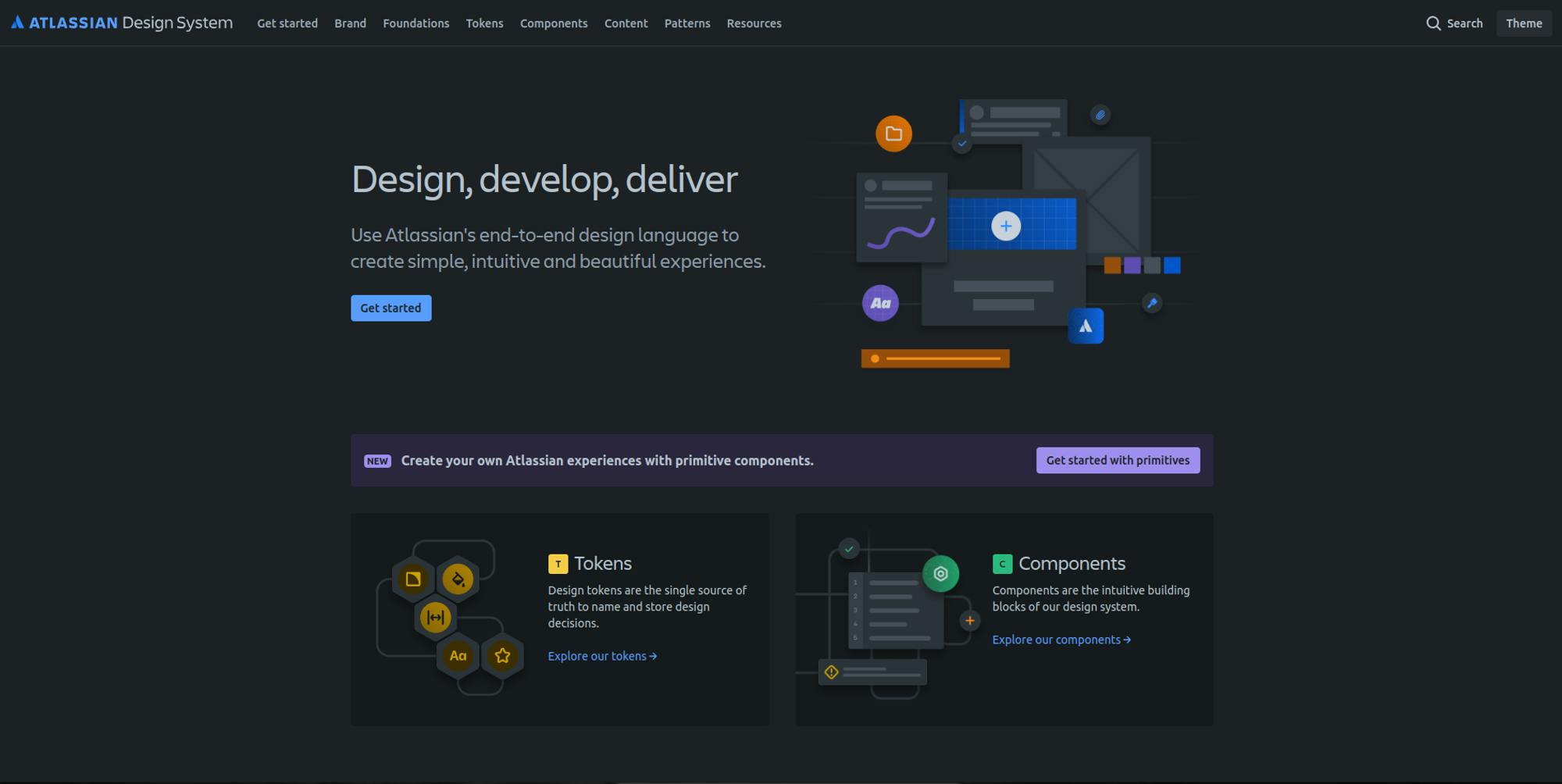
Atlassian Design System
The Atlassian Design System is renowned for its comprehensive approach to creating enterprise-level applications, focusing on teamwork and productivity tools. It excels in:
- Guidelines for designing scalable applications, which are particularly useful for maintaining consistency across large and complex platforms.
- Content design guidelines, which include voice and tone, grammar, and inclusive language, making it a prime example for those needing detailed content strategy instructions.
- Extensive component library with detailed usage examples, code snippets, and interactive demos, ideal for developers seeking ready-to-implement solutions that ensure UI consistency.
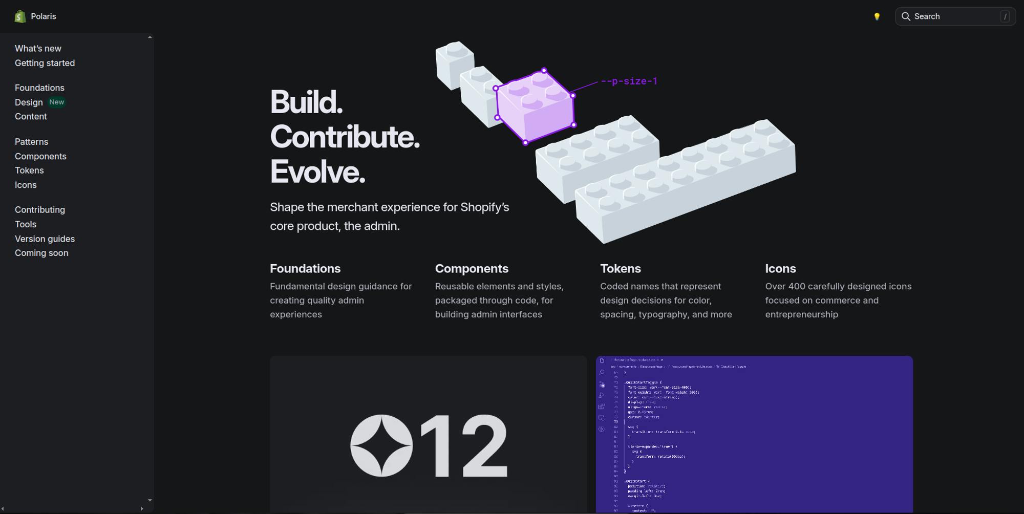
Polaris by Shopify
Polaris by Shopify is ideal for designers and developers aiming to build or enhance e-commerce platforms. Its value lies in:
- Optimized E-commerce Design - Polaris provides specific components and patterns tailored to e-commerce, such as product cards and checkout flows. These are crucial for creating smooth and persuasive shopping experiences that drive sales.
- Global Reach - The system includes detailed guidelines for internationalization, offering valuable insights on designing for diverse cultural contexts, which is essential for e-commerce sites looking to expand globally.
- Inclusive Design - It emphasizes accessibility standards that help ensure the site is usable by everyone, thus widening the potential customer base and enhancing the brand's reputation for inclusivity.
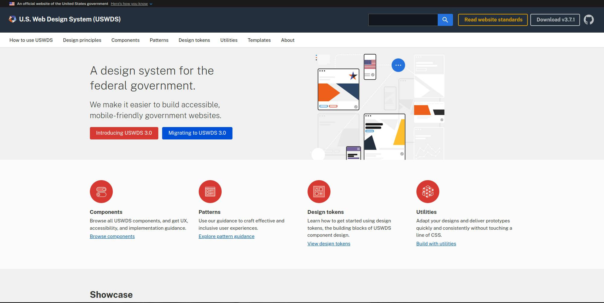
NASA Design System
NASA's Web Design System is structured to meet the high standards required for government and scientific information dissemination. It stands out with:
- Scientific data visualization guidelines, offering principles for presenting complex scientific data clearly and effectively—a must for websites dealing with technical subjects.
- Editorial style guide, which ensures consistency in communication, an essential aspect for maintaining authority and clarity in information-heavy websites.
- Robust templates and components, designed to handle high volumes of data and information, making it suitable for educational and research-oriented sites.
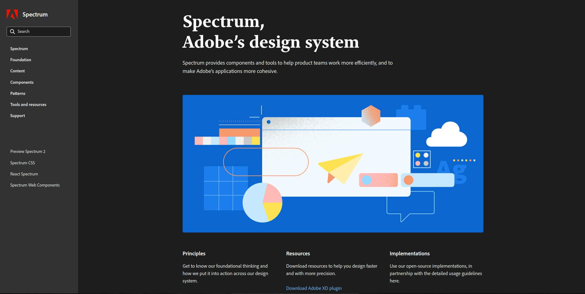
Spectrum by Adobe
Spectrum by Adobe is excellent for anyone aiming to develop a visually compelling and consistent design system for their brand, especially in creative industries:
- Comprehensive Design Language - Spectrum’s detailed design language provides a blueprint for maintaining uniformity across all design elements. This is essential for anyone looking to ensure their brand's visual identity is consistently represented across various platforms.
- Practical Visual Guidelines - The system’s guidelines on typography, icons, and color offer practical advice for creating visually appealing and accessible interfaces. These guidelines are invaluable for designers needing to align their projects with modern aesthetics while enhancing usability.
- Ready-to-Use Component Documentation - With its comprehensive documentation for UI components, including design specifications and code examples, Spectrum helps users implement standard, functional interfaces efficiently. This resource can serve as a model for developers building a design system from scratch or looking to refine an existing one.
Adopting these elements from Spectrum can significantly aid in developing a design system that not only meets high visual standards but also ensures a consistent and engaging user experience across all user interactions with the brand.
You can also find design systems from global companies like Microsoft’s Fluent, IBM’s Carbon, GitHub’s Primer, and over 50 others to explore in this GitHub repo.
Conclusion
We have looked at and understood what design systems are. We have also seen the importance of design systems and two approaches to creating your website’s design system. To gain more insight into design systems before using one of the approaches to building your Design System, try to explore one or more of the following:
- Analysis of Industry-leading Websites: One of the old ways to get inspiration is to look at what others have done. Design systems aren’t different either. Examining websites known for their exemplary design consistency over years of evolving their website and brand can provide valuable insights into their key components and implementation strategies.
- Open-Source Design Systems: Exploring popular open-source design systems like Google’s Material Design, Airbnb’s Design language, and Polaris by Shopify, which all offer resources and insights into their design systems. Open-source design systems give free access to UI components, code snippets, and best practices.
- Case Studies: Learn from real-world examples. Case studies showcase how companies implemented design systems, the challenges they faced, and how they solved these challenges. By studying these case studies, you learn valuable lessons for your projects.
- Design Communities: Engaging with design communities and forums allows designers and developers to connect with peers, share insights, and collaborate.
A Design System is a central source of truth in how we build and design websites, offering a framework for creating cohesive and consistent digital products. Understanding design systems, how to build one, and how to work with one ensures designers and developers can create quality and user-friendly websites and applications.
Understanding design systems is important especially if you want to stay ahead of the curve and deliver the best user experiences possible. Learn more about how to create design systems with this tutorial to take the next step. Highly recommend.


