

CSS Grid is a powerful way to layout and position content within the webpages we create. But, dealing with column and row line numbers inside a grid can be cumbersome, especially at the beginning, and confusing. This is where Grid Template Areas can help.
In this post, we will explore Grid Template Areas and how they can help us position content within a grid layout more visually and intuitively. By the end of this post, you’re going to understand how we can build layouts like the one below using Grid Template Areas.
Grid Template Areas Example
Interactive CodePen loads when it gets near the viewport.
Prerequisites
Before we dive into this post and learn more about Grid Template Areas, there are some prerequisites we need to cover.
Firstly, you should have a basic understanding of CSS Grid, which you can get from reading our post here. After that, you should also know the basics of CSS Subgrid, which we cover in this post.
Once you have these prerequisites covered, you’re ready to get started!
Defining Areas
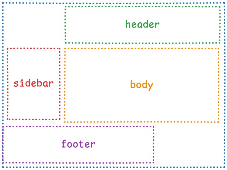
To get started with Grid Template Areas, we first need to understand how to define an area. To create an area inside a grid, we use the grid-template-areas CSS property on an element that also has the display: grid property, which makes the parent grid.
For example, we can create various areas in a grid using the code below.
.container {
  display: grid;
  grid-template-areas:
    "header header header"
    "sidebar body body"
    "sidebar body body"
    "footer footer footer";
}
This would yield a grid with areas that look like this.
Defining a grid area
Interactive CodePen loads when it gets near the viewport.
One thing to keep in mind, though, while building your grid areas is that they have to be a single rectangular shape. Irregular shapes like “I” and “T” while looking interesting, aren’t valid.
You also can’t reuse the same grid area names in different portions of the same grid. An area name can only be defined once per grid, and all instances of that name must be adjacent to each other.
Finally, for a grid-template-areas definition to be valid, it must be complete, with all cells populated within it. But, if you don’t want to assign a name to a cell and want to leave it empty, you can use a . in place of a name, like below. This means your grid is still valid, and the cell with the . will always be empty.
.container {
  display: grid;
  grid-template-areas:
    ". header header"
    "sidebar body body"
    "sidebar body body"
    "footer footer .";
}
With these empty cells, our grid’s areas will look like this.
First time here? Discover what Prismic can do!
👋 Meet Prismic, your solution for creating performant websites! Developers, build with your preferred tech stack and deliver a visual page builder to marketers so they can quickly create on-brand pages independently!

Assigning Content
Now we know how to define our grid areas, let’s look at how we can assign content to those areas so we can display it. Assigning content to a grid area is done via the grid-area property on the child element we want to position within the grid.
For example, if we have the same grid we used earlier.
.container {
  display: grid;
  grid-template-areas:
    "header header header"
    "sidebar body body"
    "sidebar body body"
    "footer footer footer";
}
We could assign child items to that grid using the syntax below.
.item {
  grid-area: header | sidebar | body | footer;
}
When either one of these values is passed, the item will then be placed into the corresponding area on the grid. You can see this in action in our previous CodePen example, where the name of each area is placed into its corresponding grid area.
Defining a grid area
Interactive CodePen loads when it gets near the viewport.
Now, at the start of this post, I mentioned how using the grid-template-areas property is more intuitive, so let’s prove it. I’ve rebuilt the same grid we’ve been looking at in the last CodePen, but without using the grid-template-areas property and instead using the column and row numbers for assigning content.
Grid without grid-template-areas
Interactive CodePen loads when it gets near the viewport.
The area we’re interested in is how we assign content to a grid area. What was a simple grid-area: body has now become grid-area: 2 / 2 / 4 / 4;, which I’m sure we can all agree is far less readable and intuitive.
Secondly, we also lose the helpful visual definition of the grid areas, check out the comparison of with and without grid-template-areas below.
/* with grid-template-areas */
.container {
  display: grid;
  height: 40rem;
  grid-template-areas:
    "header header header"
    "sidebar body body"
    "sidebar body body"
    "footer footer footer";
}

/* without grid-template-areas */
.container {
  display: grid;
  height: 40rem;
  grid-template-cols: 1fr;
  grid-template-rows: auto;
}
So, while grid-template-areas isn’t required for placing content in a grid, it definitely makes our lives easier and makes placing content more intuitive, and our code more readable.
Grid areas and Subgrid
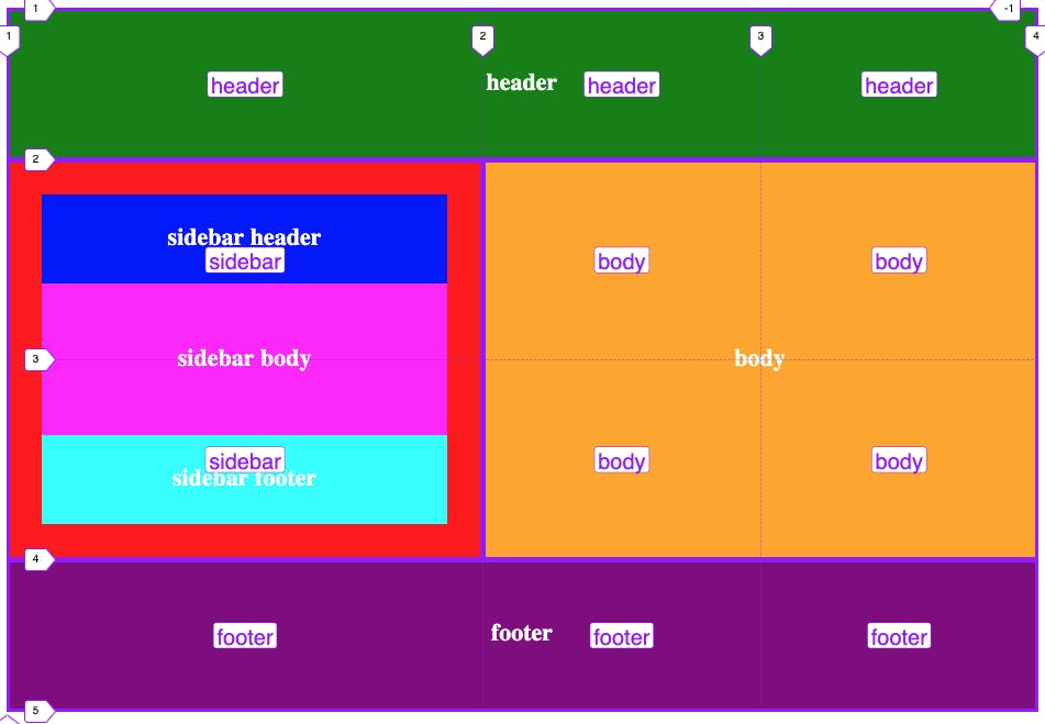
As we’ve seen so far, grid-template-areas is a helpful tool that can simplify how we use grids within our layouts. But, it also has one more trick up its sleeve, and that is its ability to be used with CSS Subgrid, allowing you to have multiple grid-template-areas definitions nested within each other.
grid-template-areas and subgrid
Interactive CodePen loads when it gets near the viewport.
In the above CodePen, we’ve taken our previous example and made the sidebar into its own grid using the parent grid’s column tracks via Subgrid. We’ve then given it its own grid-template-areas definition like so.
.sidebar {
  grid-area: sidebar;
  background-color: red;
  display: grid;
  grid-template-columns: subgrid;
  padding: 2rem;
  grid-template-areas:
    "header"
    "body"
    "body"
    "footer";
}
We then placed child items of the sidebar into this grid using these new area names for the sidebar grid.
Finally, something the keen-eyed among you may have noticed is that we’re reusing the same area names across the parent grid-template-areas definition and the child sidebar one. This is perfectly valid and not an issue, as the children of the sidebar can’t access the parent grid’s area names, so there are no conflicts.
Helpful Tips
We’re now approaching the end of the post, and we’ve explored a lot of what we can do with grid-template-areas and how we can use it to build different layouts. But, before we recap the post, I wanted to offer some helpful tips when working with grid-template-areas.
- Browser dev tools like the ones Firefox offers can show you the grid lines as we’ve mentioned in previous posts, but they also show you the area names that have been assigned to the grid, making it even easier to work with.
- When you’re naming the areas within your grid, keep them consistent with the content that will be placed within them. Avoid having the content and the name conflict with each other to help minimise any confusion.
- Avoid shortening names if the meaning of them isn’t obvious. For example, use sidebar instead of
sso everyone can instantly understand where and how each area is being used in the grid, regardless of whether it’s their first or fiftieth time looking at it.
Recap
In this post, we’ve looked at how we can use Grid Template Areas within a Grid layout to easily position our content without needing to think about row or column line numbers.
If you’re interested in learning more about Grid Template Areas, check out the MDN docs on it here. And, if you’re interested in reading more about CSS Grid and how it works with TailwindCSS, make sure to check out our post.


