

CSS Grid is the most powerful layout tool currently available in CSS. It allows us to easily create, manipulate, and populate two-dimensional layouts with just a few lines of CSS.
And, in the last few years, that power and flexibility have been expanded even further by the wide adoption of the subgrid value in CSS Grid.
In this post, we’re going to explore subgrid further, examining the problems it solves and how it alters the grids we interact with, as well as look at some examples of it in use.
Before we begin, you should be comfortable with CSS Grid and using it independently. If you want a refresher on it, check out our blog post comparing it to Flexbox.
Subgrid syntax
Before we begin talking about subgrid, what it can do, as well as the problems it solves for us, let’s take a quick look at the syntax for using it.
To start with, when using subgrid, you need a parent grid container, and then any child element inside that grid container can become a subgrid.
For example, looking at the below HTML, we could make the div with a class of child into a subgrid.
<div class="parent">
  <div class="child" />
</div>
If we wanted to do that, we could use the following CSS.
.parent {
  display: grid;
  grid-template-columns: repeat(3, minmax(0, 1fr));
  grid-template-rows: repeat(3, 1fr);
}

.child {
  display: grid;
  grid-template-rows: subgrid;
}
In this example, we’ve defined a parent grid with three columns and three rows. Then we’ve configured our child element to create a subgrid using the parent’s rows by providing the value subgrid to the property grid-template-rows. This means that our child grid will use the same grid tracks we defined for the rows on our parent grid, but have its own grid tracks for its columns.
However, you’re not limited to this configuration with subgrid. You can create a column subgrid by providing subgrid as the value of the property grid-template-columns. Or, if you want to, you can create a subgrid for both the columns and rows by providing subgrid to both of the properties we’ve mentioned above.
Nesting grids before subgrid
Subgrid itself, as the name suggests, is concerned with how nested grids interact with each other and any parent grids they’re contained within.
On the surface, nesting grids doesn’t sound too complicated, but there are some nuances to be considered when nesting grids without using subgrid. To highlight this, let’s look at the example below.
Here is the example on CodePen:
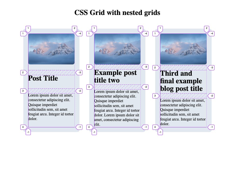
CSS Grid with nested grids
Interactive CodePen loads when it gets near the viewport.
In this example, we have a parent grid defining the columns for the three blog post cards. Each blog post item also has a grid that defines the rows for the image, title, and description being shown.
The issue, as you can probably see, is that none of them are aligned. This is because each child grid isn’t aware of the others; it’s just concerned with itself.
But, what if you wanted to display them all equally, so the titles and descriptions all aligned with each other? Well, subgrid makes this a piece of cake.
First time here? Discover what Prismic can do!
👋 Meet Prismic, your solution for creating performant websites! Developers, build with your preferred tech stack and deliver a visual page builder to marketers so they can quickly create on-brand pages independently!

How subgrid solves this issue
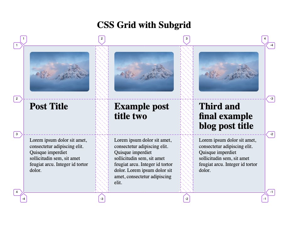
With subgrid, we can define the row tracks on the parent grid and then provide grid-template-rows: subgrid; to have the child grid use the same row tracks as the parent defines.
This is then done across all of the child grids and allows them to all have uniform rows, ensuring that each image, title, and description is kept perfectly in line regardless of the size of the content in each nested grid.
Here is the example on CodePen:
CSS Grid with Subgrid
Interactive CodePen loads when it gets near the viewport.
Nesting subgrids
Nesting grids with subgrids doesn’t need to stop at one layer deep either. There isn’t actually a limit for how many subgrids you can use inside one another. In the example below, we have three subgrids nested inside each other.
Nesting CSS Subgrid
Interactive CodePen loads when it gets near the viewport.
In this situation, when you have nested subgrids, each subgrid infers its size and spacing from its parent in the tree. What this means in practice is that when we control how much space a grid item consumes via grid-column and grid-row, we need to mention the track labels using the direct parent, not the original grid container.
So, for our example, we have an original grid container that has four columns starting at line 1 and ending at 5. It then has three rows starting at line 1 and ending at 4. The first nested subgrid, “Grid 2” then specifies the following CSS for its position in the parent grid.
grid-column: 2 / 5;
grid-row: 2 / 4;
This works because the parent grid, as mentioned, finishes at line 5 for columns and line 4 for rows. This is pretty standard for grids and placing items inside them, but where it gets interesting is nesting another subgrid inside the last one.
In this case, we need to look at how “Grid 2” defines its own grid lines. Because “Grid 2” has one less column vs its parent grid (3 vs 4), it also means it has one less grid line, and they’re slightly out of sync due to how “Grid 2” is placed within the parent.
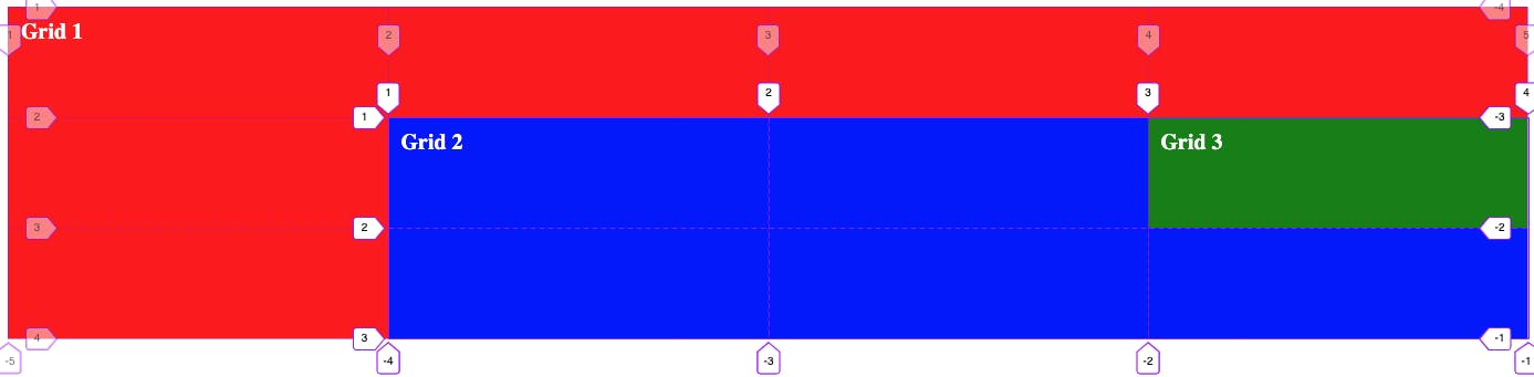
This means “Grid 2” starts at line 1 and finishes at 4, and the parent grid line 2 is in the same position as “Grid 2”’s line 1. So, when we go to place our next nested grid, “Grid 3” we need to keep this in mind and use “Grid 2”’s line numbers.
When we place “Grid 3”, we use the following CSS. Which means we’ll start at line 3 and finish at line 4 of “Grid 2” for the columns and start at line 1 and finish at line 2 for the rows.
grid-column: 3 / 4;
grid-row: 1 / 2;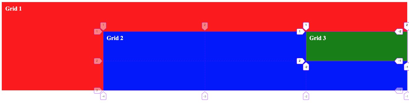
Subgrid and line names
Now that we understand how to place items in nested subgrids by using the direct parent’s grid line numbers, I’m going to throw a little bit of a curveball at you.
You can use any parent grid line names to place an item inside a deeper nested subgrid.
CSS Subgrid line names
Interactive CodePen loads when it gets near the viewport.
In the example above, we have the same three-tier nested grid setup from the last section, but this time the top-level parent grid specifies line names using the CSS below.
grid-template-columns: [wrapper-start] 1fr [page-start] 1fr [page-end] 1fr [wrapper-end];
grid-template-rows: [wrapper-start] 1fr [page-start] 1fr [page-end] 1fr [wrapper-end];
We then use these line names inside the two nested grids, “Grid 2” and “Grid 3” to control where they are located inside their direct parent.
For “Grid 2” this is pretty run-of-the-mill stuff. We place it using the below CSS to refer to the line names we specified above for the parent grid “Grid 1”.
grid-column: page-start / wrapper-end;
grid-row: page-start / wrapper-end;
But, where it gets interesting is that we can define our own names inside “Grid 2” for its columns like so.
grid-template-columns: subgrid [subgrid-start] [subgrid-middle] [subgrid-end];These new names will be inaccessible to the parent “Grid 1”, but when we’re placing “Grid 3”, we can use them along with the original names specified at the top-level grid “Grid 1”. We can even mix and match them.
grid-column: page-end / subgrid-end;
grid-row: page-start / page-end;
In this case, for the columns, we use page-end from the top level “Grid 1” and then subgrid-end from the direct parent “Grid 2”. Then both of the row line names come from “Grid 1” as well.
Gap inheritance
While we’re talking about subgrids inheriting properties and values from their parent grids, let’s talk about gap inheritance.
When you create a subgrid, it will, by default, inherit the gap property values from its parent grid. However, this can be overridden, and you can specify a gap value specific to the subgrid, which will then be inherited by any subgrids that are a child of it.
You can see this in practice by looking at the example CodePen below.
CSS Grid Gap Inheritence
Interactive CodePen loads when it gets near the viewport.
Helpful tip for working with grid and subgrid
Working with CSS grid can be confusing, and subgrid can exaggerate this. So, to help with this, there is one helpful tip I have for you. Use your browser’s dev tools to your advantage.
Modern browsers like Chrome and Firefox have built-in tools for helping developers build with grid and subgrid. These tools allow you to inspect grids on the page, see their tracks and lines overlayed on the page content, as well as see the gap between each grid track.
These features combined allow you to get a better understanding of the grid/subgrid you’re building and how it interacts with the content you’re placing inside it and any amendments you may need to make to the grid.
Recap
Throughout this post, we’ve looked at CSS grid and how subgrid works within it to help us build more flexible and powerful layouts in our projects.
We’ve looked at how to create subgrids and control how content is placed inside them across both the parent grid and nested subgrids within. We also looked at some examples of using subgrid in practice in some example situations to see exactly how subgrid can help us.
If you’re interested in learning more about subgrid, check out the current MDN documentation for it here. You can also see the current support for subgrid by checking out the caniuse page here. Finally, if you’re interested in reading more about CSS grid overall, check out our post comparing it to Flexbox here and how grid can be implemented using TailwindCSS here.
Thanks for reading.


