Top 13 Landing Page Optimization Best Practices in 2026

Website landing pages serve as the face of your online presence. It’s the first point of contact between your business and potential customers and gives the first impression of what visitors have of your business. A well-optimized landing page is crucial because it can greatly help in converting visitors into customers - this could be in the form of sales, sign-ups, purchases, and so on.
The benefits of having a well-optimized landing page cannot be overemphasized, and so it becomes more important than ever to employ best practices for landing page optimization. In this article, we will be looking at 13 essential strategies to optimize your landing page’s performance and boost user conversions.
What is landing page optimization?
Before we look at the strategies or best practices to optimize our landing page, we will first look at what landing page optimization really means.
Landing Page Optimization is the process of improving elements on a landing page to improve user experience and engagement and increase conversions. It is the incremental improvements and changes of elements you make to your landing page to improve or drive user conversions.
Landing page optimization focuses on refining design and content and making data-driven decisions to ensure that visitors take the desired action - making a purchase, signing up for a newsletter, or filling out a form.
Pro Tip: If you’re looking for a faster way to create and optimize landing pages, try Prismic’s Landing Page Builder, which uses AI to help you generate high-performing pages in minutes.
Top 13 landing page optimization best practices
We’ve compiled a list of the top 13 landing page optimization tips that you can employ to optimize your landing pages.
1. Good user experience (UX)
The first on our list is good user experience. The foundation for a good landing page is to know your audience or target market. This helps in designing a good user experience for the audience. Before you start designing your landing page, you need to answer questions like:
- What problem are you solving?
- Who is your target audience?
- How do you solve this problem?
- Why would visitors be interested in what you offer?
Answering these questions will give you insight into what users want and what the landing page will look like. When you know your audience, you can tailor your design and entire design system to appeal to that specific audience.
Also, always remember to go for a simple and minimalistic design. This is because a clean, simple, and elegant design helps in keeping the focus on your message and call-to-action (CTA). For a better understanding of user experience, check out our article on UX tips for developers.
2. Visual hierarchy and layout
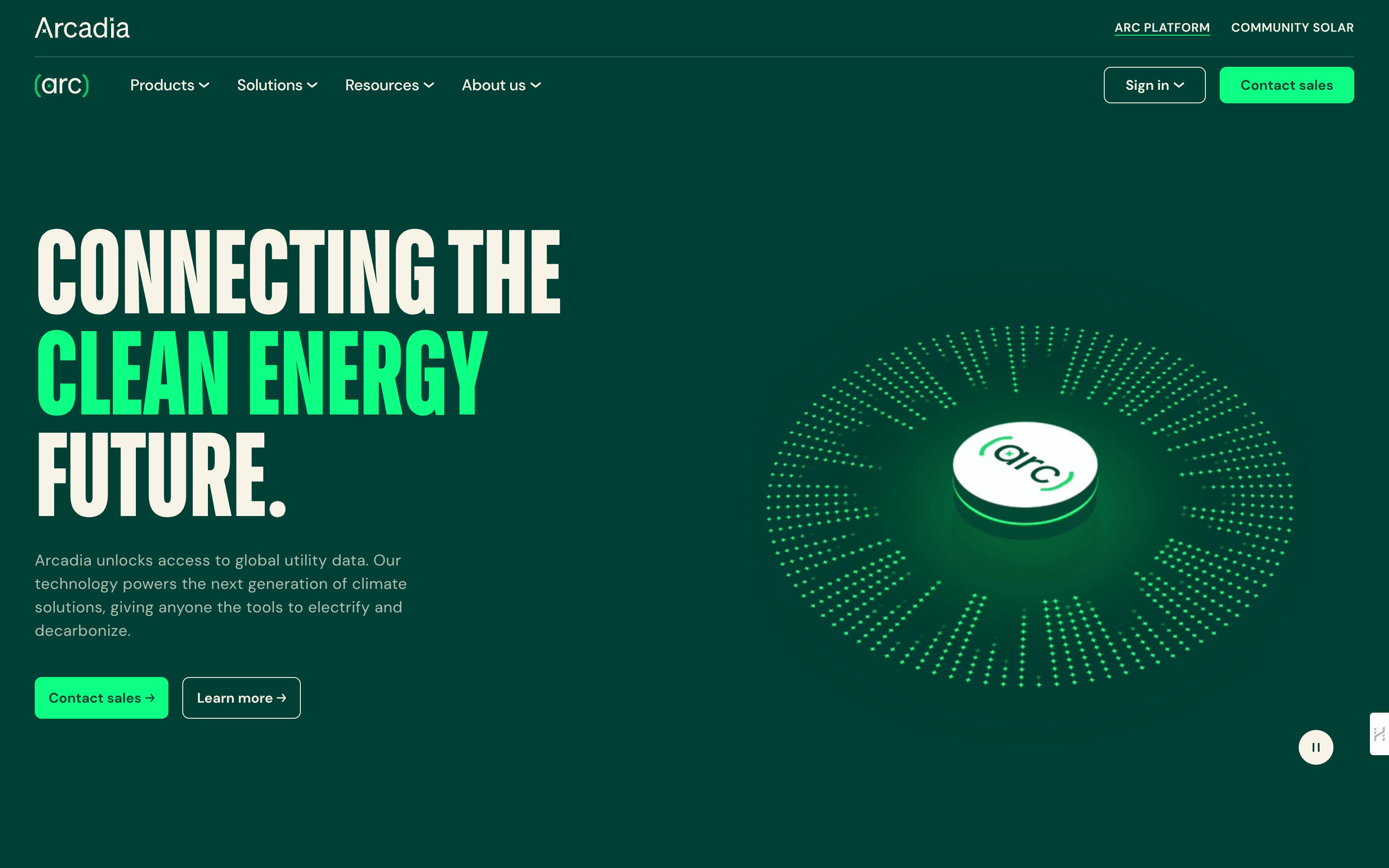
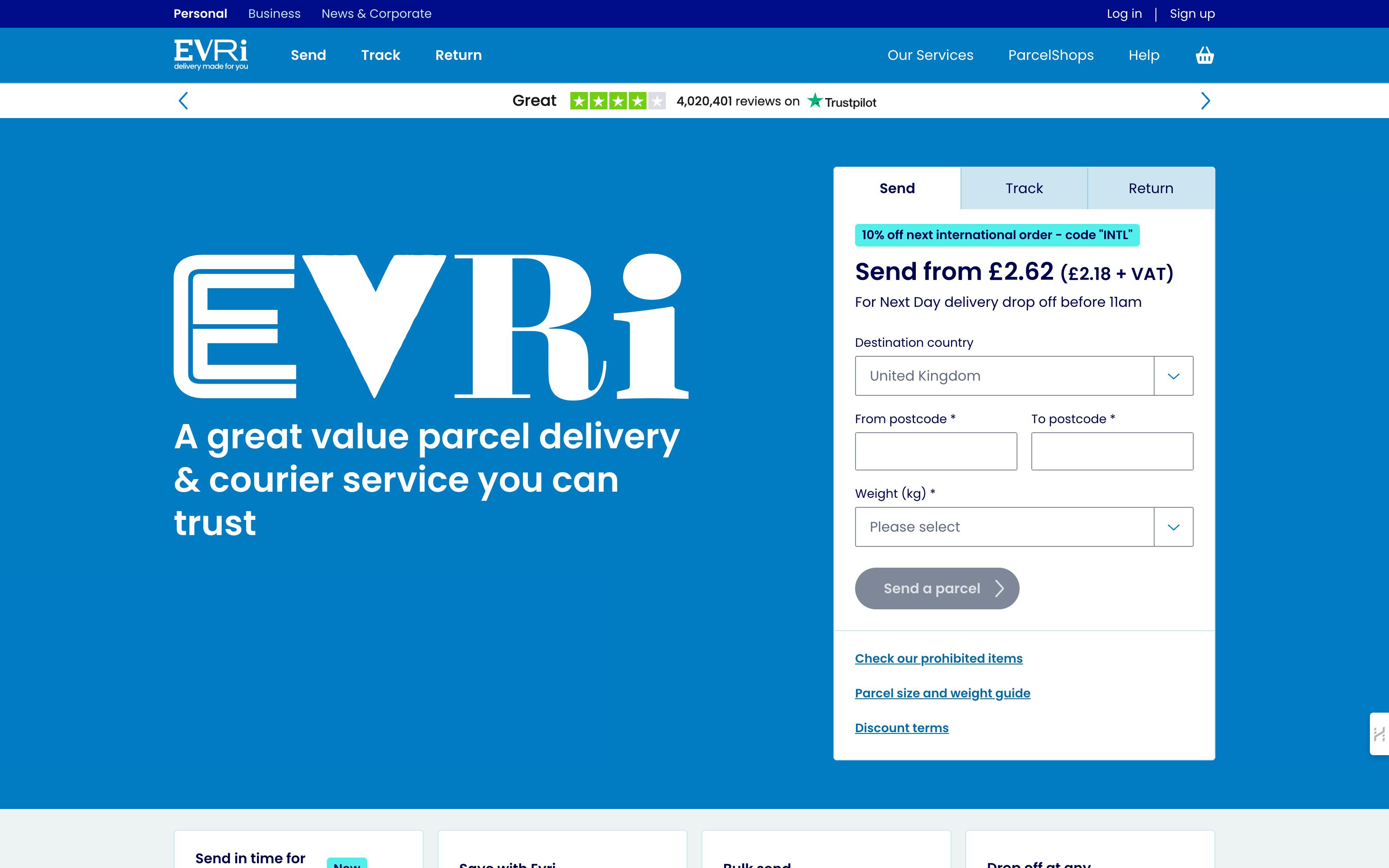
Optimize your landing page structure to guide visitors toward conversion:
- Emphasize key elements: Use contrasting colors, larger fonts, and strategic placement to make your headline and CTA stand out.
- Above-the-fold content: Place critical information (headline, key benefits, and CTA) where it's immediately visible without scrolling.
A strong visual hierarchy naturally directs attention to your most important message and call-to-action, increasing engagement and conversion potential. By thoughtfully arranging elements, you create a clear path for visitors to follow, enhancing the overall effectiveness of your landing page.
First time here? Discover what Prismic can do!
👋 Meet Prismic, your solution for creating performant websites! Developers, build with your preferred tech stack and deliver a visual page builder to marketers so they can quickly create on-brand pages independently!
3. Simplified navigation
For good landing page optimization, make sure to simplify your navigation:
- Keep it minimal: Remove or significantly reduce standard website navigation.
- Focus on conversion: Eliminate links that could lead visitors away from your main goal.
- Guide user attention: If navigation is necessary, make it intuitive and directly related to the page's purpose.
By minimizing distractions and simplifying navigation, you maintain visitor focus on your core message and call-to-action, increasing the likelihood of conversion.
4. Clear and compelling call-to-actions
When visitors become engaged, your CTA should stand out visually and clearly communicate the action you want visitors to take. This is because CTAs are one of the most critical parts of your landing page. It helps you capture leads and user conversions. The messaging should be concise, bold, and stand out (easily noticed).
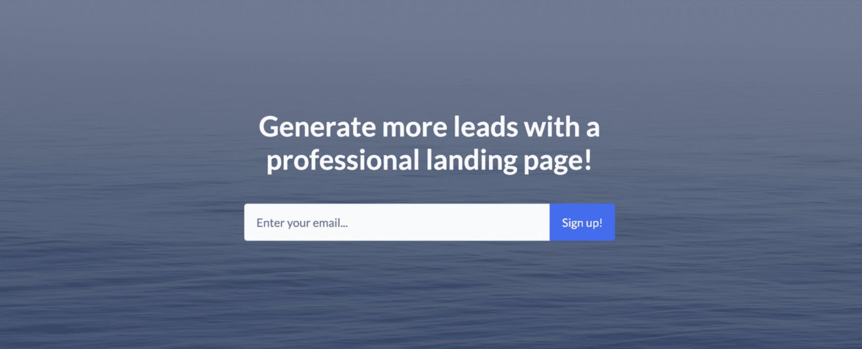
CTAs shouldn’t be ambiguous or complex since you are telling the user what action you want them to take. For instance, if you want users to sign up for your newsletter, there should be a text, an email text input, and a button saying “Sign up.”
5. Social proof
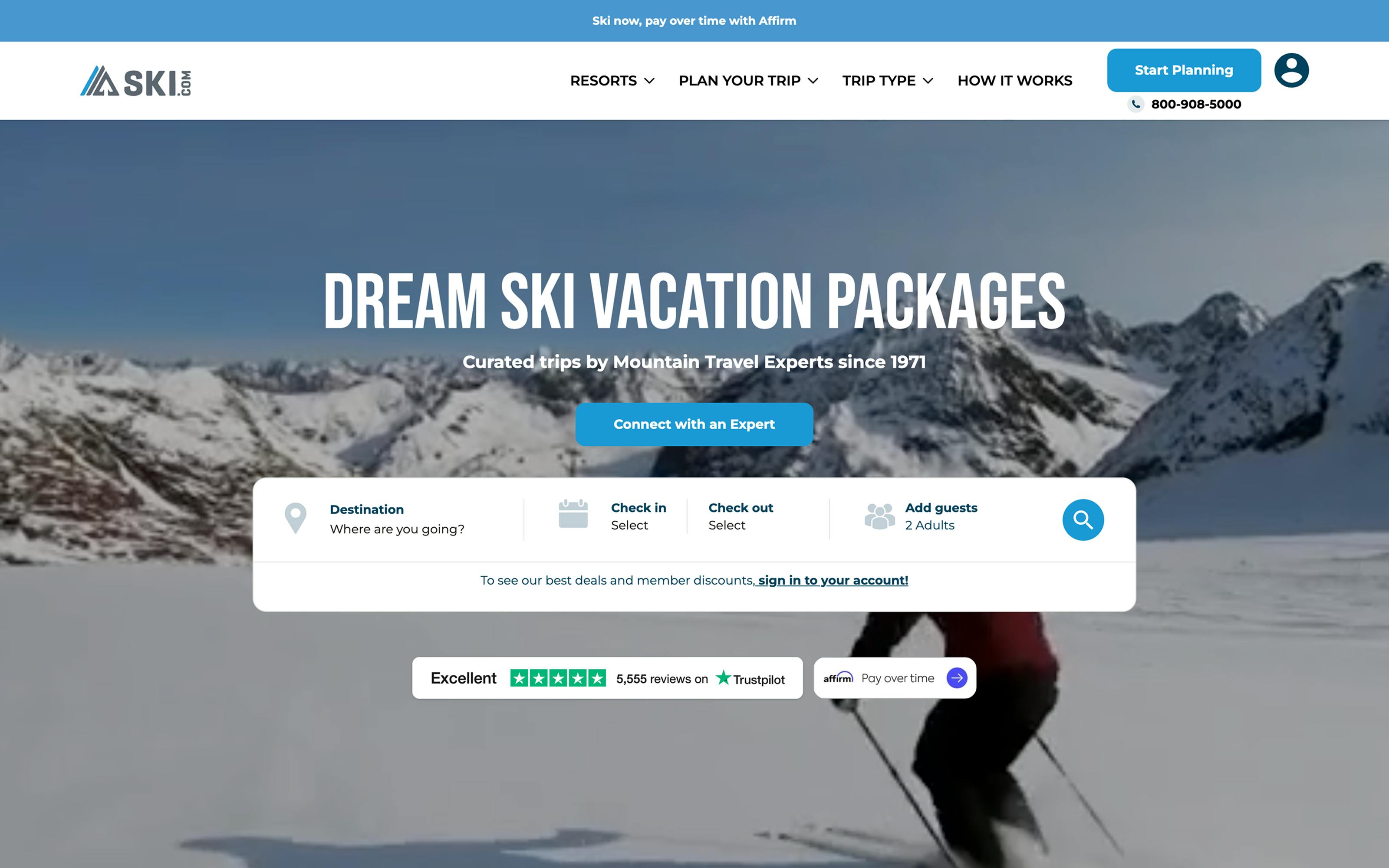
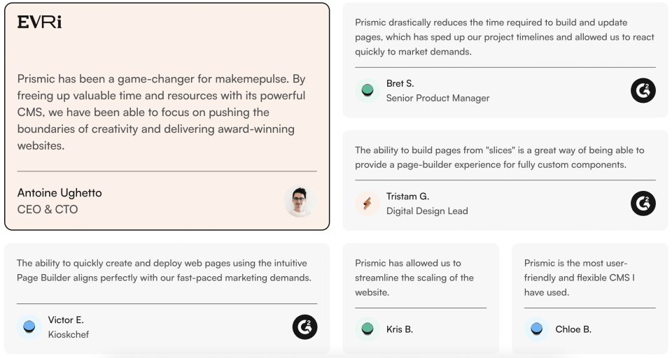
This is a great way to build trust with your visitors or potential customers. People buy from brands or companies they can trust. One way to establish trust with potential customers is to incorporate testimonials and case studies with logos of popular partners or clients who have worked or used your services. Reviews from previous customers show potential customers that you are credible, legitimate, and can be trusted. This helps to influence their decision-making.
6. Benefit-oriented copywriting
Craft compelling copy that resonates with your target audience:
- Focus on benefits: Highlight how your offer solves problems or improves situations.
- Create impactful headlines: Immediately convey value, addressing user needs and pain points.
- Answer "What's in it for me?": Showcase clear, concise value propositions throughout your copy.
Effective, benefit-focused copywriting engages visitors, communicates value, and drives conversions by aligning your offer with user needs.
7. Form optimization
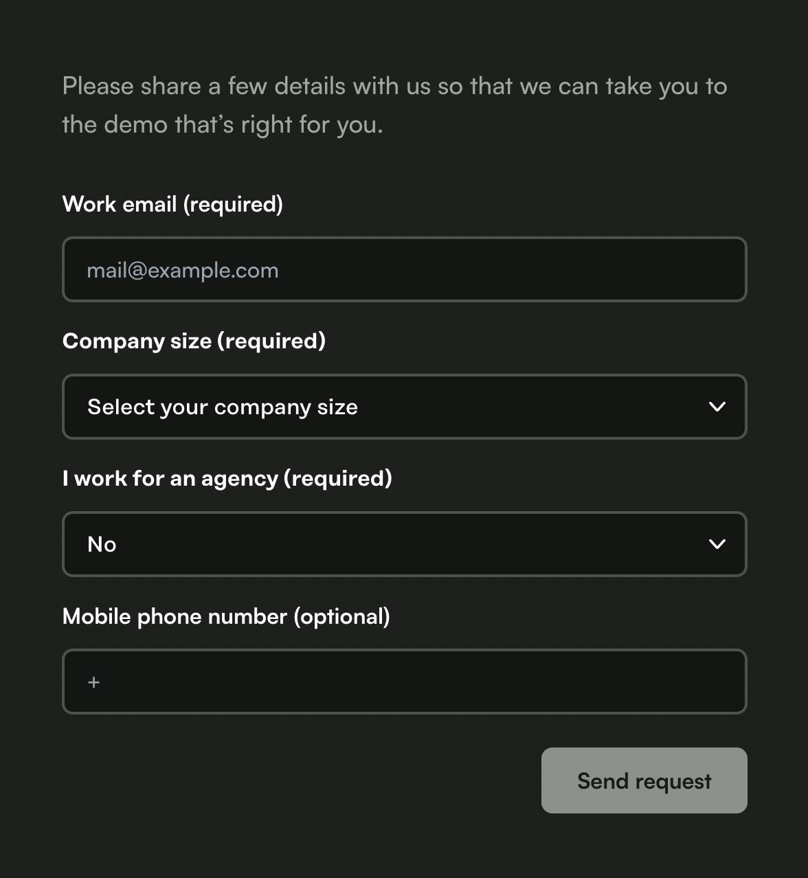
If your landing page includes a form, keep it straightforward to reduce friction and increase conversions:
- Minimize fields: Ask only for essential information.
- Use smart design: Implement inline validation, progress indicators, and smart defaults.
- Mobile-friendly: Ensure forms are easy to complete on all devices.
Optimized forms lower barriers to entry, improving completion rates and capturing more leads.
8. Search Engine Optimization (SEO)
Search Engine Optimization (SEO) is very important for landing page optimization, as it ensures that your landing page will get visited organically. It focuses on your website’s visibility in search engine results when certain keywords are searched. Good SEO means that your website will rank higher in search results, which drives more organic traffic and increases conversion rates.
Boost Your Website SEO with Prismic
See how Prismic can improve both technical and content optimizations in this comprehensive SEO guide.
9. Performance and speed optimization
Page load time is very crucial in optimizing landing pages to reduce bounce rates and ensure a good user experience. Optimizing the average load time of a webpage to be under 2 seconds is considered good, while up to 3 seconds is tolerable. However, anything above 3 seconds is considered poor and should be optimized.
No user wants to waste time waiting for your website to load.
For speed optimization, you should look to:
- Optimize and compress your images (use avif and webp formats).
- Consider using a content delivery network (CDN) to serve your visuals.
- Lazy load images until they are needed.
- Minify your CSS and JavaScript files to reduce their size and improve load times.
10. High-quality, relevant visuals (images and videos)
Use high-quality images and videos to create a visually appealing landing page, and include relevant visuals that support your value proposition and demonstrate your offer. High-quality visuals can significantly impact engagement and thus increase user conversions. However, the visuals should be minimal, well selected, and used appropriately, else it won’t be effective.
Visuals like images should showcase your offer or product and try to form a good human connection with visitors, while videos should show how easy it is to use your product or service.
11. Accessibility
Accessibility is a crucial part of optimizing your landing page. It focuses on ensuring your landing page is accessible and can be used by all users, including those with disabilities.
Accessibility in a web page includes using the right HTML semantics (h1, p, anchor tags, etc.) for various elements and layouts for users using speech screen readers. Using alt text for images helps those with visual impairments access your site via screen readers. Additionally, making the site navigable via keyboard will contribute to accessibility. This not only broadens your potential audience but also improves the overall user experience.
Accessibility also improves the SEO (Search Engine Optimization) of your landing page because search engine crawlers and friendly bots gain more information from accessible websites and increase their visibility and page ranking on the search results.
Check out our Next.js accessibility starter guide!
Our Next.js accessibility starter guide is a three-part series on all things accessibility!
12. Mobile-first design
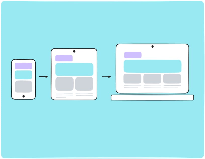
Many users access websites via mobile devices, making it crucial to ensure your landing page is mobile-responsive. While the percentage of mobile traffic can vary depending on your industry and target audience, it's important to optimize for all devices. Whether your visitors come through organic searches, emails, or social media platforms, you need to ensure that your landing page provides a seamless experience across both mobile and desktop platforms. This approach caters to all users, regardless of their preferred device, and helps maximize engagement and conversions.
13. A/B testing
This is the continuous improvement of your landing page. As you make improvements and as traffic increases, you compare the different versions to see which version has performed best and which elements helped to boost your conversion rates. There are certain analytics applications that will help you to get better insights into how users interact with your landing page. Heat maps also help to visualize how visitors interact with your web page using color-coded systems.
Tips to help you A/B test your website redesign
Check out this article to learn more about A/B testing, its importance, how it works, and how to A/B test your website redesign.
Optimizing landing pages in Prismic
Prismic is a headless CMS that offers an intuitive web interface for content creation and management, along with a powerful API for fetching content. It enables developers and marketers to build, edit, and ship dynamic and customized websites by separating content management from frontend development, resulting in extensible, flexible, and scalable websites.
Build landing pages faster with Prismic’s AI Landing Page Builder
While the best practices listed above are essential for optimization, the challenge many marketers face is scale. Relevant landing pages drive traffic and convert better across search, paid media, ABM campaigns, and events, but building them manually is time-consuming. Most teams can only build a few pages per week, resulting in missed opportunities to capture high-intent traffic.
Prismic's AI landing page builder solves this bottleneck. Begin by creating an approved base page, then upload a CSV file containing your targeting data, such as keywords or audience segments. The AI landing page builder creates dozens of high-quality, editable variations, each aligned with your brand voice and tailored to your campaign goals.
This approach works particularly well for two use cases:
SEO campaigns: Scale pages for long-tail keywords and new markets using the SEO landing page builder. Create variations optimized for different search terms without sacrificing brand quality or consistency.
ABM campaigns: Generate personalized pages for different accounts, industries, or buyer roles with the ABM landing page builder. Use CRM or enrichment data to create targeted experiences that resonate with high-value prospects.
If you are new to Prismic, you don't need to migrate your entire website. It works independently of your CMS and comes with branded slices as part of our solution, so there’s no developer dependency or replatforming required.
Companies like VITRONIC have seen dramatic results, going from weeks of manual page building to 60 live, on-brand pages ready to convert in just 90 minutes. Whether you're running paid ad tests, optimizing for search, or personalizing post-event follow-ups, you can scale content creation without compromising quality.
Other Prismic features that help you optimize landing pages
Prismic has made building and optimizing your landing page easy with its rich features and functionalities:
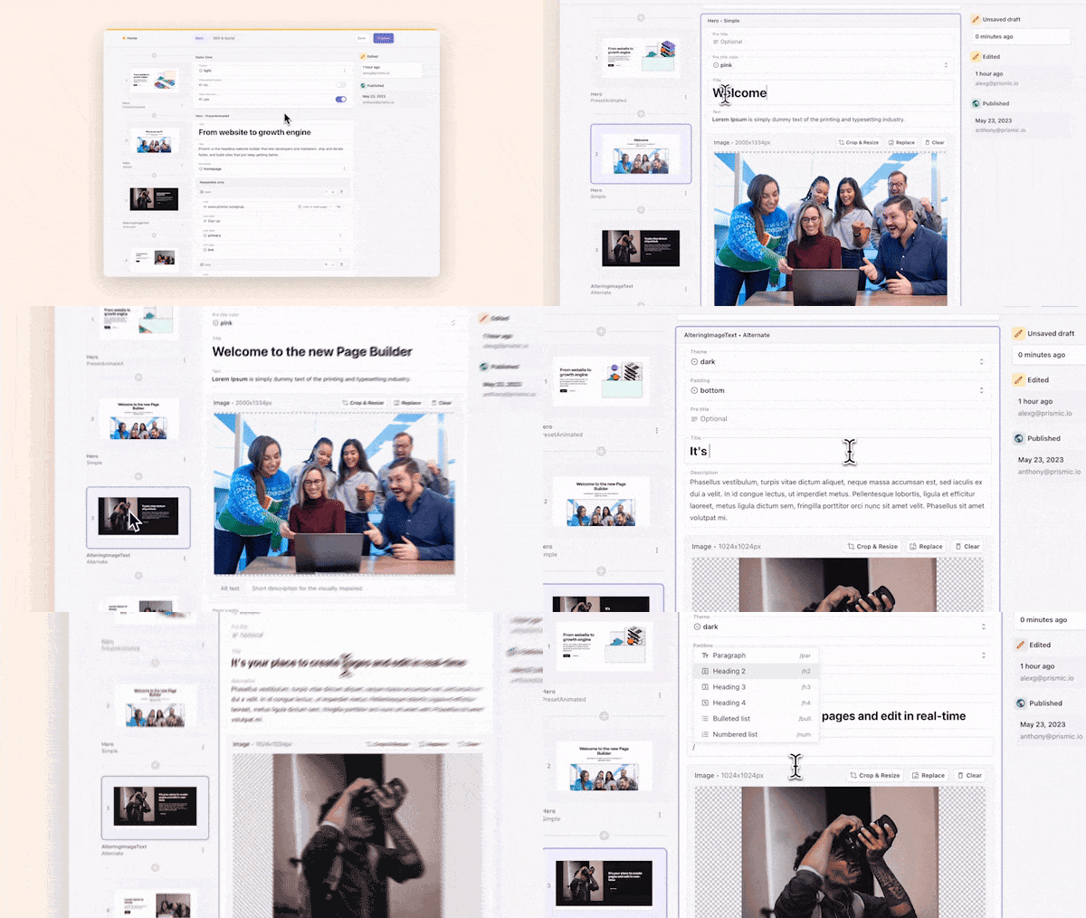
- Visual Page Builder: Prismic's Visual Page Builder enables marketers to create and optimize landing pages independently. Build pages like assembling a slide deck—add, remove, and rearrange content sections in real-time with instant visual feedback. The drag-and-drop interface uses reusable, on-brand page sections (slices) that maintain design consistency across all your landing pages. This means you can quickly test different layouts, update messaging, and launch new campaign pages without waiting on development resources, keeping you flexible as you optimize for conversions.
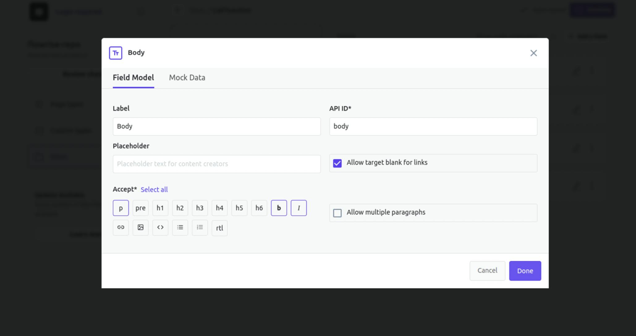
- Rich Text Editor : Prismic has a rich text editor that allows you to choose the right HTML semantic you want for your copywriting. It could be
<h1>,<h2>,<p>, etc.
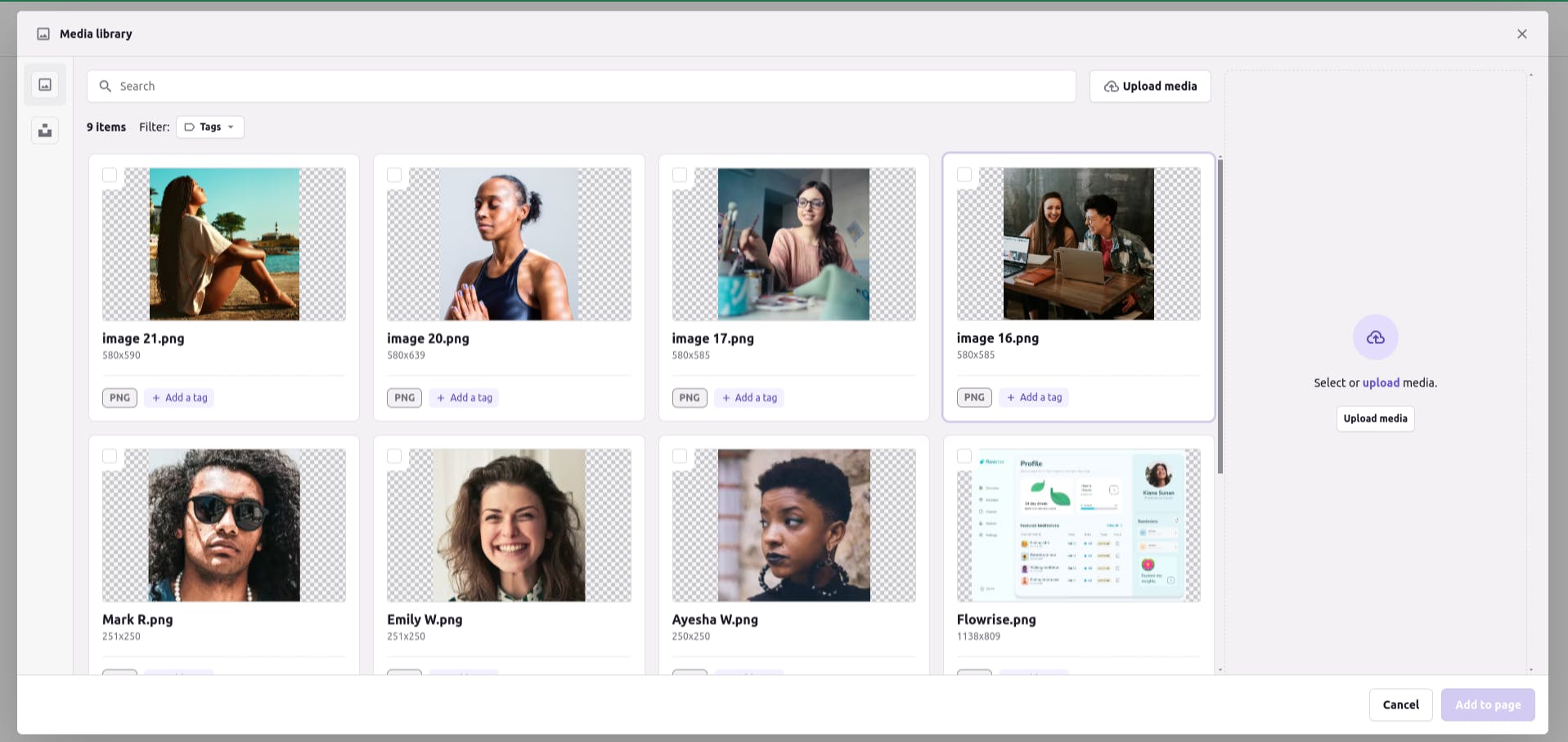
- Image and Visual Optimization : Prismic has built-in image optimization features to ensure your images and other visuals are fast-loading, well-compressed, and of high quality.
Conclusion
Optimizing your landing page is a continuous process that requires more than just attention to design. It also requires various elements like SEO optimization, Page load speed optimization, A/B testing, and so on.
In this article, we looked at 13 best practices you can implement to optimize your landing page and increase user conversion from visitors to customers. Moreover, using a CMS like Prismic can further simplify the process, enabling marketers to easily manage and optimize content.
Finally, remember that the key to successful optimization is to always keep your user’s needs and experience at the forefront of your strategy.


