Essential Parts of a Website: The Complete Website Anatomy Guide
 By Alison Brunk
One of the best starting points for designing or building a website is understanding its main parts. In this article, we’ll break down the anatomy of a website, from the sections visitors see on the screen to the behind-the-scenes elements that keep it running.
Whether you’re a developer or a marketer, understanding these components will make it easier to build a site that’s both effective and enjoyable for users.
The main parts of a website (what people actually see)
A good website is made up of a few main components that work together to create the full experience. These are the parts people notice right away.
Header
The header is the top section of a website that appears on every page. It usually includes the logo, main menu, and sometimes a search bar or contact links. The header helps users orient themselves and easily access essential parts of the site.
Headers can be made static (fixed at the top of the page) or sticky, which means they remain visible as the user scrolls down. Use sticky headers if you want users to have constant access to navigation links without needing to scroll back up.
On desktop screens, headers display a full navigation menu with dropdowns or multiple links. However, on mobile devices, the menu is hidden to save space and only appears when a user taps an icon, typically a hamburger menu.
A well-designed header is straightforward, easy to read, and works well across all devices. It plays a significant role in branding and site navigation, making it one of the most essential parts of a website.
Navigation
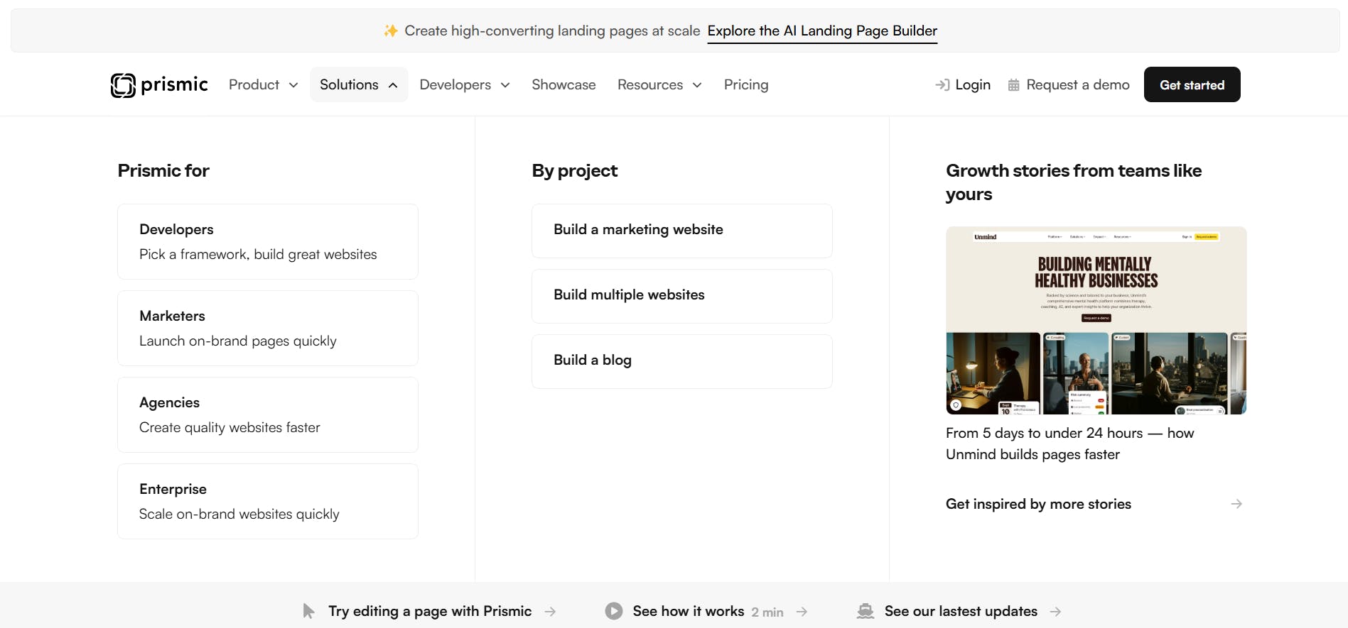
Technically, the navigation, or menu, is part of the header. However, it’s such a key component that it deserves its own section. This menu helps users find their way around the website. It usually includes links to main pages like Home, About, Services, and Contact.
Depending on the scenario, menus can be horizontal (across the top) or vertical (down the side), and they often include dropdowns or submenus to organize content without cluttering the page. For a standard website, the navigation is usually horizontal across the top with main links like Home, About, and Contact. However, for a documentation site, you’re more likely to see a vertical menu down the side that lists sections and subsections for easy access.
Navigation menus are sometimes linked to breadcrumbs, which are a trail of links that show users their current location in the site’s hierarchy. Breadcrumbs help visitors understand where they are and make it easy to go back to previous pages.
Looking for menu inspiration?
Looking for menu design inspiration? Explore our CSS menus article, featuring creative examples and code snippets to elevate your site's navigation.
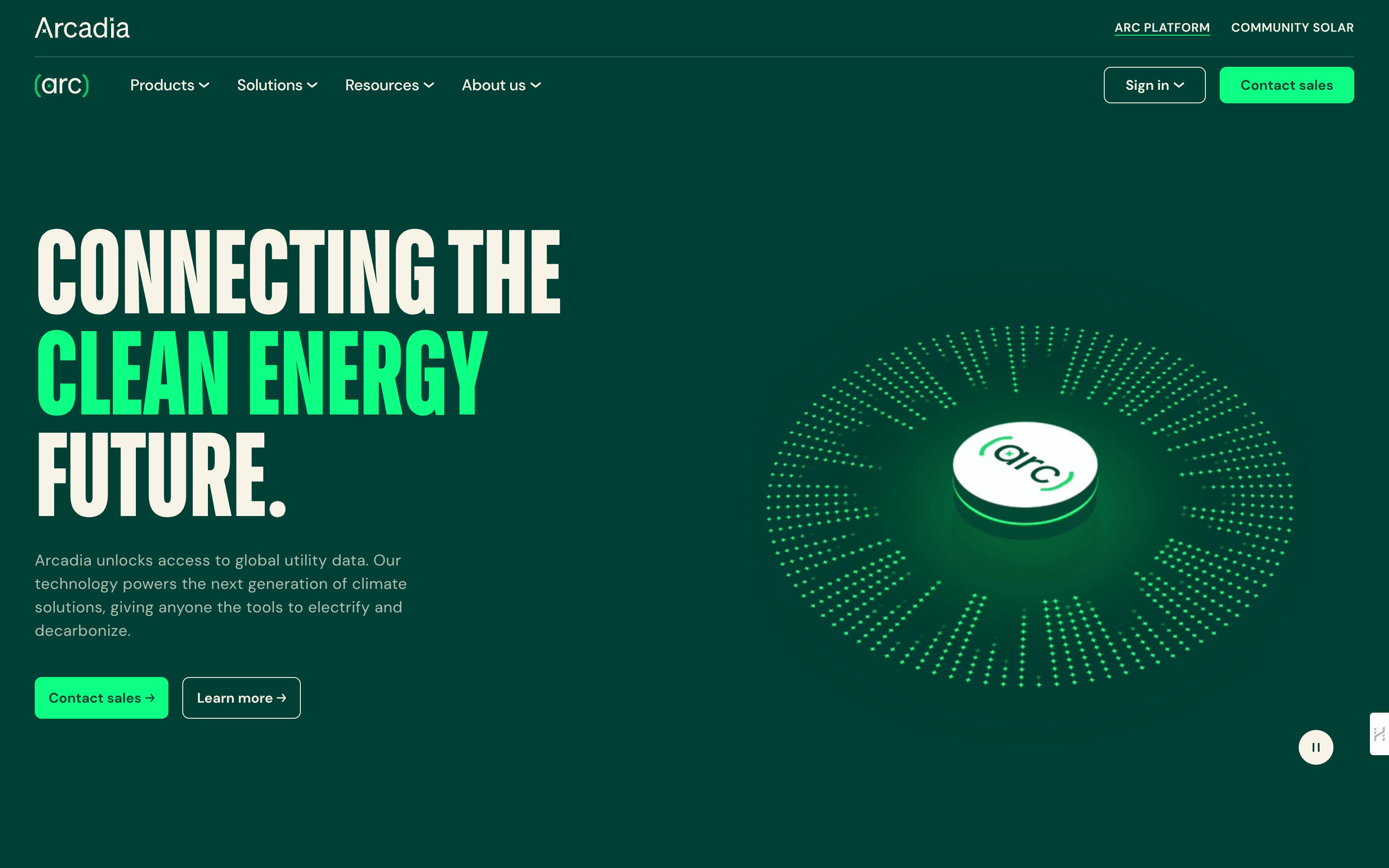
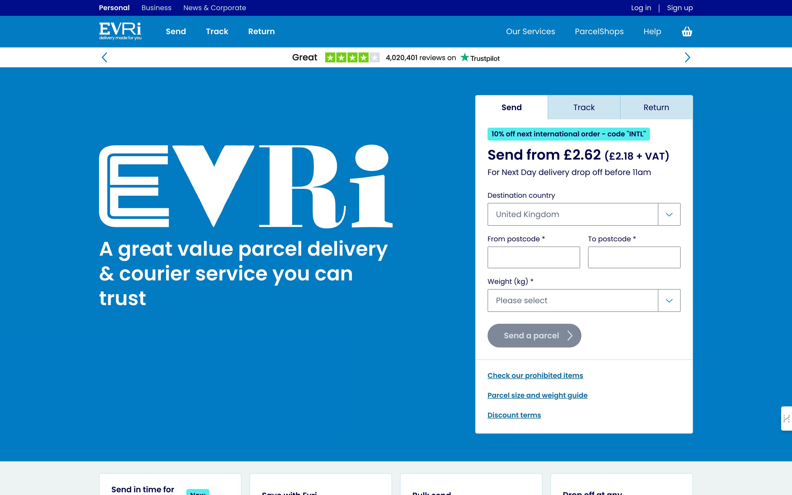
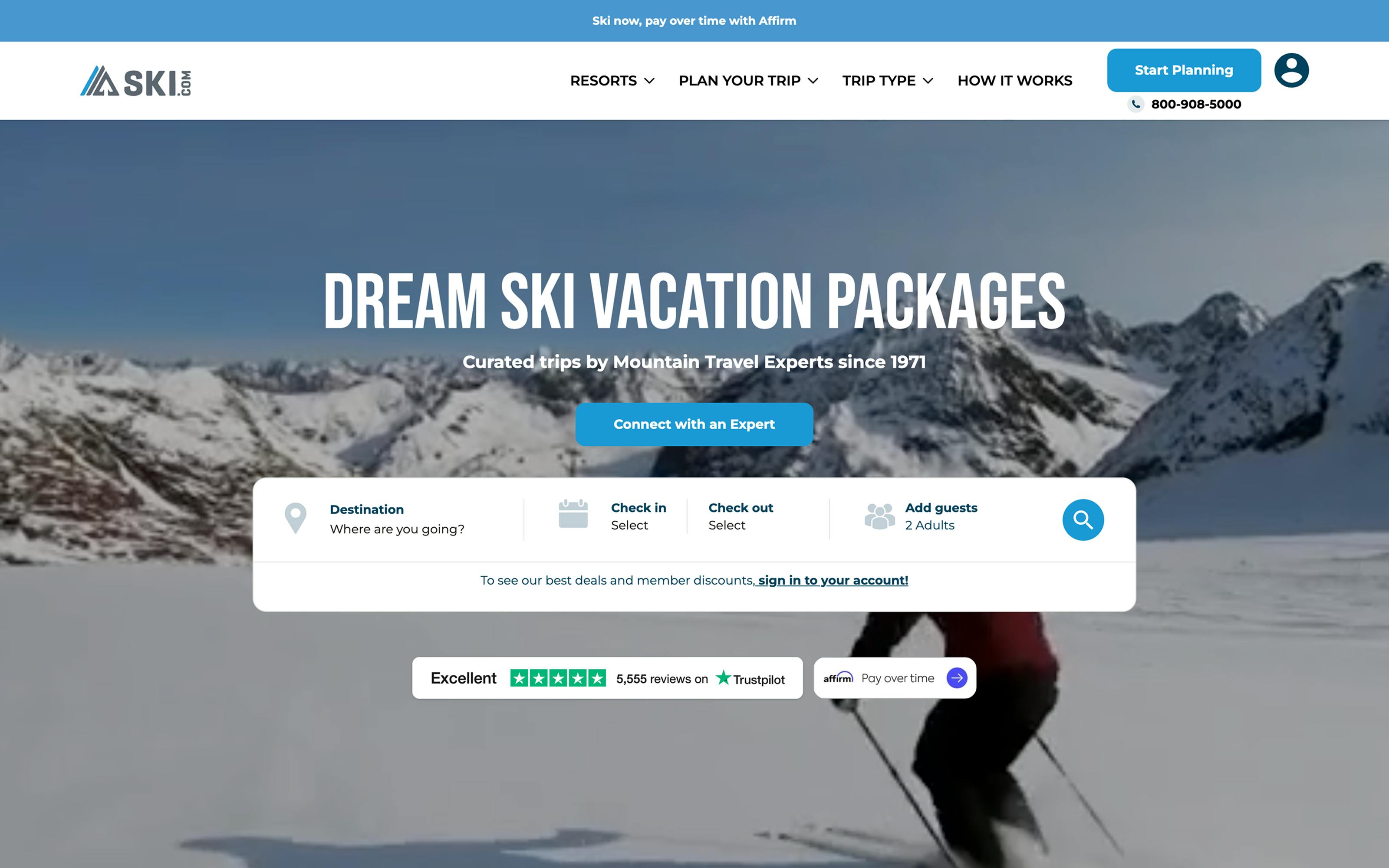
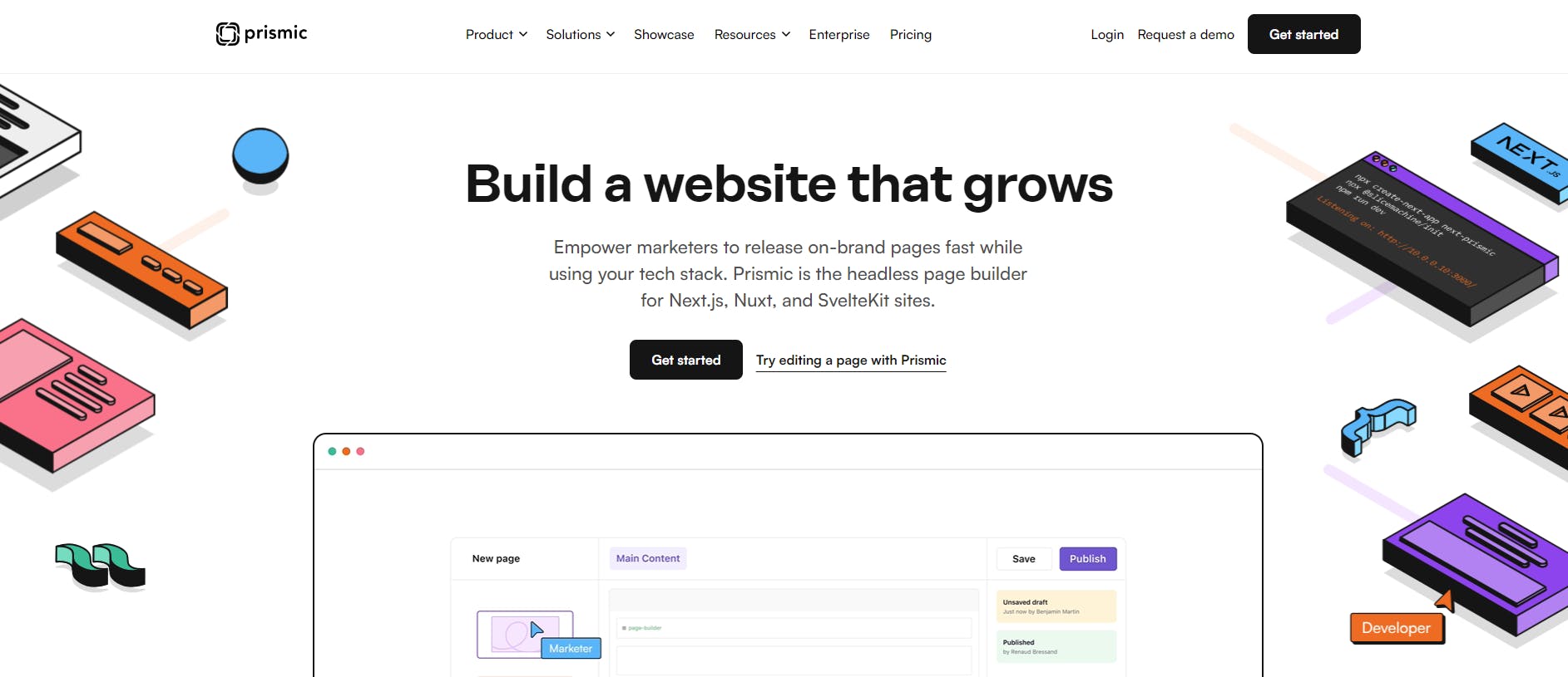
Hero section

The hero section is usually the large, prominent area near the top of a webpage. It’s often the first thing visitors see when they land on the site. This section typically includes a headline, a brief message or subheadline, a strong call to action (CTA), and an eye-catching image, video, or animation.
The hero section’s main goal is to grab attention quickly and communicate the website’s purpose or key offer. It sets the tone for the rest of the page and encourages visitors to take action, like signing up, making a purchase, or learning more.
A well-designed hero section is clear, visually appealing, and focuses on a single message to avoid overwhelming visitors.
Note: The hero section is placed above the fold, meaning it appears on the screen without the user needing to scroll. This placement is crucial because it’s the first thing visitors see and plays a big role in capturing their attention.
Explore more effective hero section examples!
Want to learn more about creating an effective hero section that converts visitors into customers? Our guide covers best practices and real-world examples.
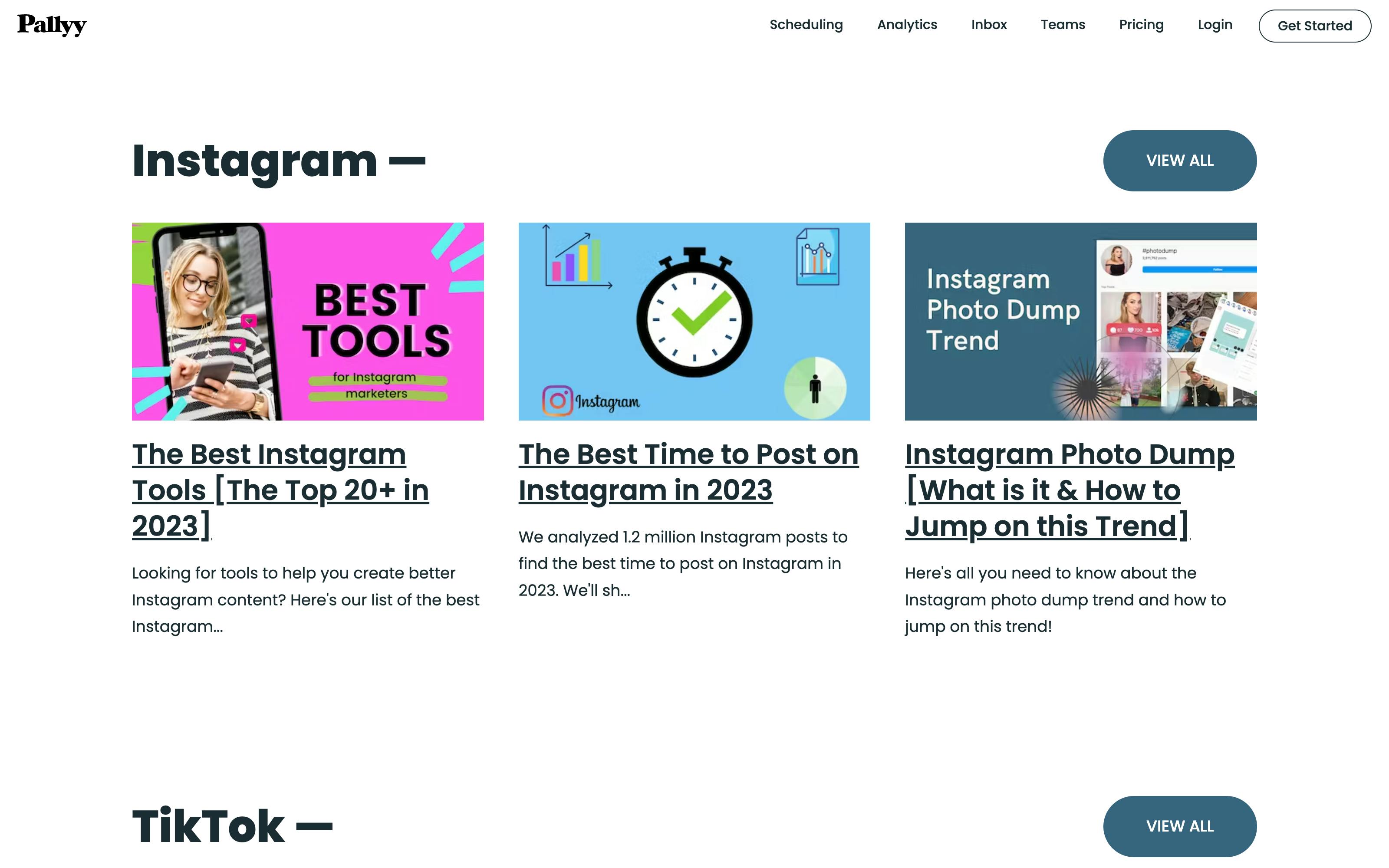
Main content area
The main content area is where most of the page’s information lives. This section contains text, images, videos, and other media that explain your products, services, or message in detail.
Depending on the page, the content here can vary a lot. For example, a homepage might have summaries and highlights, while a blog post or product page will have more detailed information.
The main content area should be organized and easy to read. Using headings, paragraphs, bullet points, and images helps break up the text and makes it easier for visitors to find what they need.
This is also where internal linking takes place. Linking to other pages within your site helps visitors explore related content and improves SEO by showing search engines how your site is connected.
Sidebar

The sidebar is an optional section that runs vertically along the left or right side of a webpage. It’s often used to show extra content or navigation links that support the main section, without getting in the way of what visitors are actually there to read.
Common sidebar elements include:
- Links to recent or popular posts
- Category filters or topic tags
- Advertisements or promotional banners
- Social media feeds or follow buttons
Some sites may also use sidebars for table of contents, search functionality, or newsletter sign-up forms.
Sidebars help visitors discover related content and navigate deeper into your site without losing their place on the current page. They're particularly useful for content-heavy sites like blogs, documentation pages, and news platforms where users benefit from quick access to additional resources.
That said, sidebars aren't essential for every website, and many modern designs prefer cleaner layouts without one, especially on mobile devices where screen space is limited.
Call-to-action (CTA) elements
Call-to-action elements guide visitors to take specific actions on your website. These actions could be signing up for a newsletter, making a purchase, contacting your team, or downloading a resource.
Common CTA elements include buttons, banners, forms, and links. They should be easy to find and stand out visually, often using contrasting colors or clear text like “Buy Now” or “Get Started.”
Placing CTAs strategically throughout your site encourages users to engage and helps drive your business goals. Ensure each CTA clearly communicates what will happen when clicked.
Testimonials and social proof
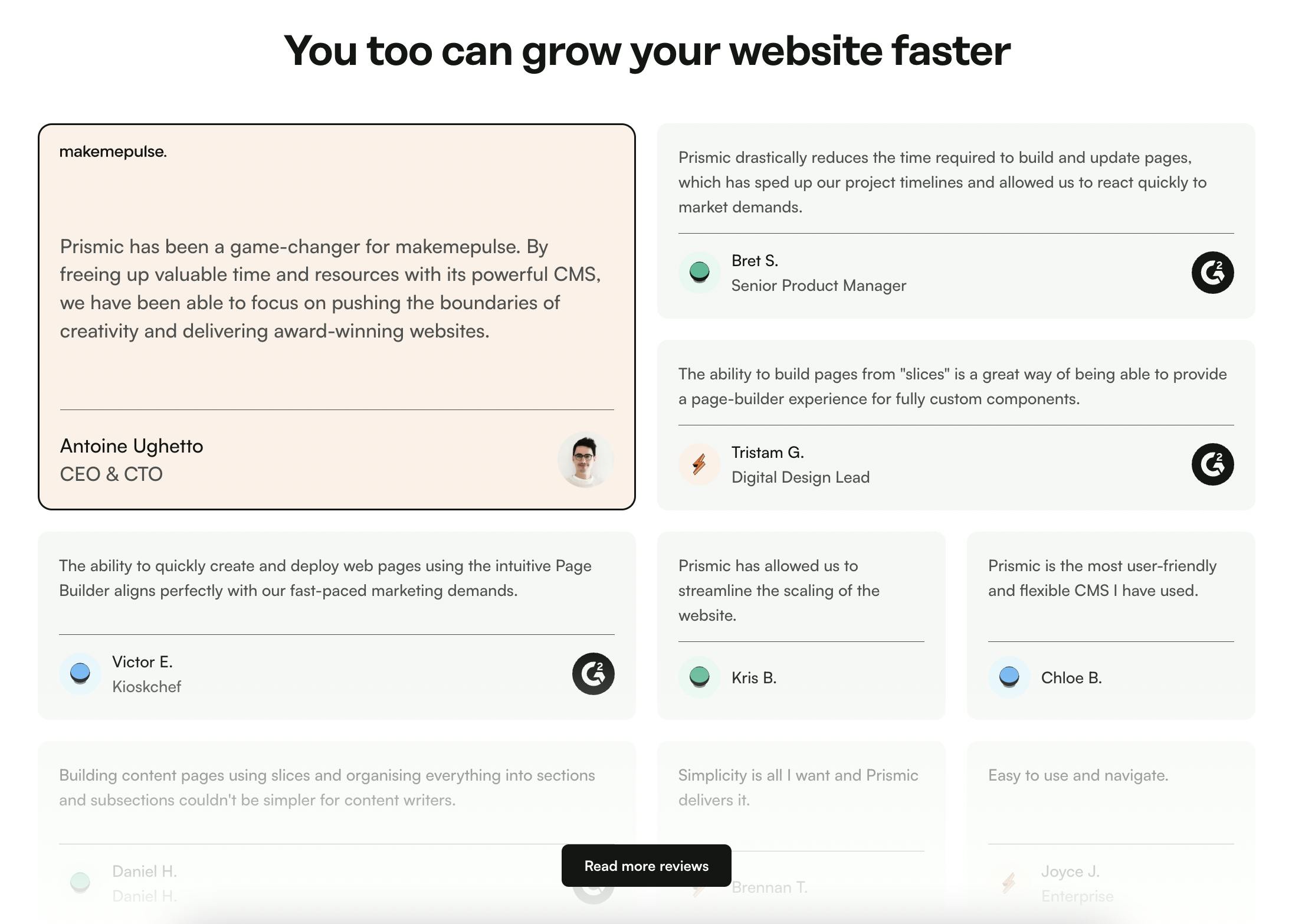
Testimonials and social proof build trust with visitors by showing that others have had positive experiences with your product, service, or brand. They help potential customers feel more confident in making a decision.
Examples of social proof include:
- Customer reviews and ratings
- Written or video testimonials
- Case studies
- Logos of well-known clients or partners
- Mentions in media or awards
Placing testimonials near key decision points, like next to a CTA or pricing section, can make them more effective.
Footer
The footer is the section at the bottom of a webpage. It usually appears on every page and contains information or links that are helpful for visitors, but not essential enough to display higher up.
This is a good location to place your contact information, legal links (Privacy Policy, Terms of Service), social media links, and a secondary navigation menu. You can also include a newsletter sign-up form, copyright notice, or a small site map for quick navigation.
Optional parts of a website
Some website elements aren’t strictly necessary, but they can make the site easier to use and more engaging. Whether you include them depends on your goals and the kind of experience you want visitors to have. These include:
- Blog: Lets you share updates, tips, or educational content. You can add a sidebar for things like a table of contents, recent posts, or category filters.
- Search bar: Helps visitors find what they need without clicking through multiple pages.
- Form : Useful for contact requests, newsletter sign-ups, event registrations, or feedback.
- Breadcrumb: Shows visitors where they are on your site and makes navigation easier. It also supports SEO.
- Slider: Rotates images, featured content, or promotions in one container. It is commonly used in hero sections and e-commerce sites.
- Progress indicator: Shows how far someone is in a process, like when reading an article or filling out a form.
- Tags: They are commonly used in blogs or e-commerce websites. These elements group content by topic or category, so visitors can filter and explore related items easily.
Behind-the-scenes parts of a website (technical layer and elements)
The parts of a website you see are only one aspect. Behind the scenes, there’s a technical layer that makes your site functional and keeps it online.
Frontend code
Frontend code controls everything visitors can see and interact with on your website. It’s traditionally built using the big three: HTML (structure), CSS (style), and JavaScript (interactivity).
While those are the standard building blocks, many developers now use frontend frameworks (React, Vue, Svelte, etc), CSS frameworks (Tailwind CSS, Bootstrap, Material UI), and headless CMS solutions to speed up development, manage complex interfaces, and make code easier to maintain.
Learn more about these frontend technologies:
Backend infrastructure
Backend code runs on the server and handles the parts of a website that visitors don’t directly see. It processes requests, manages data, and delivers the right content to the frontend.
The backend is responsible for things like:
- Managing databases and storing content or user information
- Handling form submissions and authentication
- Serving dynamic content based on user actions or permissions
- Integrating with external APIs or services
Common backend languages include JavaScript (Node.js), Python, PHP, Ruby, and Java. Many websites also use backend frameworks like Express, Django, Laravel, or Ruby on Rails to speed up development and keep code organized.
Domain name
A domain name is your website’s address on the Internet. It's the text people type into their browser to visit your site (for example, prismic.io).
Choosing a good domain name is key for branding and usability. It should be short, easy to remember, and relevant to your business or content. You’ll need to register the domain through a domain registrar and renew it regularly to retain ownership.
Web hosting
Web hosting is the service that stores your website’s files and makes them accessible on the internet. When someone visits your domain name, their browser connects to your hosting server to load the site.
There are different types of hosting, including:
- Shared hosting: This involves multiple websites sharing the same server resources.
- VPS hosting: A virtual private server that offers more control and dedicated resources.
- Dedicated hosting: An entire server dedicated to your website.
- Cloud hosting: Flexible hosting that scales resources based on traffic demands.
Platforms like Netlify, Vercel, and GitHub offer free hosting services for basic websites. Developers working on static sites or personal projects use these services since they include features like continuous deployment, SSL certificates, and global content delivery networks (CDNs) at no cost.
Meta tags
Meta tags are snippets of HTML code that provide information about a webpage to search engines and browsers. They don’t appear on the page itself, but affect how web crawlers and devices understand your website. Common meta tags include:
- Title tag: The page title shown in search engine results and browser tabs.
- Meta description: A short summary that appears below the title in search results.
- Viewport tag: Controls how a page is displayed on mobile devices.
- Robots tag: Tells search engines whether to index a page or follow its links.
See these website components in action
Want to see how all these website parts work together? This Next.js and Prismic tutorial demonstrates how all of these components work together, from headers and hero sections to navigation and content areas, to create a beautiful, modern site. Check it out! 👇
Why Prismic is ideal for building these website elements
Prismic combines the flexibility of a headless CMS with the ease of a headless website builder, making it simple to create and manage all the key parts of a website. With Slice Machine and the Page Builder, developers can build reusable, customizable sections for headers, hero areas, CTAs, testimonials, and more. They can even create multiple variations of each section for different use cases.

Once those sections are in place, marketers can use them like building blocks, arranging, mixing, and filling them with content directly in Prismic’s visual Page Builder without touching code. This setup speeds up page creation, keeps designs consistent with your brand, and reduces the back-and-forth between teams.
The result is a streamlined workflow where developers keep full control over the code and structure, while marketers have the freedom to build and update pages as needed. It’s like having a page builder tailored to your brand, backed by the power and flexibility of a headless CMS.
Conclusion
A website is more than just what visitors see on the screen. From the visible elements, like headers, footers, and navigation menus, to the behind-the-scenes components like codebase and domain name, each part plays an important role in the overall user experience and performance.
Understanding the anatomy of a website helps you design, build, and maintain a site that looks good, functions smoothly, and meets your goals.